YAT Rebranding
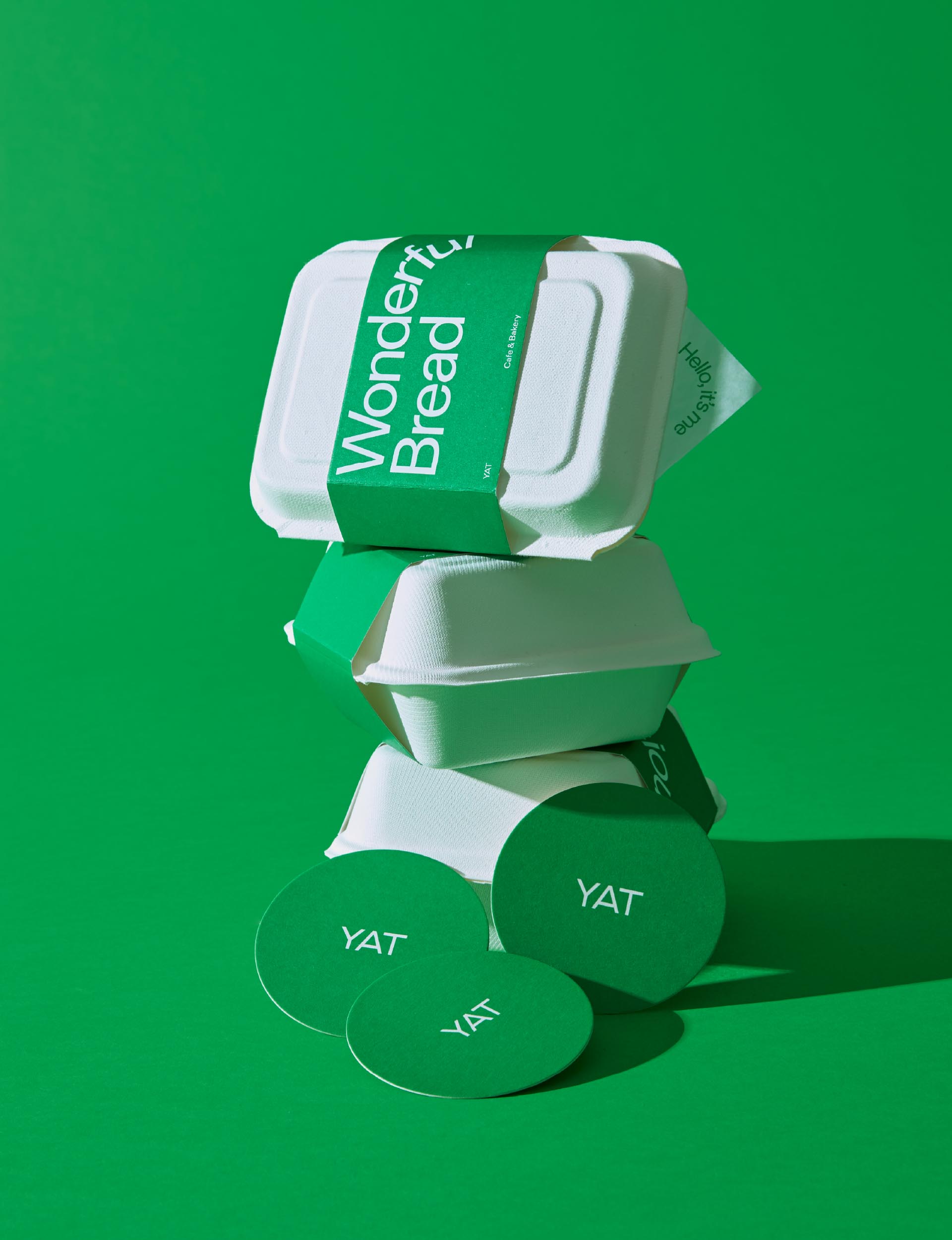
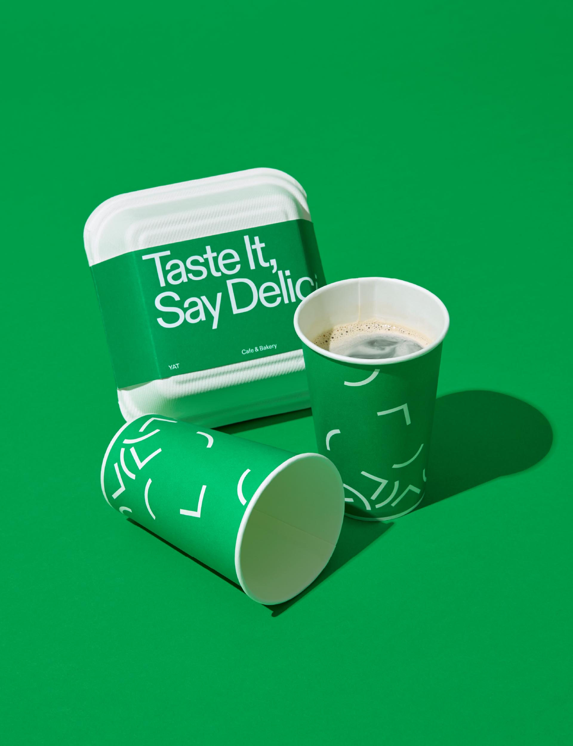
This brand design project is for ‘YAT,’ a café in Sokcho. YAT was seeking a unique brand design reflecting the natural beauty of Mt. Seorak and its spatial identity. BRENDEN undertook the overall brand design and designed YAT’s visual concept, identity, graphics, packages, subsidiary materials and contents.
Year
2020
Category
Art Direction, Branding, Package Design, Contents Design
Client
YAT
Award
iF Design Award 2022 Communication Winner
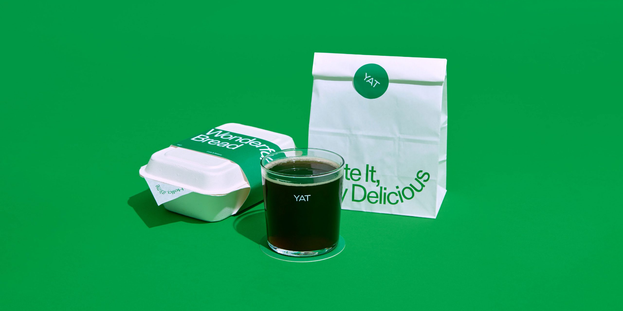
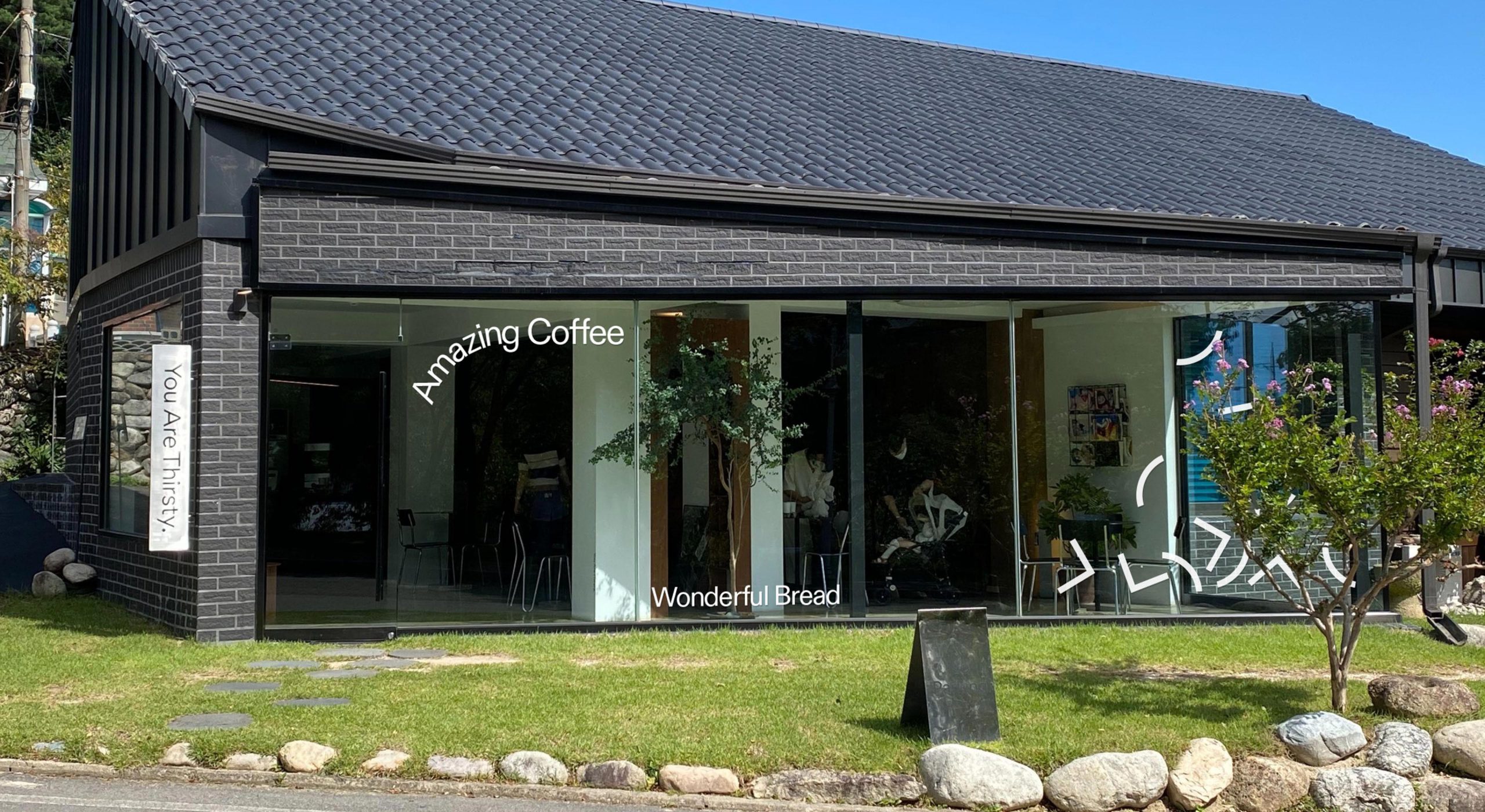
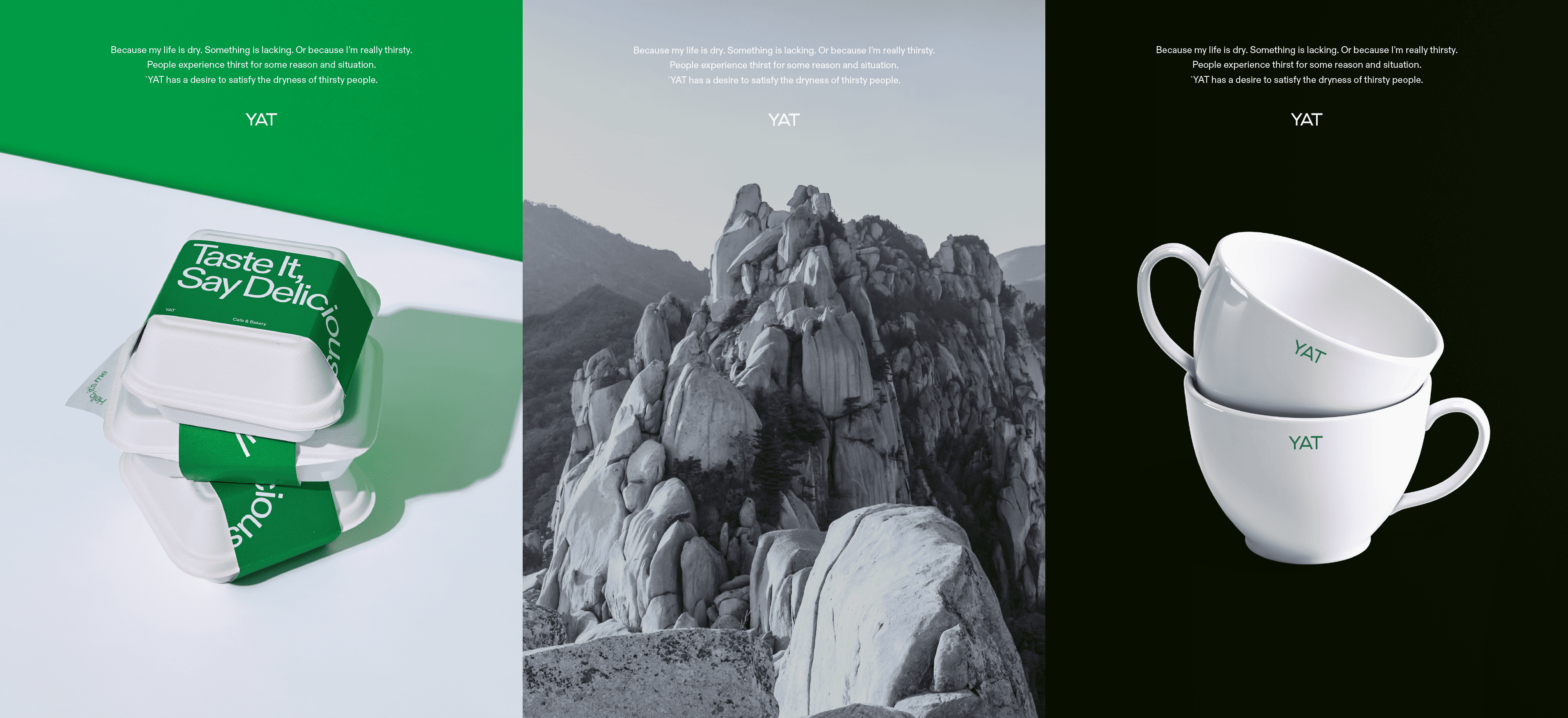
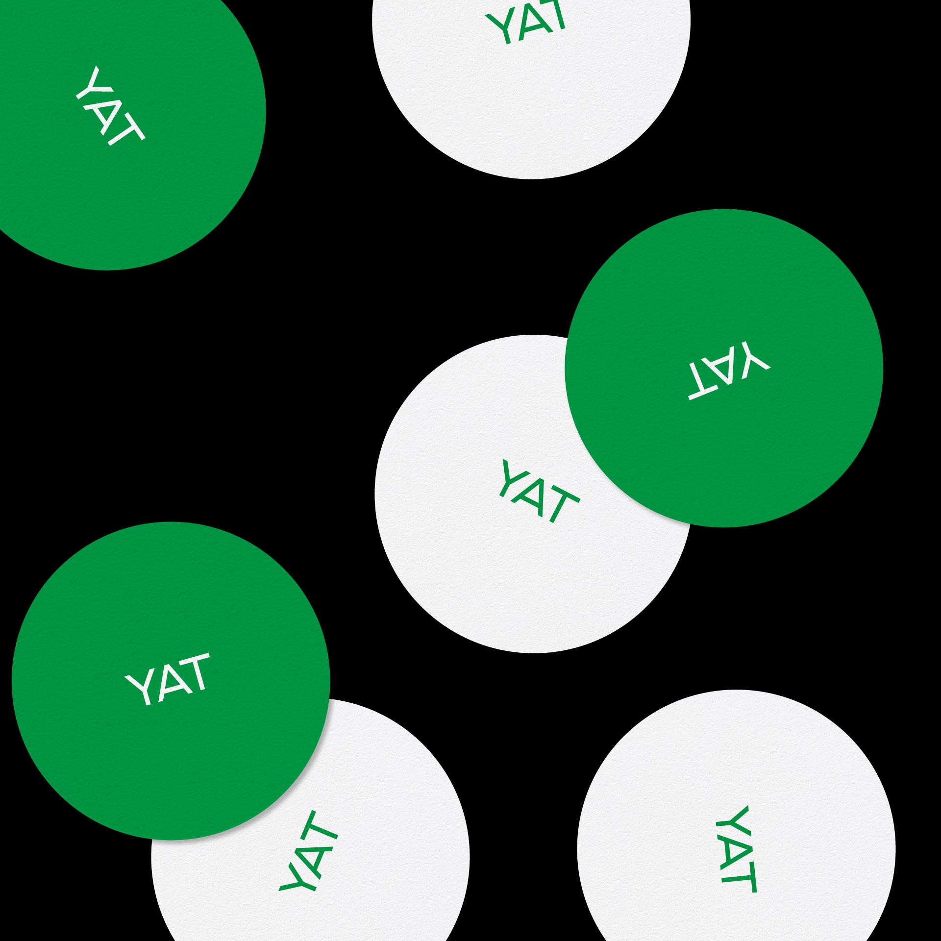
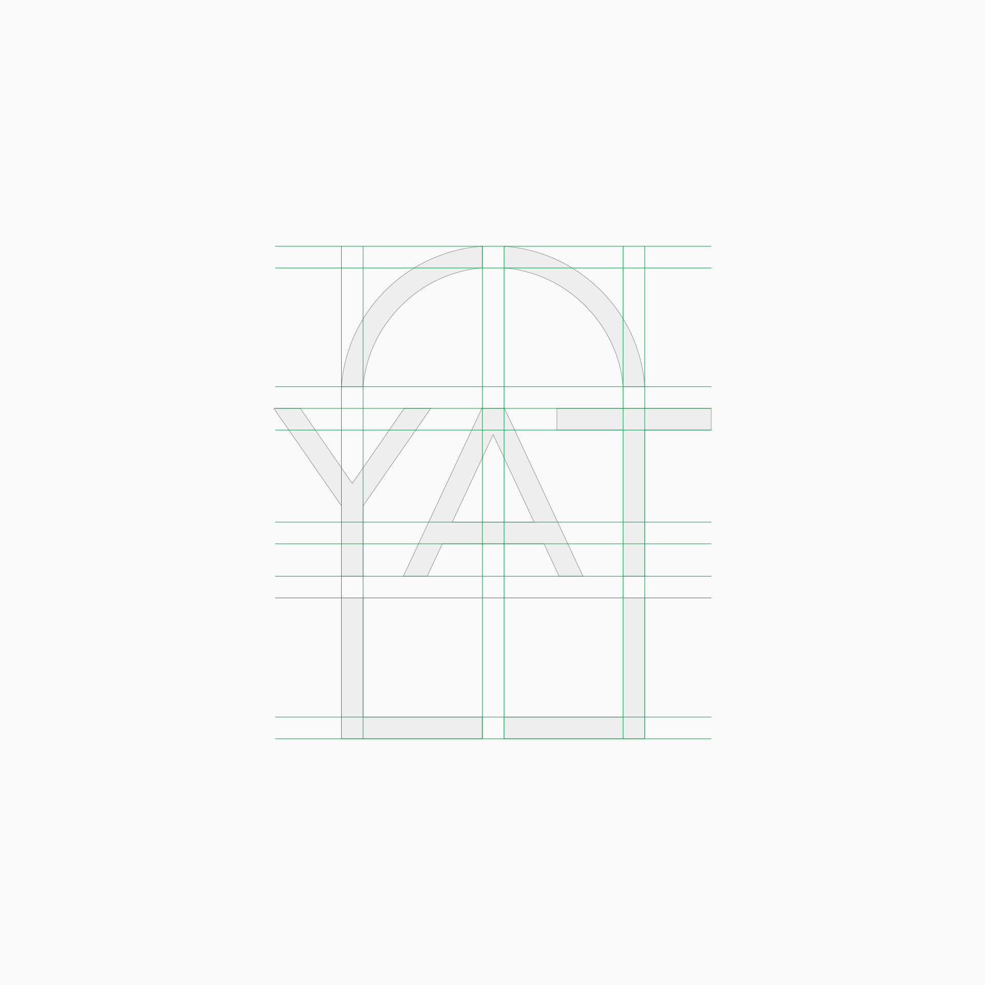

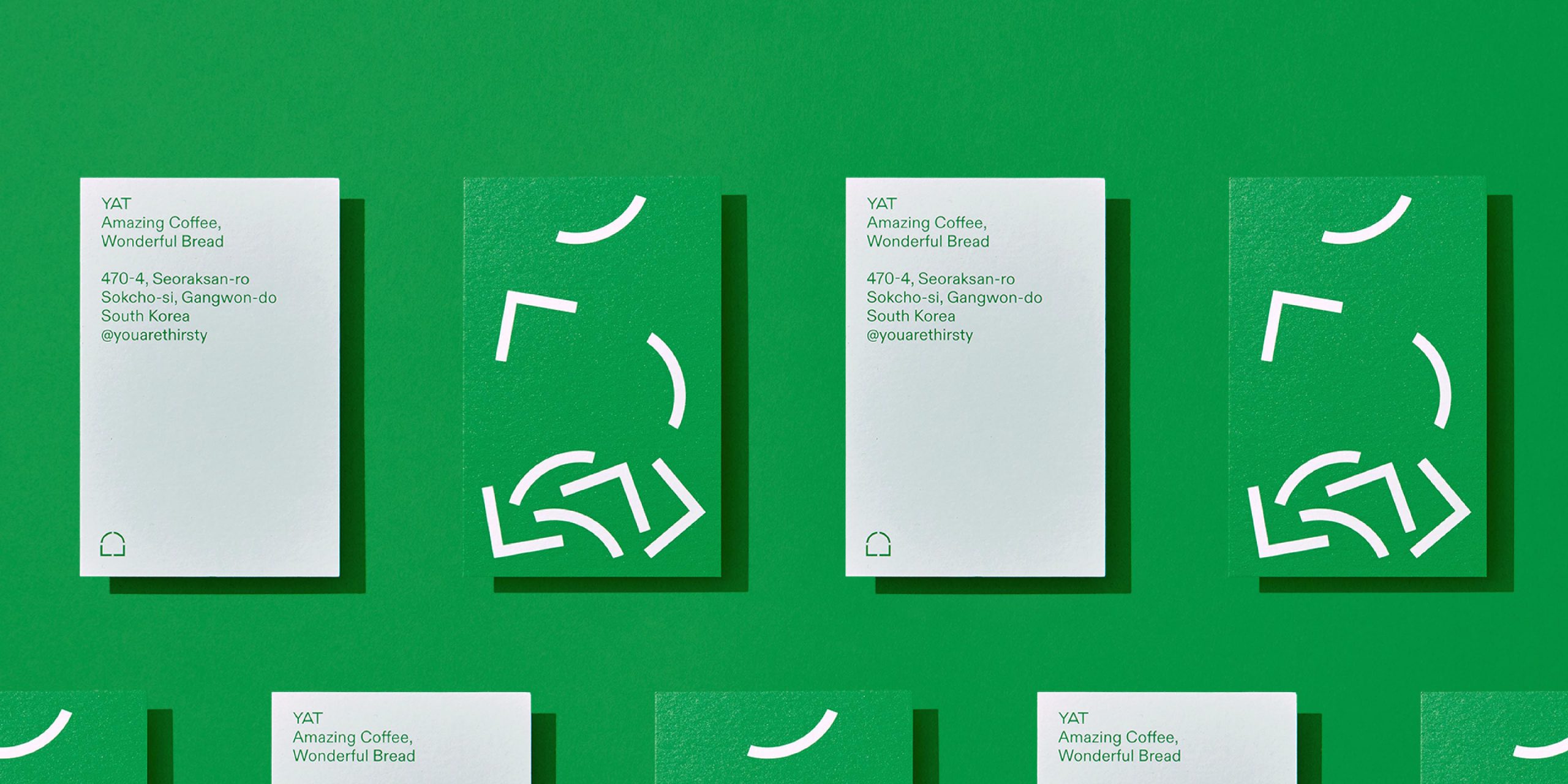
Inspired by the semi-circle shape applied to its interior and furniture, YAT’s symbol design symbolizes the blunt boulders characterizing the Mt. Seorak. YAT’s symbol is designed to be used in diverse forms in combination with its wordmark. Also, we chose green symbolizing leaves as the main color in harmony with YAT’s brown furniture to make customers feel trees (brown) and leaves (green) in the café.
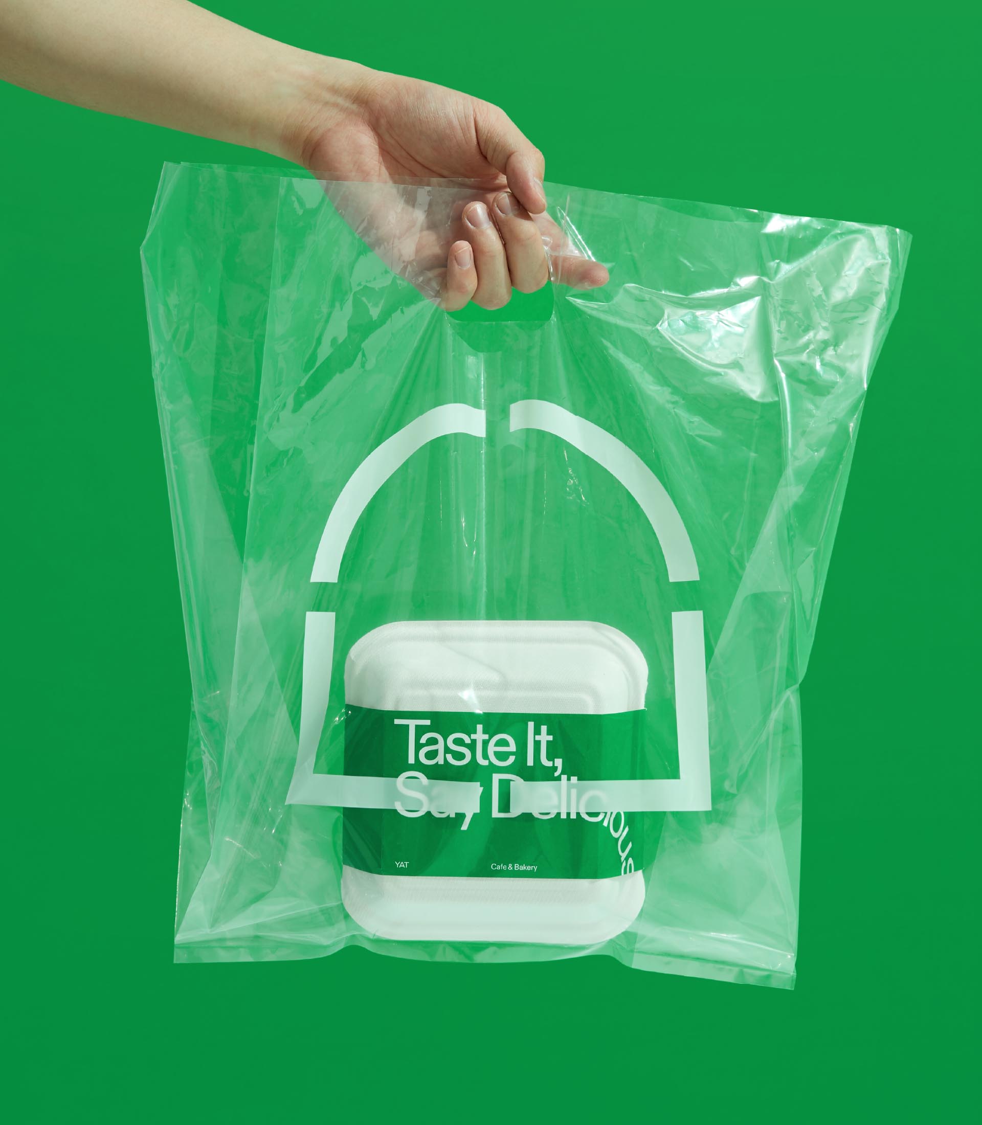
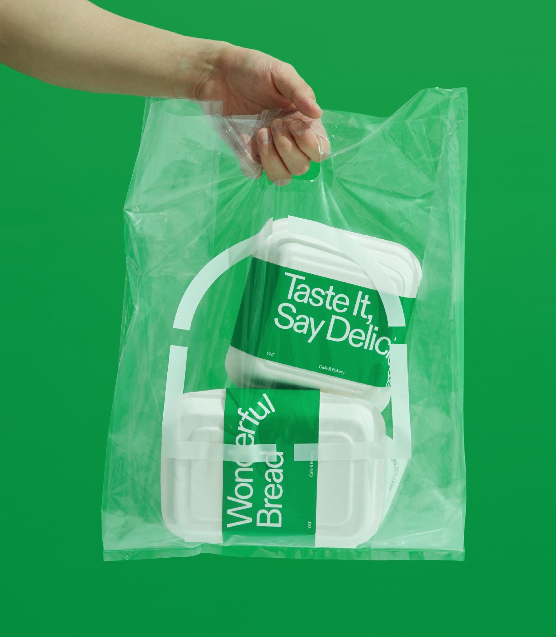
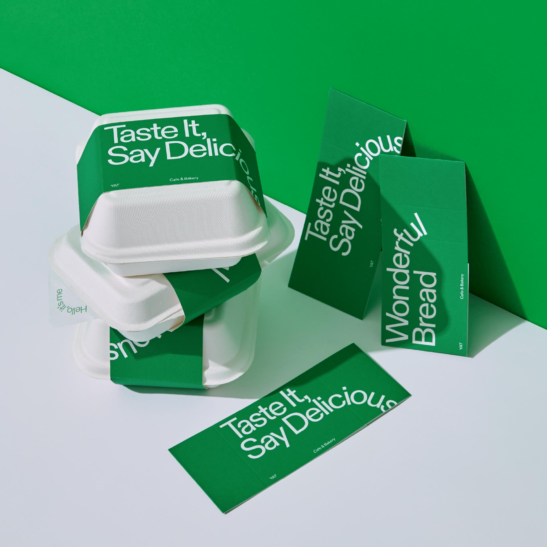
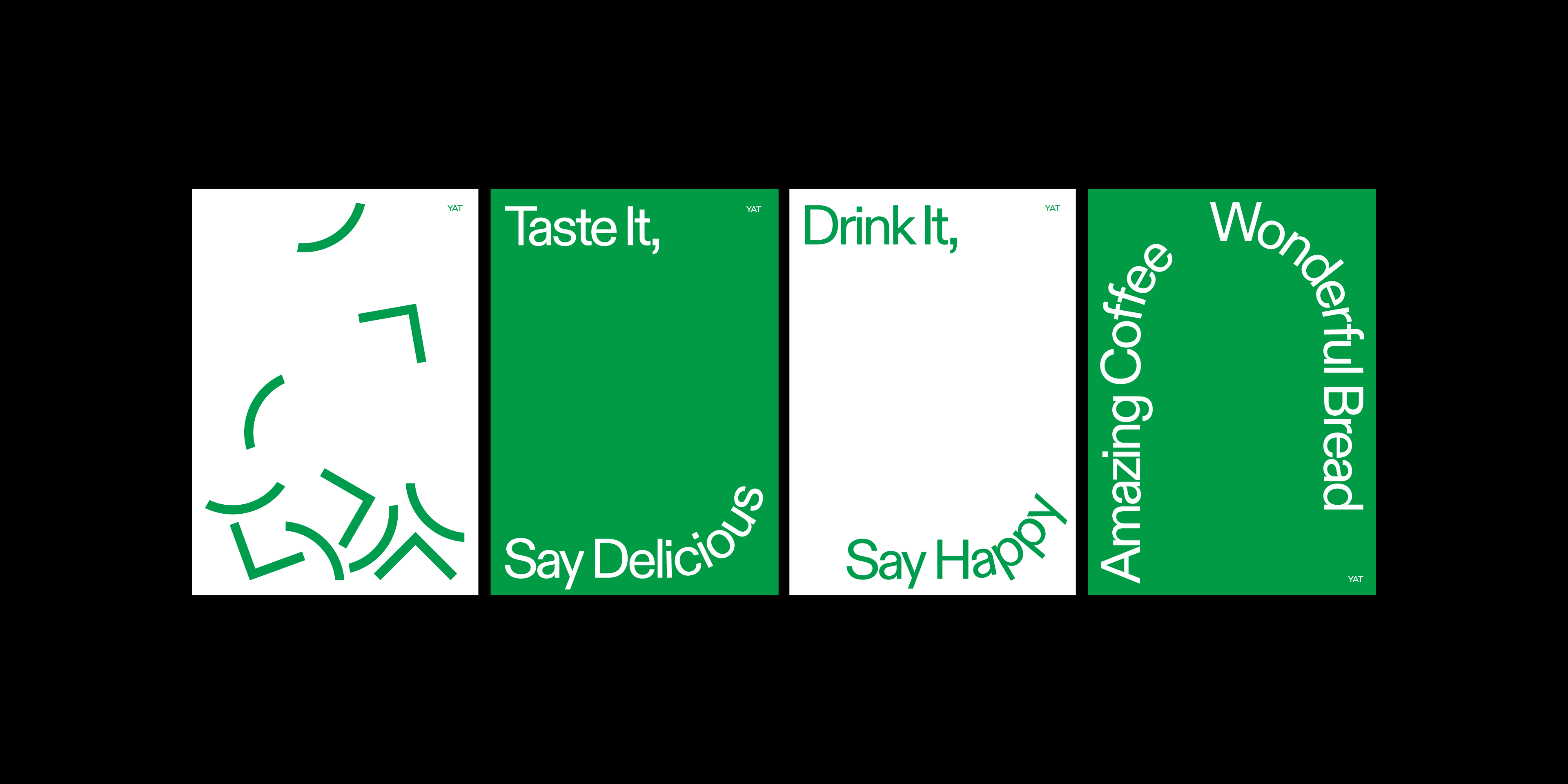
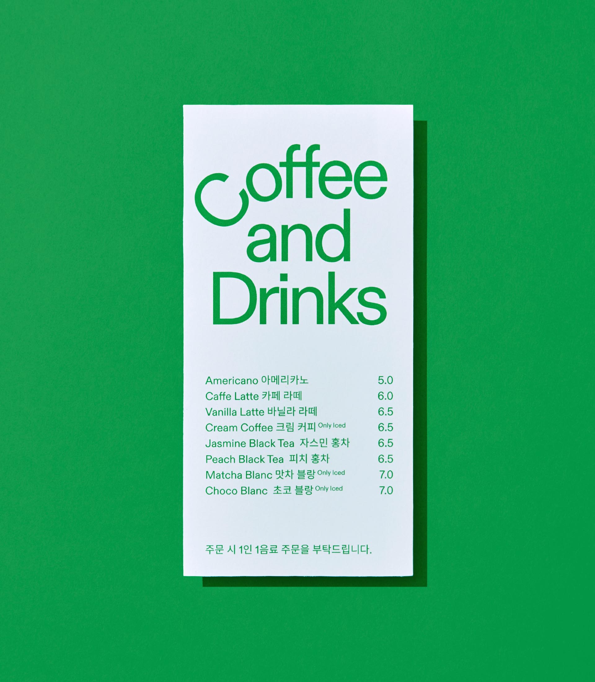
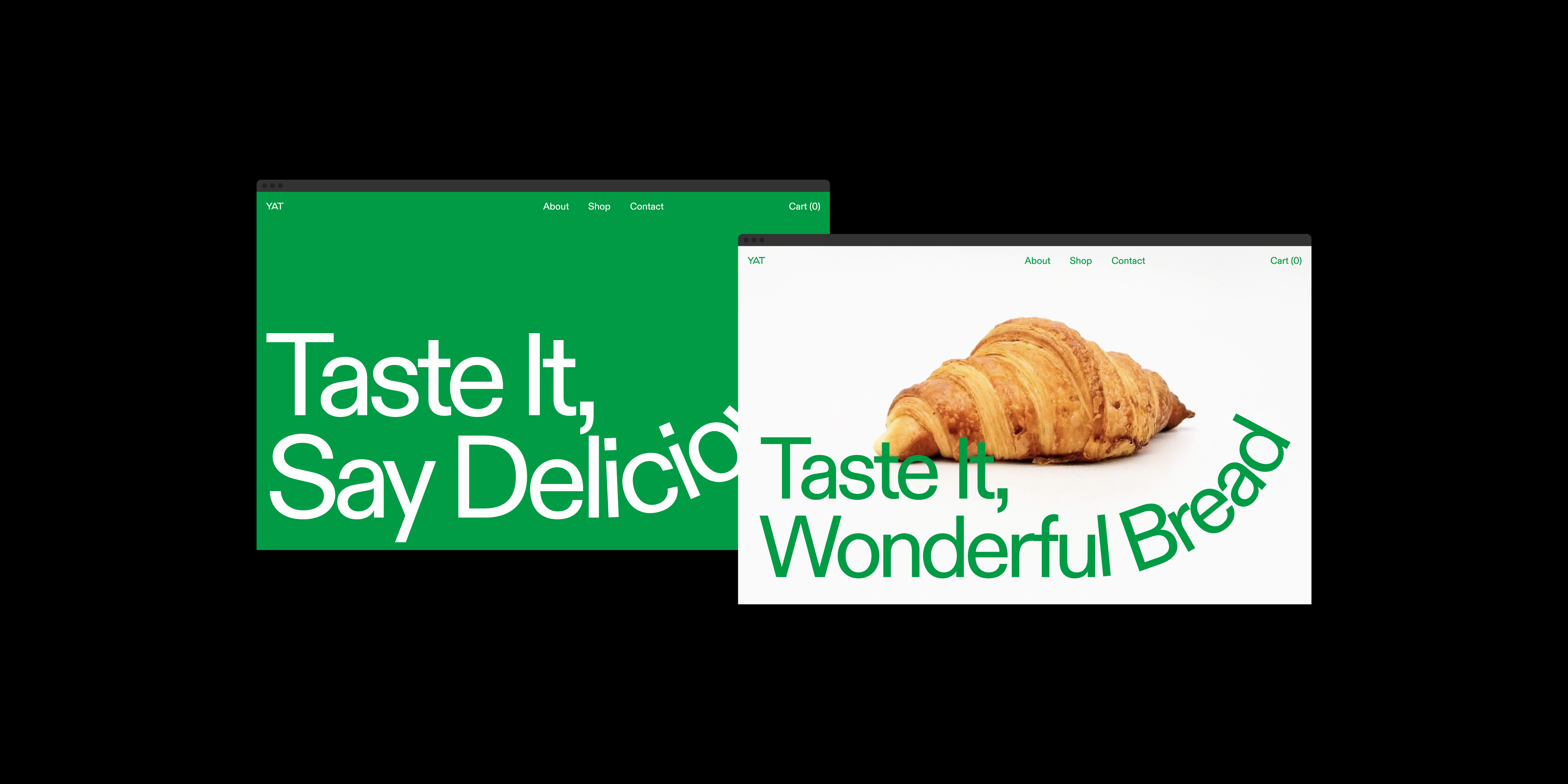
YAT’s graphic is based on the graphics used in its symbol. In accordance with the meaning that ‘experiences through YAT enrich everyday life,’ we designed the graphics divided into 4 parts, which can form different shapes. Likewise, the typography is designed to move rhythmically in straight and curved lines following the shapes of graphics in the symbol. Also, the graphics of overlapping curved typography symbolize the ‘ridge of rocks’ in the Mt. Seorak.
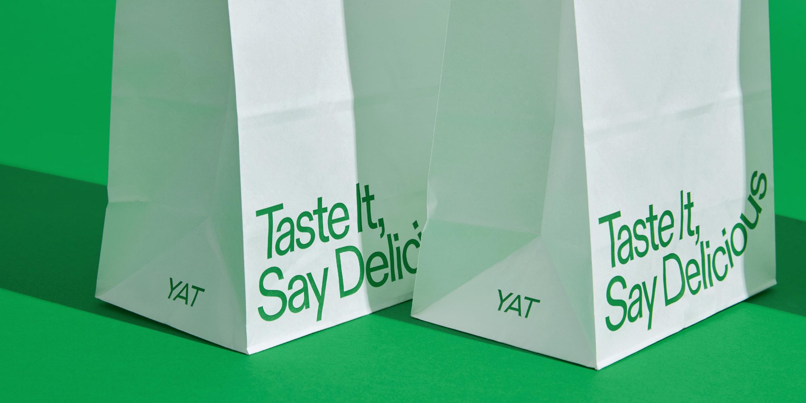
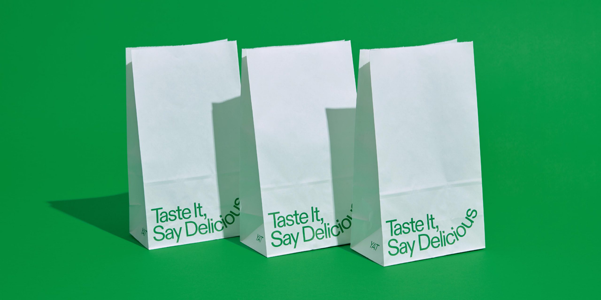
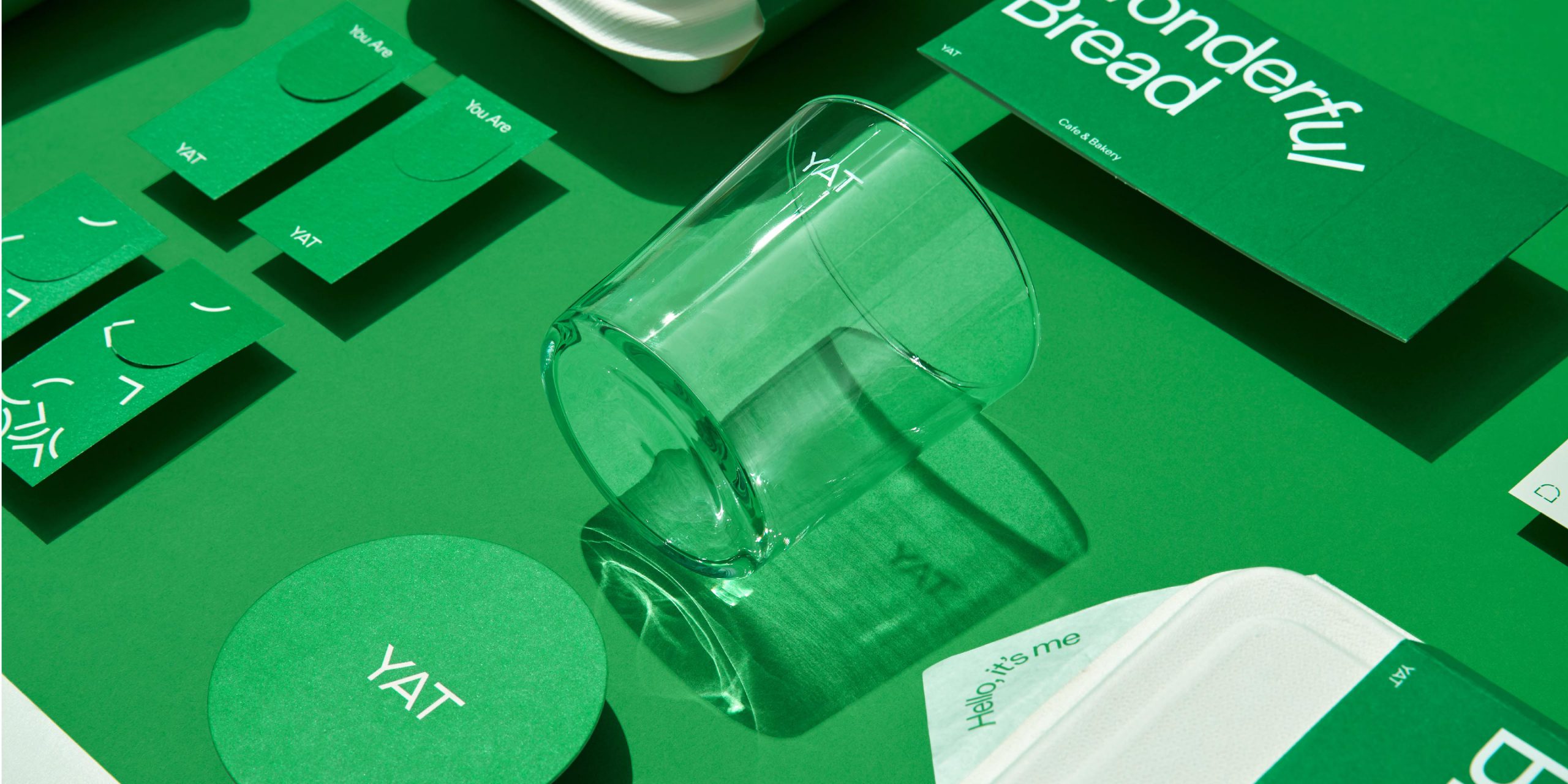
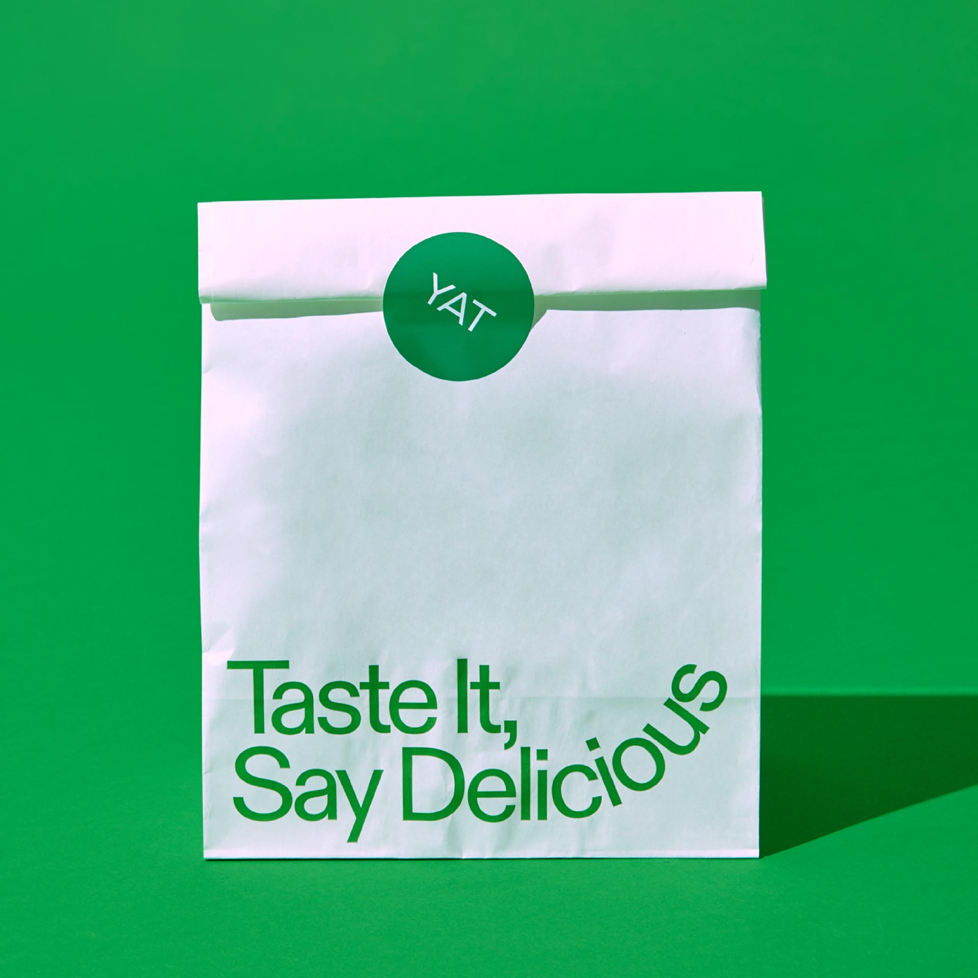
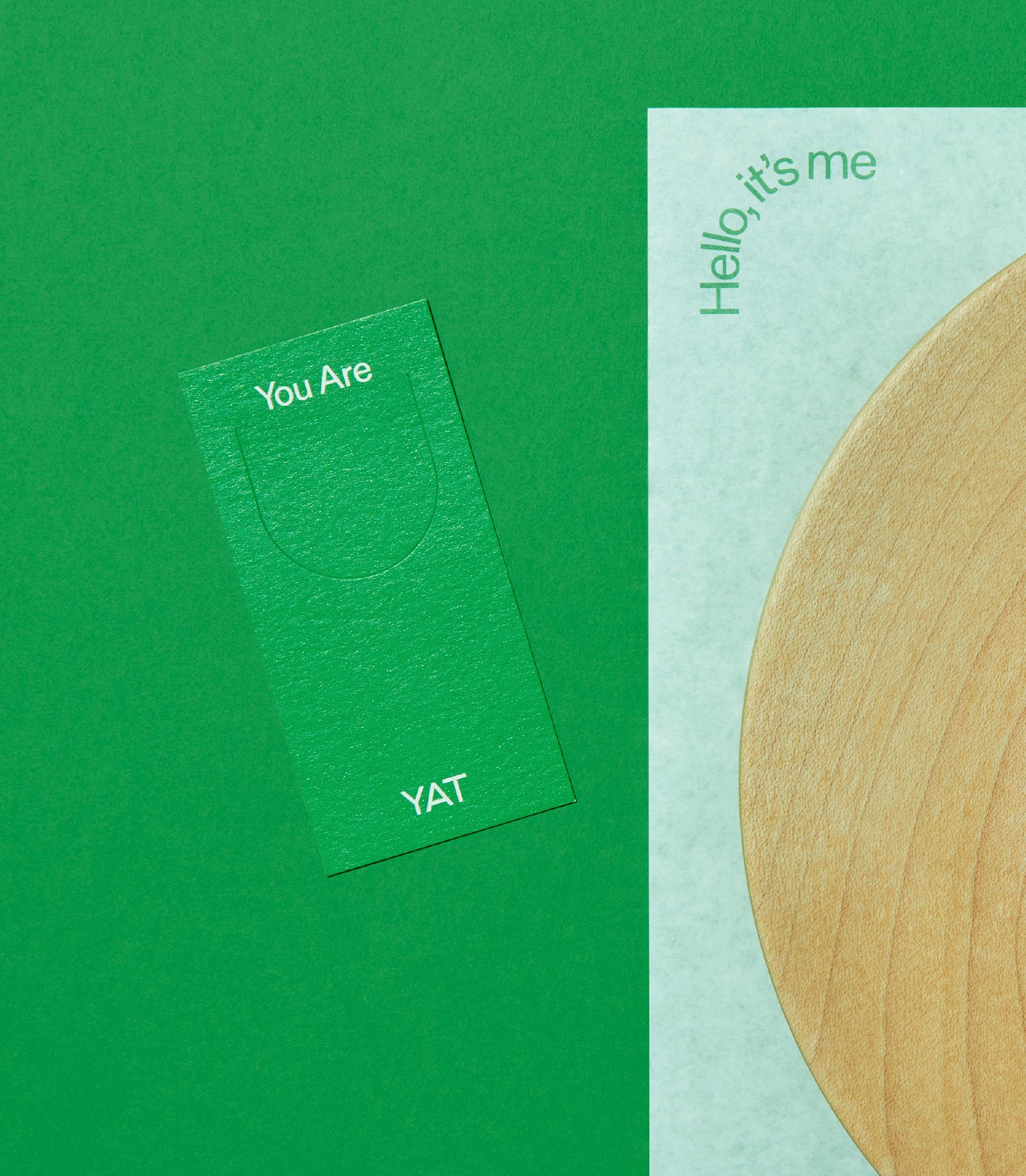
YAT’s graphics fit diverse offline media used in the café, e.g. paper cups, packages, tissues, business cards, coupons and menus. YAT’s unique rhythmic graphics and colors found on such items mingle with its wooden furniture, displaying YAT’s distinctive nature-friendliness. Also, easily combined with photo images, the graphic system allows YAT’s identity to be consistently applicable to social media contents.


BRENDEN
Creative Direction / Do-eui Lee
Project Management / Wook Jung
Design / Jaewan Yu, Doeui Lee
Client
YAT
Award
iF Design Award Winner 2022