THE WHOO
Rebranding Project
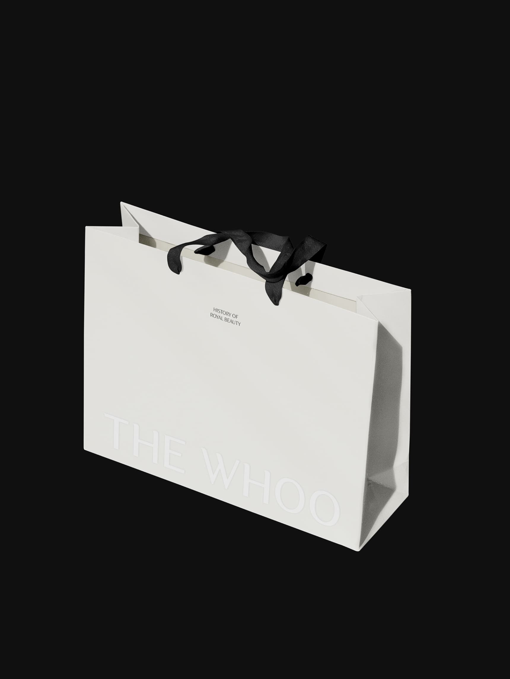
We have renewed the brand identity of the Korean premium cosmetic brand ‘The History of Whoo’. The transition from ‘The History of Whoo’ to ‘THE WHOO’ is a strategic move to preserve the heritage of the past 50 years. It also aims to solidify its position as a representative premium brand while seeking new innovations in the global market.
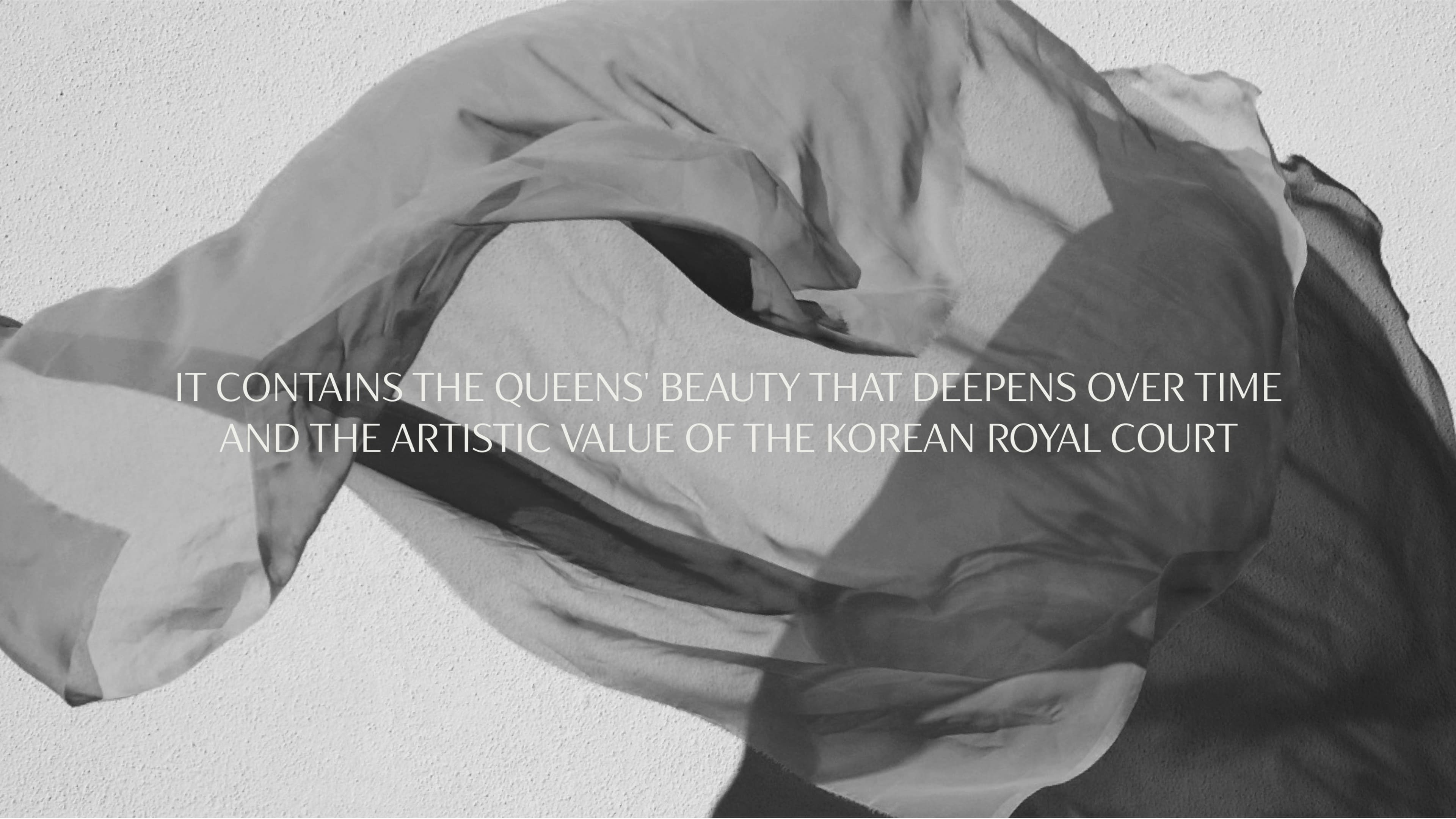
This rebranding is an important step in expanding its brand vision, which is based on Korean court philosophy, and in inspiring a new generation.
Design Approach
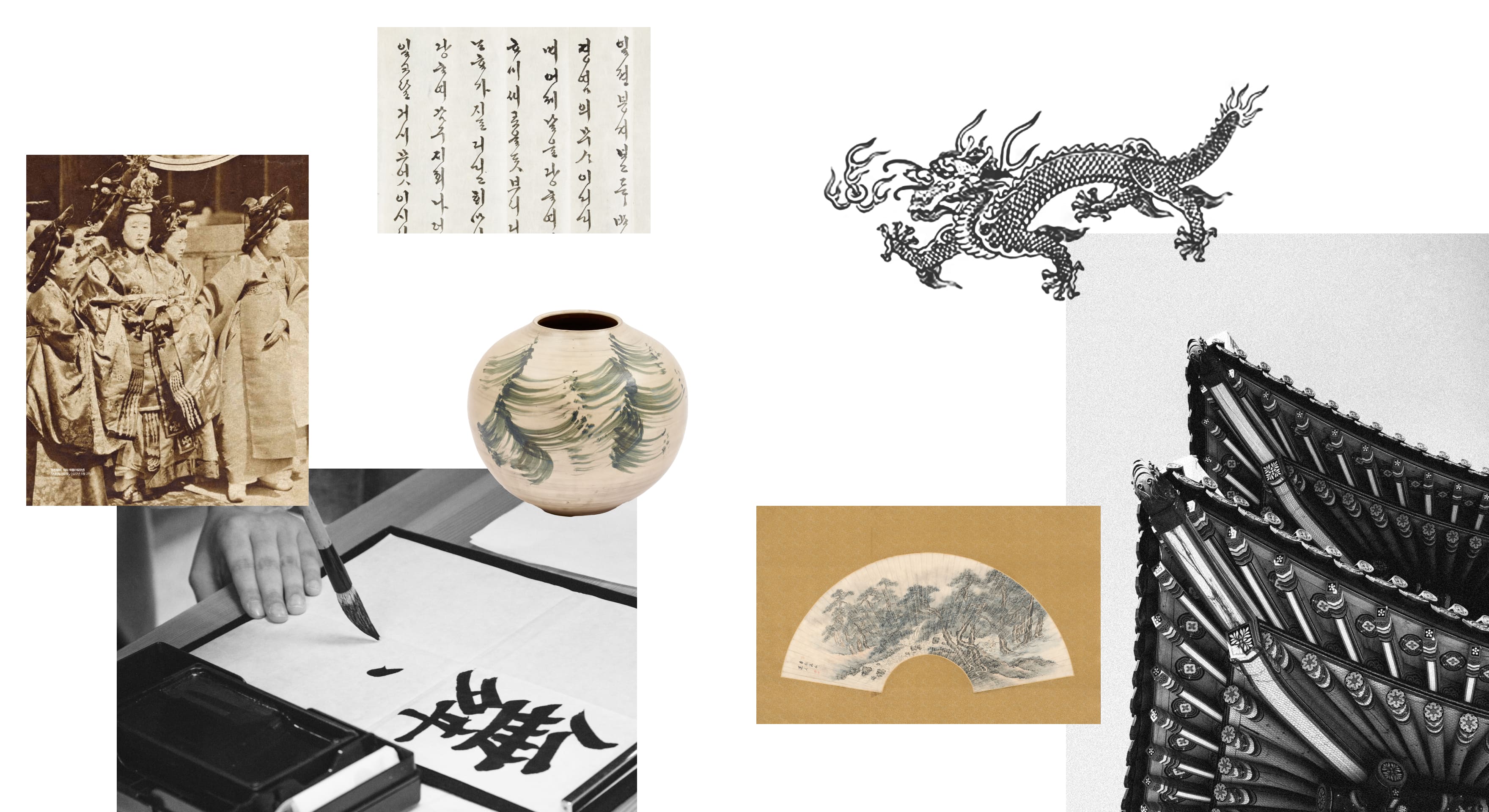
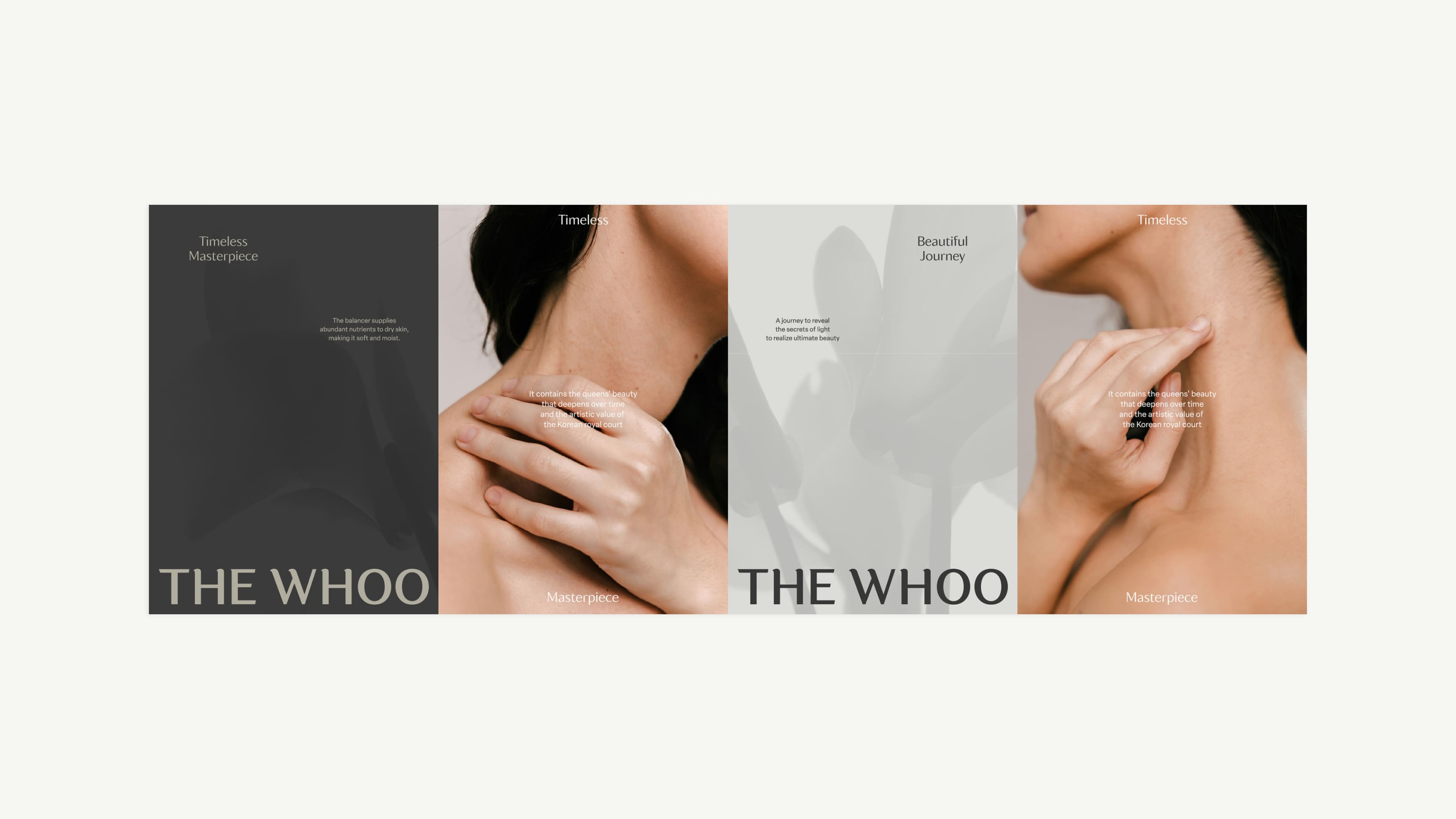
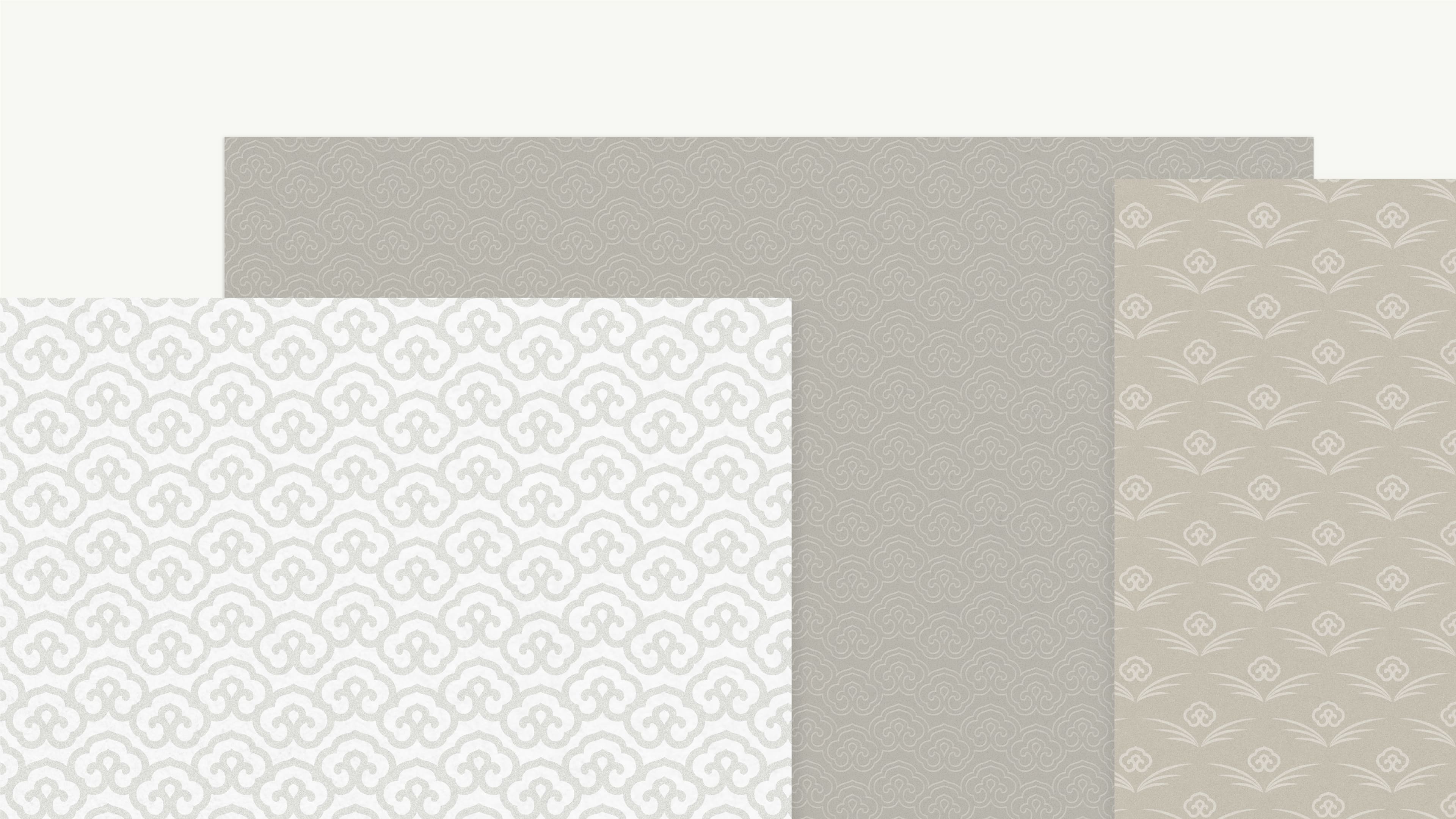
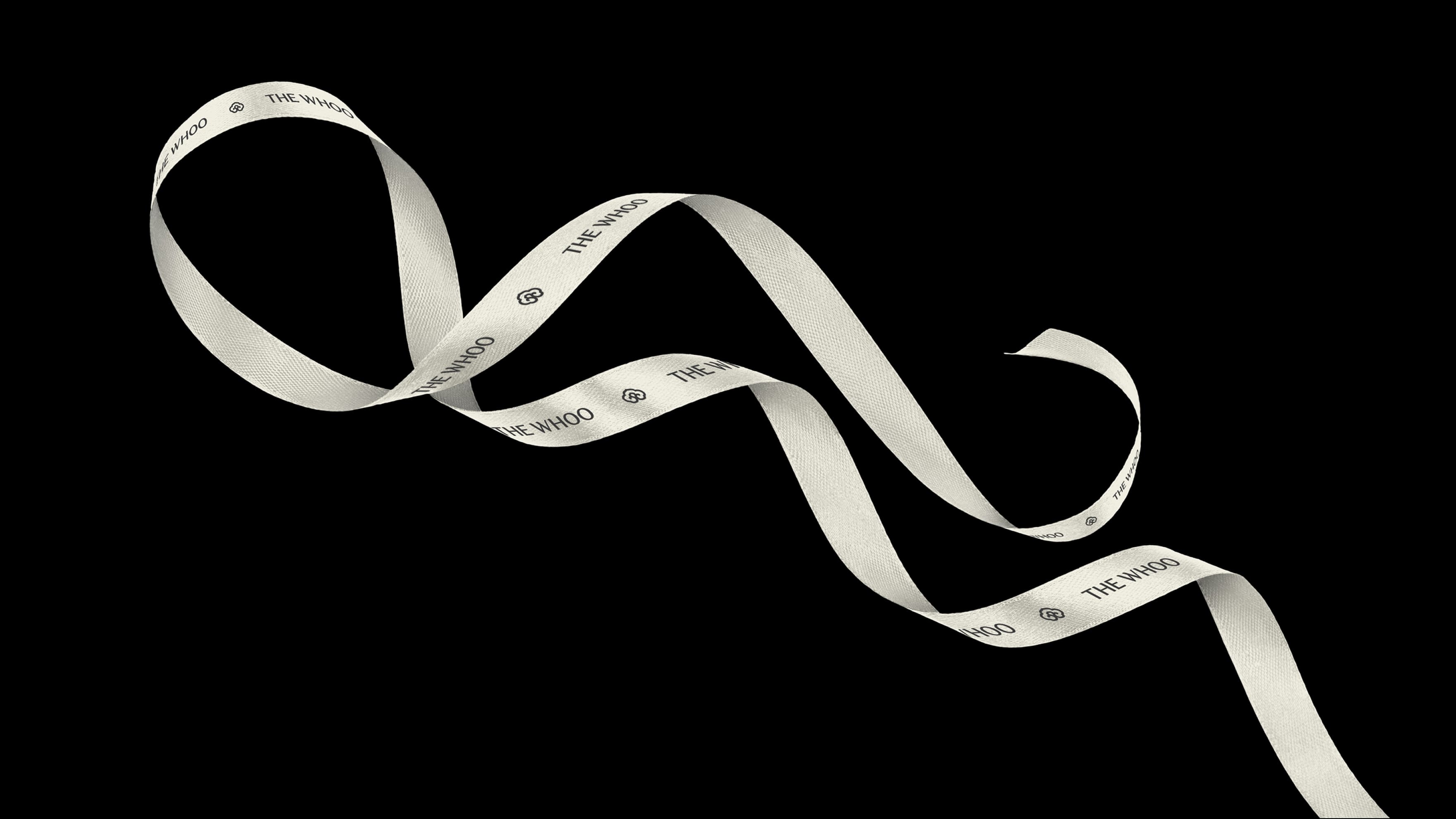
The aesthetics of Korean culture are derived from curves and balance that harmonize with nature. Delicate curves and central balance embody the ideal of healthy beauty that we strive for. We have developed the brand assets around these motifs.
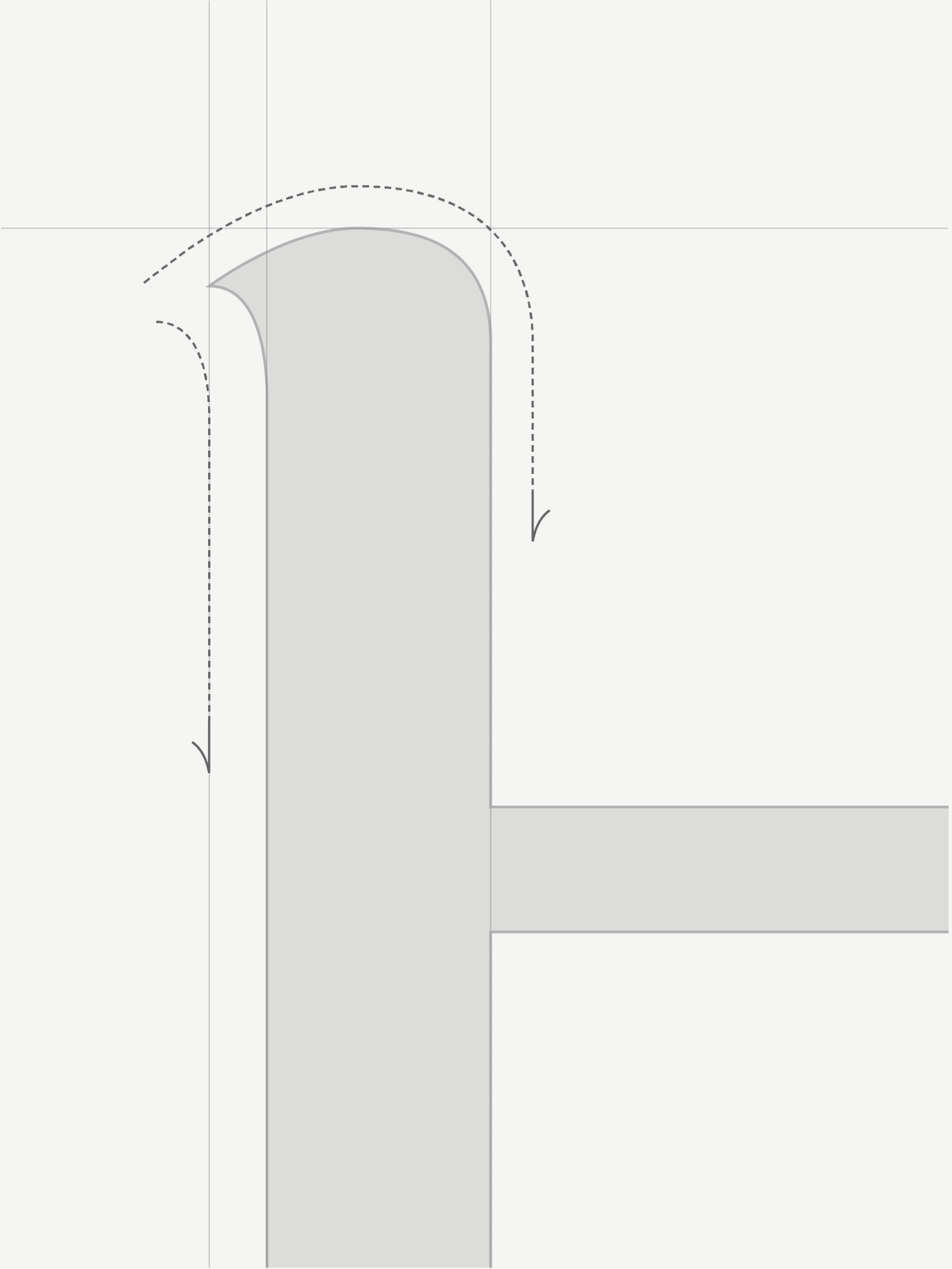
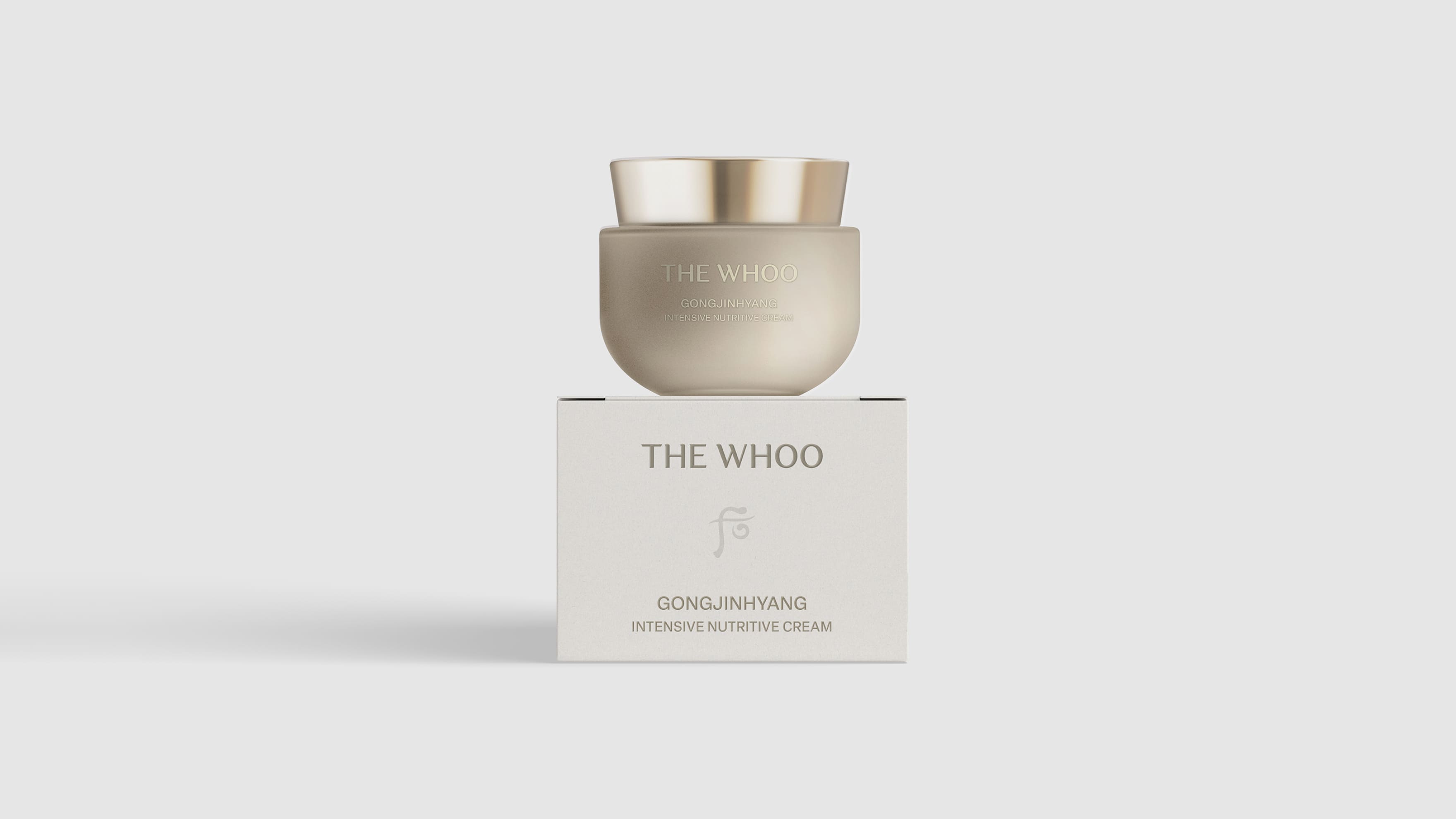
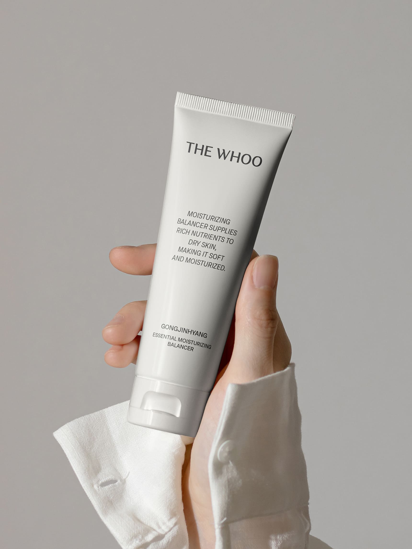
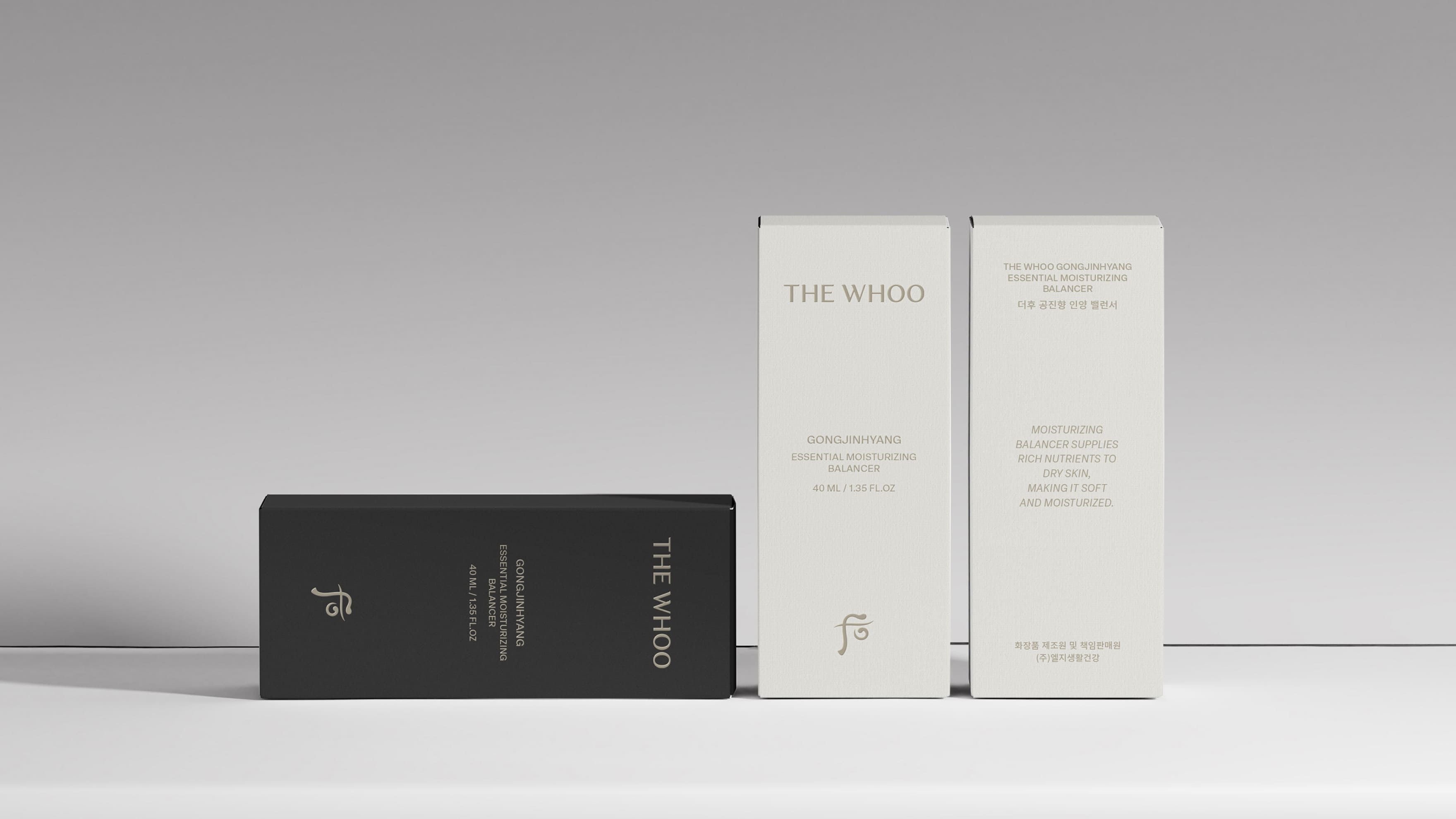
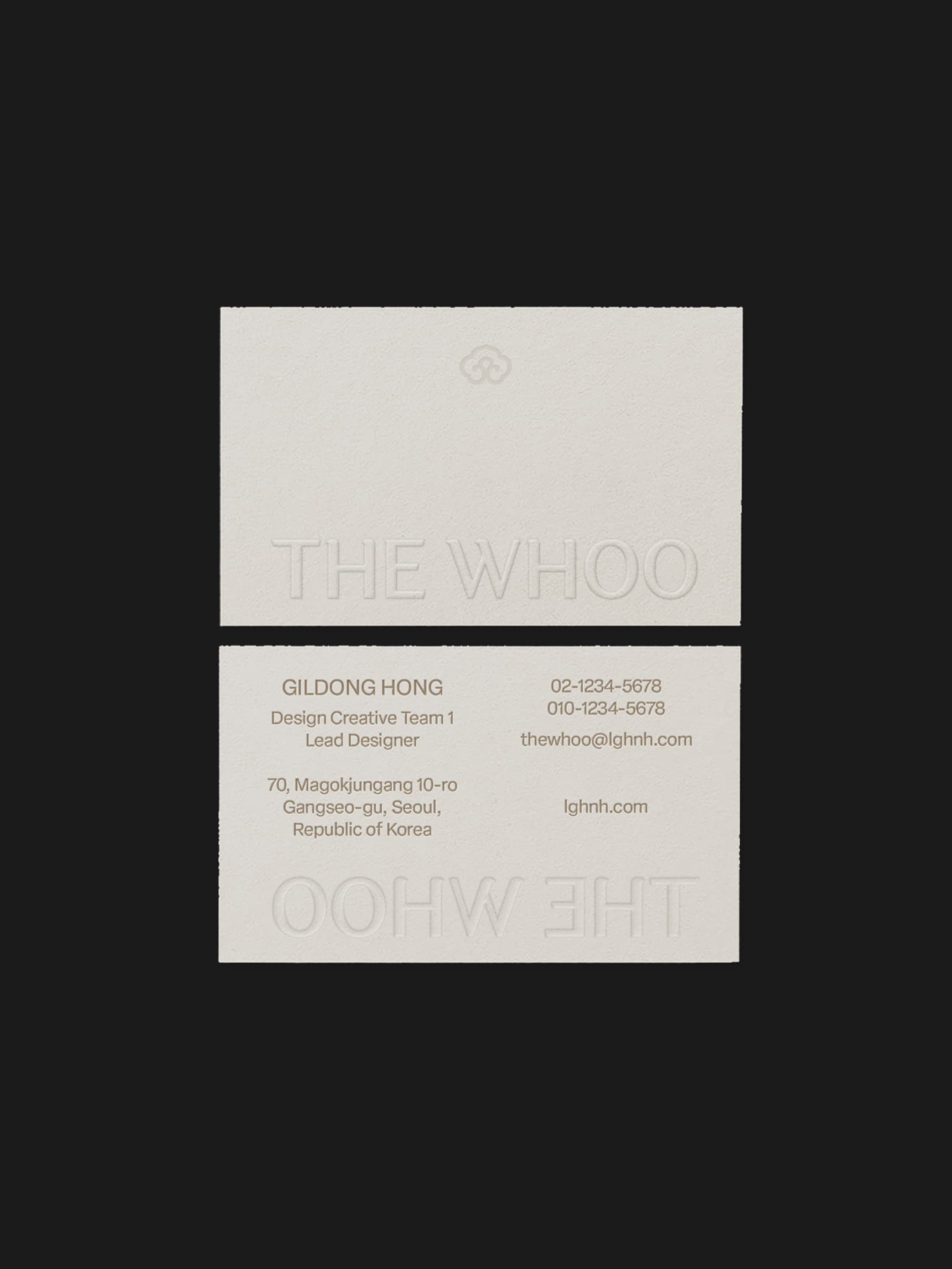
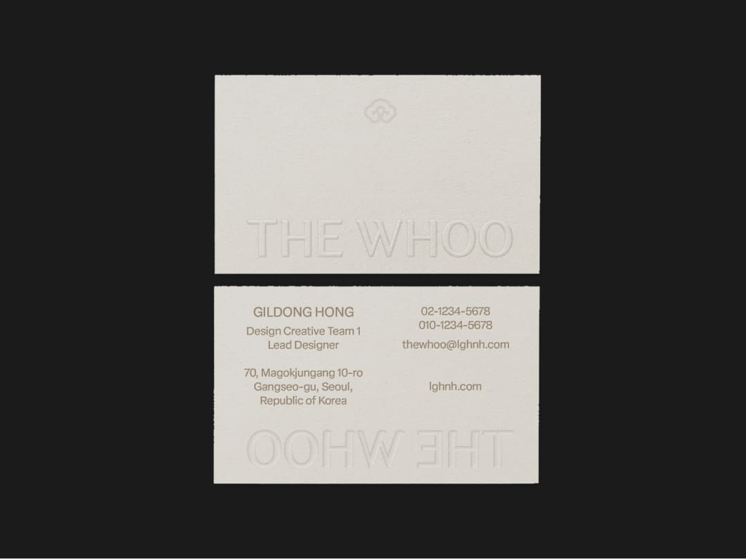
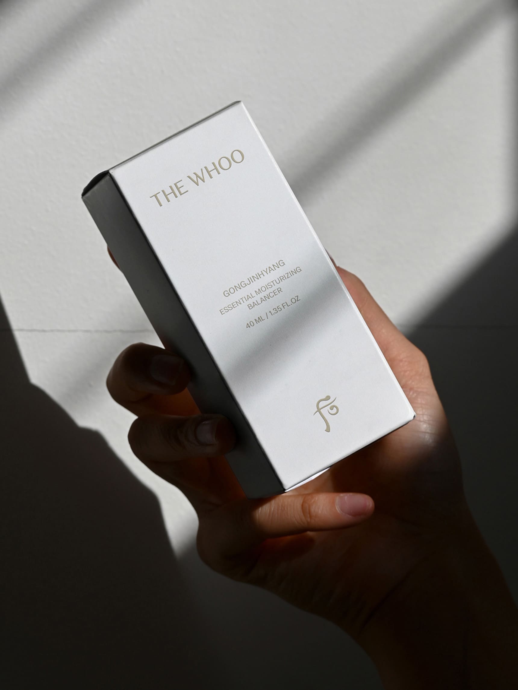
The new logotype has the soft curved details of the calligraphy. Created in a sans-serif typeface, it exhibits solidity in response to the shortened text length, while revealing the brand’s identity through the curve details.
The aesthetics of Korean culture are derived from curves and balance that harmonize with nature. Delicate curves and central balance embody the ideal of healthy beauty that we strive for. We have developed the brand assets around these motifs.
The new logotype has the soft curved details of the calligraphy. Created in a sans-serif typeface, it exhibits solidity in response to the shortened text length, while revealing the brand’s identity through the curve details.
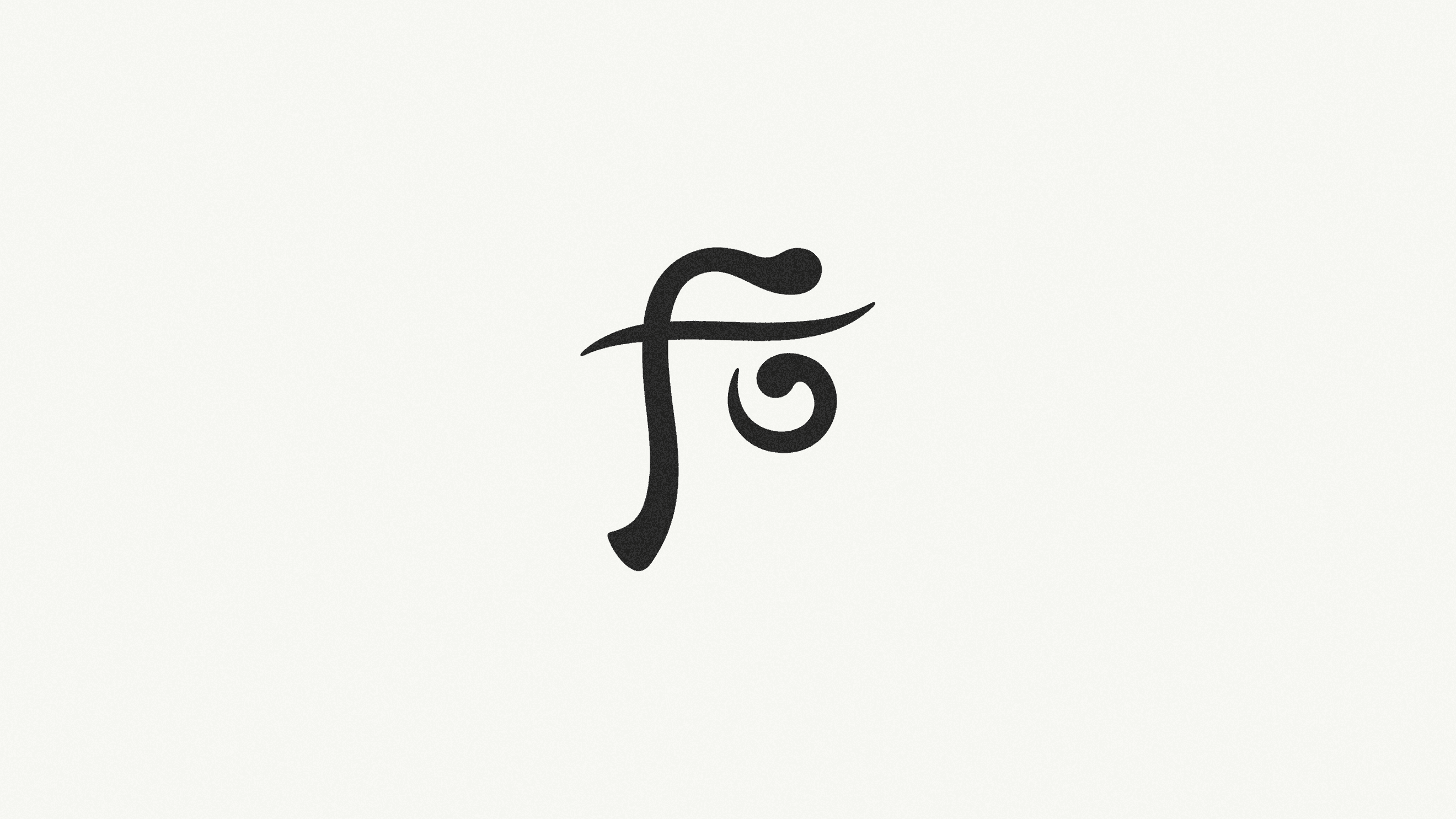
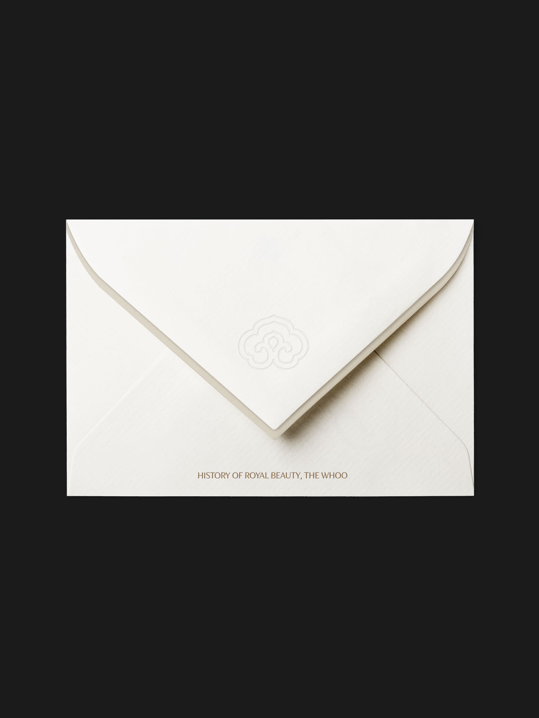
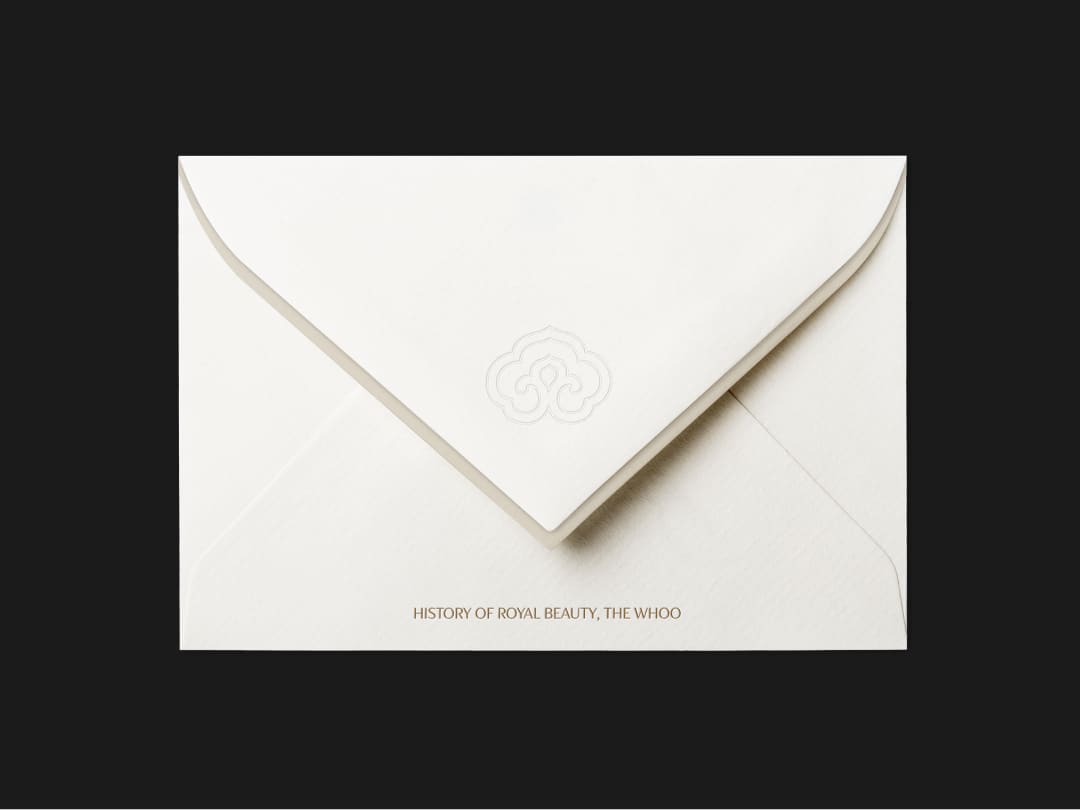
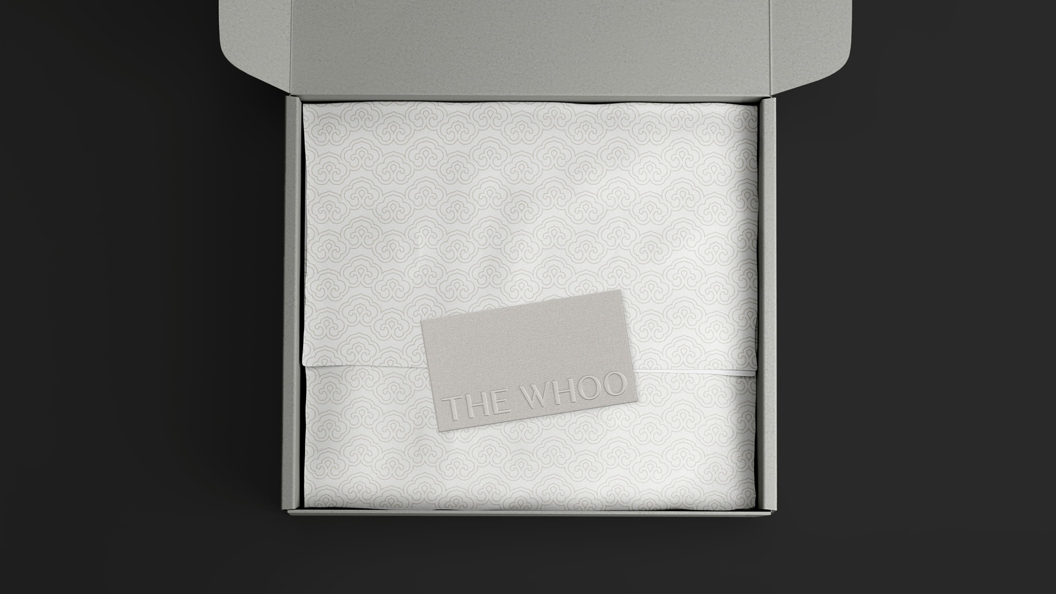
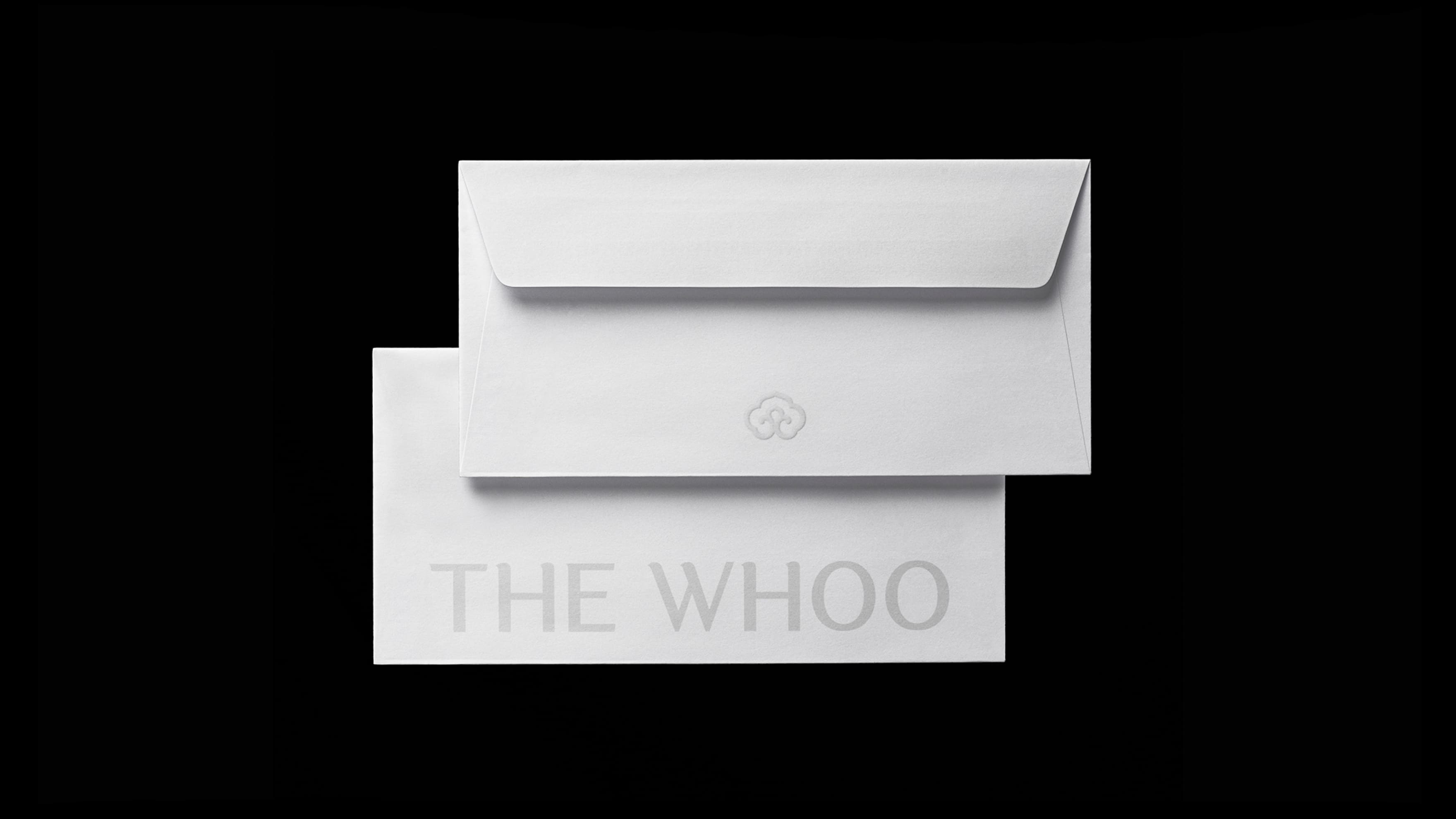
The 后 symbol was developed to fit the digital environment while maintaining its basic form. By refining the rough texture of brush strokes, it is reduced to only simple curves, achieving balance through variations in stroke pressure. The symbol's lines remind us of the soft curves of a face and natural beauty.
We have refined the lines and thickness of the lotus symbol. For its three-dimensional applications in decorations, sculptures, and packaging patterns, etc., we adjusted the curves to more closely mimic the shape of a circle. Additionally, we have modified the unstable seam lines to enhance visual stability.
We have refined the lines and thickness of the lotus symbol. For its three-dimensional applications in decorations, sculptures, and packaging patterns, etc., we adjusted the curves to more closely mimic the shape of a circle. Additionally, we have modified the unstable seam lines to enhance visual stability.
THE WHOO
Rebranding Project
BRENDEN
Creative Direction / Do-eui Lee
Project Management / Wook Jung
Project Lead / Sujeong Yang
Design / Sujeong Yang, Hyewon Cho, Juhyun Lee, Haena Yang
Client
LG H&H