Sockpiens
Naming & Rebranding Project
"Sockpiens" is a lifestyle brand with a vision to expand into the broader realm of basic clothing, starting with socks.
As a brand that originated with basic socks, it carries the meaning of being an essential brand for all of humanity. Leveraging the core value of 'Root' shared by socks and sapiens, we have created a consistent system for brand naming, brand strategy, and visual identity.

One of the primary objectives of the design renewal is the need for expanding the target audience.
The existing branding, 'Sockspop,' has predominantly appealed to women in their 20s to 30s, and to maintain the existing customer base while simultaneously attracting male and younger customers, a graphic and image strategy was implemented.

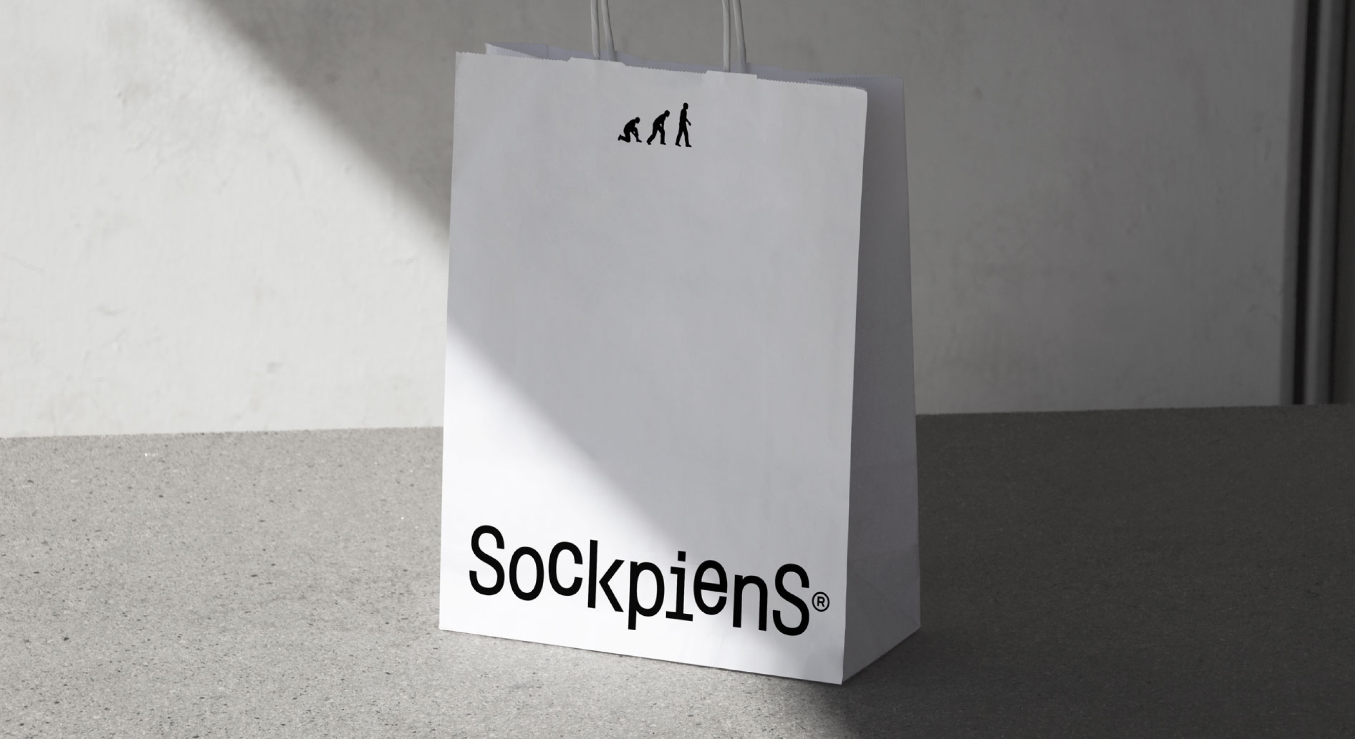
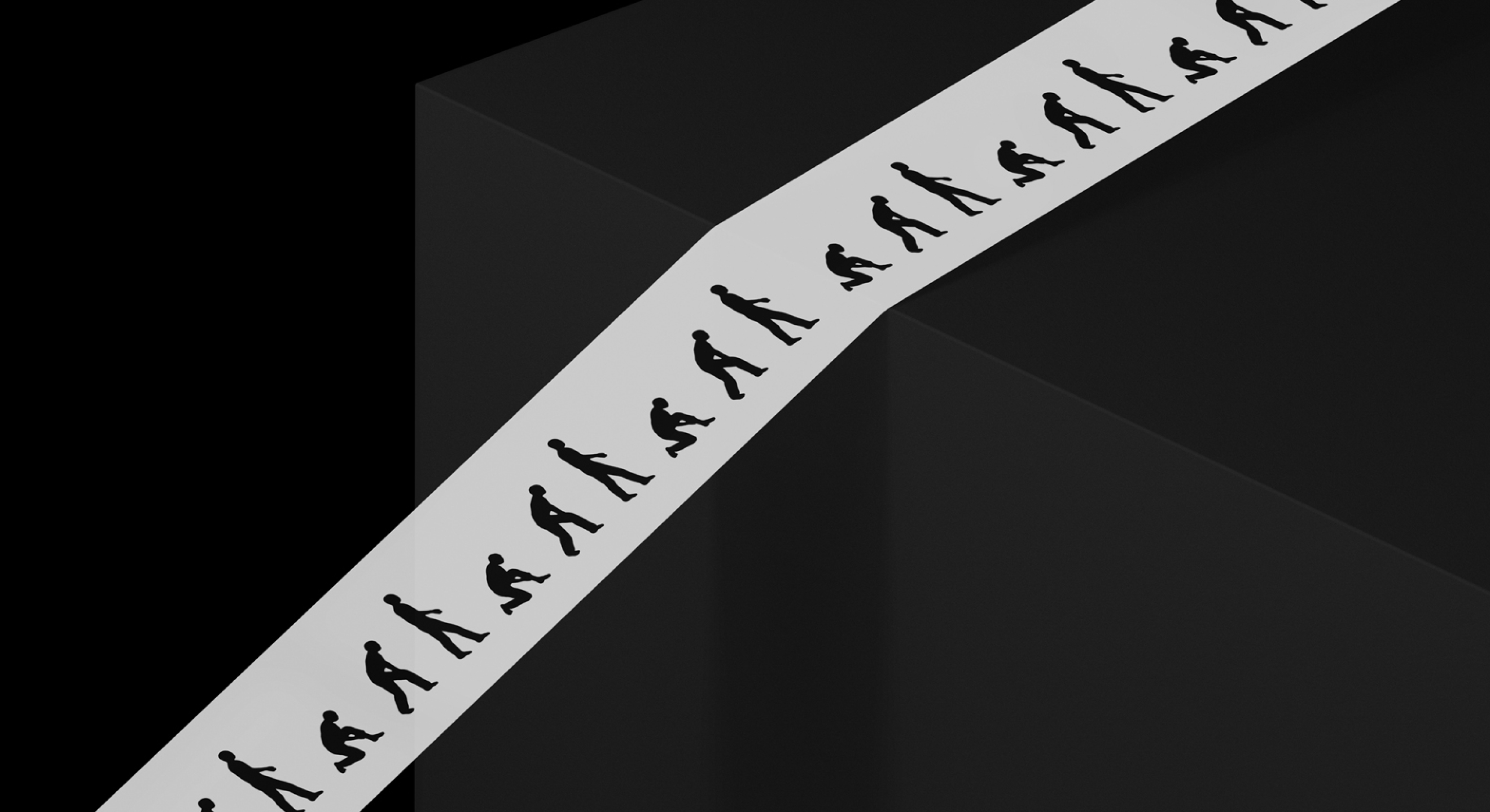
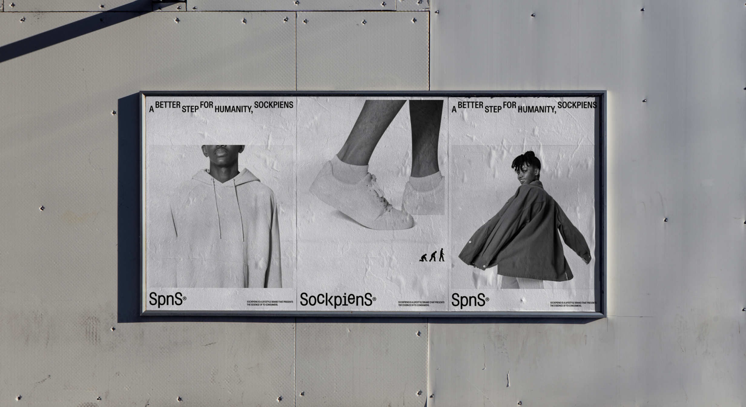
Graphic motifs were also created to prevent gender bias or excessive use of colors that could distance the brand from the image of basic clothing. Leveraging the fundamental identity of 'Root' and the concept of 'footsteps' for all of humanity, consistency was established across various channels, with the intention of enabling the expansion of basic products in a flexible manner.
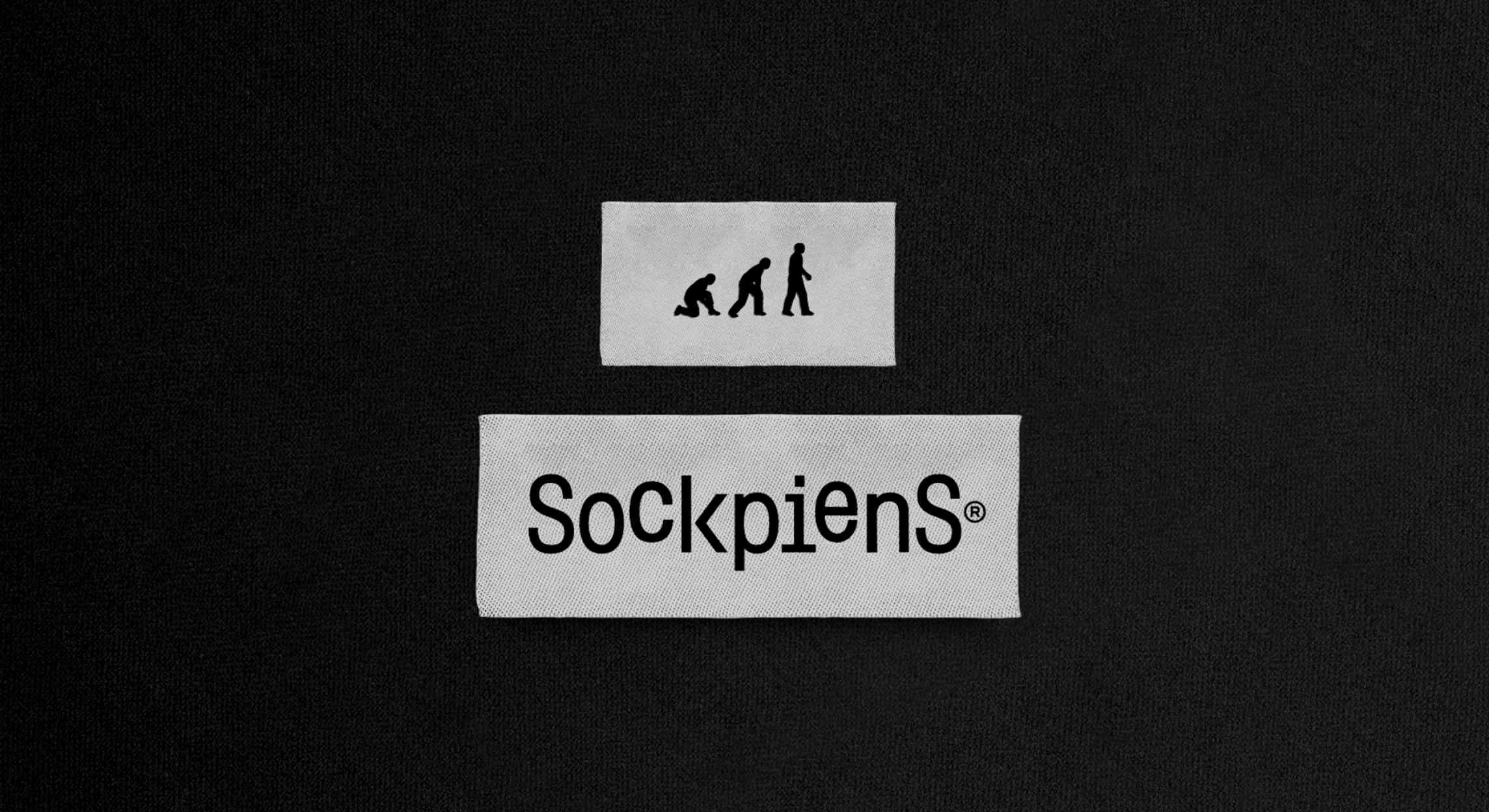
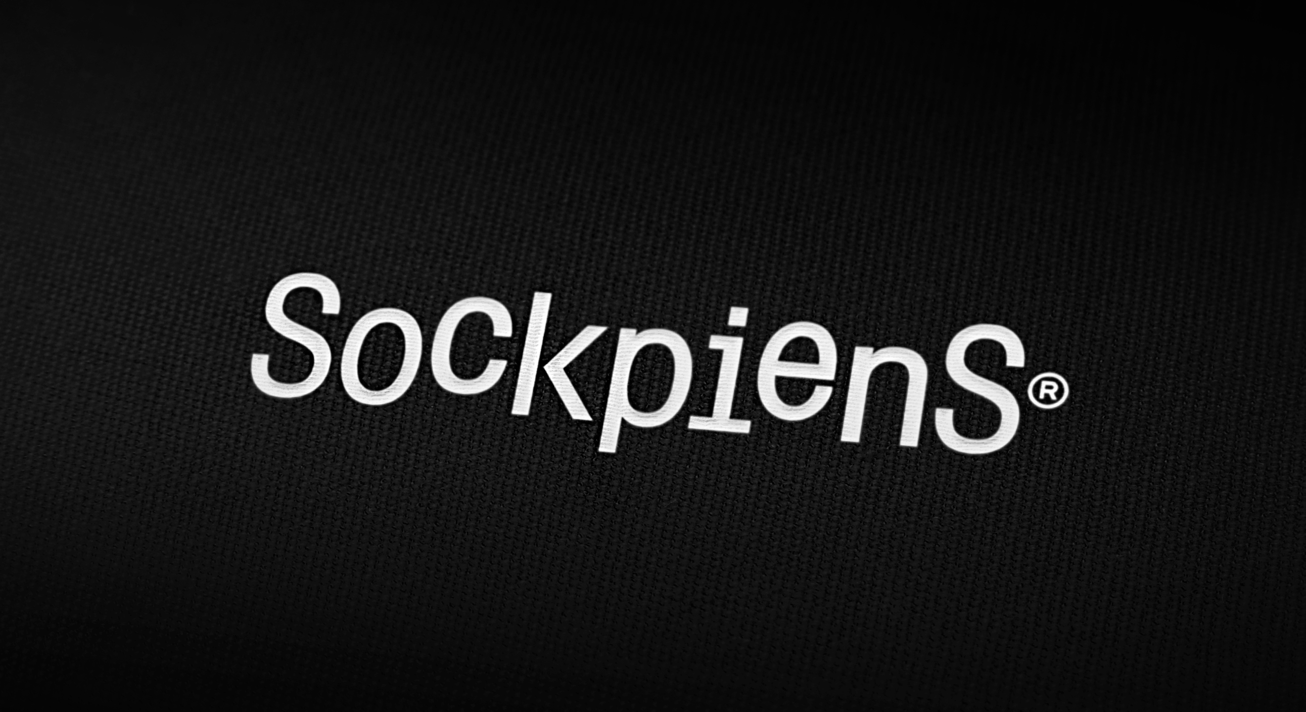
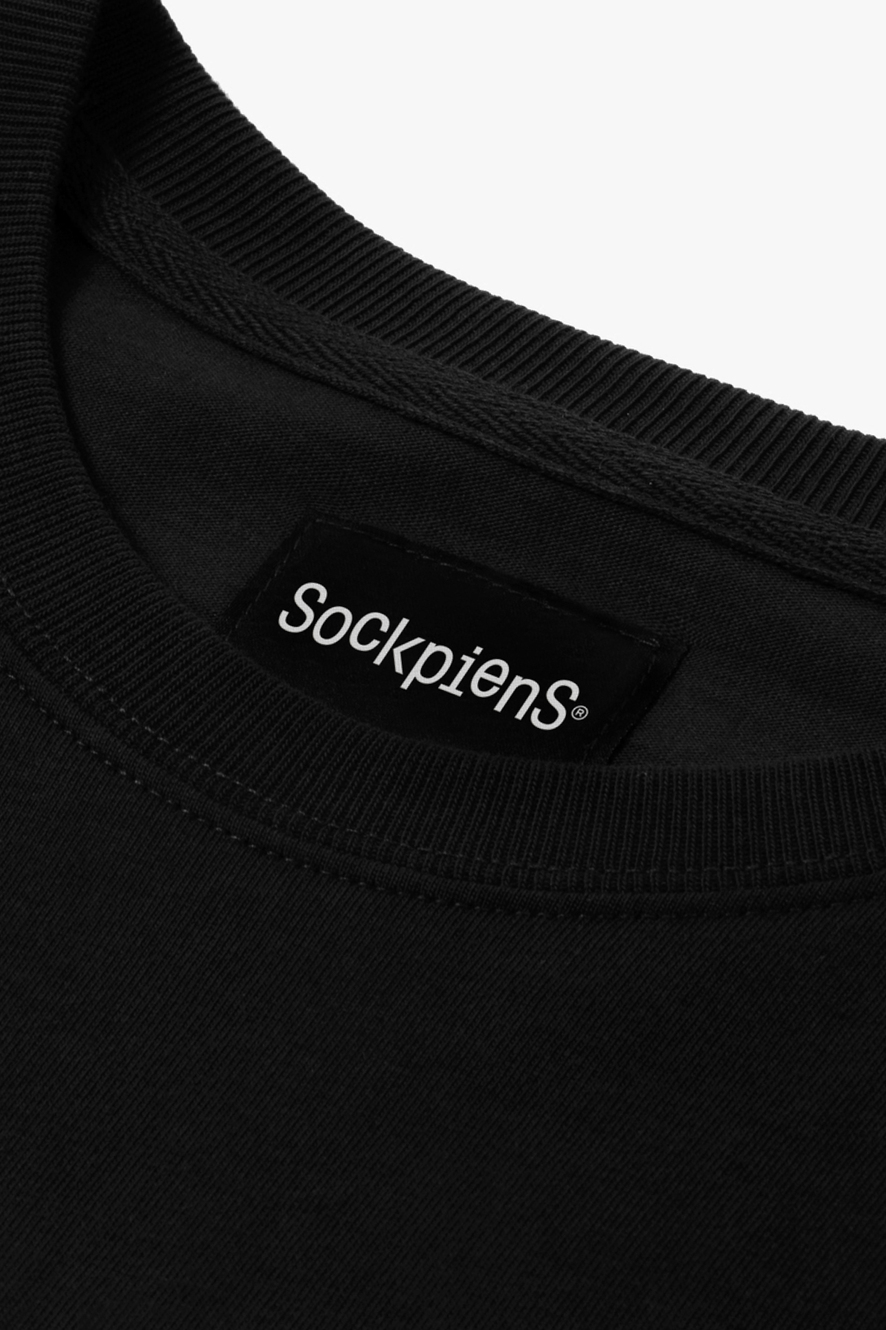
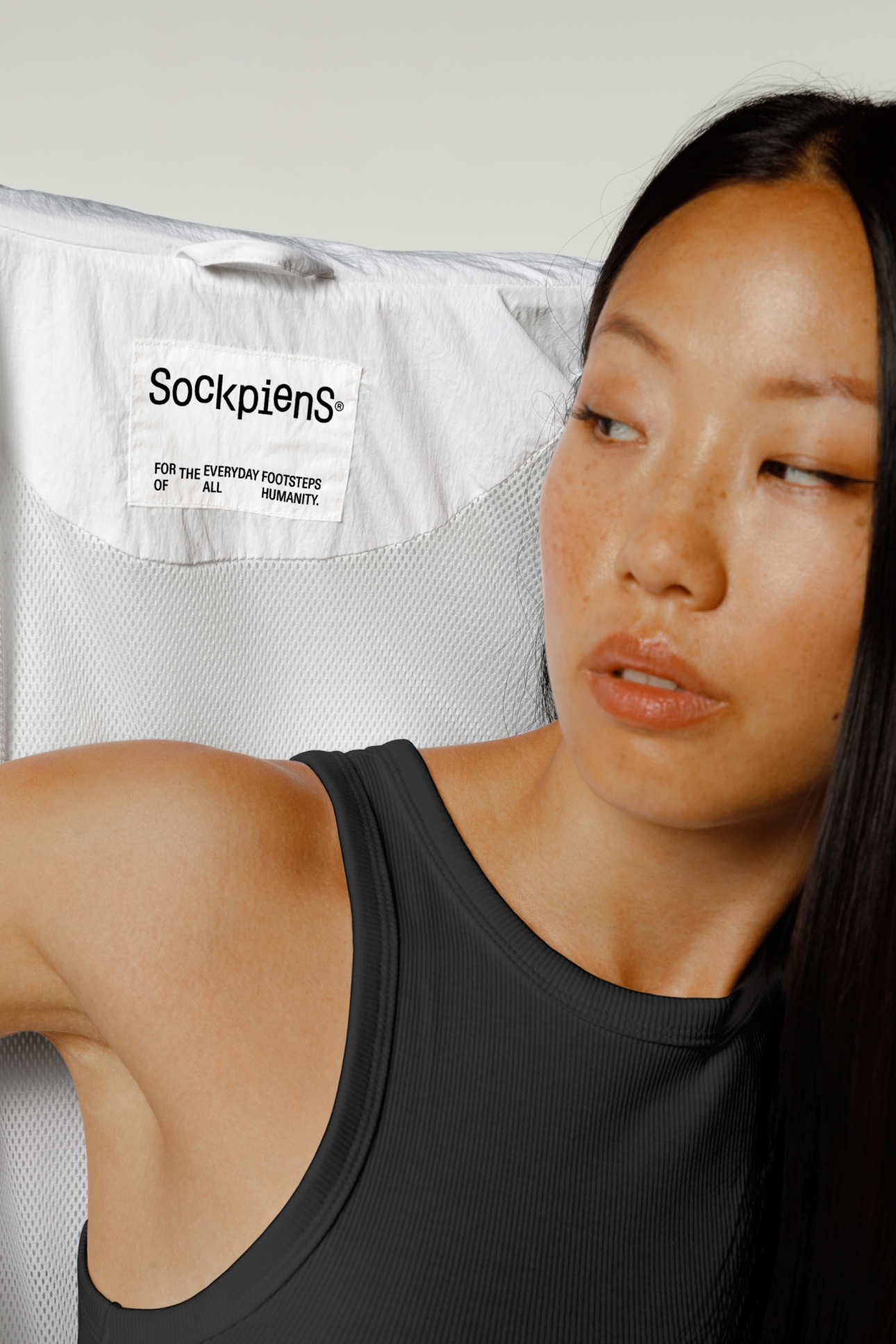
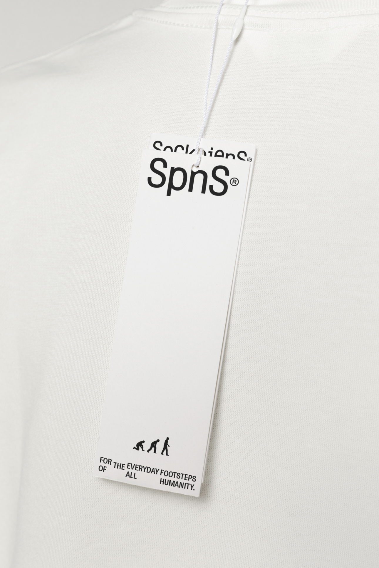
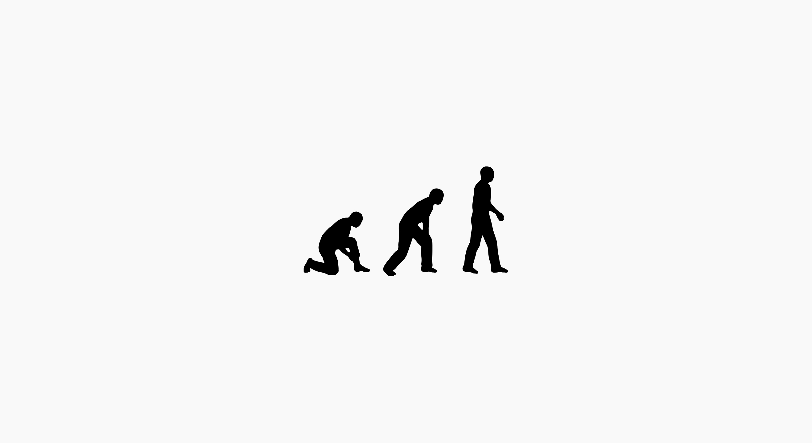
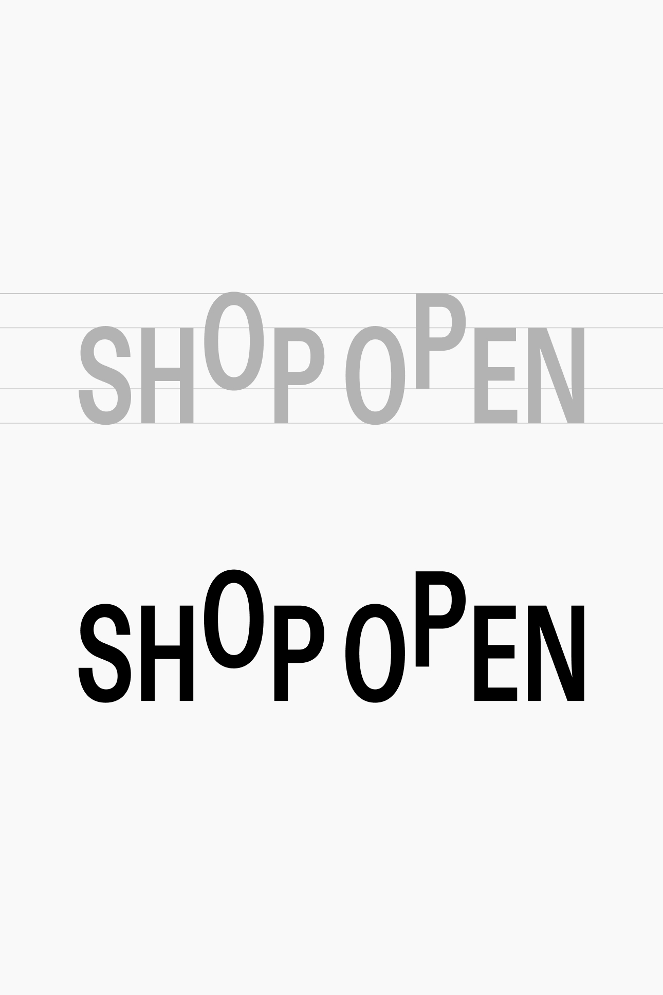
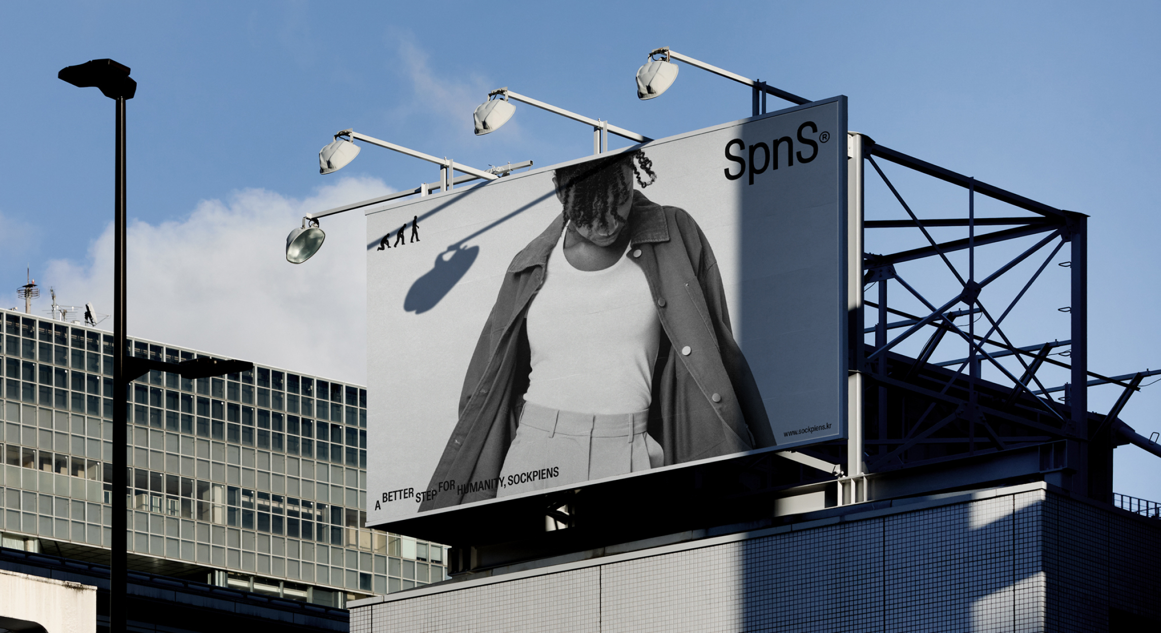
Sockpiens' wordmark features the form of two feet stepping in opposite directions, using two baselines. It embodies the characteristic of 'walking' based on this form. It signifies providing a better everyday life to customers who wear basic clothing, which is essential for everyone. As a brand that started with socks, it interprets the concept of 'footsteps' in a commemorative way.
Sockpiens' symbol is a reinterpretation of the Homo sapiens figure that may be a mental model for many people, targeting consumers who intuitively wear socks and walk into their daily lives. Through this visual connection with Homo sapiens, it offers a sense of fun and a positive perception.
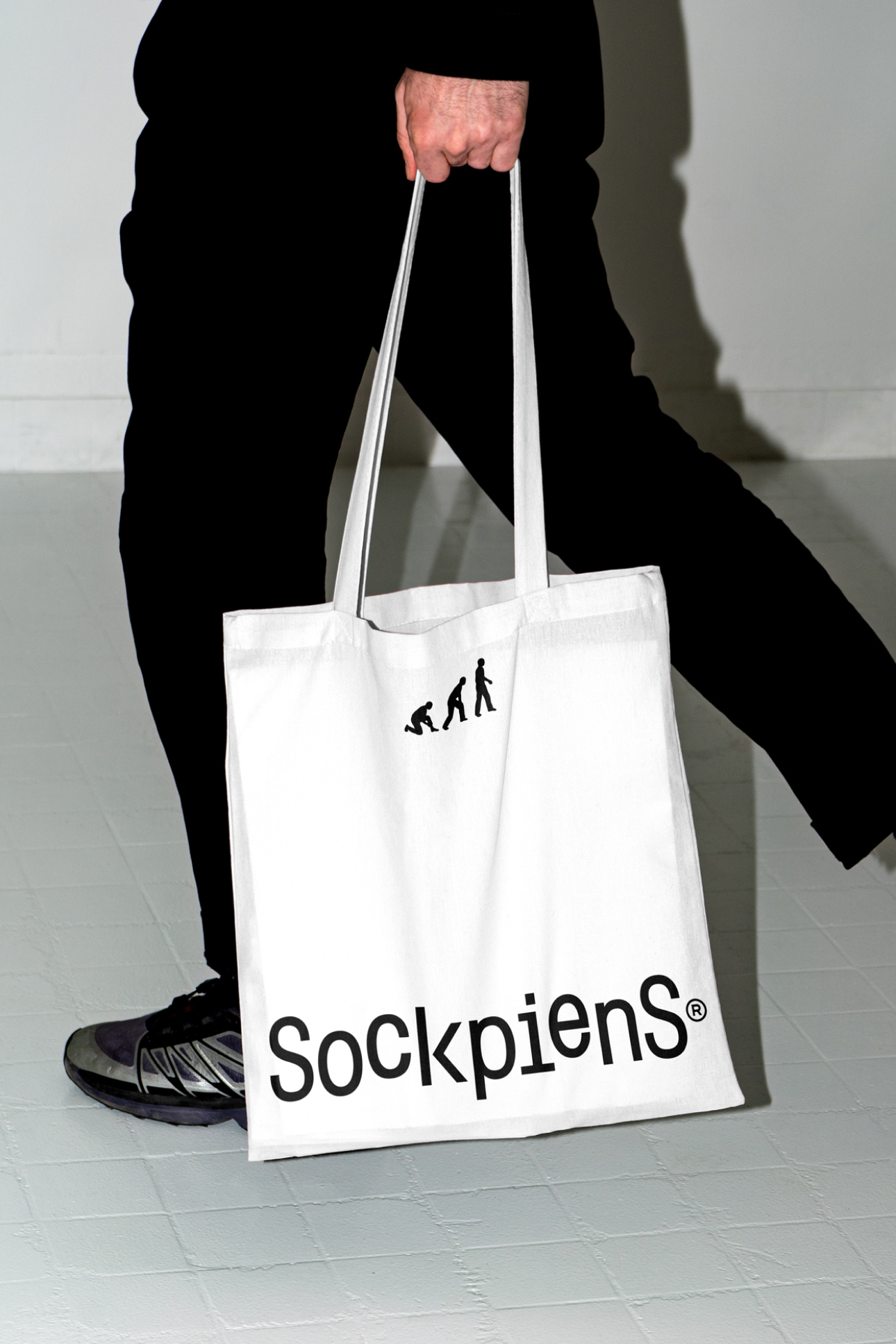
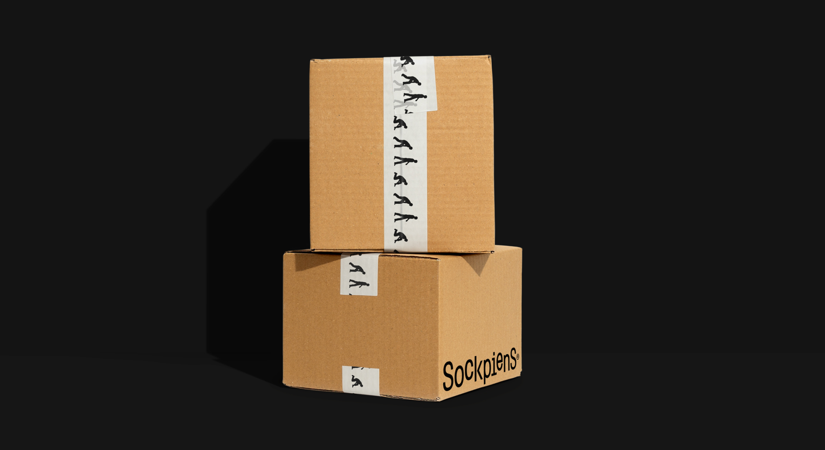

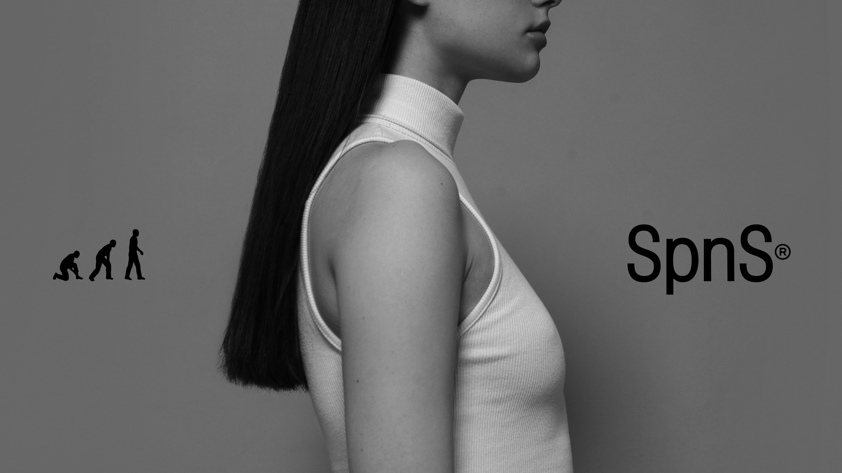
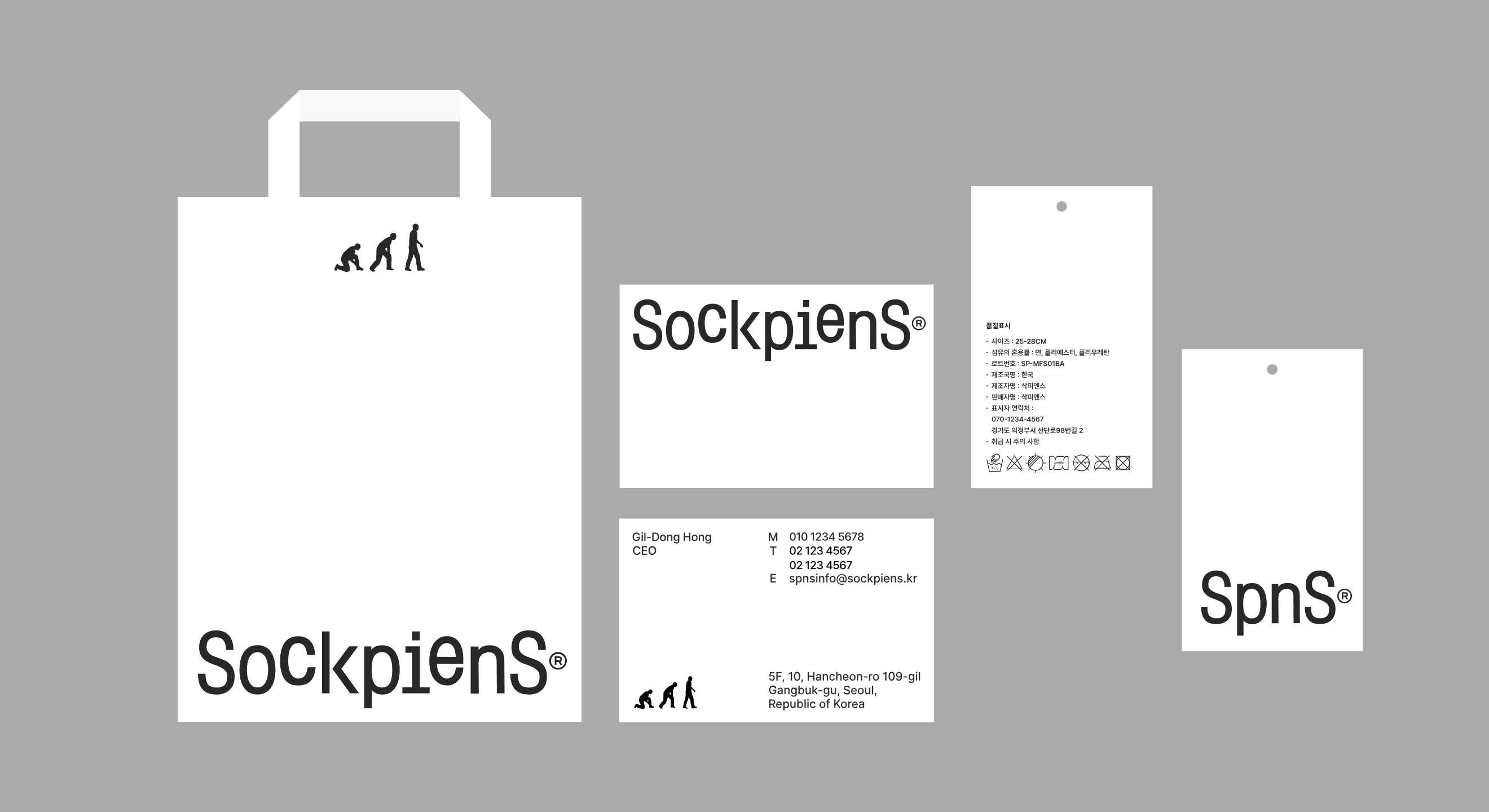
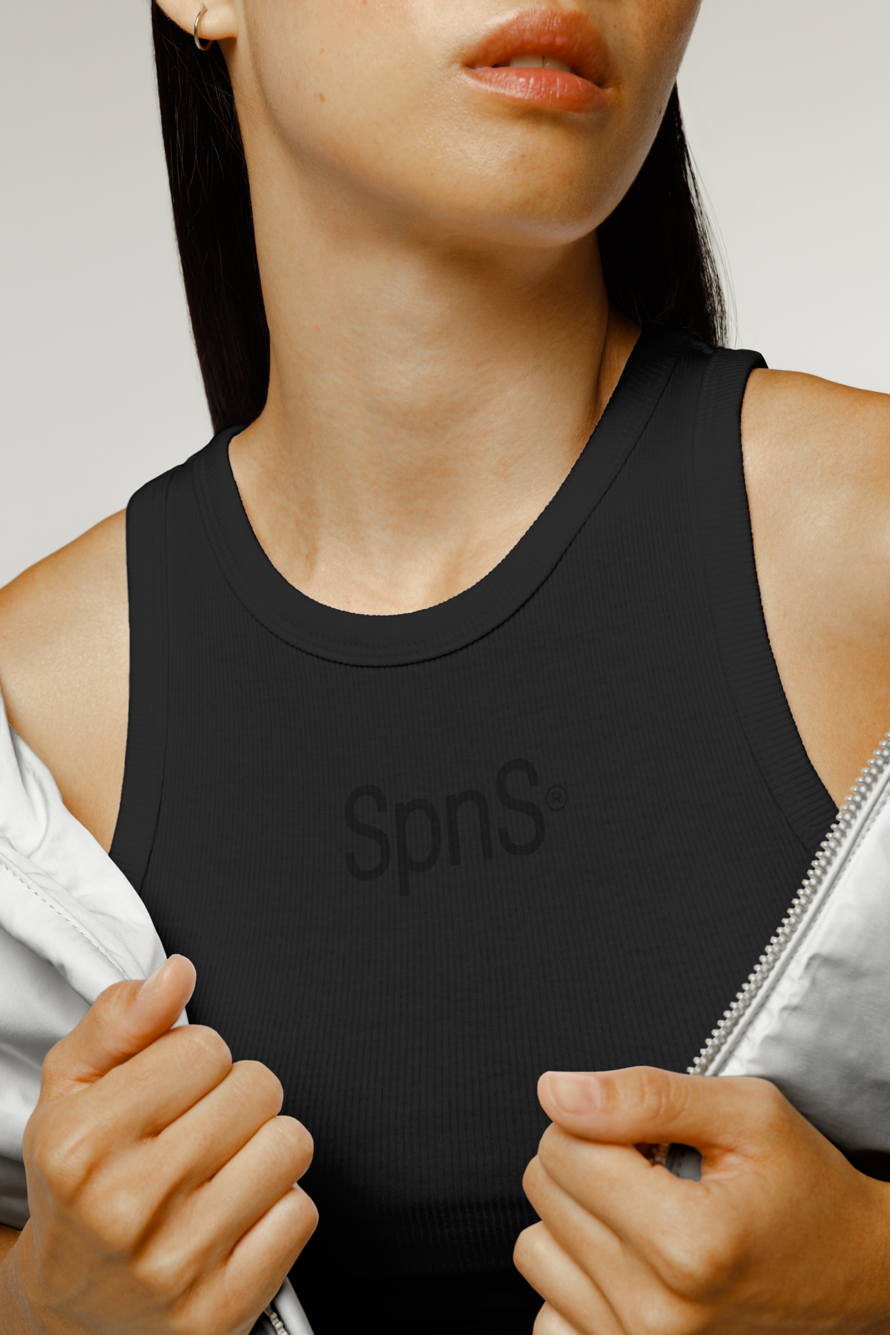
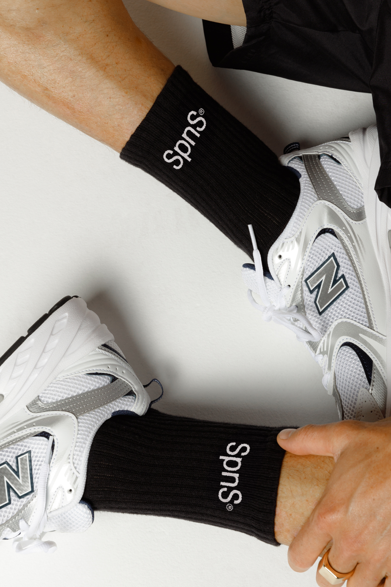
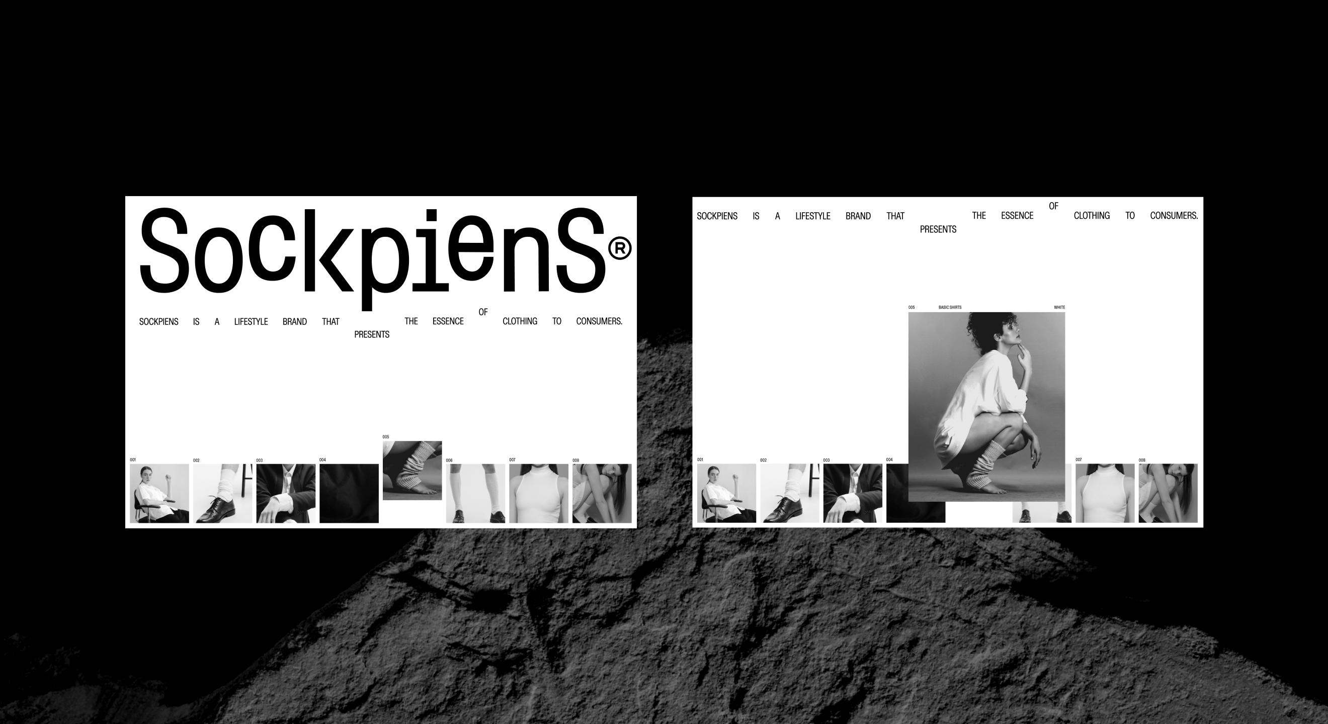
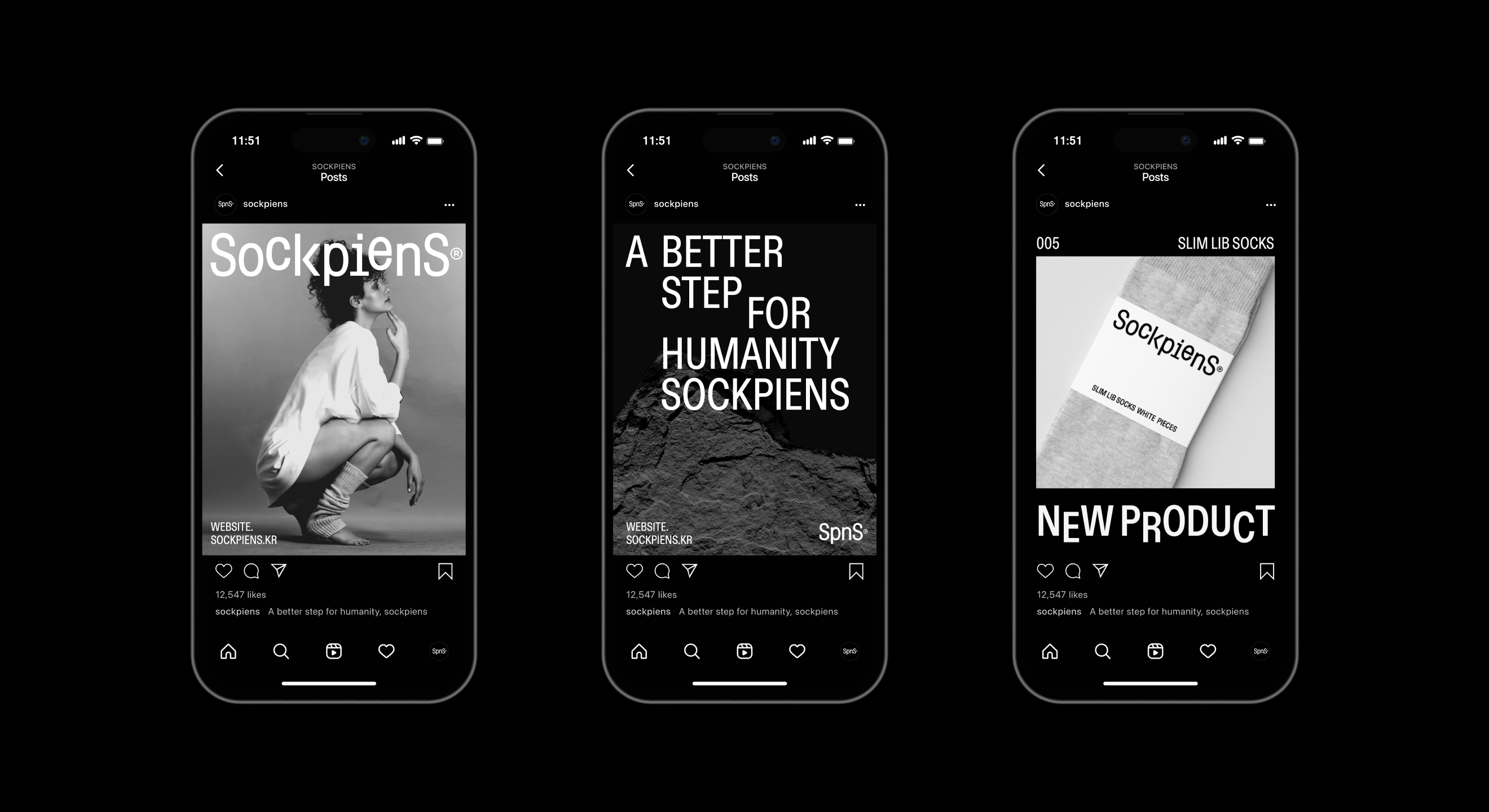
Sockpiens' graphic system is also based on the meaning of the wordmark (the form of walking) and is applied across various channels. It encompasses typography, the use of imagery and interaction on the website, maintaining consistency throughout the wordmark and the brand as a whole. The main color system is built upon the foundational black and white colors, which are the origins of basic clothing, and we have also developed a system to adapt colors according to sock colors or marketing environments
Sockpiens
Naming & Rebranding Project
BRENDEN
Creative Direction / Do-eui Lee
Project Management / Wook Jung
Design / Jiwoong Lee, Jeong-in Byun
Creative Partner / Sung-Oh Park, Ye-Seop Lee
Client
POPCORN&KIKI
Award
iF Design Award Winner 2024