NAVER Tech 1
Office Building Signage
& Wayfinding System
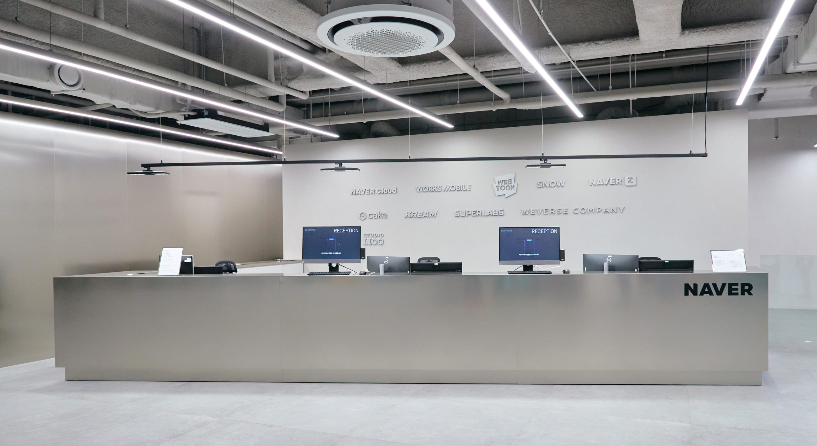
The Naver Tech 1 Signage Project is a project aimed at creating signage and wayfinding systems for a space where approximately 10 subsidiary companies of Naver are located. The project aims to provide intuitive guidance to all users of the space, helping them understand the location and direction of their destinations and enabling them to navigate without getting lost. Additionally, the project aims to design a system that facilitates space division in common areas and workspaces.
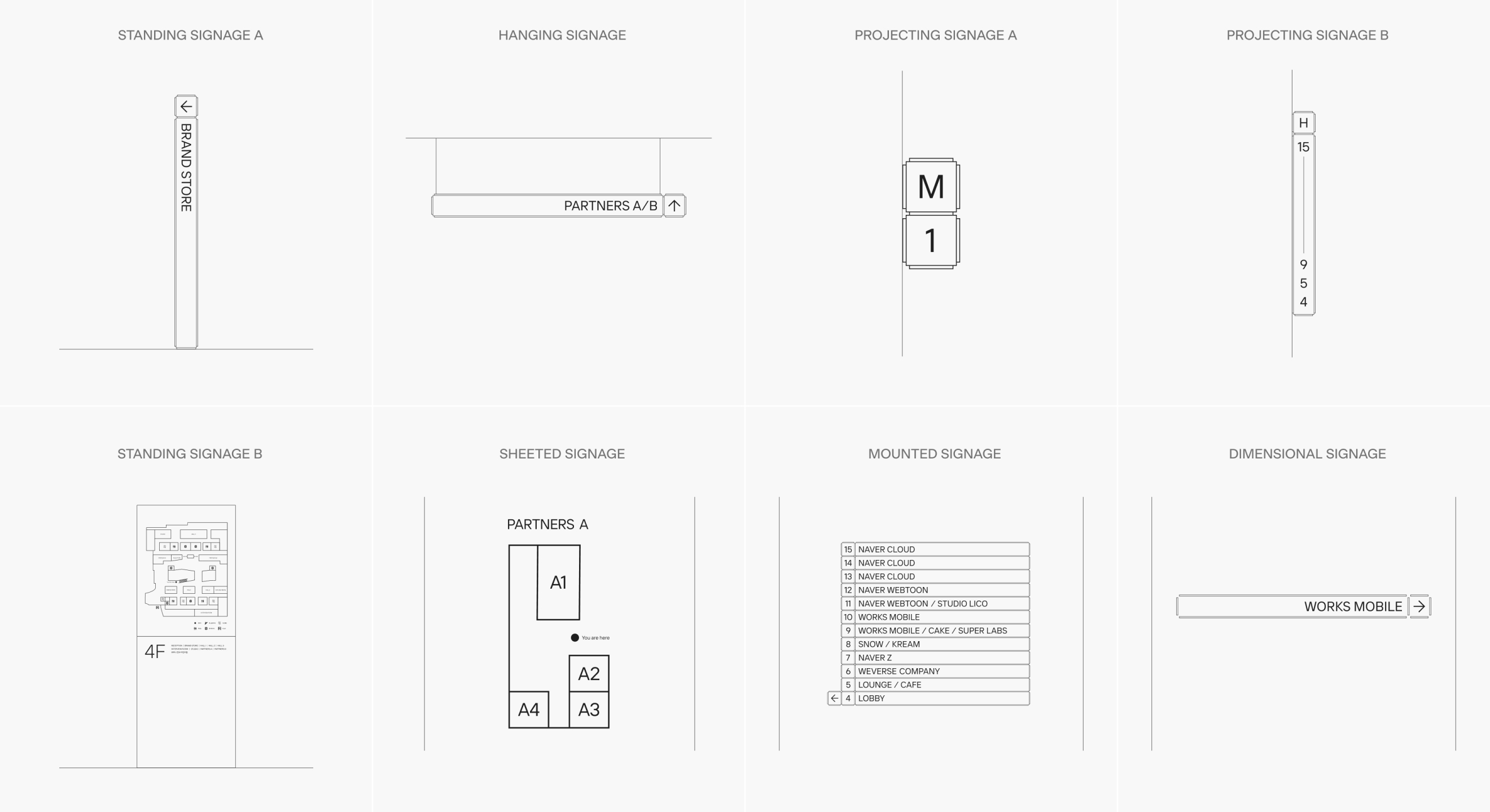
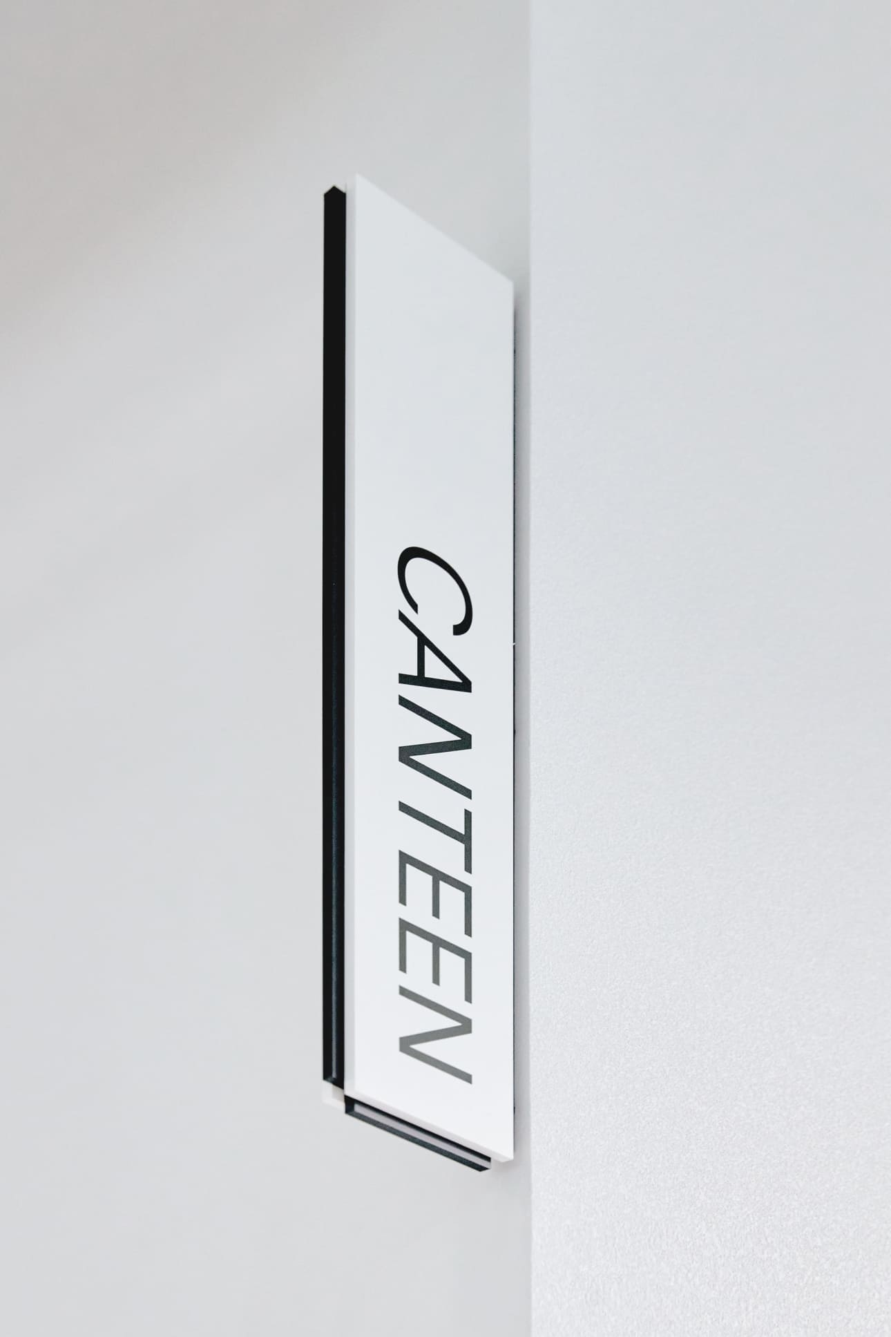
The signage takes various forms such as hanging, standing, and protruding, which are transformed into a three-dimensional representation of the 2D graphics system, creating visual coherence.
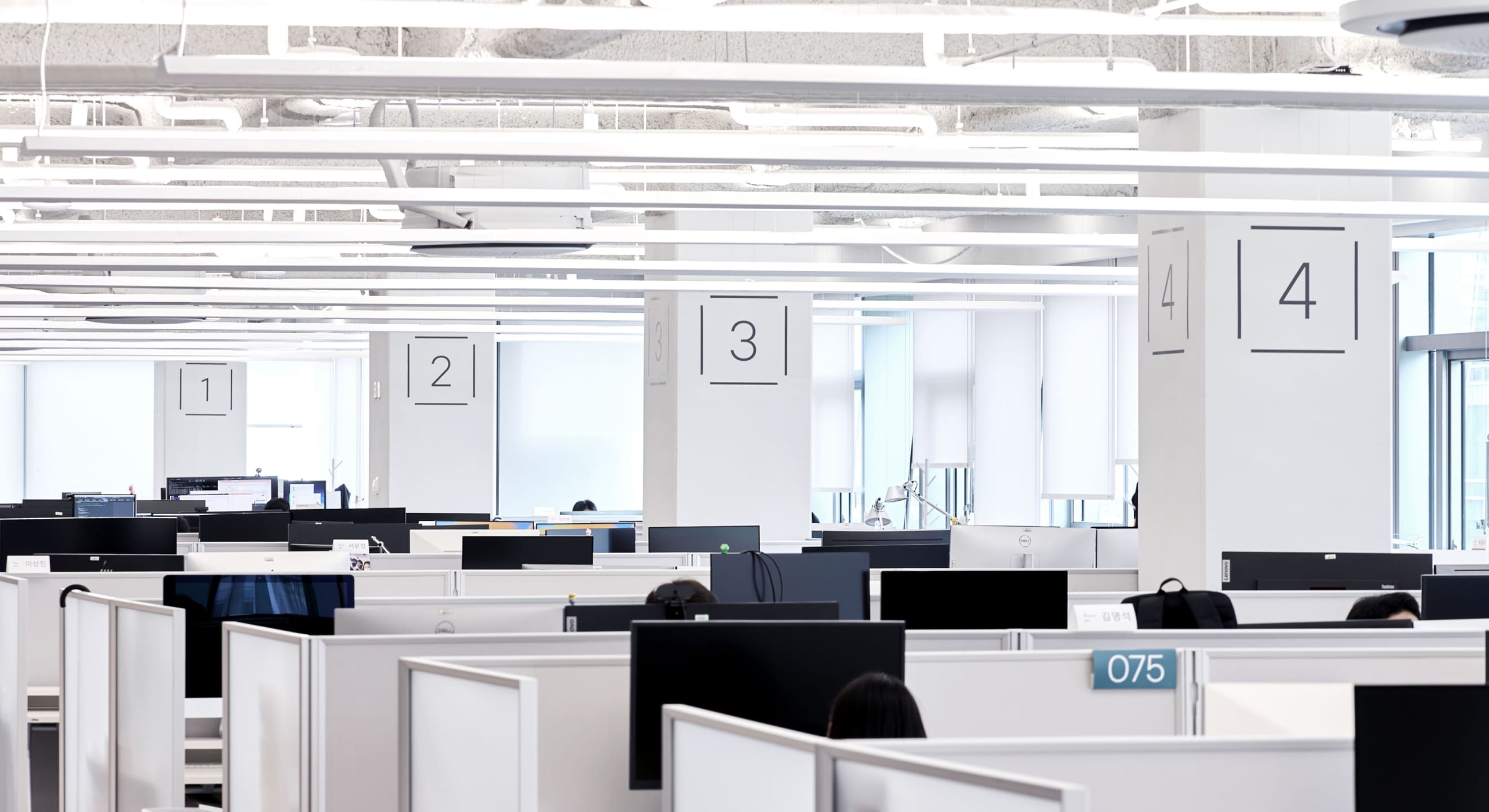
The design concept revolves around the idea of IT companies coming together and creating synergy. The identity is represented by an open-ended square line, symbolizing innovative companies that break free from the conventional norms.
This design not only highlights the individual information or companies but also signifies the creation of synergy when they come together. The design features a cohesive and familiar form that aligns well with IT-based services. It also signifies that each company contributes and supports the entire building structure.
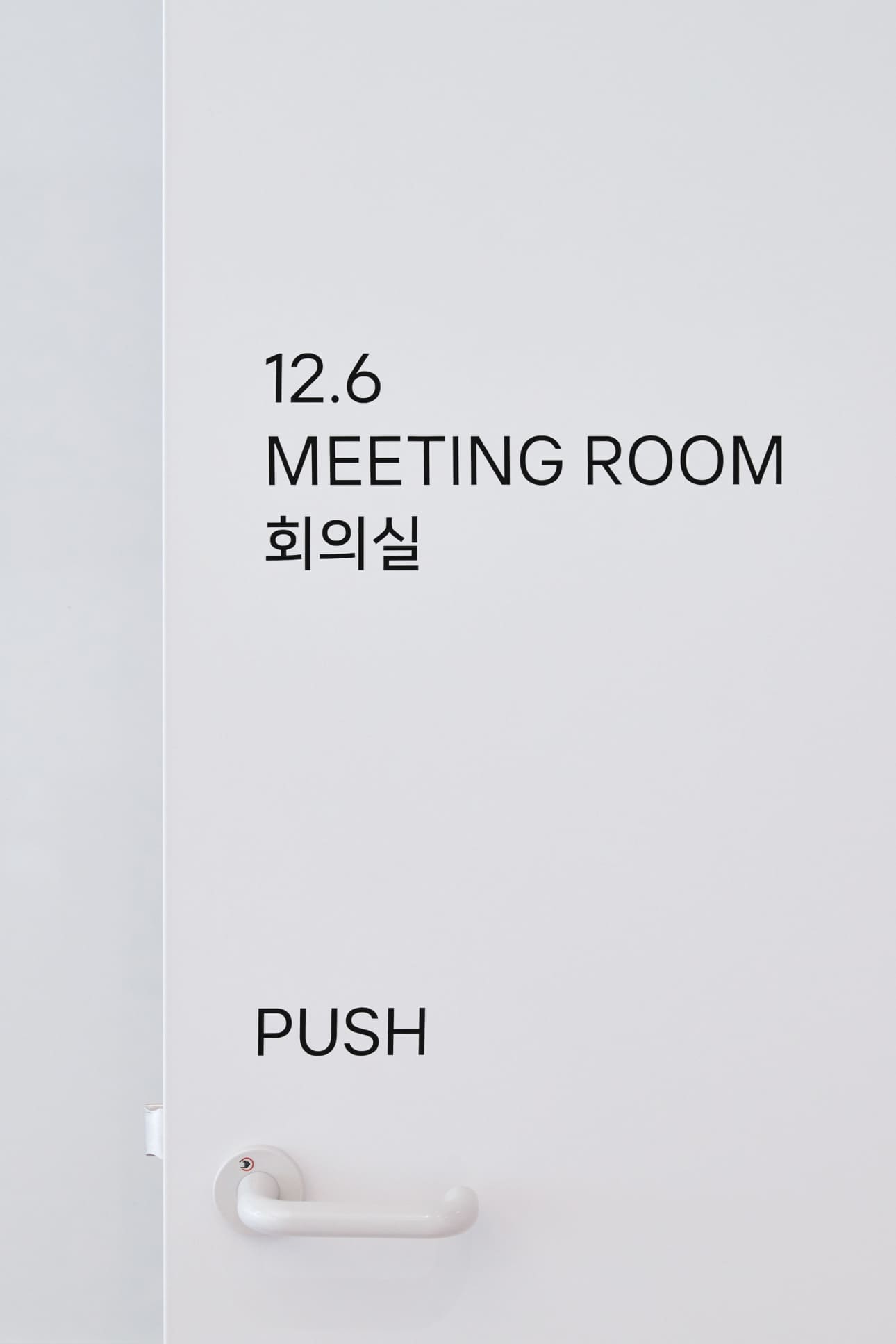
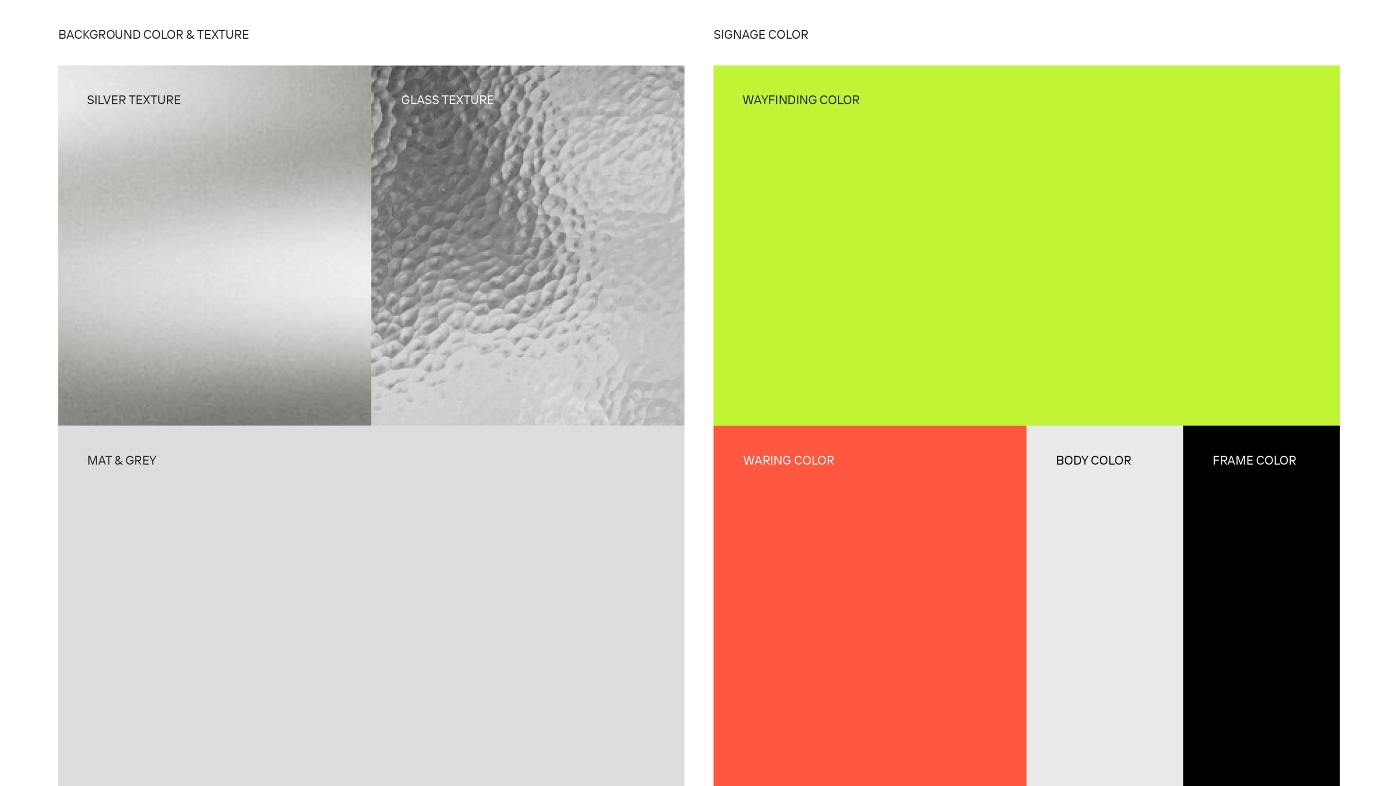
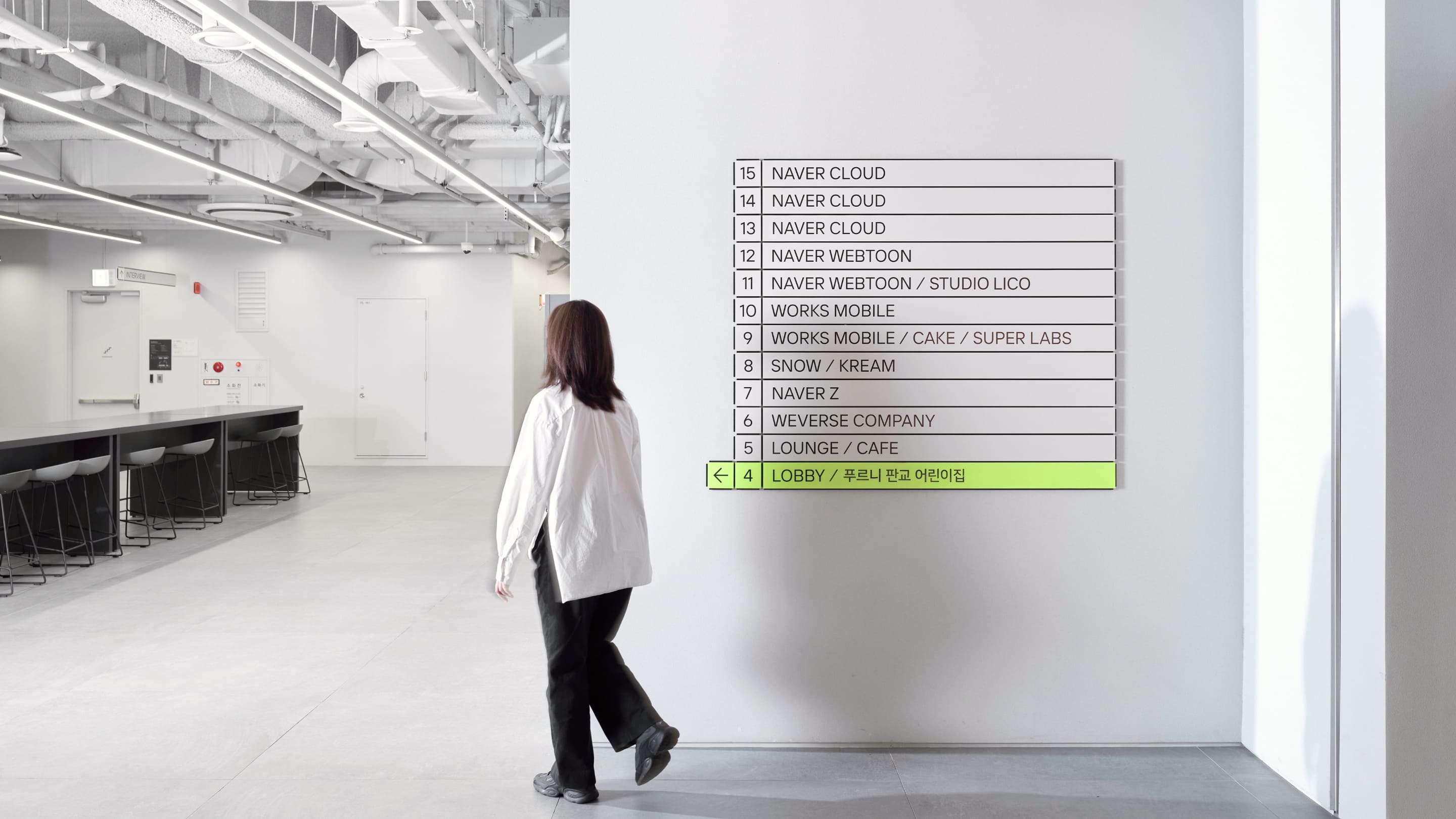
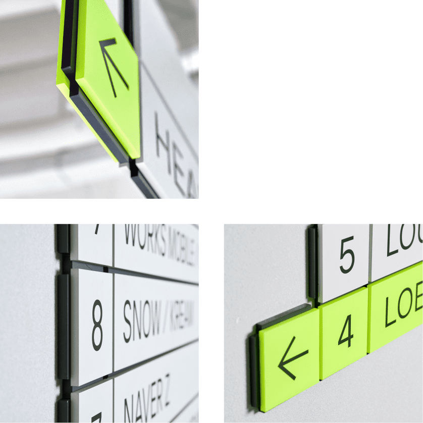
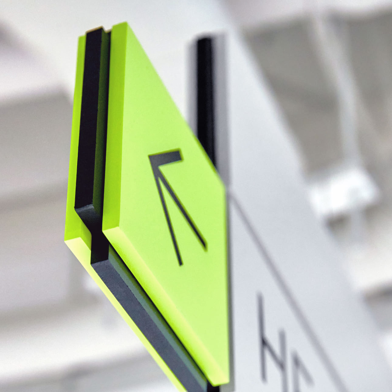
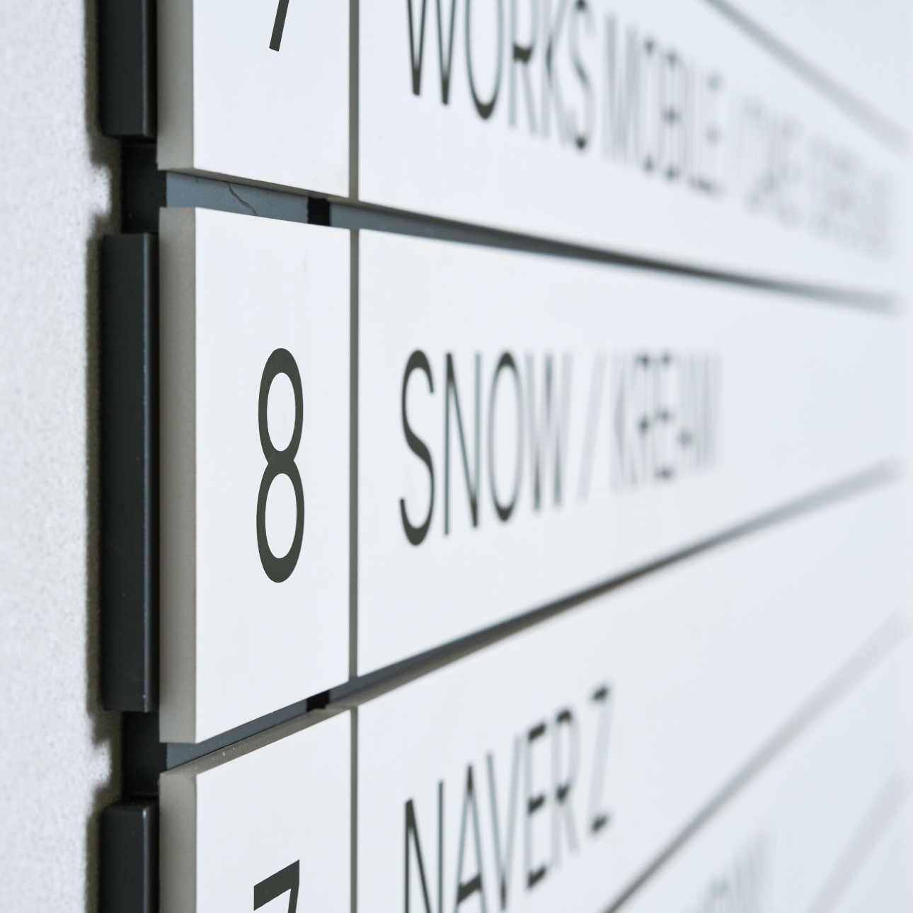
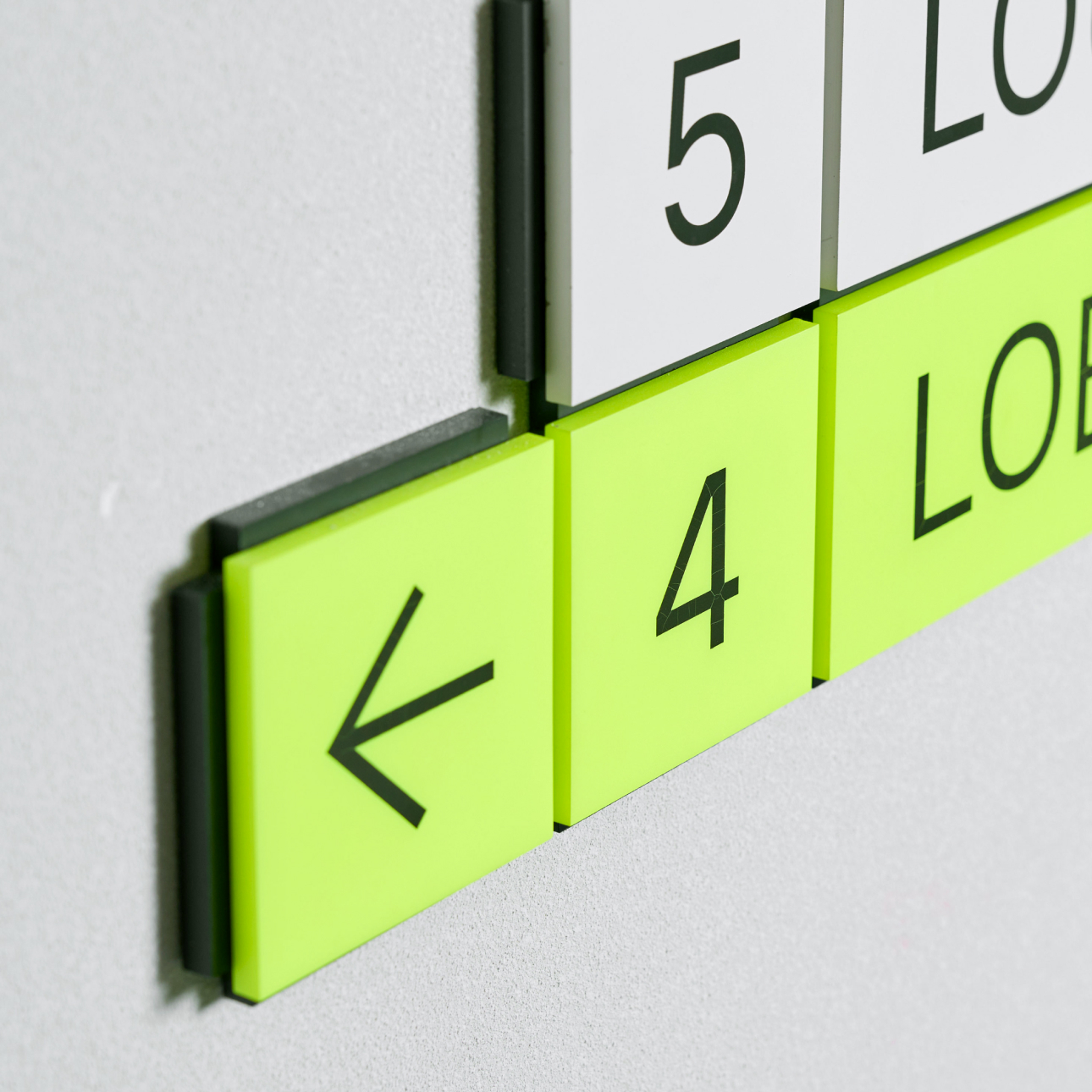
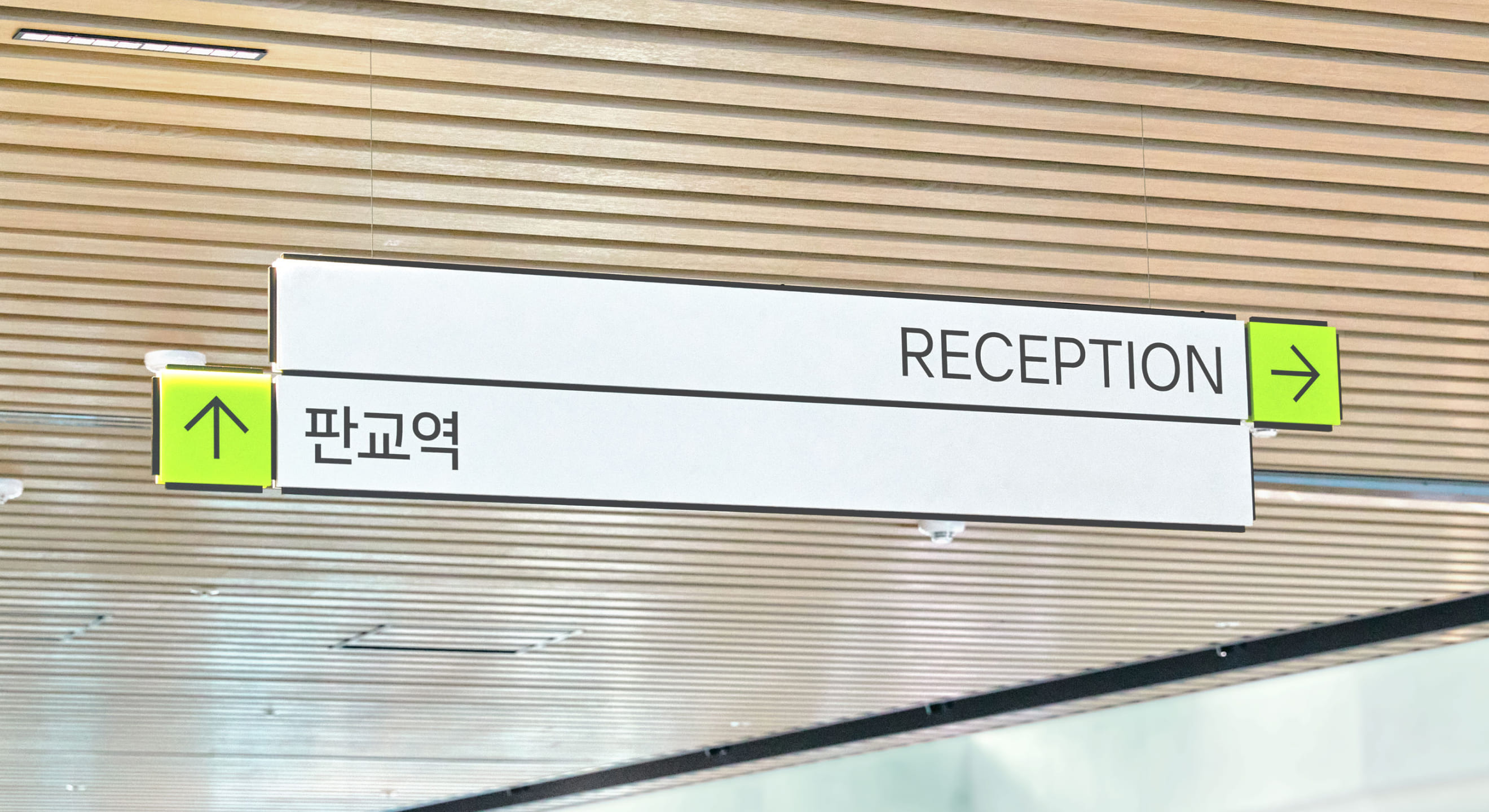
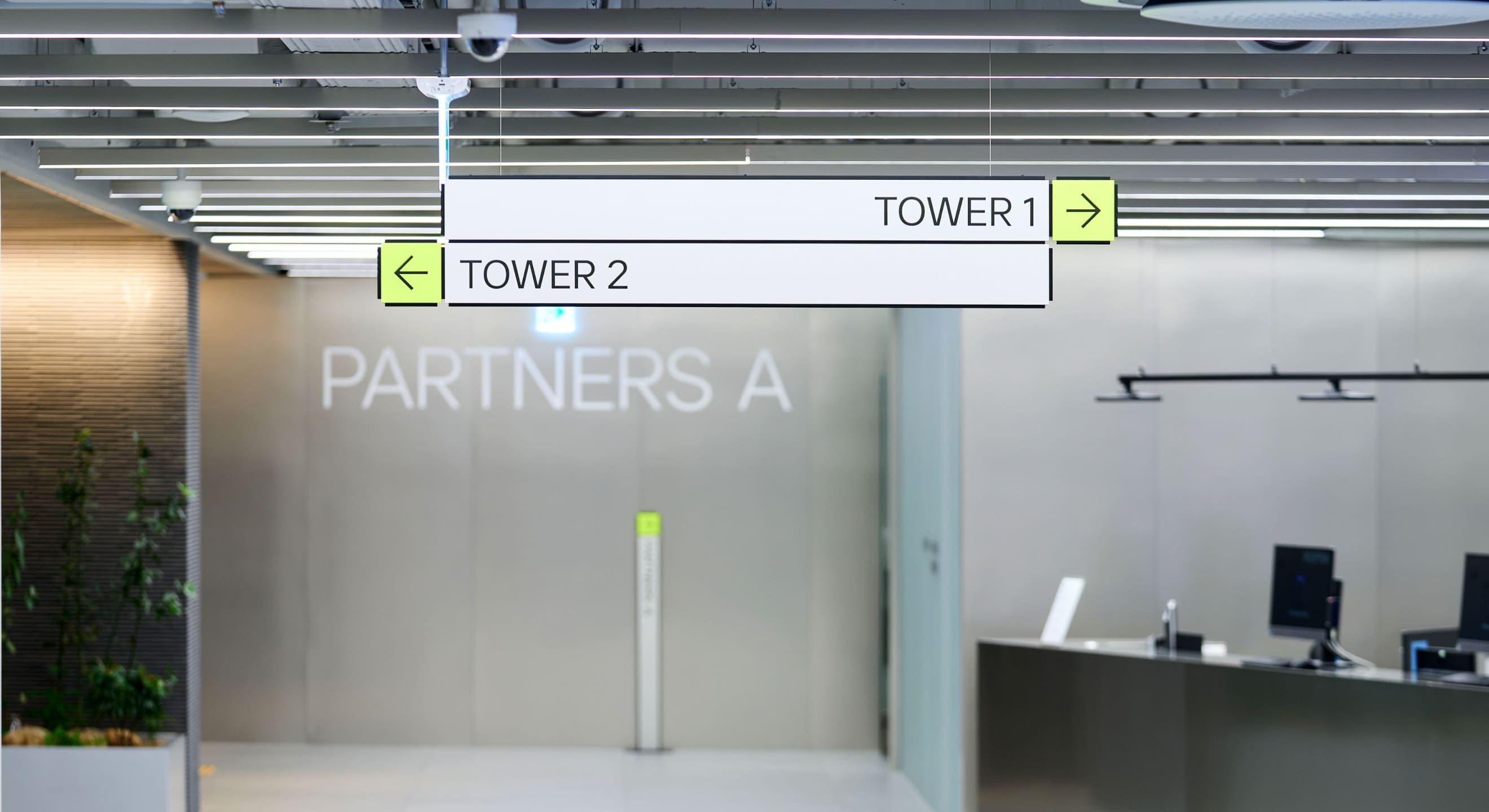
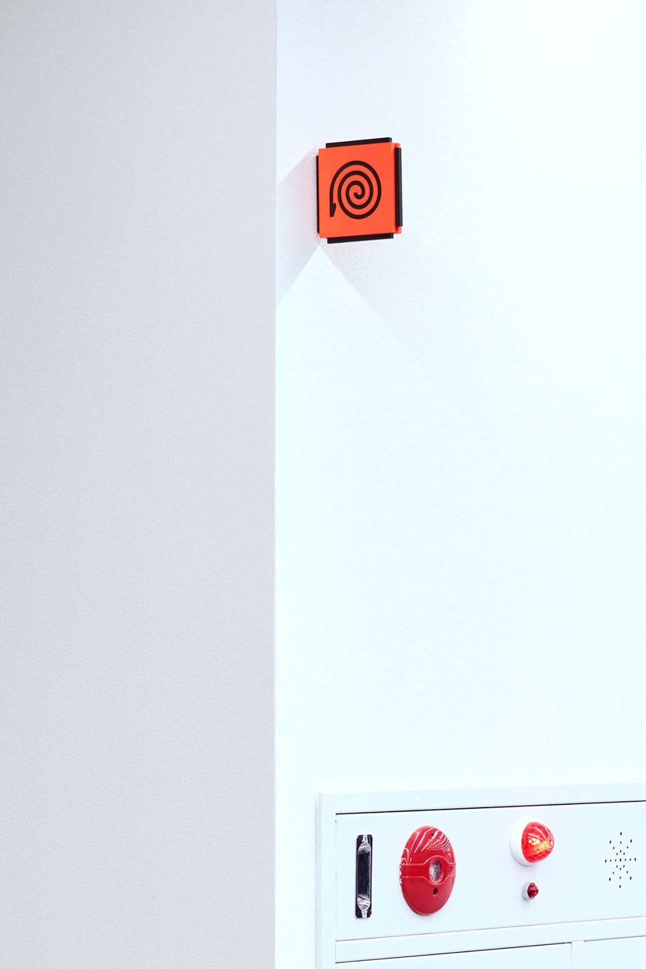
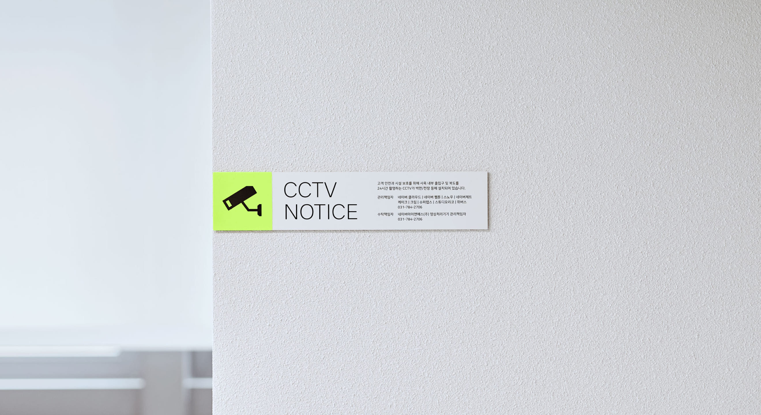
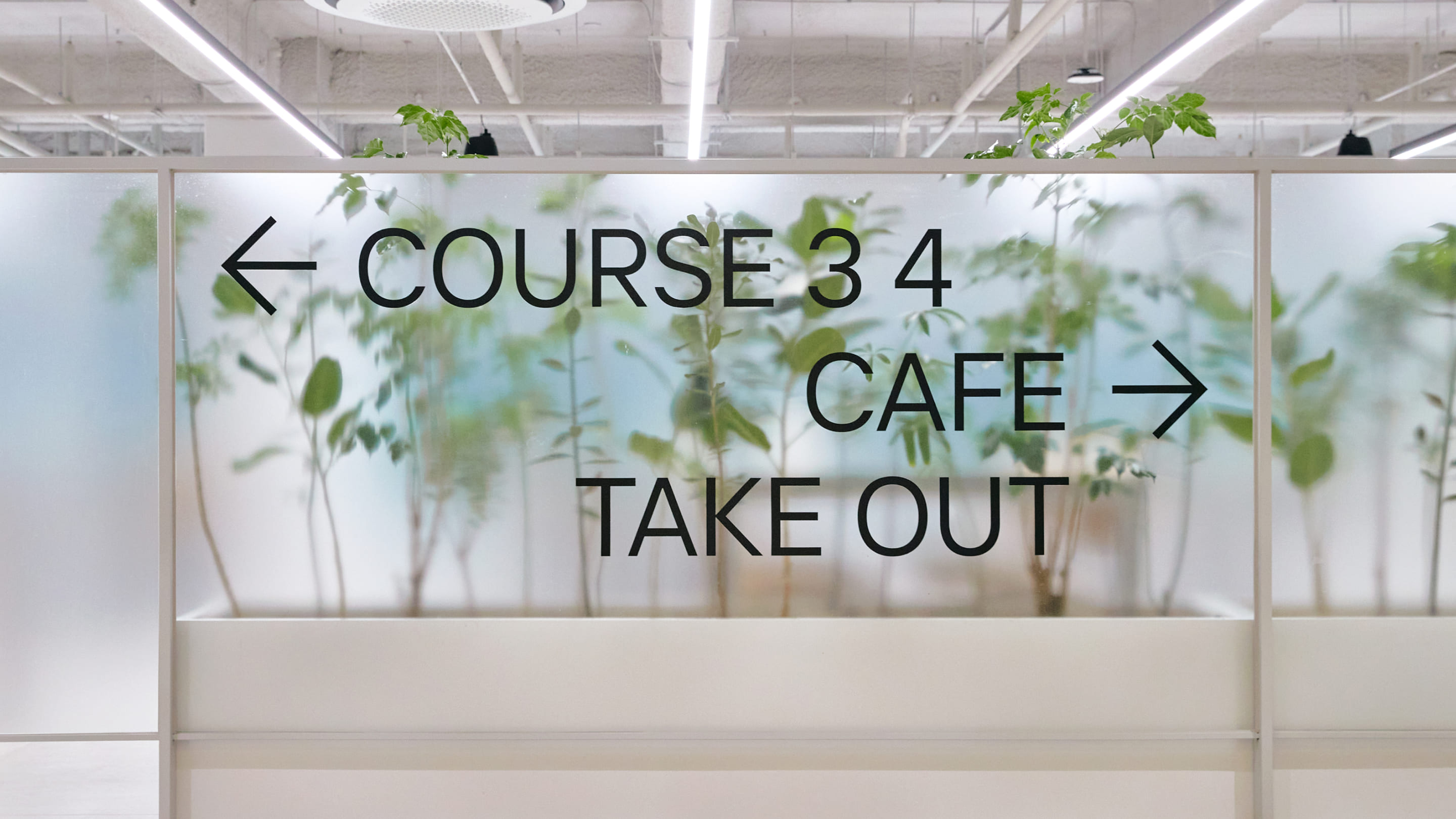
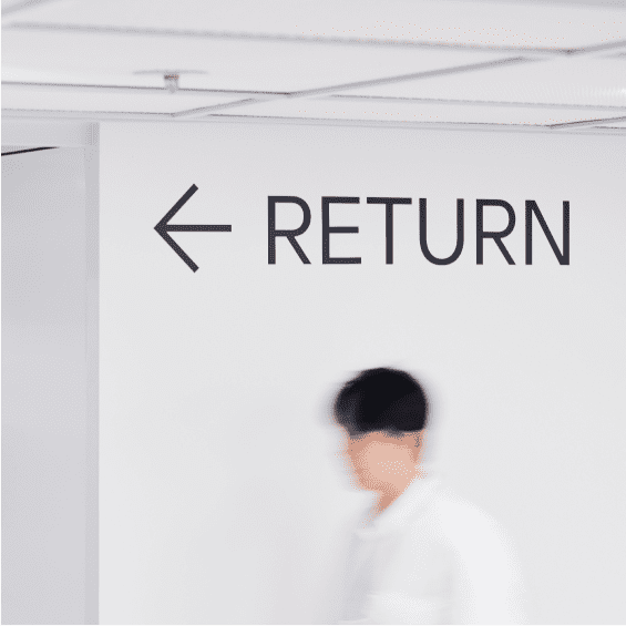
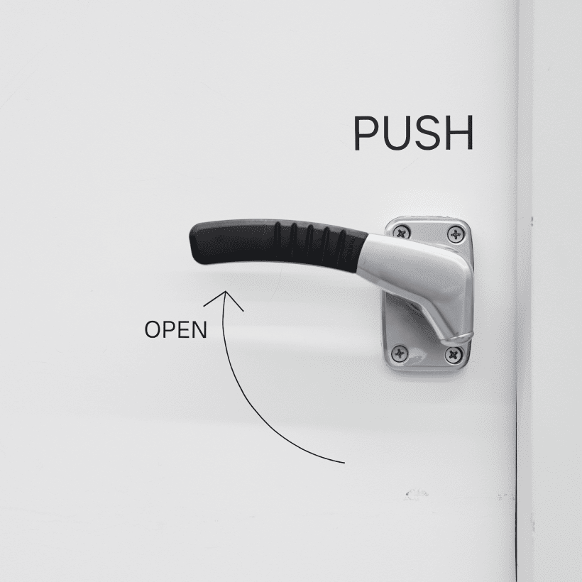
As most walls have a light gray hue, the body color of signage was set to a slightly differentiated gray, providing subtle contrast. Additionally, a distinct green color was used for directions and emphasis to ensure visibility, while safety signs utilized a reddish hue to maintain consistency.
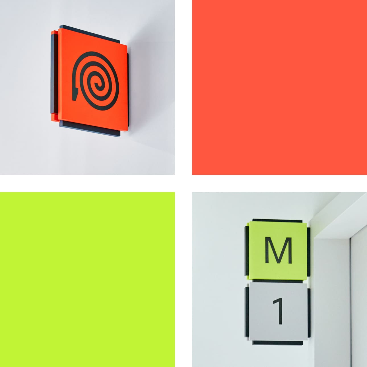
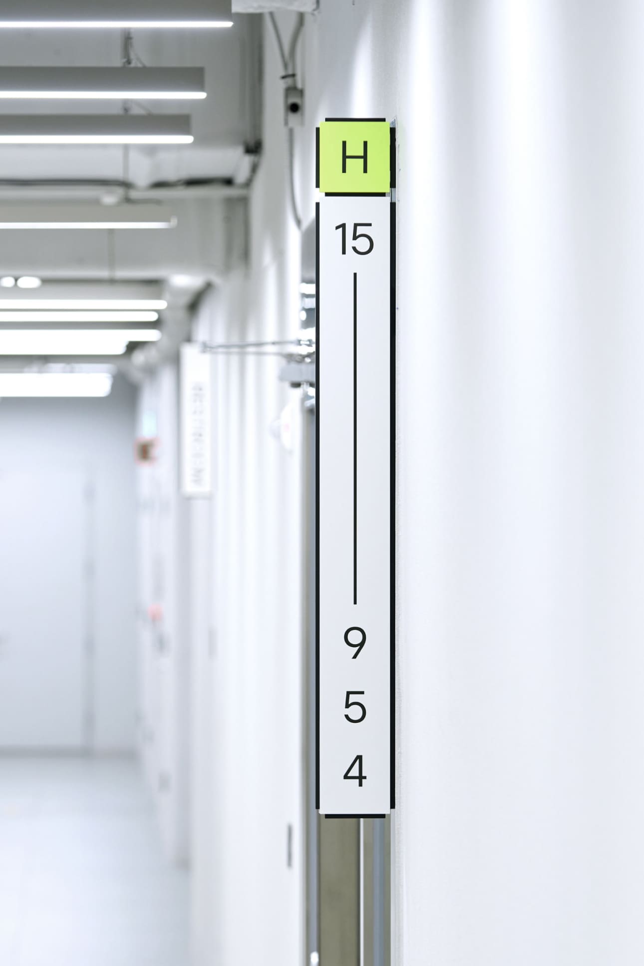
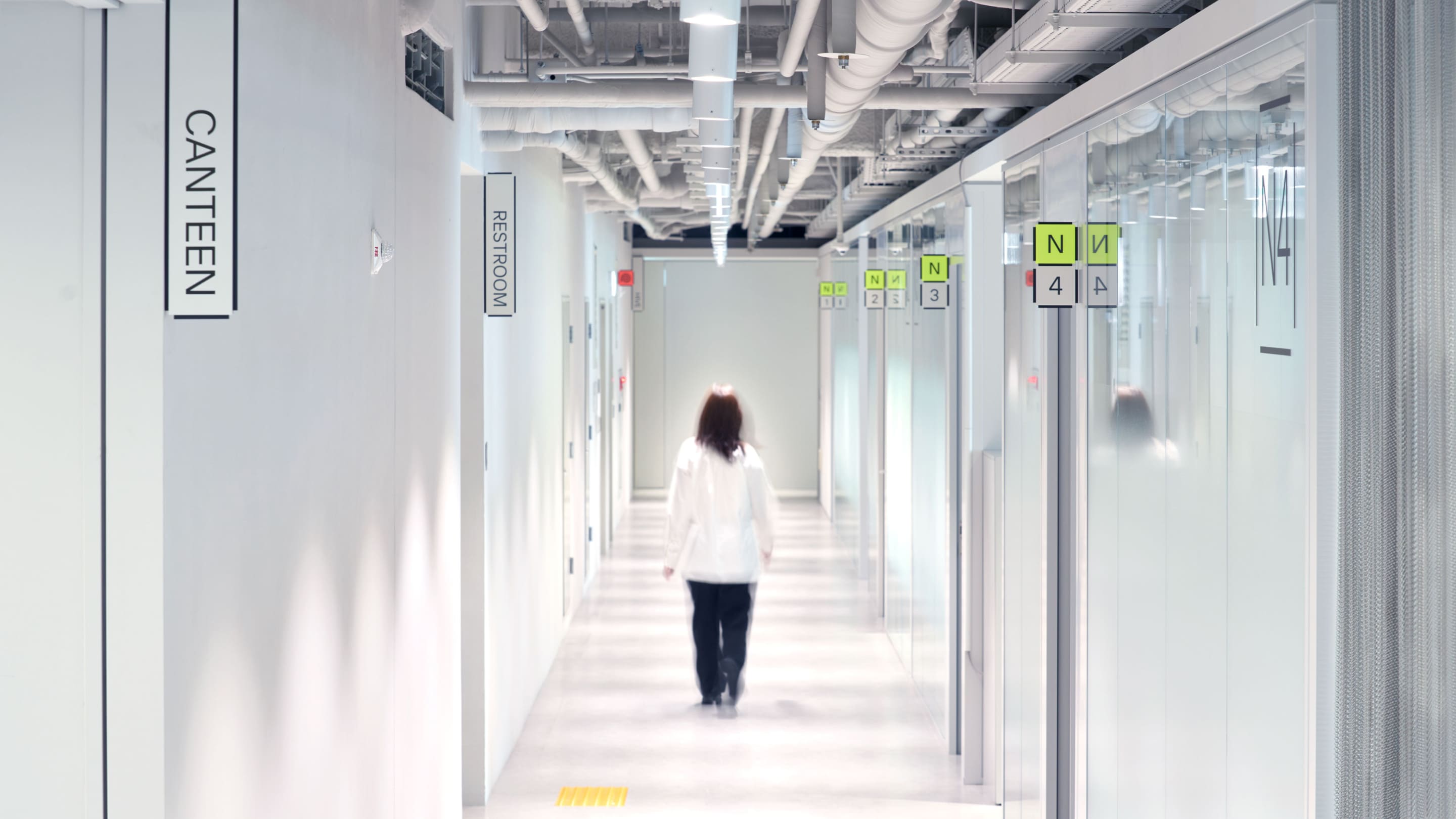
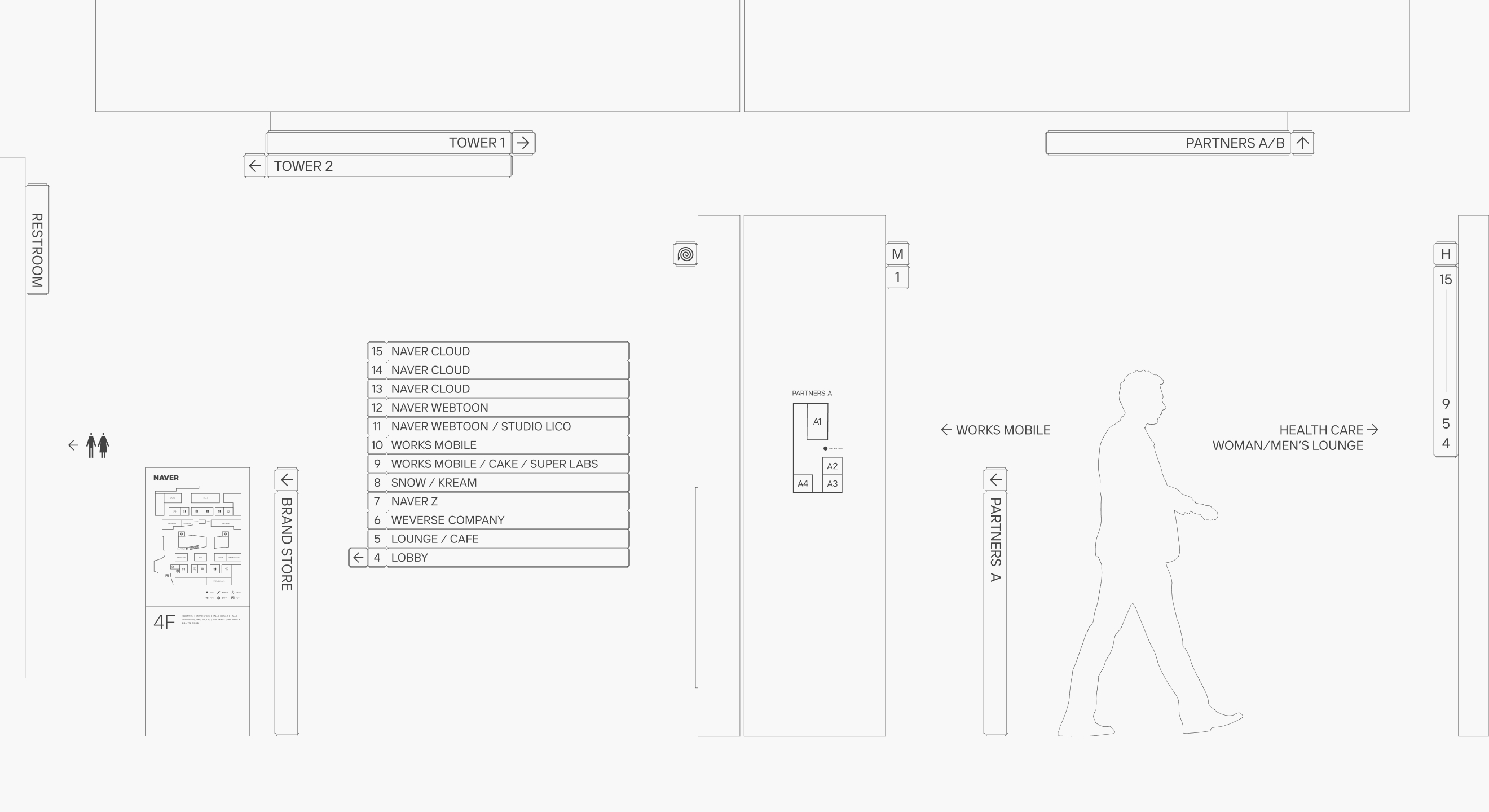
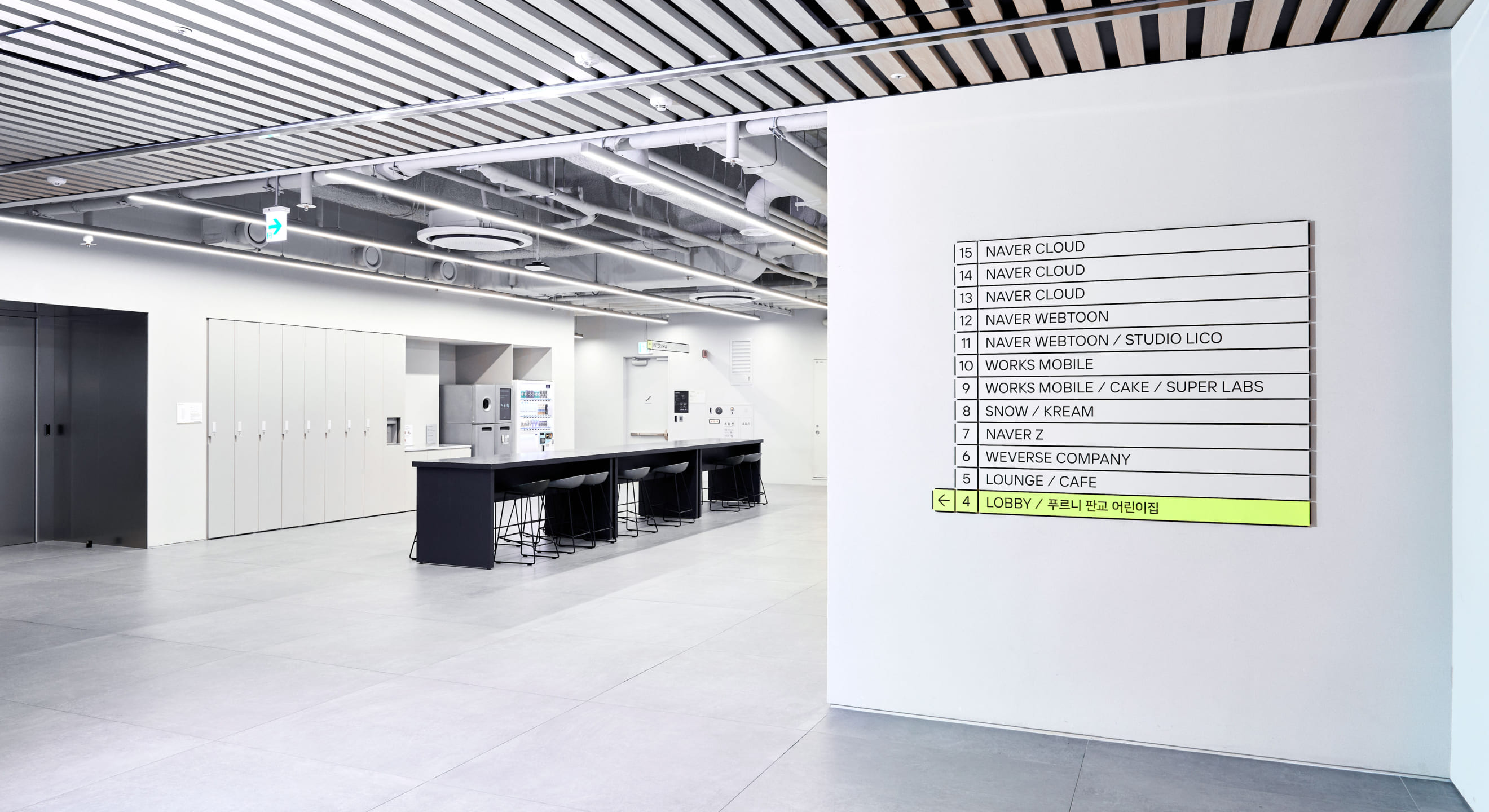
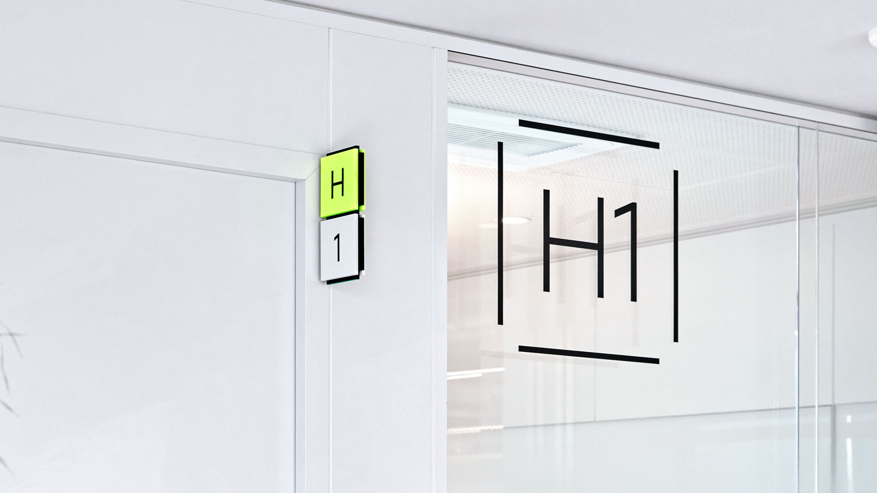
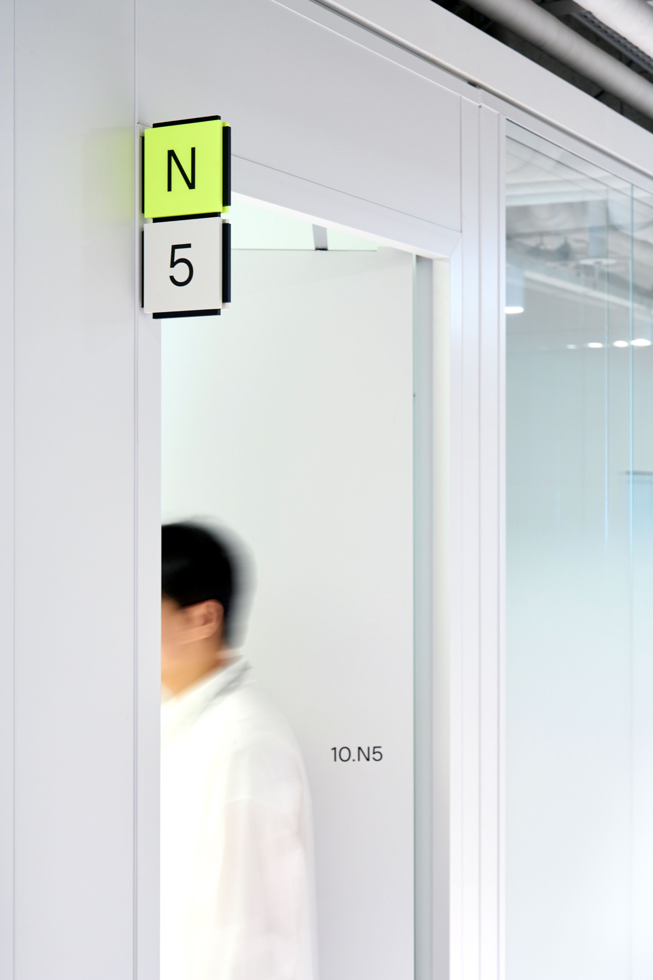
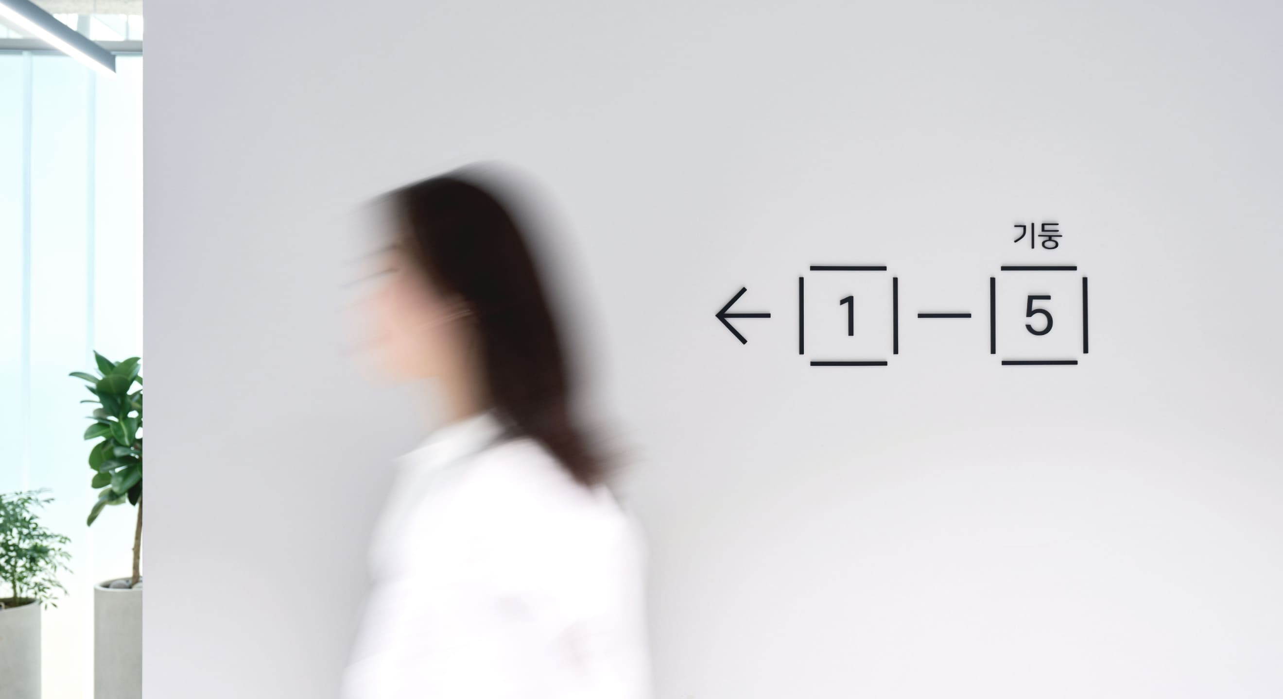
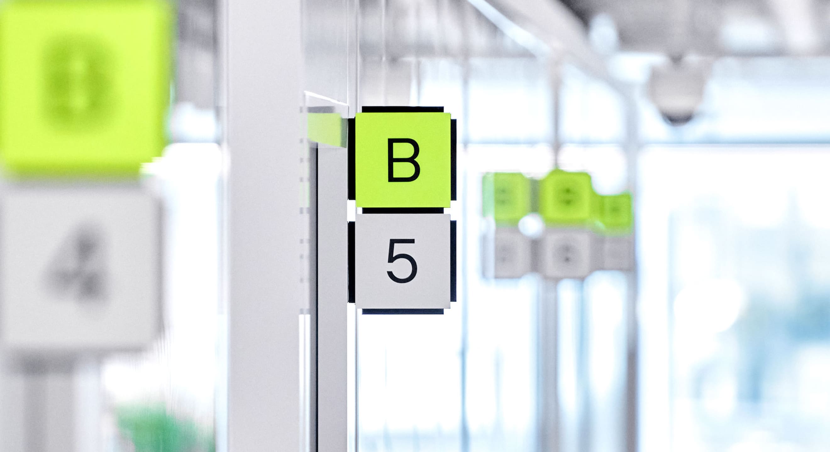
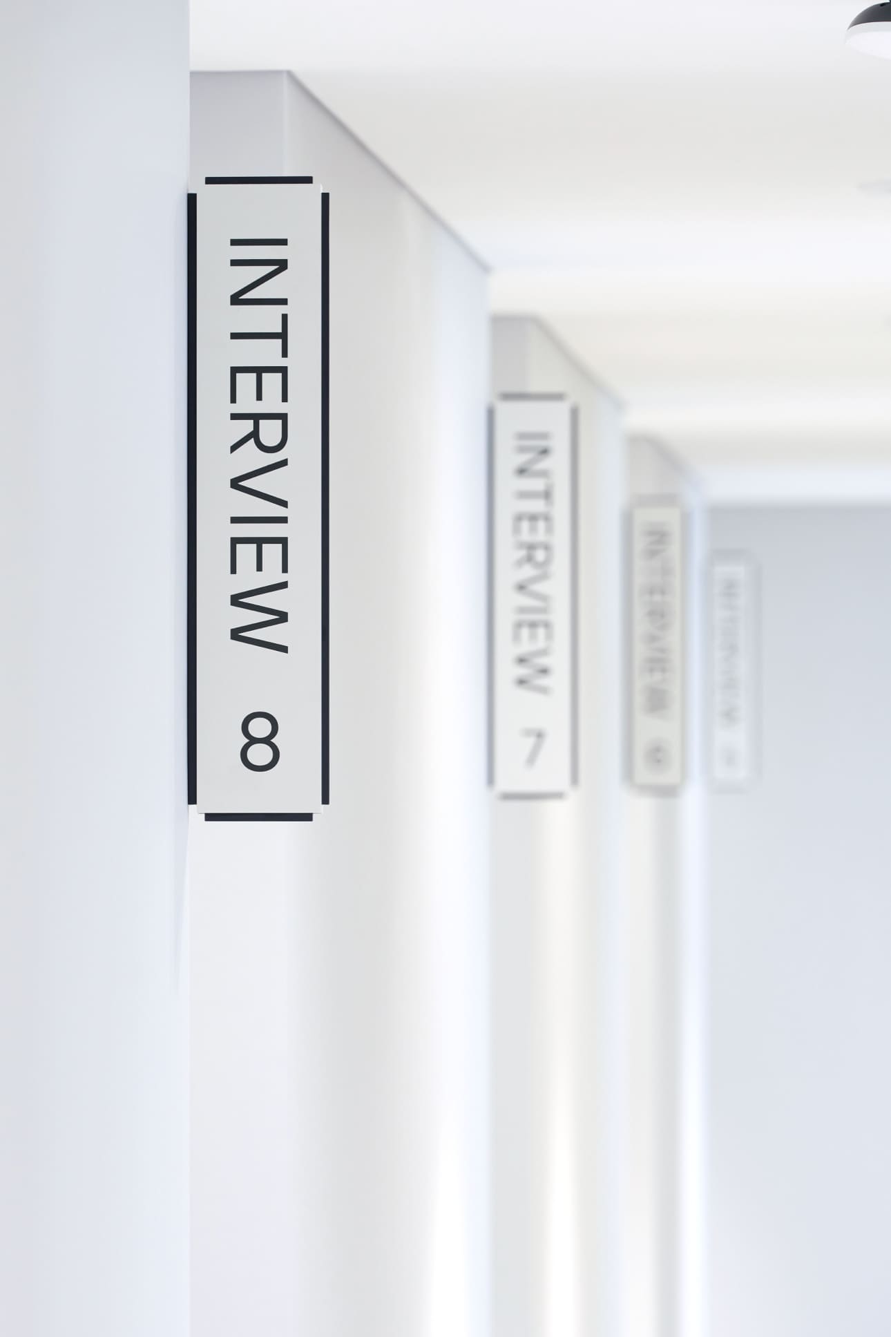
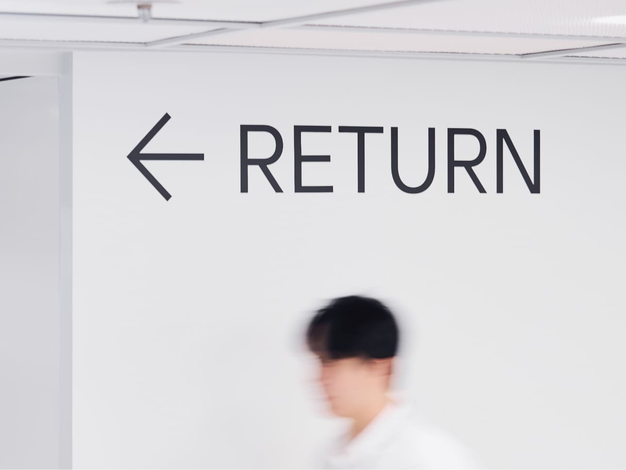
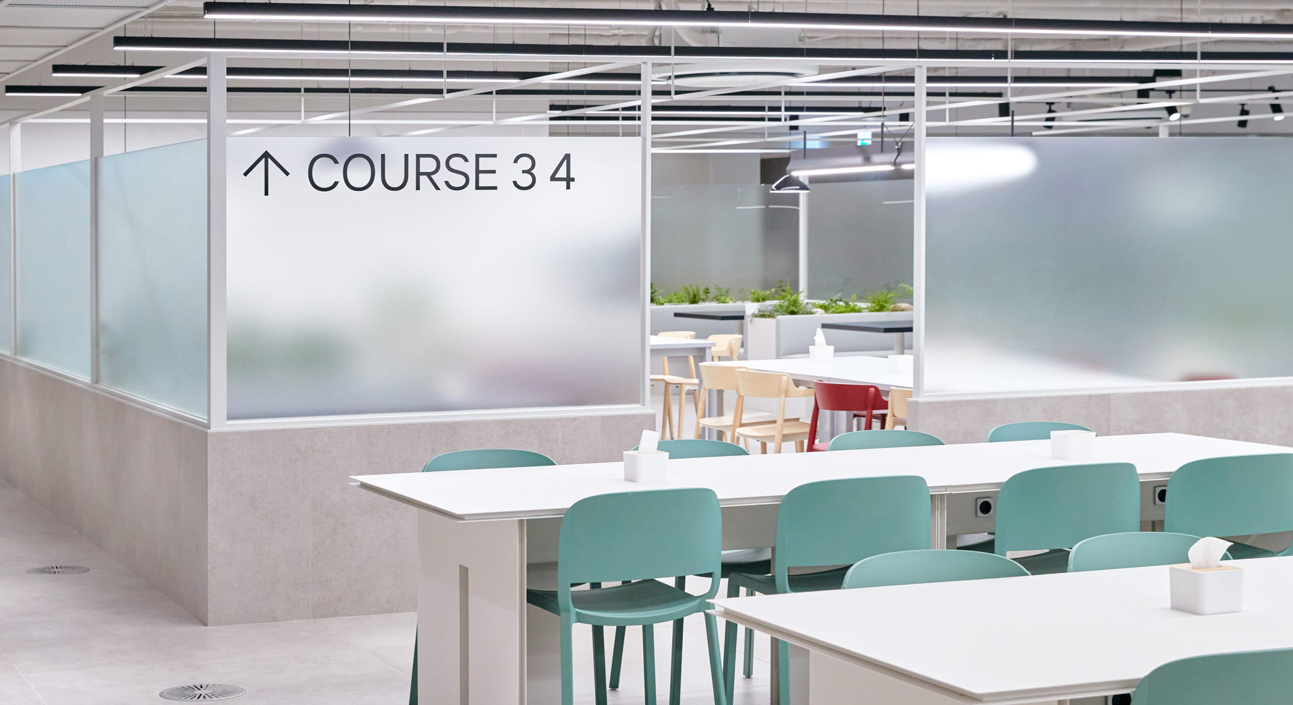
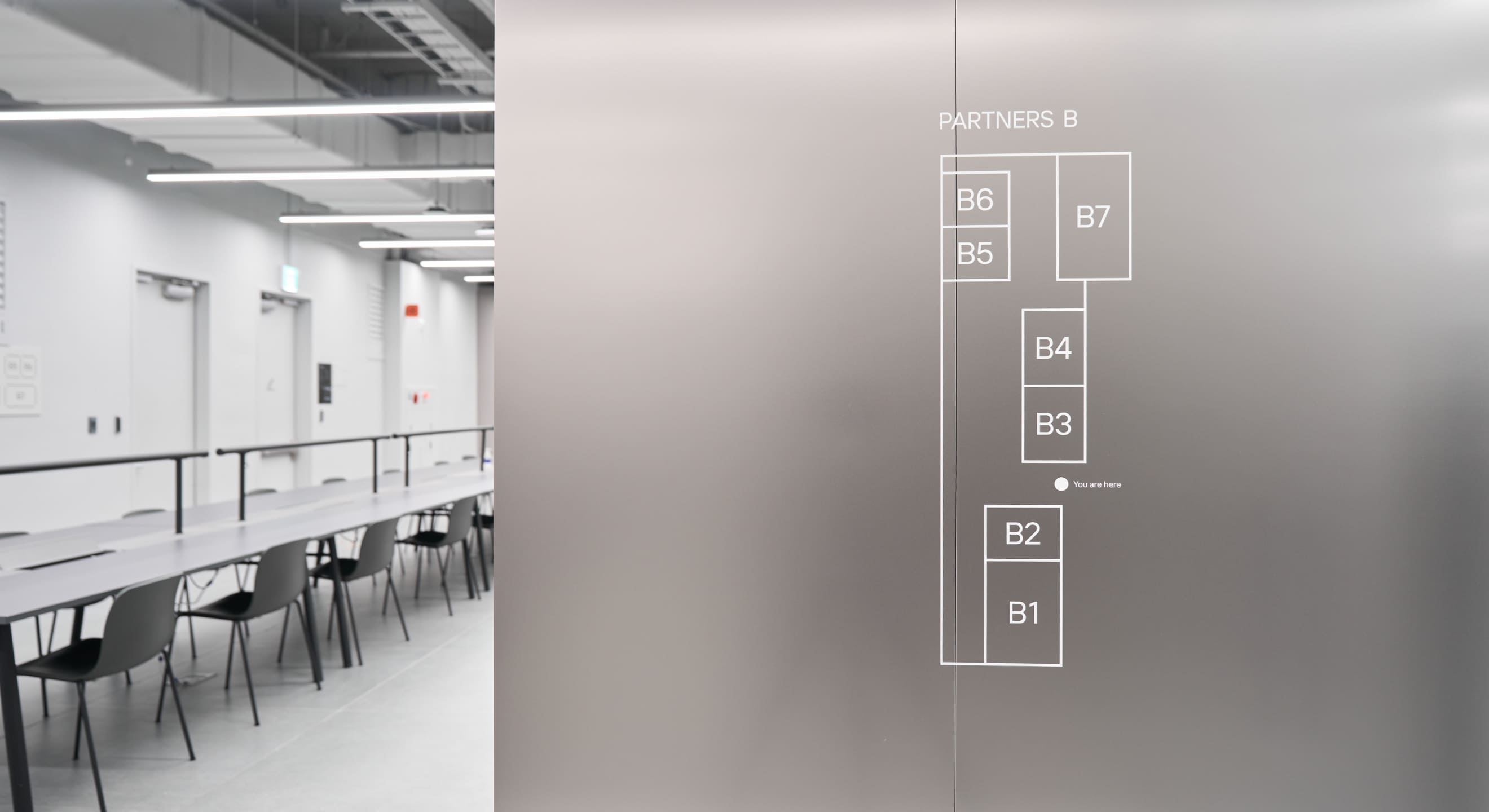
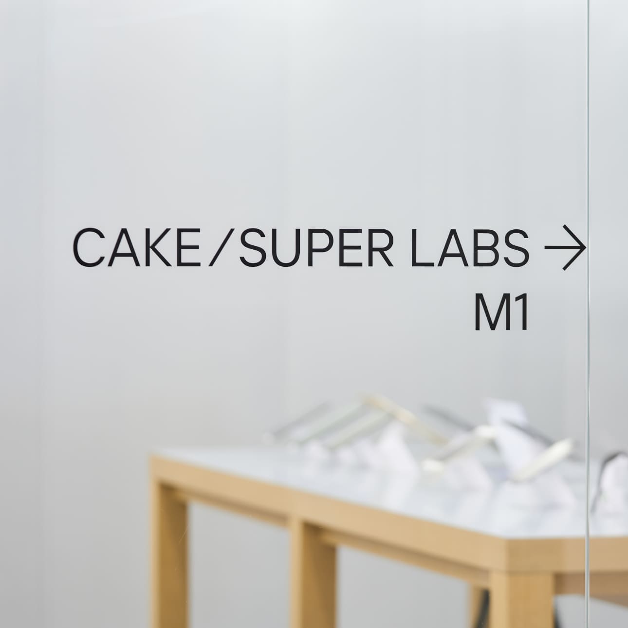
Regarding the wayfinding system, each box displays only one piece of information, allowing users to obtain information one at a time. The directions for movement are set according to the actual positioning, and they are emphasized with fluorescent green color to facilitate easy navigation.
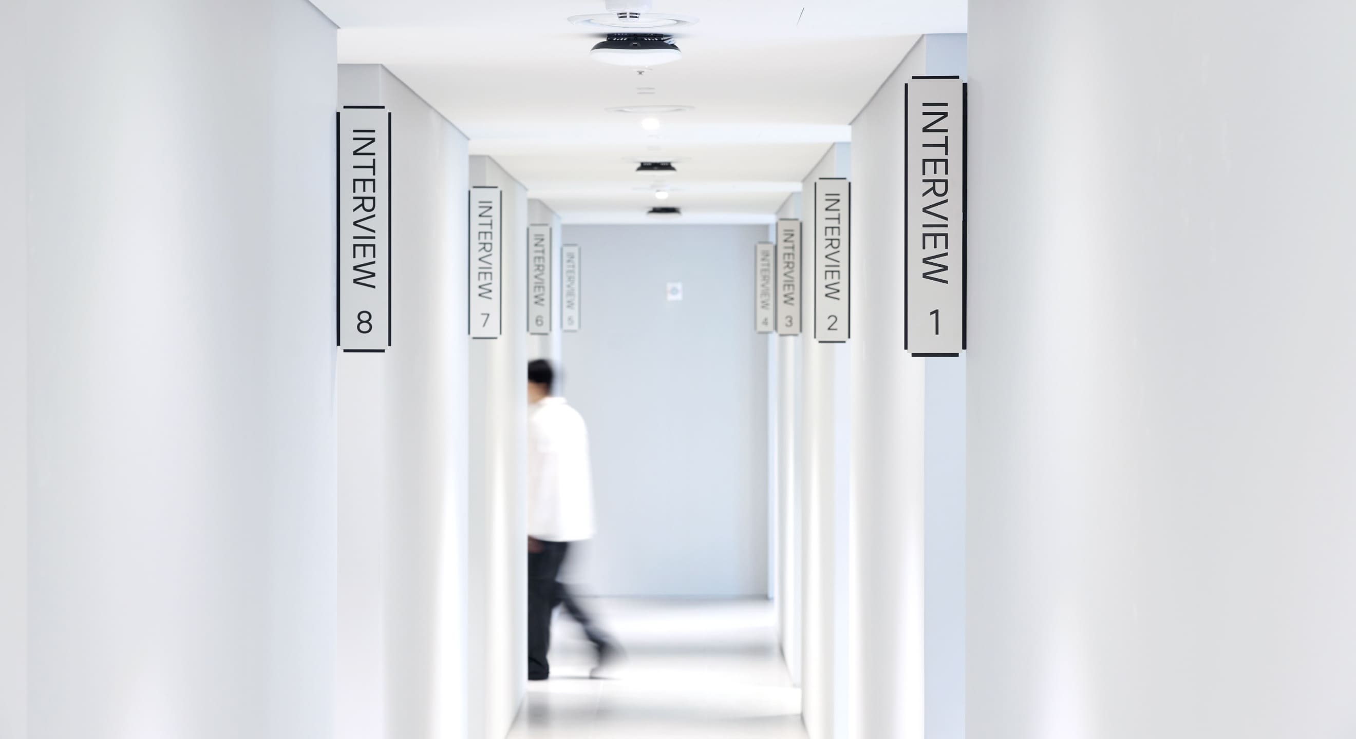
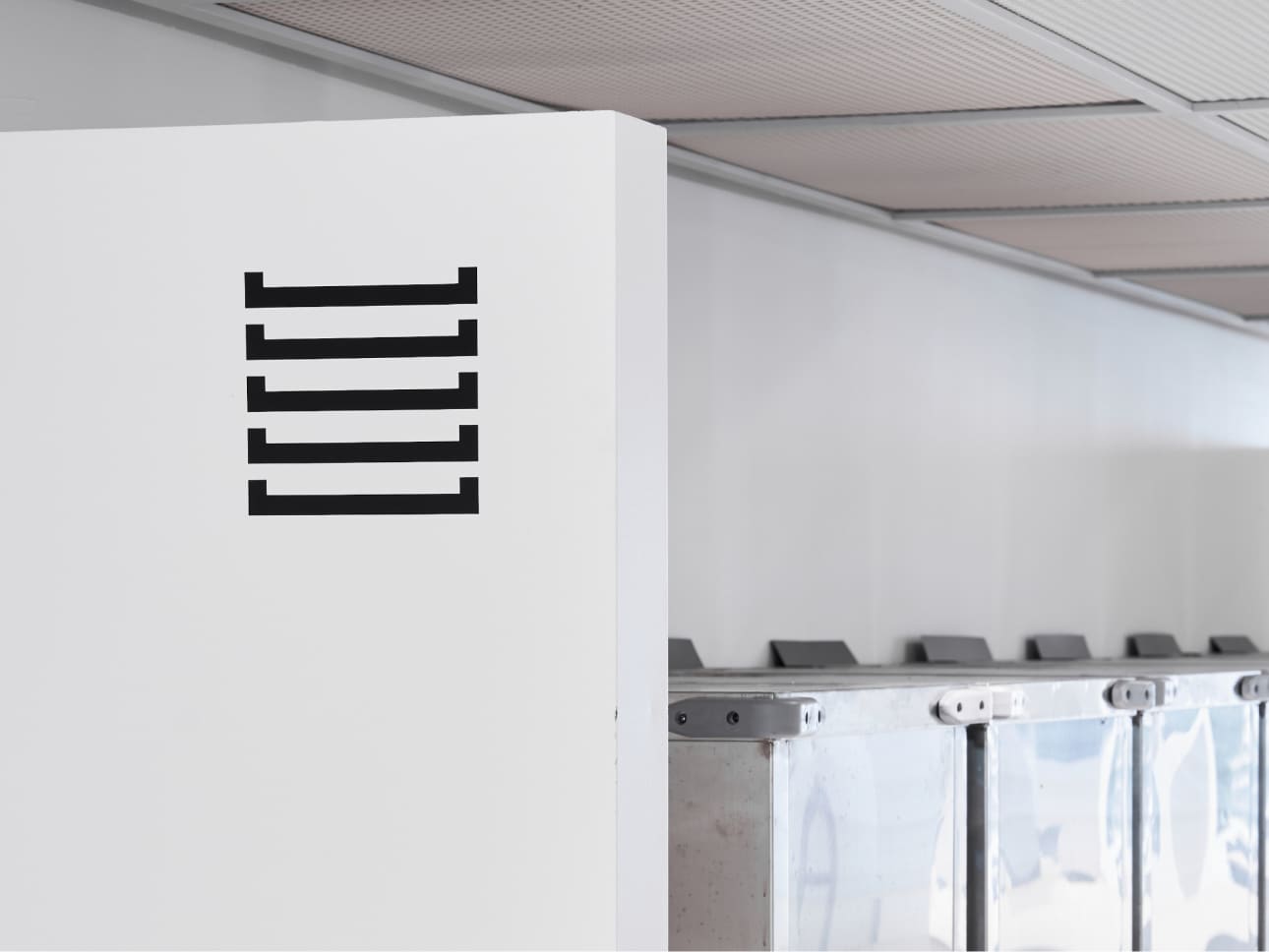
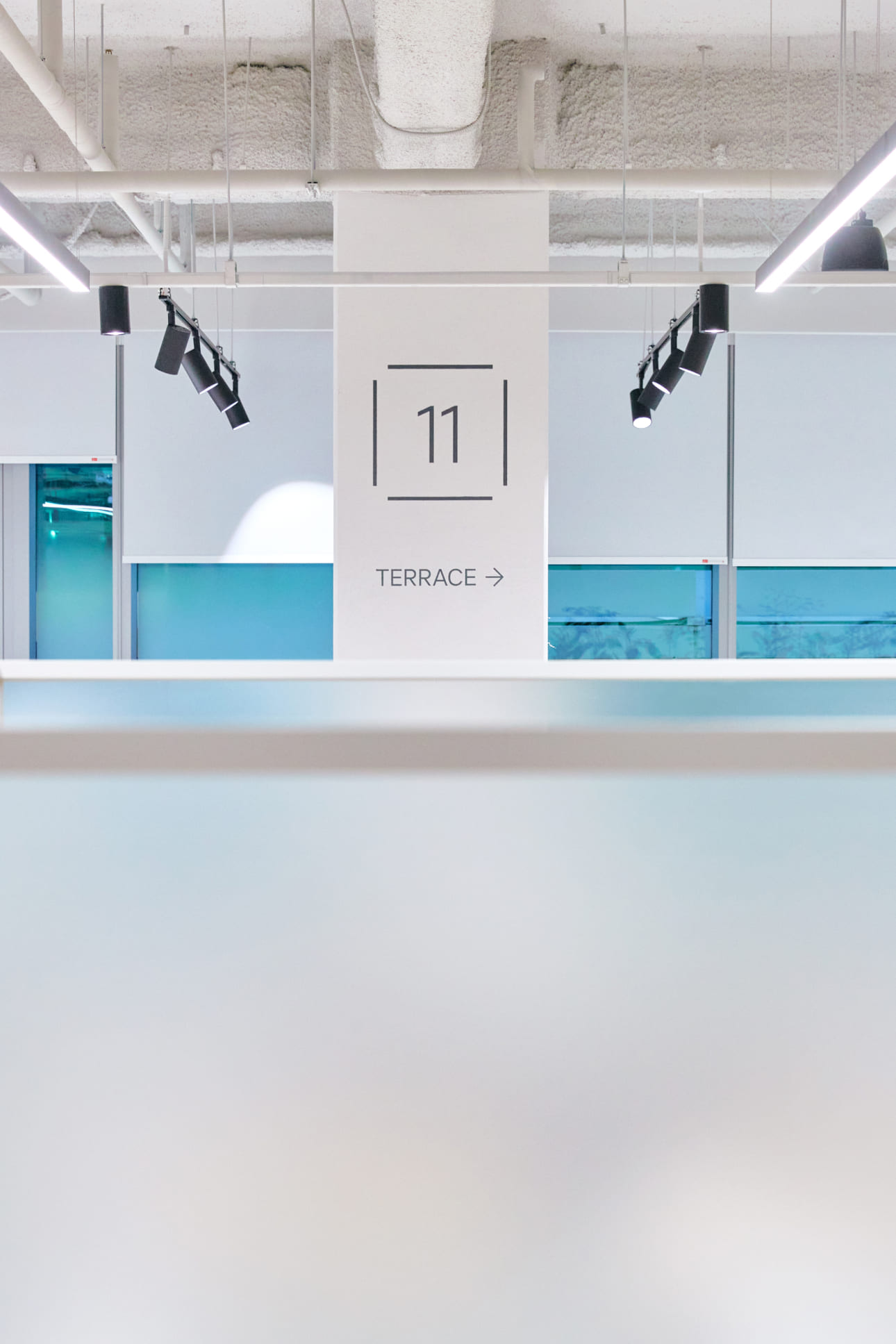
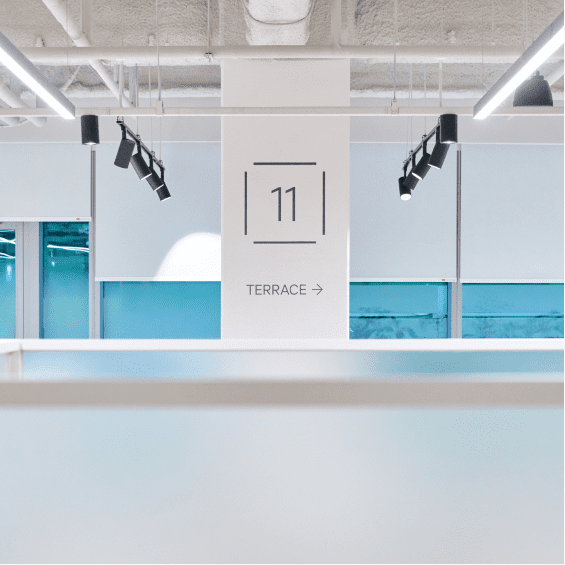
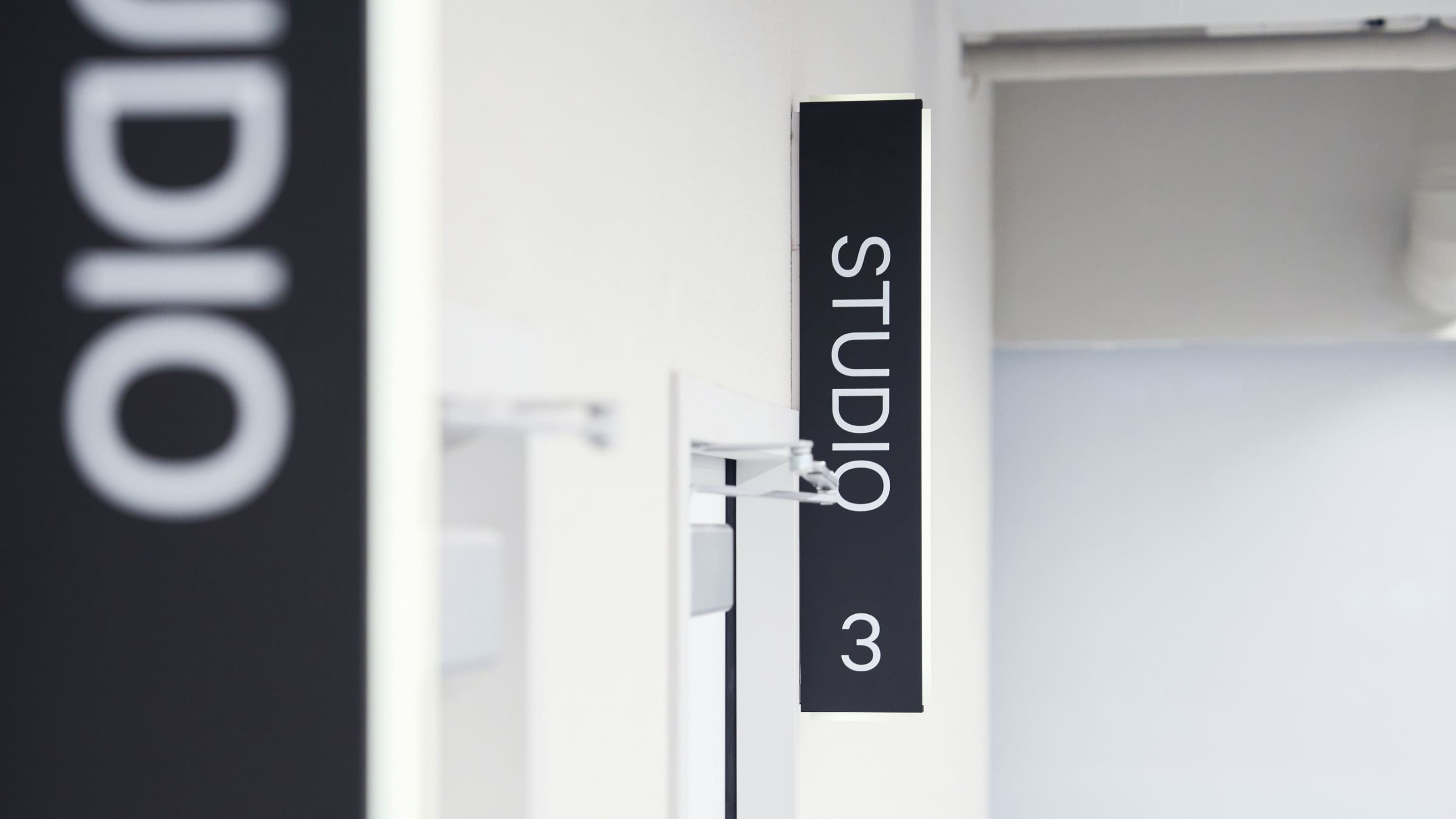
Through numerous concept tests, we established the design principle of utilizing 'lines and boxes' to create a 'frame-like' design. This serves as a visual language to easily represent the separation and synergy of each company, seamlessly blending with the linear and vertical building structure.
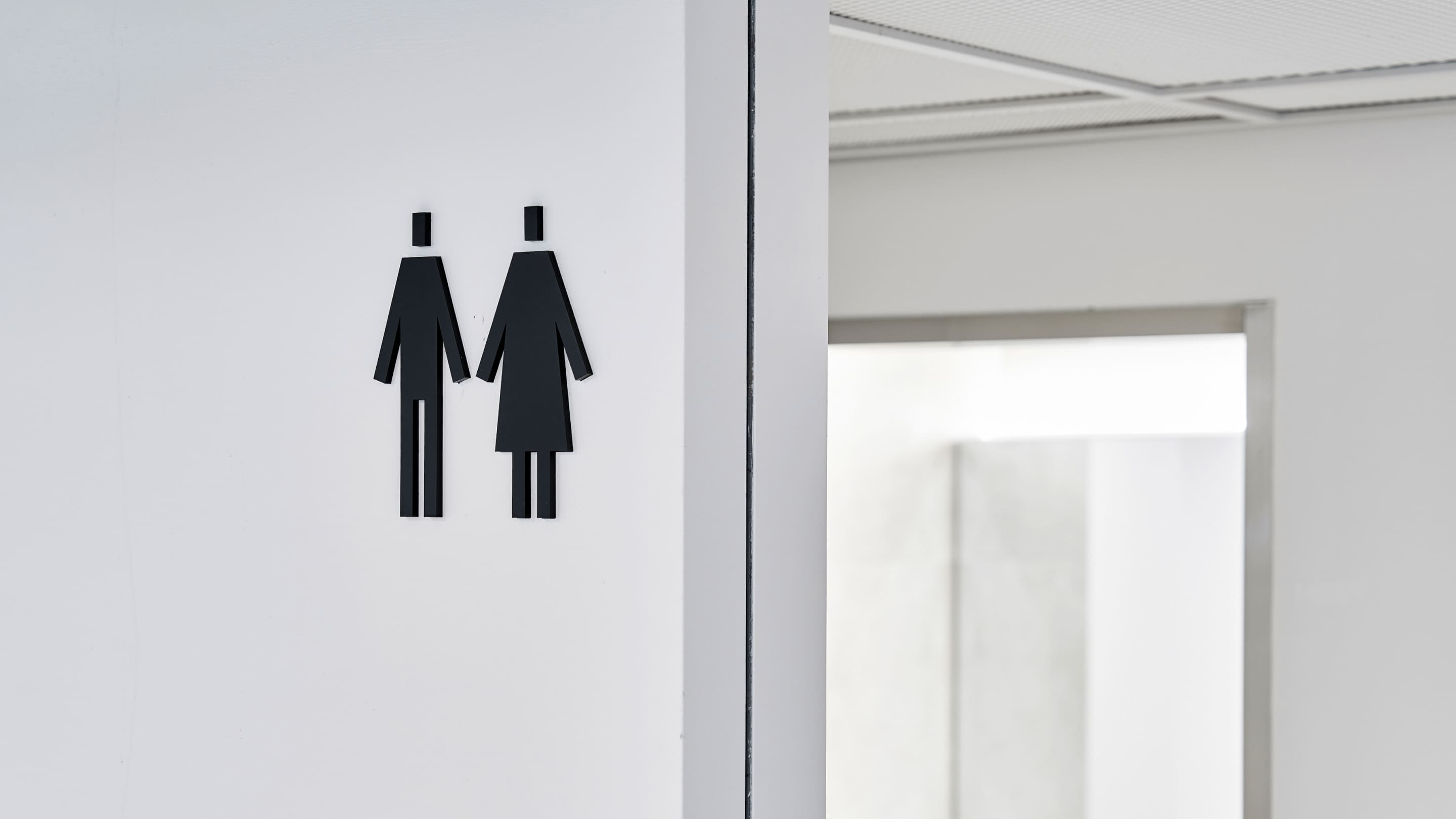
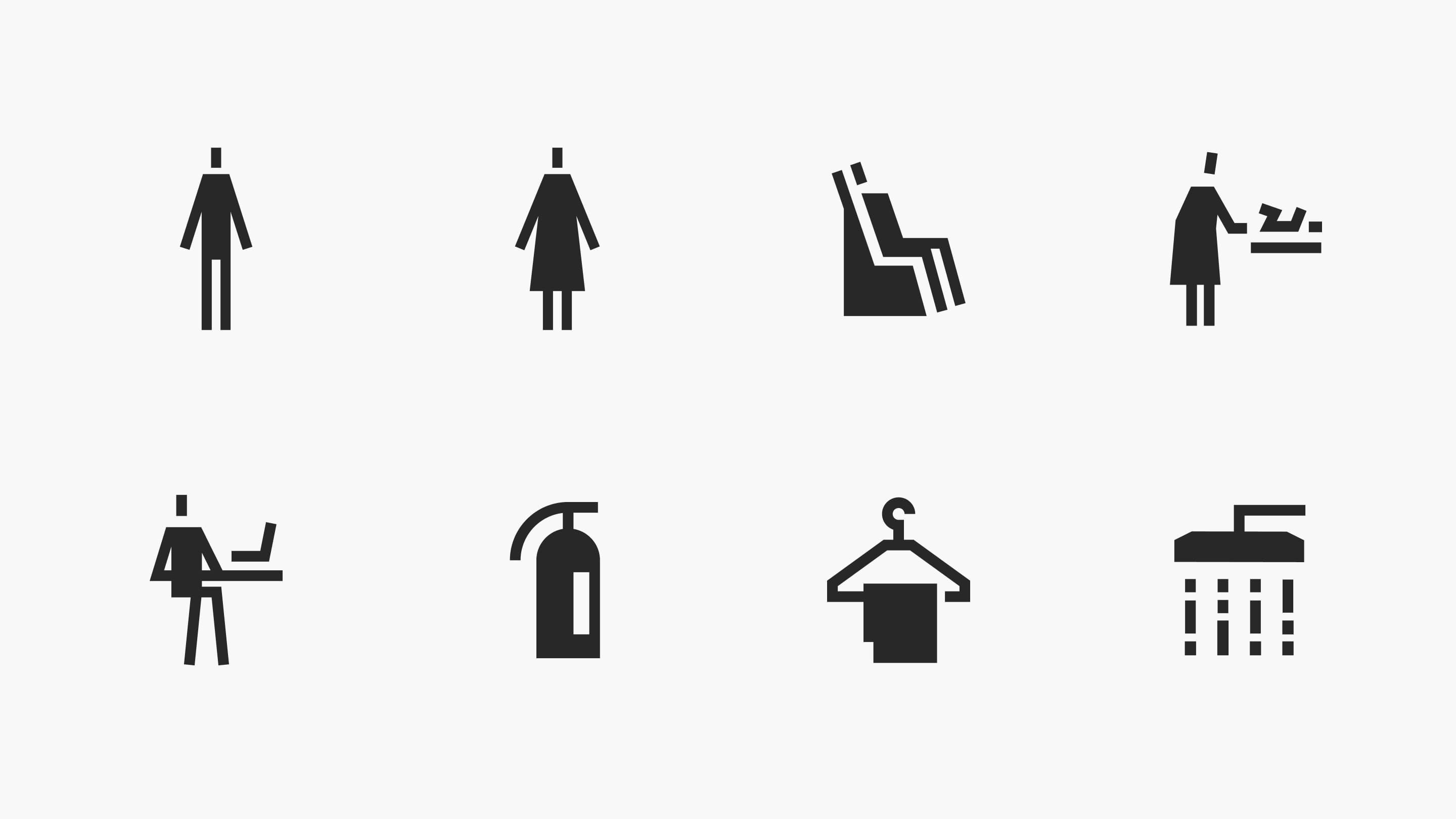
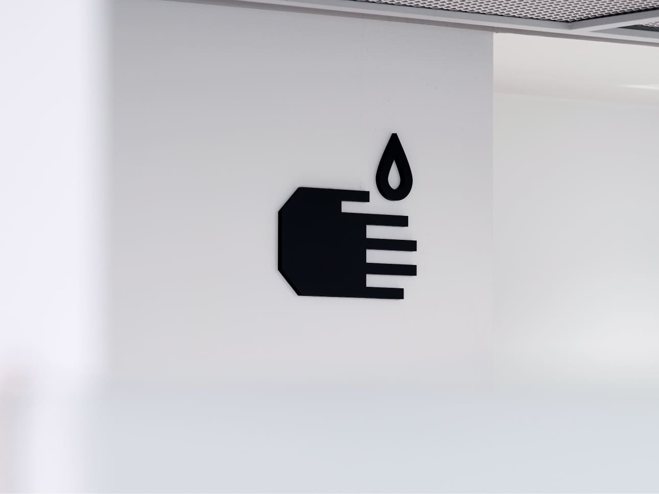
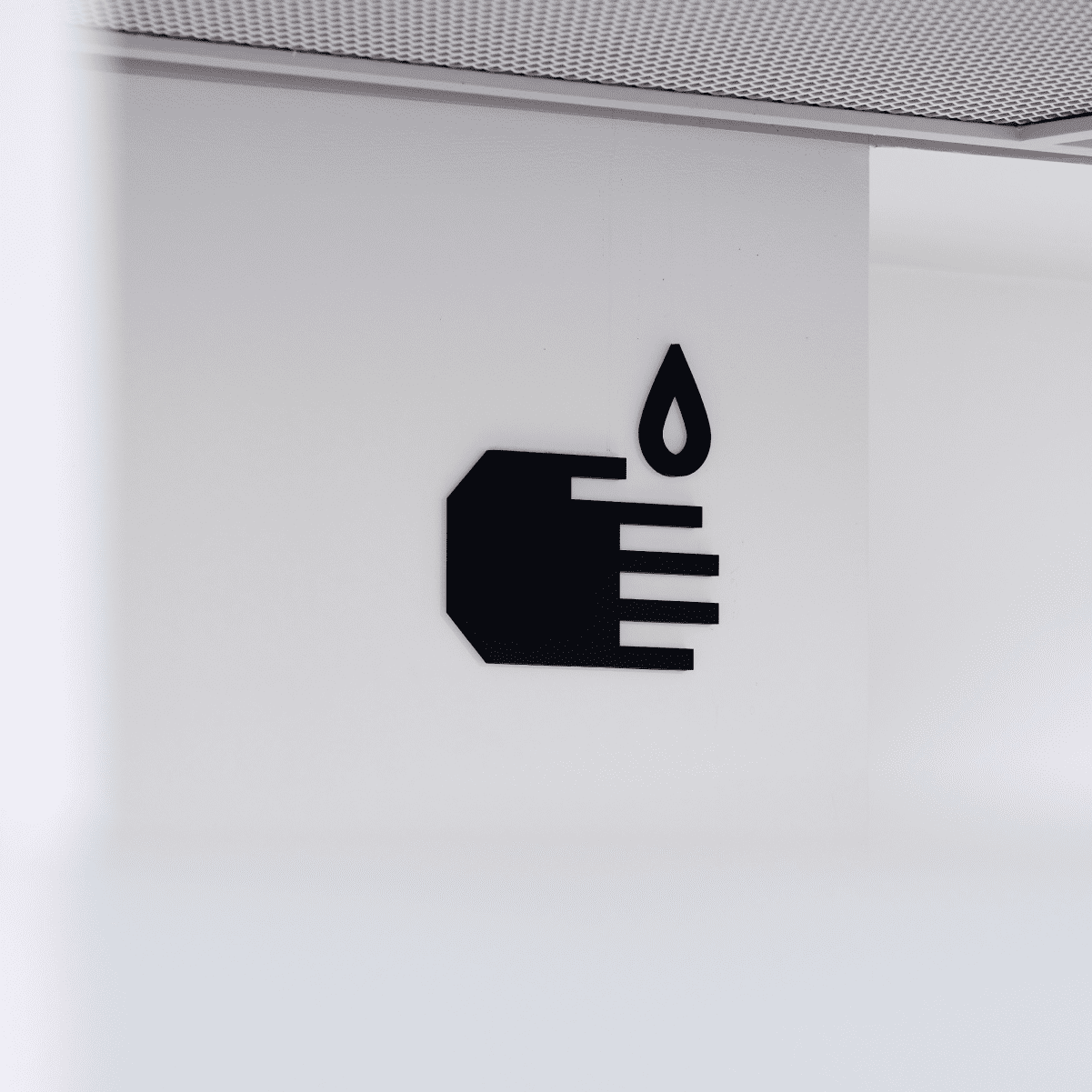
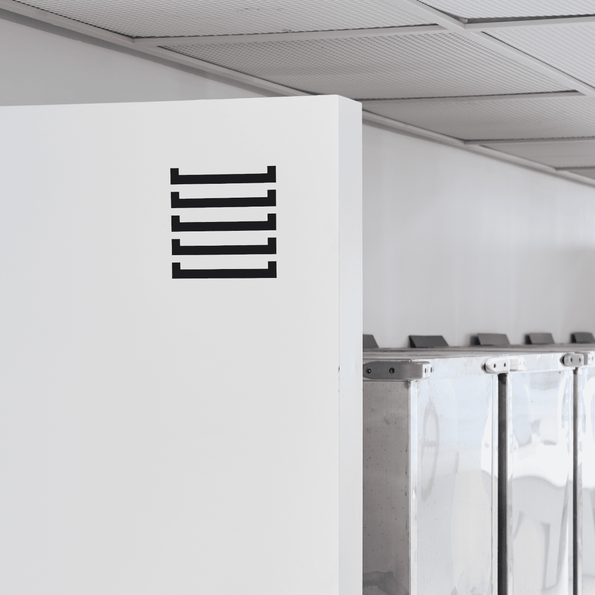
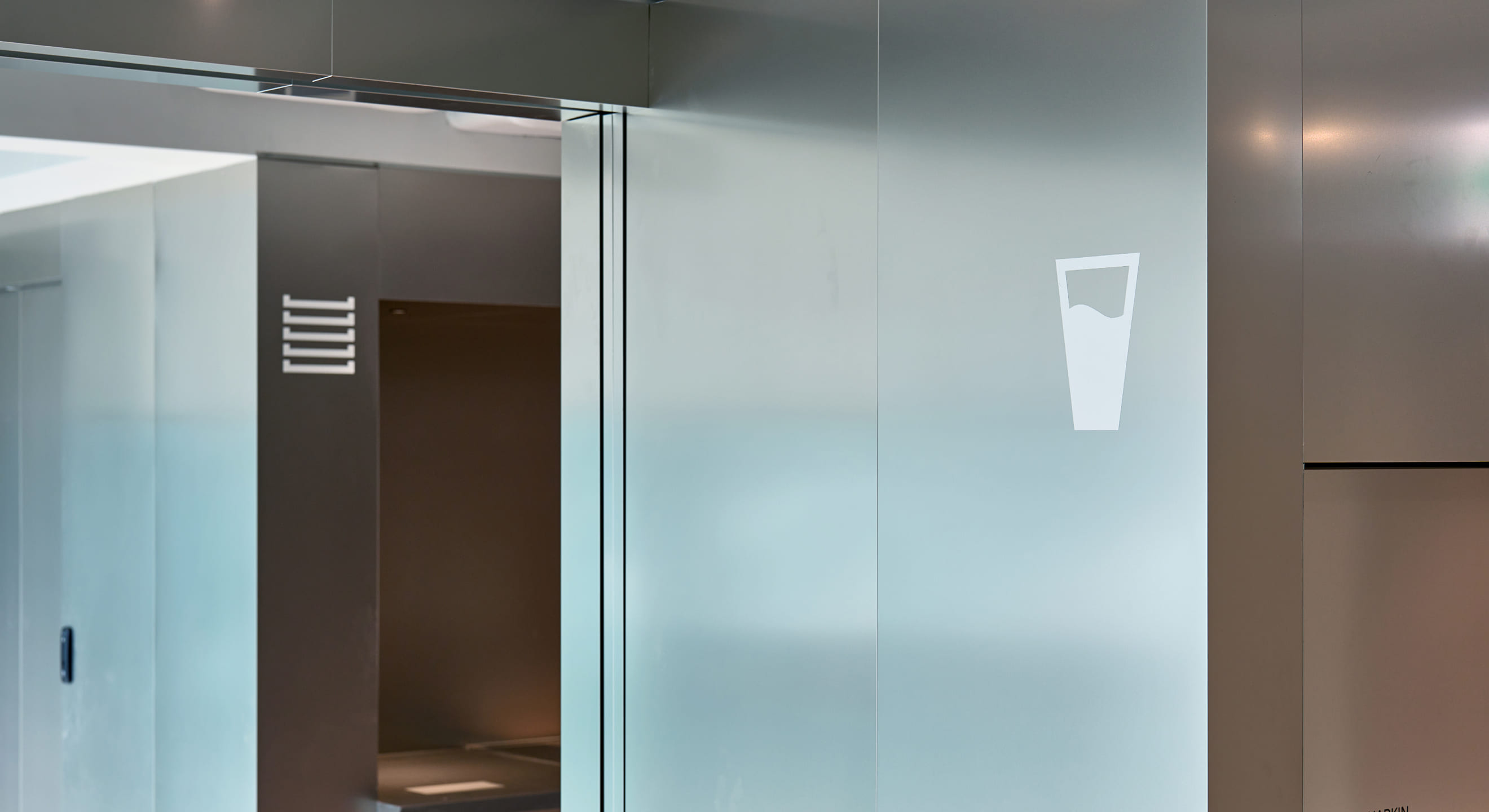
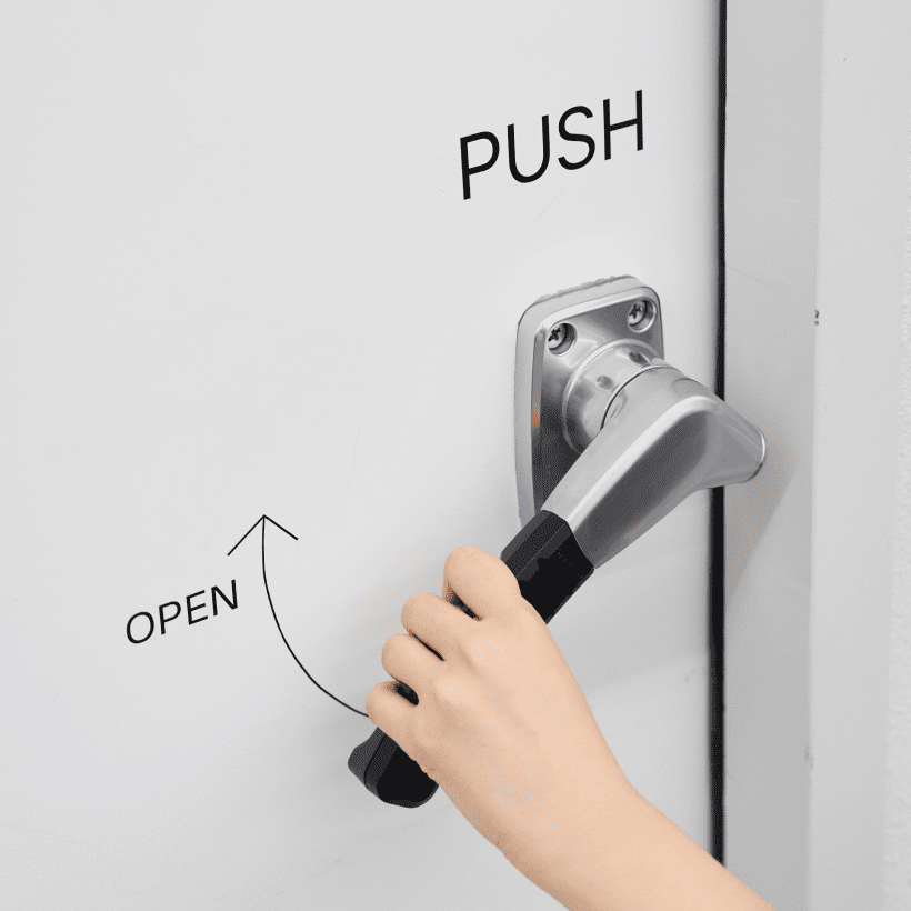
When creating pictograms, instead of visually connecting the modular box-shaped identity with lines, we developed a system that embodies the linear characteristics and atmosphere of the space. Clear and concise design: Unnecessary elements were excluded to ensure a clear and concise design, enhancing the visibility of the pictograms.
The dining area at Naver TechOne accommodates approximately 10 companies simultaneously, necessitating an intuitive system for swift navigation rather than implementing an identity based on lines and boxes throughout. As compared to other areas, signage has been crafted in a size that is visible from afar, ensuring easy navigation.
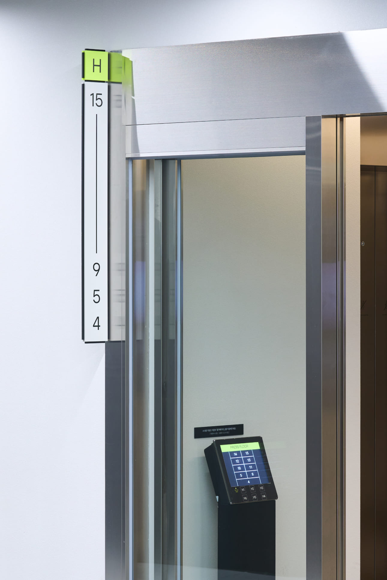
We developed signage in a form suitable for spaces requiring illumination while maintaining the structure. The design ensured a contrast between the body area and the lighting area of the signage, utilizing the middle layer of the three-layered structure as a lighting channel.
We developed signage in a form suitable for spaces requiring illumination while maintaining the structure. The design ensured a contrast between the body area and the lighting area of the signage, utilizing the middle layer of the three-layered structure as a lighting channel.
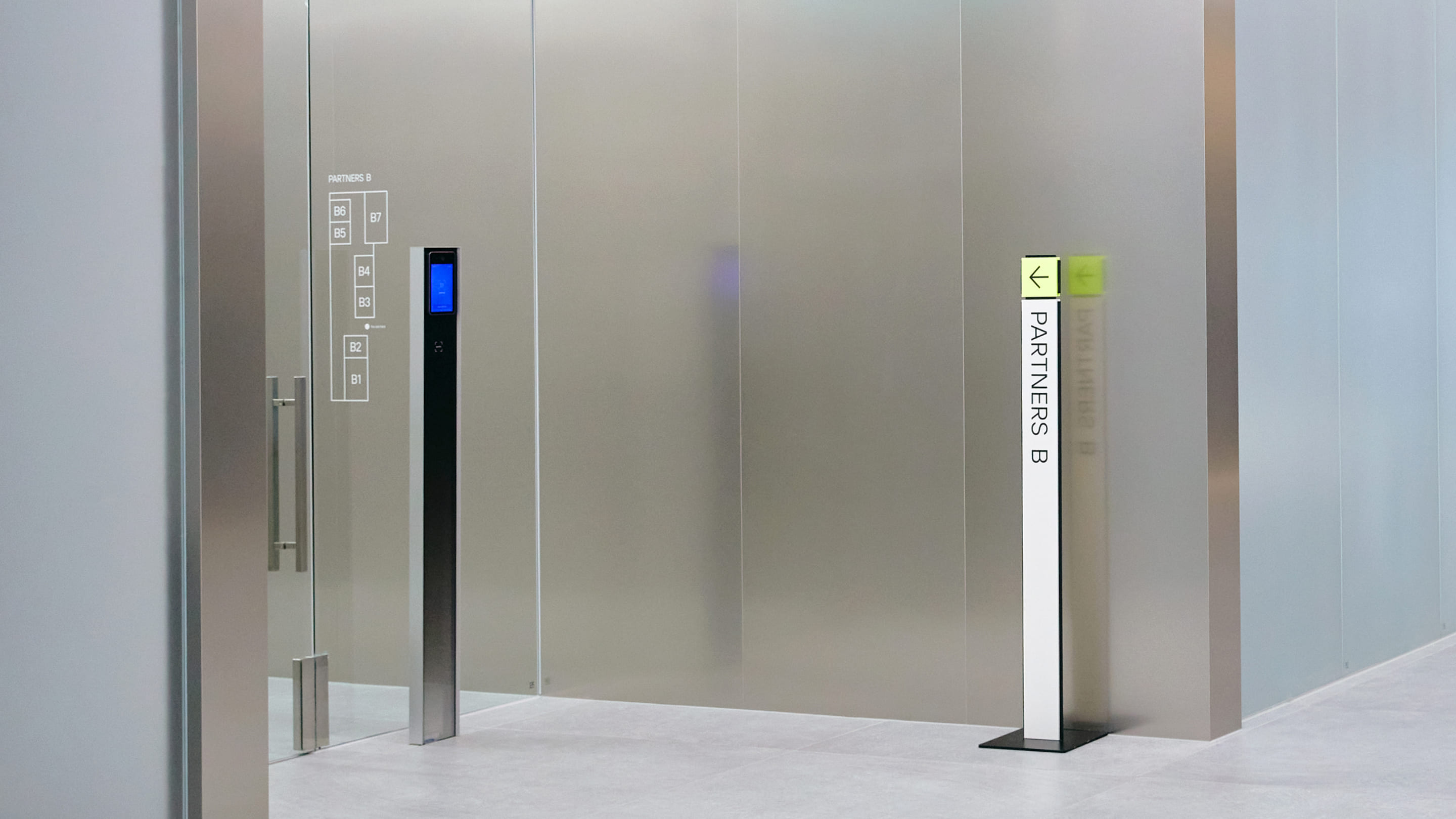
When the surrounding space is mostly composed of metallic materials, the signage can effectively stand out. By utilizing reflective materials, the signage was positioned in locations where fluorescent green color contrasts well and can be prominently seen.
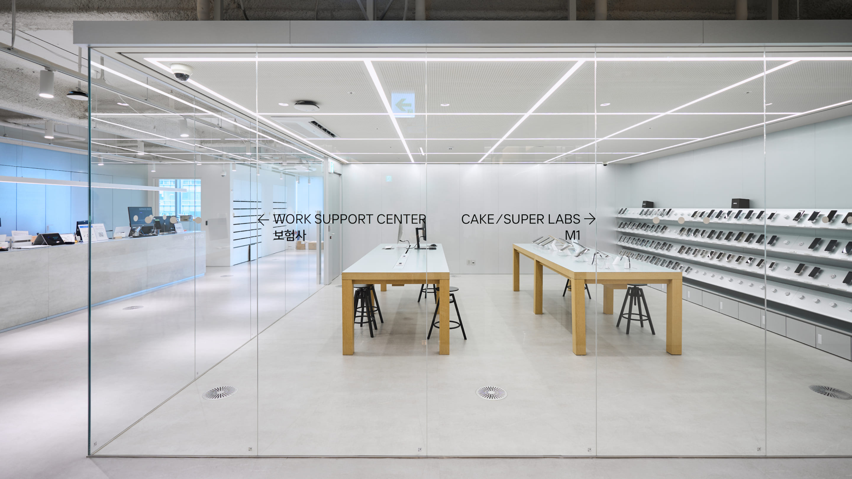
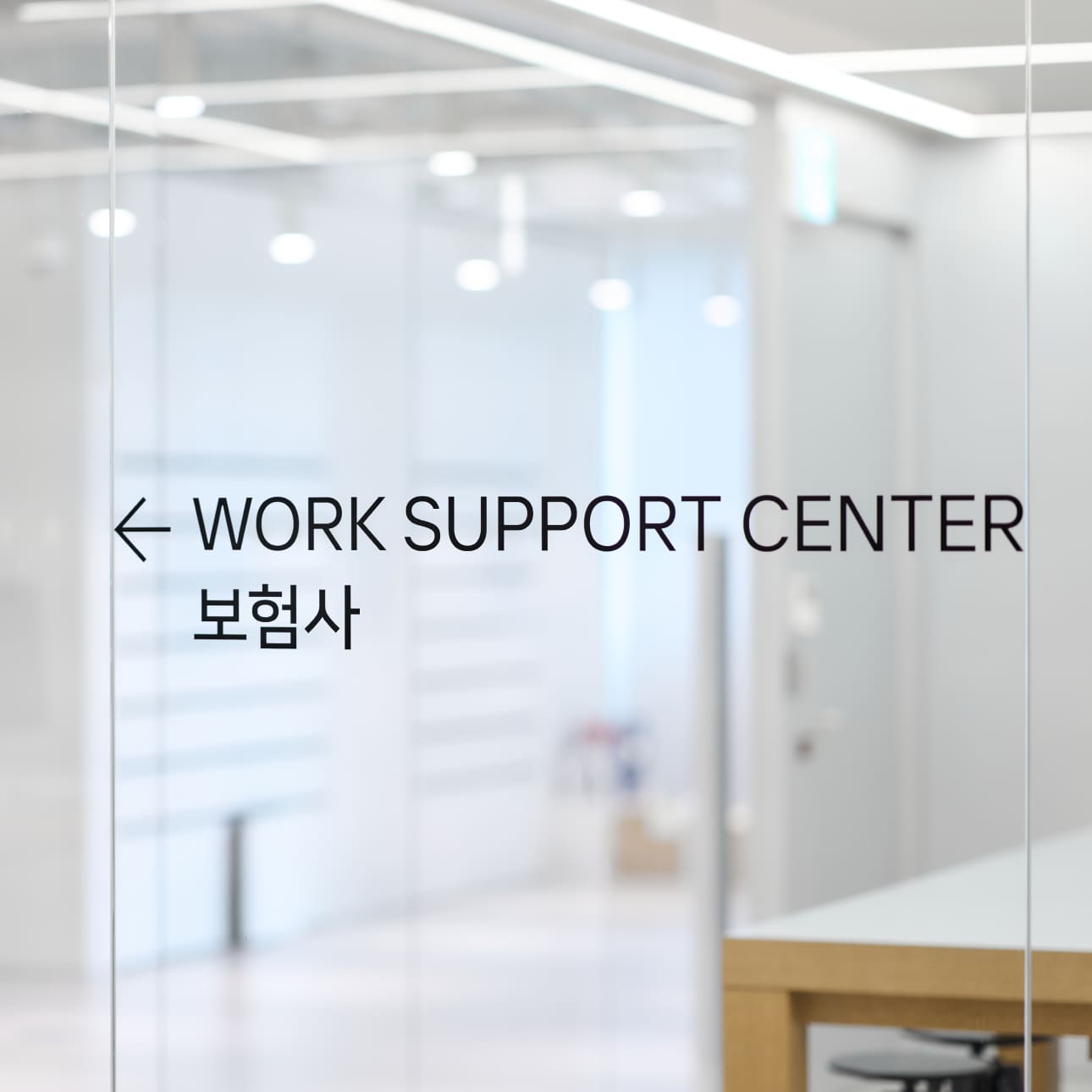
When signage needs to be placed on transparent surfaces, it's positioned at the average eye level of users. This is done while considering swift movement and ensuring that the signage doesn't obstruct the view of the interior landscape within the transparent space.
NAVER Tech 1
Office Building Signage
& Wayfinding System
BRENDEN
Creative Direction / Doeui-Lee
Project Managing / Wook Jung
Design / Jiwoong Lee, Hyejoo Yun
Creative Partner / Samik Plan, Studio Eden, APRO Studio
Client
Naver
Award
iF Design Award Winner 2024
Red Dot Design Award Winner 2023