The Shilla Duty Free
2023 Season VM Design
Season VM Communication Design
This is the 2023 season VM design for The Shilla Duty Free.
It represents a design strategy for communicating with customers throughout the year. Recently, there has been a trend of increased luxury brand consumption among younger generations, expanding the target demographic of duty-free shops to include younger consumers. In response to this shift, key visuals representing spring, summer, autumn, and winter were developed with playful and vibrant designs to break away from the conservative and static image traditionally associated with duty-free shopping. This aims to provide customers with new experiences and enjoyment.
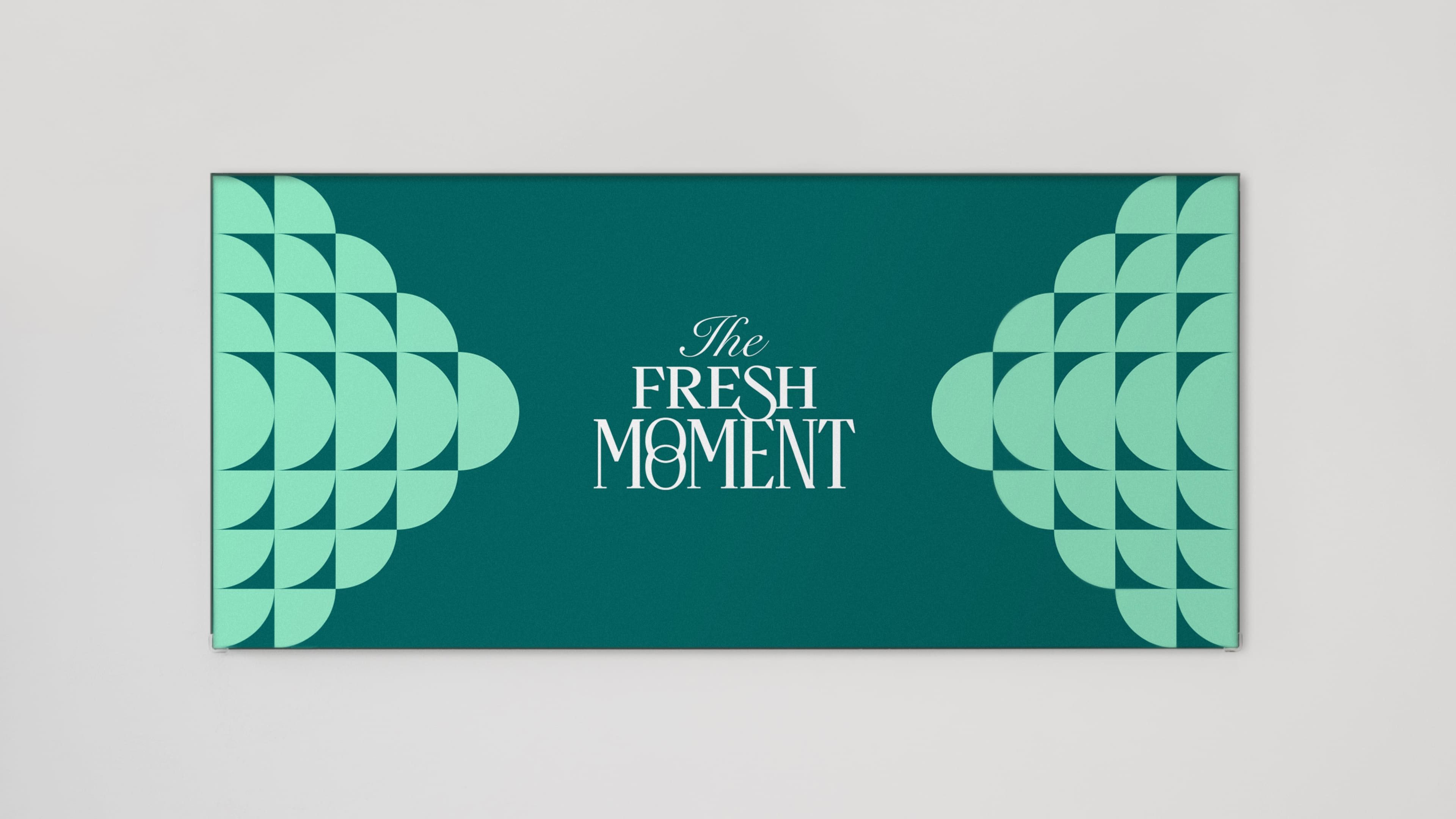
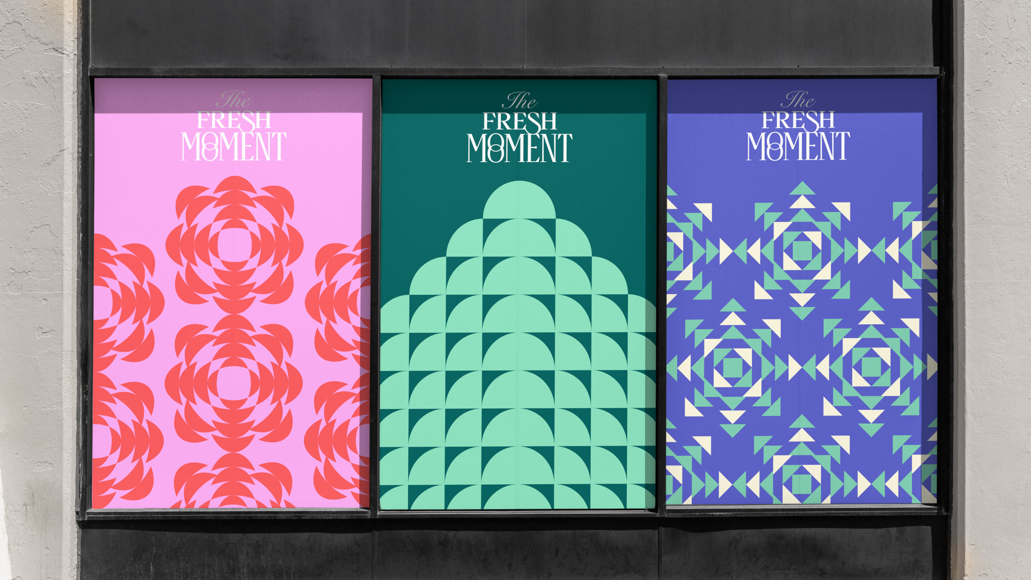
The Shilla Duty Free's spring season graphic, "THE FRESH MOMENT," embodies the blooming flowers, budding leaves, and the sense of new beginnings through expansive graphics and title designs. It emphasizes the excitement and vitality of people welcoming the spring season.
We've created both the English title for "THE FRESH MOMENT" and a Chinese title for our Chinese tourists. Through the expanding title design, we aim to express the excitement and vitality of people welcoming the spring in "THE FRESH MOMENT", thereby forming visual consistency with the key visual.
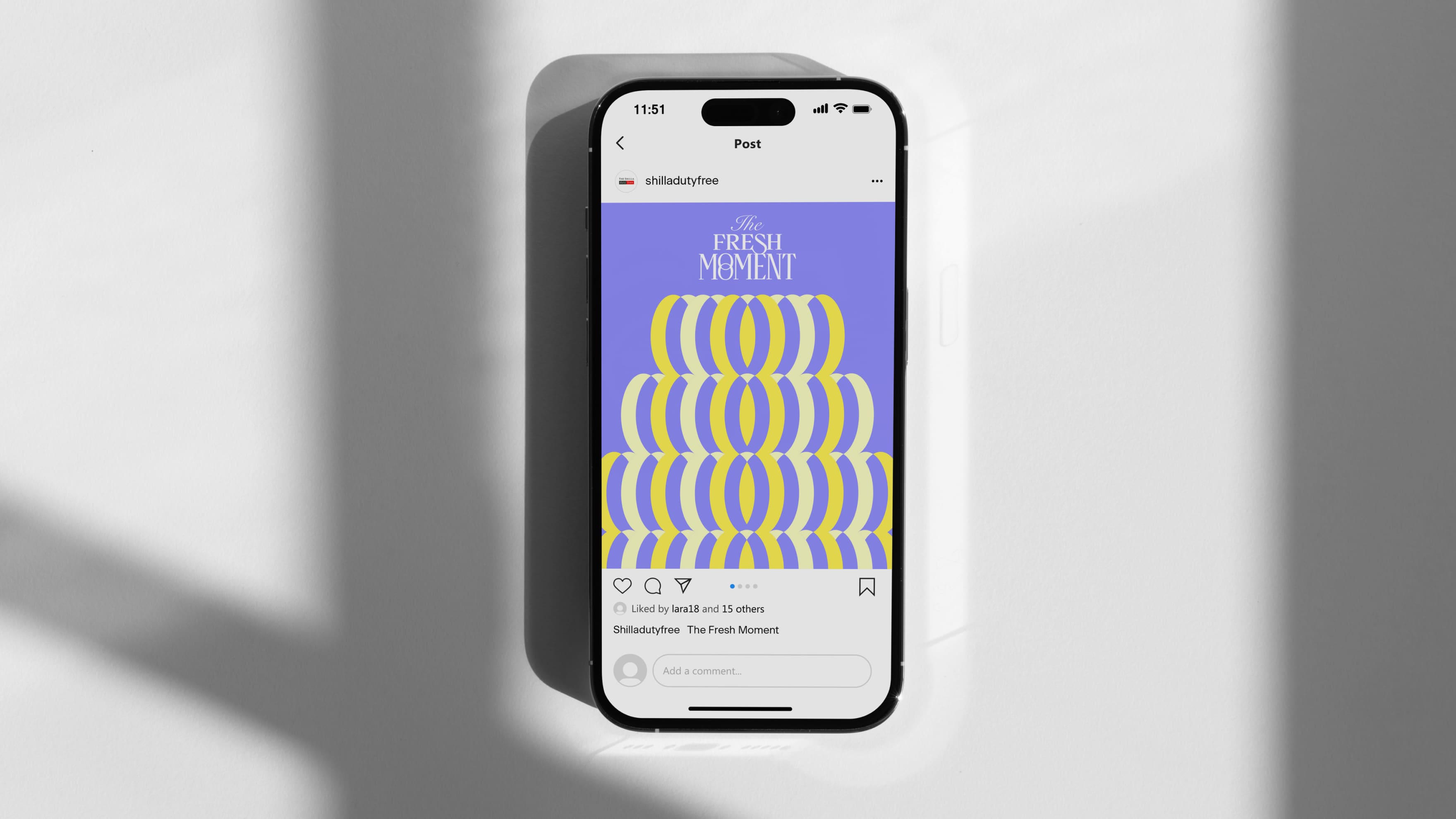
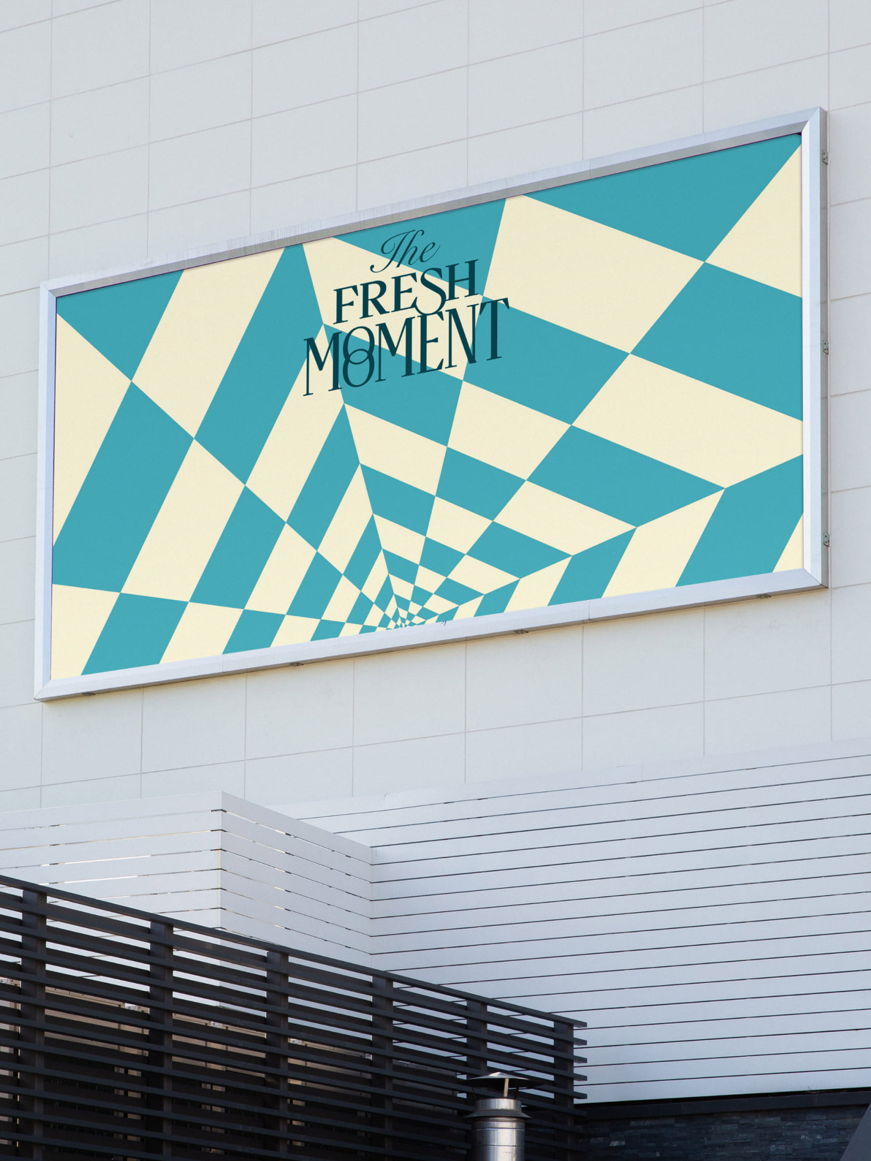
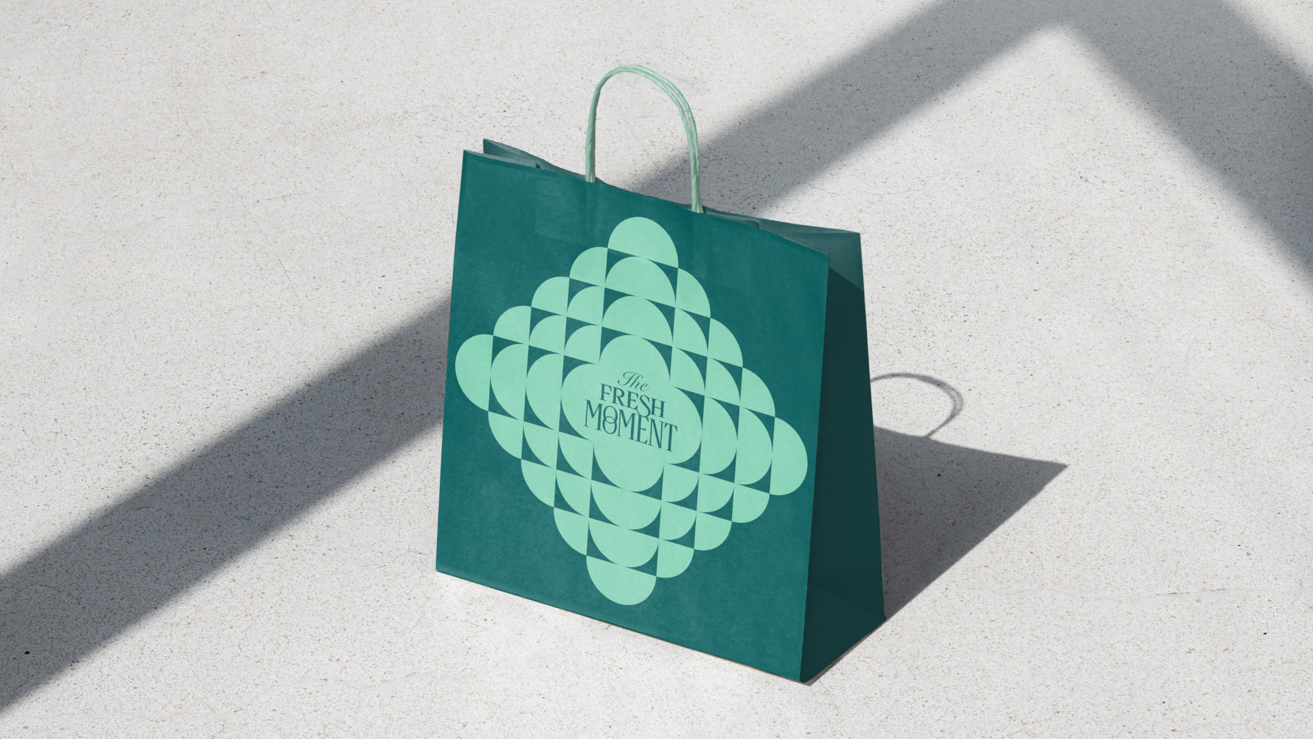
We apply the main key visual and category graphics across various applications to clearly convey the identity of "THE FRESH MOMENT" to customers. Through this, we effectively communicate the diverse image of The Shilla Duty Free to our customers.
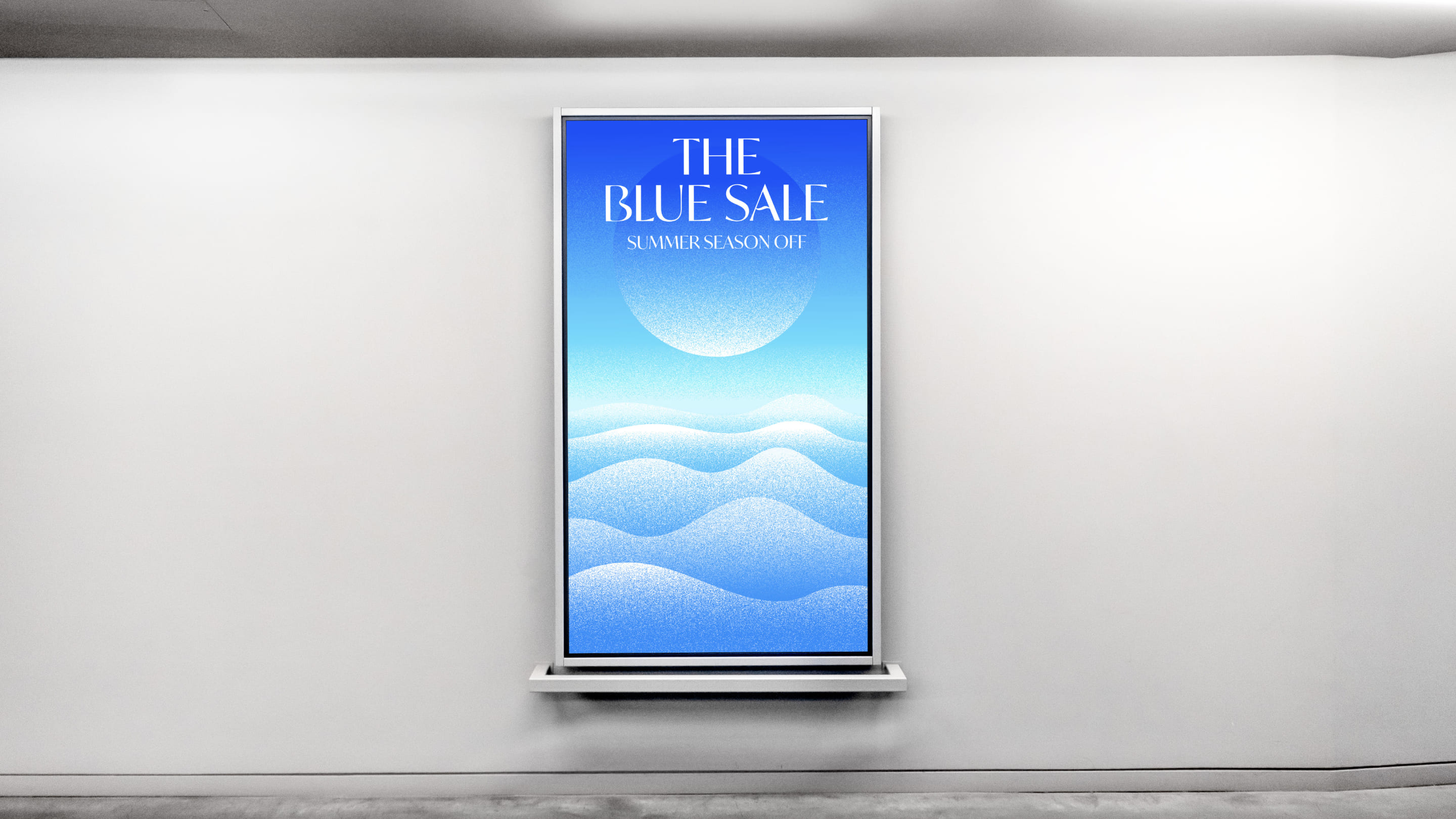
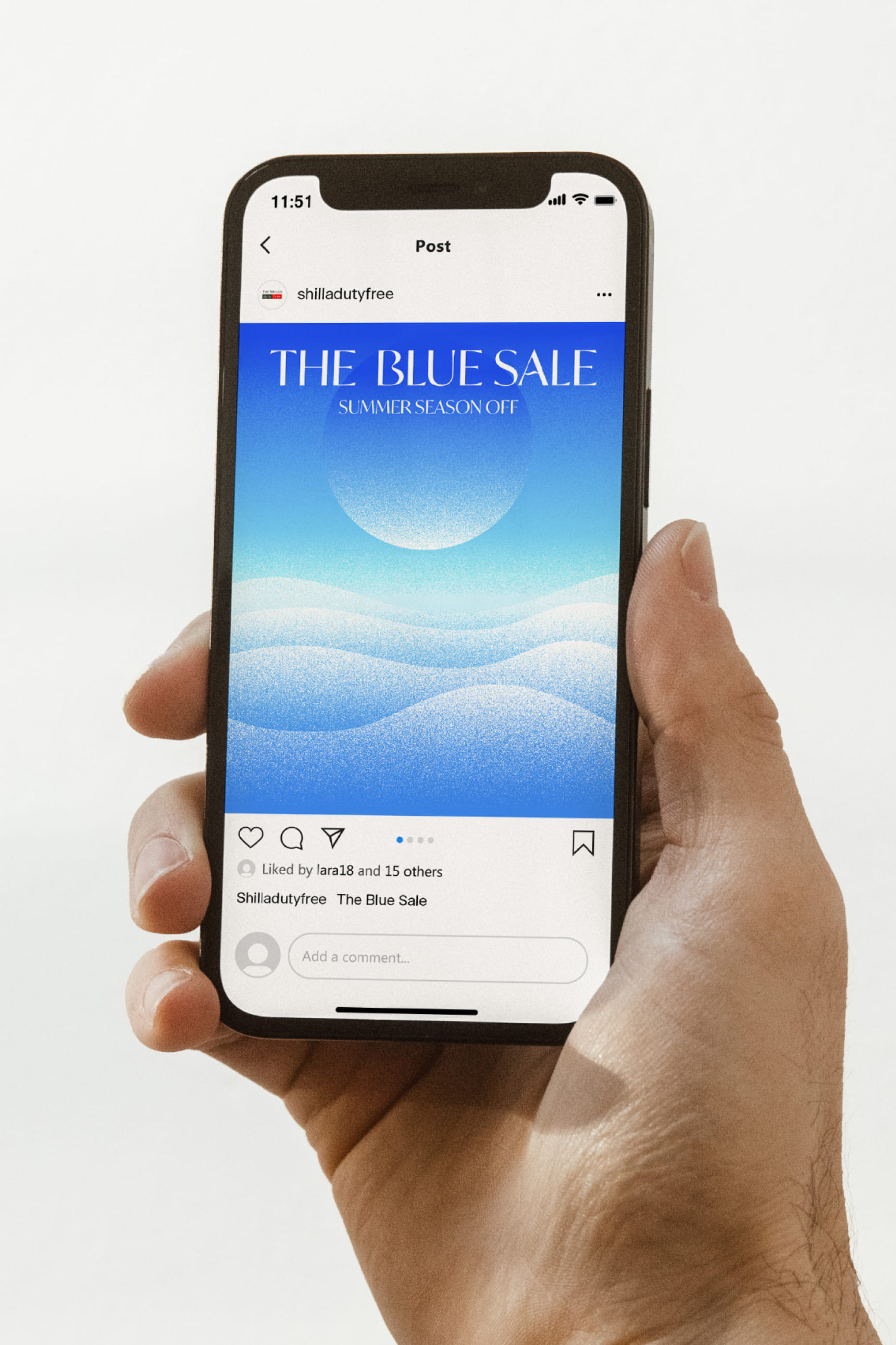
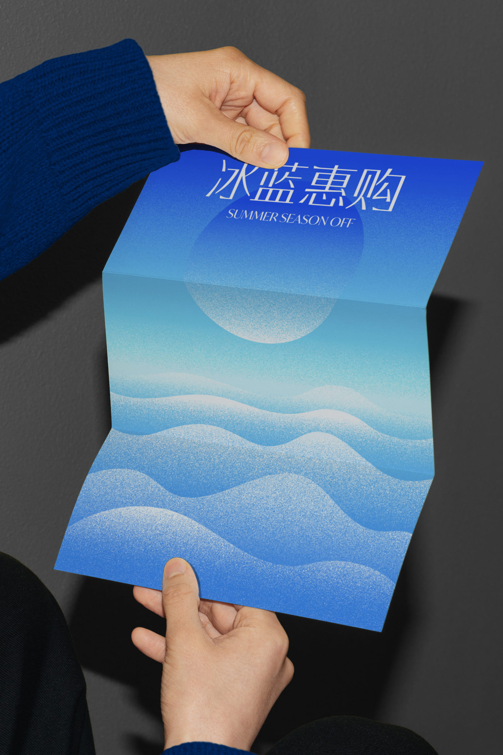
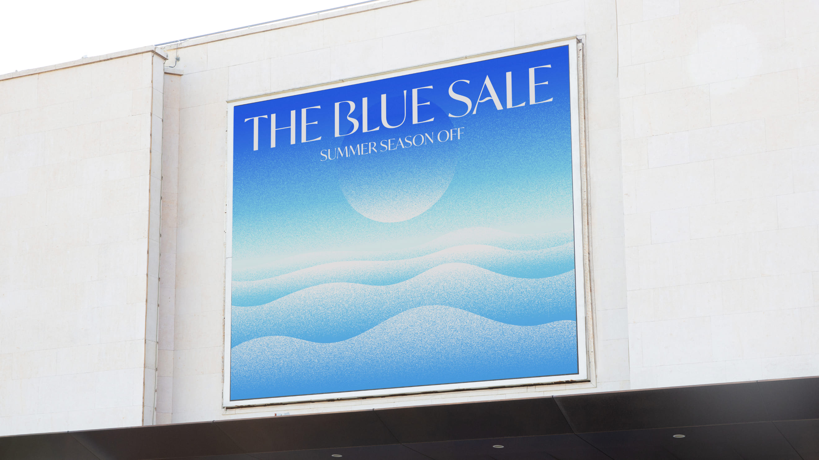
The Shilla Duty Free's summer season graphic is titled "THE BLUE SALE." The visual for the summer season depicts the sea's scenery and colors through illustrations, conveying the refreshing atmosphere of summer and showcasing the color blue in a straightforward manner, delivering a cool impression to customers.
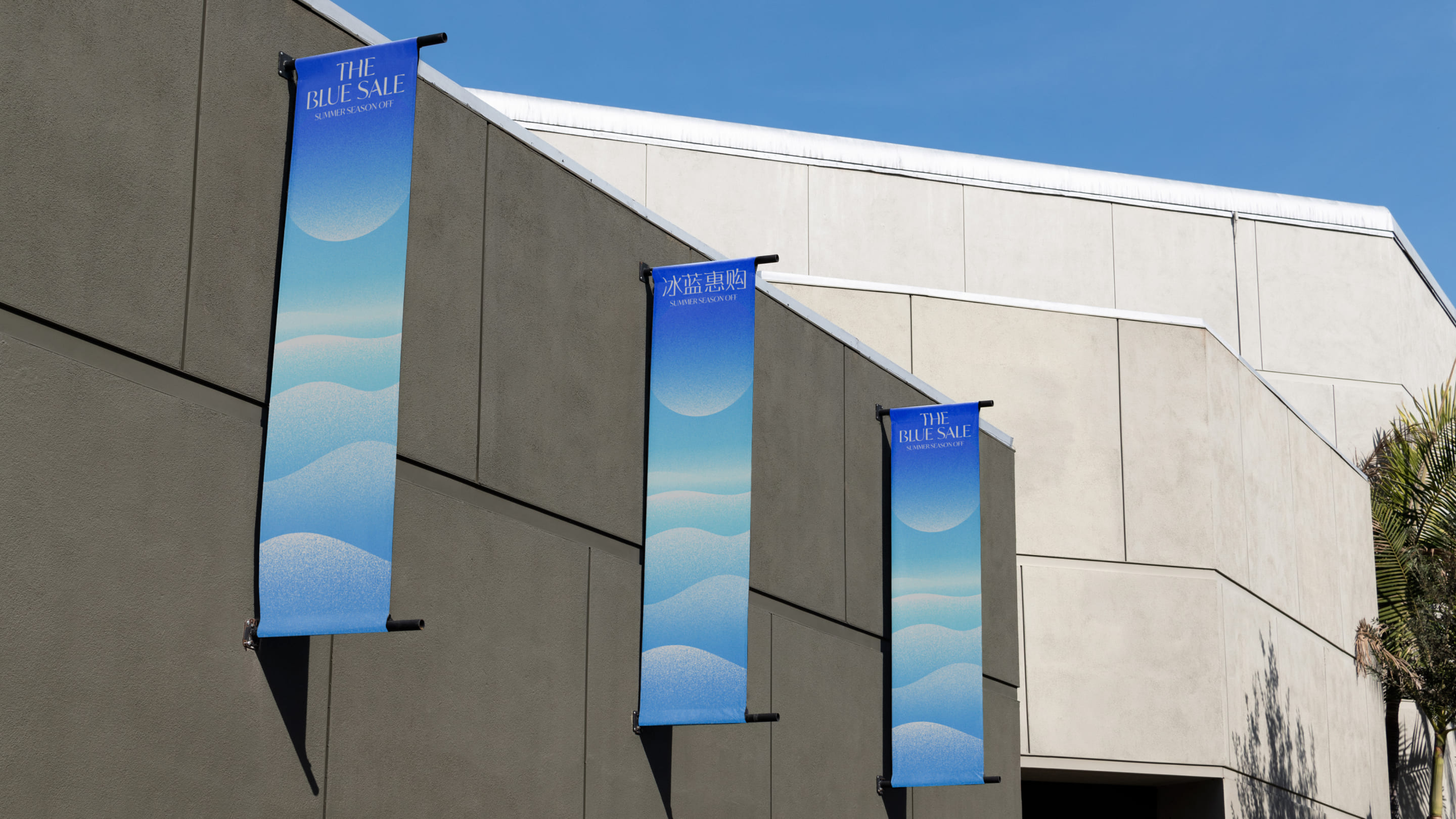
We have created the English title for "THE BLUE SALE" and a Chinese title for Chinese tourists. Both titles are designed to reflect the sculptural features of wave graphics.
The main key visual of "THE BLUE SALE" is utilized in two different types, each representing different aspects based on the position of the sun. Depending on the space where the key visual is used, one can choose and apply accordingly.
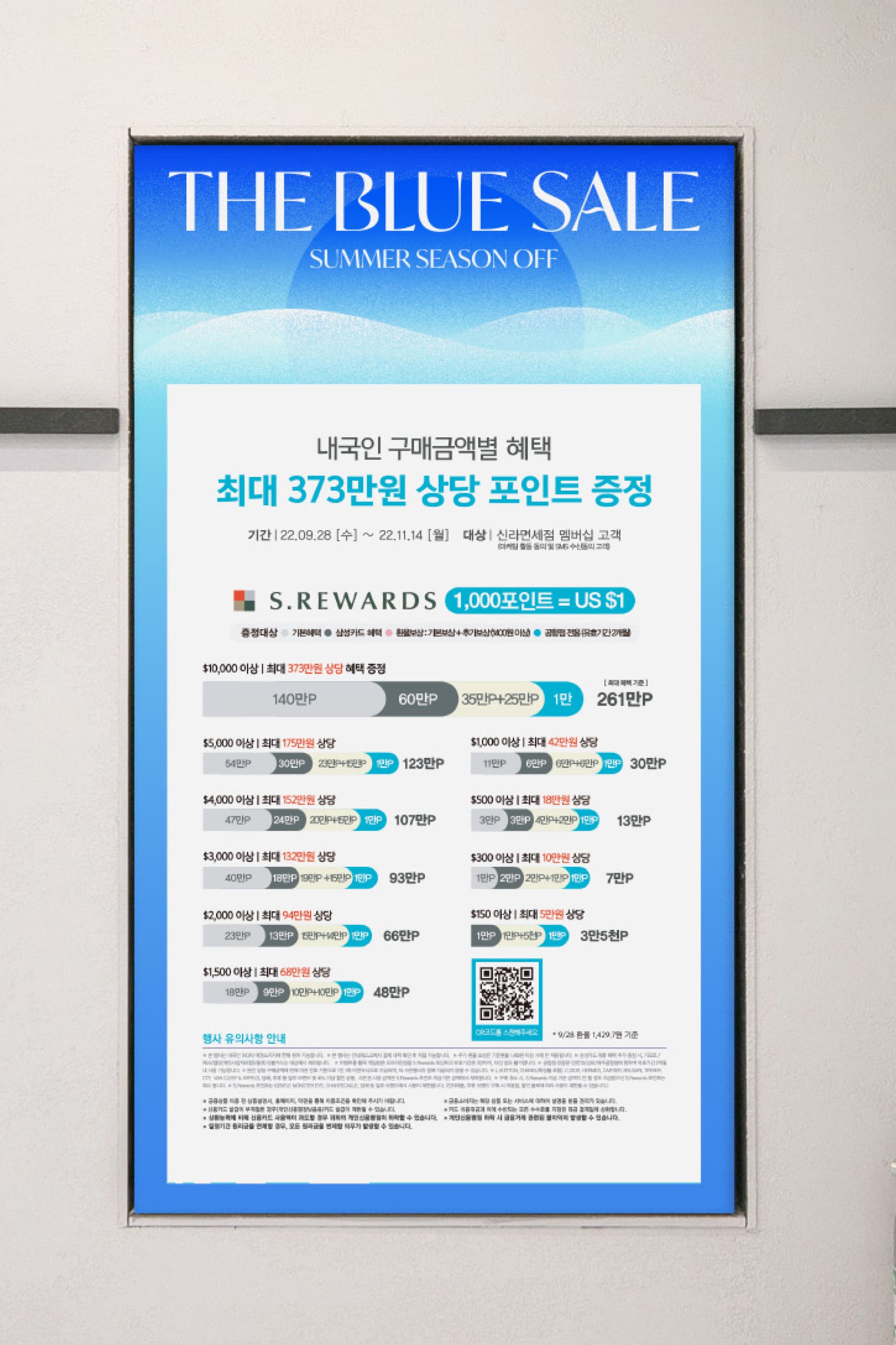
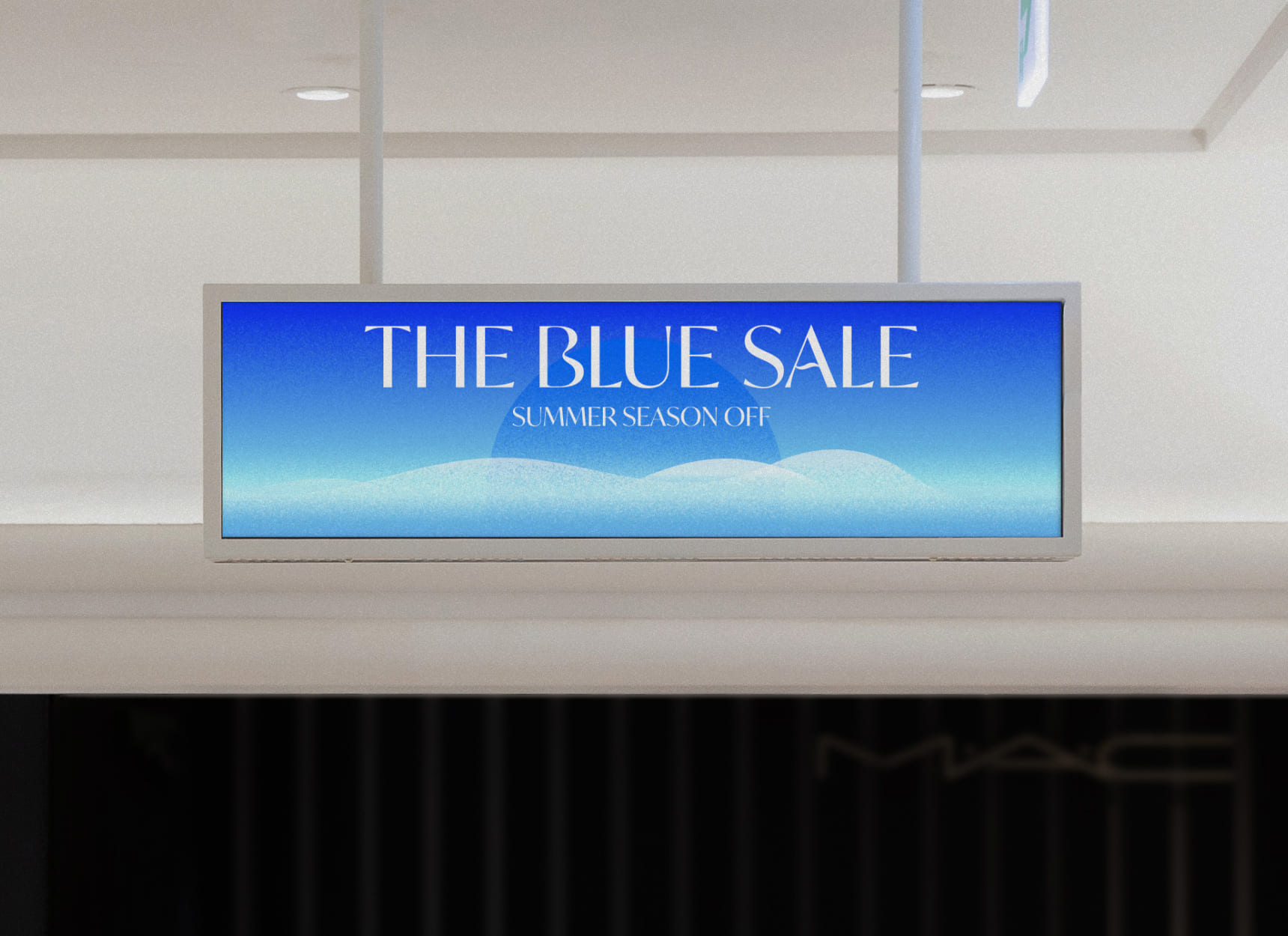
We apply the key visual graphics across various applications to convey the identity of "THE BLUE SALE" to customers. Through this, we communicate The Shilla Duty Free's refreshing summer image to customers.
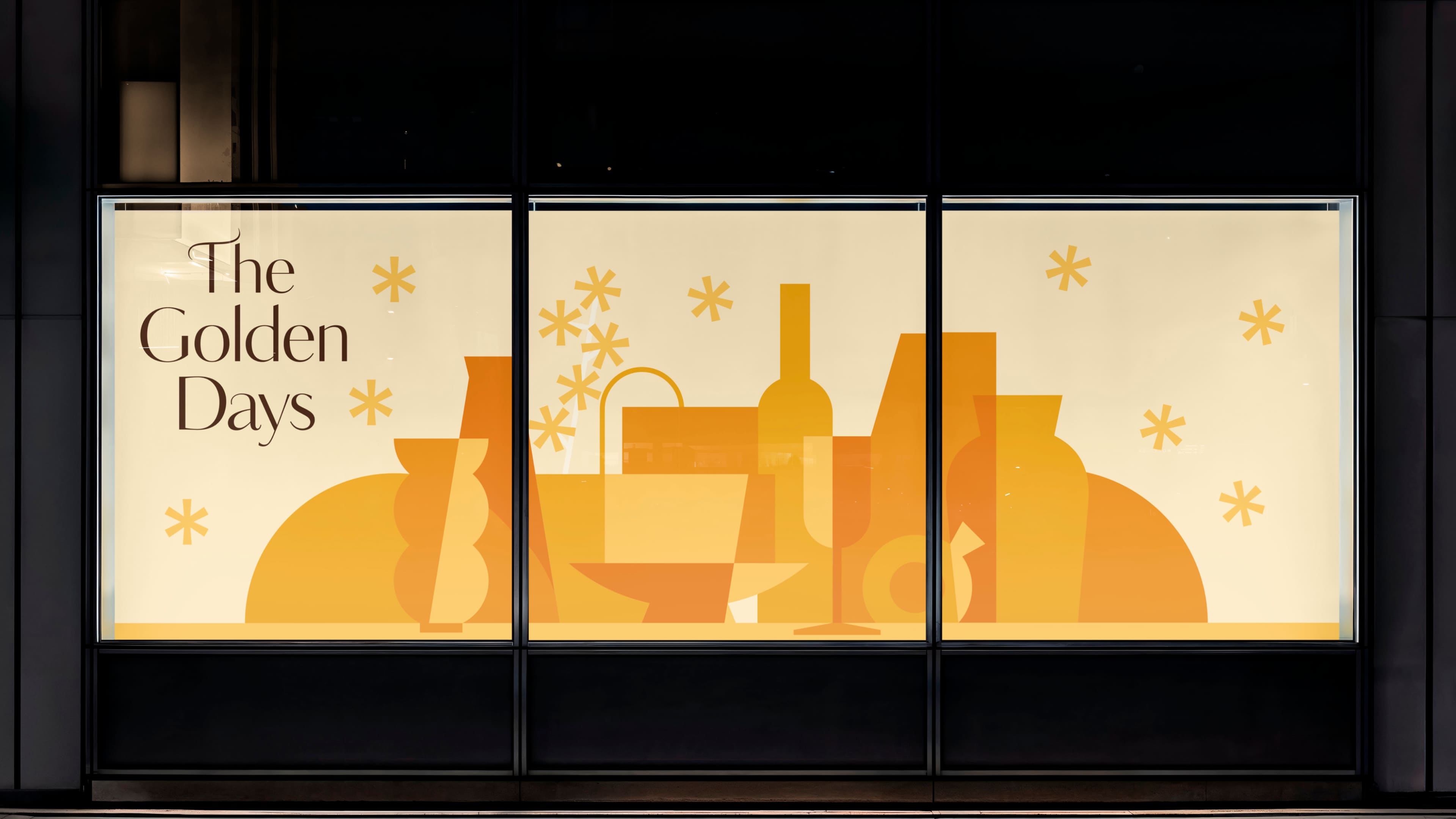
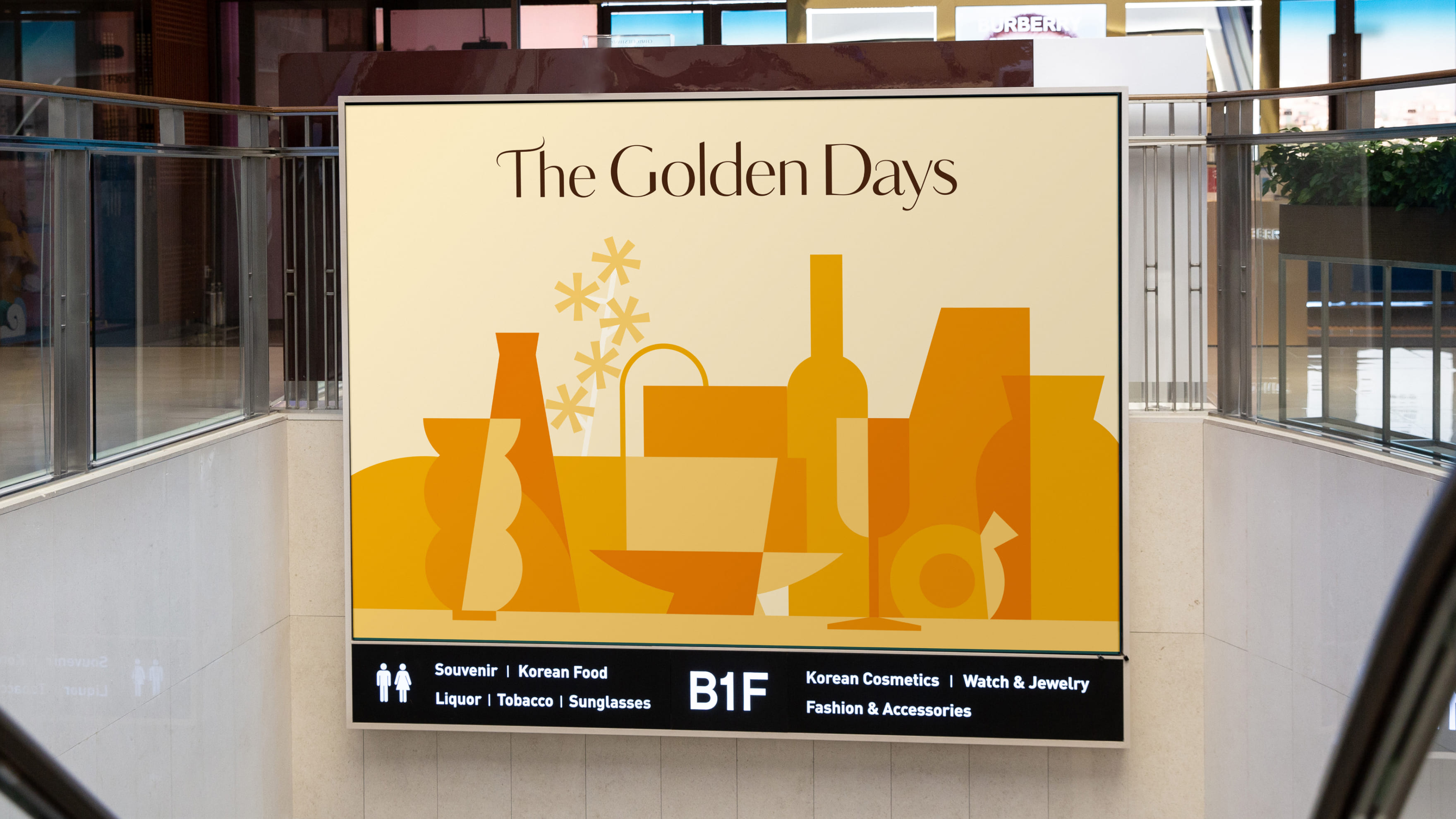
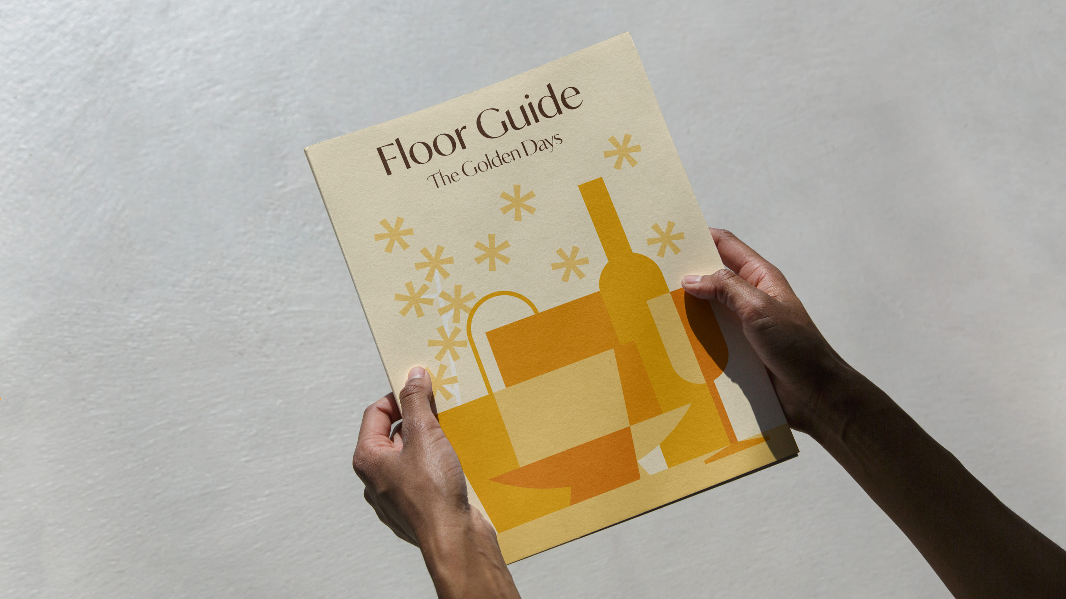
This is the season graphic for "The Golden Days" at The Shilla Duty Free during the autumn season. The graphic features abstracted and simplified shapes inspired by products sold at The Shilla Duty Free, layered together to symbolize the season of abundant autumn shopping, coinciding with the long holiday known as "Golden Week" for Chinese tourists.
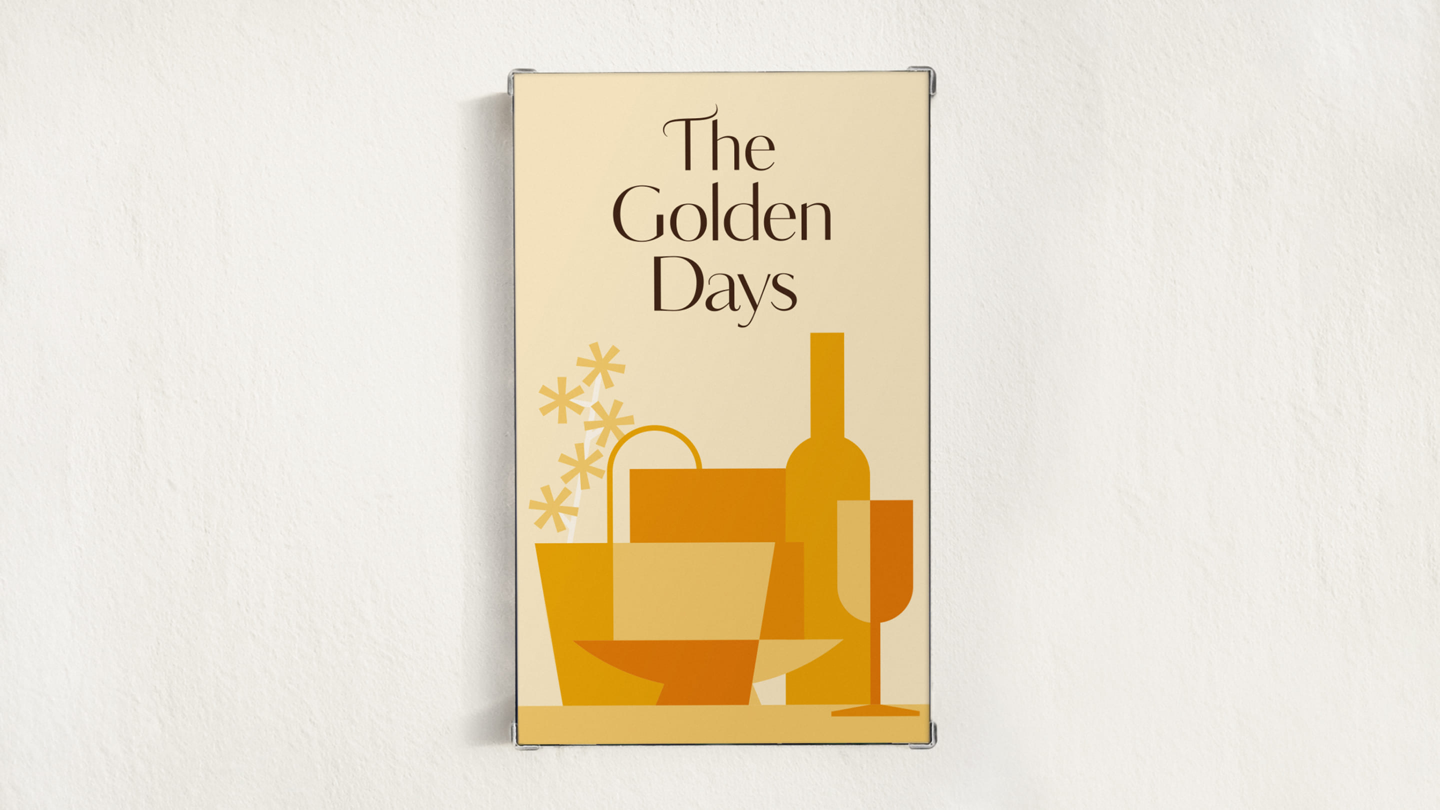
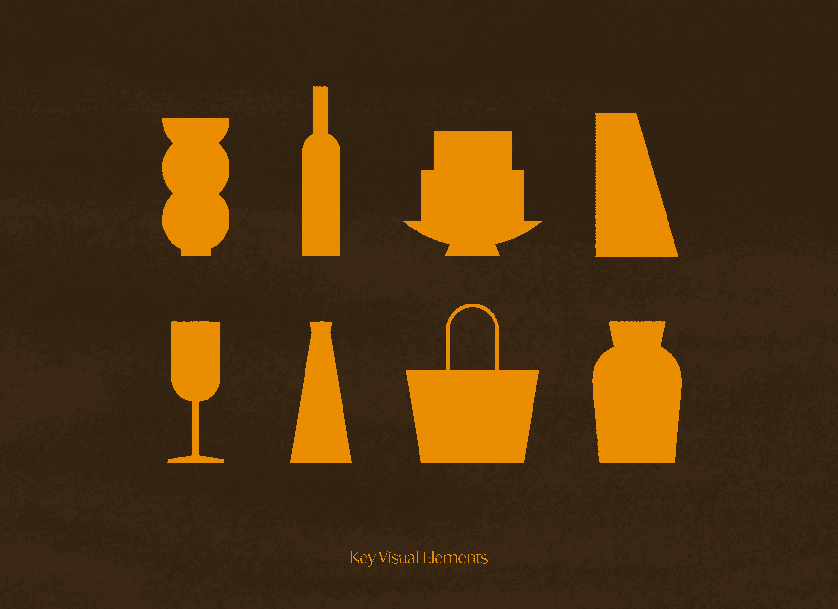
Abstracted and simplified Key visual Element graphics, inspired by products sold at The Shilla Duty Free, are layered together to symbolize the abundant autumn shopping experience at The Shilla Duty Free. Element graphics of "The Golden Days" consist of a total of 11 shapes, forming the key visual.
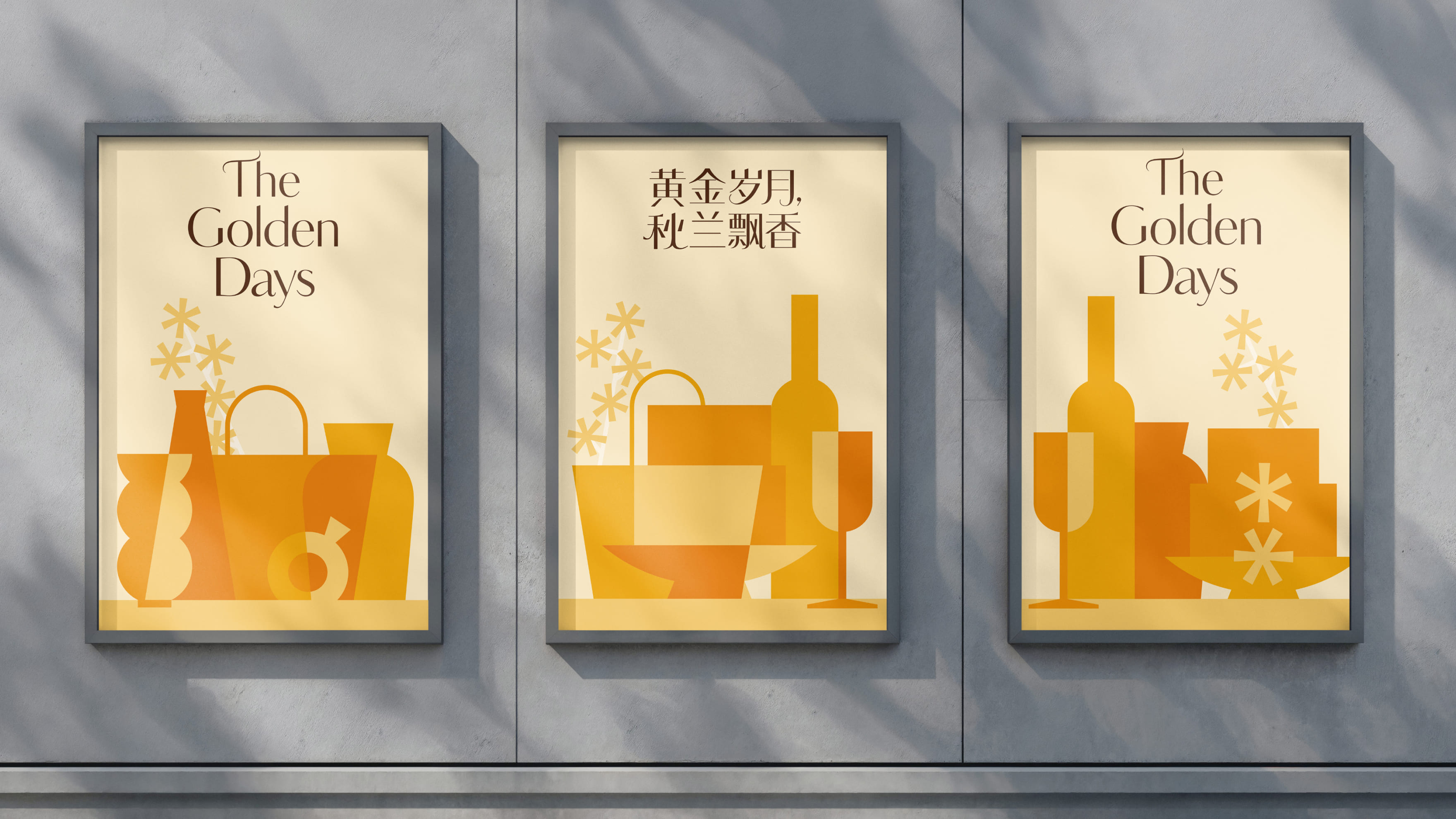
We have created an English title, 'The Golden Days' and a Chinese title for Chinese tourists. Tittle characterized by lively curved shapes represents the joy of shopping and the richness of autumn.
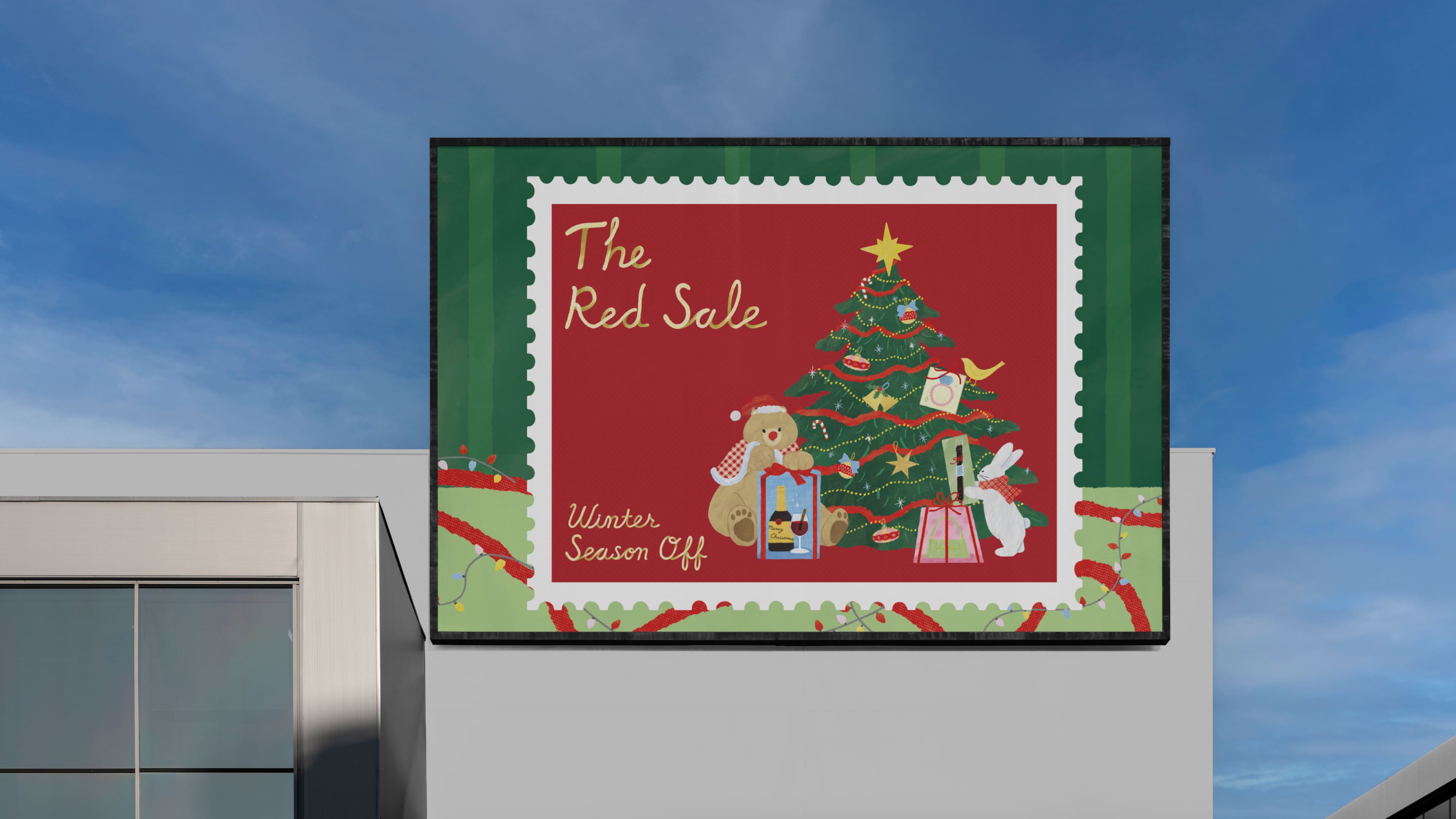
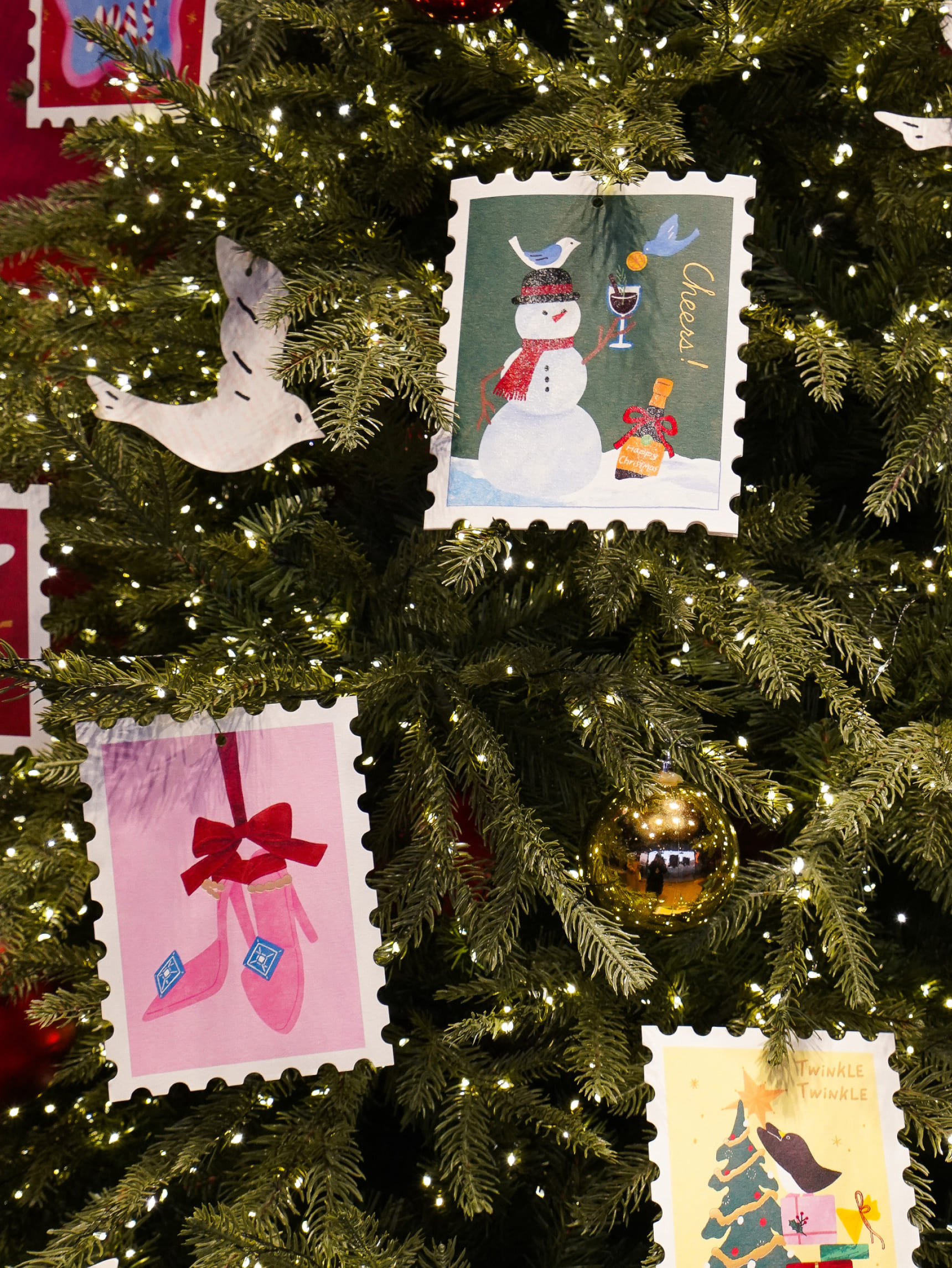
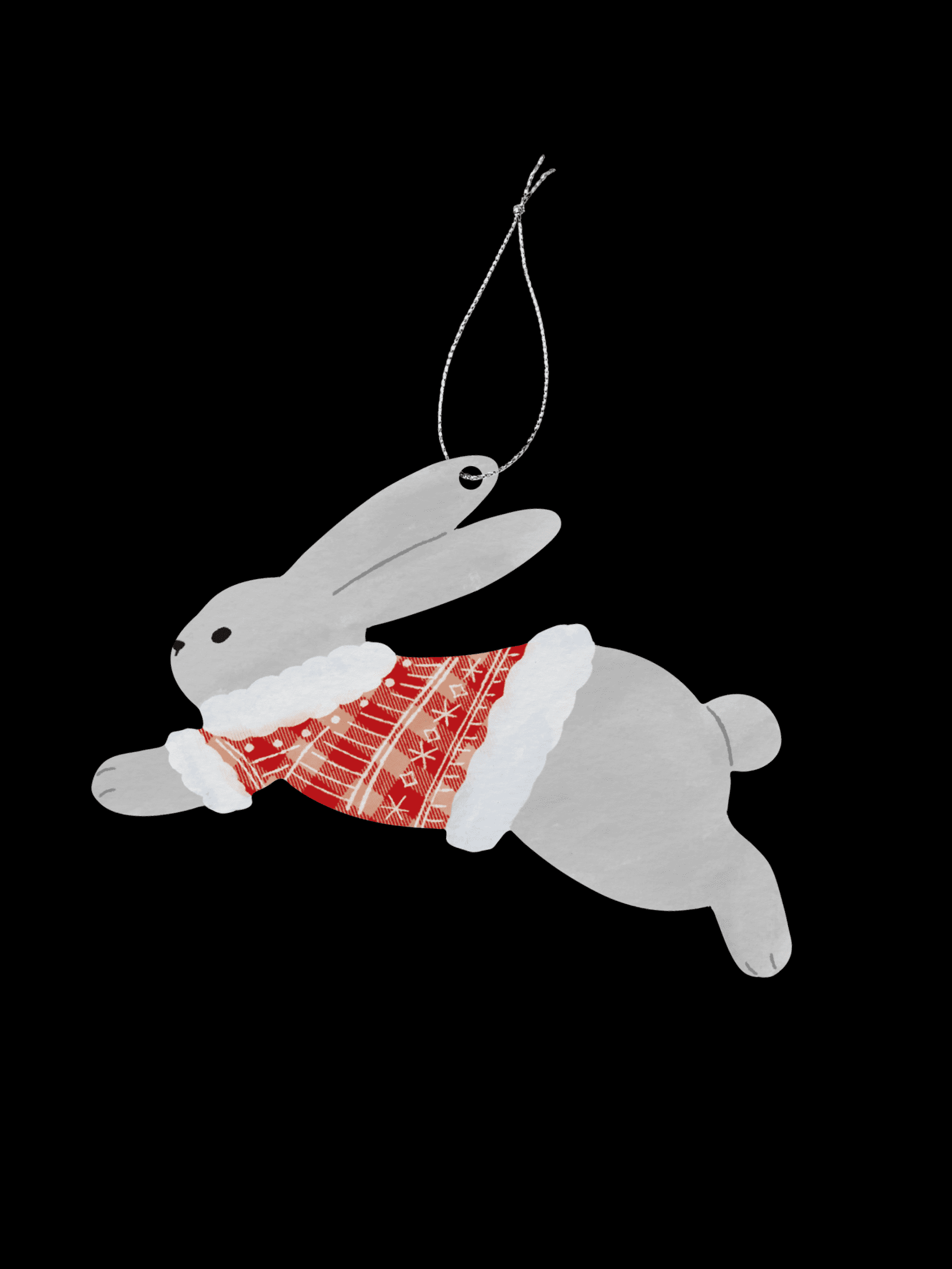
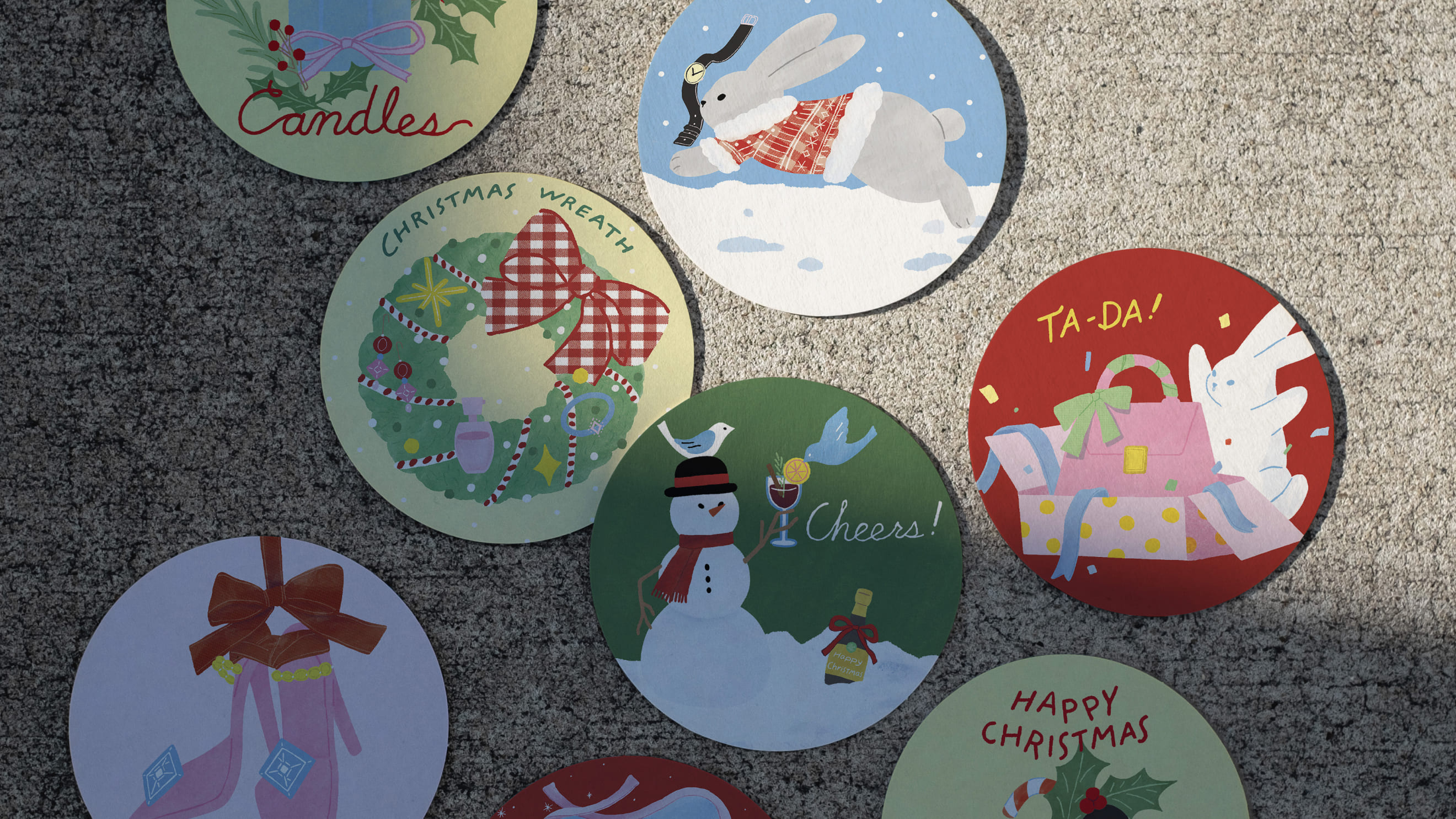
The winter season graphic for The Shilla Duty Free, titled 'THE RED SALE,' is themed around Christmas. Both the main and sub visuals feature illustrations of animals, Christmas decorations, and products inside stamps to create a fairy-tale atmosphere.
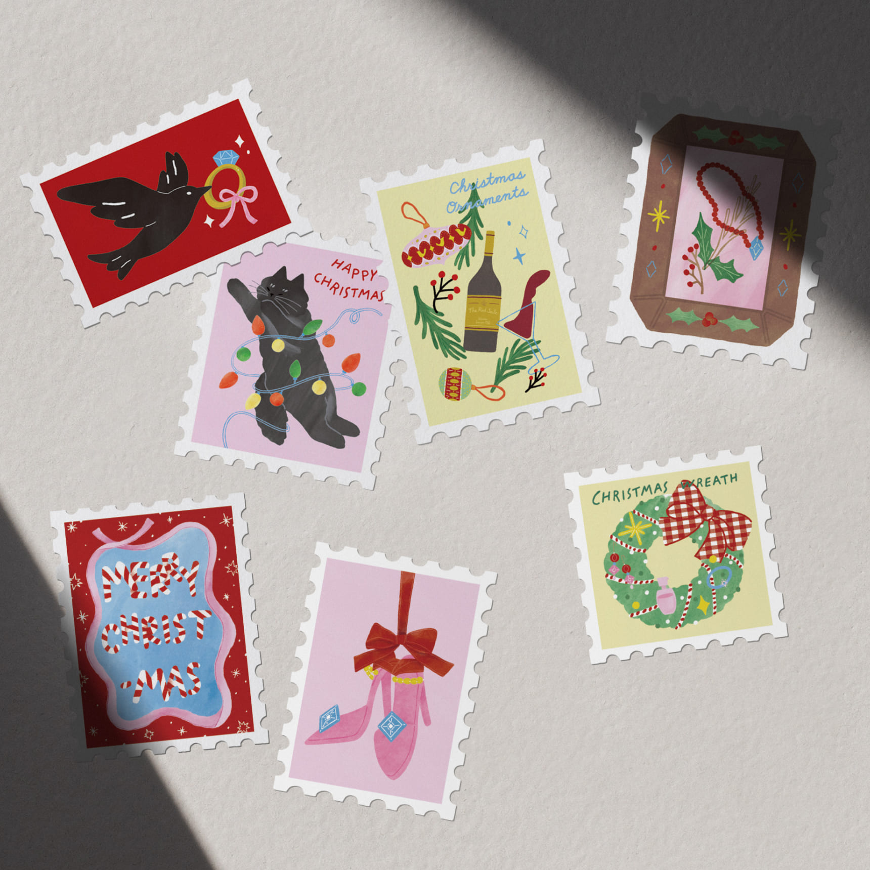
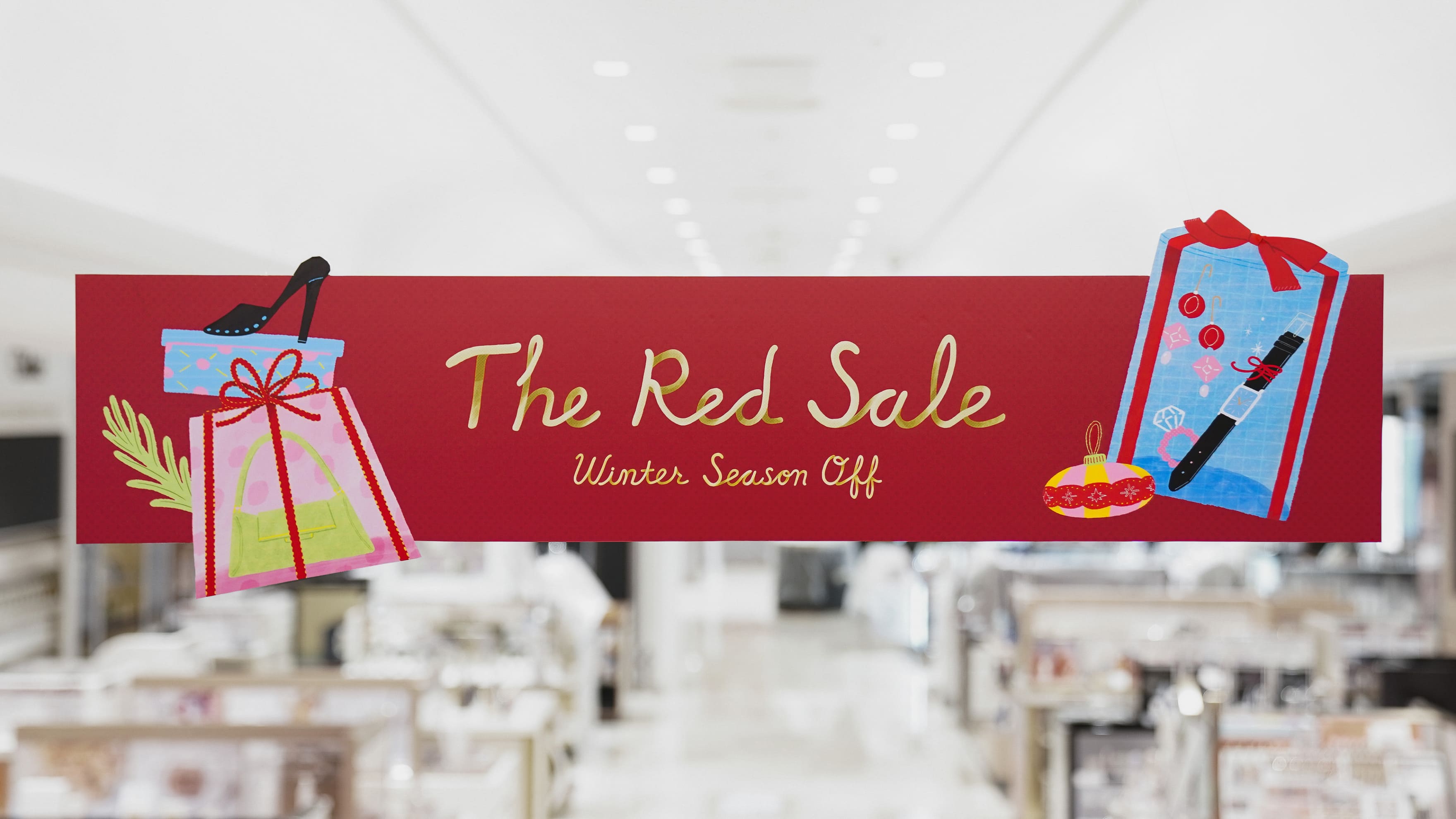
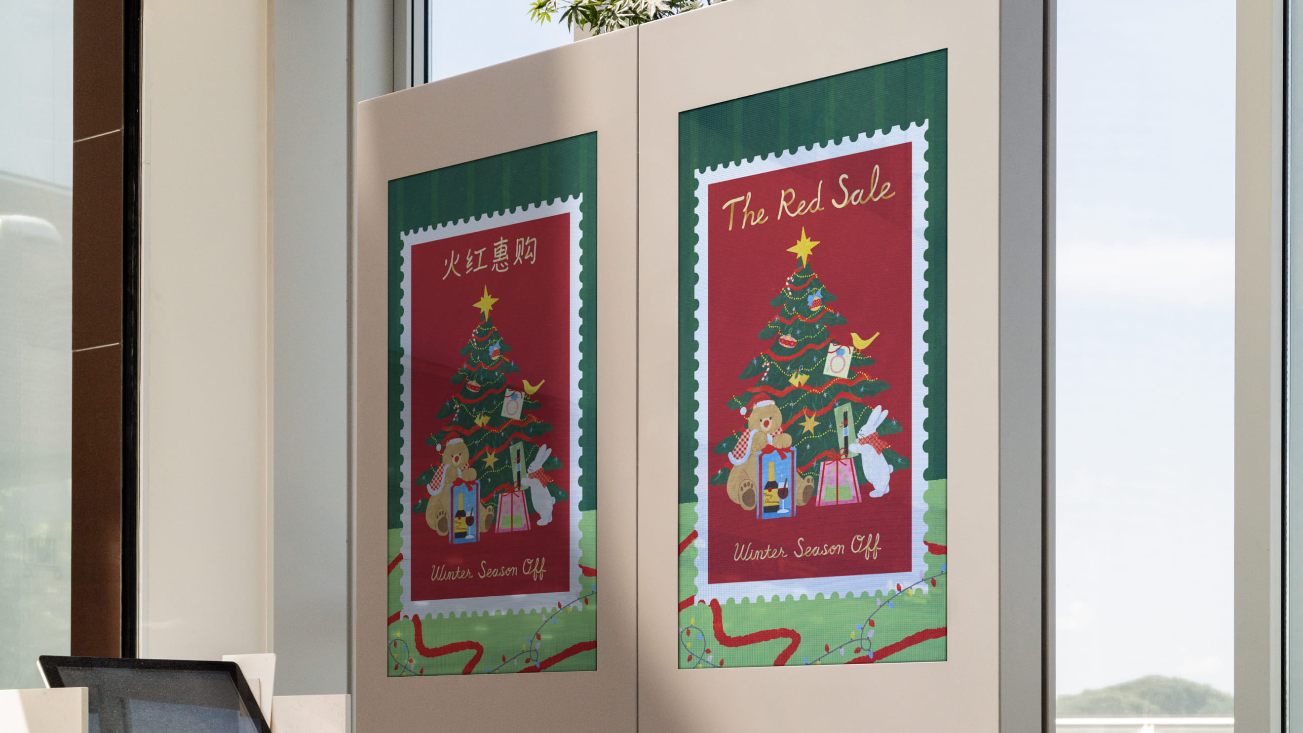
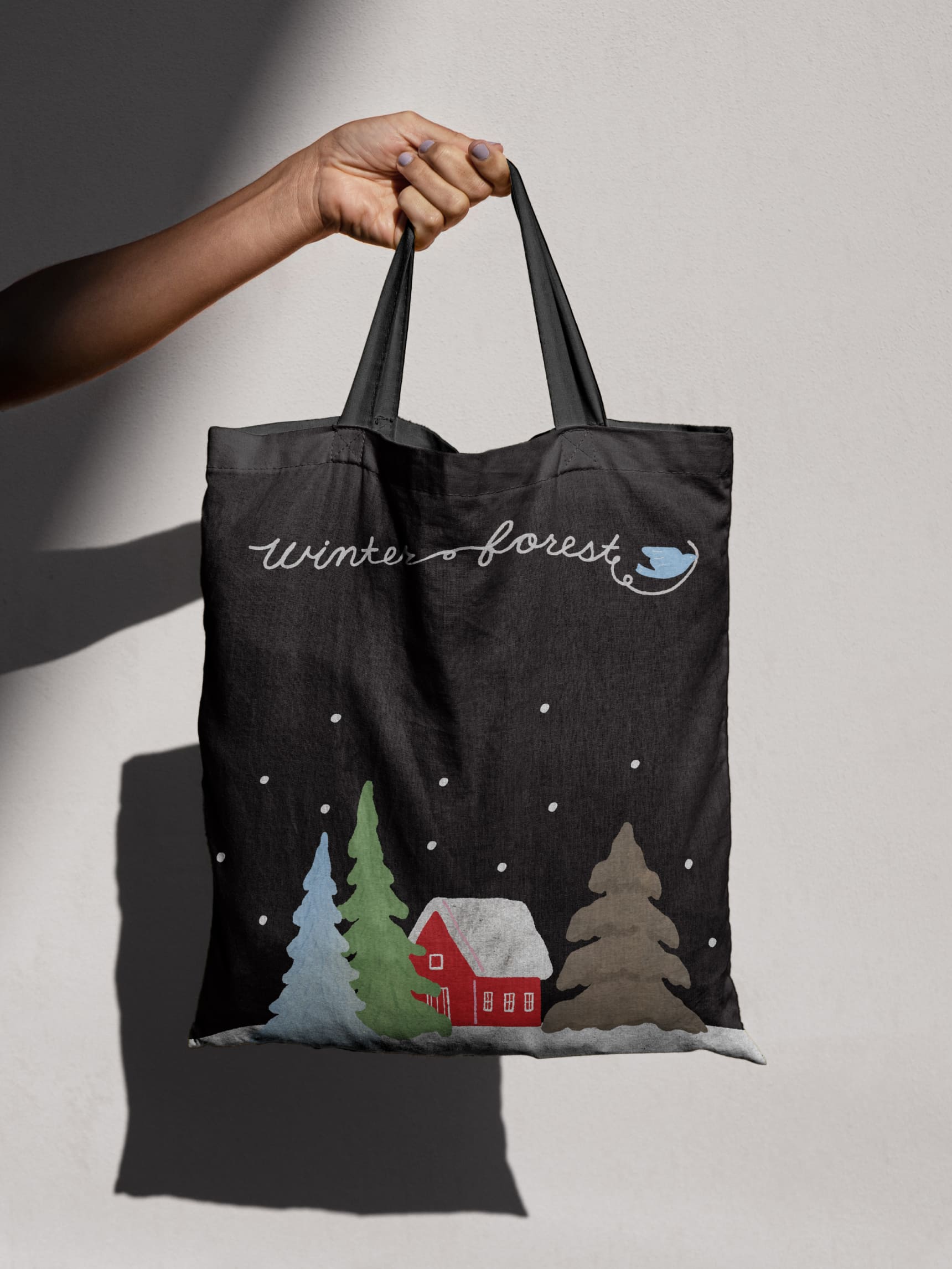
We create illustrations for key visuals using various applications such as The Shilla Duty Free's tree ornaments to convey the identity of THE RED SALE to customers.
Shilla Duty Free
Season VM Design
BRENDEN
Creative Direction / Do-eui Lee
Project Management / Wook Jung
Design / Haena Yang, Juhyun Lee, Hanbeom Choi, Hyewon Jang, Jieun Lee, Juhye Ma
Creative Partner / Sai woo, Eunhee Lee
Client
The Shilla Duty Free