NAVER App
Renewal Promotion
Key Visual & Website Design
This project is a promotion aimed at effectively conveying the enhancement of usability and internal service refinement of the NAVER app to users. The primary goal is to communicate the redesign of the bottom navigation bar's swiping and the Green Dot architecture to users without any resistance.
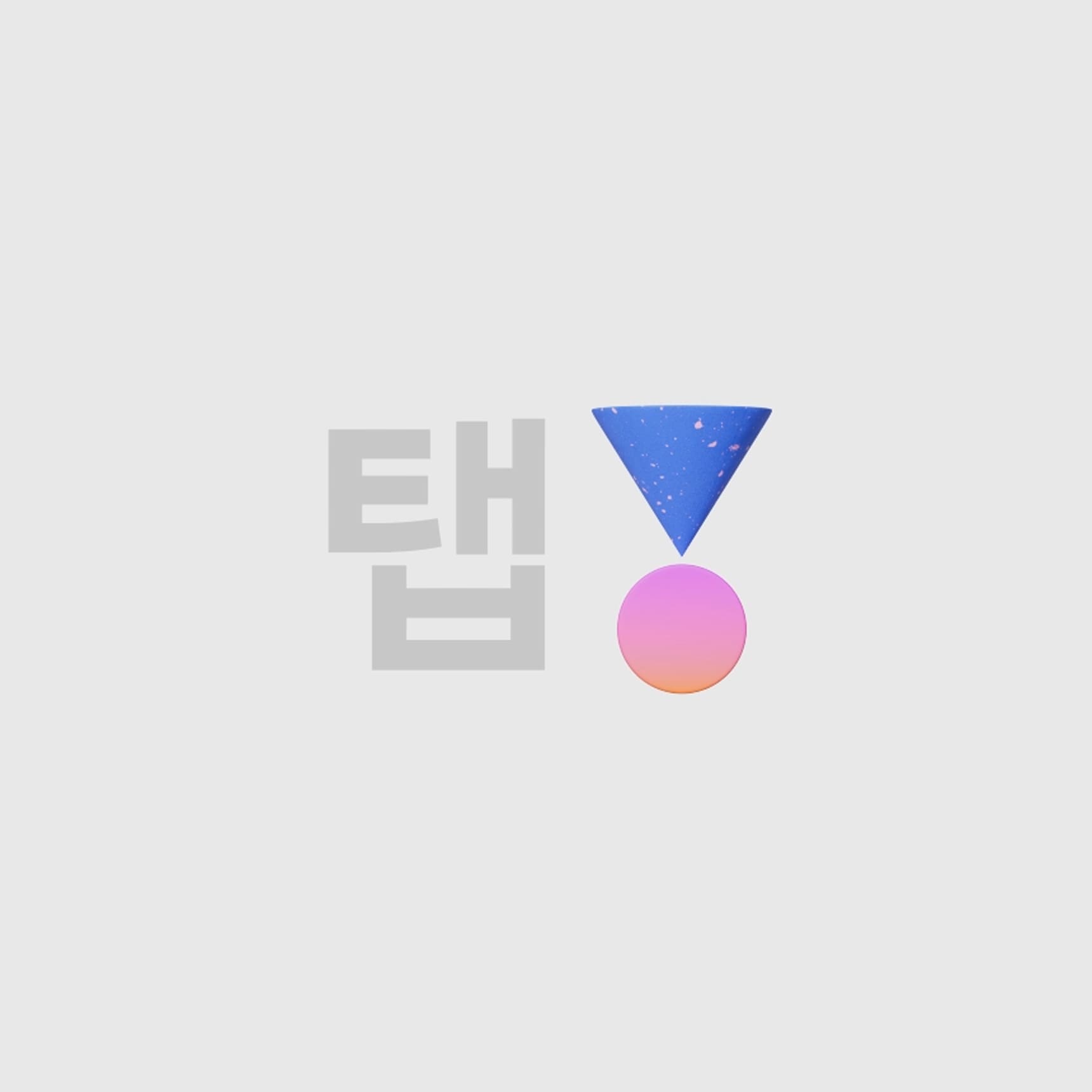
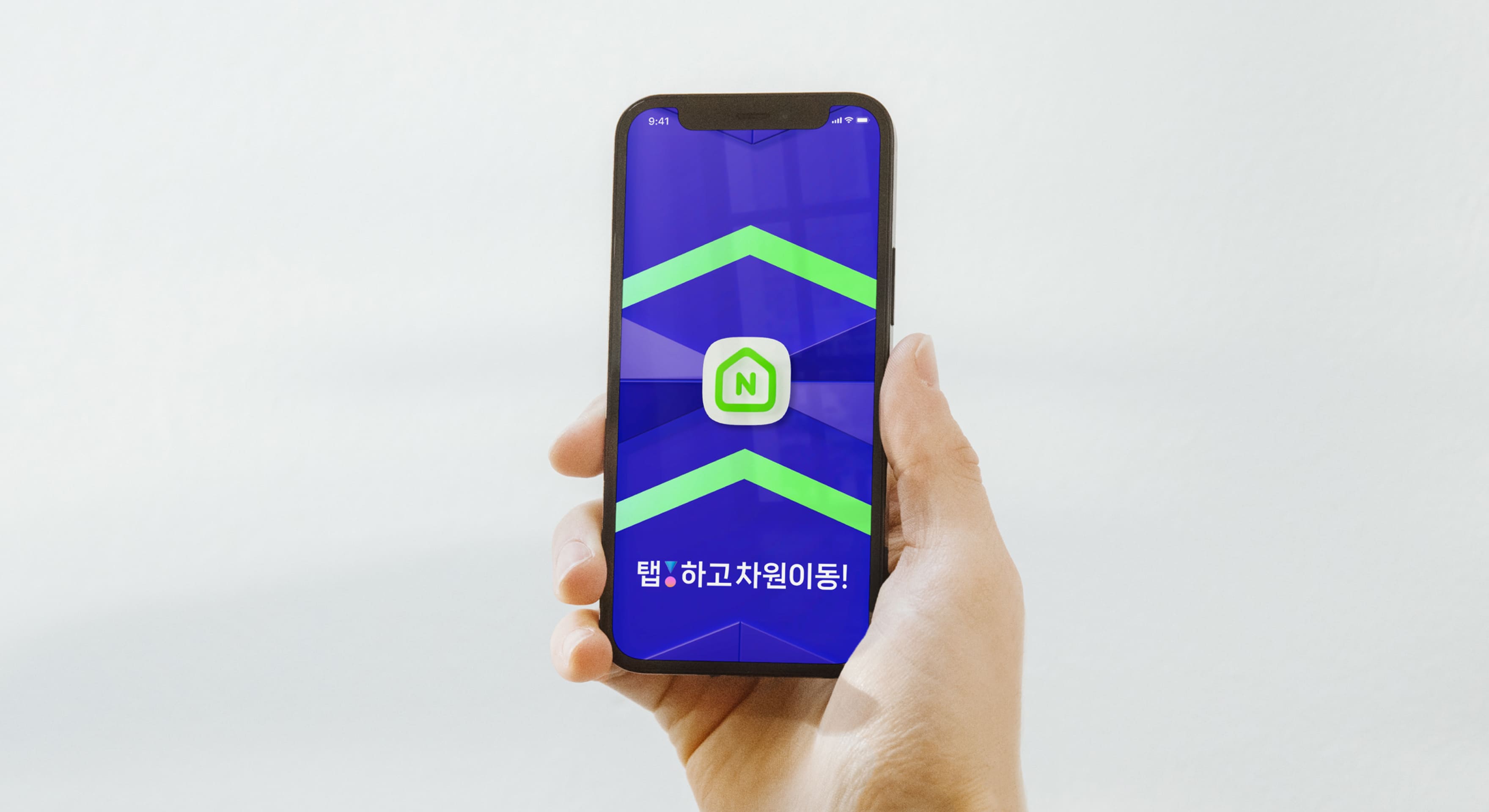
We have developed the verbal identity with the campaign slogans "Tap and transcend dimensions" and "Practical enjoyment!". We translated this into visual key visuals by designing "intuitive tab icons" and "exclamation marks associated with joyful emotions."
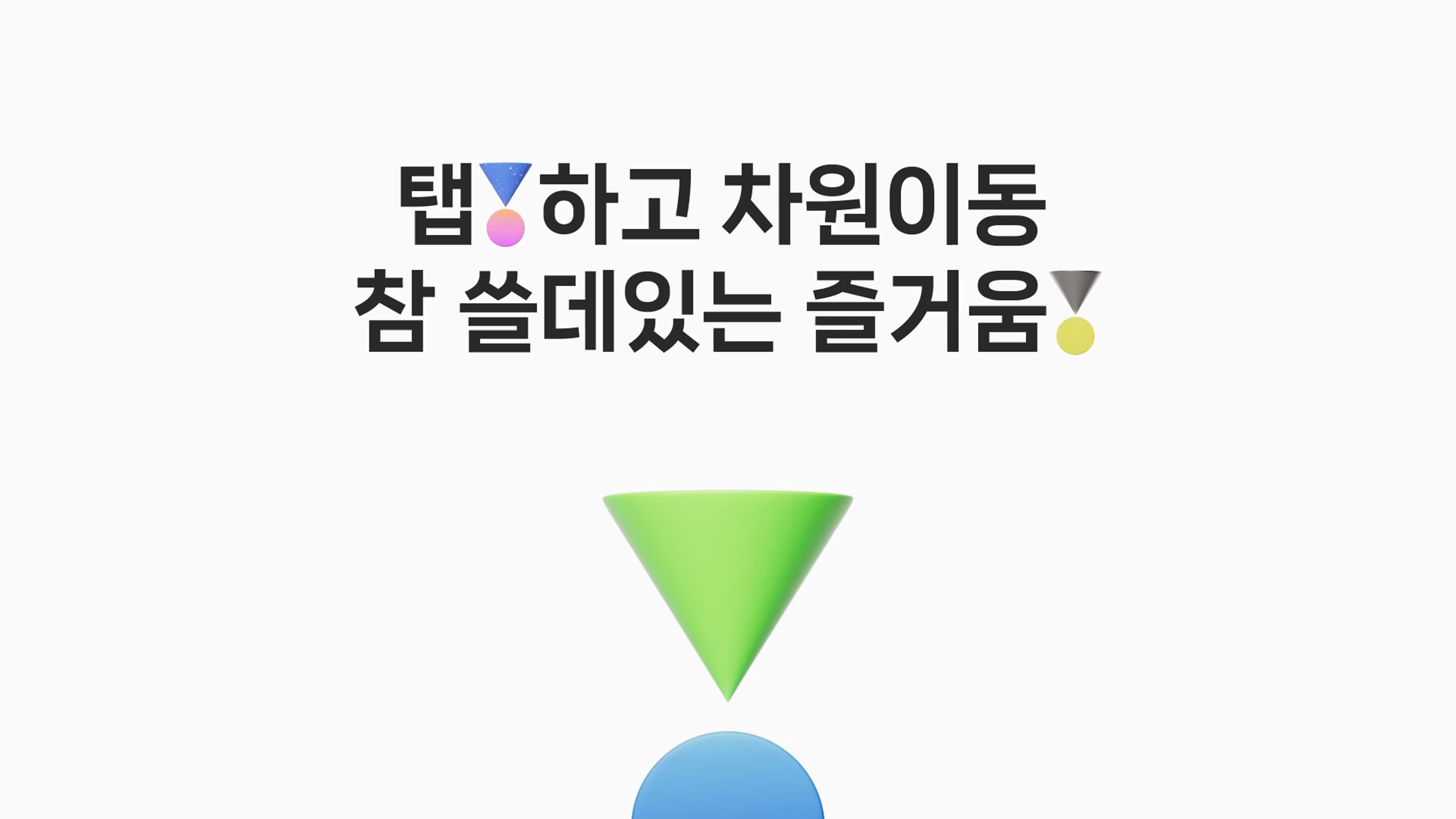
The key visual resembling an exclamation mark consists of triangles representing user touches and circles representing interactions occurring on the screen. This graphic motif is utilized in the main motion graphics to help intuitively convey tapping and joyment.


The newly developed verbal identity and visual key visuals representing taps and exclamation marks have been utilized in the manifesto flow to convey the purpose and planning intentions of the promotion. This serves to effectively communicate to users the overall objectives of the promotion and the reasons for the renewal in a clear and concise manner.
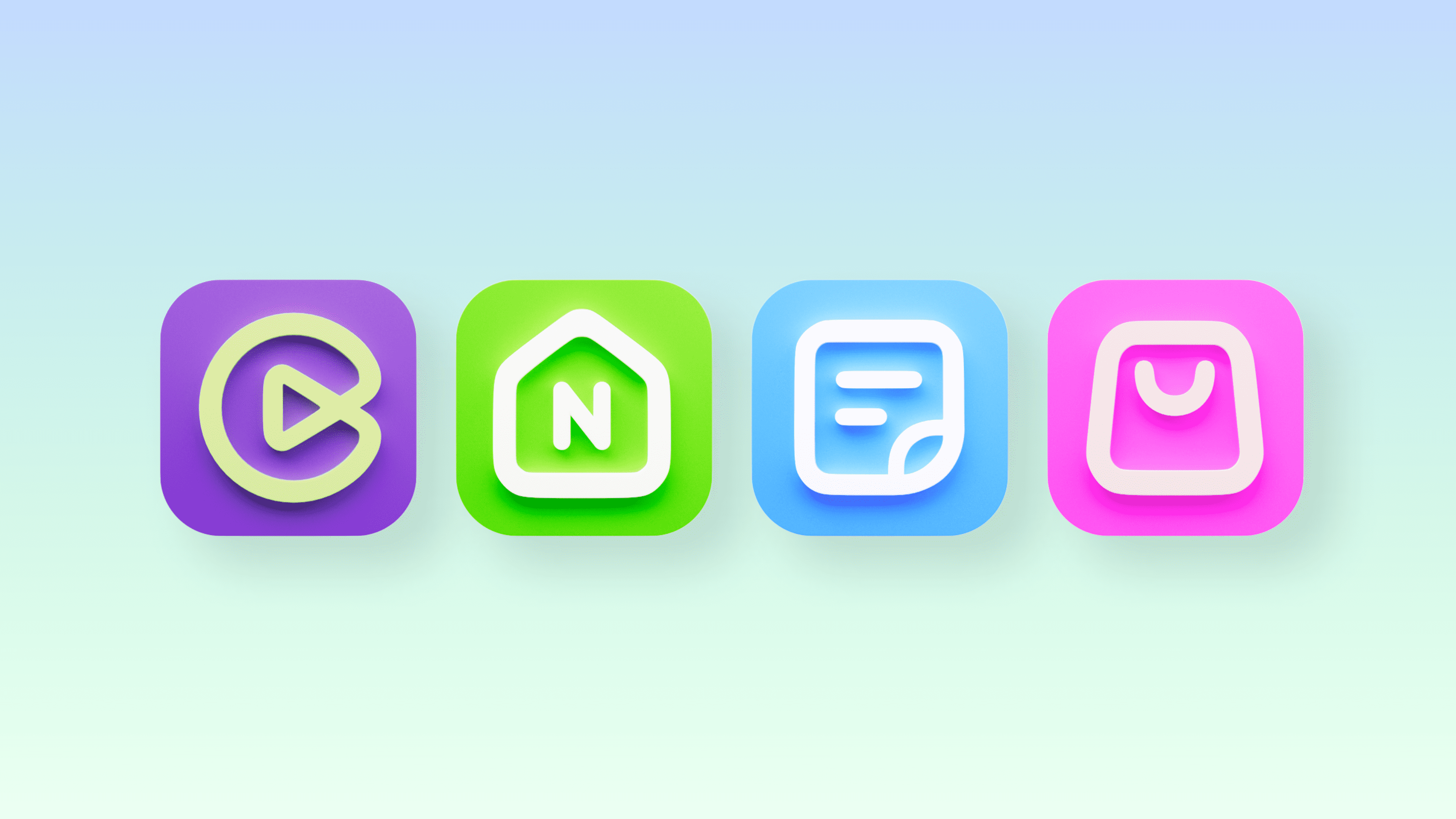
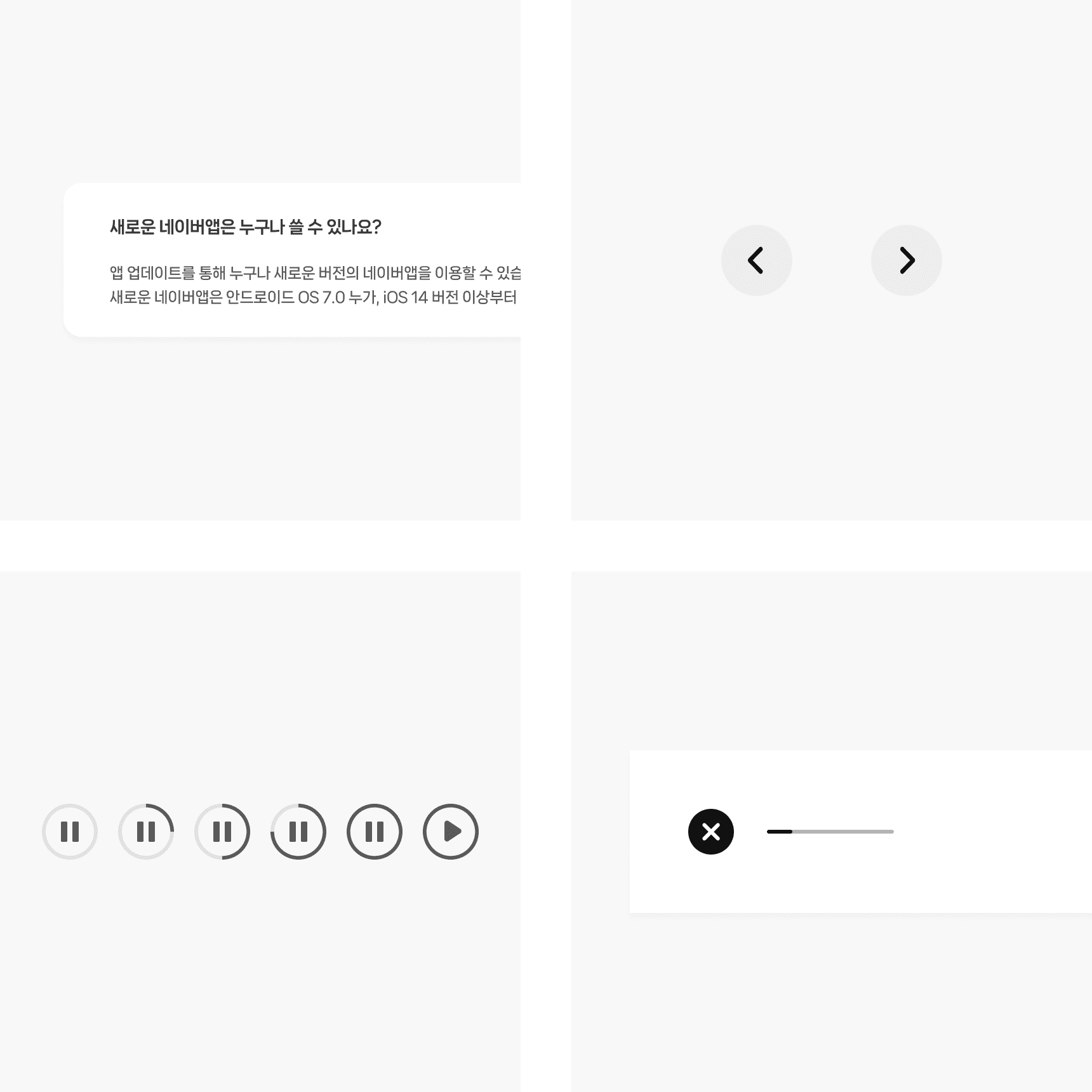
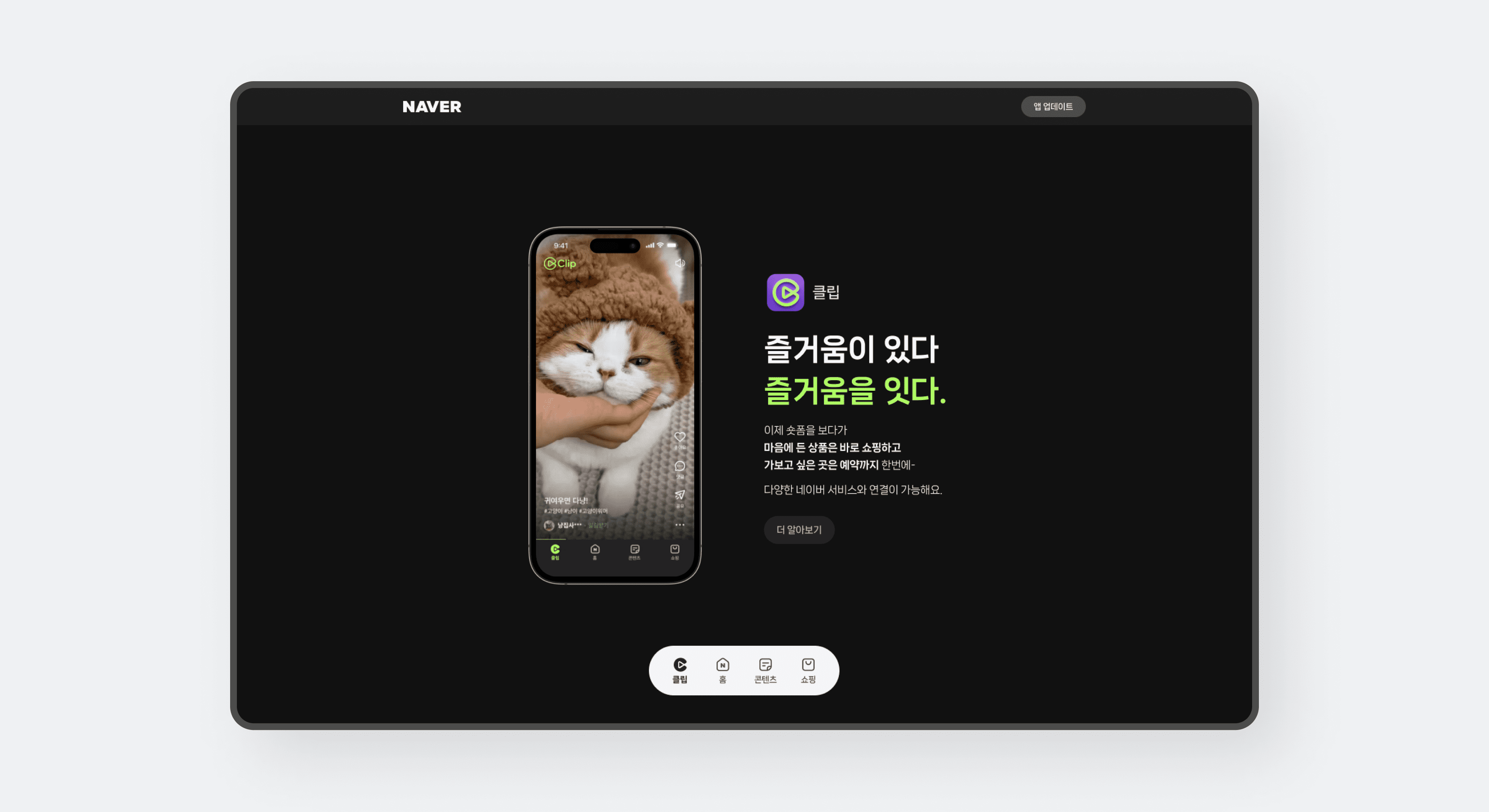
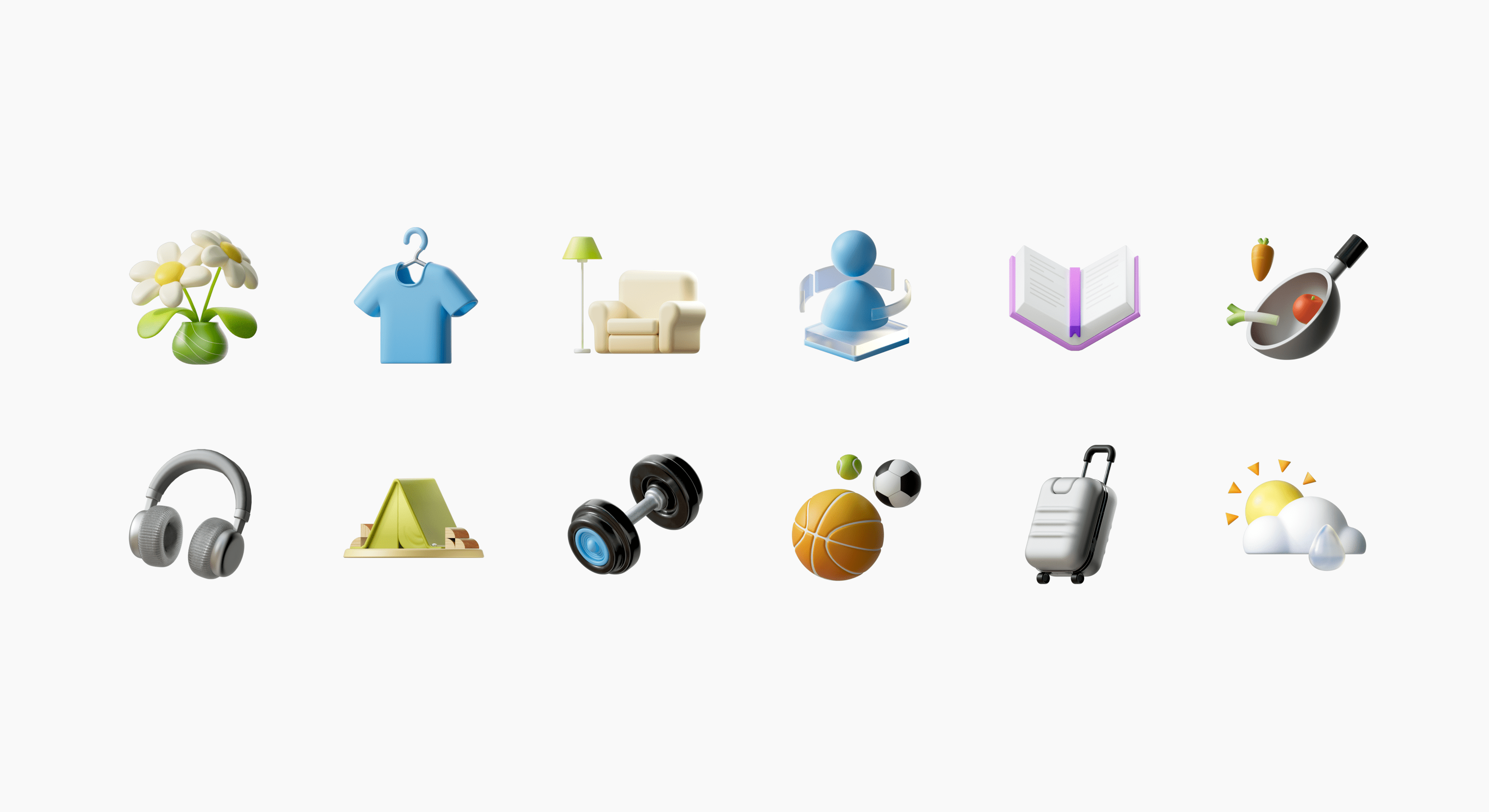
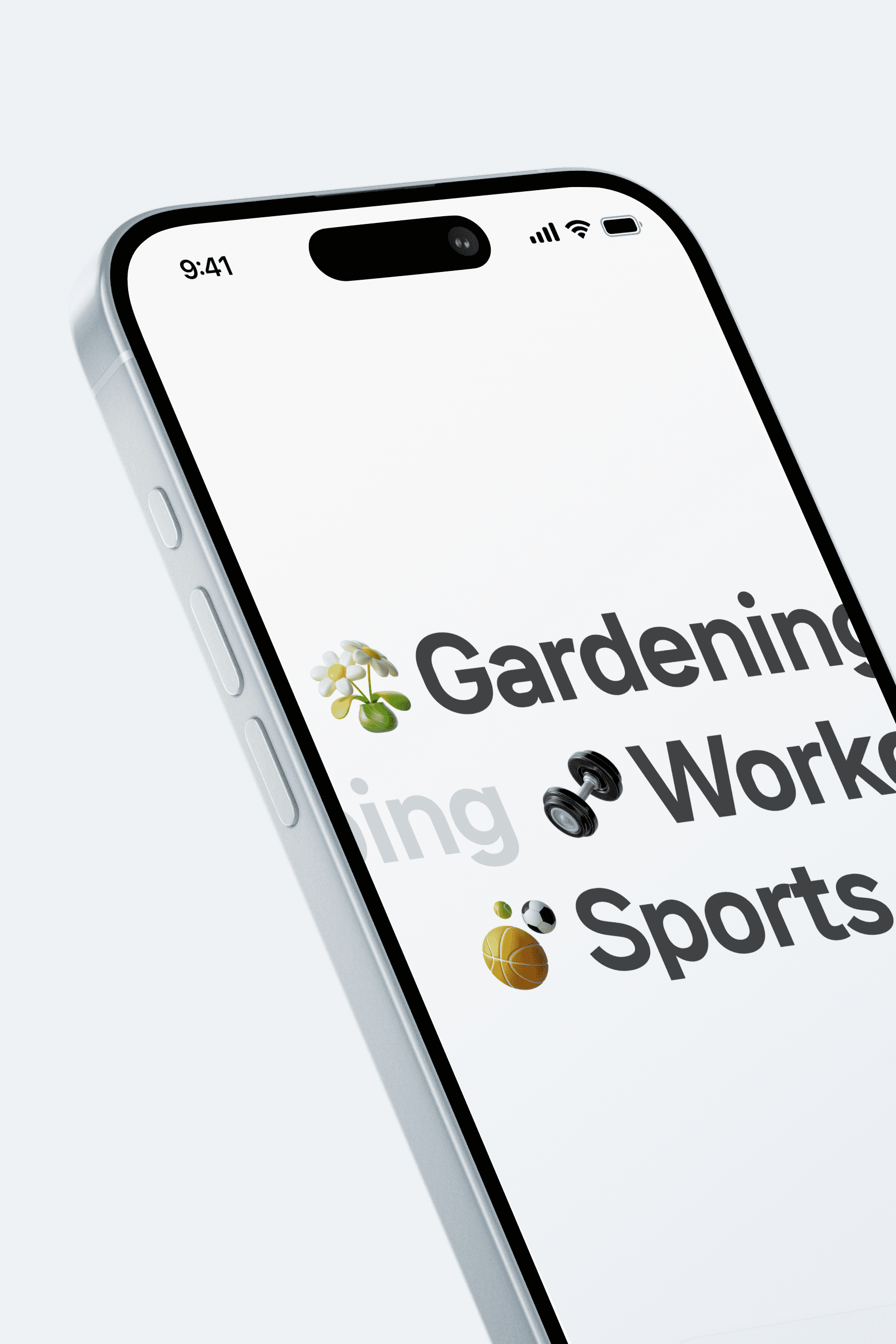
The navigation buttons fixed at the bottom of the promotion website implement the core of the app's renewal, which is the bottom tab bar. These buttons facilitate flexible navigation between pages corresponding to each tab. Additionally, we have developed 3D icons suitable for the nature of each tab and utilized them visually across the entire website.
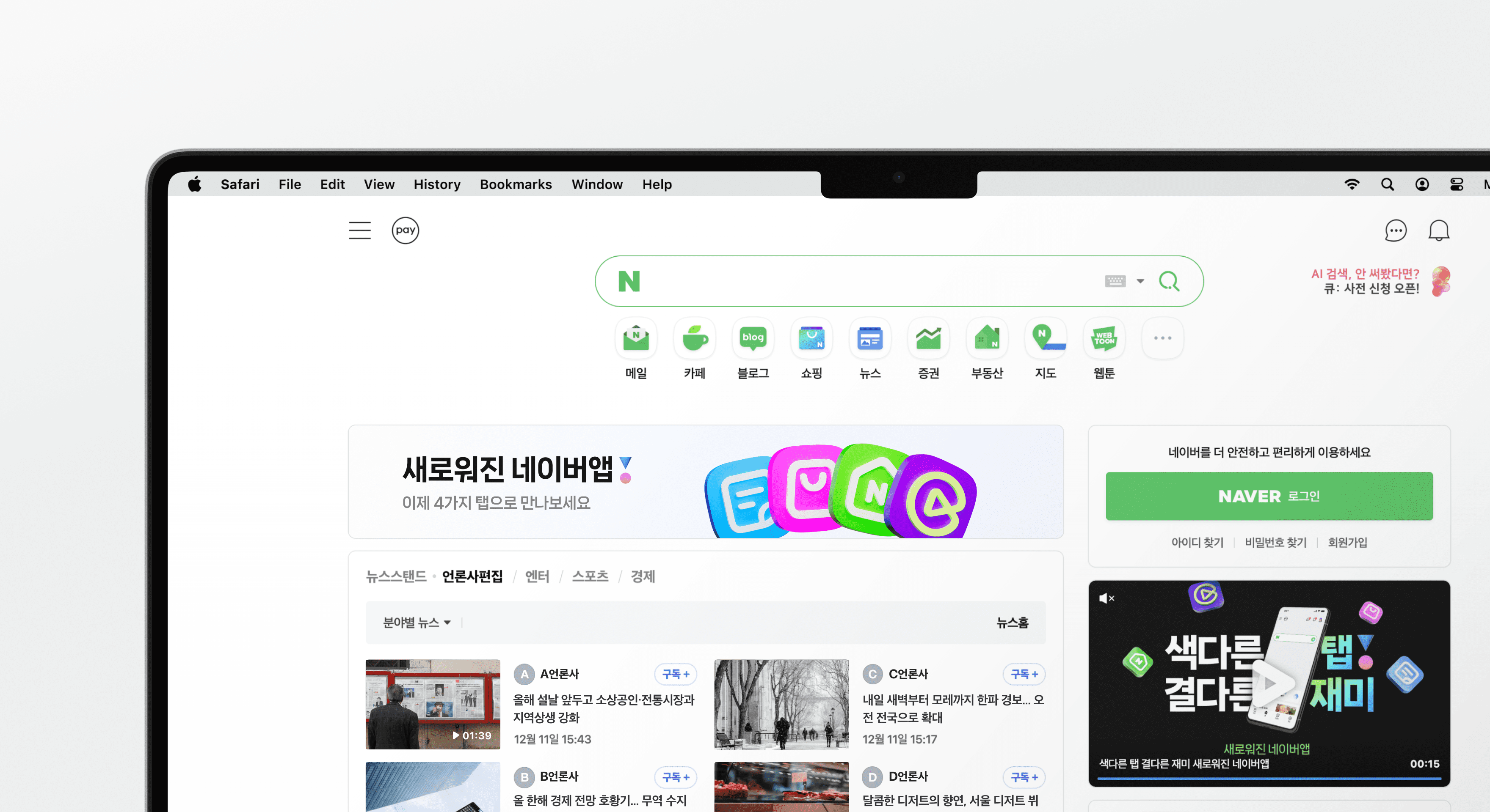
The website is designed with a layout that centers elements on the screen to provide a consistent experience across both PC and mobile environments. When the screen size is reduced, elements are prioritized and arranged downward accordingly. UI elements are crafted to maintain the essence of the tabs while remaining versatile for various environments.

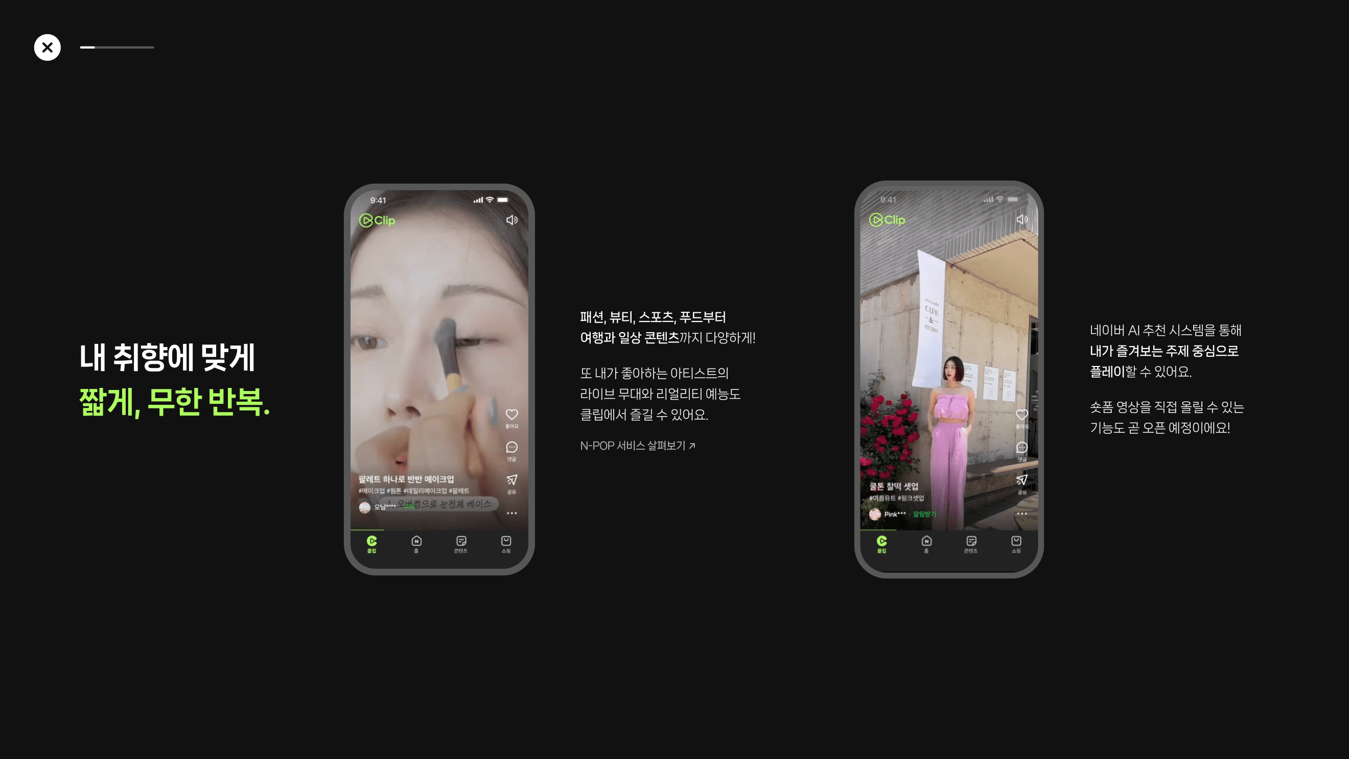
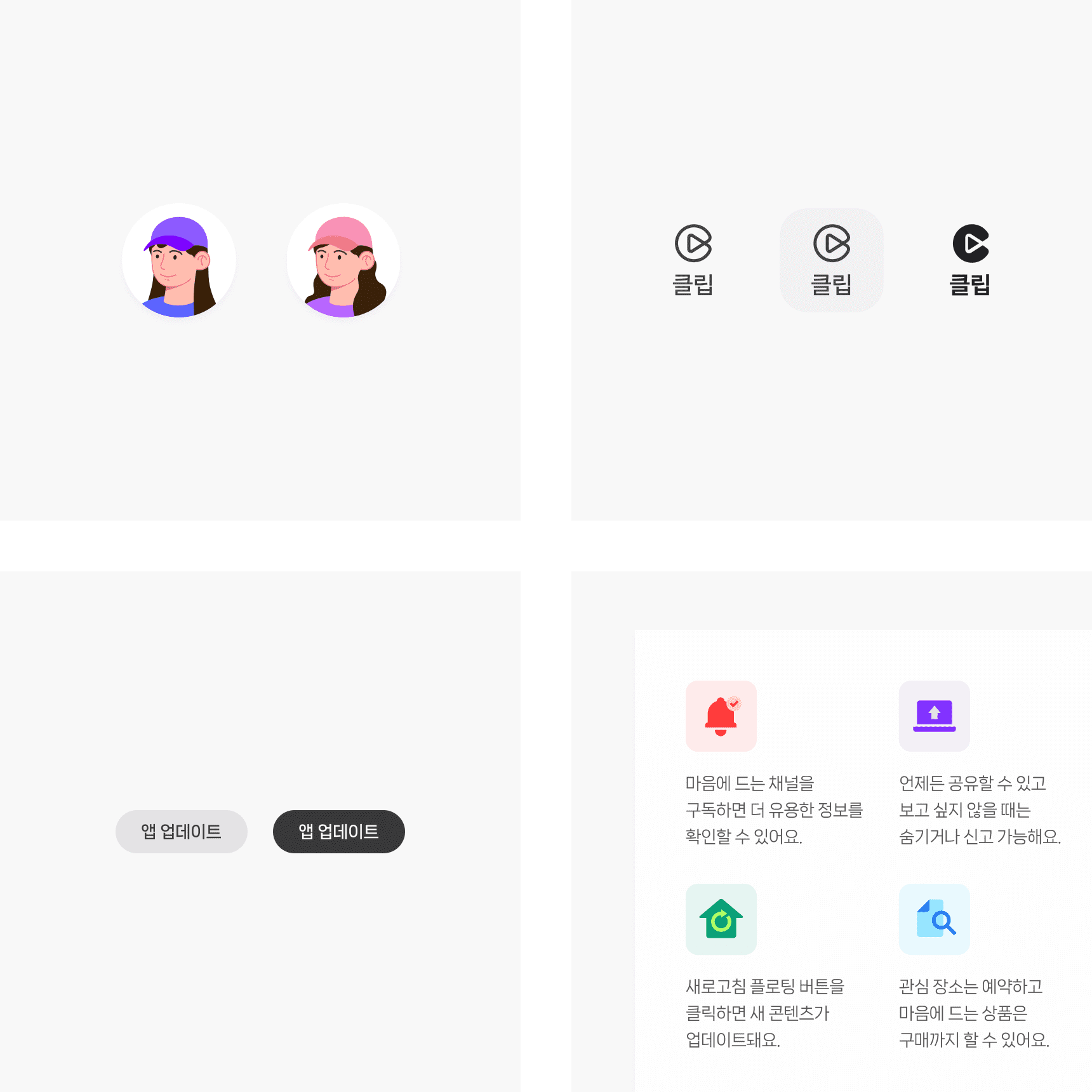
For detailed pages, a horizontal UI layout was implemented to deliver complex content effectively. Users can scroll horizontally to sequentially explore the content, ensuring they can navigate through extensive information without disruption.
Additionally, components and mobile videos were positioned to explain the revamped functionalities, aiming to enhance users' understanding effectively. Horizontal scrolling is implemented consistently across both PC and mobile platforms to provide a cohesive user experience.
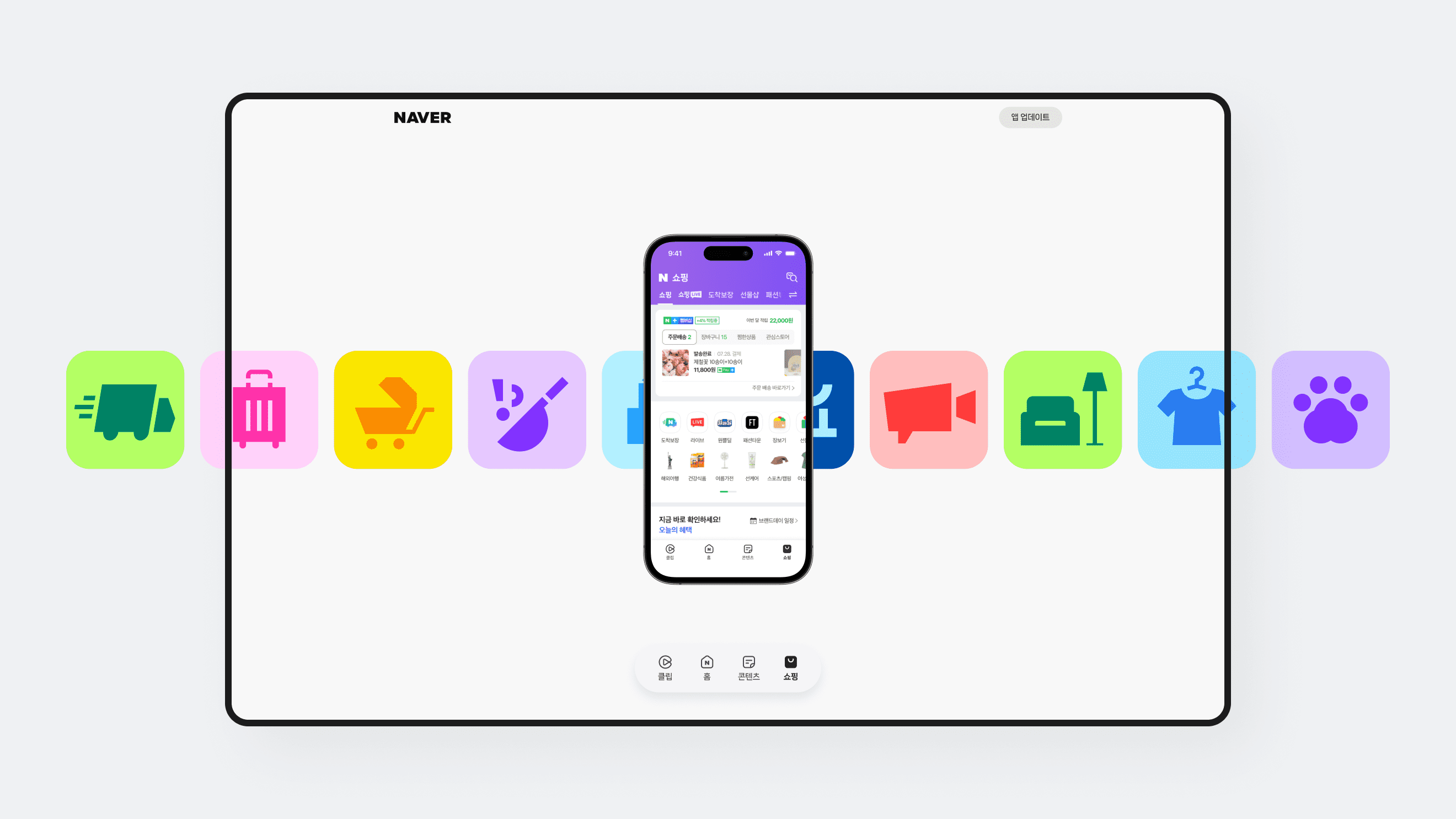
The sub-icons used for the Clips, Home Feed, and Shopping tabs were designed to match the mood of the main tab icons. These icons were developed in both 2D flat format, used on detail pages, and 3D format, seen in the main flow. Sub-icons were utilized throughout the web according to the hierarchy of content.
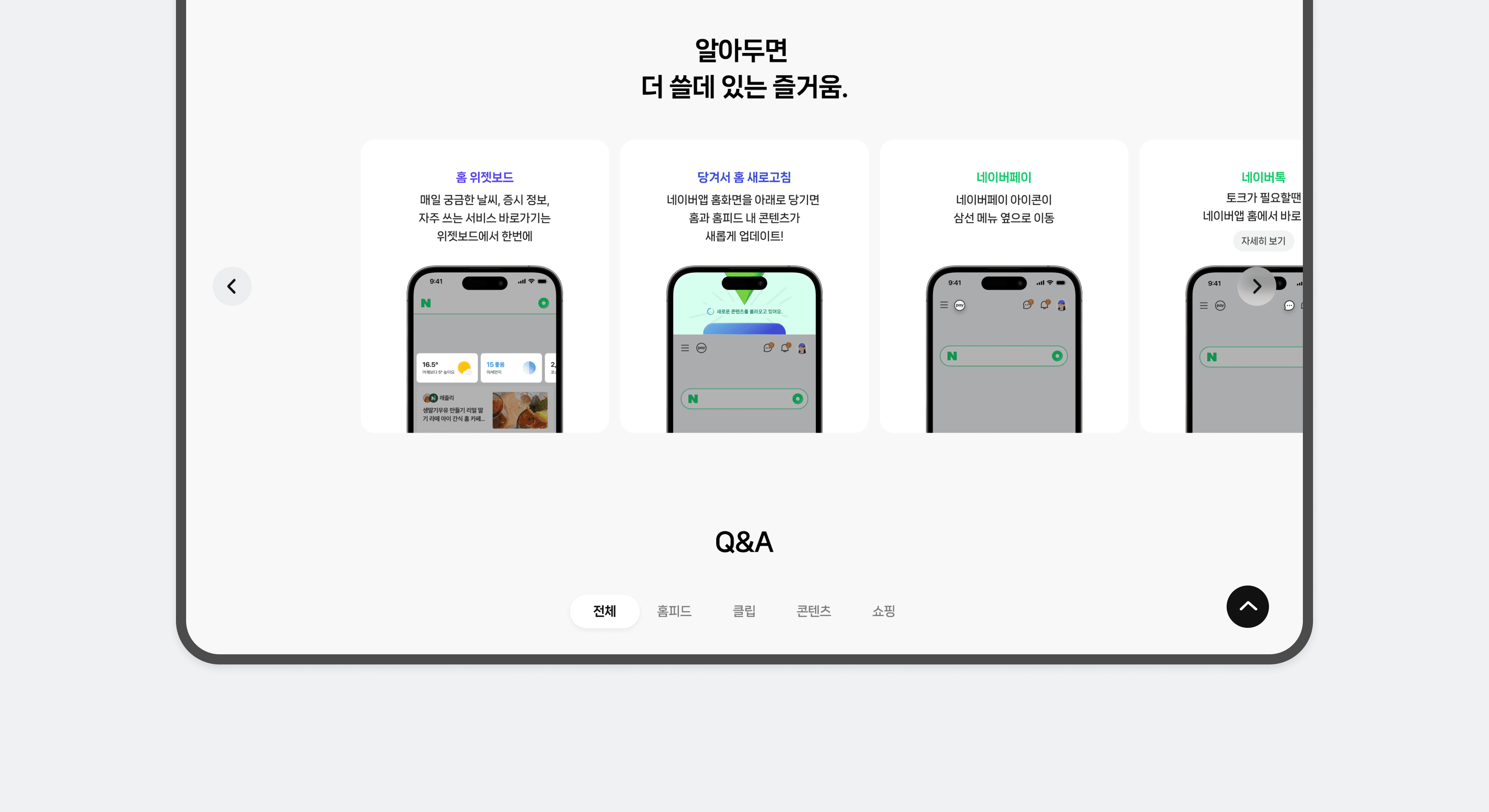
Additionally, the ‘More’ section, which explains additional changes, adopted a carousel card UI that considers the hierarchy between cards. To aid users' understanding of new features while maintaining the overall mood of the promotion, interactions were inserted into the card's hover state when moused over.
NAVER App Renewal
Promotion Design

BRENDEN
Creative Director / Do-eui Lee
Project Management / Wook Jung
Project Lead / Jiwoong Lee
Design / Jiwoong Lee, Jaehyun Bae, Hanbeom Choi, Hyewon Jang, Jieun Lee
Creative Partner / Minwoo Chun, Acme Image
Client
Naver