Orange House
Brand Identity Design
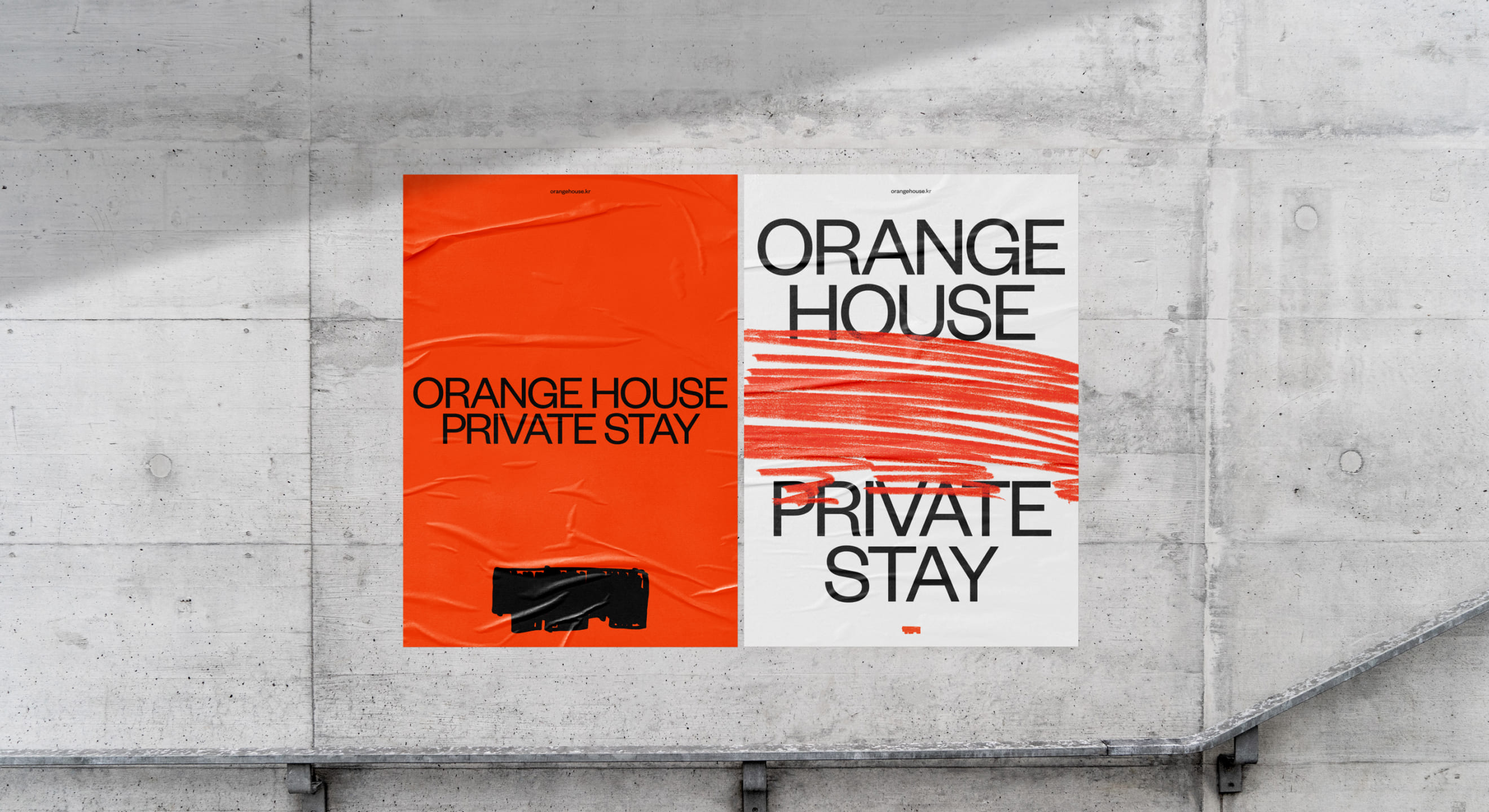
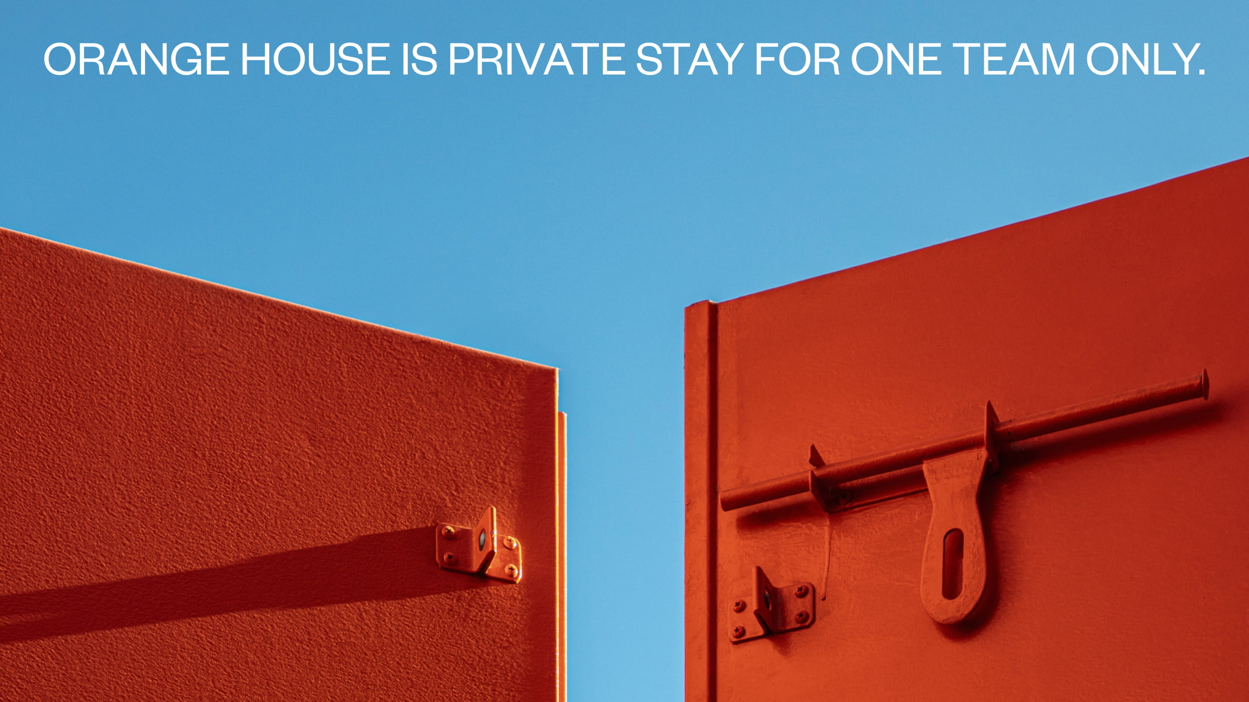
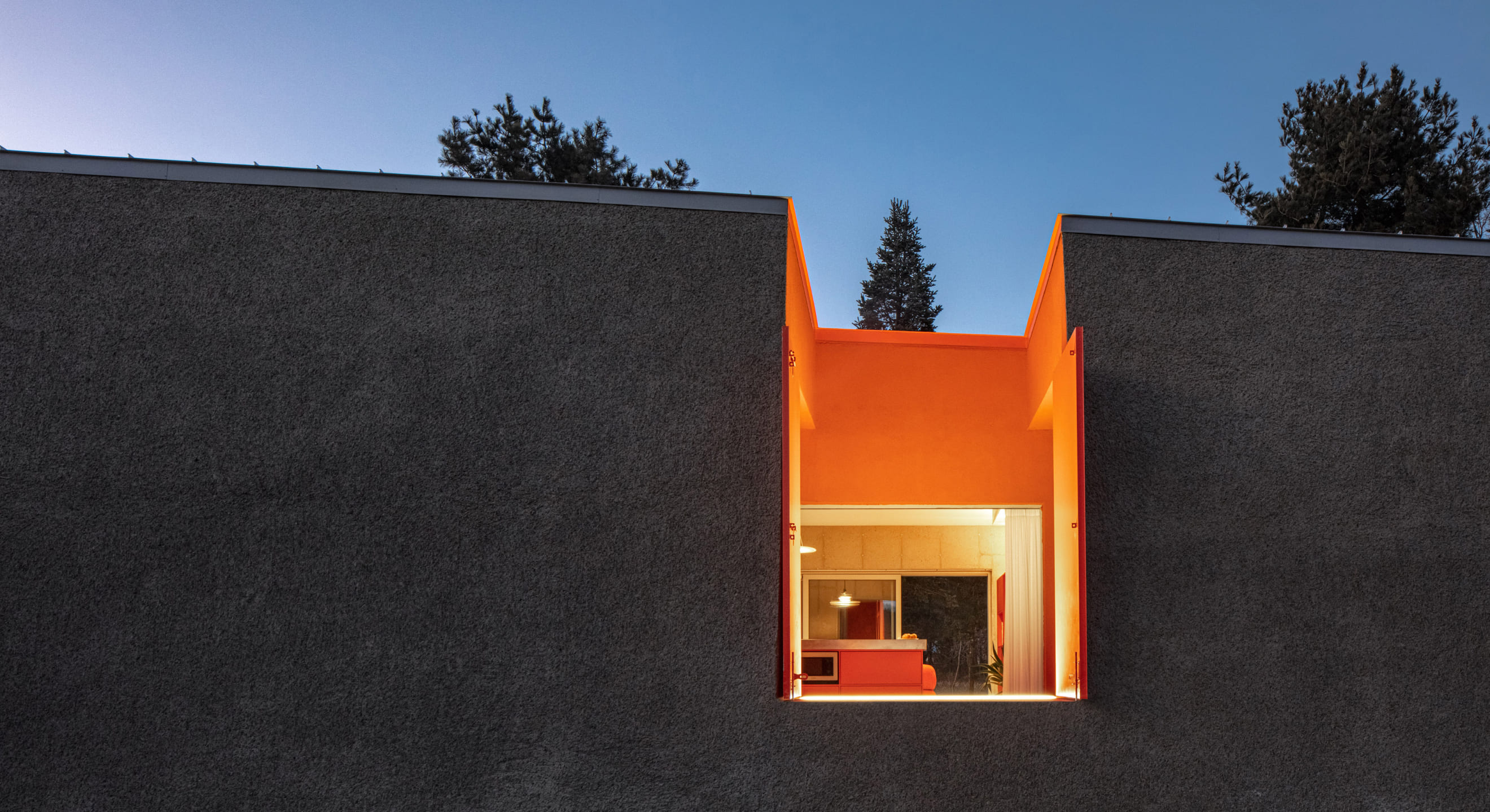
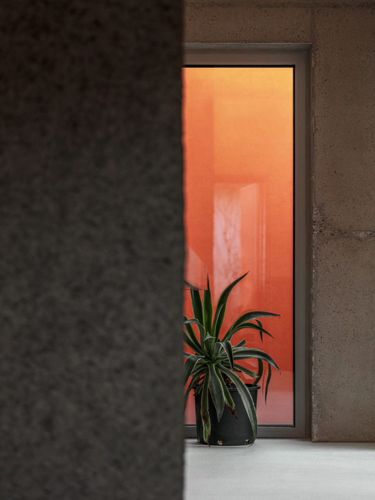
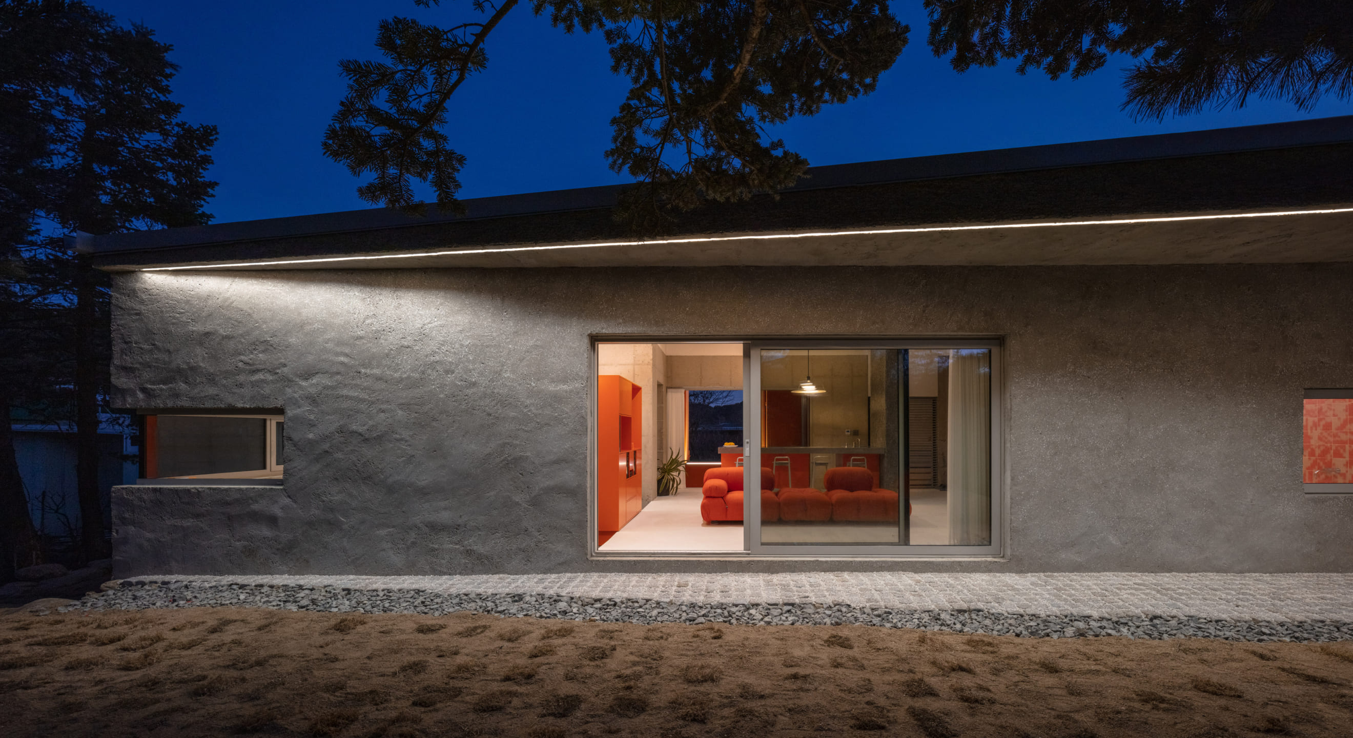
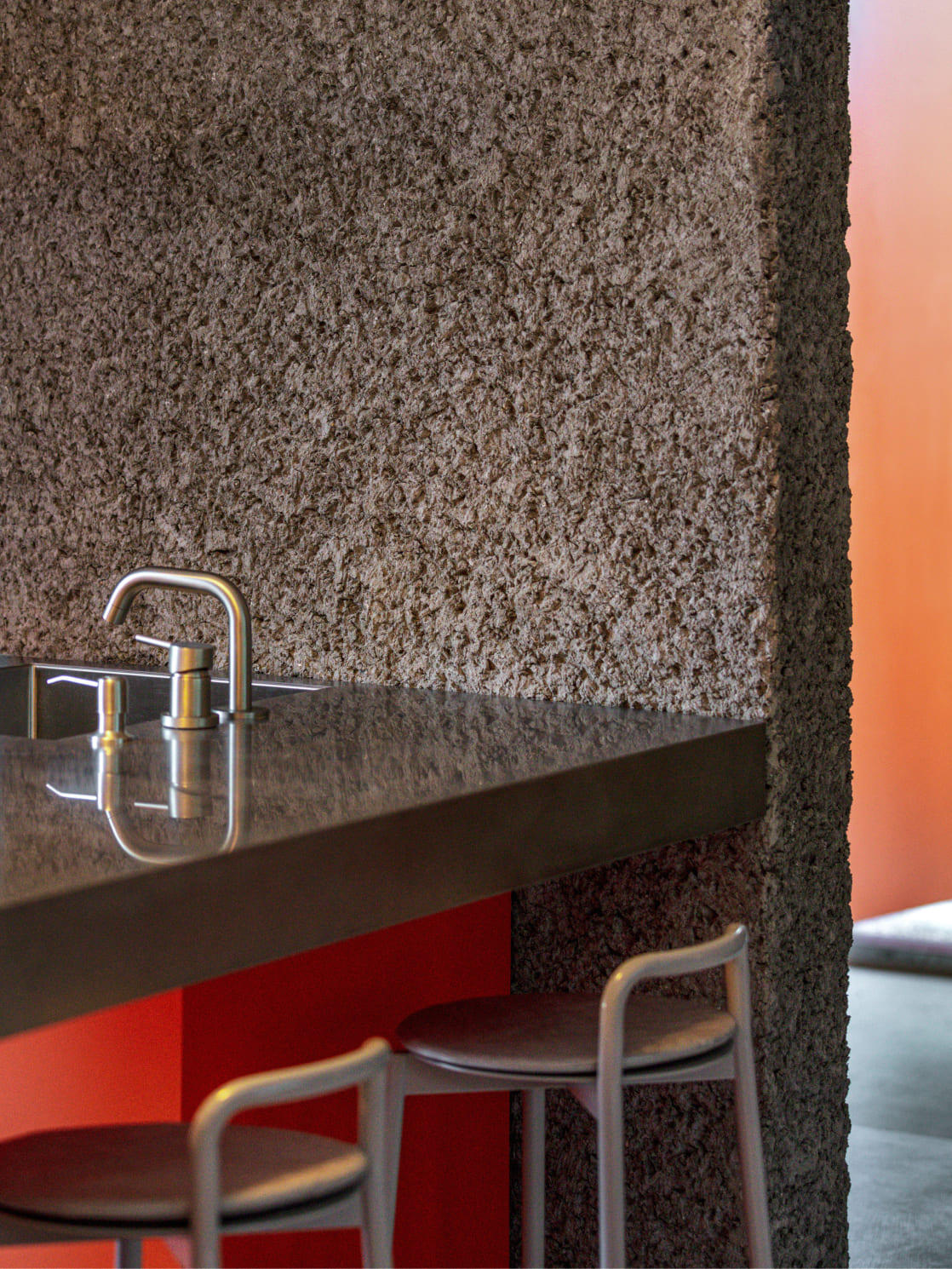
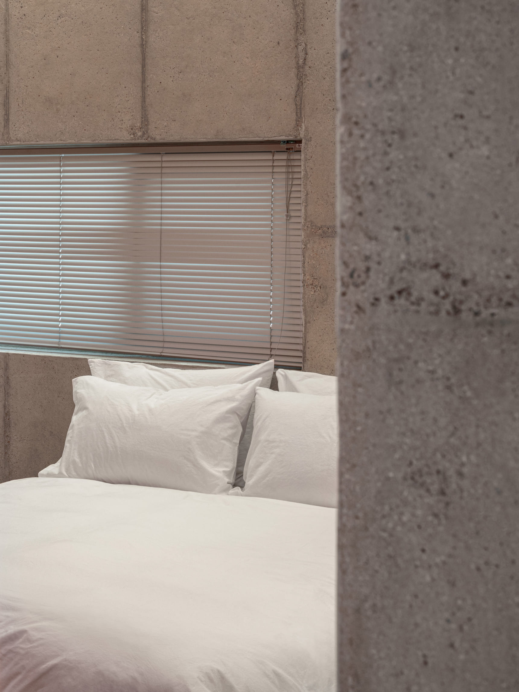
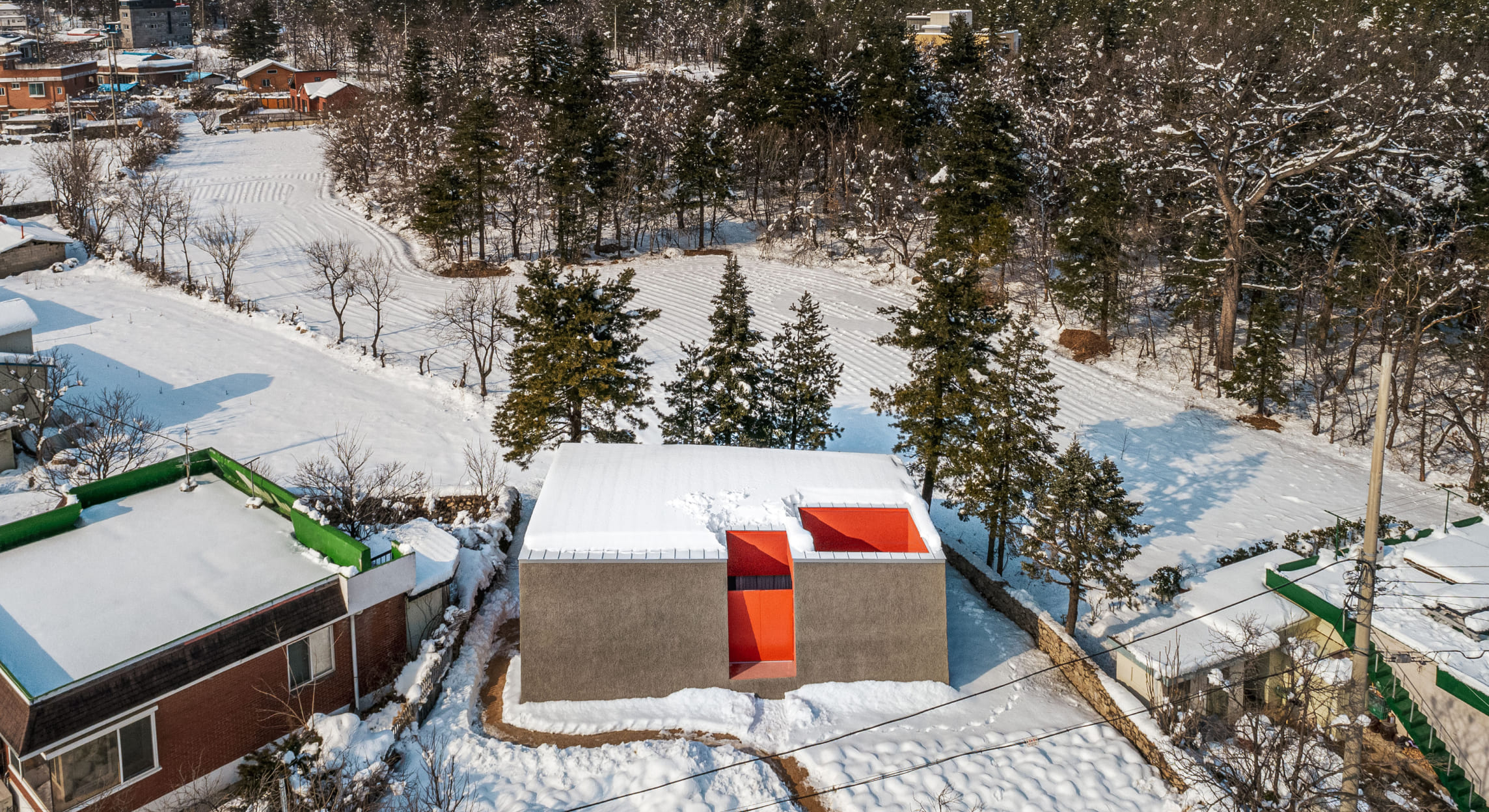
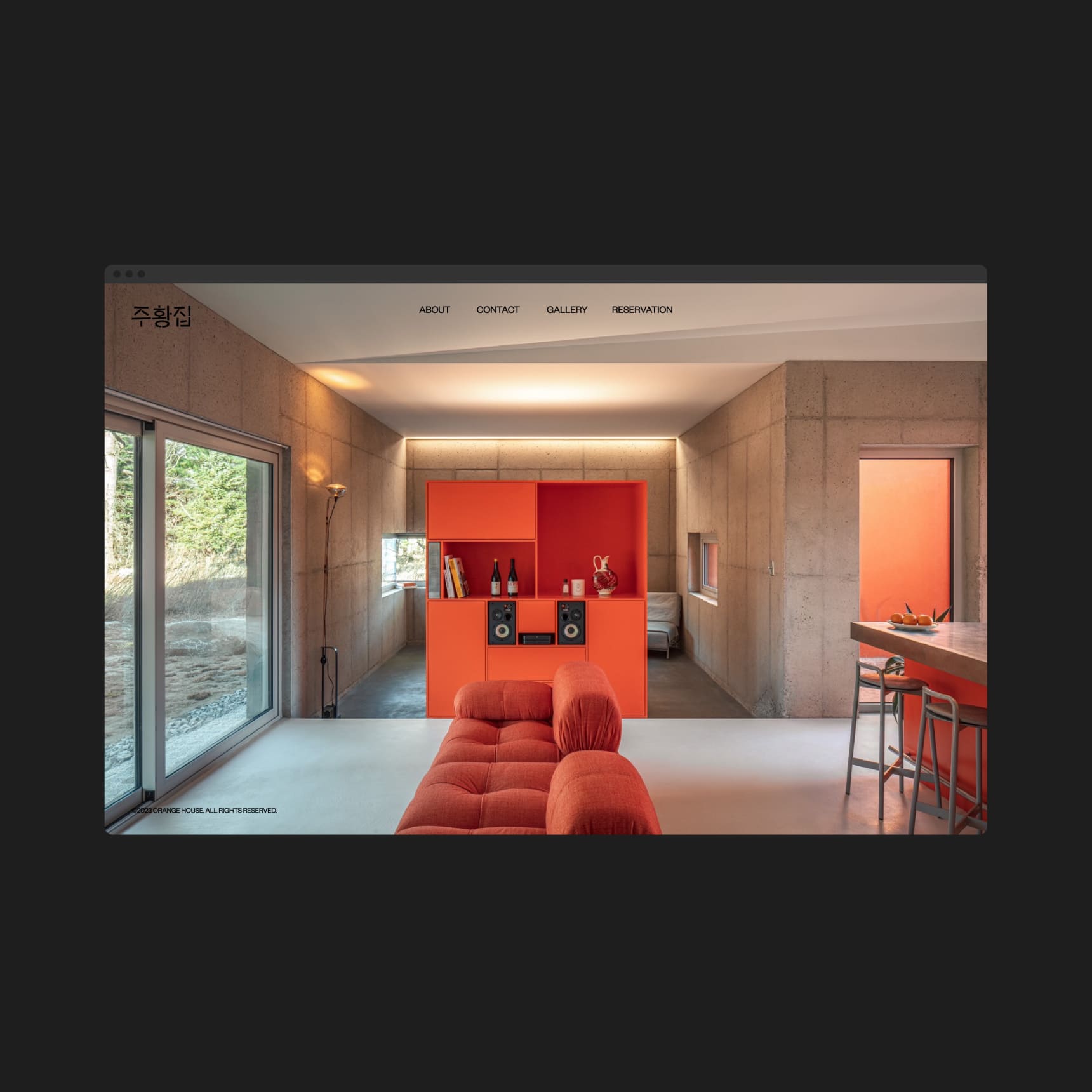
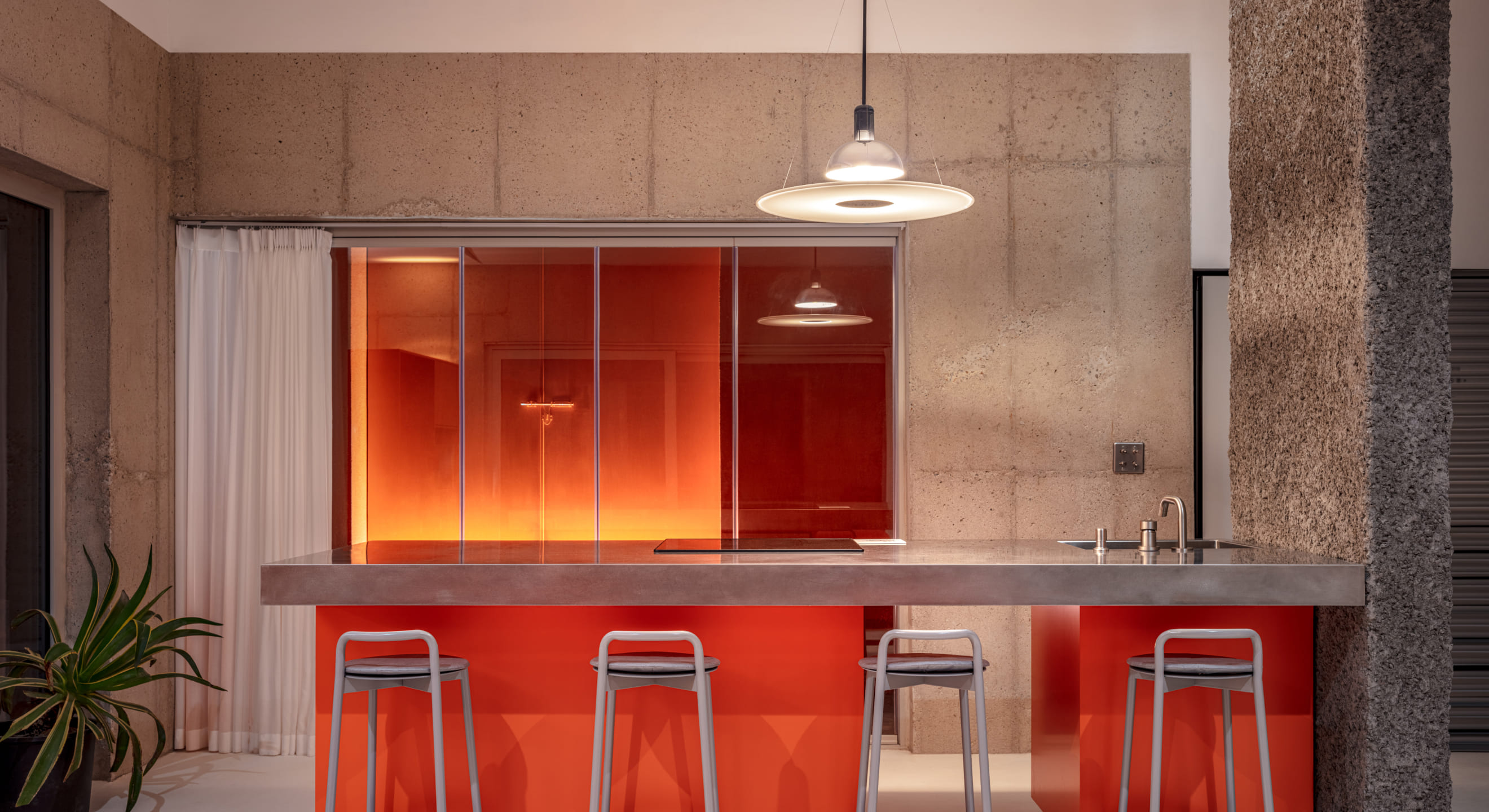
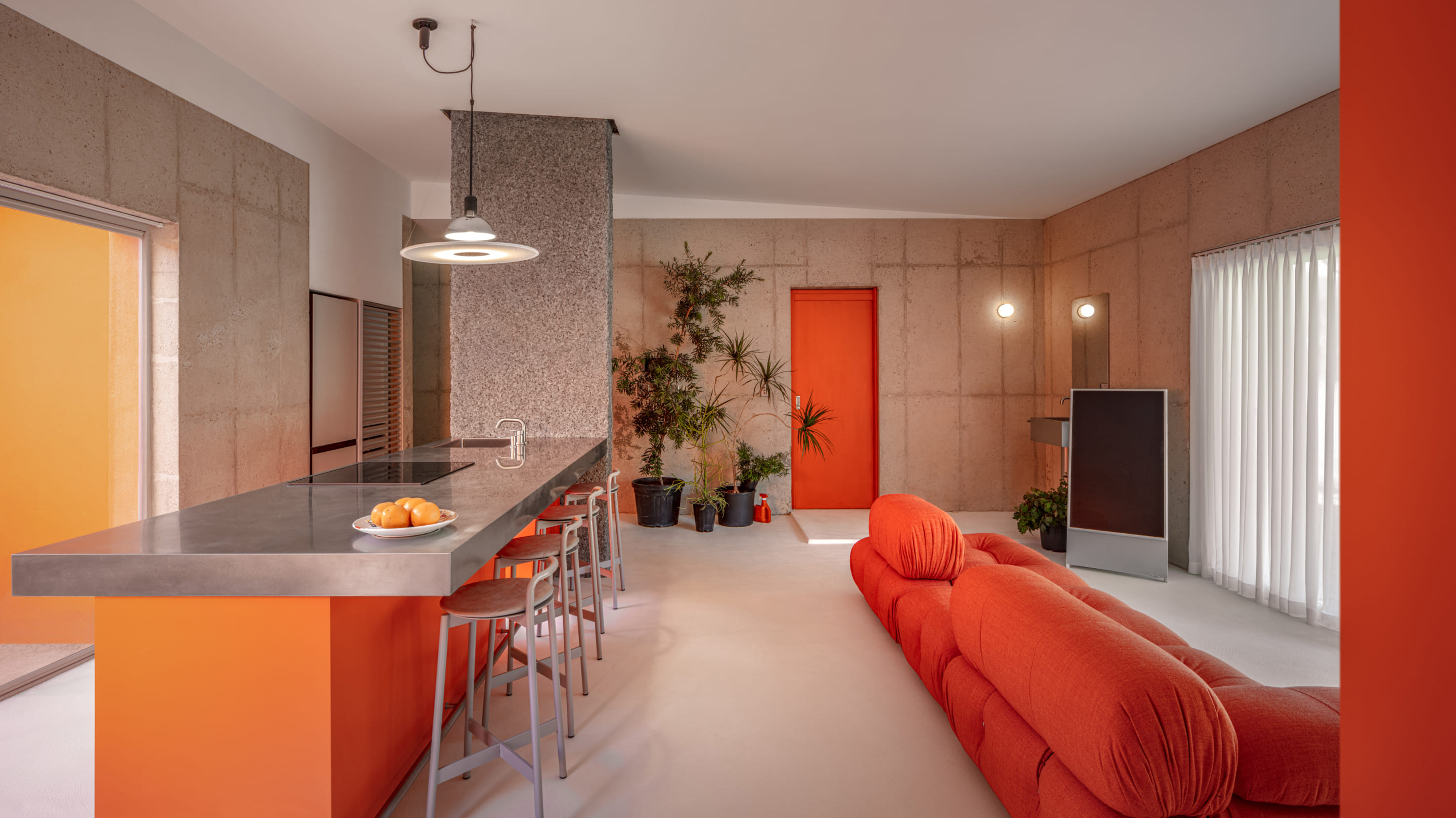
Orange house is a private stay carved out of a large stone in Sokcho. With a unique personality that pays attention to the textures and colors of nature, the brand identity of Orange House is developed as a place to escape from the daily routine and relax with various senses.
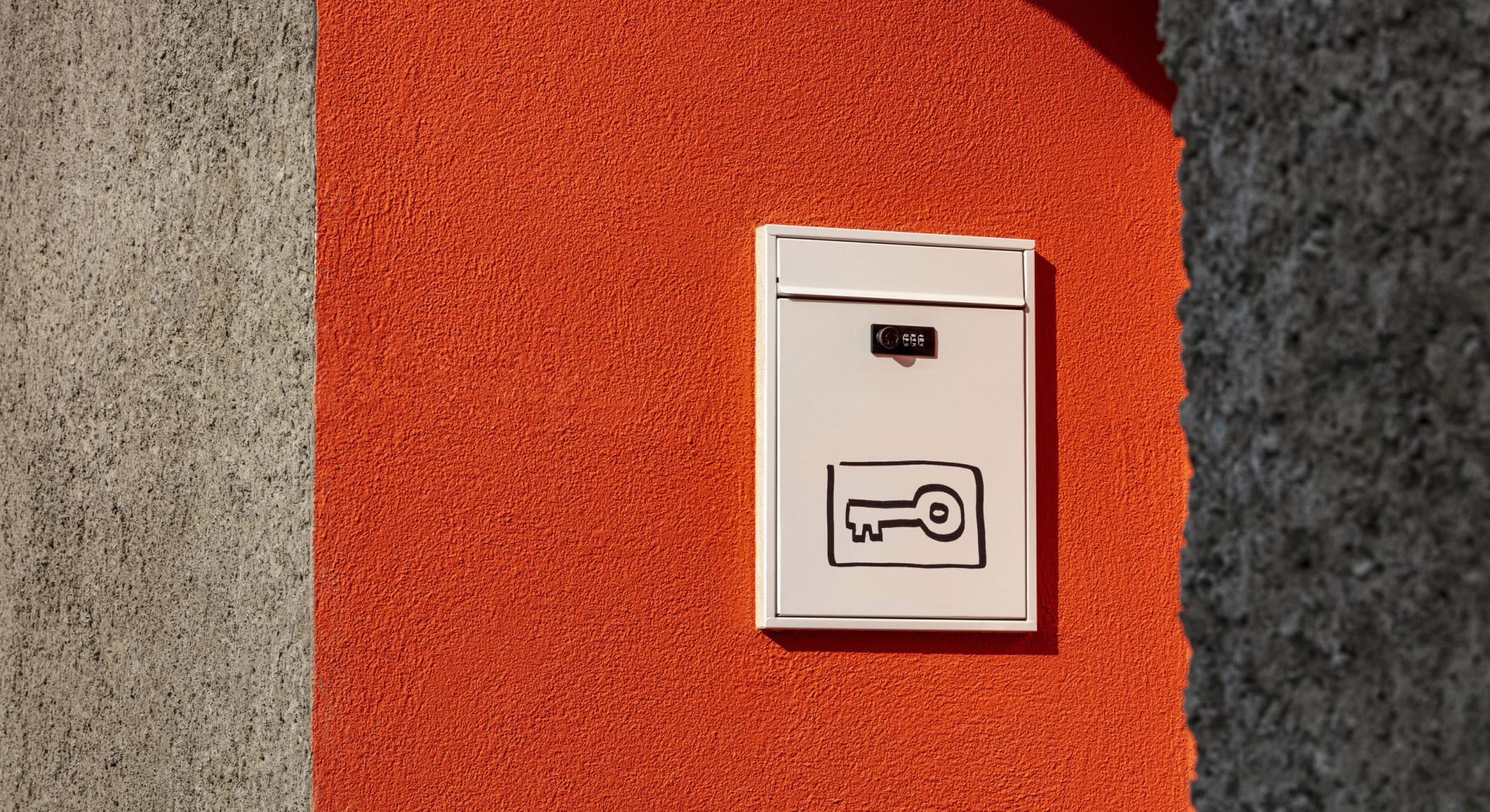
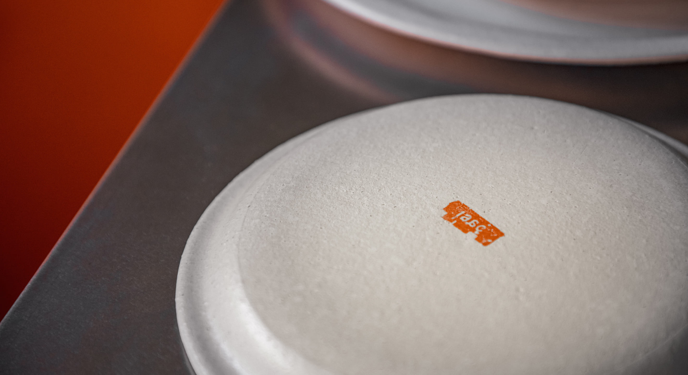
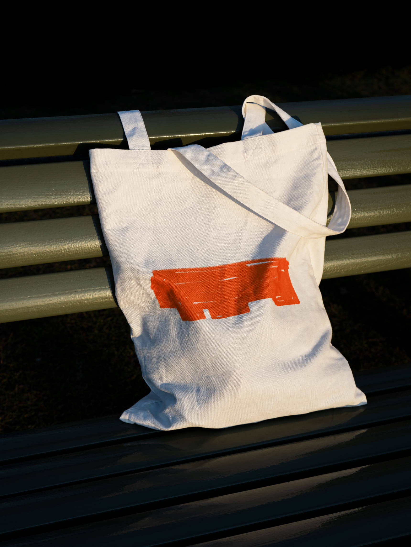
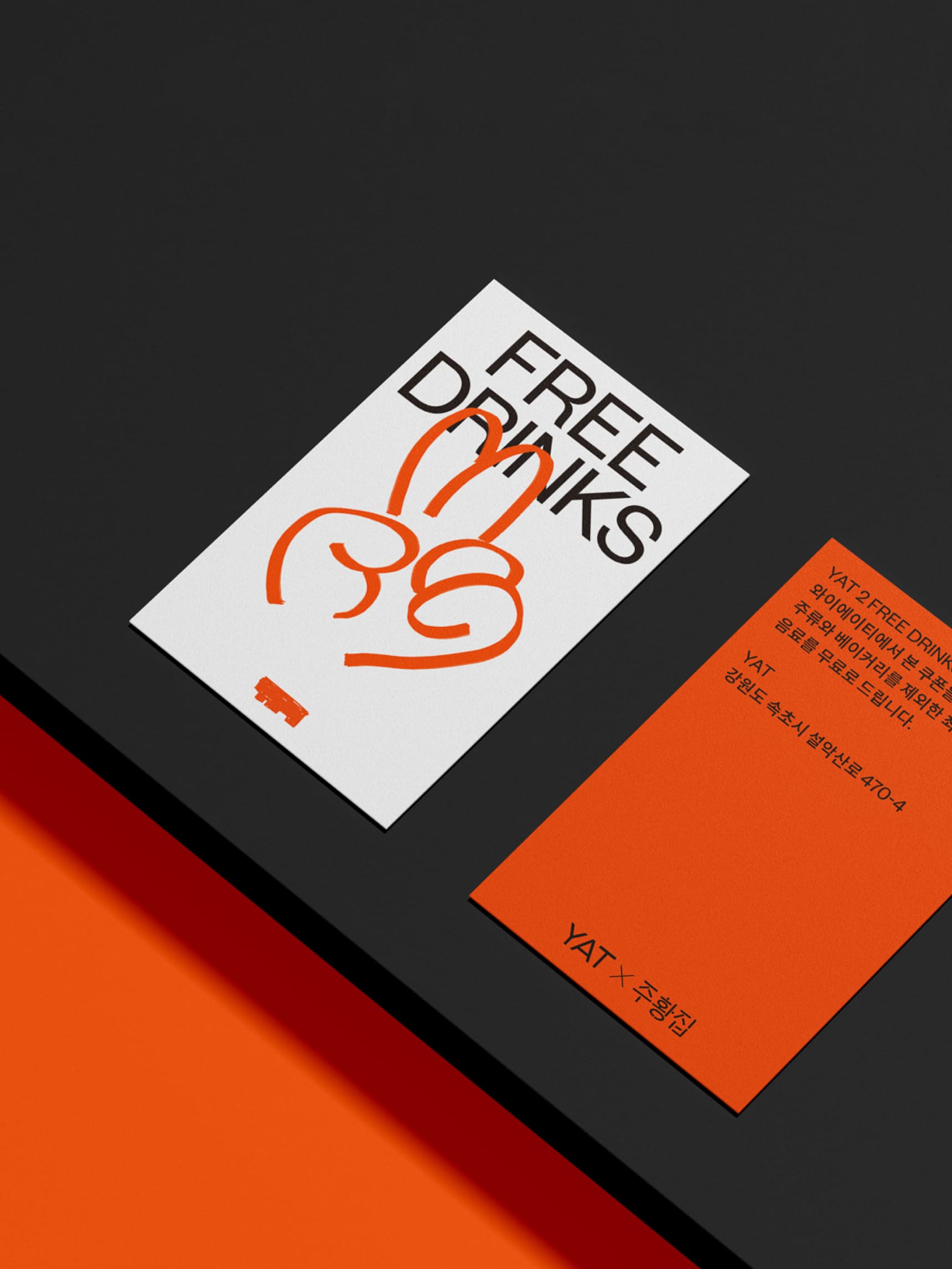
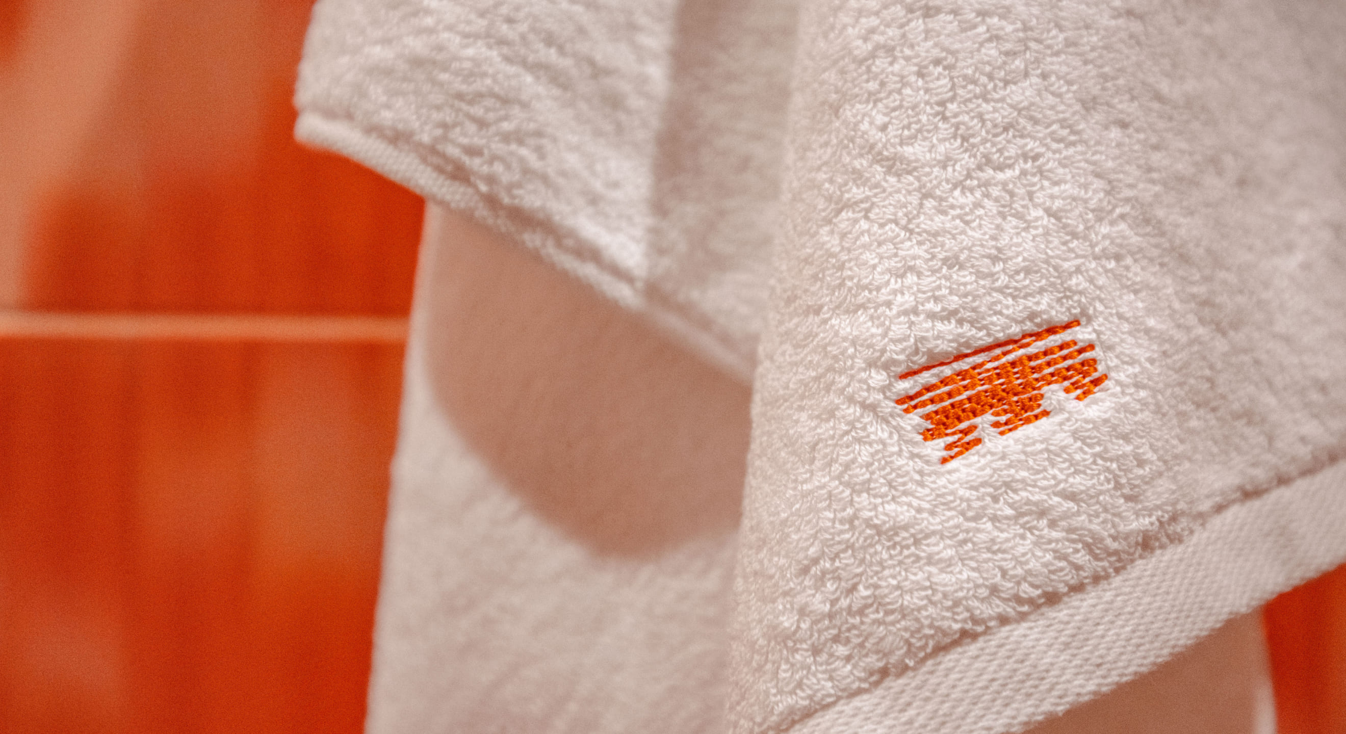
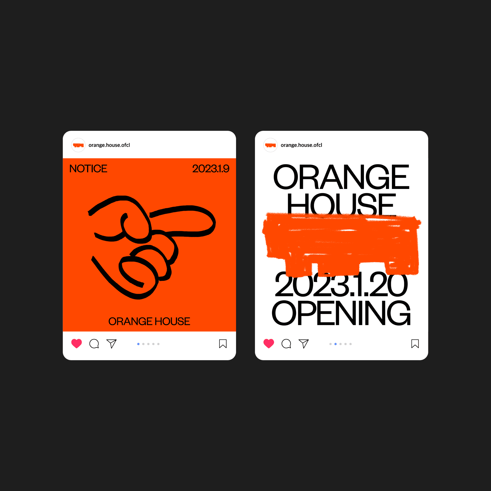
Orange house is more than just a place to stay, it's a medium between people and nature. We express this in graphic motifs that reveal a free and wild mood, paying attention to the color of the earth, the texture of the stone, and the orange of the architecture. The different sensory experiences enjoyed here are visualized by the main symbol and 16 other symbols with variations in texture and form.
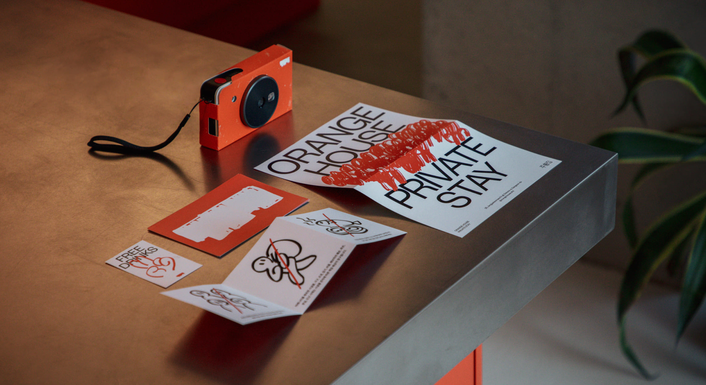

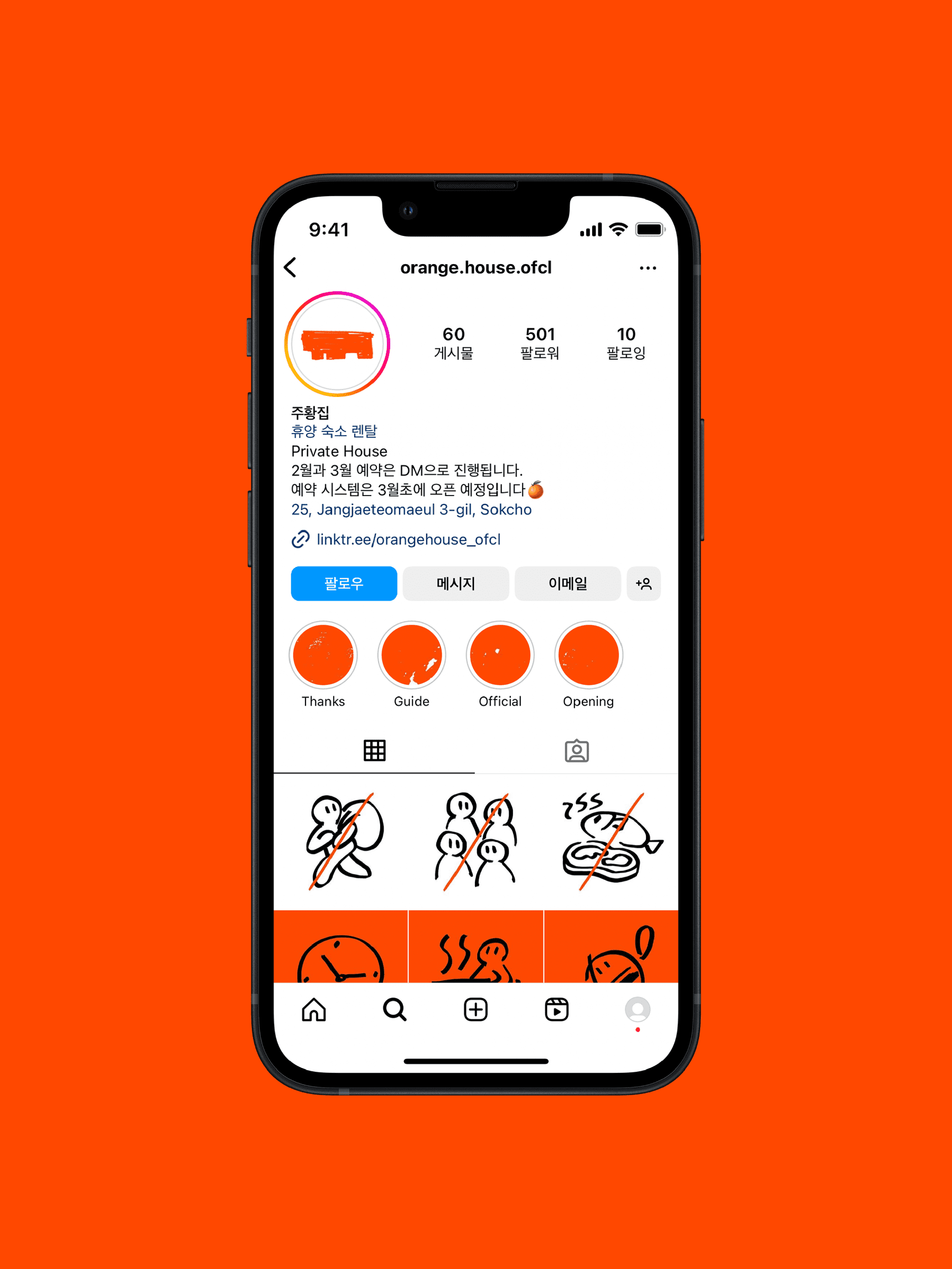
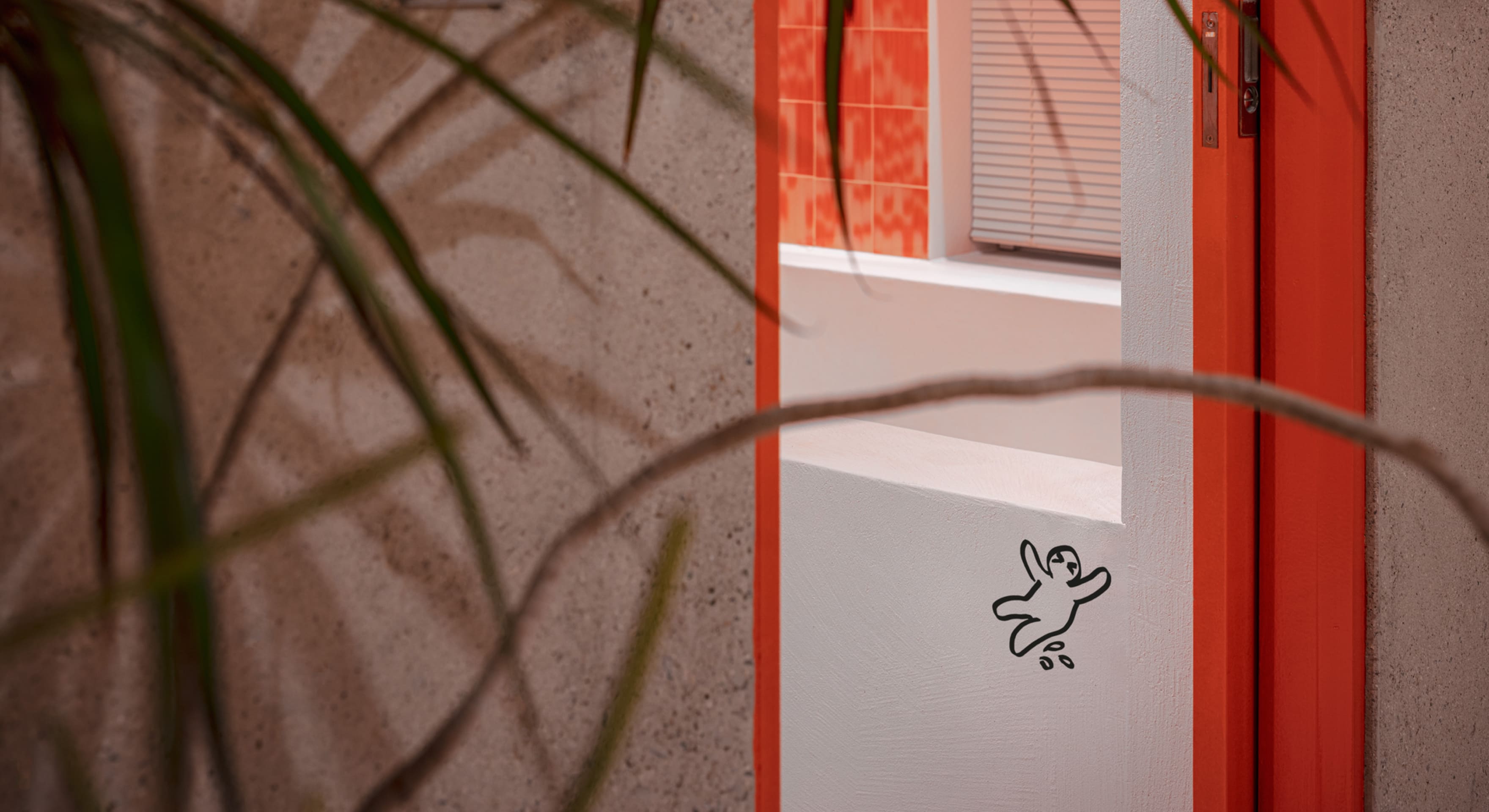
The rustic, line-touched drawing illustration pictograms are used as signage and communication graphics to bring colorful fun to places online and offline.

Orange House
Brand Identity Design
BRENDEN
Creative Direction / Do-eui Lee
Project Management / Wook Jung
Design / Jaewan Yu, Hyewon Jang
Creative Partner / One-Aftr
Client
Orange House
Award
iF Design Award Winner 2024
Red Dot Design Award Winner 2023