Oppodd
Brand Identity Design
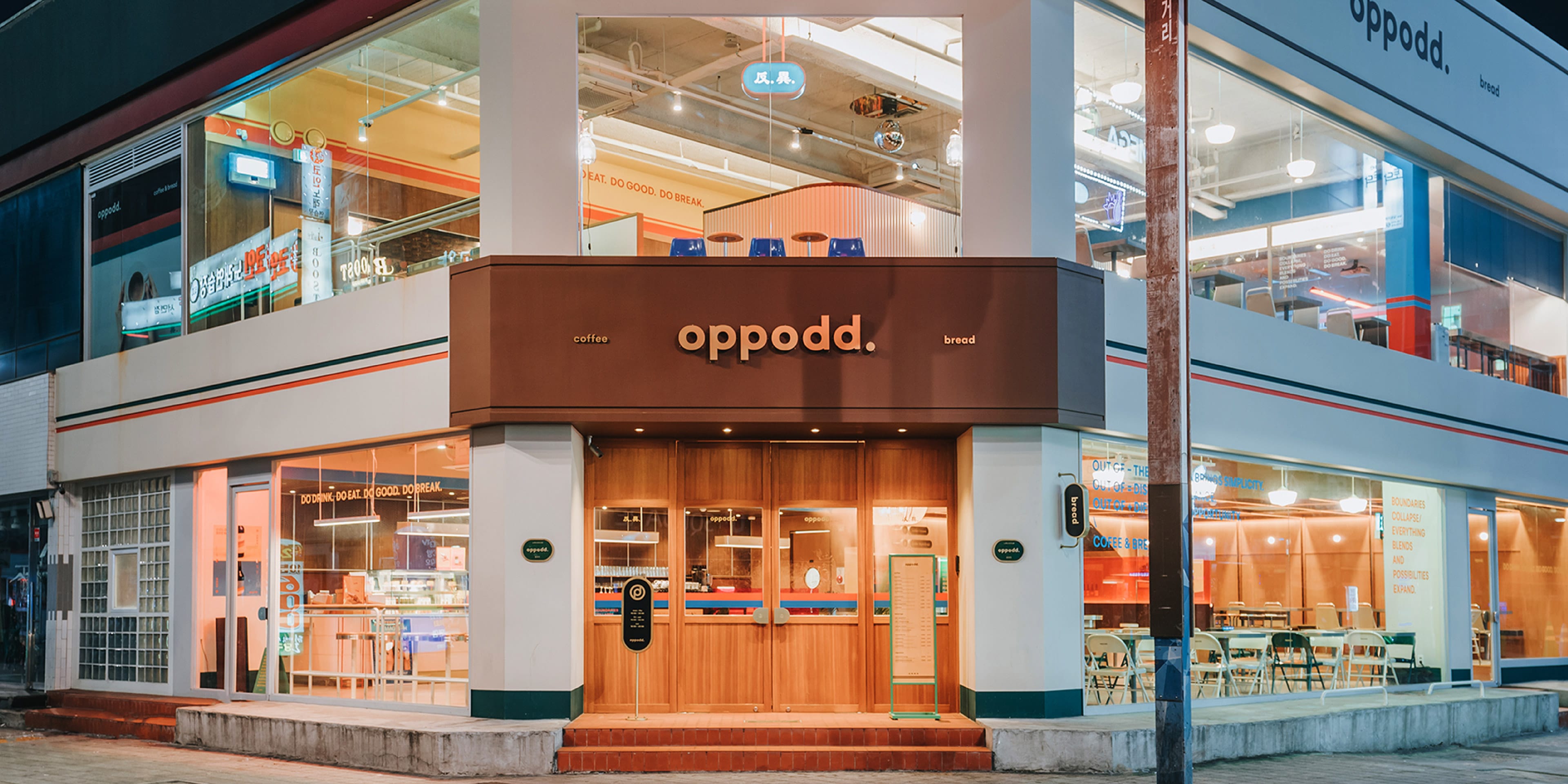
This branding project is for ‘Oppodd,’ a café located on the busiest commercial street in Seomyeon Busan Korea. BRENDEN undertook the overall brand design project and designed Oppodd’s naming, concept, identity, graphic, package, and space.
Year
2020
Category
Art Direction, Branding, Naming, Graphic Design, Product Design, Space Design
Client
Oppodd

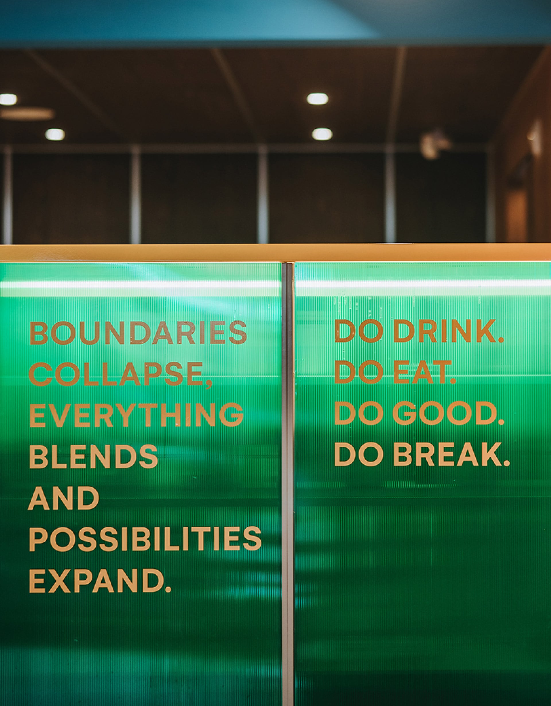
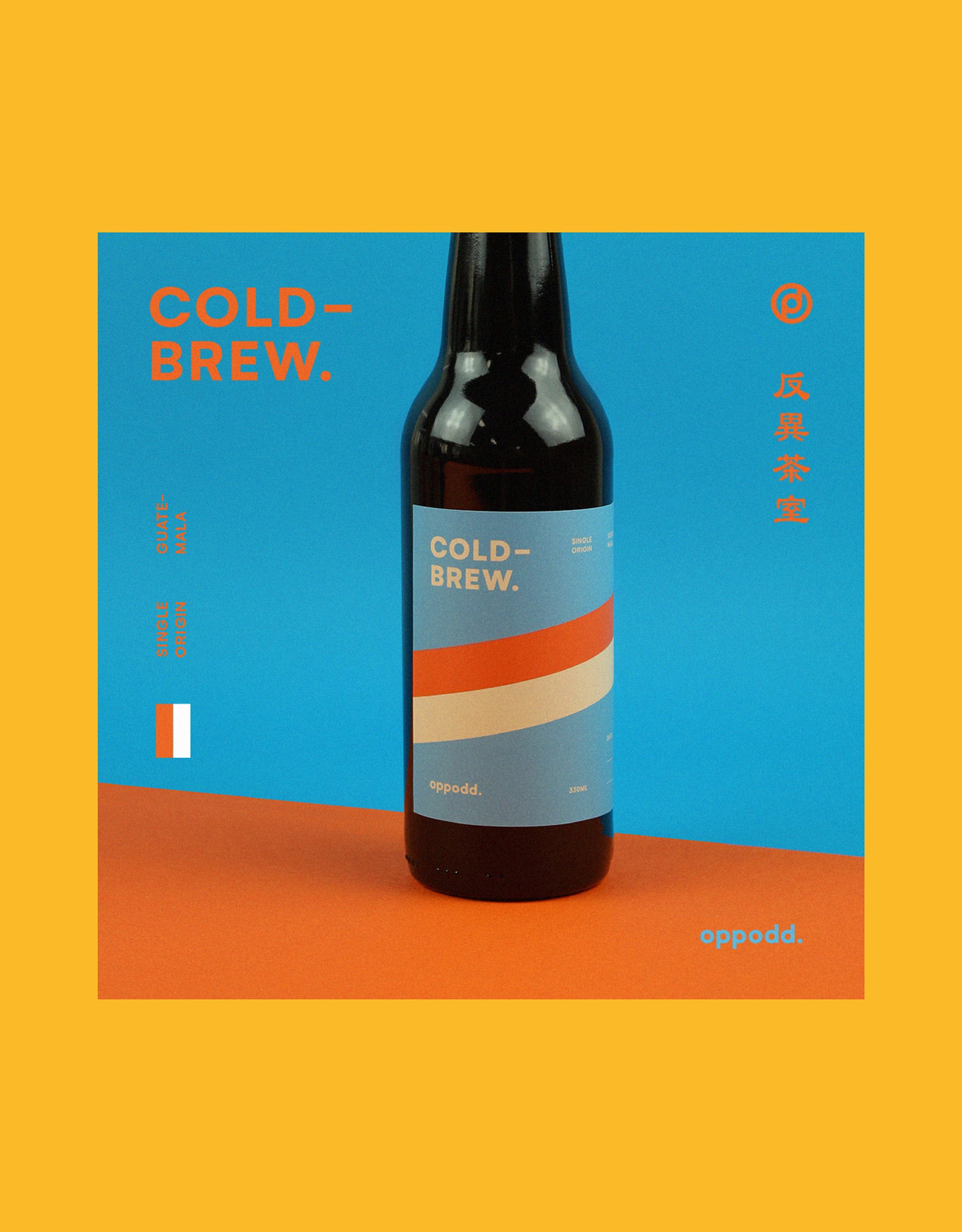
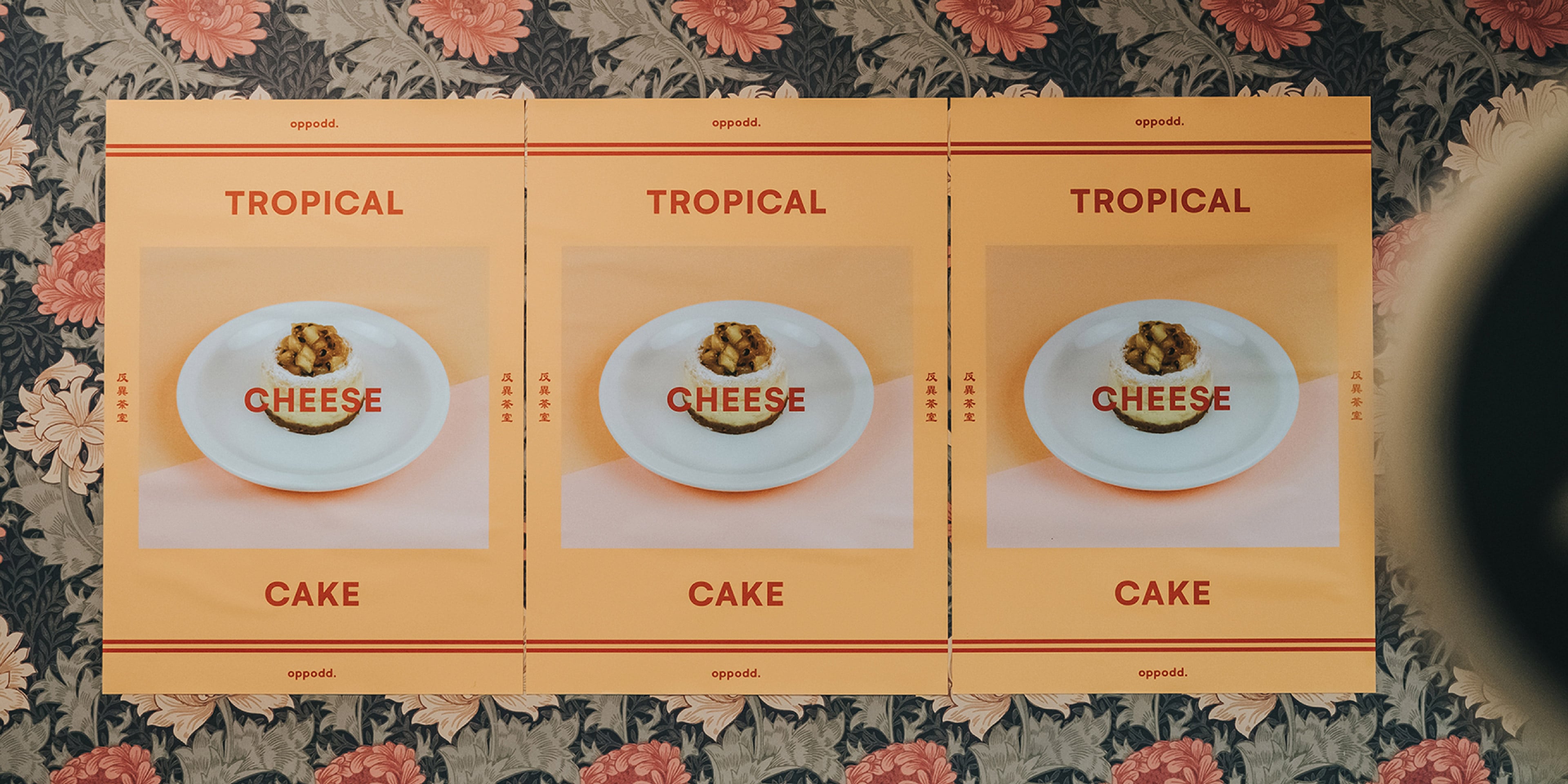
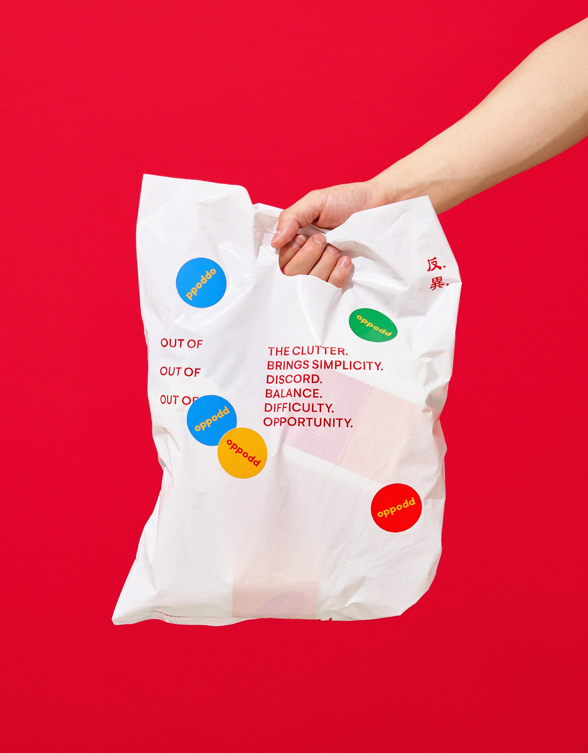
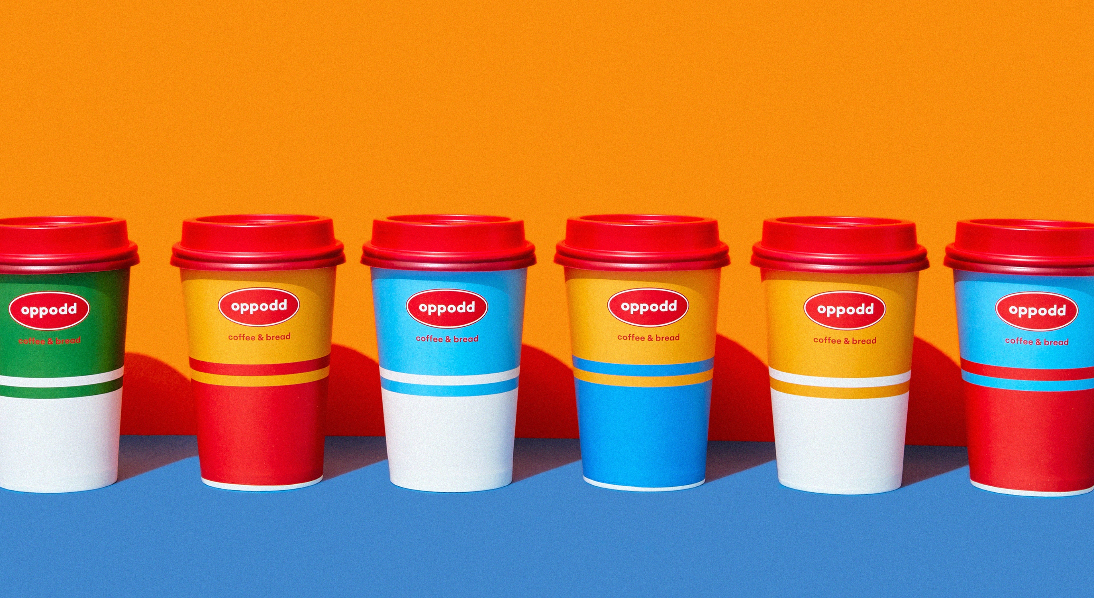
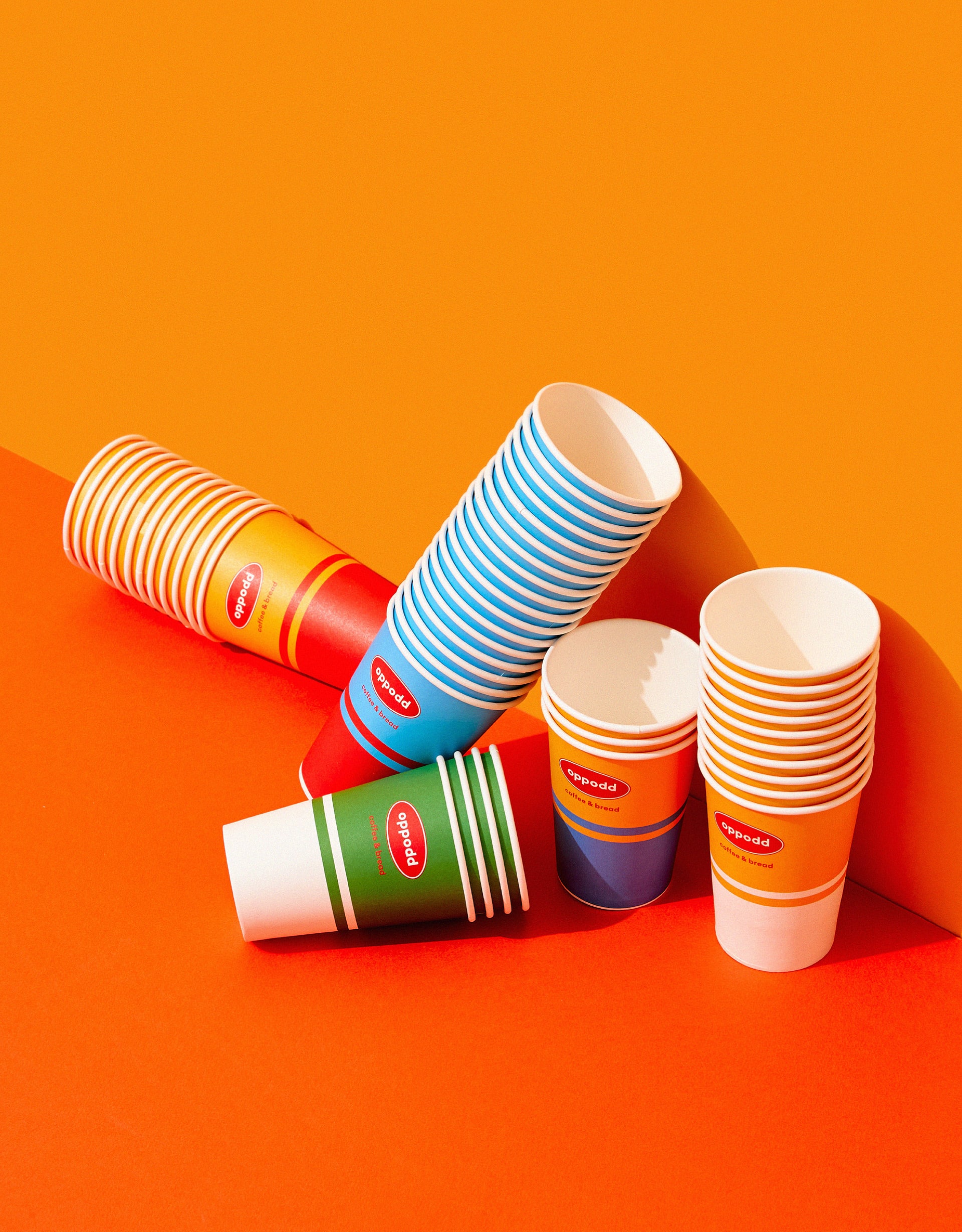
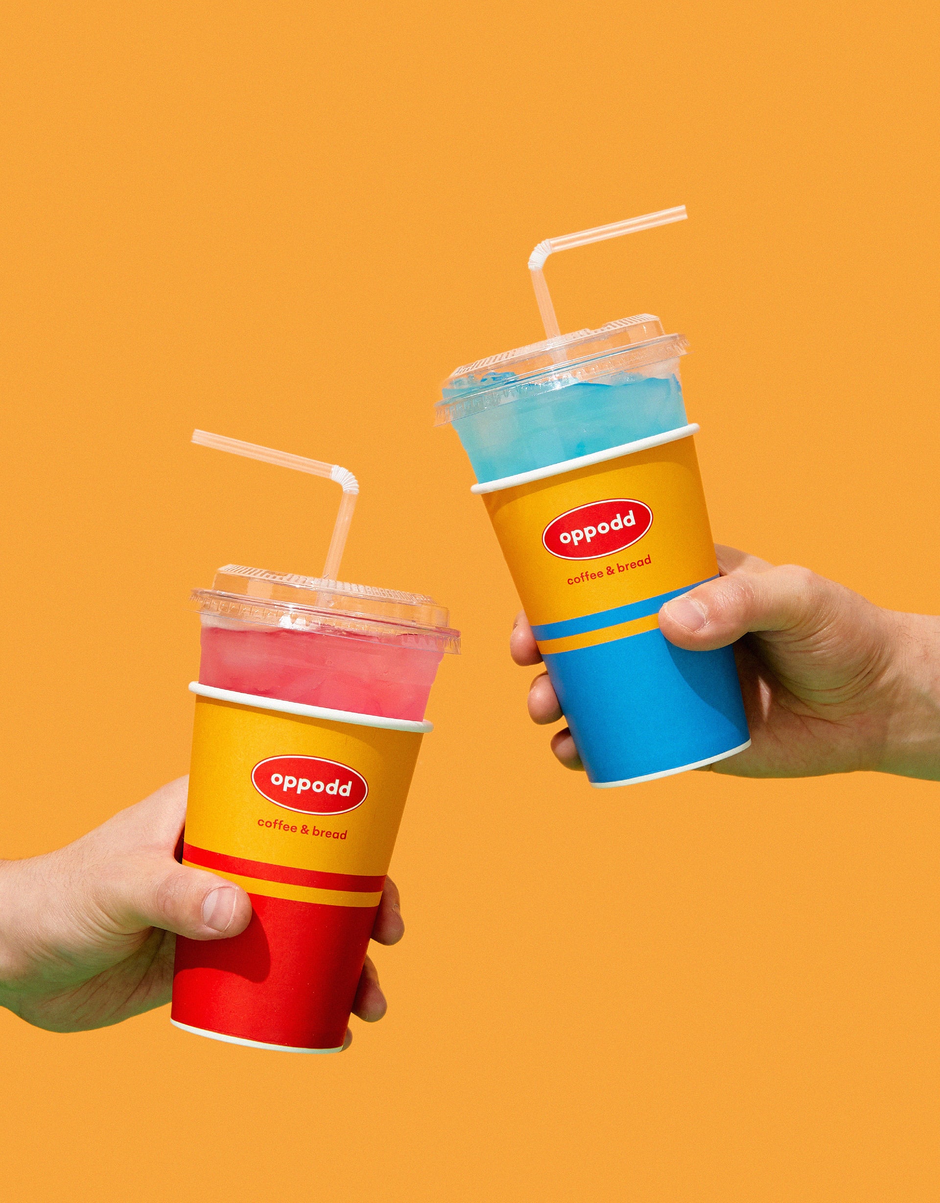
Oppodd is a combination of ‘opposite’ and ‘odd,’ meaning ‘a peculiar harmony of discrete things,’ which underlies the design concept of ‘a combination of East and West, a shift of perspectives, and a variation of the times.’ We designed Oppodd’s distinctive identity by combining the visual elements found in different cultures.
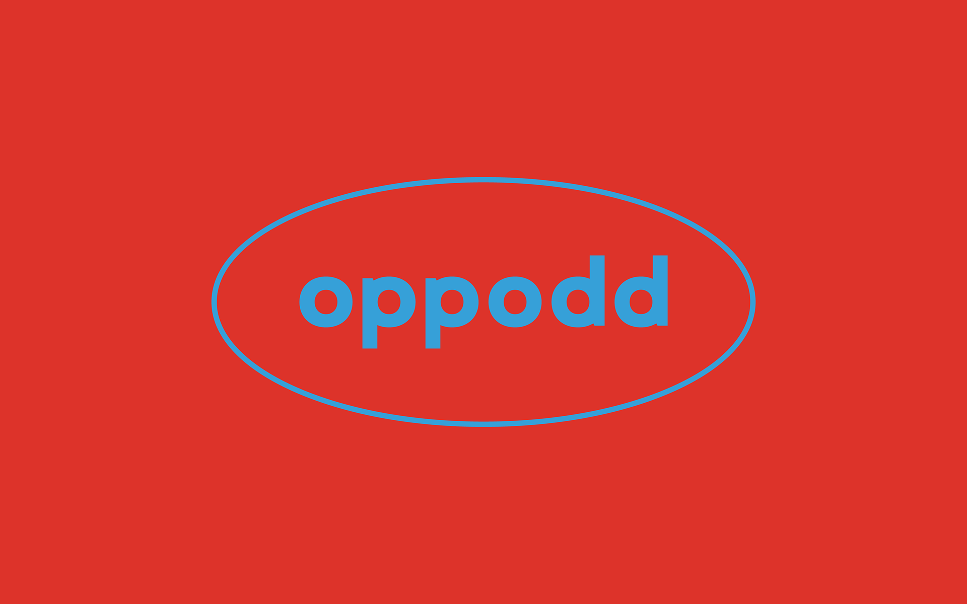


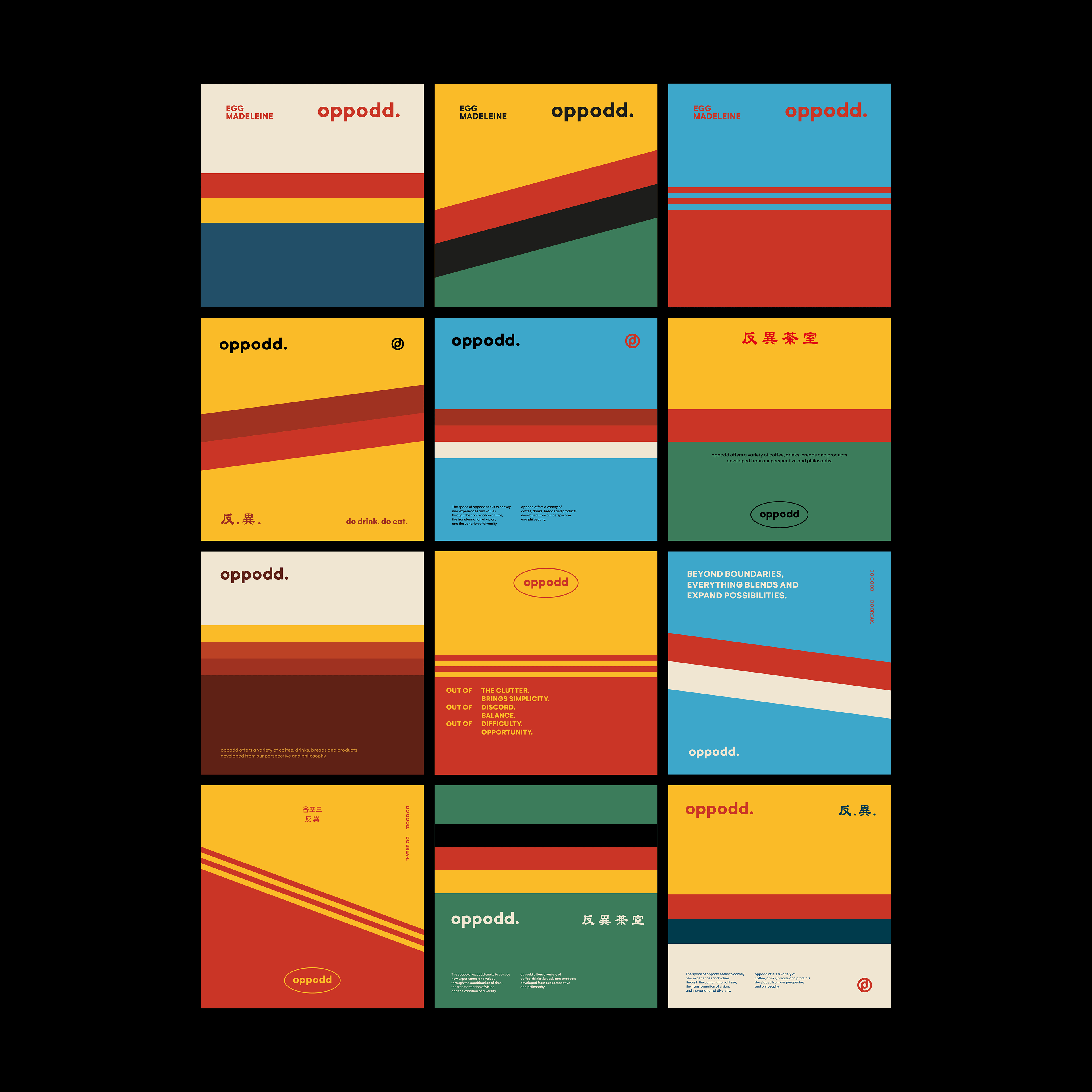
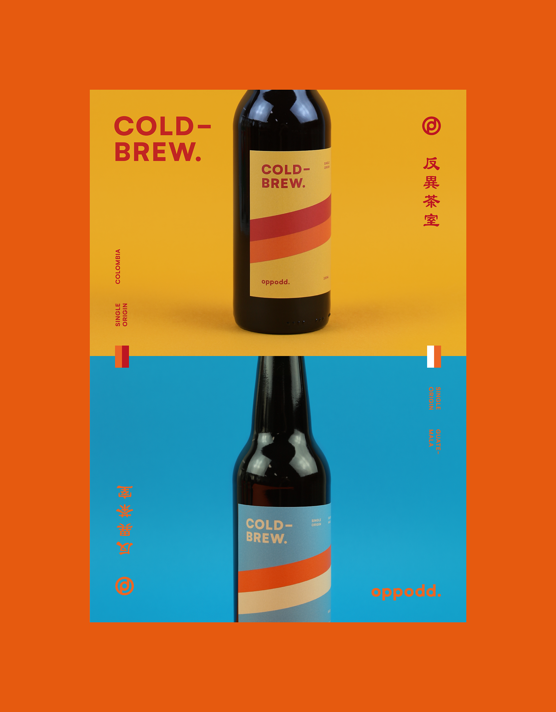
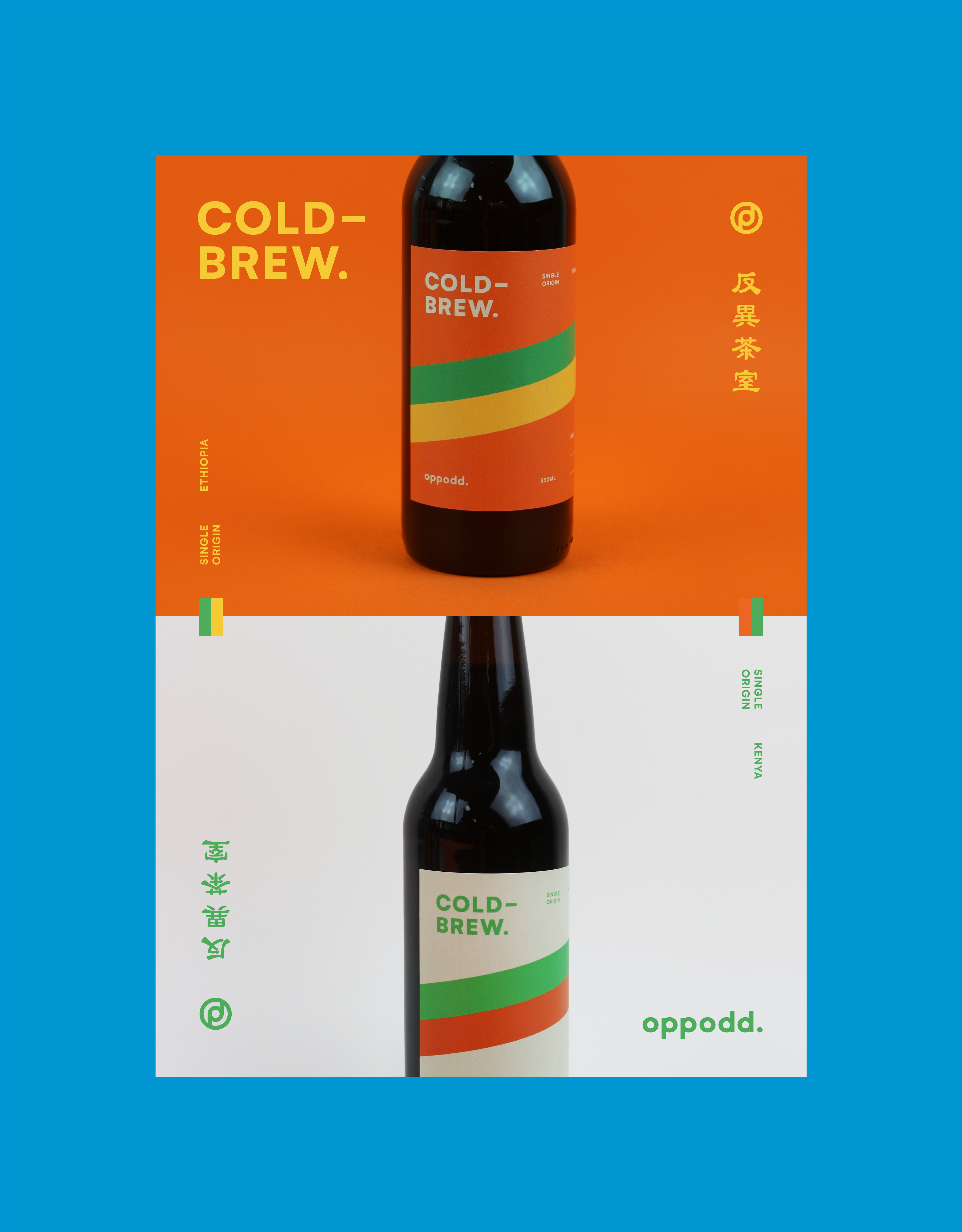
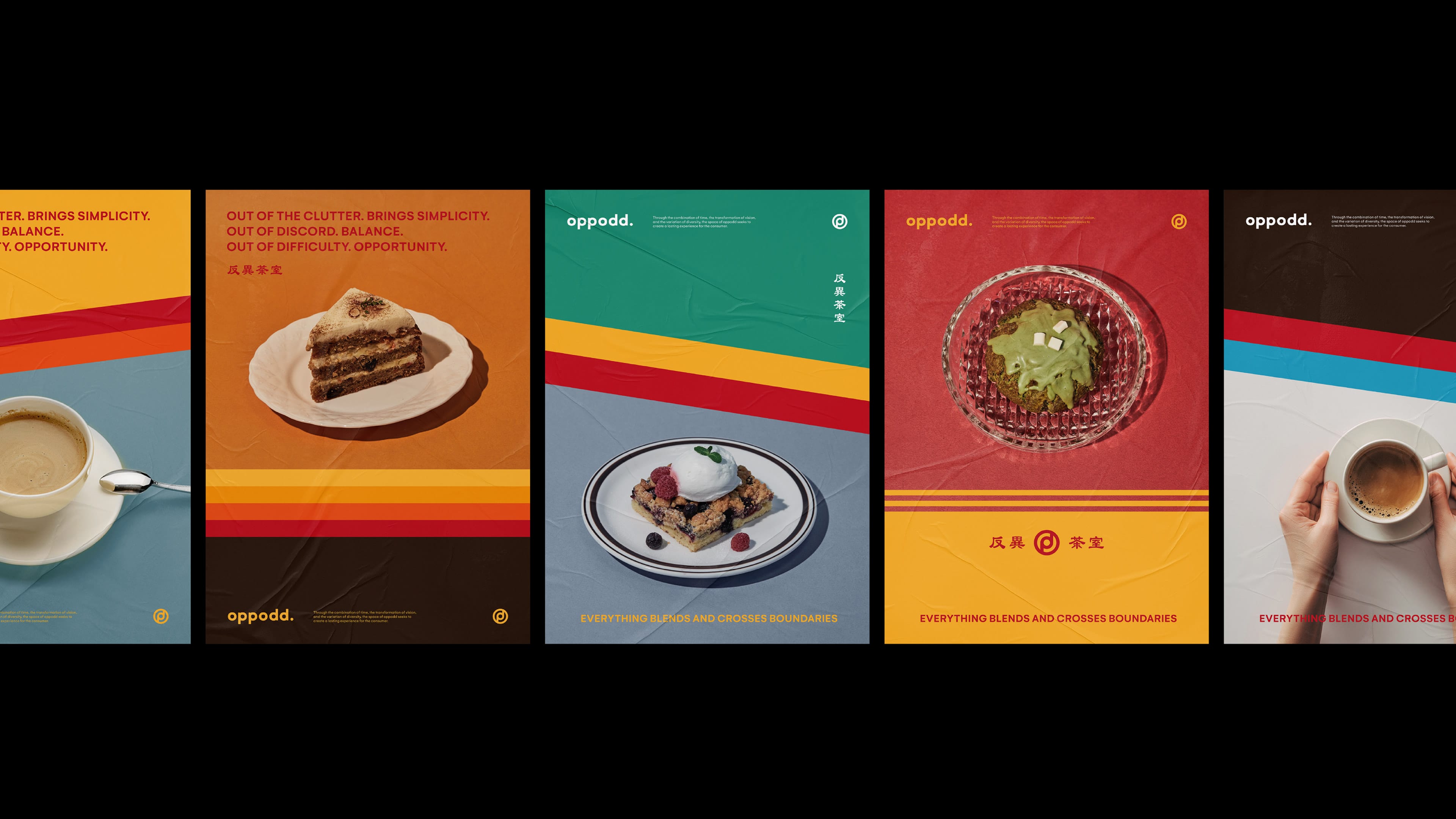
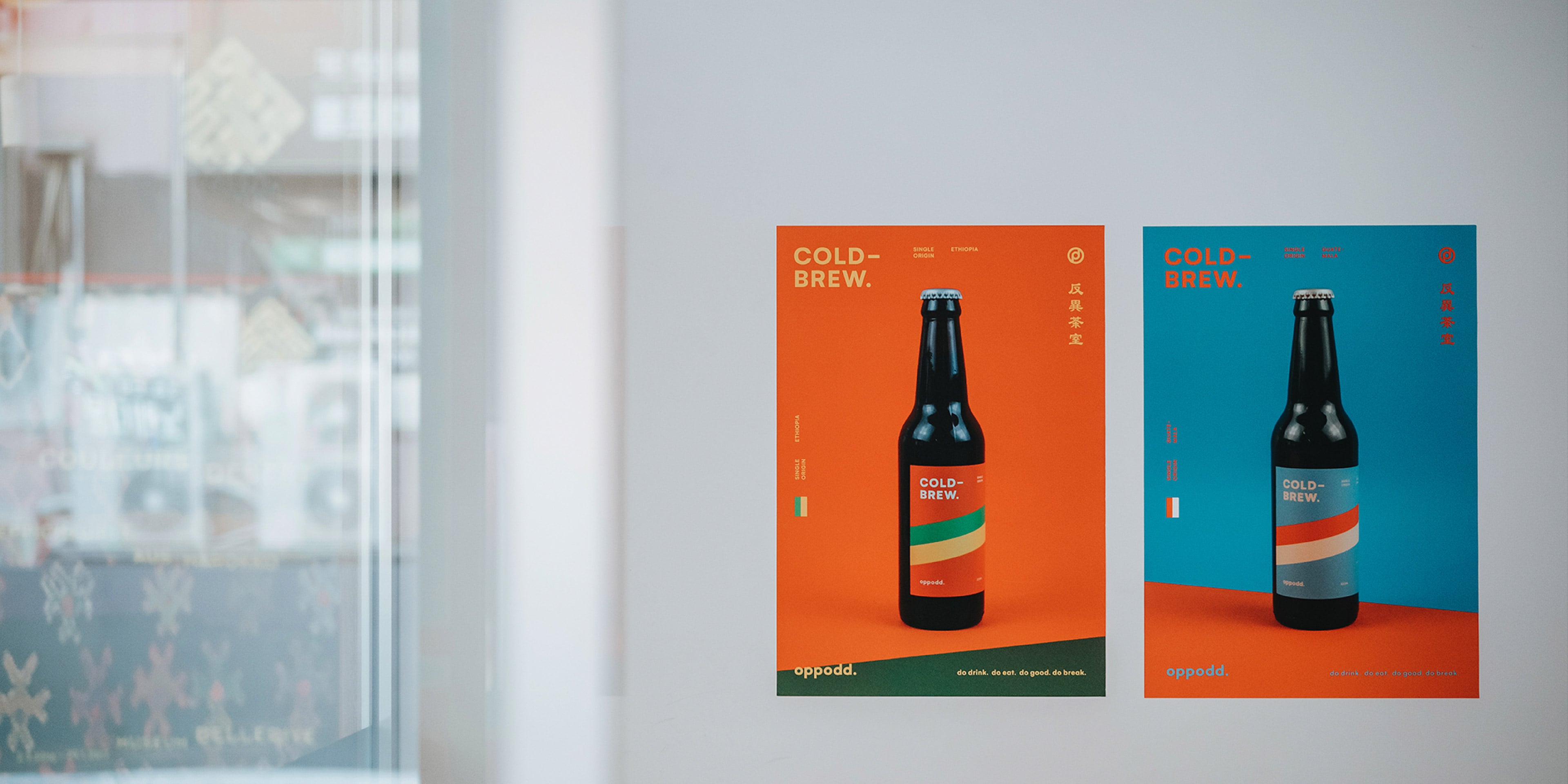
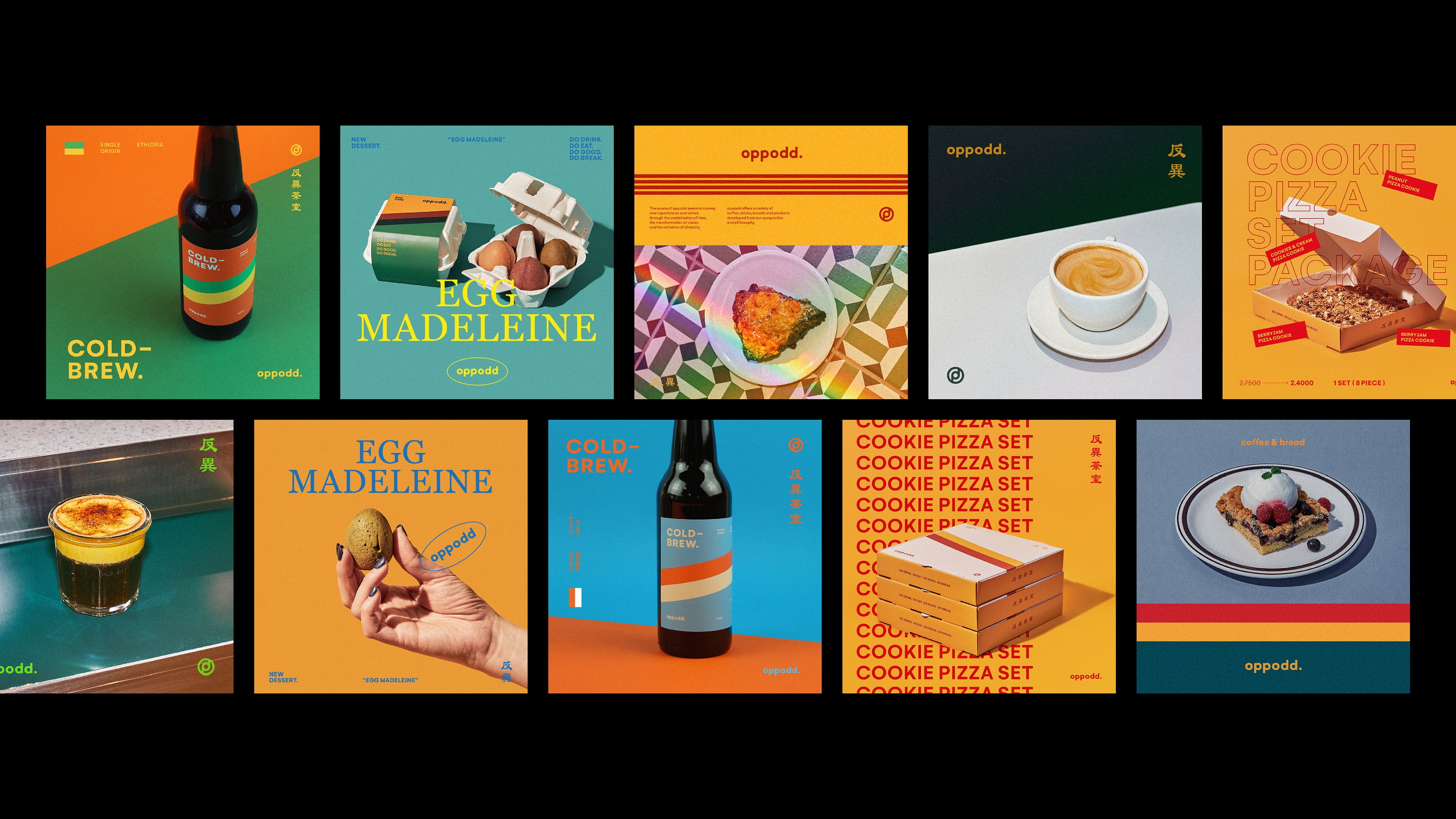
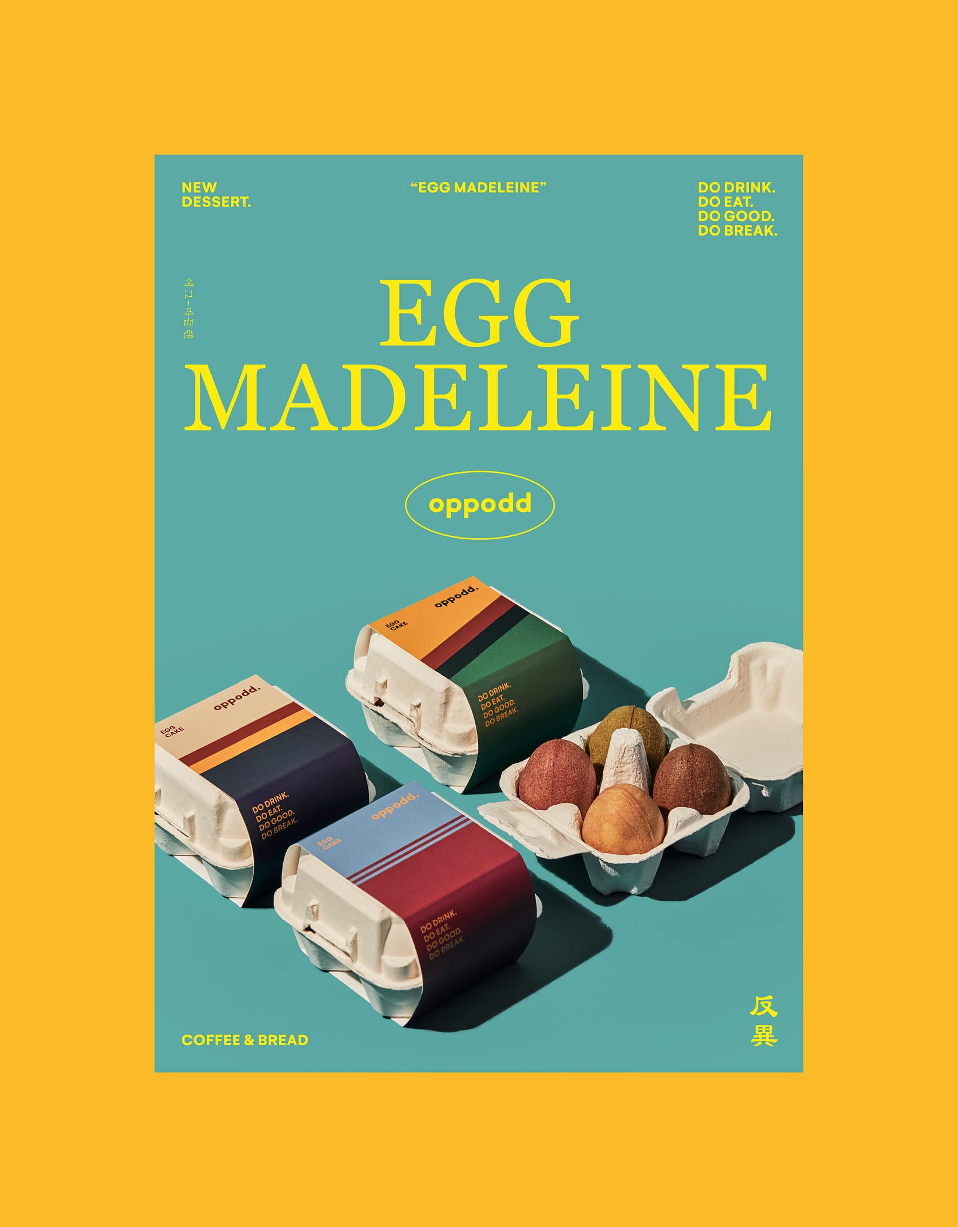
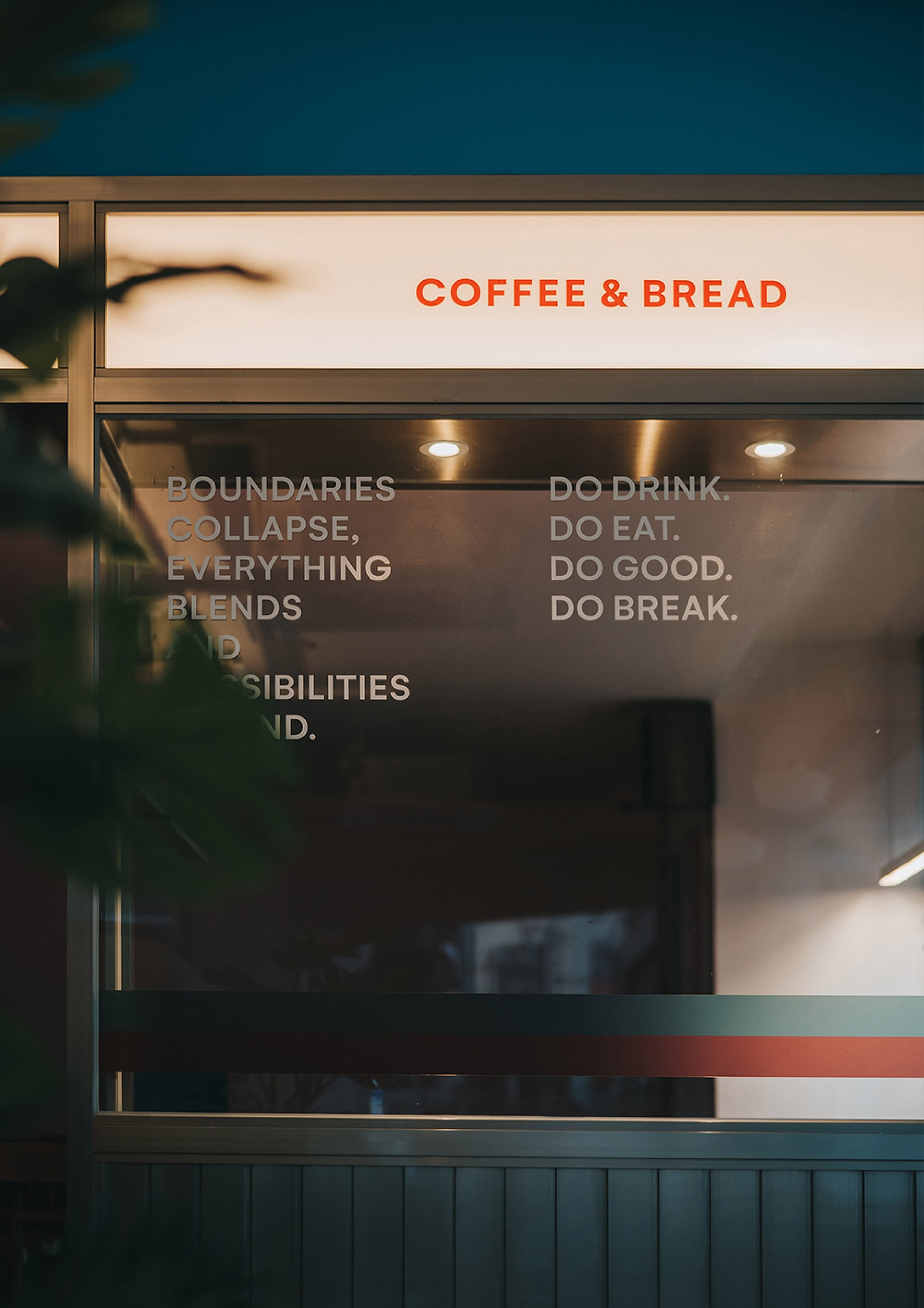
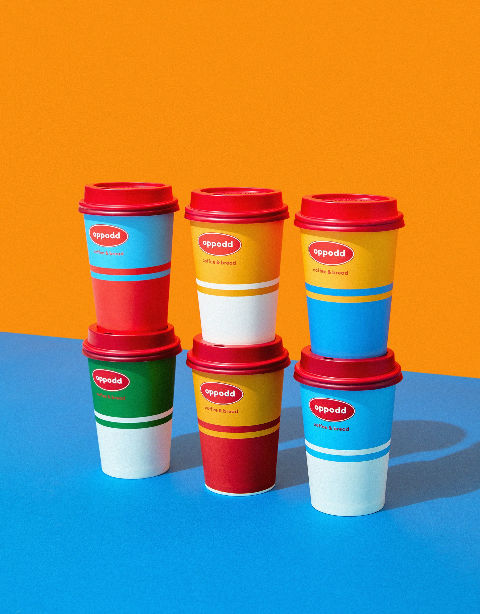
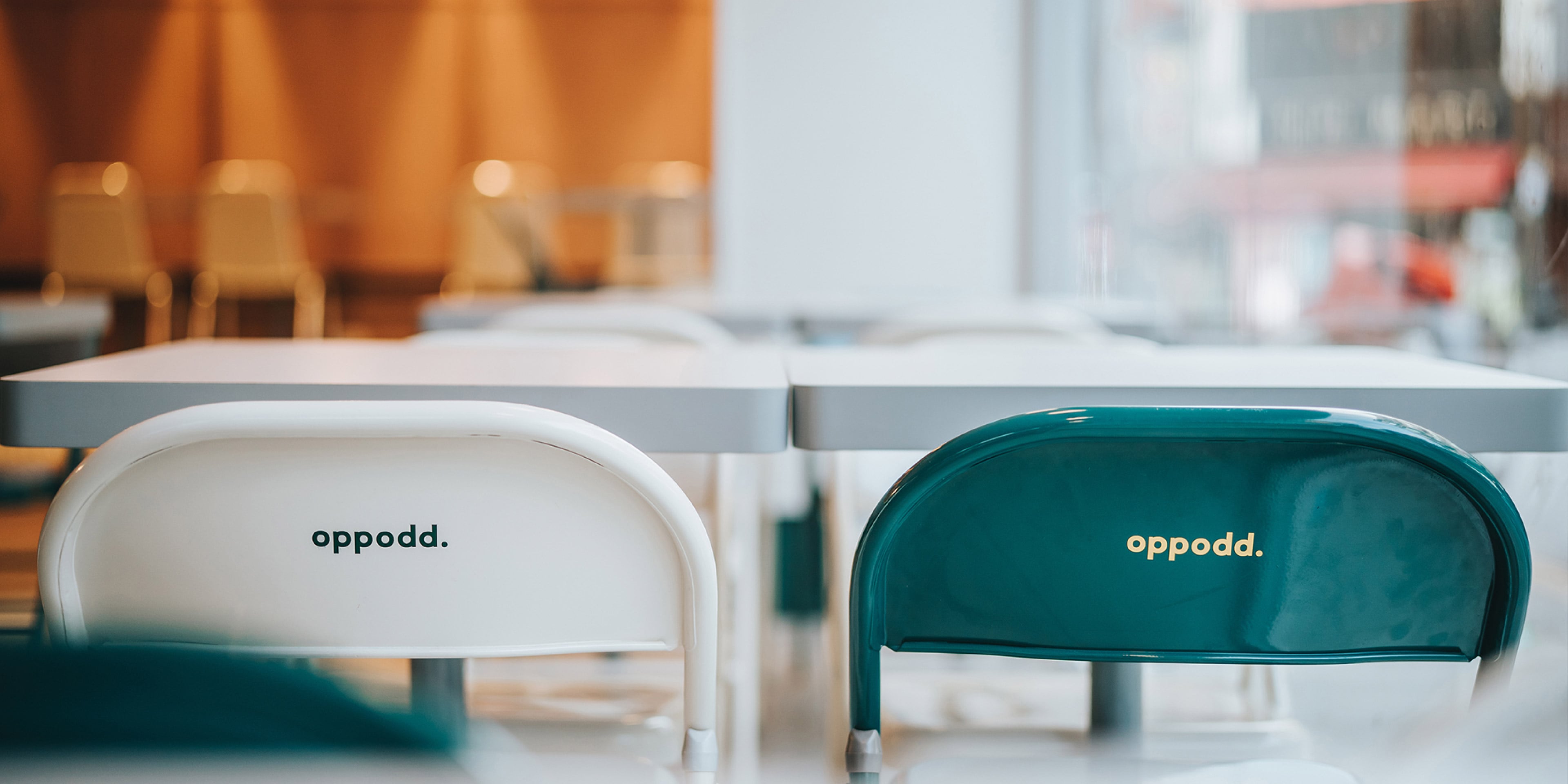
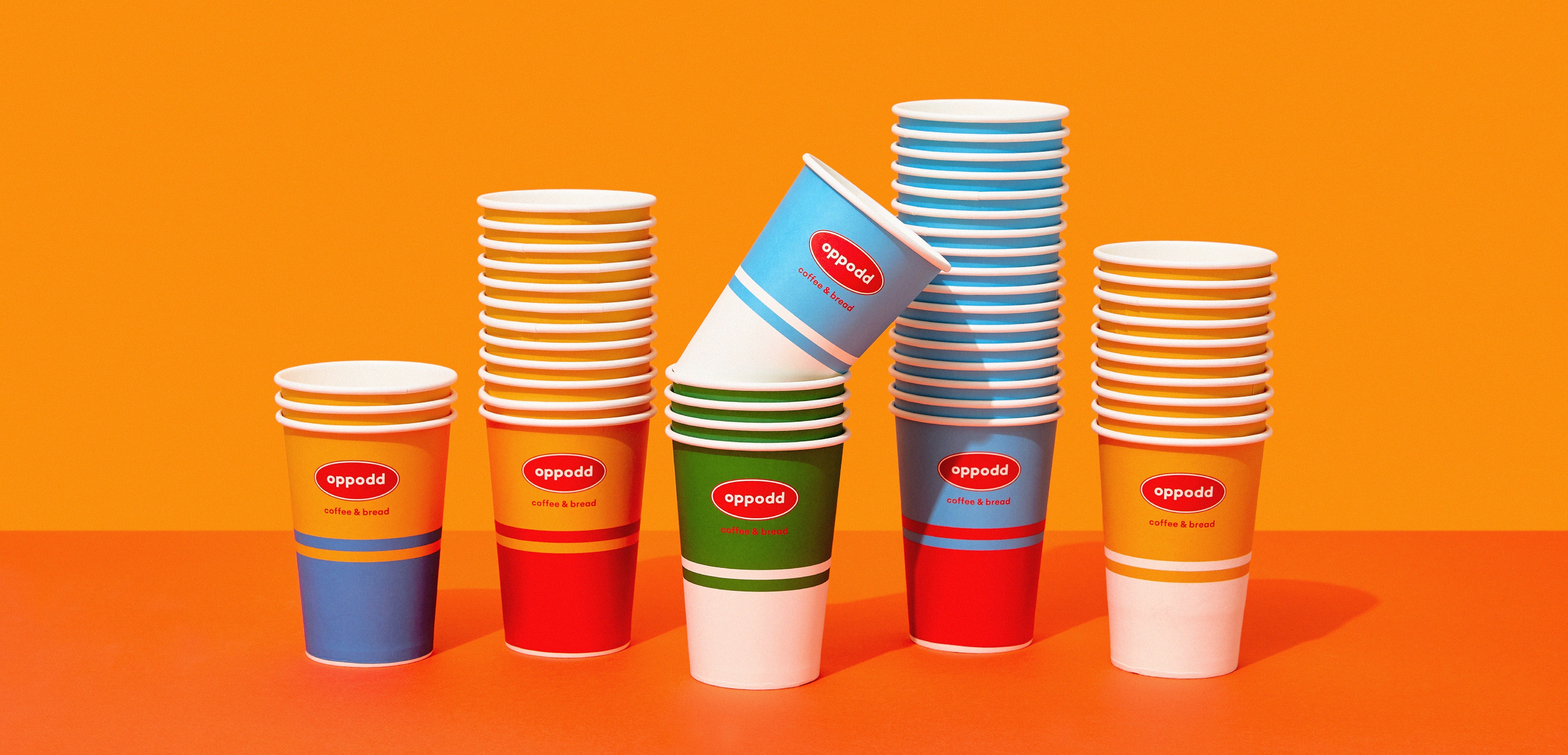
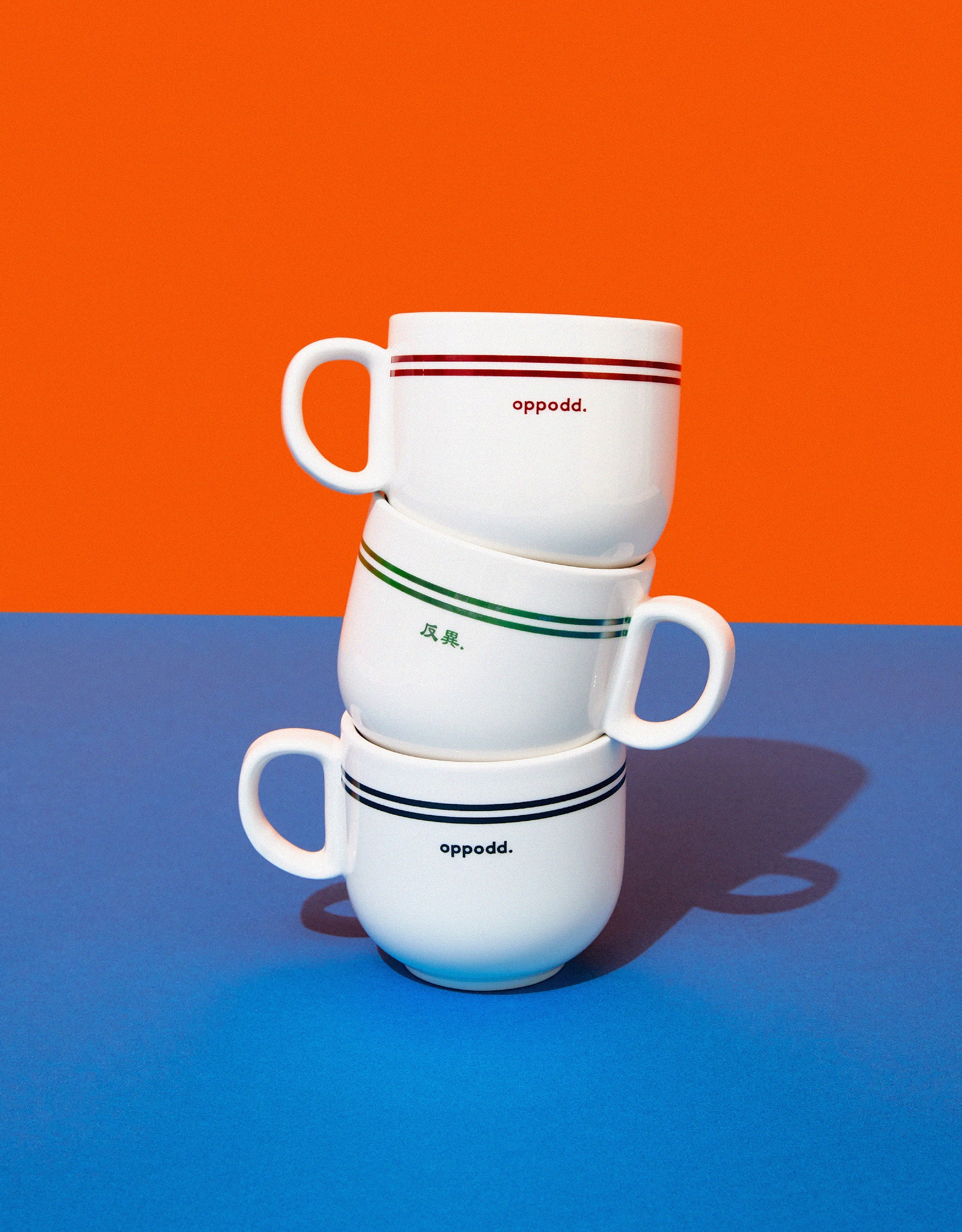
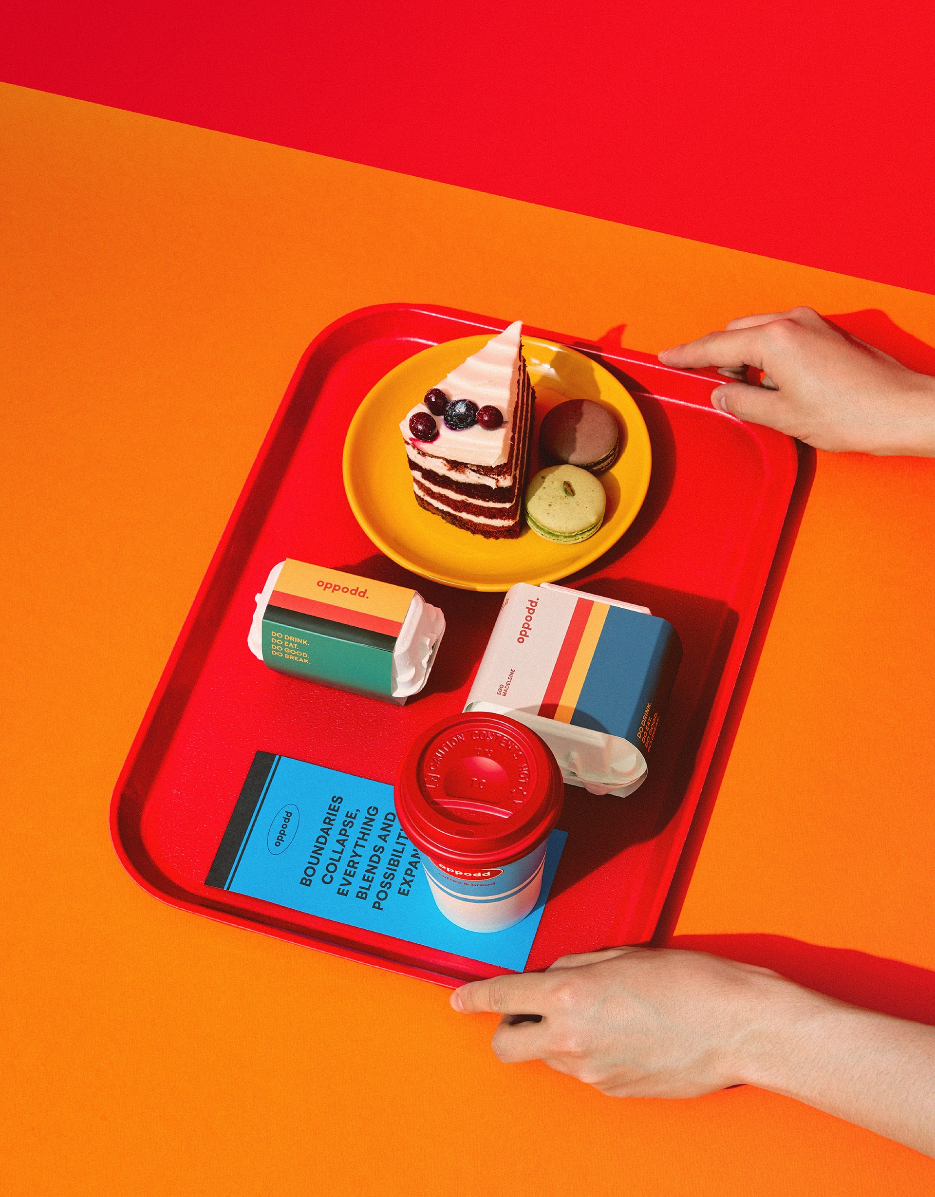
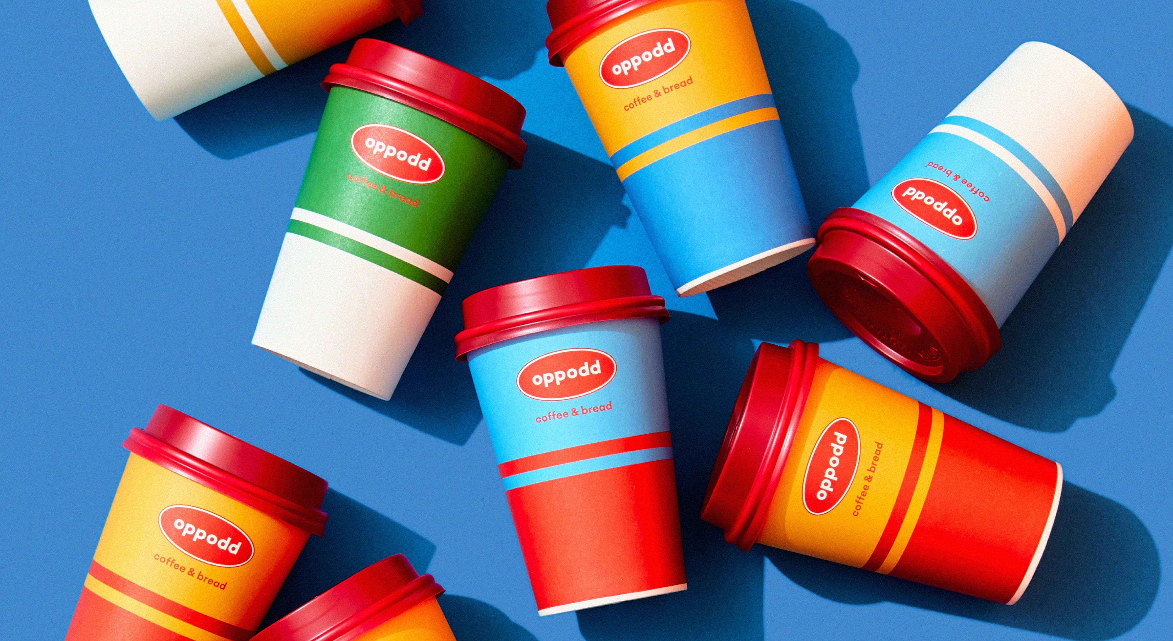
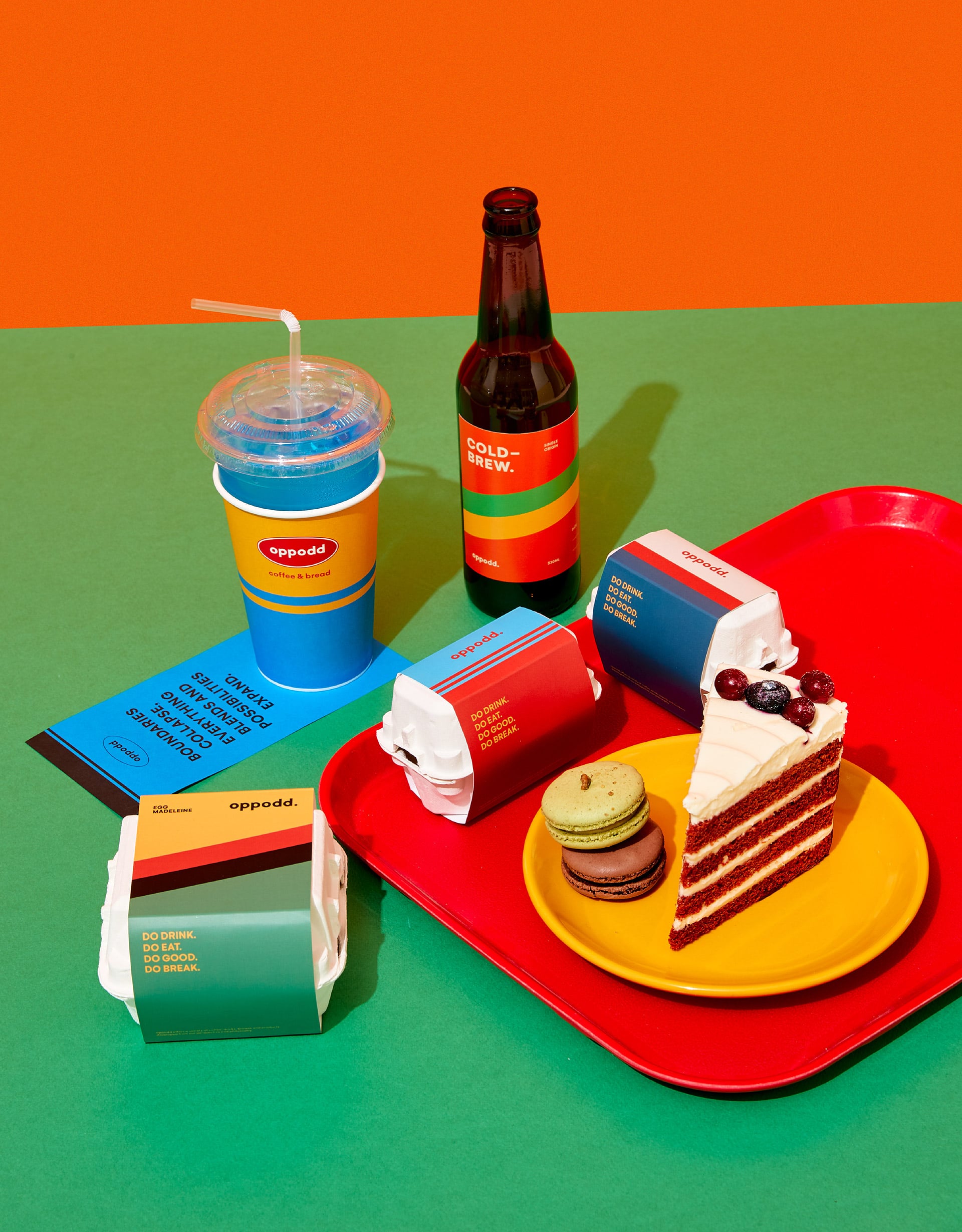
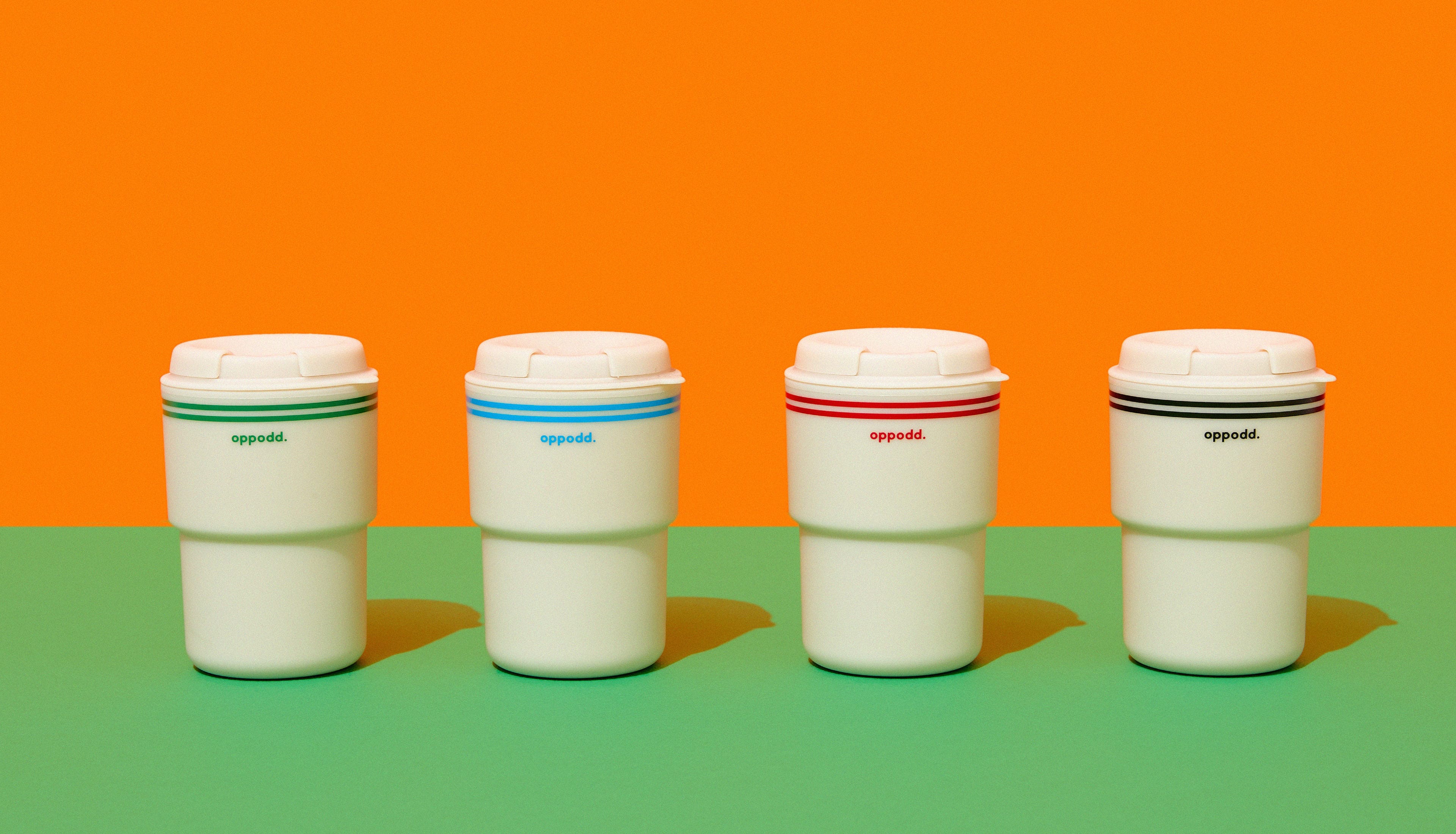
Oppodd’s wordmark design presents asymmetry of alphabet characters, which symbolizes the concept of a ‘combination of diversity.’ Also, the Chinese sub logo and symbol, graphics using lines and faces, and harmony of daring primary colors are designed to consistently demonstrate the concepts Oppodd pursues throughout its space, packages, and SNS contents.
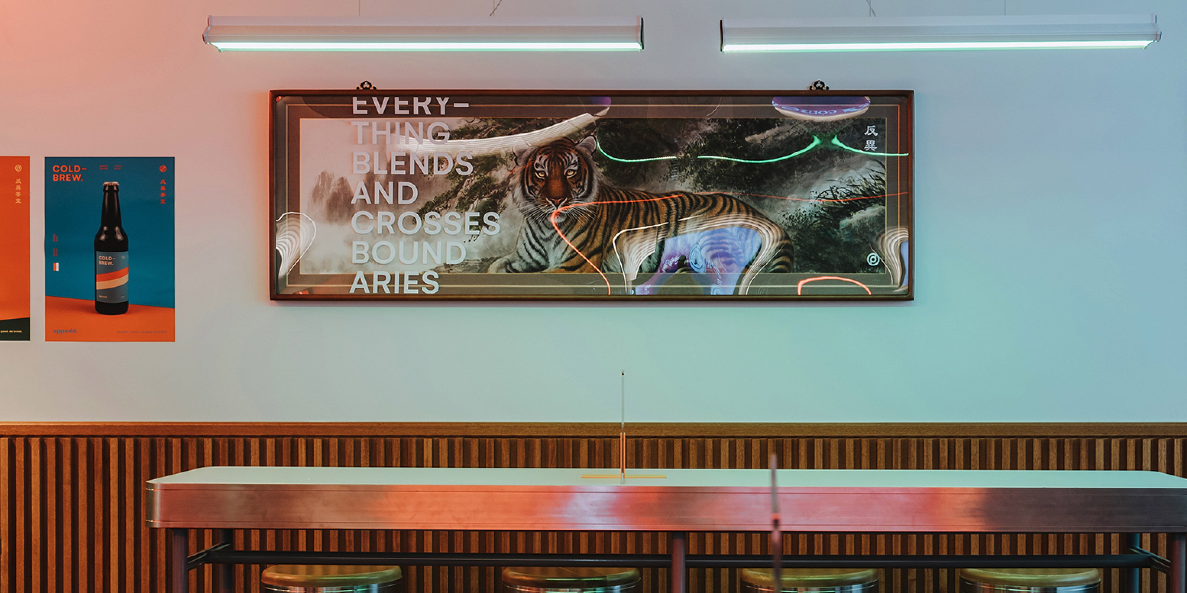
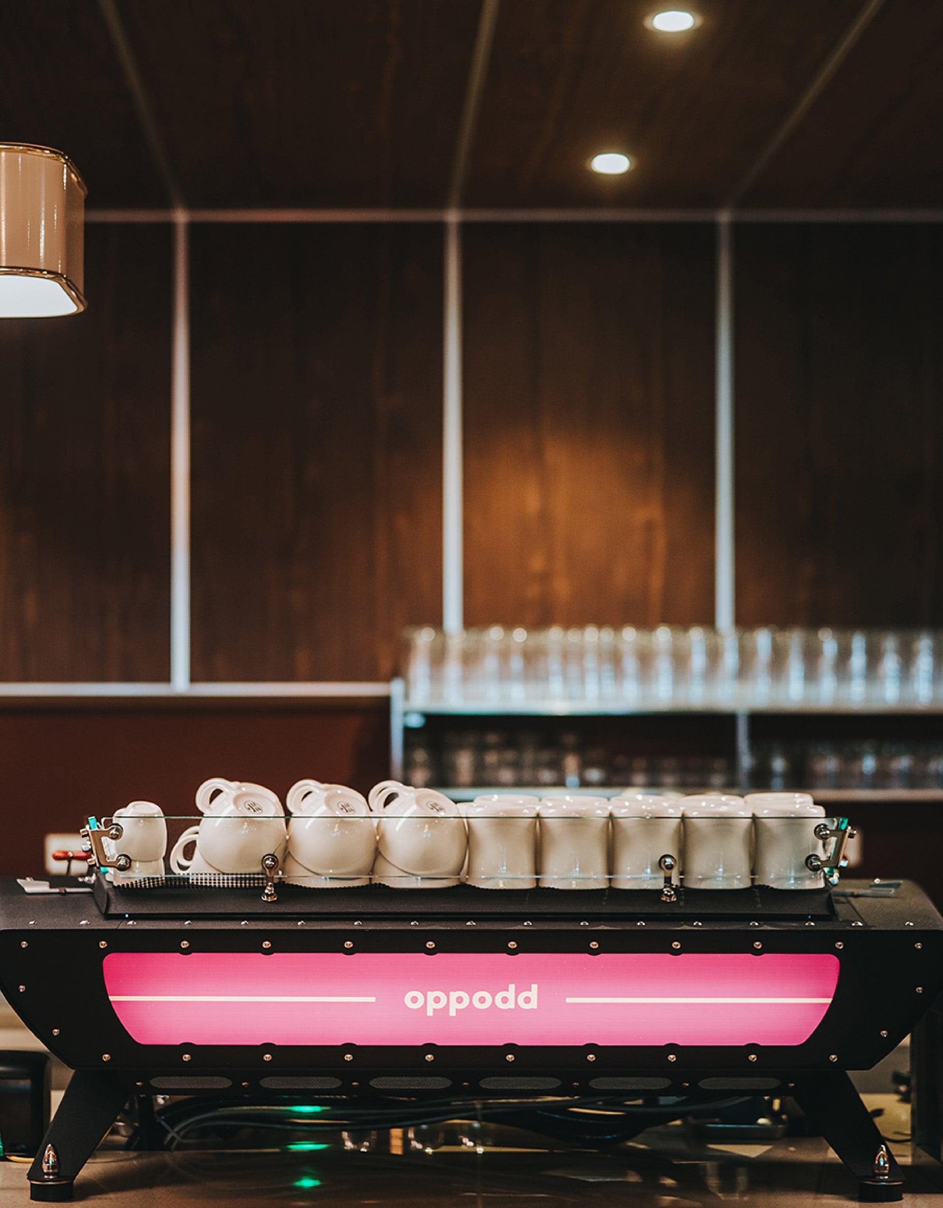
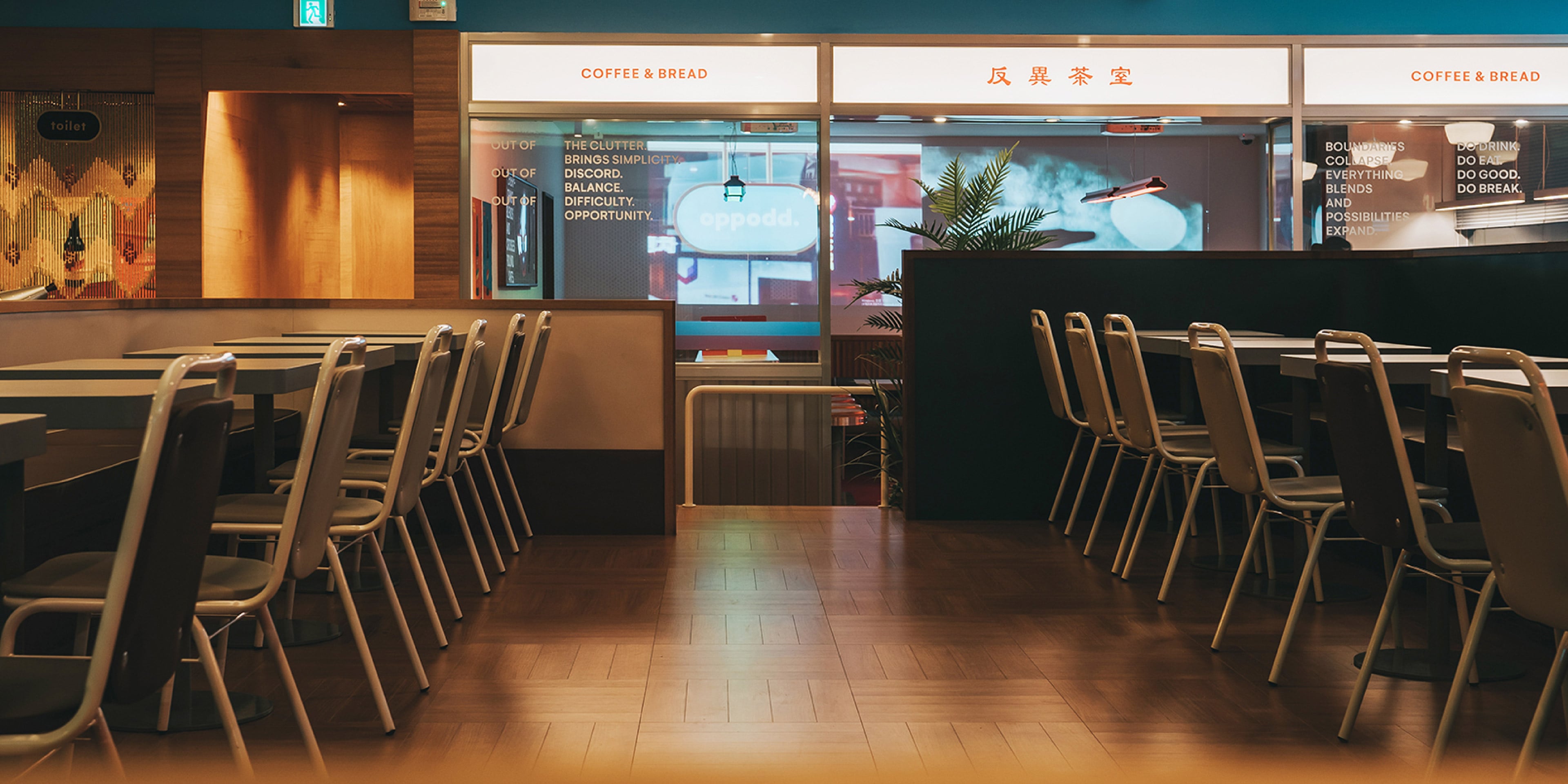
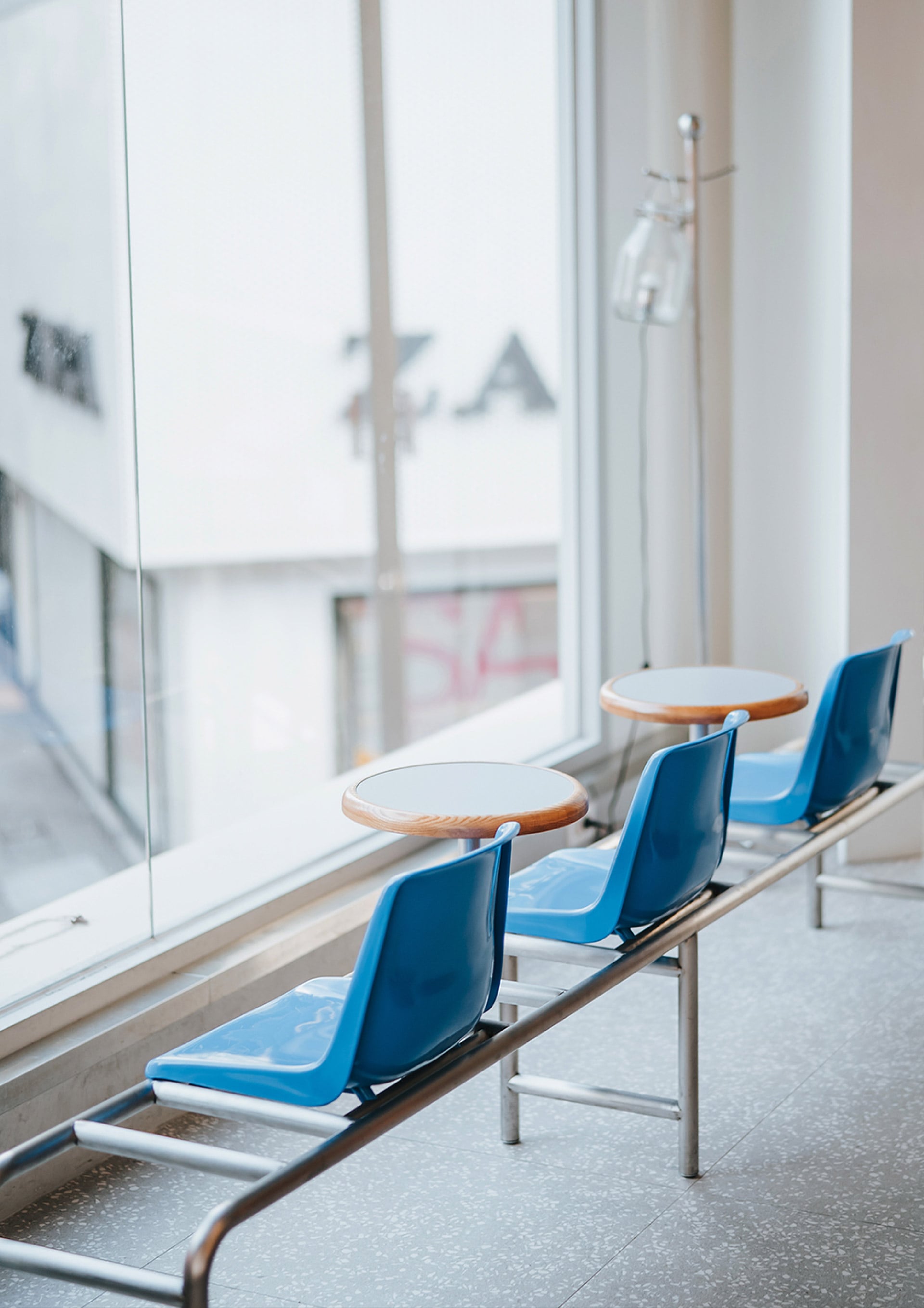
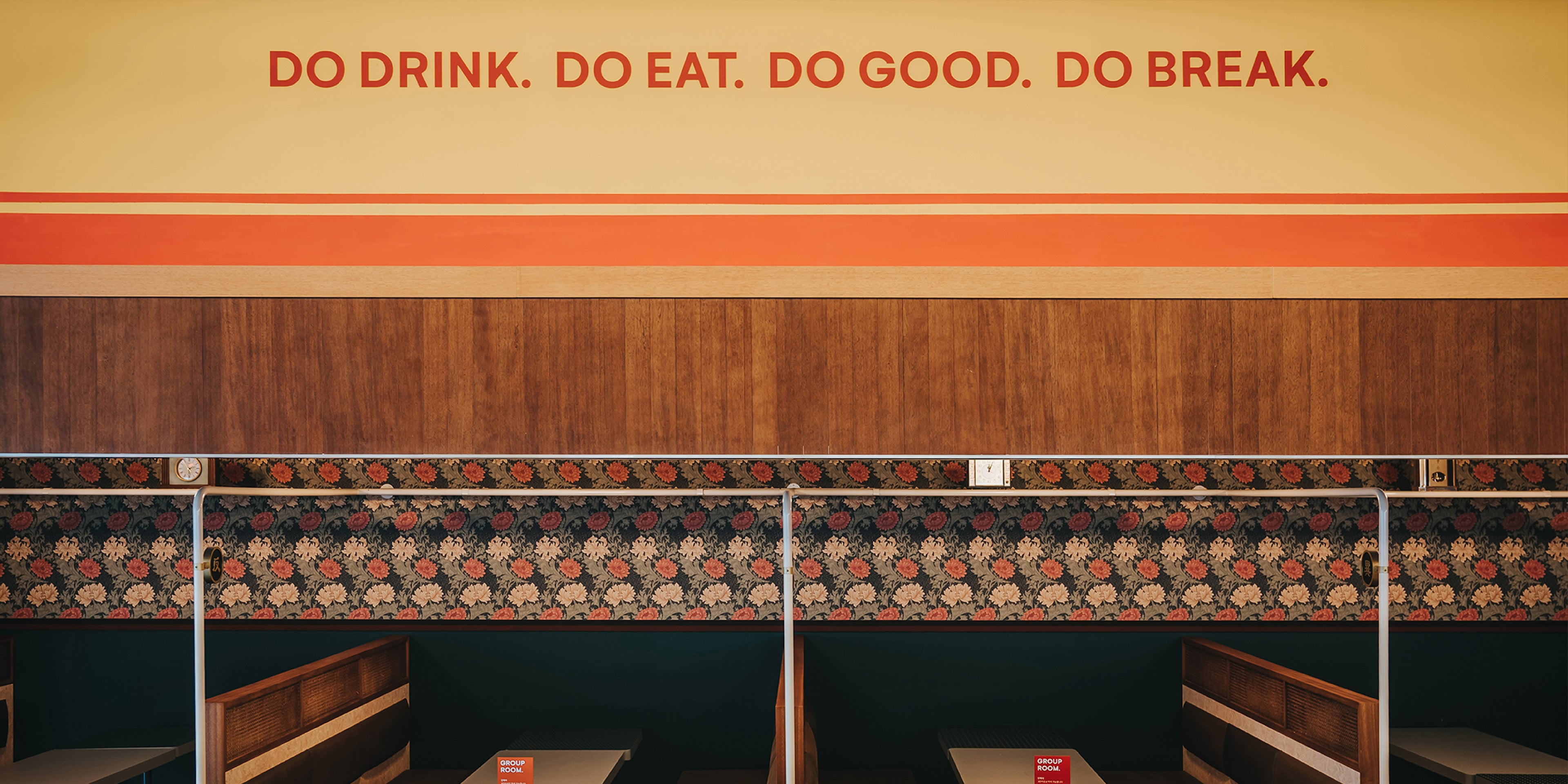
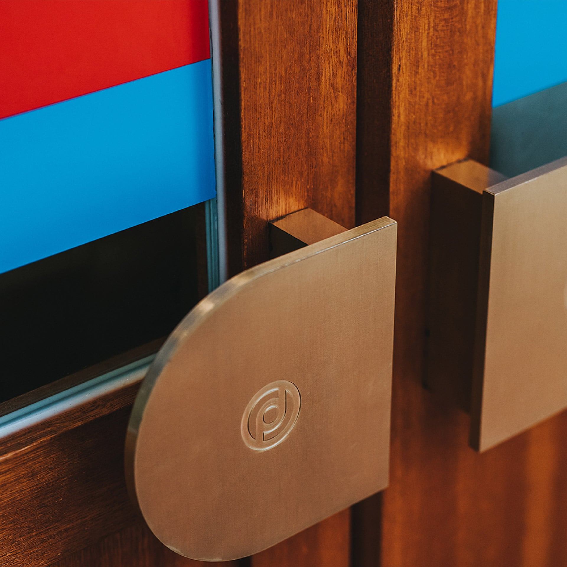
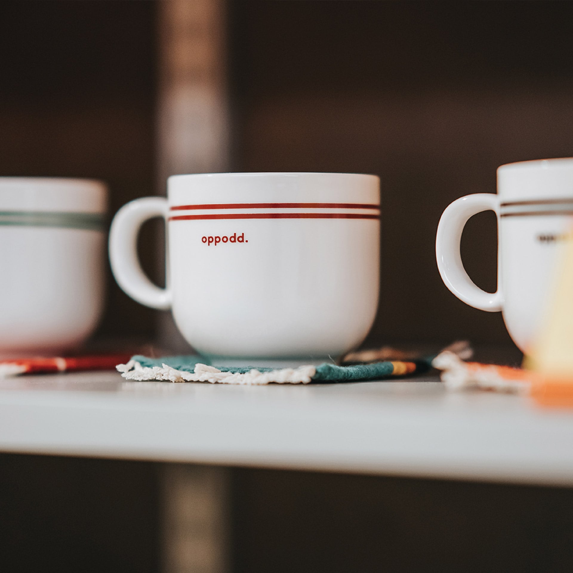
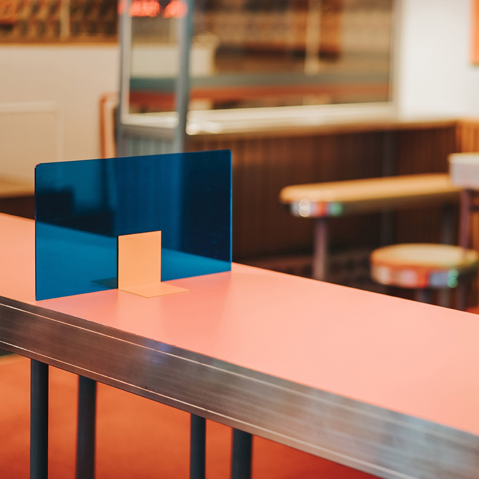
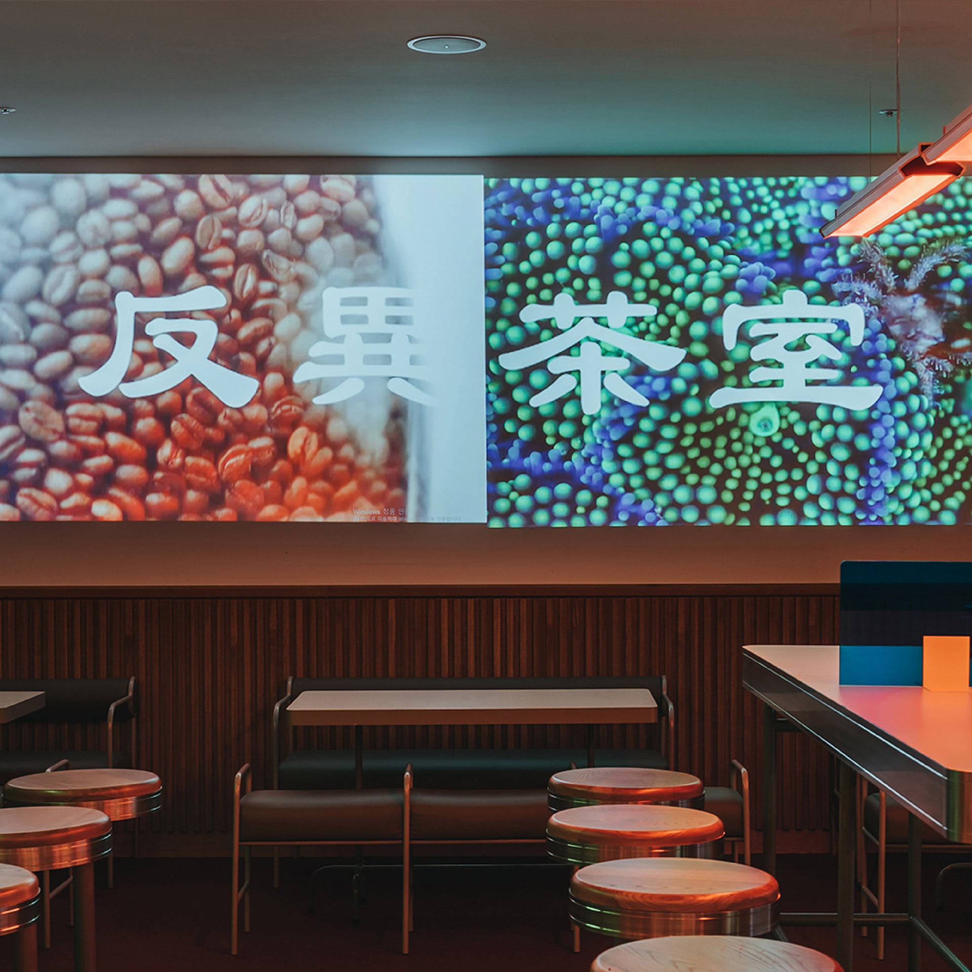
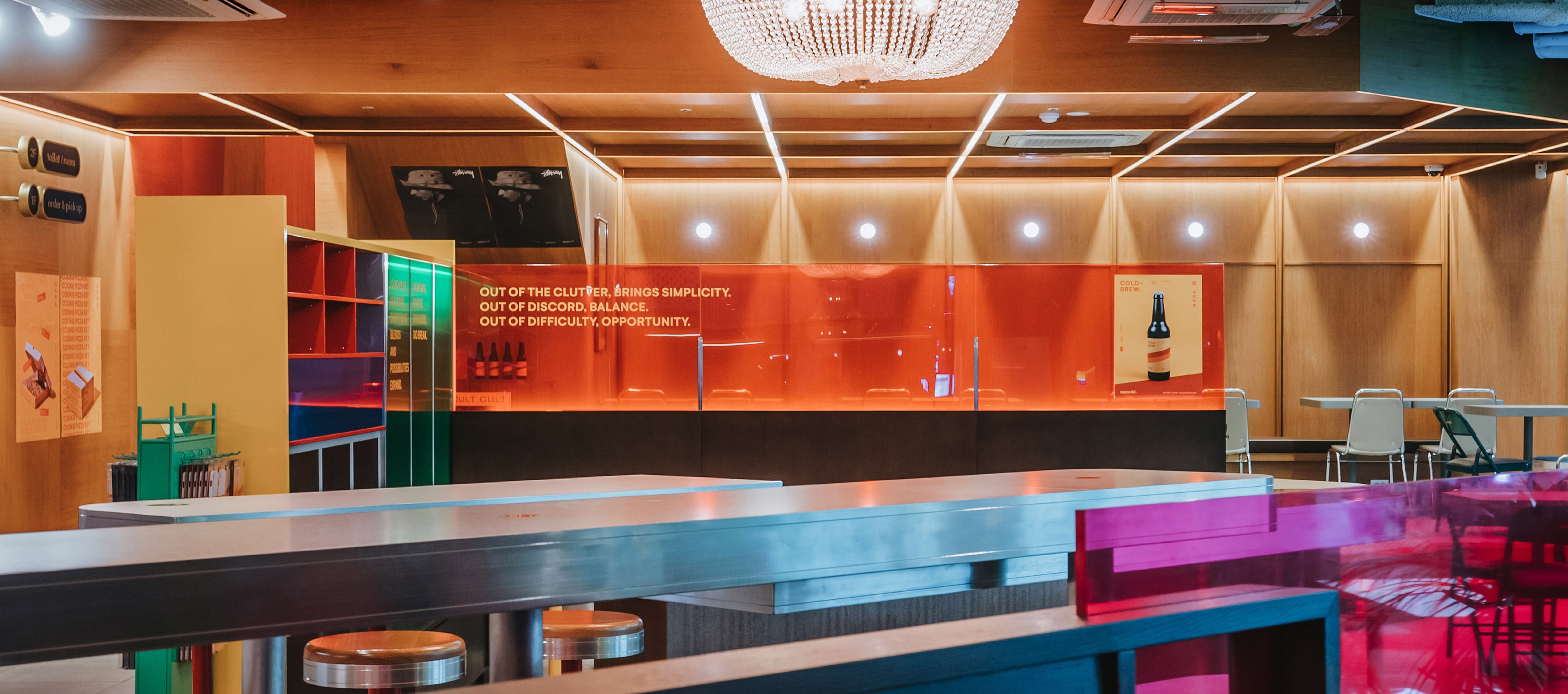
Oppodd’s space created with the combination of visual elements that may be found in Eastern and Western cultures offers diverse settings and atmospheres reminiscent of a tea house in Hong Kong, a hamburger store in US and a space of the past. Such diverse settings occupy the spacious café, which would otherwise feel boring, to give a fresh experience to customers every time they visit the place.
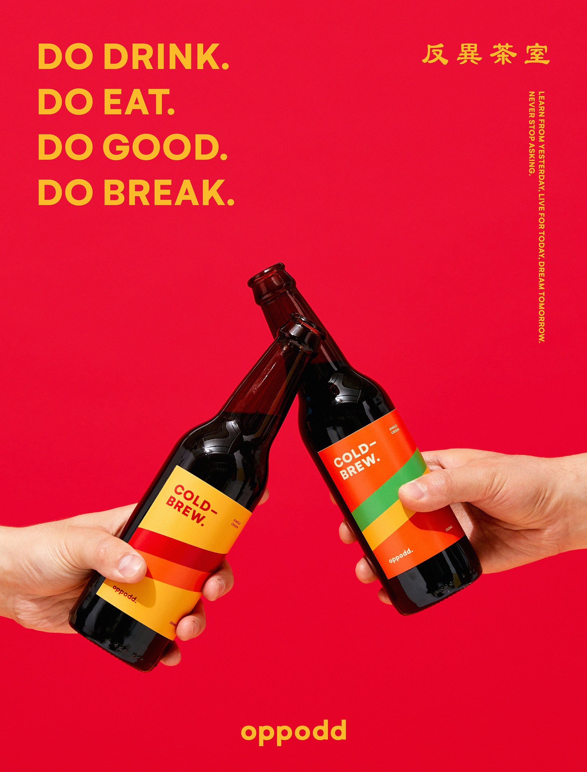
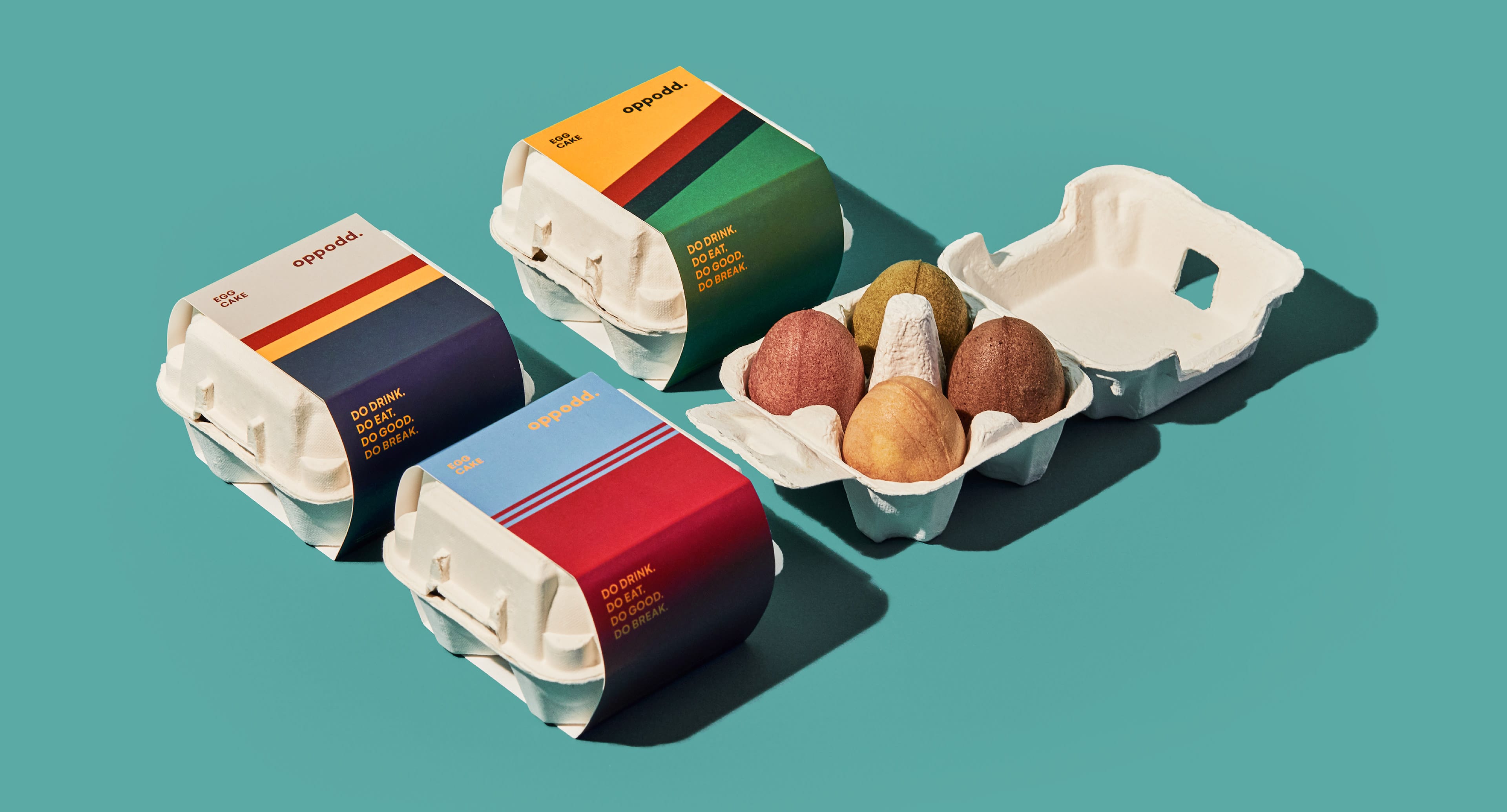
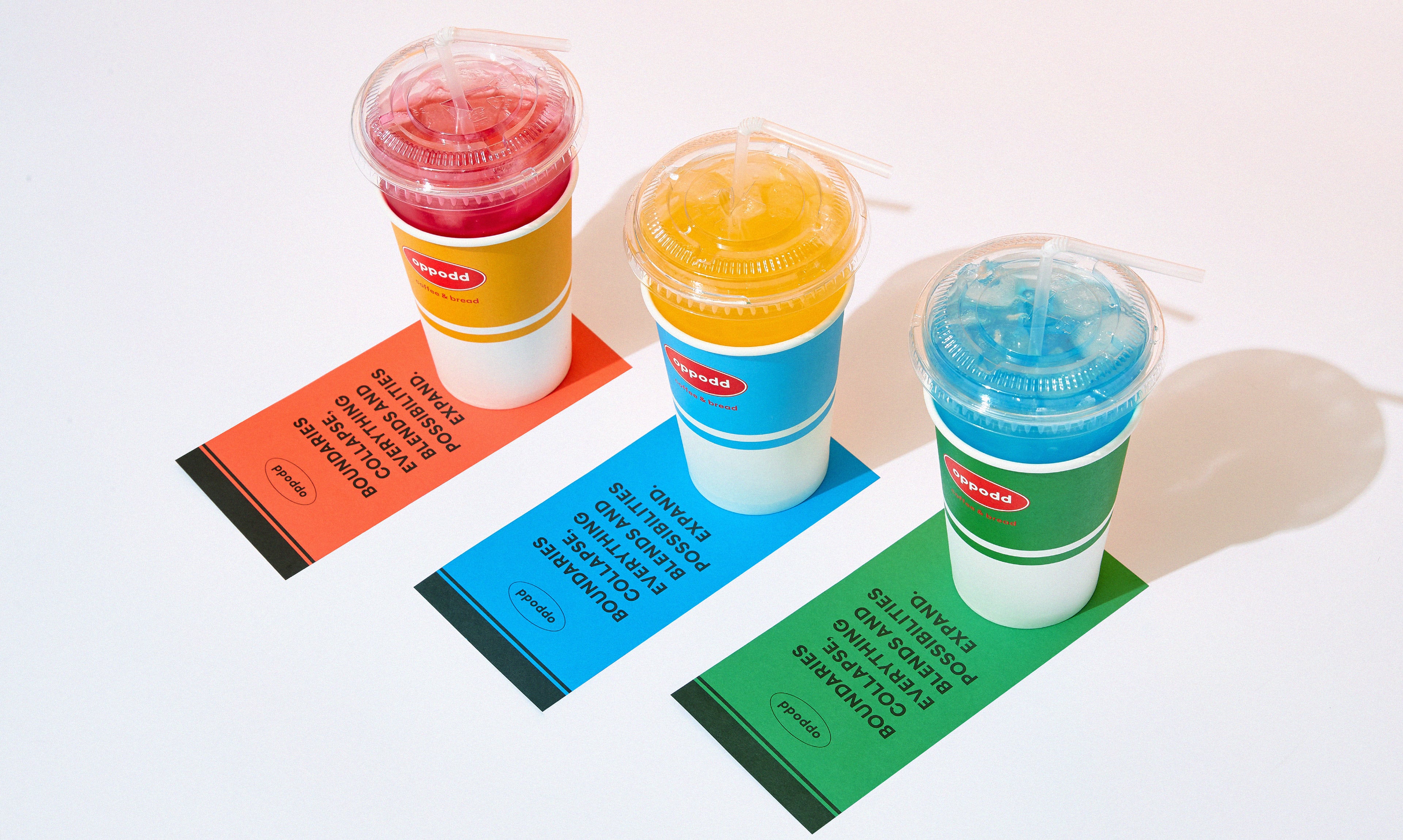
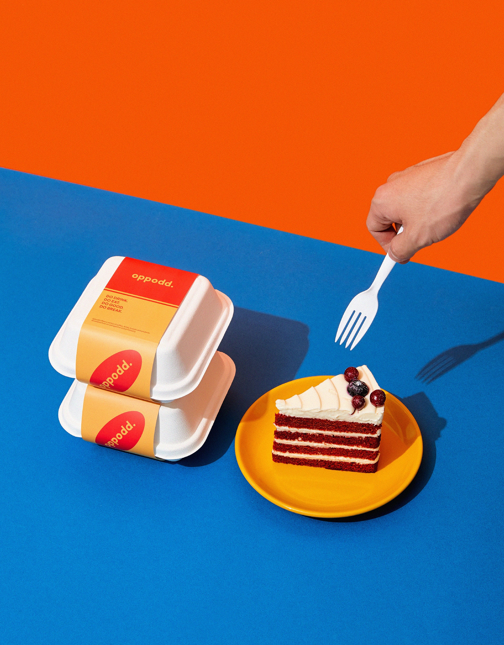
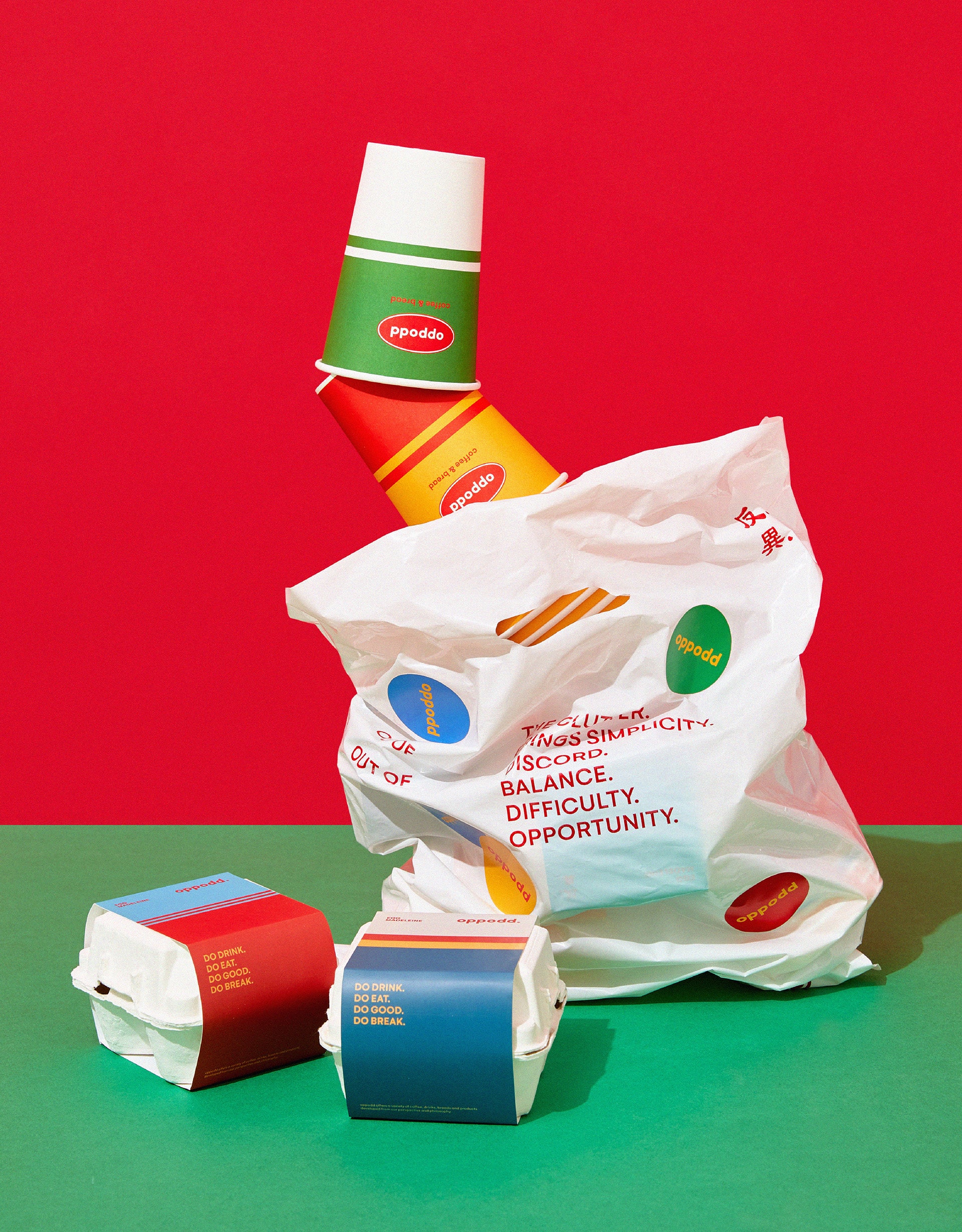
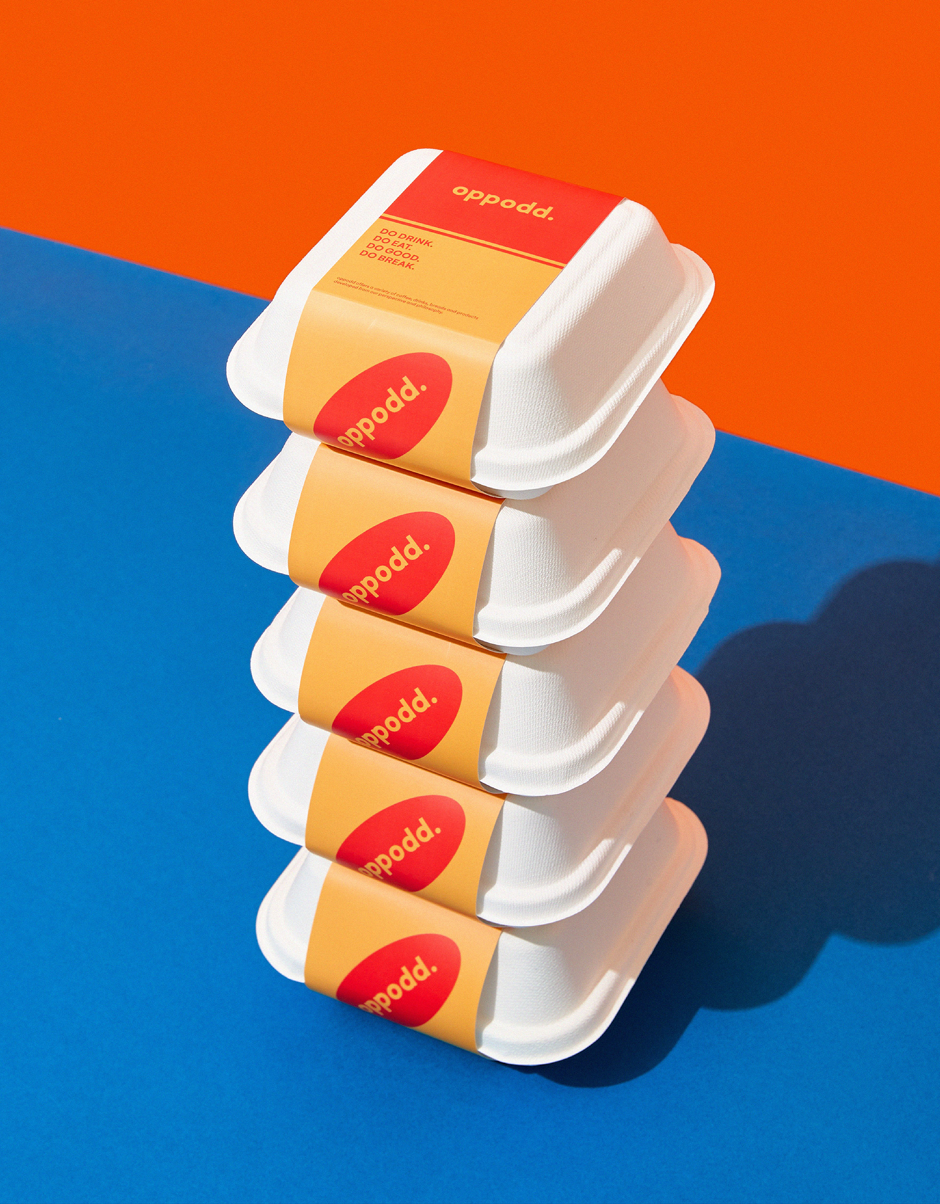
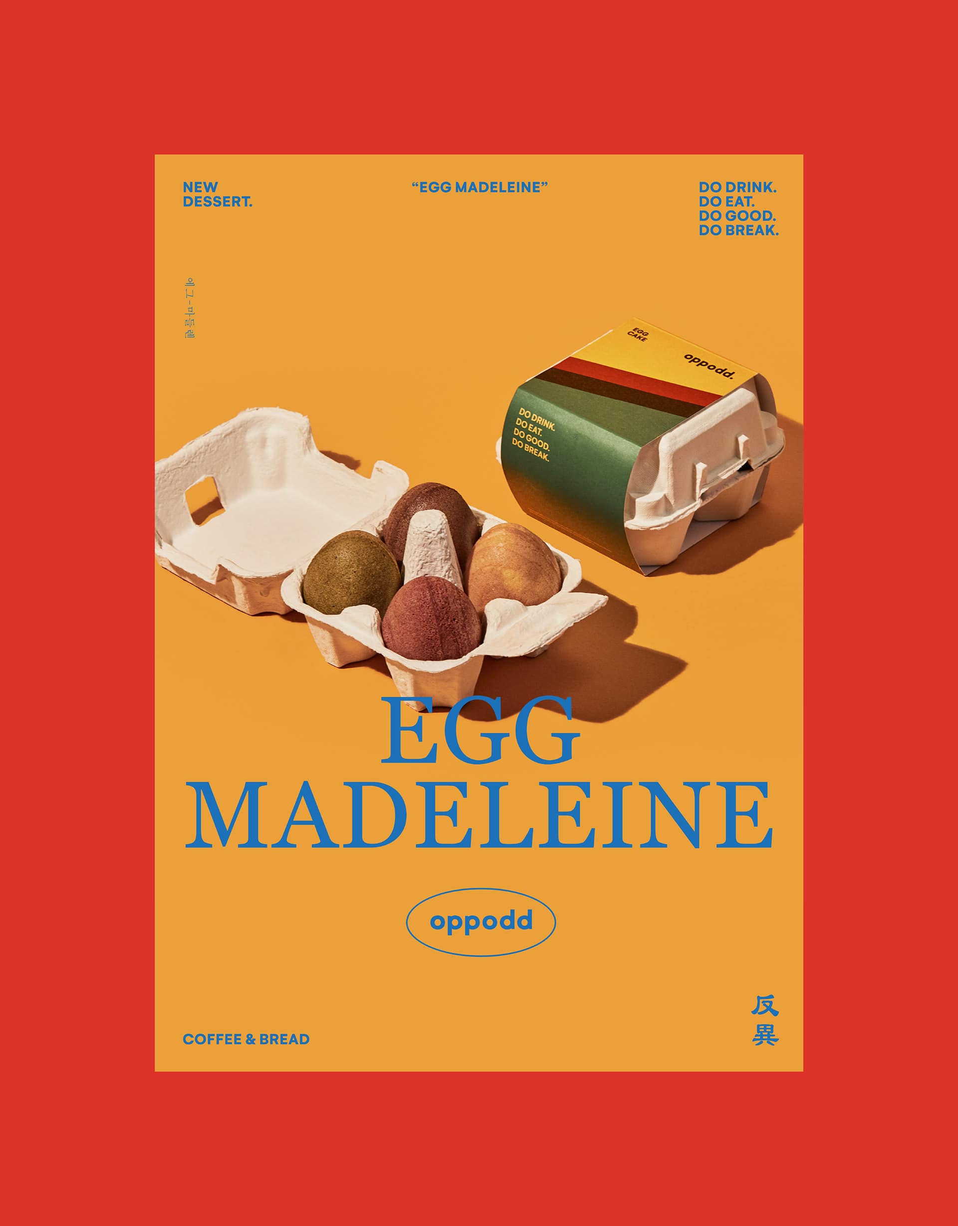
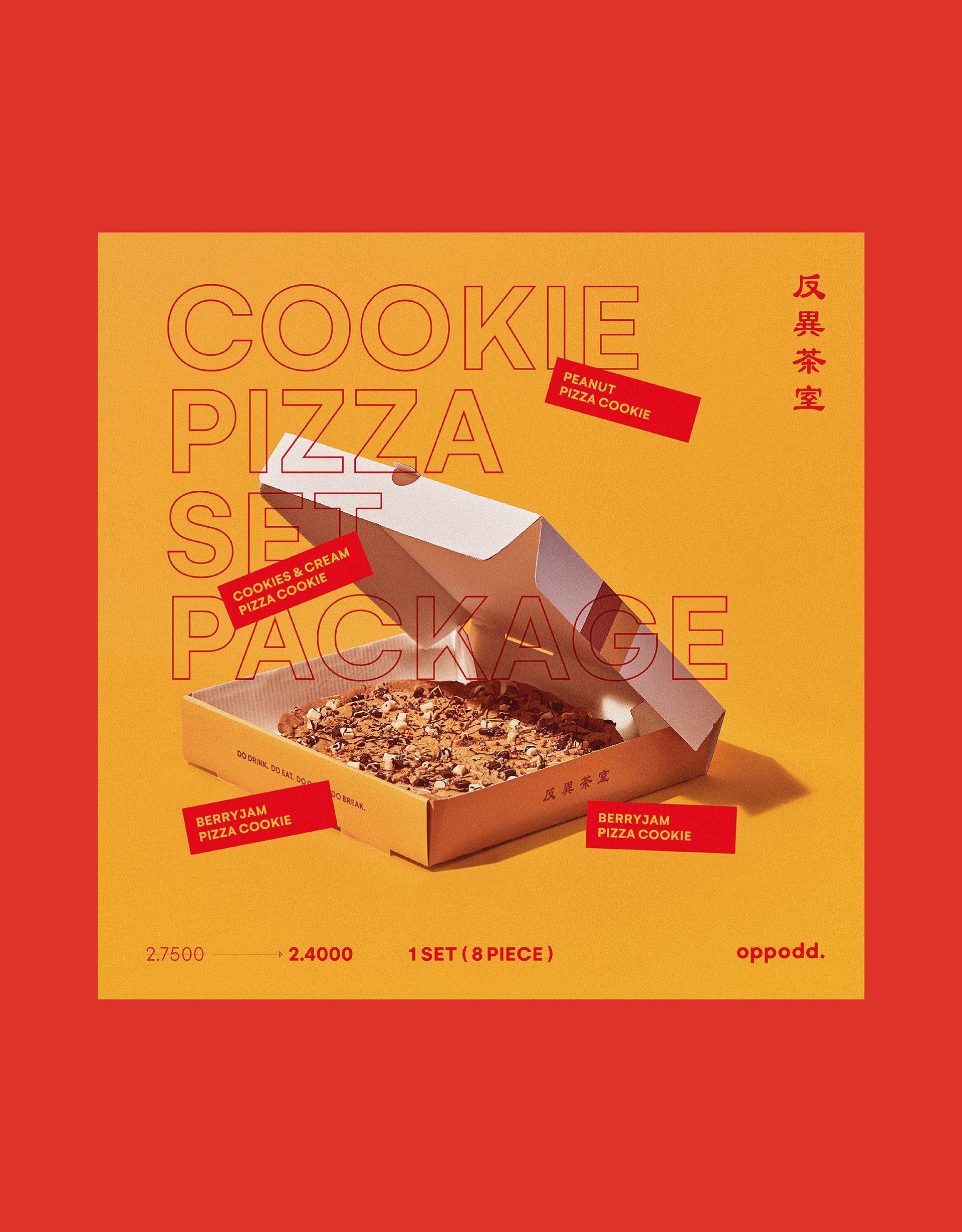
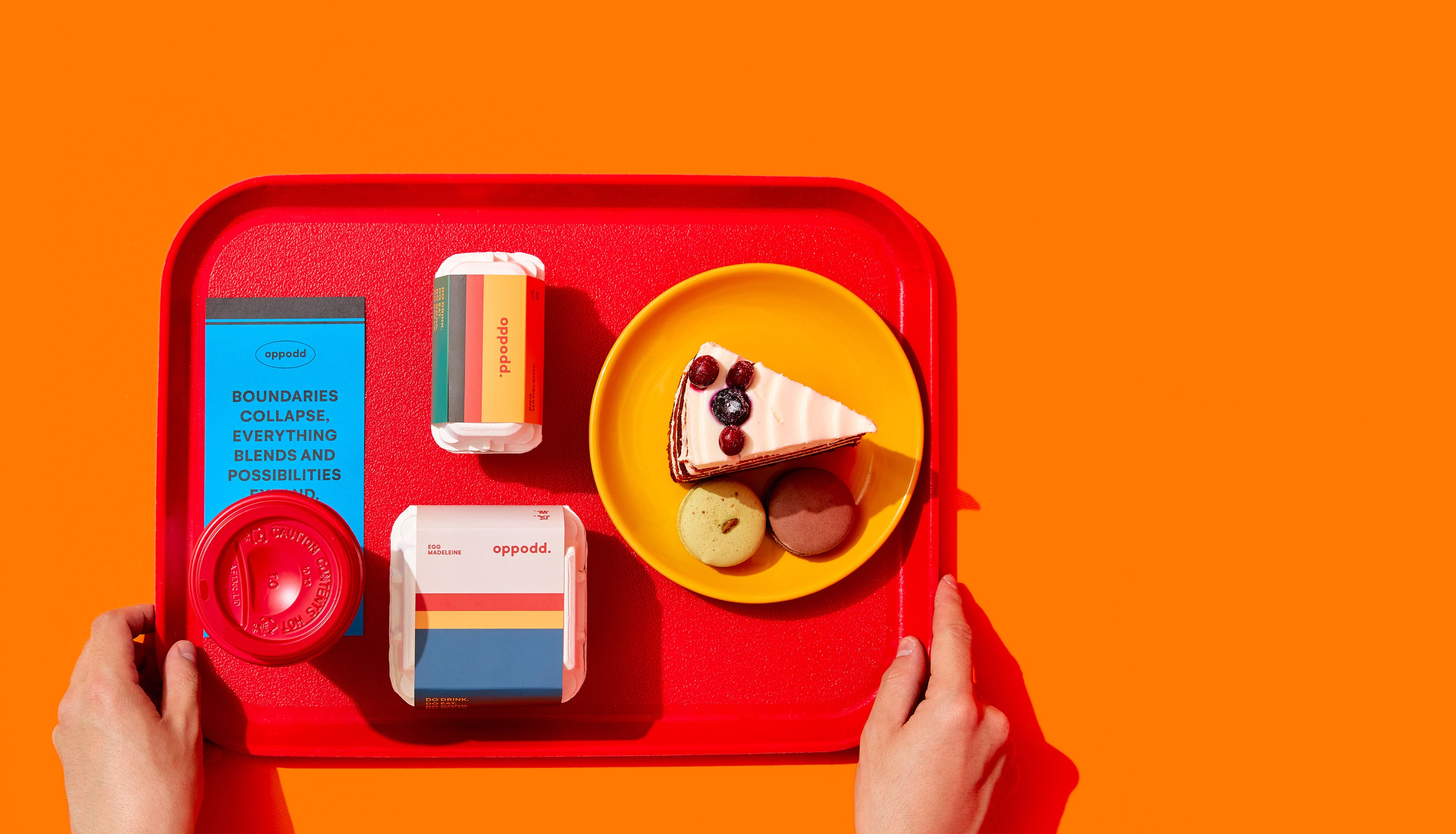
Oppodd is differentiated as evidenced by its unique menus and packages, e.g. pizza-shaped cookies in a pizza box, cold brew and milk tea in a beer bottle, and egg-shaped madeleine in an egg carton. Also, Oppodd’s menus combining discrete elements provide unprecedented fresh experiences and fun factors.

BRENDEN & VIIND
Creative Direction / Do-eui Lee
Project Management / Wook Jung, Jiwoon Kim, Kyungmin Kim
Design / Doeui Lee
Cretive Partner / Studio Viind, 1mm Design