NAVER Plus Store
Visual Identity Design
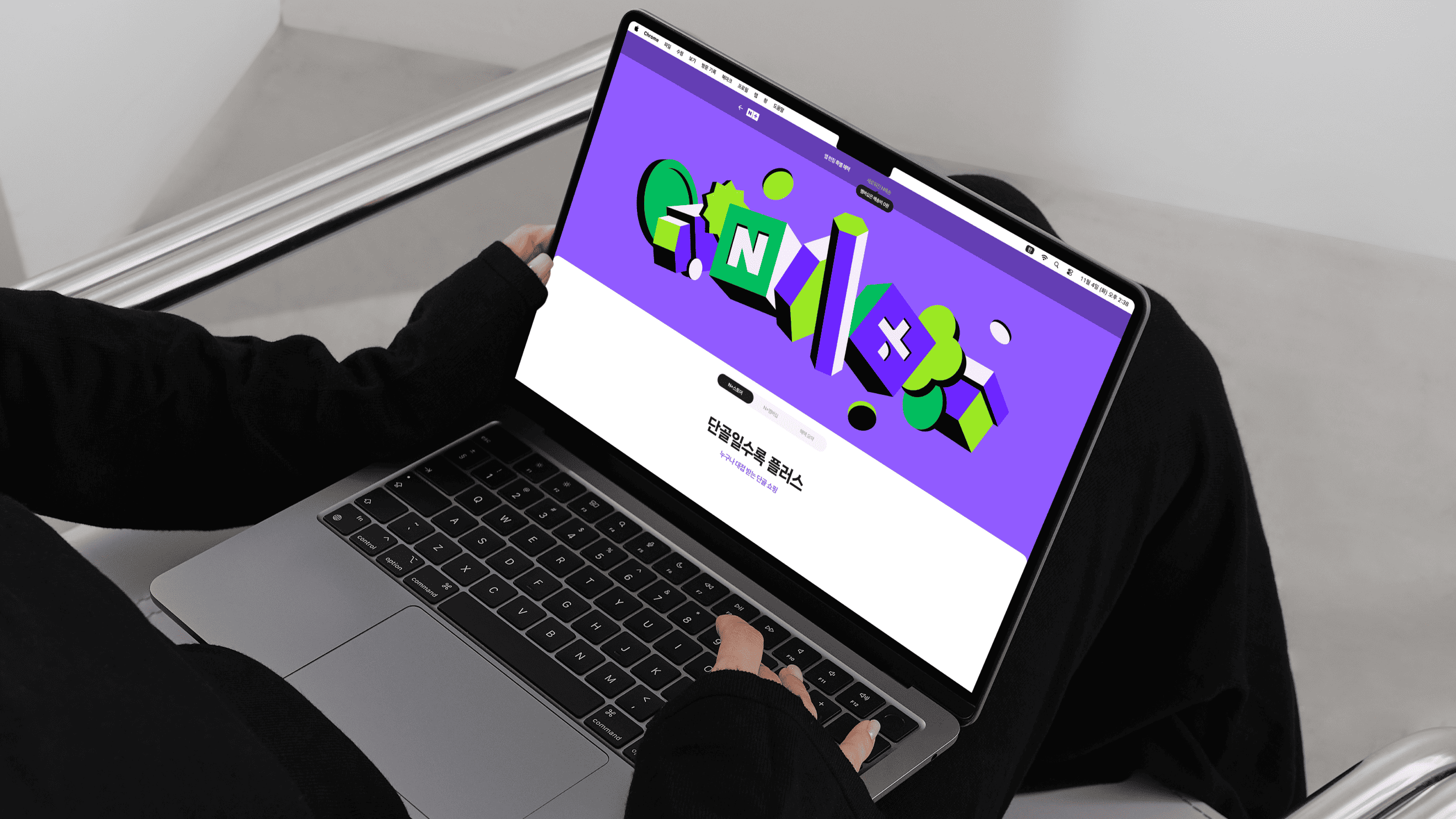
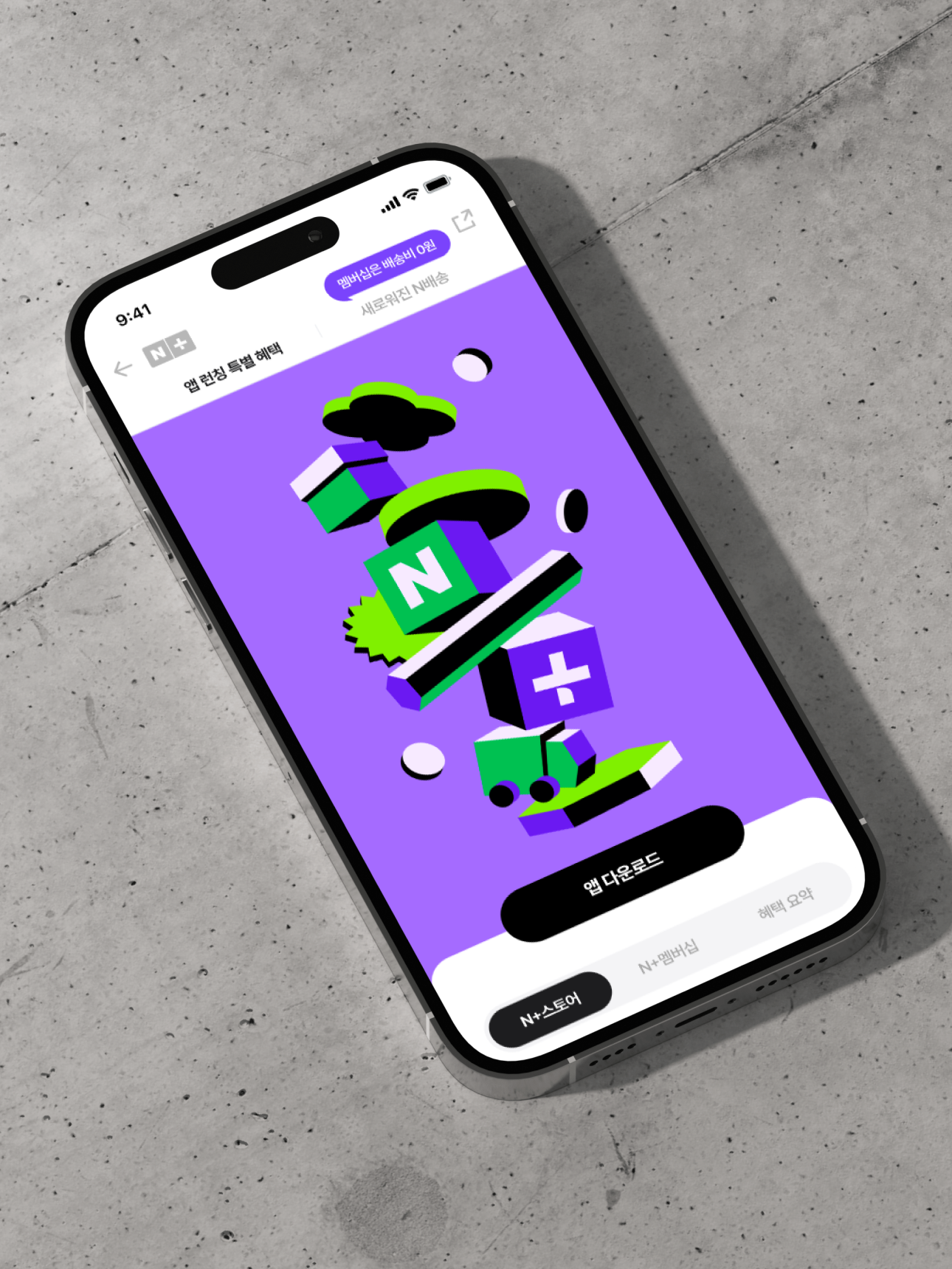
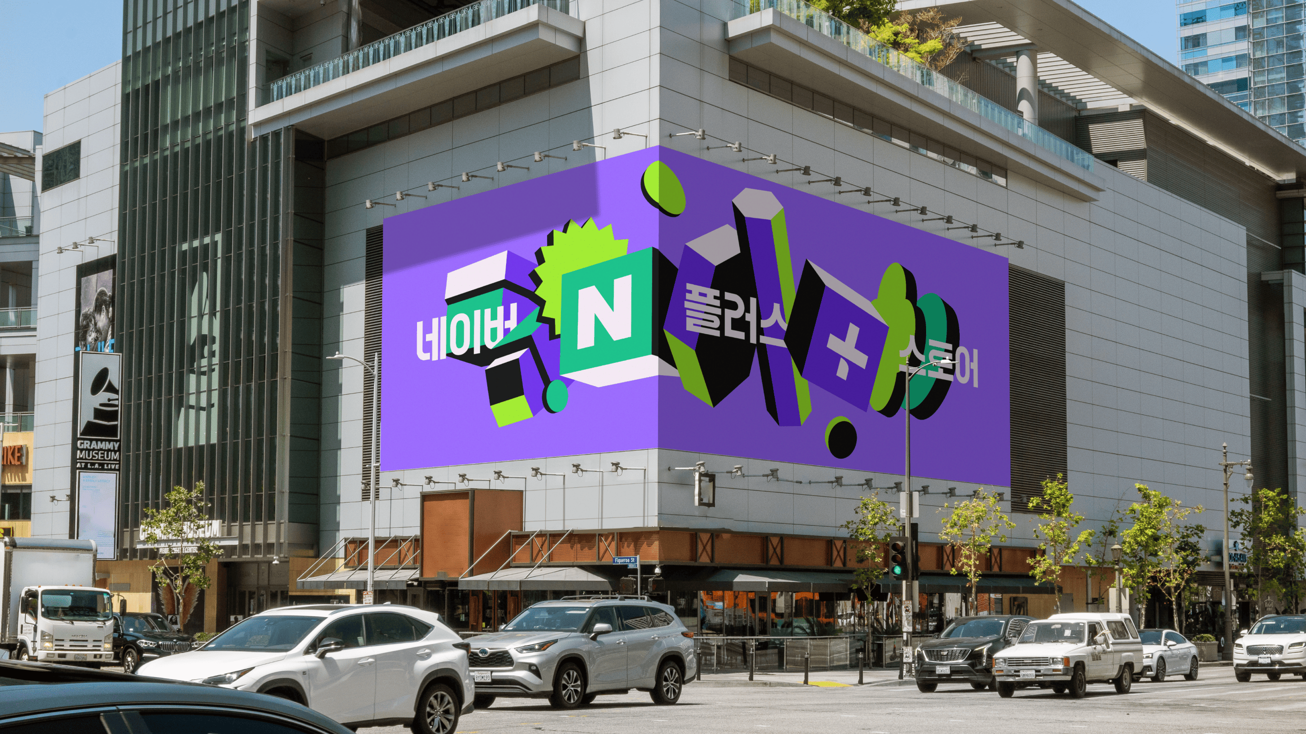
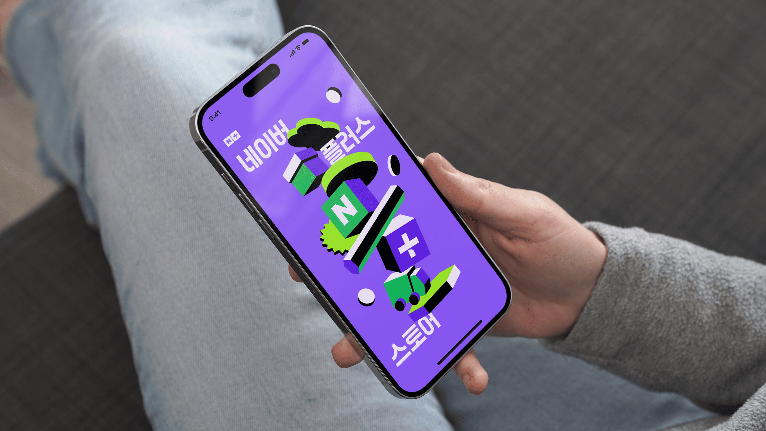
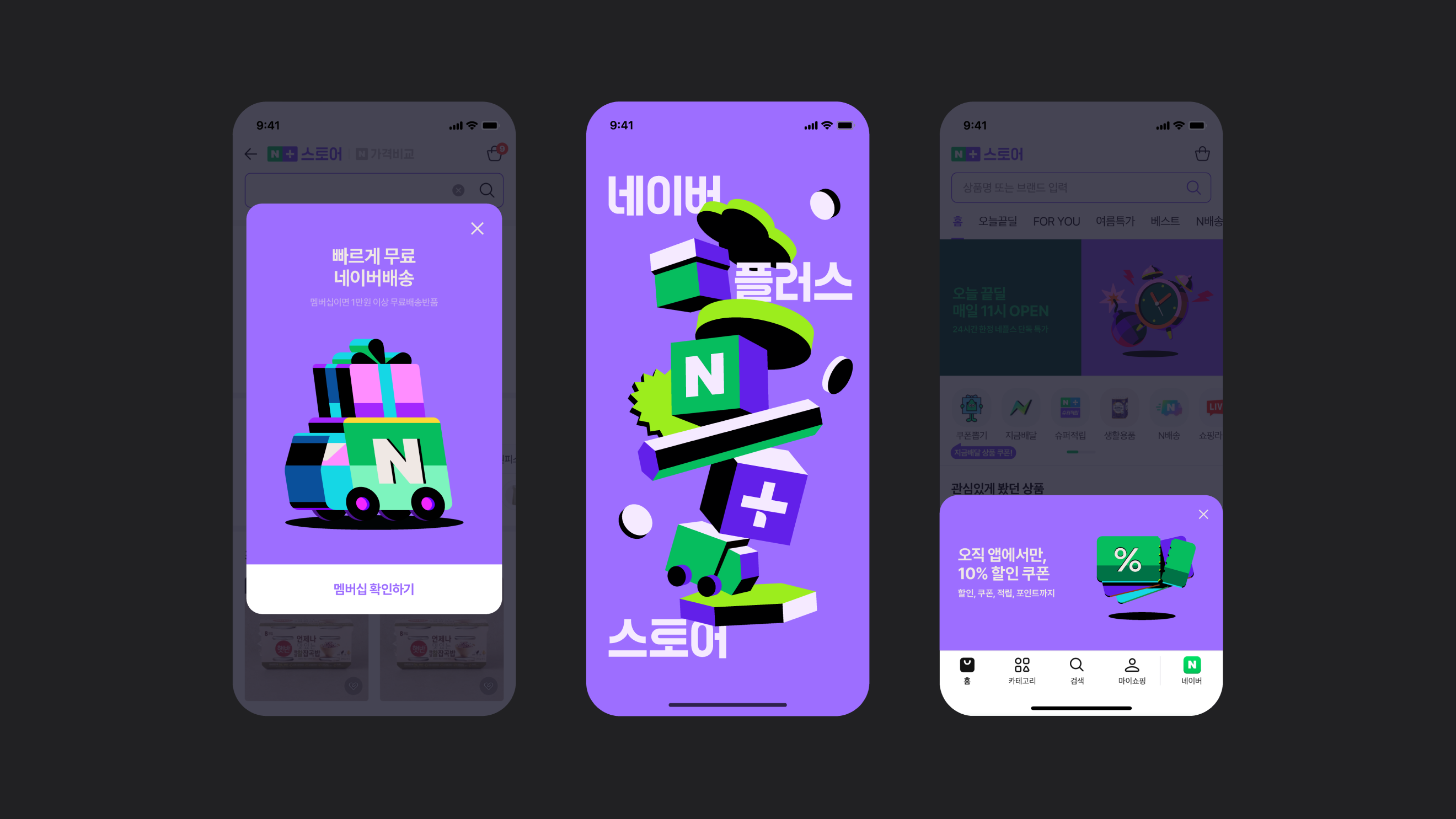
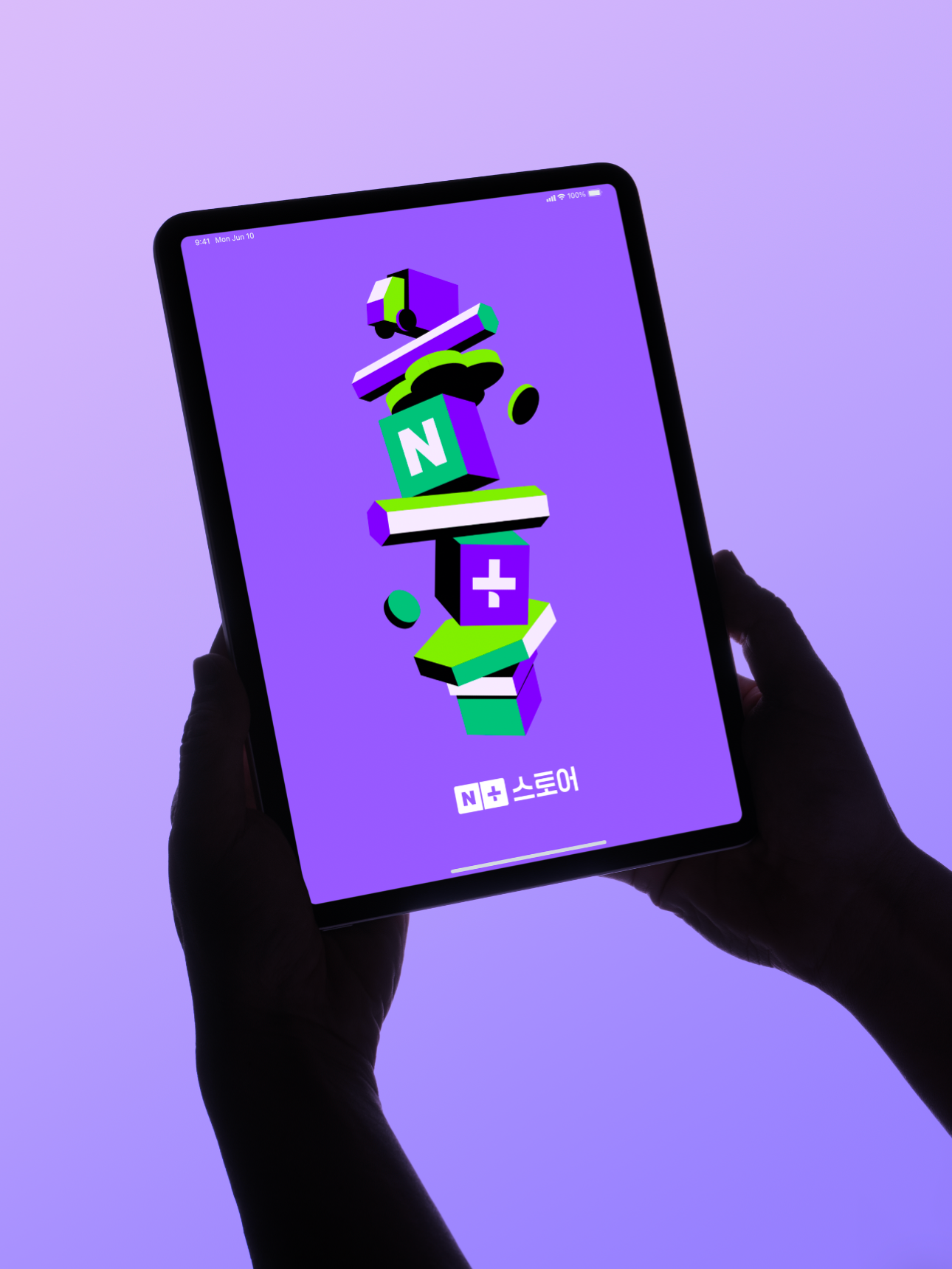
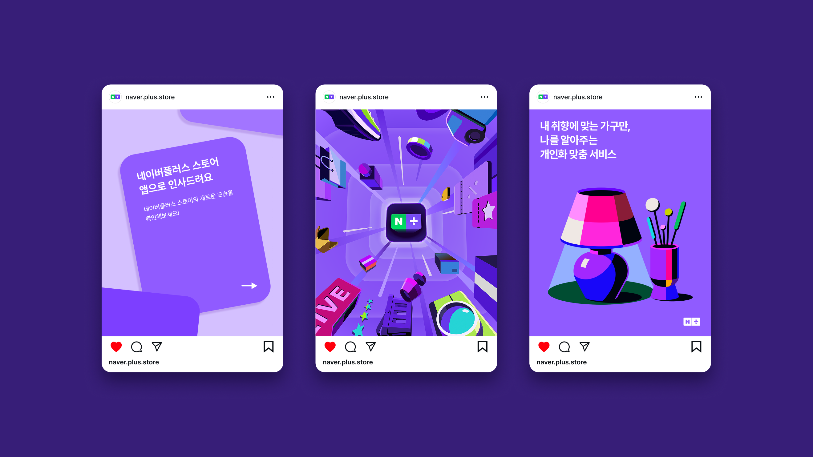
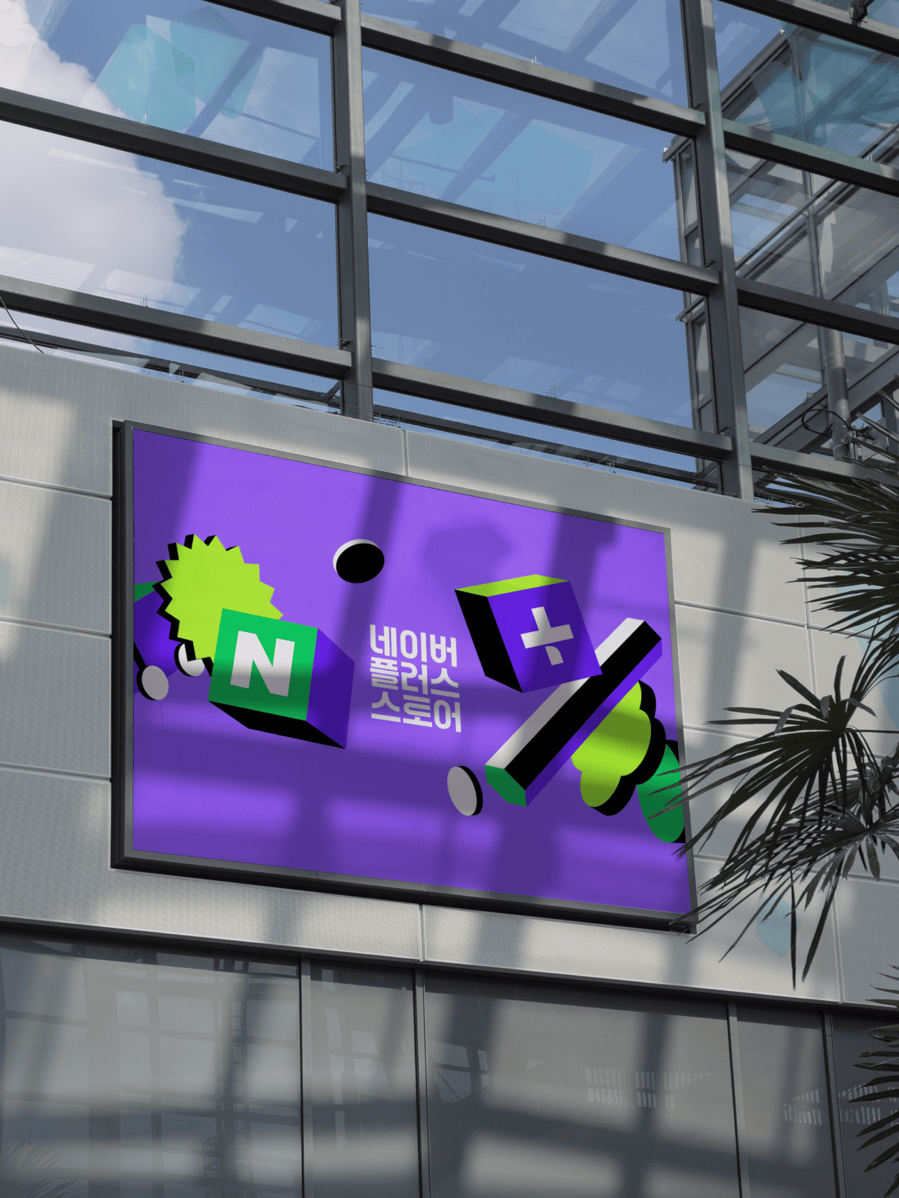
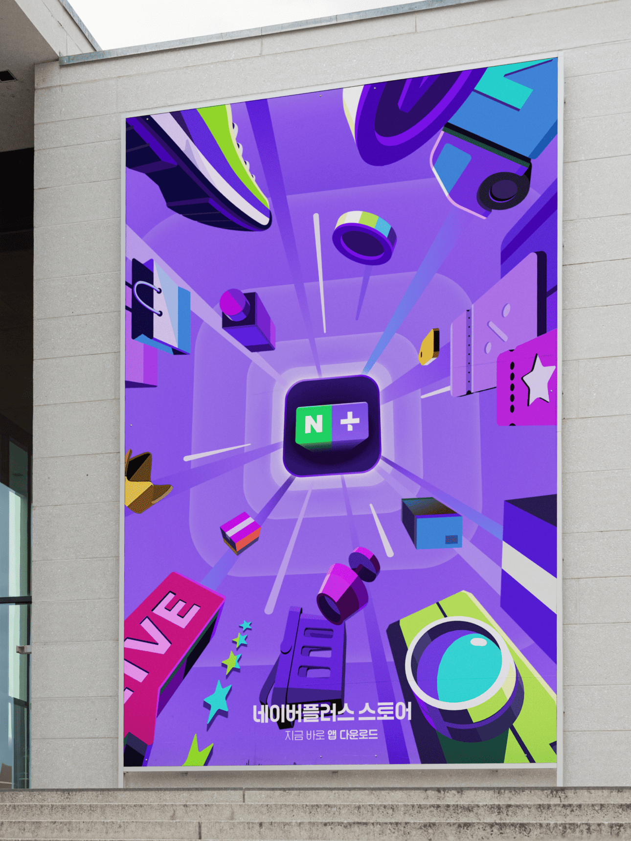
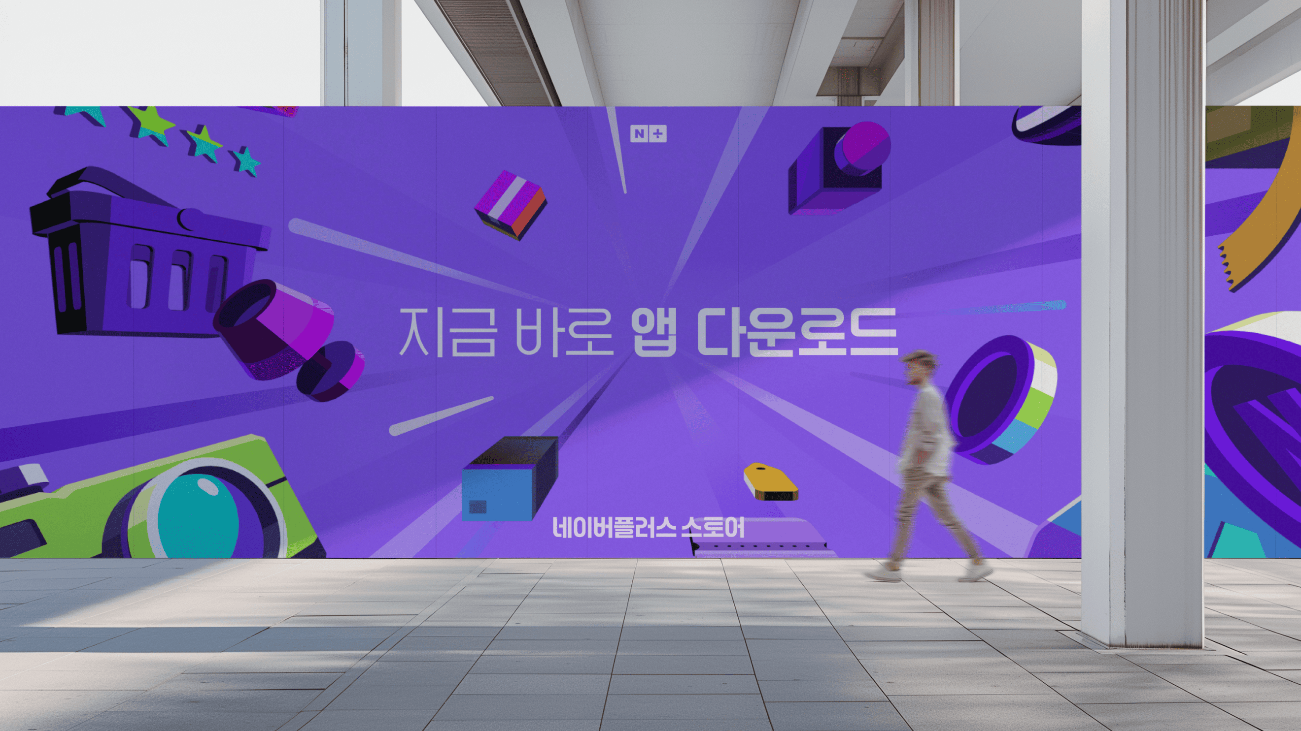
This is a brand visual development project for the launch campaign of the Naver Plus Store app. The campaign delivers impactful communication through marketing based on a key visual across both online and offline channels. By embedding the brand assets of Naver Plus Store into the key visual, it delivers clear brand experience points and identity to the target audience, leaving a lasting impression.

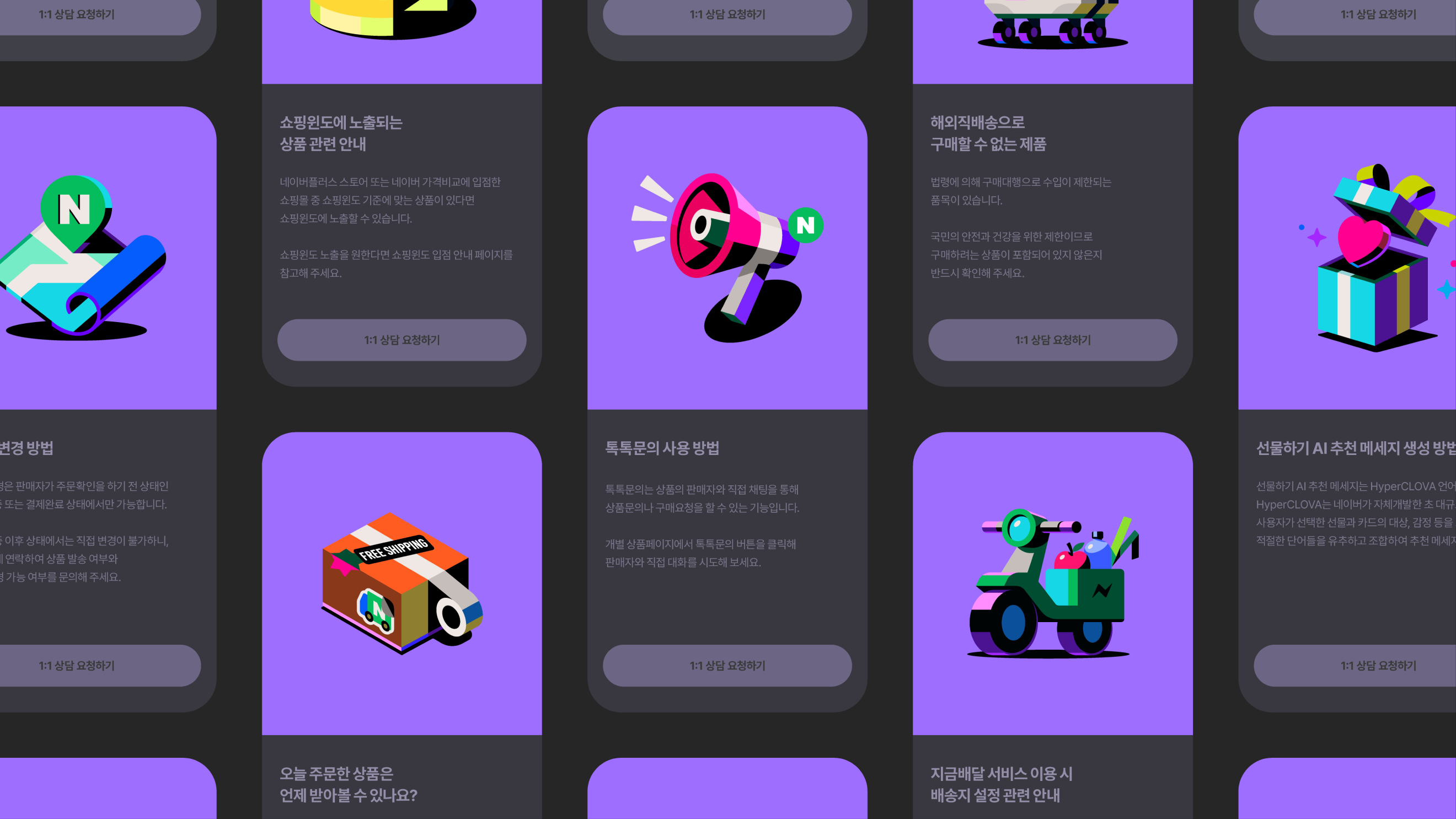
The Korean lettering, based on the Naver Plus Store wordmark, follows a geometric flow that aligns with the visual concept. Its playful rhythm and friendly impression create a casual image, helping customers feel more at ease and comfortable with the app.


NAVER Plus Store
Visual Identity Design
BRENDEN
Creative Direction / Do-eui Lee
Project Management / Wook Jung
Project Lead / Jeongwon Hwang
Design / Jeongwon Hwang, Juhye Ma, Mihyun Hong, Dohae Kim, Jieun Lee
Creative Partner
Illustration / Minkyung Lee, Jinjoo Kim
Client
NAVER
Project Direction / NAVER
Brand Strategy / NAVER
Design / NAVER
Award
iF Design Award Winner 2026