NAVER Maps
Rebranding Project
This is a brand identity renewal project for NAVER Maps. NAVER Maps initiated this renewal to expand beyond a map service that connects countless places and information in everyday life, evolving into an integrated experience platform centered around places. To visually communicate the brand direction of “connecting every experience related to places,” we developed a comprehensive brand design system, from the symbol to the icons used throughout the UI.
The core mission of this rebranding was to transform NAVER Maps from a simple navigation focused map app into an integrated platform that provides diverse and multifaceted place experiences tailored to users.
In NAVER Maps, the pin marker is a familiar metaphor for users. In this renewal, we retained the familiarity of the pin while reinterpreting its meaning and visual expression in a new way. The renewed three dimensional pin symbol represents various contents and place experiences connecting and expanding from it, conveying the idea of a platform that offers rich and multidimensional map experiences beyond a purely functional map.
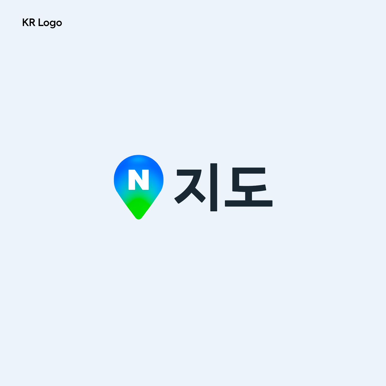
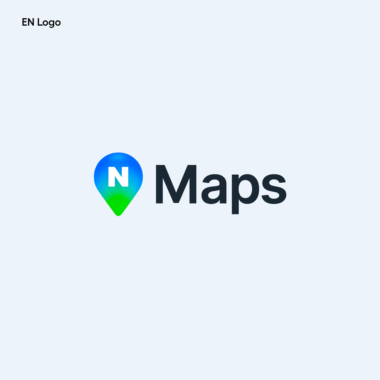
These are the Korean and English logos of NAVER Maps. Both the Korean and English logos consistently apply curved forms inspired by the rounded shape of the symbol.

The symbol motion of Naver Map extends the brand experience across the app. When the app launches, the symbol motion naturally appears in the search bar, intuitively conveying Naver Map’s identity as a platform that offers diverse experiences through various places and content.

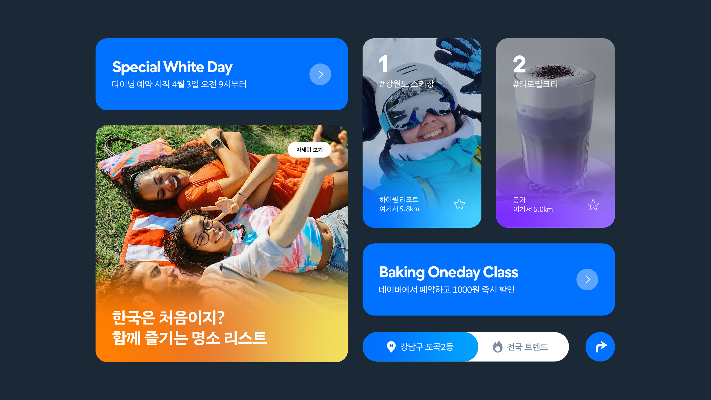
The brand colors of NAVER Maps use gradients to convey the idea of experiences expanding and connecting. Based on the existing green and blue of NAVER Maps, a naturally extending spectrum was developed as the main color system. A broader color spectrum was also developed as secondary colors to express the diverse experiences offered by NAVER Maps. These colors were derived from various travel destinations and places across Korea, reflecting the atmosphere and landscapes of real locations while visually expressing the rich place experiences provided by NAVER Maps.
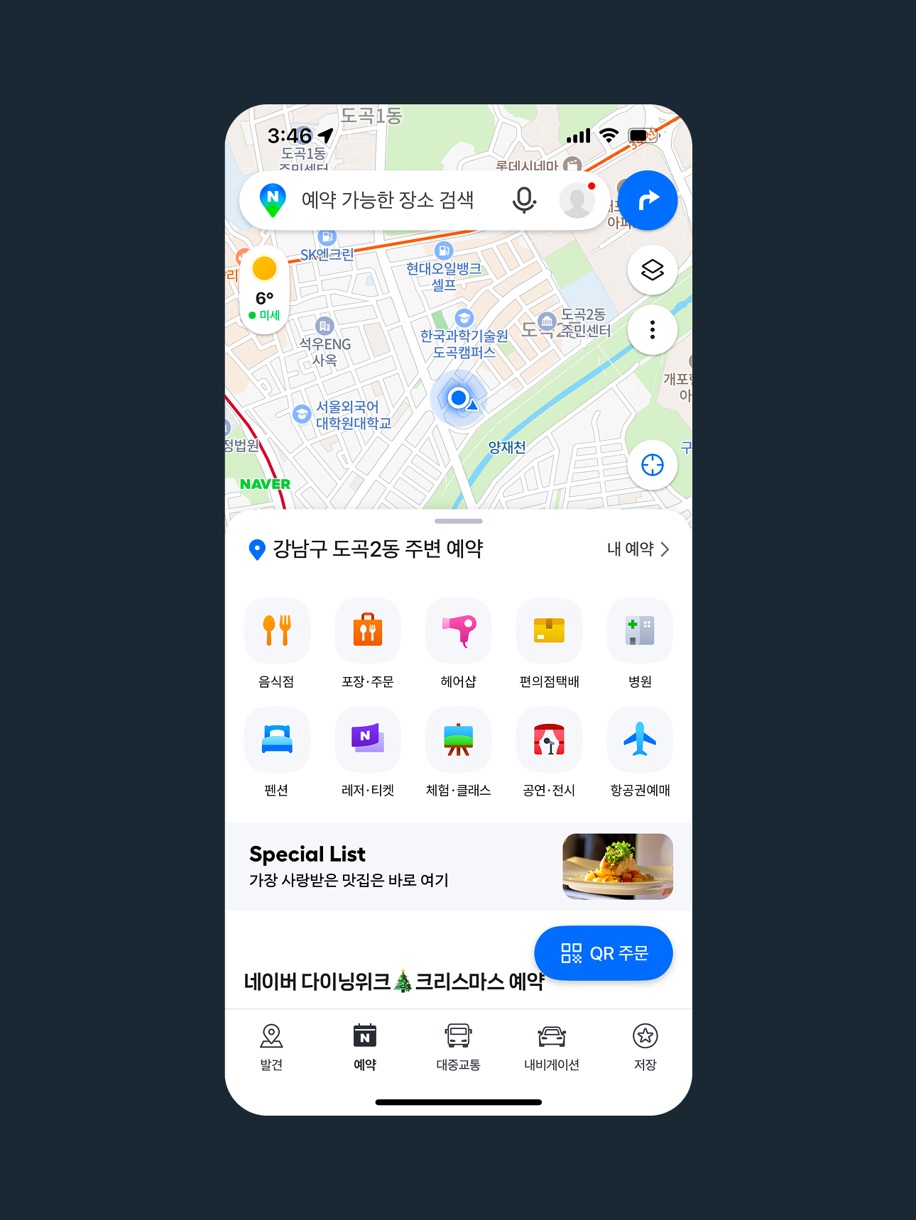
These are the shortcut icons, as well as the top and bottom tab icons of NAVER Maps.
They were designed using the diverse NAVER Maps brand color system and inspired by the rounded form of the pin symbol. Curved shapes are applied consistently across the icons to intuitively convey the function and character of each feature, while providing a cohesive visual experience throughout the app interface.

These are the illustrations of NAVER Maps. They visualize the various moments and situations users experience through NAVER Maps using diverse brand colors and lively scene expressions. Each illustration captures experiences such as exploring places, moving between locations, and enjoying leisure activities, reflecting the wide range of experiences enabled by the map service. They were designed to communicate the rich and multidimensional place experiences provided by NAVER Maps in a friendly and intuitive way.


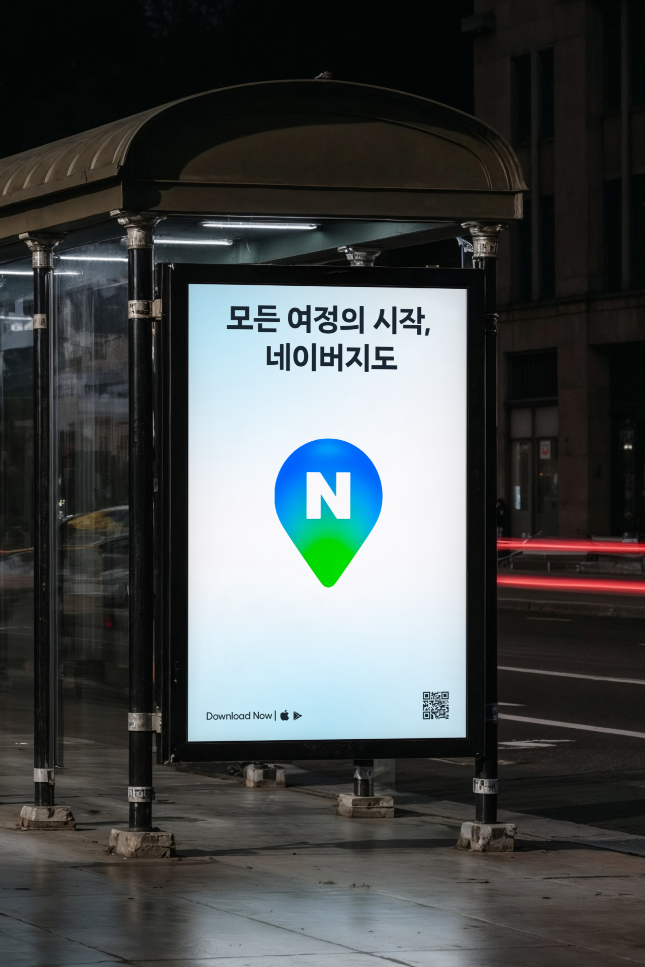
Various online and offline media were developed using the logo, color system, and other visual brand assets of NAVER Maps. The symbol, color system, and graphic elements were applied according to the characteristics of each medium to ensure the brand identity is communicated consistently, providing a cohesive brand experience across all user touchpoints.


NAVER Maps
Rebranding Project
BRENDEN
Creative Direction / Do-eui Lee
Project Management / Wook Jung
Project Lead / Kyung-eun Ko, Byeongkuk Jung
Design / Kyung-eun Ko, Haena Yang, Mihyun Hong, Byeongkuk Jung
Creative Partner / Donghyun Lim, Cobb Studio, OUS Worldwide
Client
NAVER
Project Direction / NAVER
Brand Strategy / NAVER
Design / NAVER
Award
Korea Design Award 2025