Songwol
Rebranding Project
Songwol is a brand that has led Korea’s towel culture for over 70 years, renewed its corporate identity to respond to the evolving lifestyle market. The new identity is inspired by the brand’s origin story of a pine tree illuminated by moonlight, reflecting the founder’s vision of cleansing the world’s impurities and creating a clean and bright future. Reinterpreting the symbolic meanings of “Song” and “Wol” through a modern visual language, the key design assets were reorganized into a unified brand system to deliver a consistent brand experience across diverse touchpoints.
Songwol is a long established brand that has led Korea’s towel culture since its founding in 1949. However, as the logo changed several times over the years, a distinctive brand identity unique to Songwol had not been clearly established.

To establish Songwol’s previously undefined identity, the brand philosophy and slogan were redefined first. Inspired by the founder’s vision of a pine tree illuminated by moonlight, symbolizing a steadfast spirit and the aspiration to cleanse the world’s impurities and create a pure and radiant future, the brand philosophy was defined as “a steadfast attitude like a pine tree,” and the slogan as “Timeless Standard.”
Songwol’s core values were derived from its brand philosophy “a steadfast attitude like a pine tree” and its slogan “Timeless Standard.” Rooted in the pine tree’s unwavering character and the idea of enduring quality over time, Songwol defines three key values. Trustful places customer trust at the forefront. Reliable maintains consistent quality standards through long standing craftsmanship and expertise. Sustainable represents a responsible approach that considers a sustainable future.
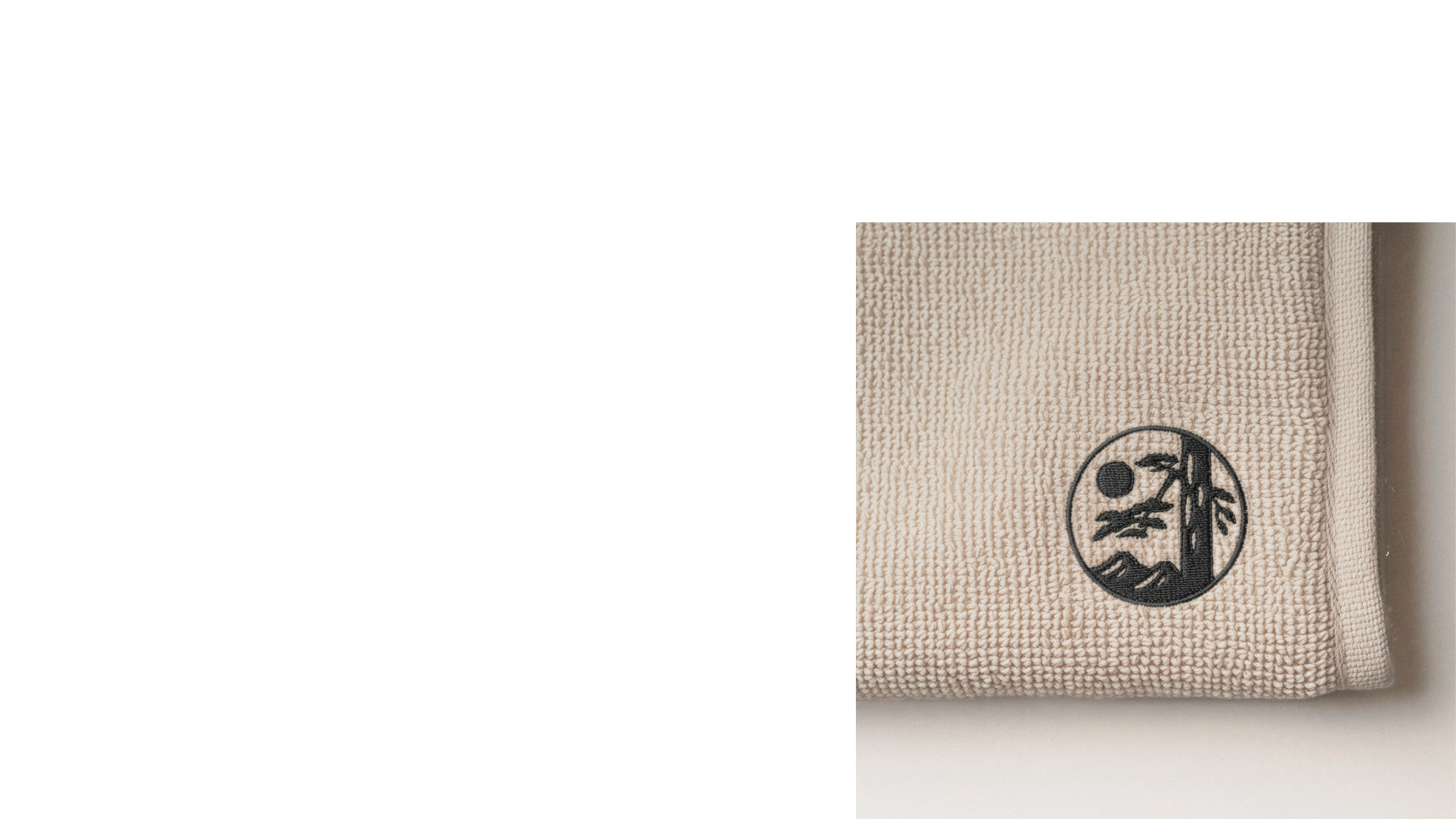
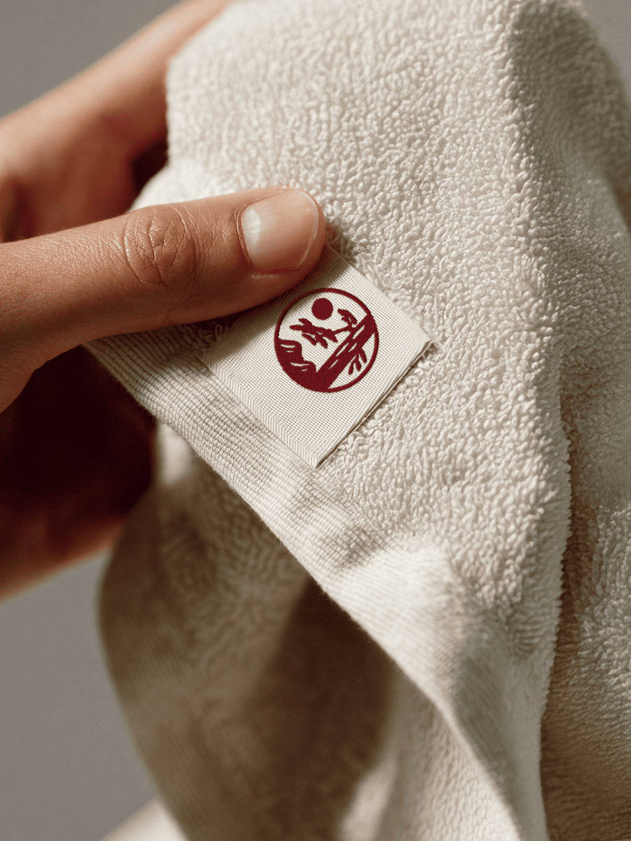
Songwol’s brand name and logo were redefined. Previously, the brand used a Chinese character symbol alongside the name “Songwol Towel.” As the brand expanded beyond towels to include various lifestyle products such as umbrellas and personal care items, “Songwol Towel” was repositioned as a category brand for the towel line. A new illustrated symbol of the pine tree and the moon was developed to represent the brand philosophy. The naming and logo system were reorganized around “Songwol,” establishing a clearer and more cohesive brand identity.
The Songwol pine and moon symbol originates from the original emblem used at the time of the company’s founding. To enhance usability across digital platforms and production methods such as embroidery, the intricate original form was refined into a simpler and more distinctive symbol.
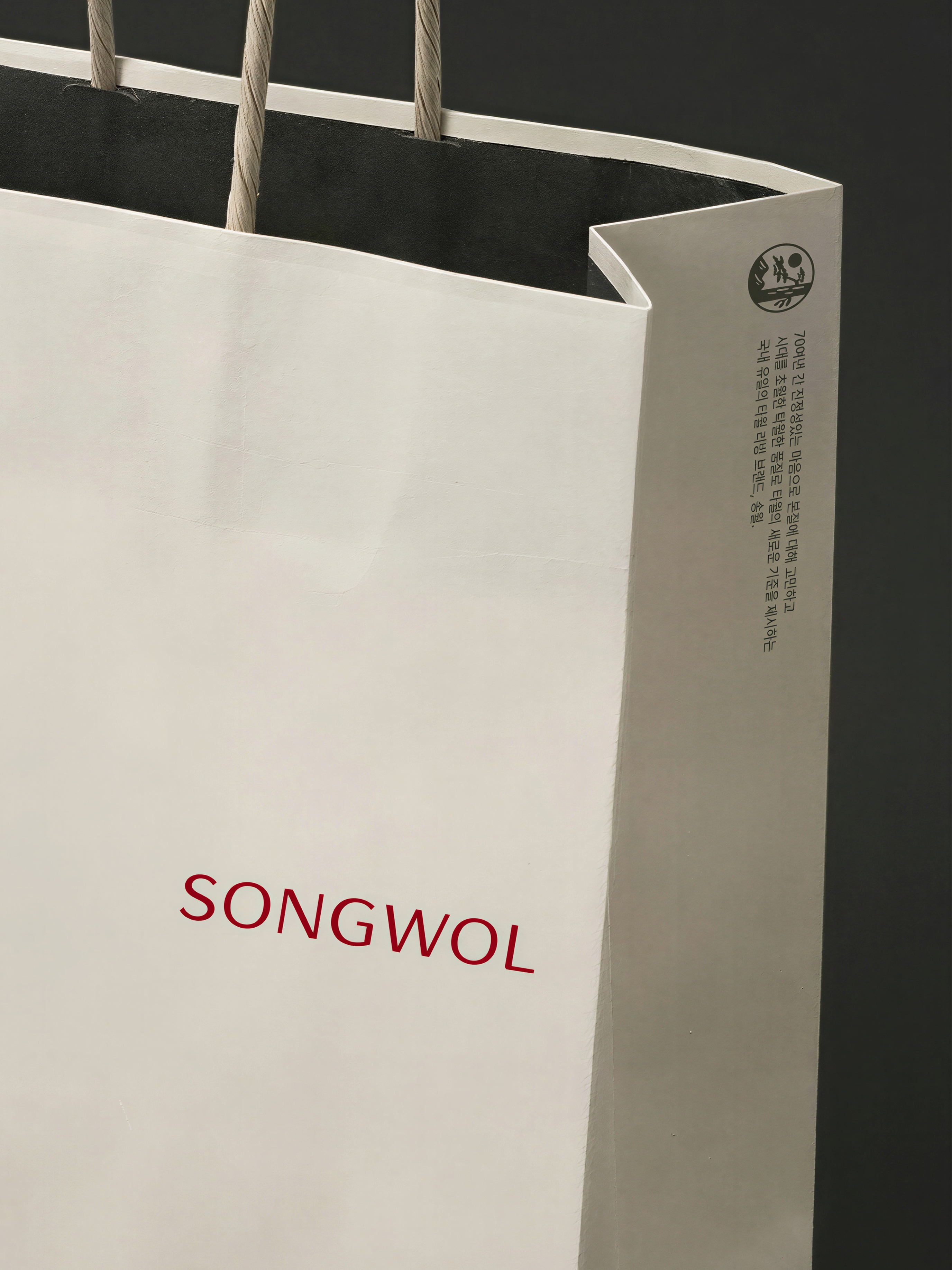
The Korean and English wordmarks are used as the primary wordmarks of Songwol, while the Chinese character wordmark is mainly used as a flexible wordmark. The flexible wordmark was developed to allow free placement and is used as a visual brand asset across various brand touchpoints.
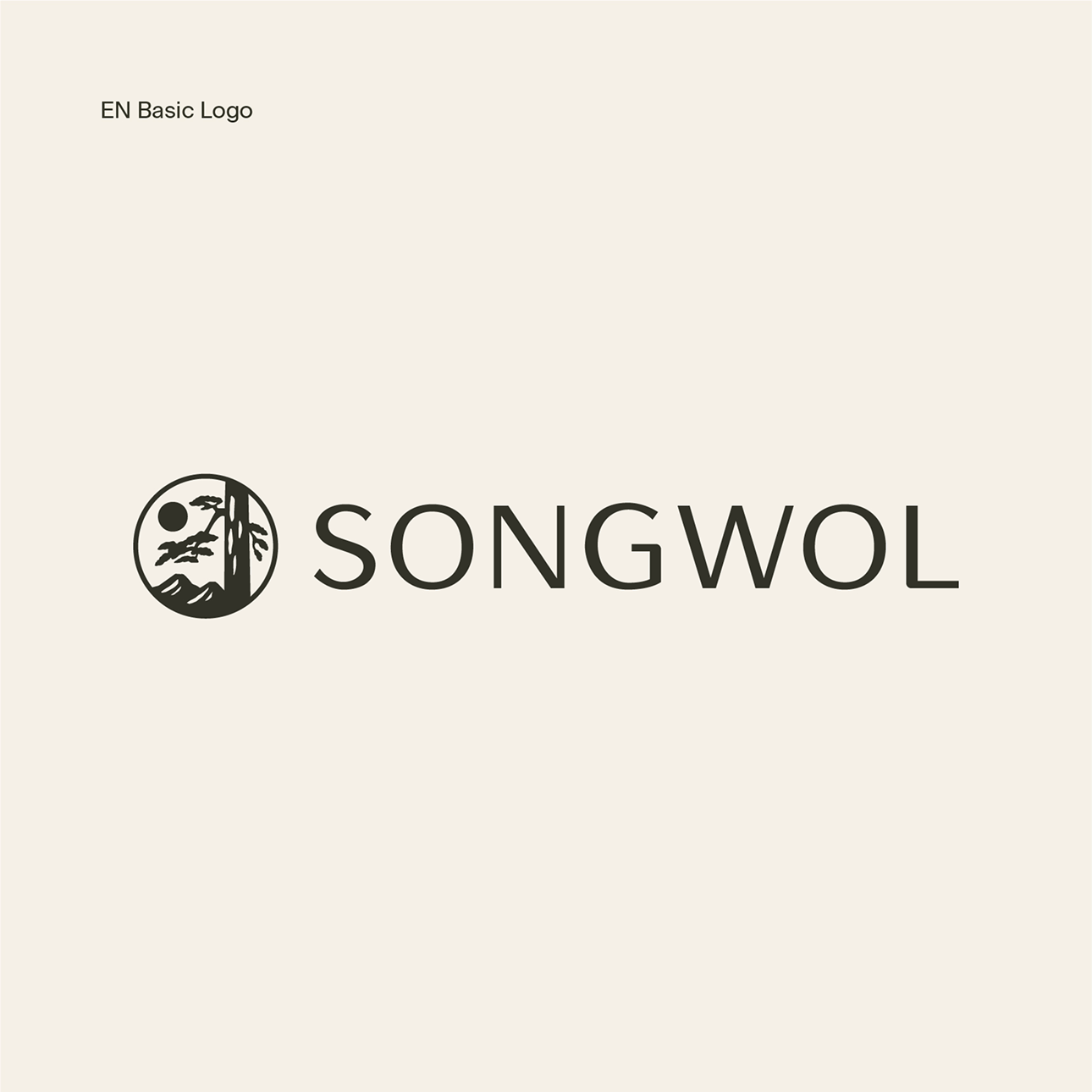
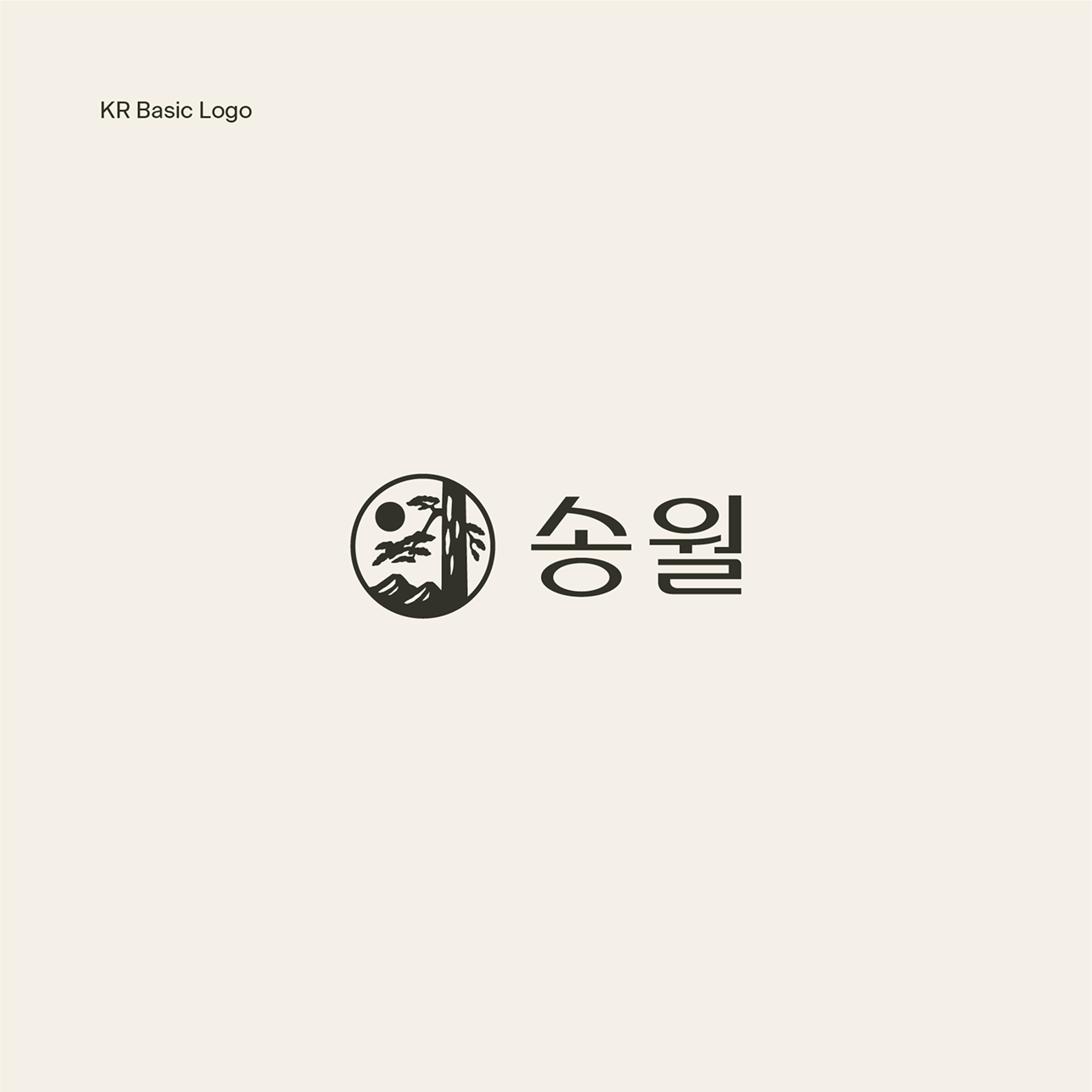
Songwol’s English, Chinese character, and Korean logos were designed based on shared visual characteristics to maintain a consistent brand impression. Despite the different writing systems, elements such as stroke weight and proportions were unified so that all logotypes are perceived as a single, cohesive brand language.
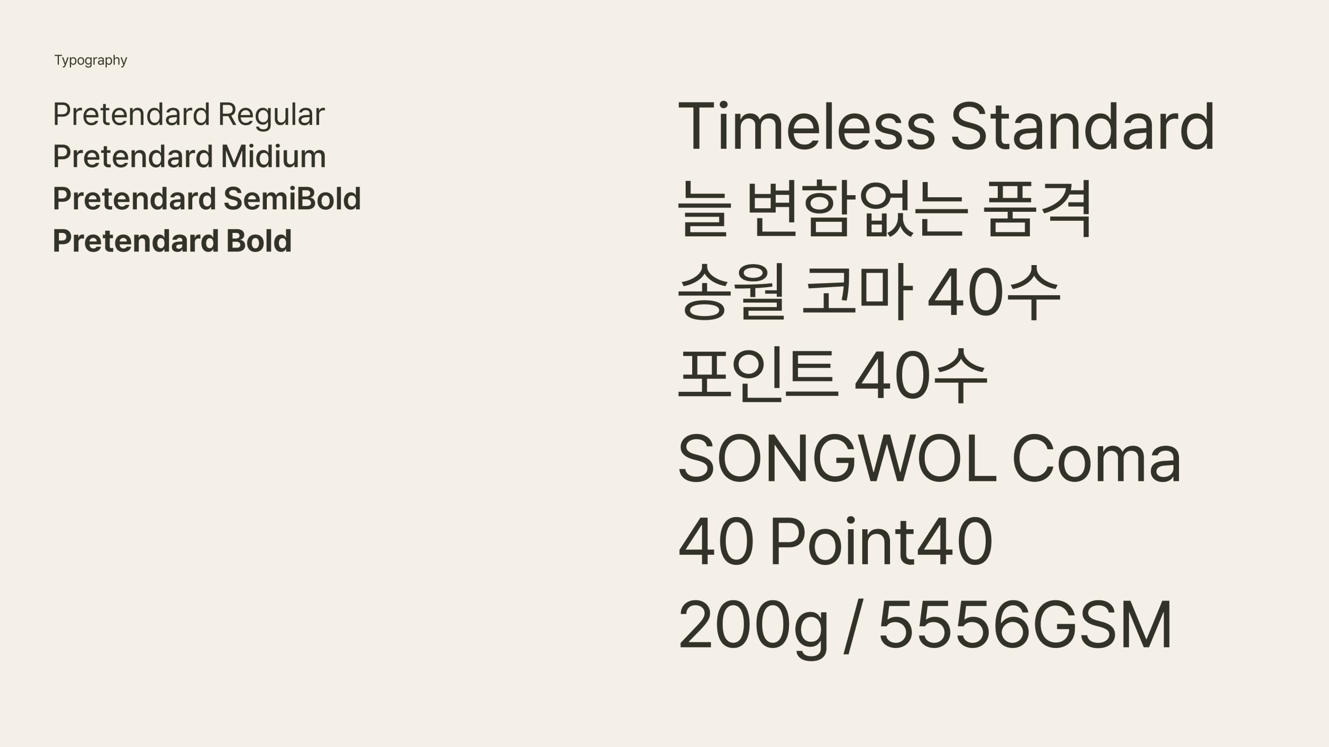
The category brand names such as Songwol Towel, Songwol Vina, and Songwol Umbrella were redefined and unified into a single naming system. And Songwol’s typography adopts Pretendard as the brand typeface, allowing flexible use across both online and offline environments.
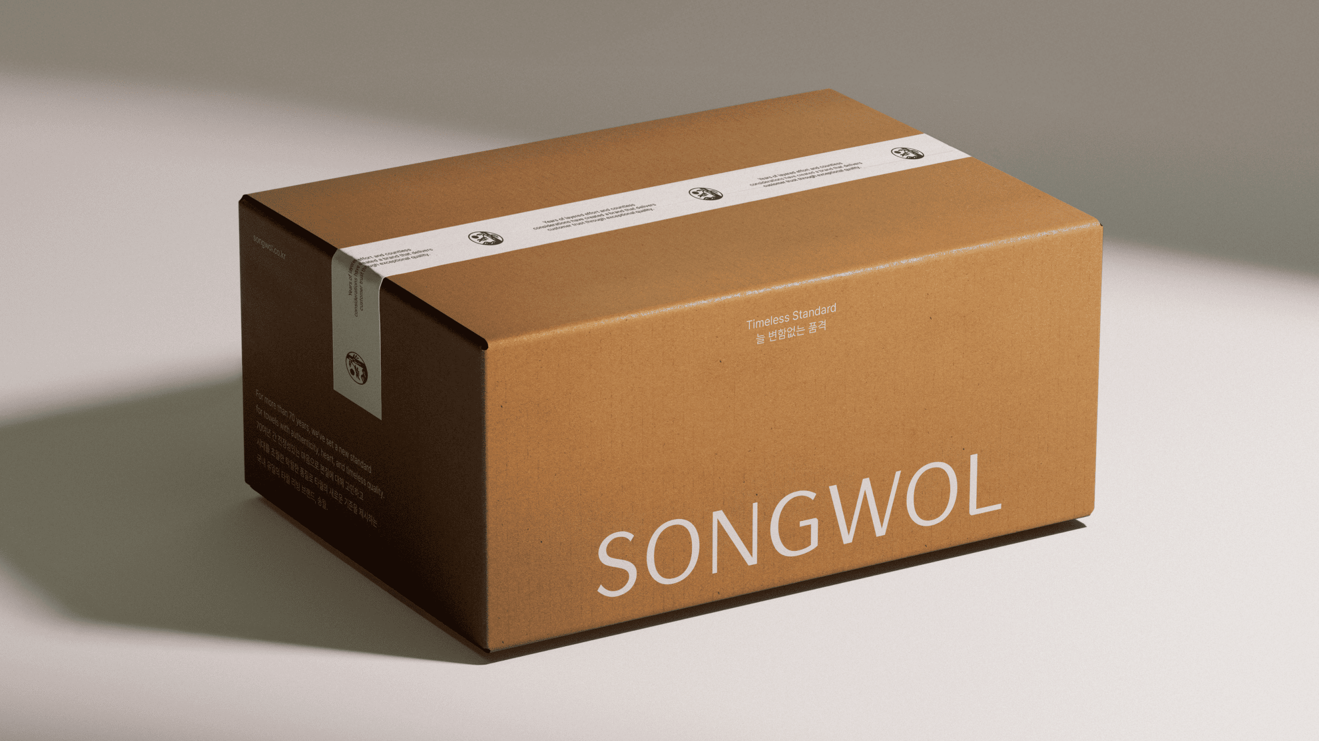
Songwol’s brand colors retain the previously used red as a secondary color, while a range of beige tones was newly introduced as the primary brand palette. Centered around beige, the color system visually conveys the soft and warm texture of towels while expressing a calm and comfortable mood that reflects Songwol’s direction as a lifestyle brand.
Songwol’s graphic and layout system is derived from the brand slogan “Timeless Standard.” To visually express Songwol’s enduring standards, line-based graphic elements and structured layouts are used. Horizontally aligned text and image placements, along with linear graphic elements, convey Songwol’s consistent attitude and stable brand image.
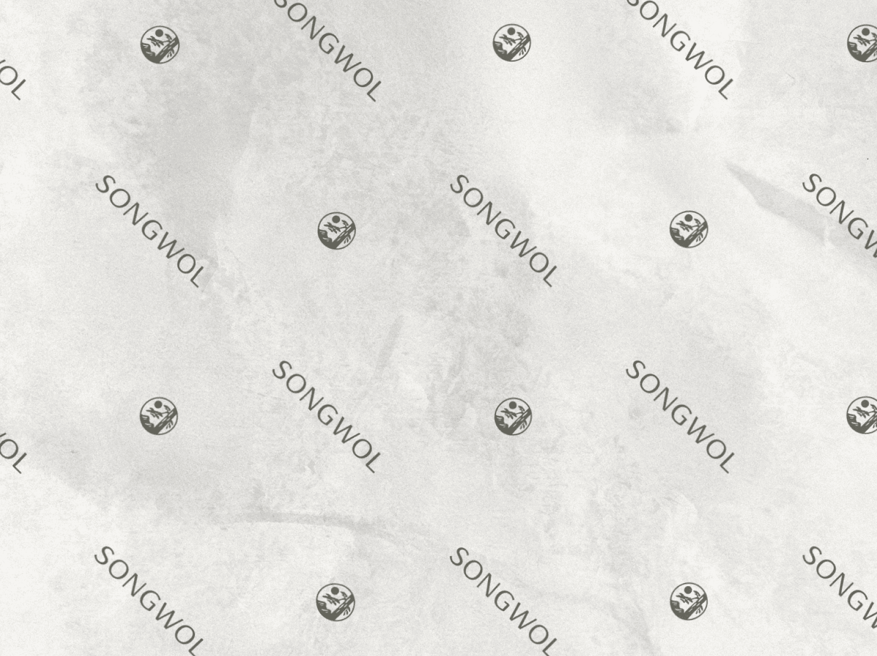
Songwol’s brand identity is consistently applied across various applications, including packaging, labels, and product tags. The visual assets such as the brand symbol, wordmark, and graphic system are designed to be clearly expressed. This ensures a consistent brand experience across diverse touchpoints, from product packaging to online environments.
This is the design for Songwol’s retail stores.
It actively utilizes Songwol’s logo, symbol, and key brand design elements.
Songwol
Rebranding Project
BRENDEN
Creative Direction / Do-eui Lee
Project Management / Wook Jung
Project Lead / Byeongkuk Jung
Brand Strategy / Sunyong Kim
Design / Haena Yang, Byeongkuk Jung, Mihyun Hong
Creative Partner
Brand Strategy / Quest
Client
Songwol
Project Direction / Songwol
Project Management / Songwol