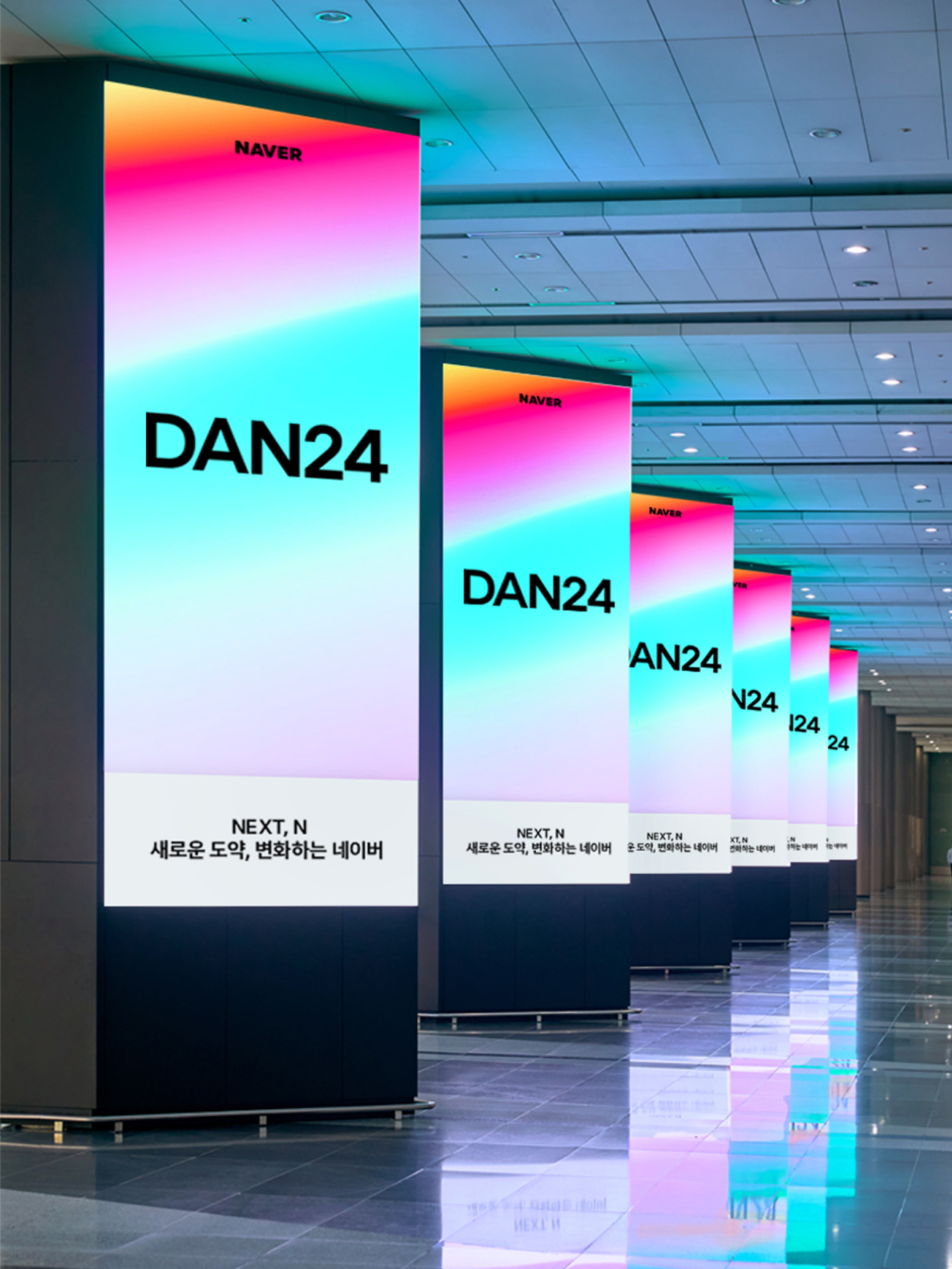
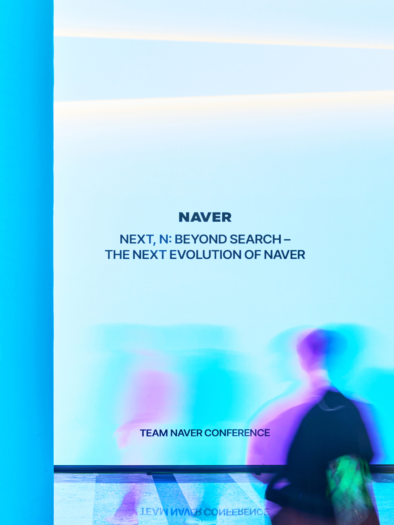
Team Naver Conference DAN24
Art Direction & Brand Design
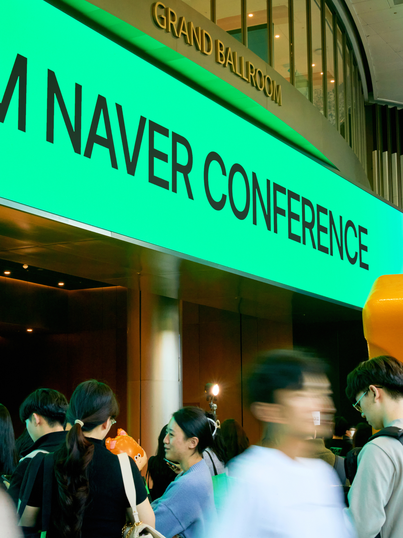
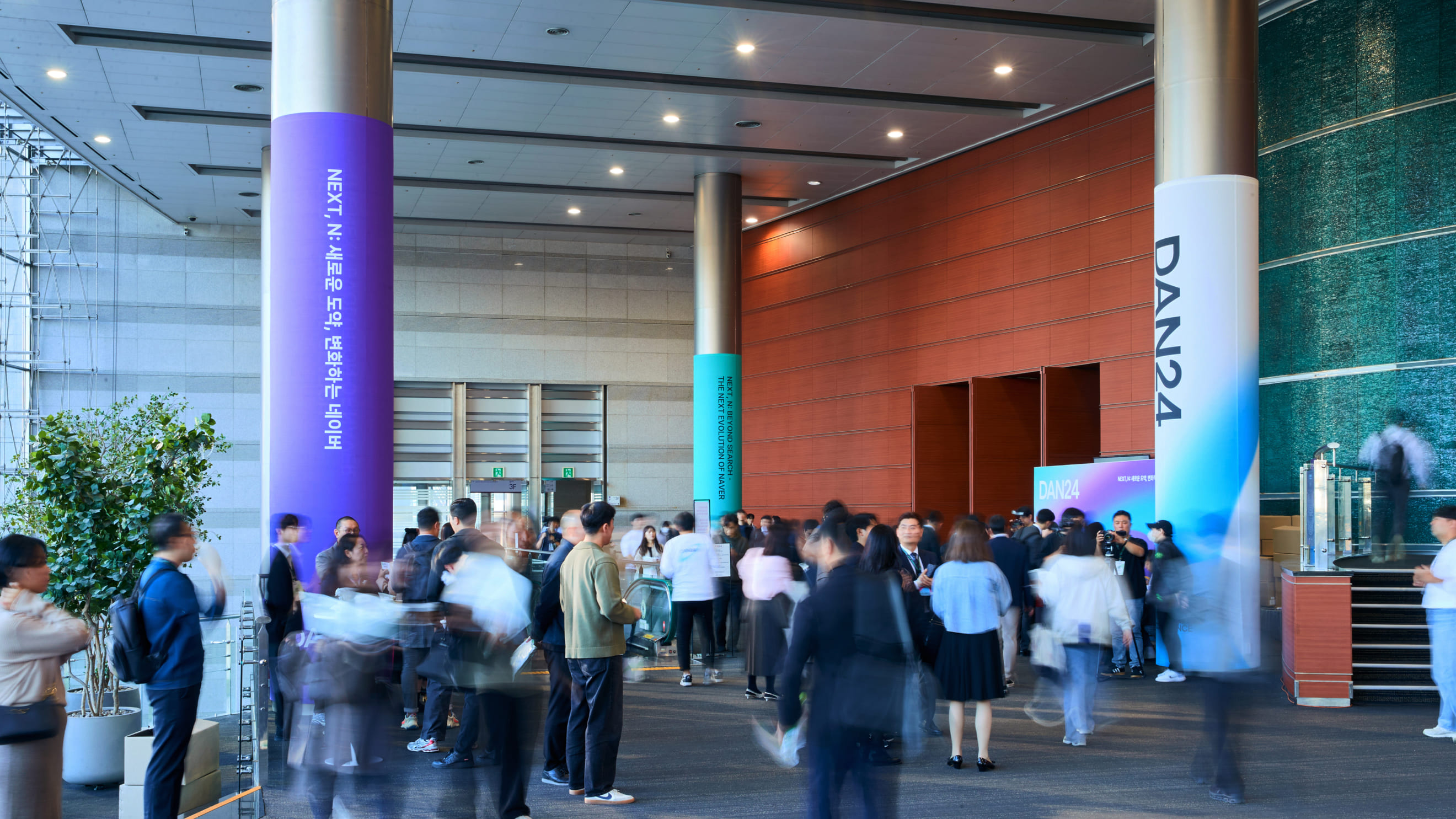
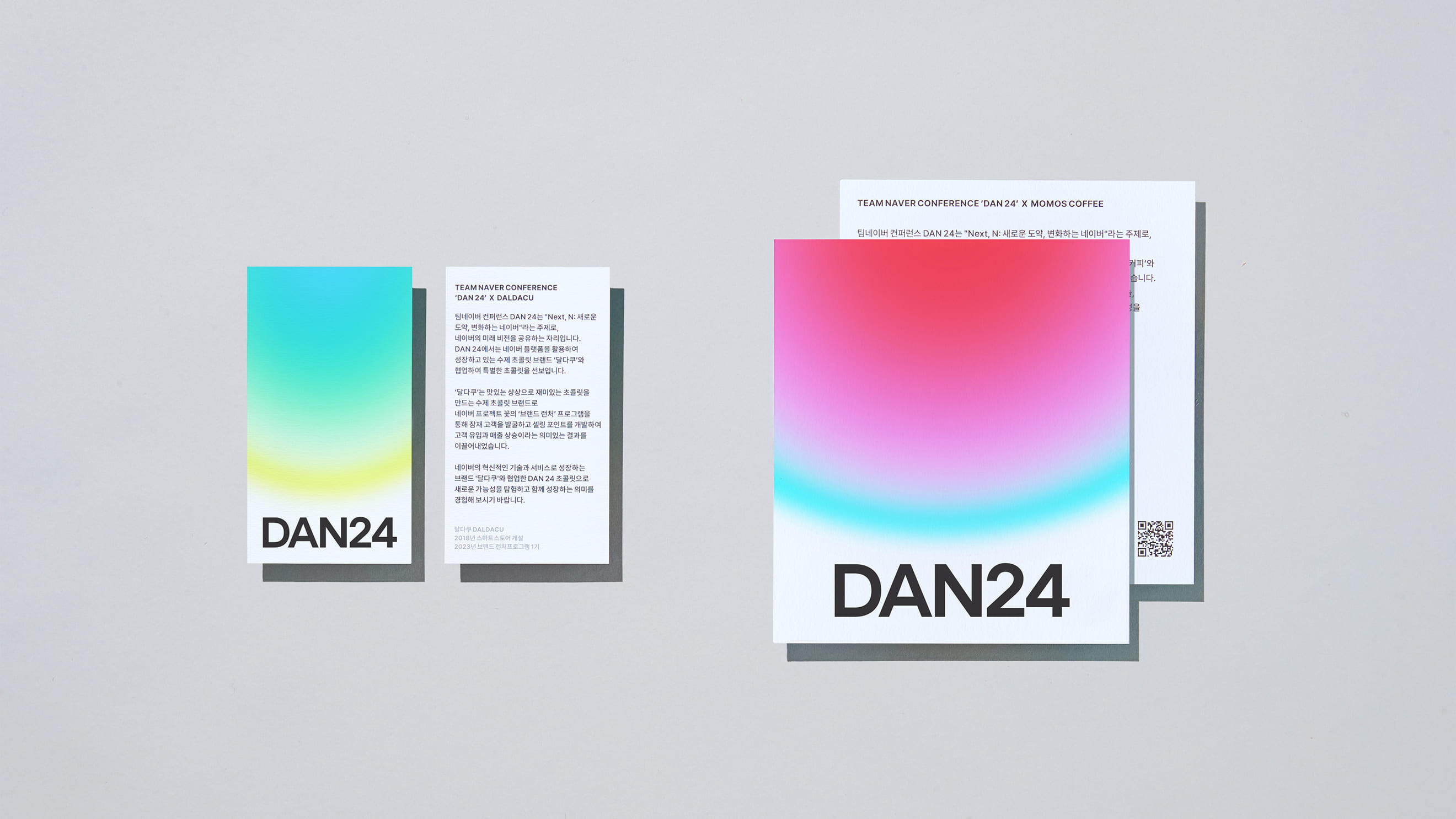
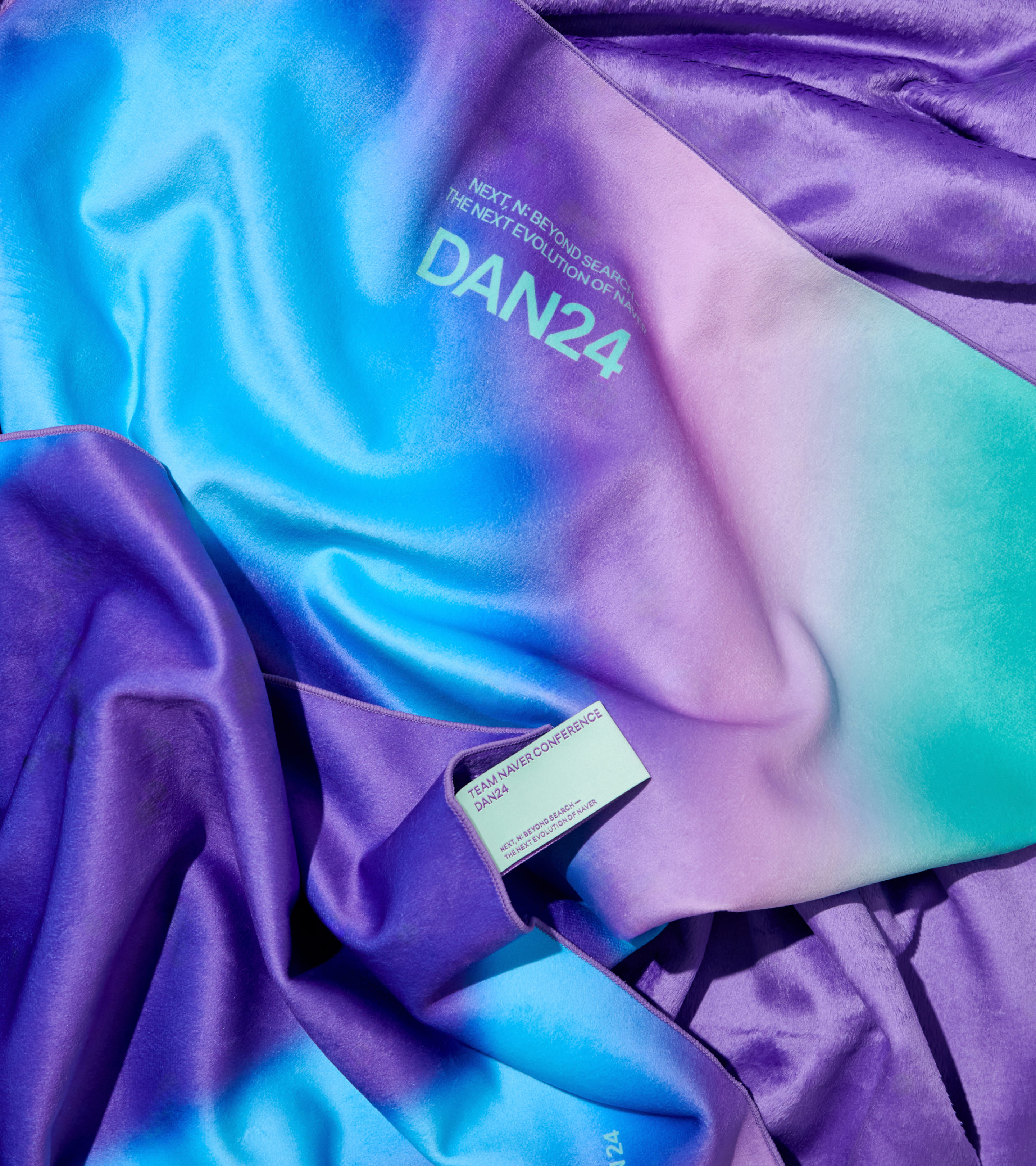
DAN24 is NAVER's integrated conference brand with various stakeholders such as users, investors, and partners. DAN24 explore the elements necessary for the present and the future with a flexible attitude to changing times. Through this exploration, we would like to present new possibilities for a better daily life and visualize them as the main identity of the conference.
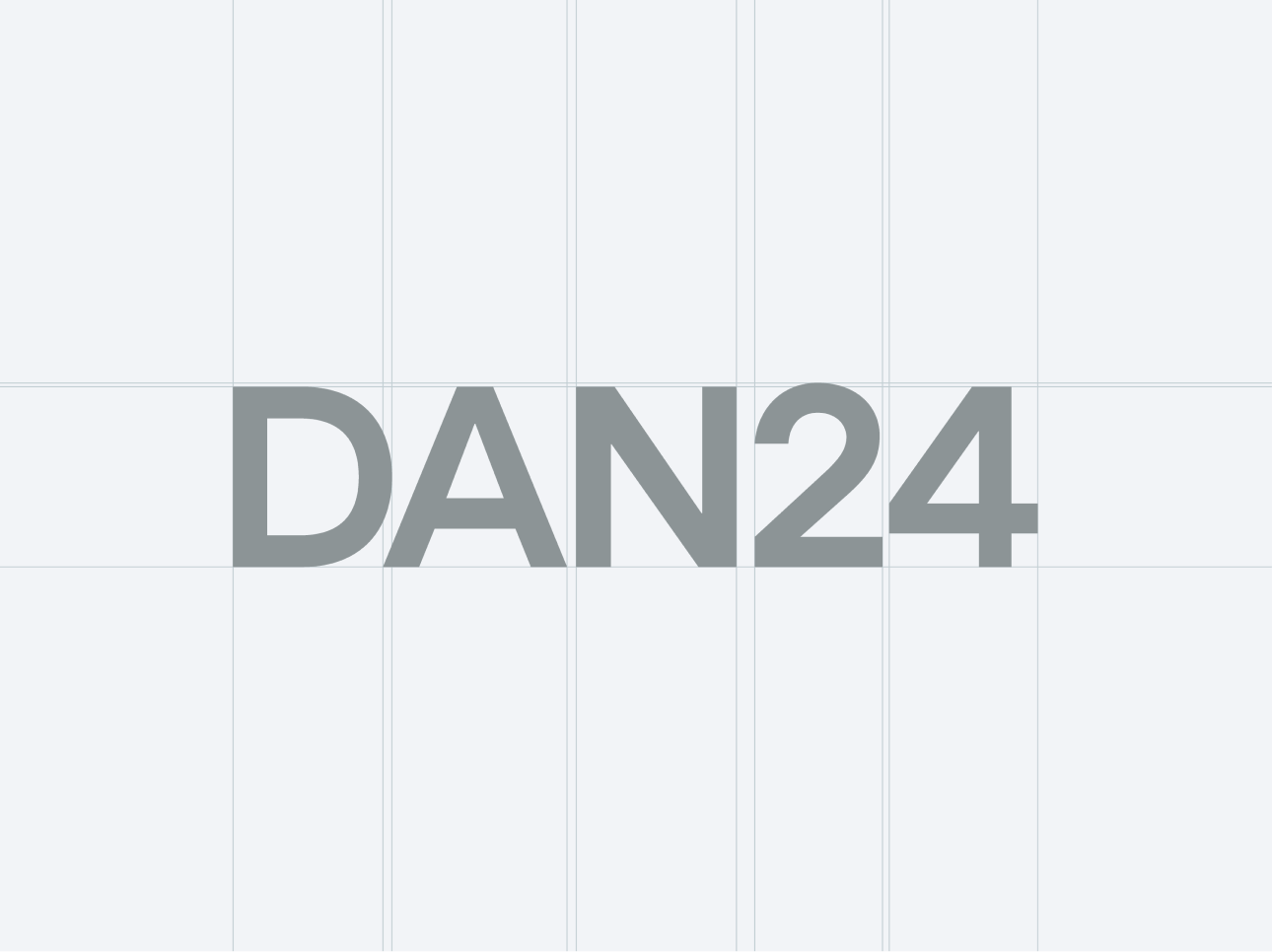
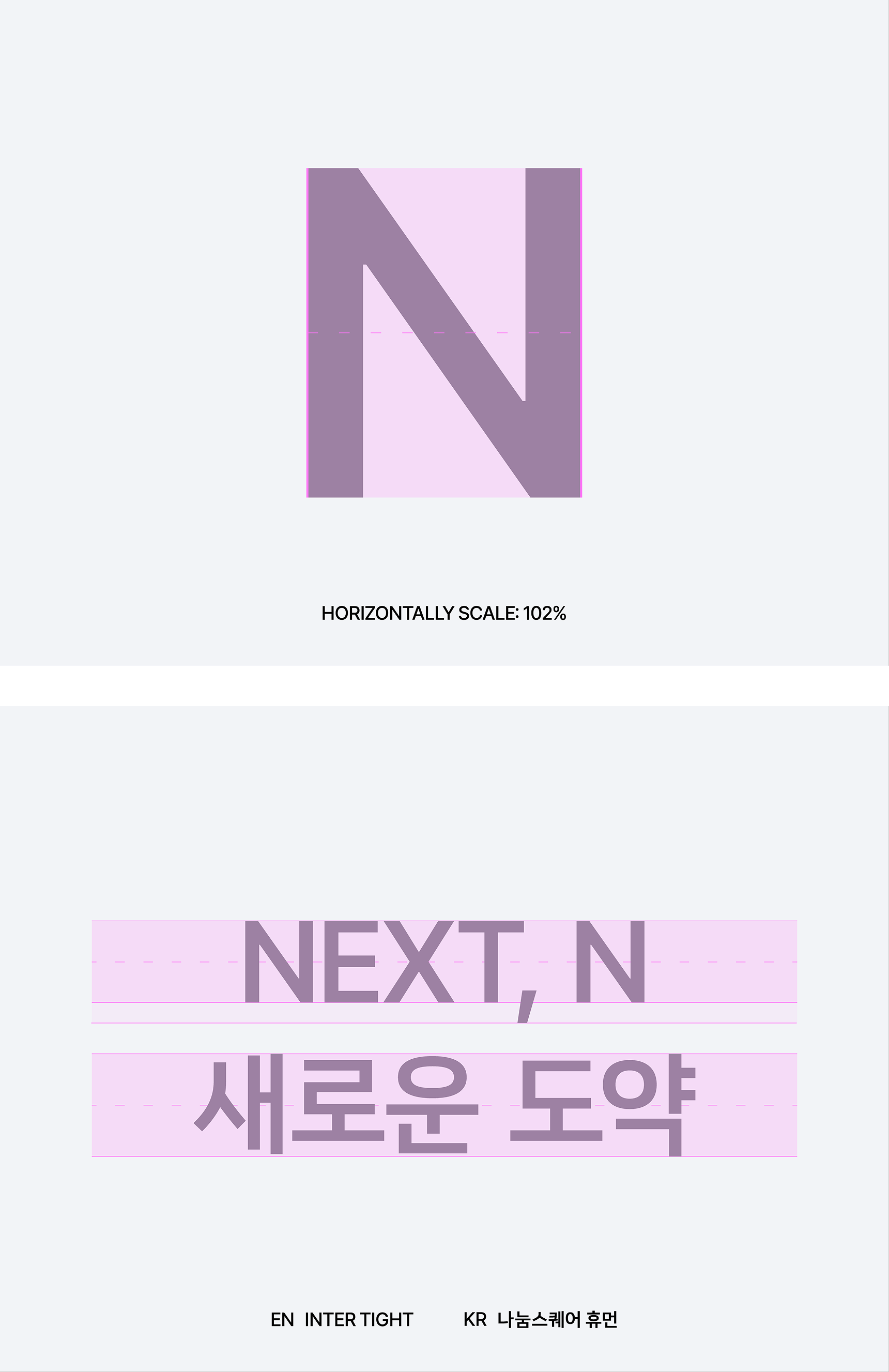
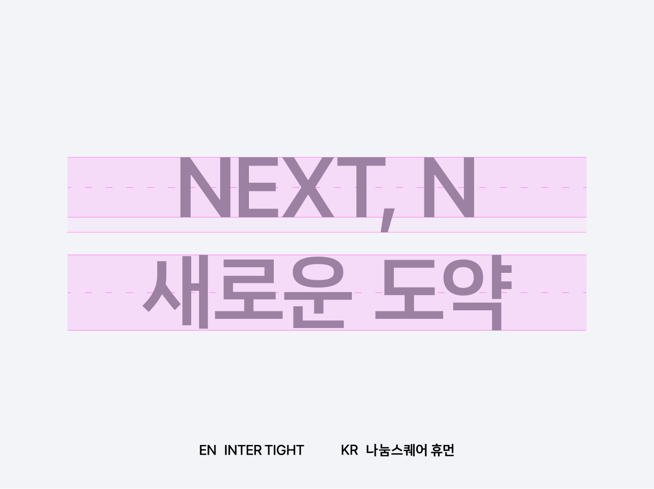
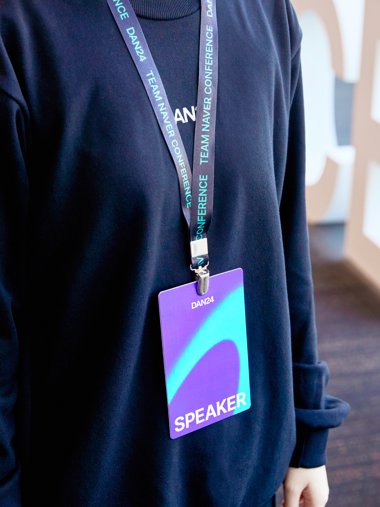
We designed a sleek and modern logo to align with Naver’s technology-centric image. The bold yet simple typography reflects the professionalism and reliability of DAN24. Additionally, the logo minimizes the impact of changing trends, creating a future-oriented and sustainable image.
By excluding decorative elements, the logo maintains high recognition across various media and environments, and functions effectively throughout the entire event.
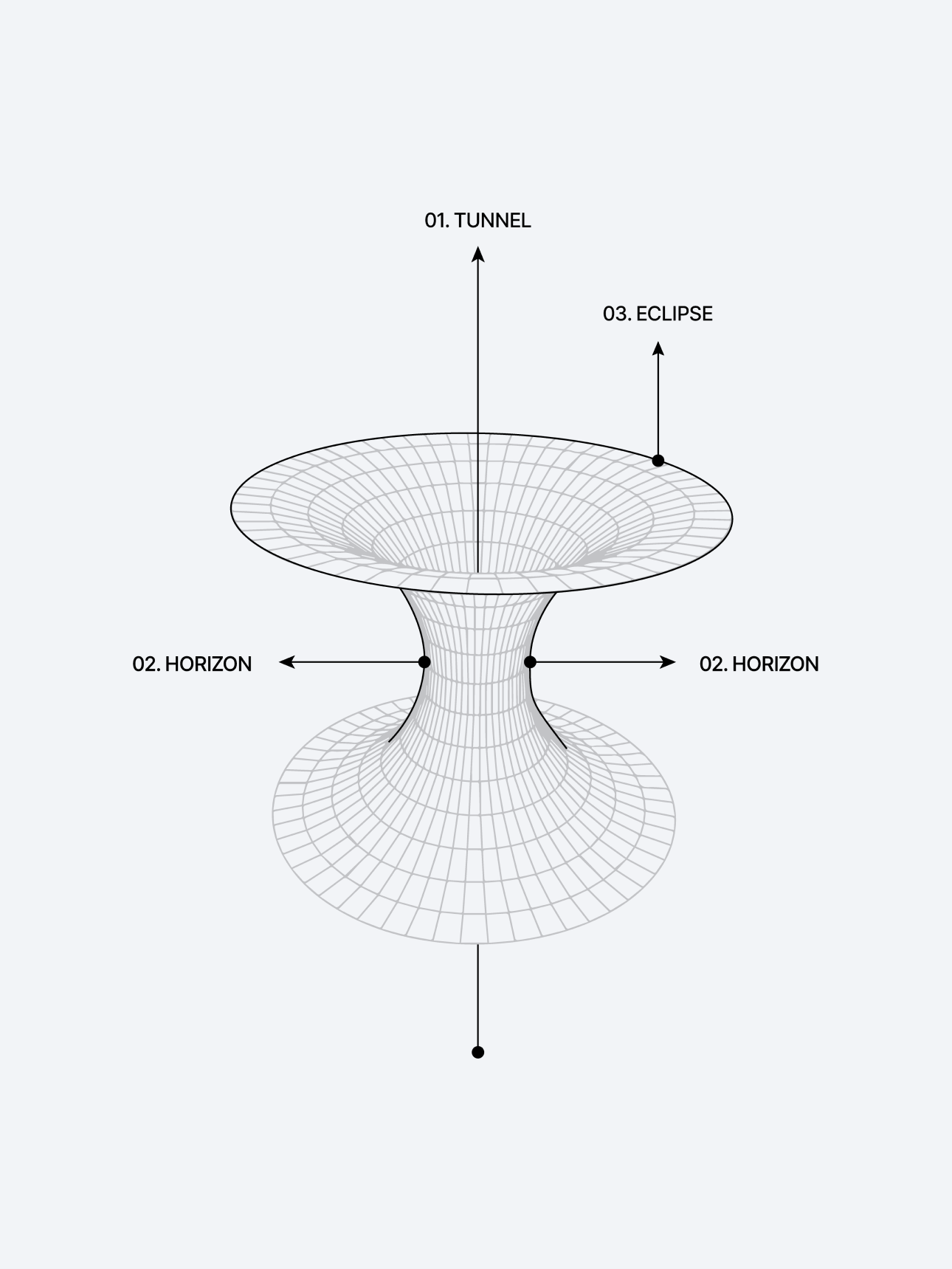
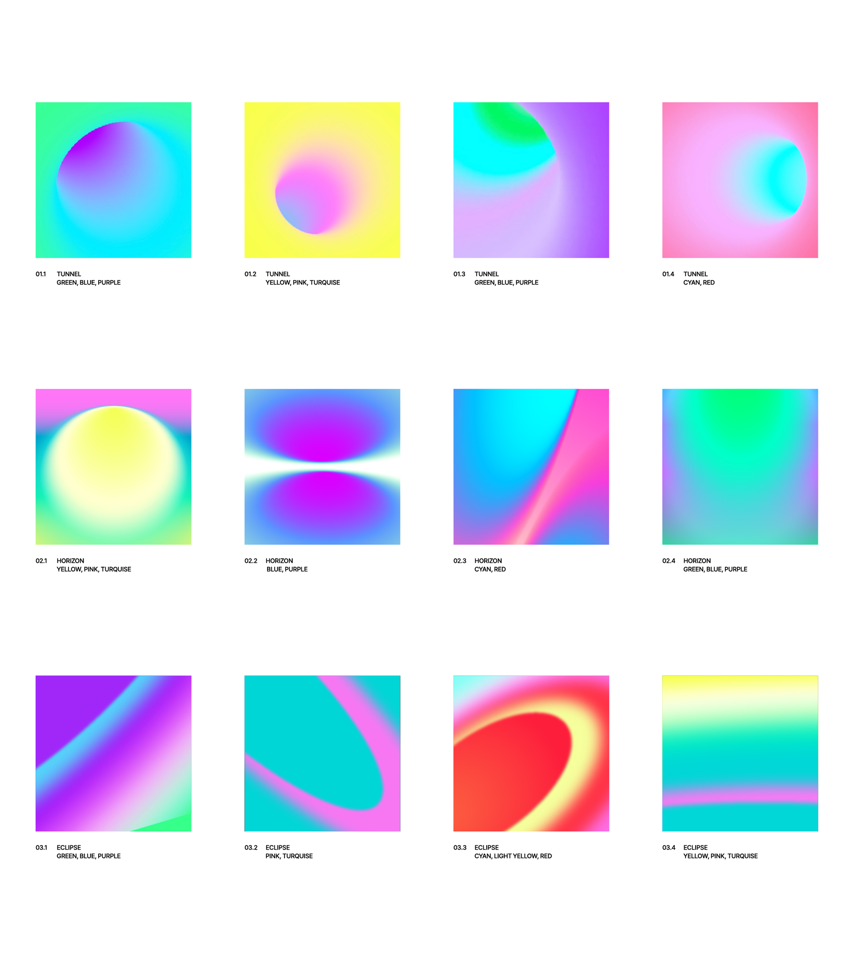
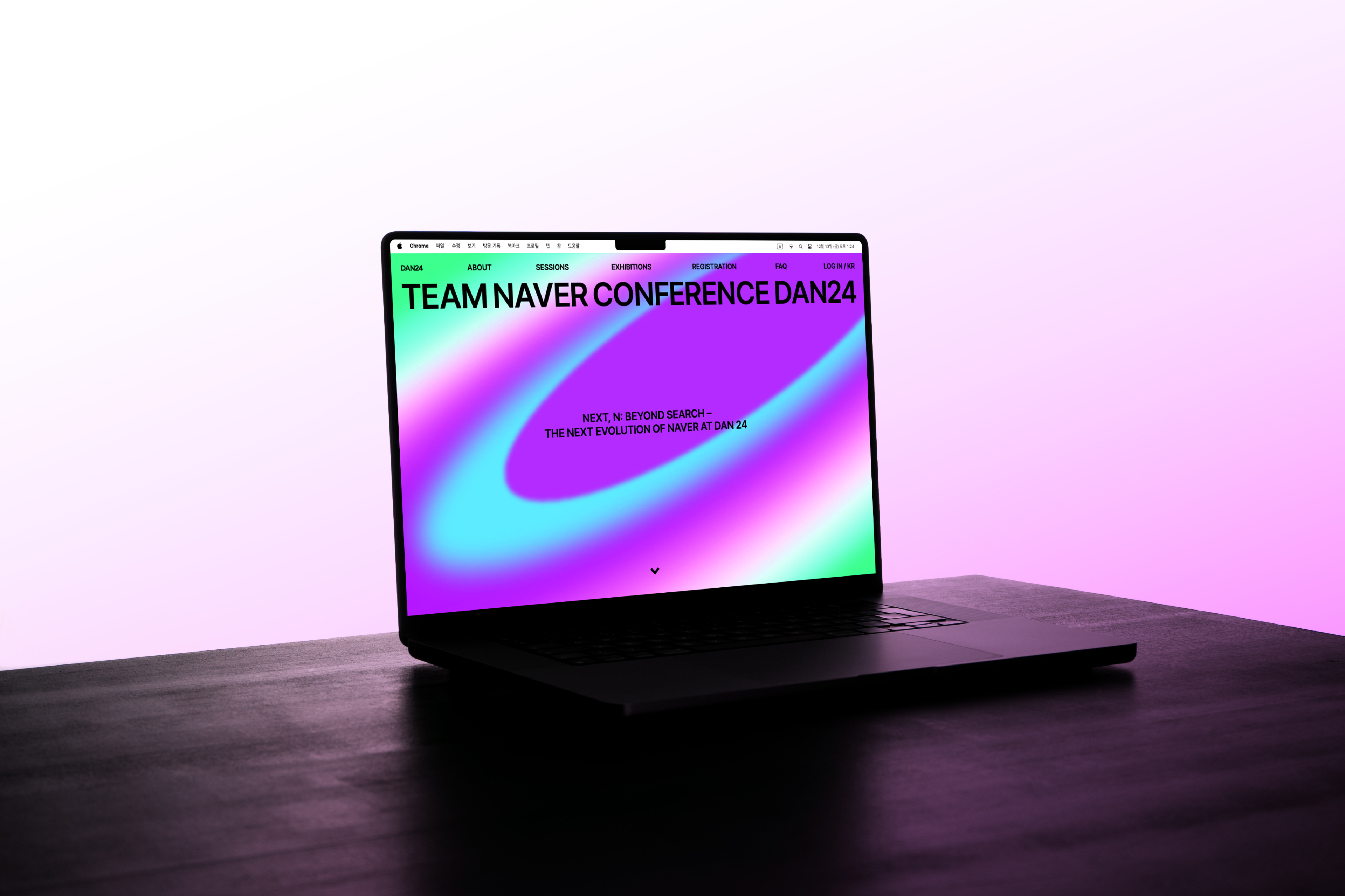
Wormholes are set as visual metaphors, and graphics using wormholes symbolize Team Naver's journey to study future possibilities. The scenery around the wormhole developed from the first person's point of view and the scenery of the moment when swimming through express the explorer's independent attitude and at the same time, it brings out visual experience as if the viewer were on a journey.
Warmhole graphics stimulate viewers' curiosity, and the flow of speed along the structure of the warmhole symbolizes the power to resolve curiosity through enterprising behavior. In addition, we would like to set the process of exploring inside the wormhole as a concept of passage and convey a visual immersion that makes all participants experience the journey together.
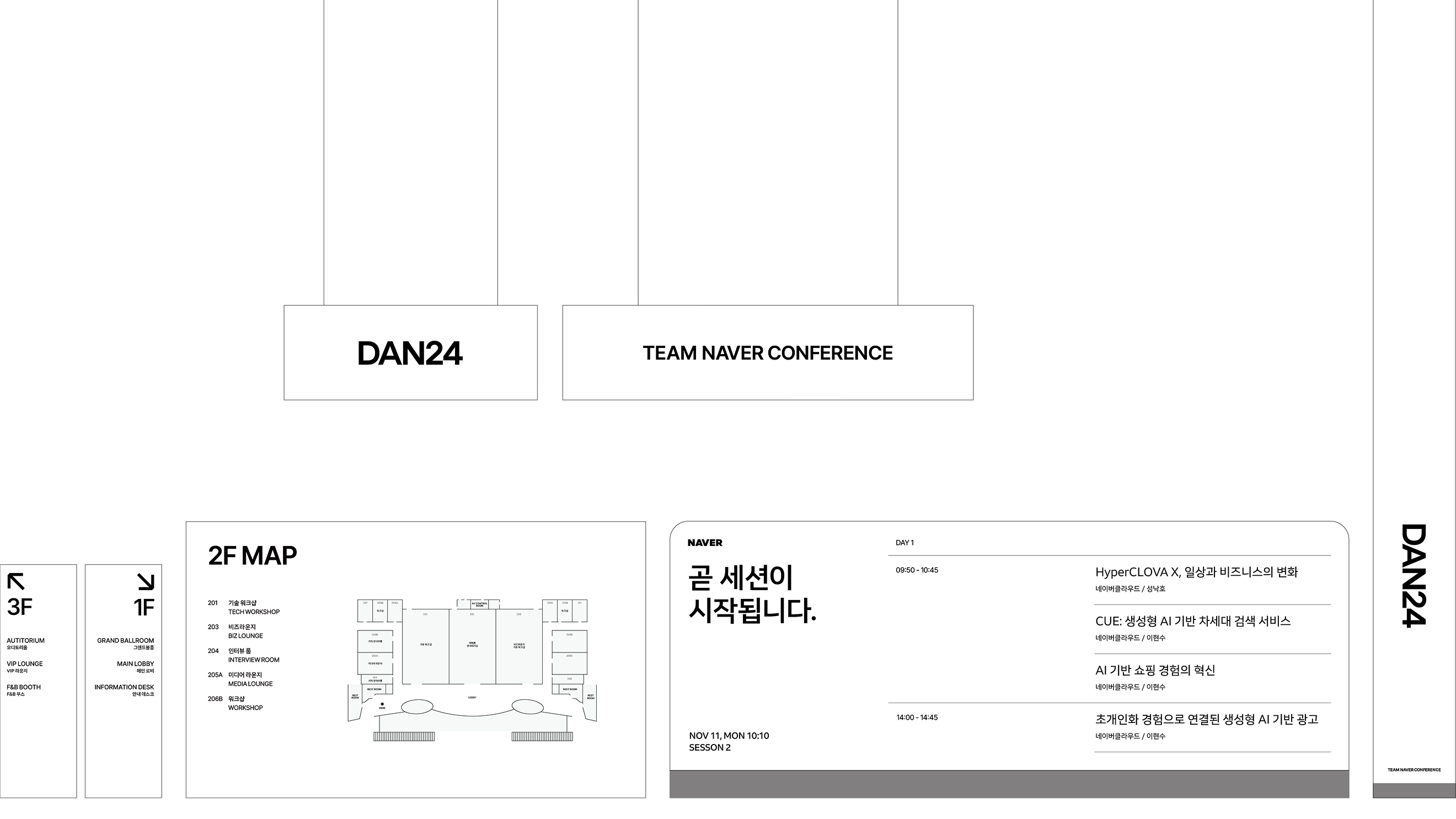
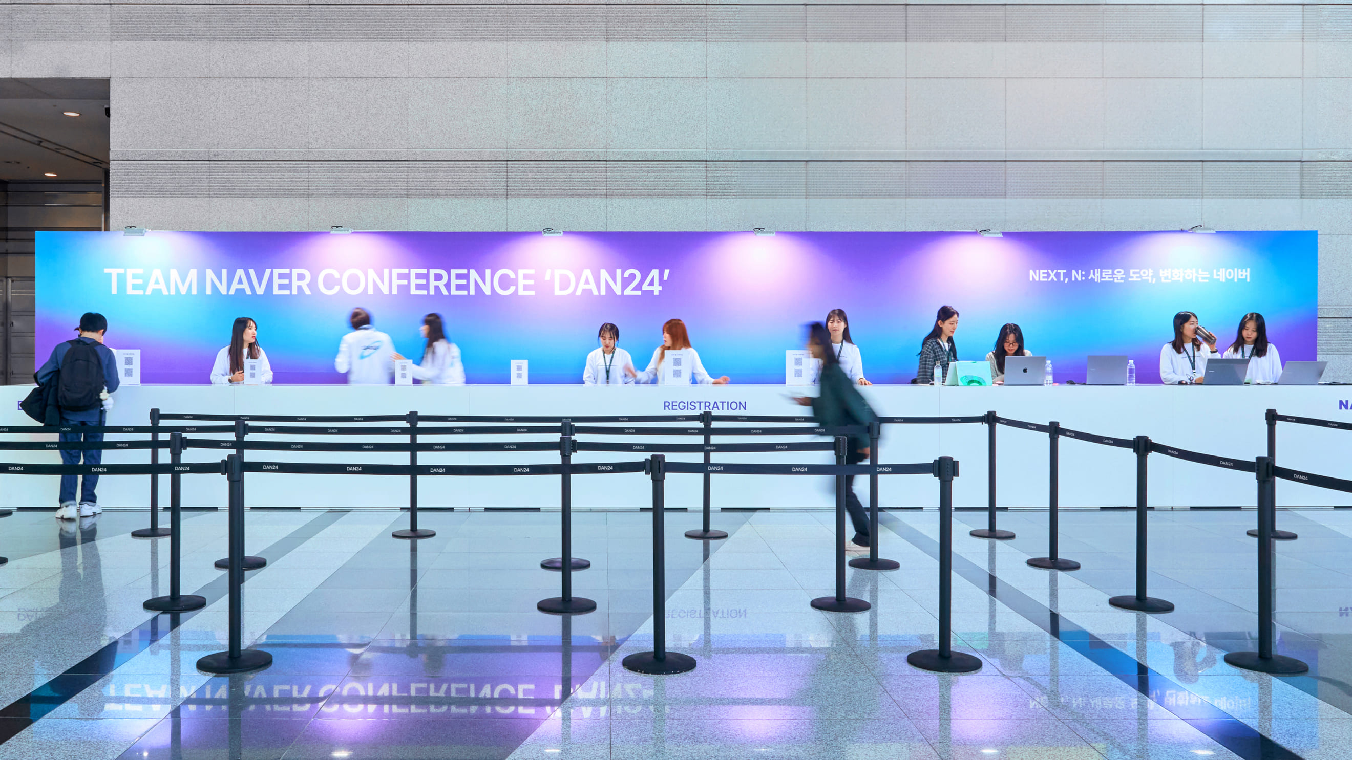
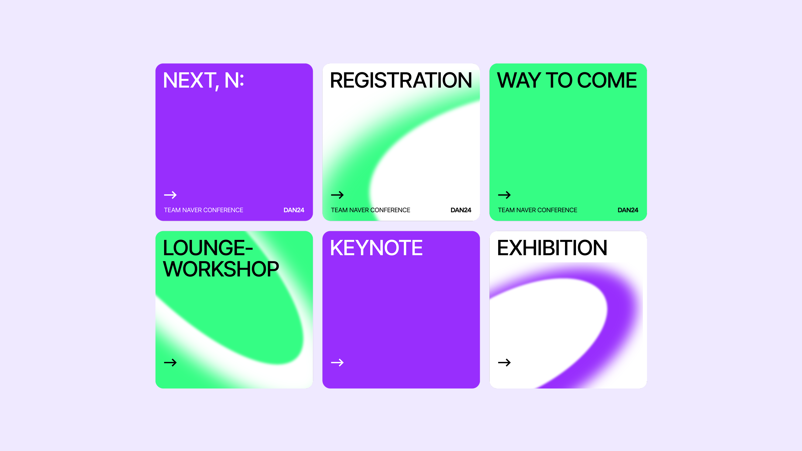
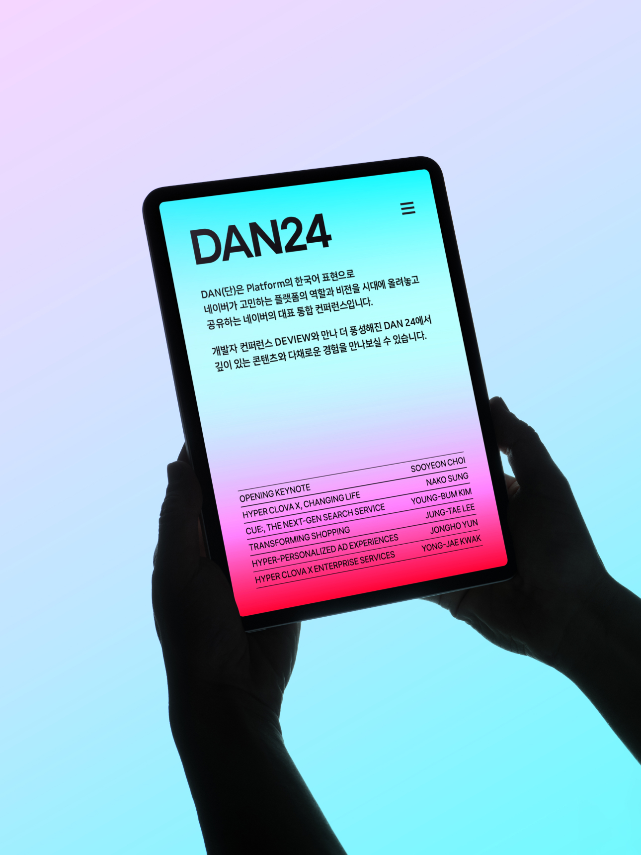
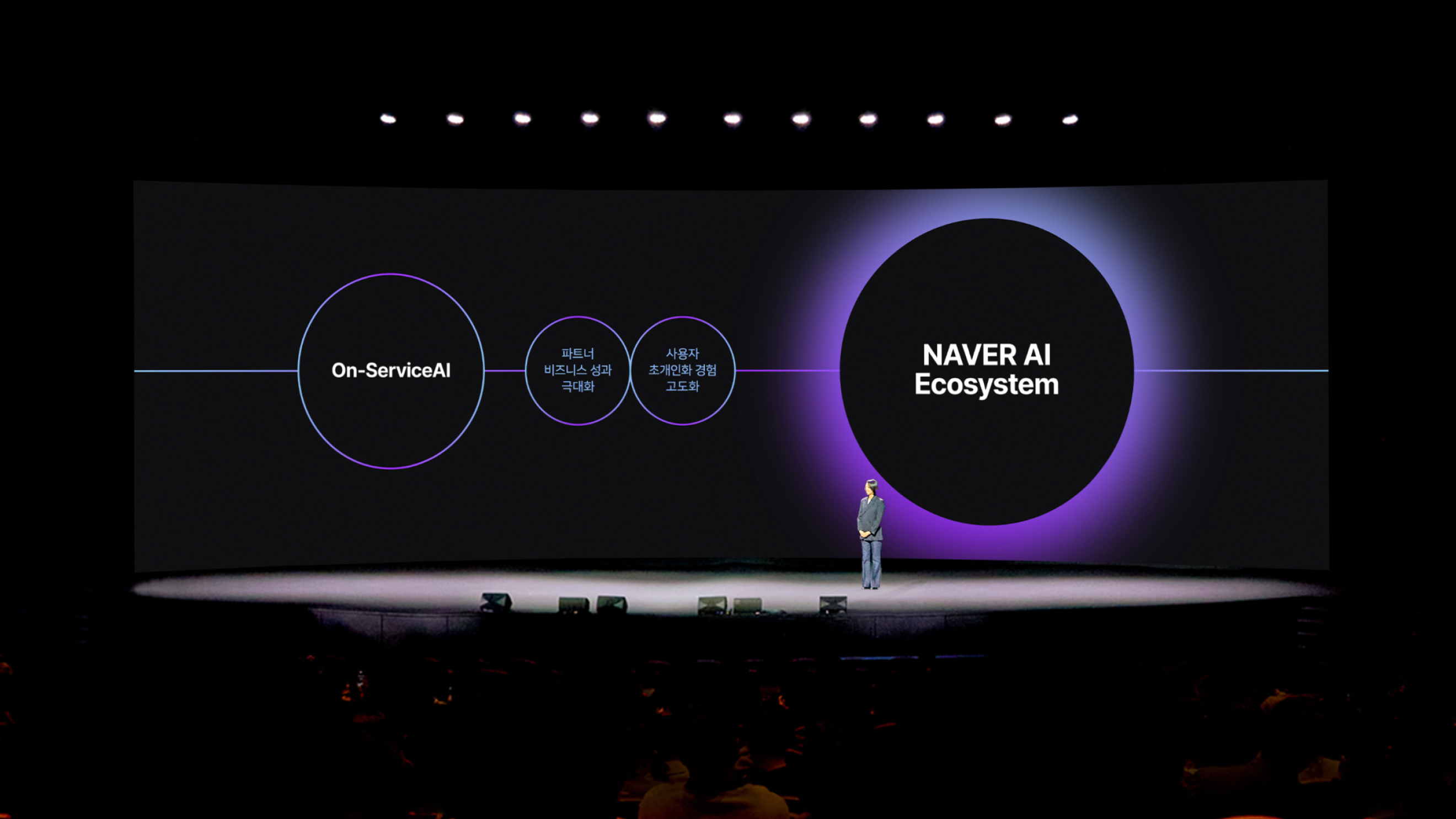
The layout of DAN24 minimizes visually distracting elements and arranges key information or images at the center, naturally guiding the viewer’s attention. By making proper use of space, each element is clearly separated, maintaining overall balance and preventing confusion from excessive details.
Simple and refined dynamic effects create a smooth and intuitive user experience, providing the space to focus on the content. These motions allow elements on the screen to connect naturally, delivering information effortlessly while adding vitality to the design.
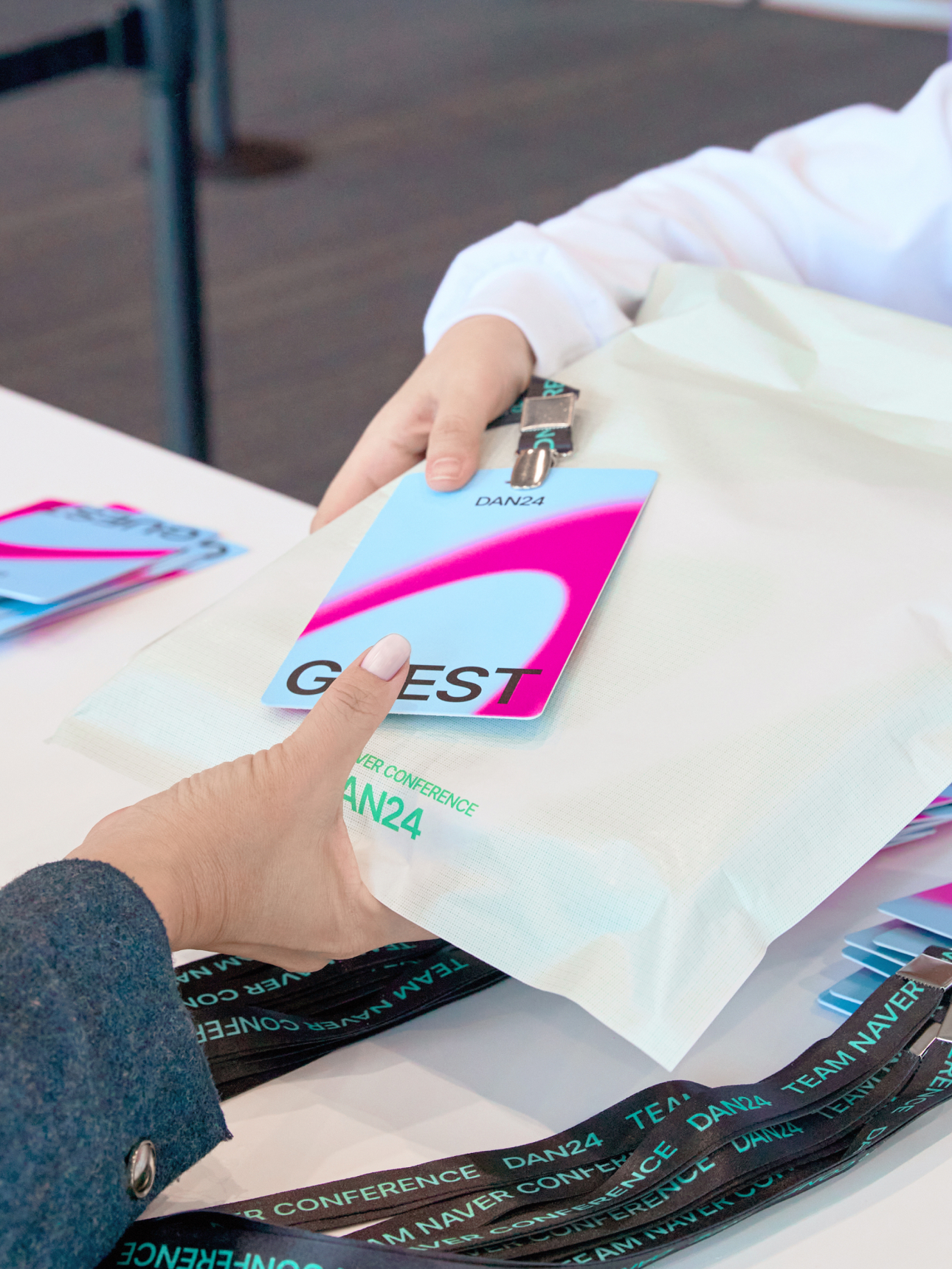
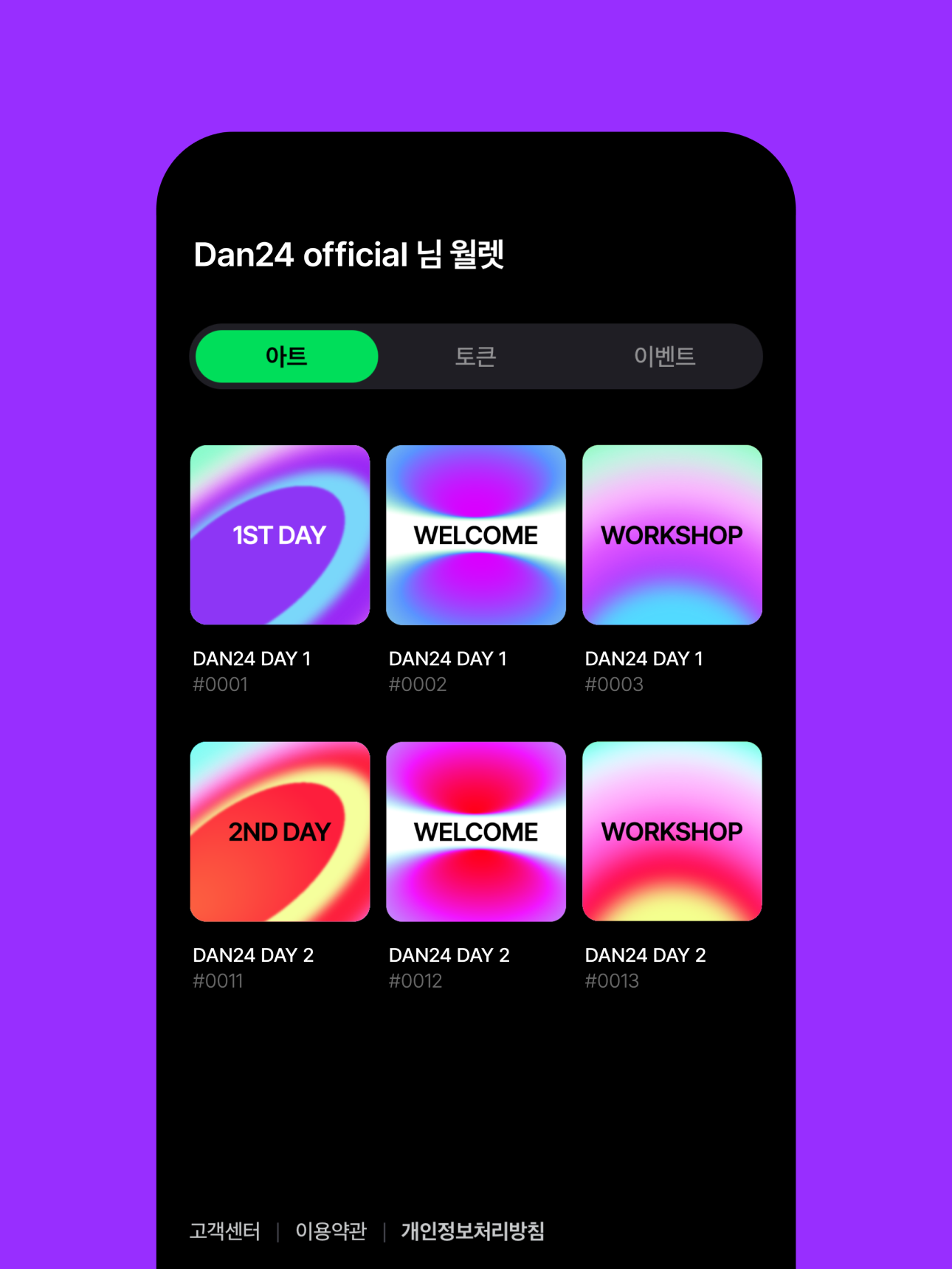
DAN24 uses NFT tickets. NFT tickets are digital tickets based on blockchain technology, and unlike traditional paper or electronic tickets, they are unique digital assets. Each ticket has a unique identifier and metadata, making it easy to verify its authenticity, and serves as an entry pass for events or performances.
NFT ticket artwork goes beyond simply listing event details or schedules; it is designed to be recognized as an artistic and unique digital asset. By owning the ticket, the holder possesses a form of digital asset, which can be kept as a souvenir after the event or resold later.
Team Naver Conference DAN24
Art Direction & Brand Design
BRENDEN
Creative Direction / Doeui Lee
Project Management / Wook Jung
Project Lead / Byeongkuk Jung
Design / Byeongkuk Jung, Jeongwon hwang,
Chaewon Yoon, Hanbum Choi, Juhye Ma
Creative Partner
Design / Owhyworks
Motion / Taeyeol Lee (Studio basil)
Photography / APRO Studio
Sound / 274CUSTOM
Client
Naver
Award
iF Design Award Winner 2026
Red Dot Design Award Winner 2025