Oppodd
Rebranding Project
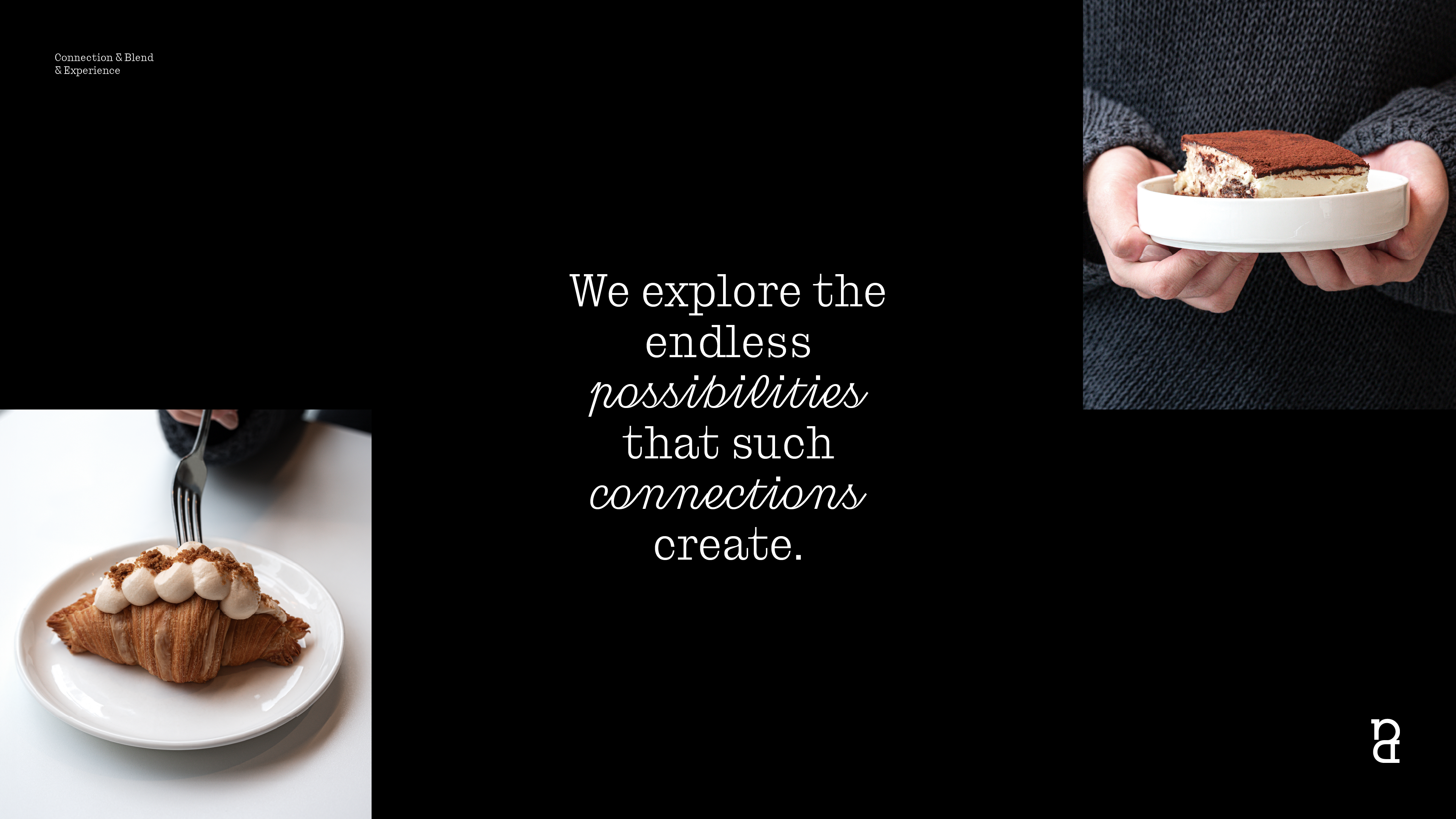
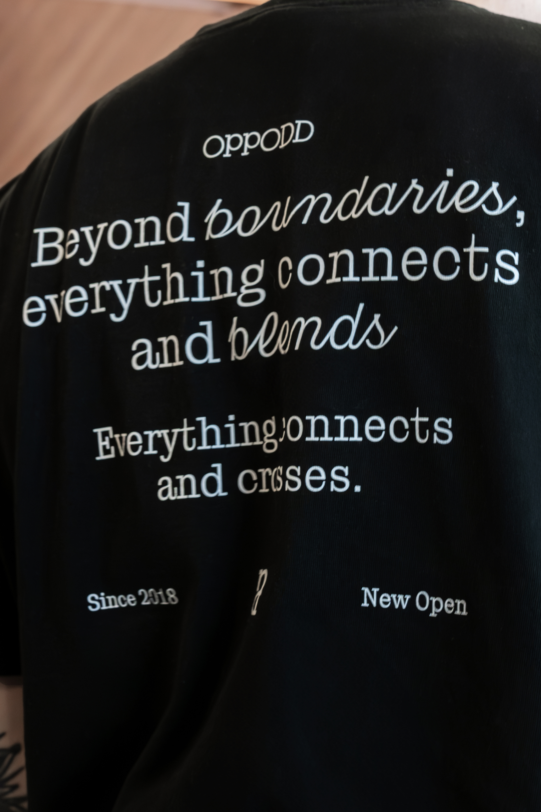
Located in Seomyeon, Busan, South Korea, Oppodd was created and is operated by BRENDEN. Given Seomyeon’s vibrant atmosphere and high foot traffic, BRENDEN rebranded Oppodd as a dynamic space where people, beverages, desserts, and diverse content come together, fostering interaction and offering a variety of experiences. To reflect this brand value, Oppodd has evolved beyond a traditional café, providing new spatial experiences through various collaborations and creating a unique, multidimensional environment.
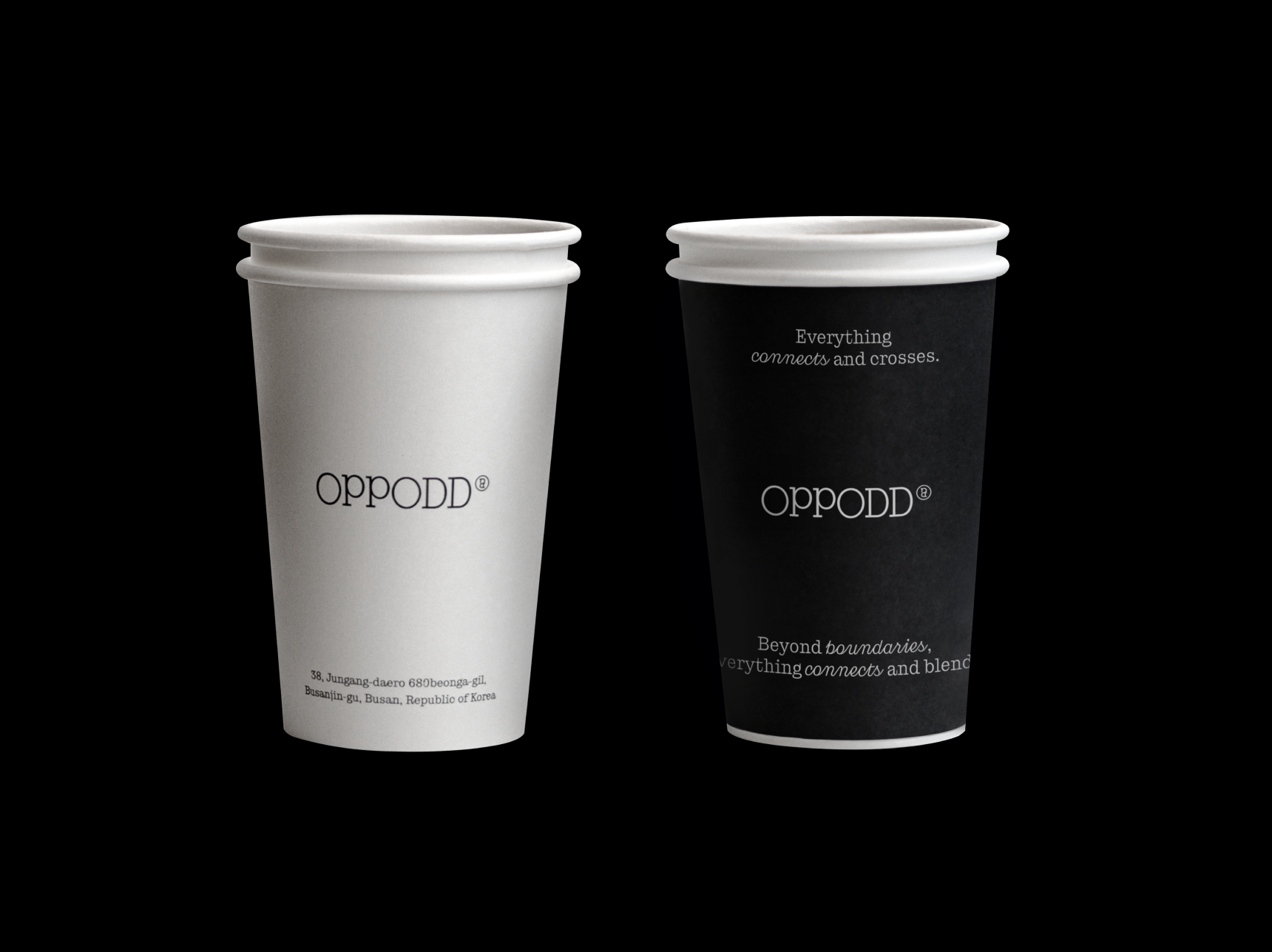
The Oppodd wordmark, with its harmonious blend of straight and curved lines, and the symbol combining the "D" and "P" from the wordmark, convey the idea of various elements of Oppodd, such as beverages, food, and content, being interconnected and blending. Furthermore, a small symbol placed after the logotype can serve as a replacement for the "×" sign when collaborating with other brands. This emphasizes Oppodd's brand value of creating new spatial experiences through collaboration with diverse brands, aiming to provide customers with richer and more dynamic experiences.
The symbol of the Oppodd logotype is created by combining the letters "D" and "P" representing the connection between customers and Oppodd, enabling diverse spatial experiences.
Oppodd's graphic system is designed based on a combination of circles and lines, similar to its logo. The main graphics of Oppodd feature circles and lines harmoniously coming together, with each element interconnecting to create new graphic forms. The sub-graphics are derived from the interconnected appearance of circles and lines and are used in combination with Oppodd's typography and imagery. This emphasizes Oppodd's brand value of providing a rich and diverse spatial experience through the connection and blending of various elements.
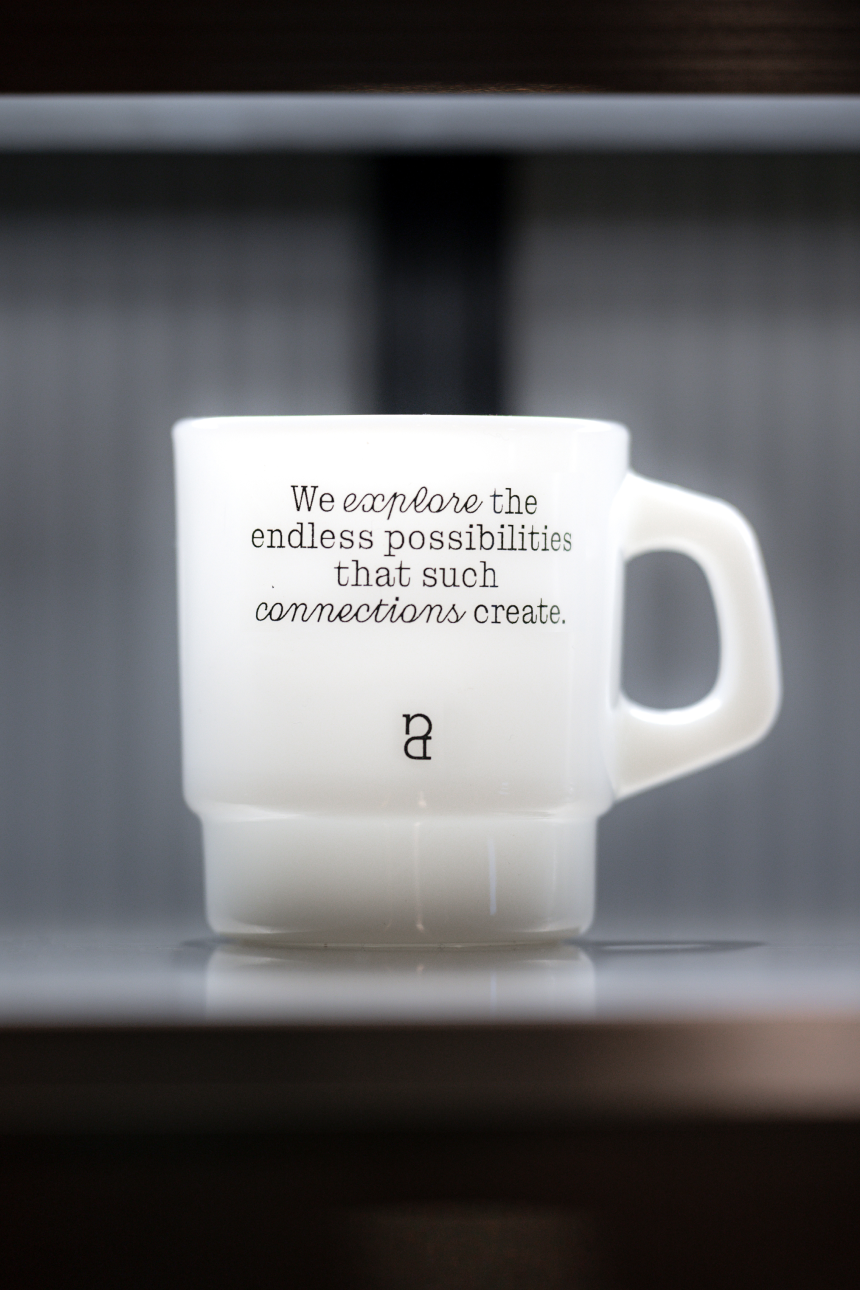
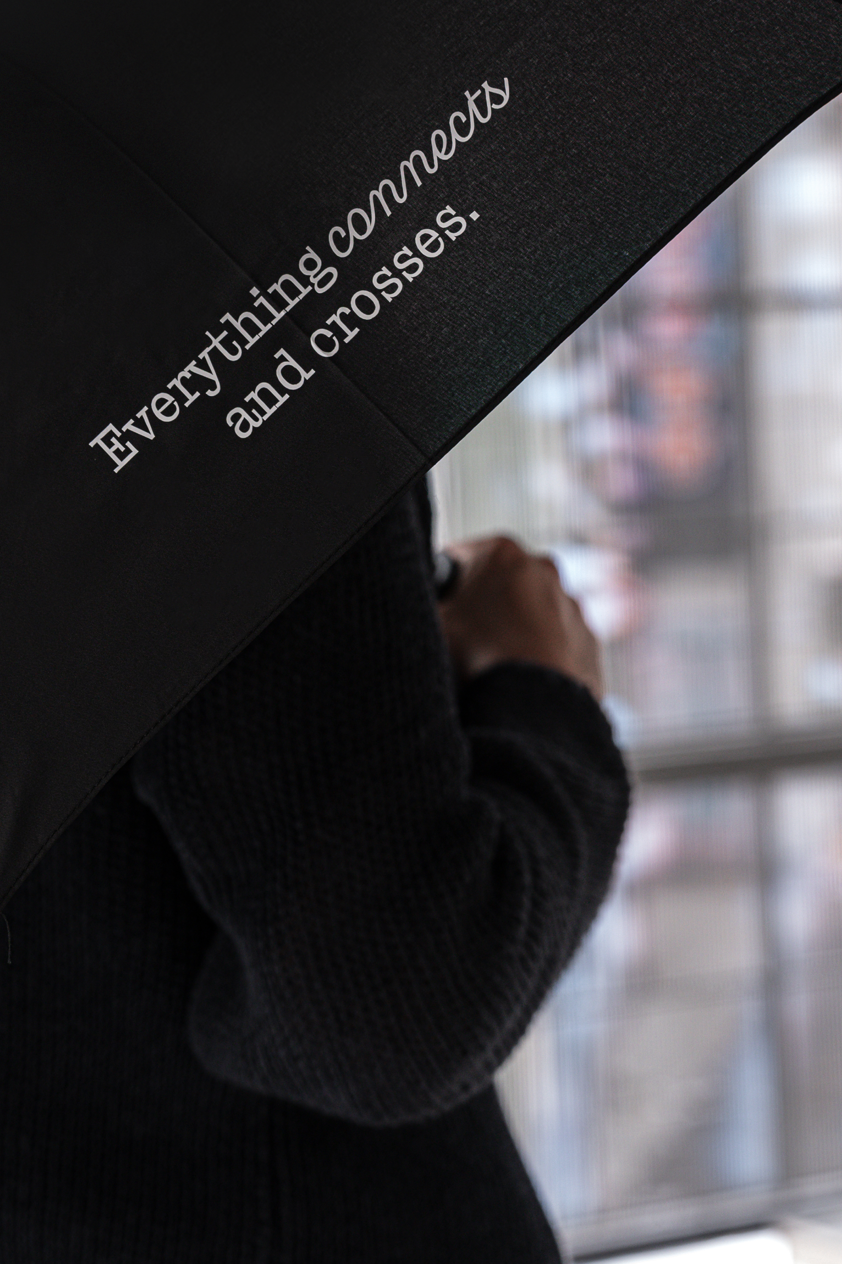
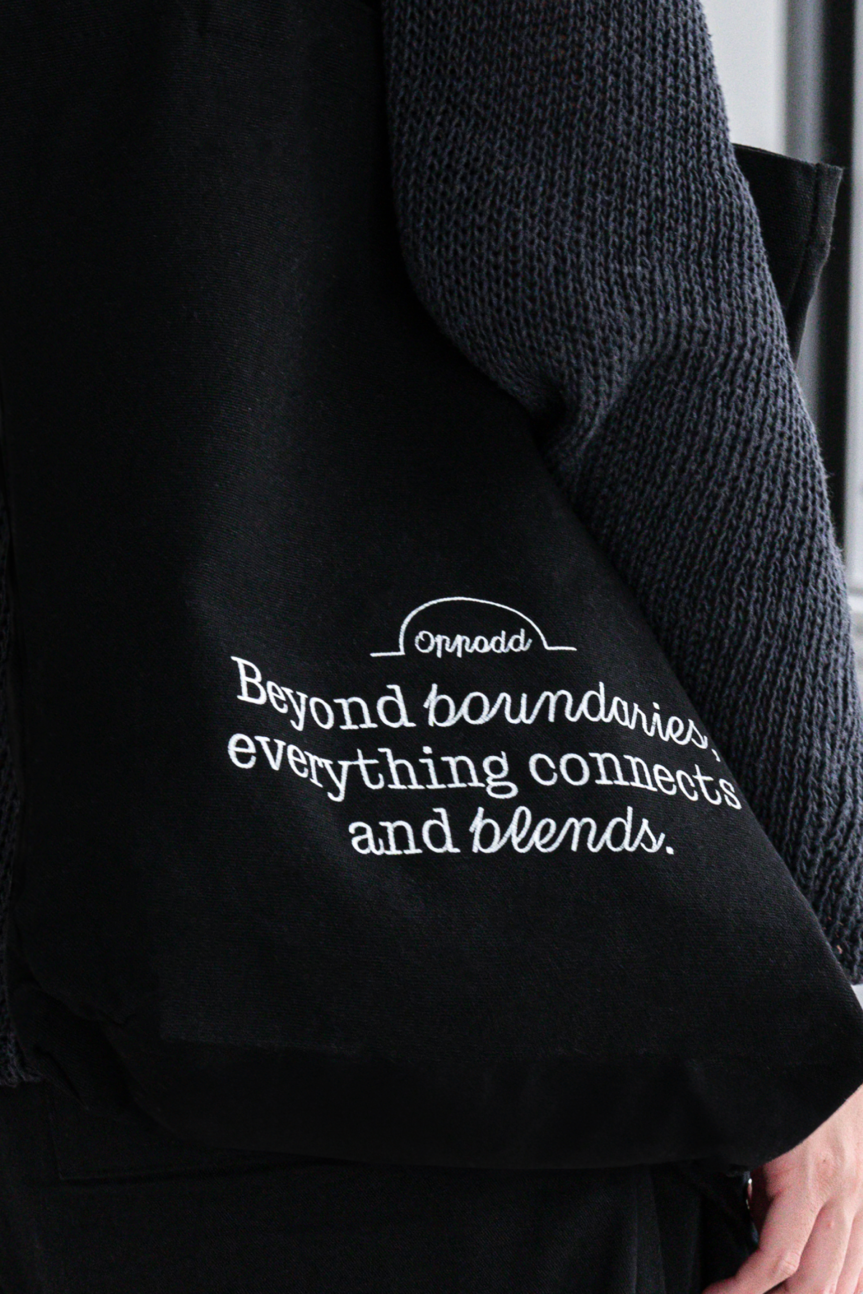
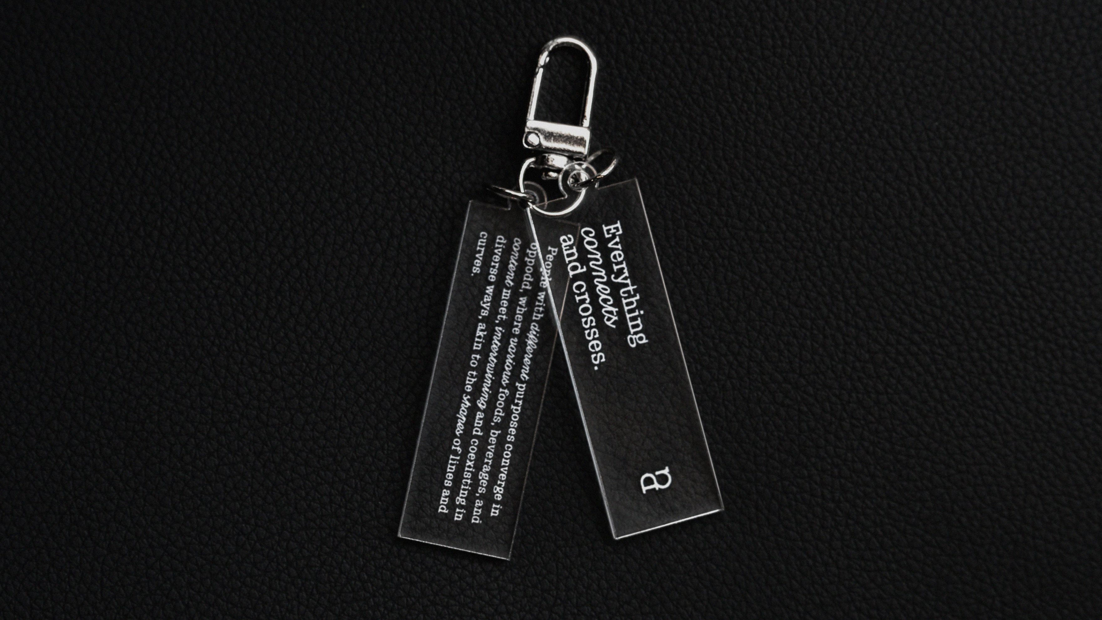
Oppodd's typography combines the slab serif and script styles of the Cucina typeface.
By combining these different type styles, Oppodd conveys its brand value of various elements and content coming together,
blending, and connecting seamlessly.
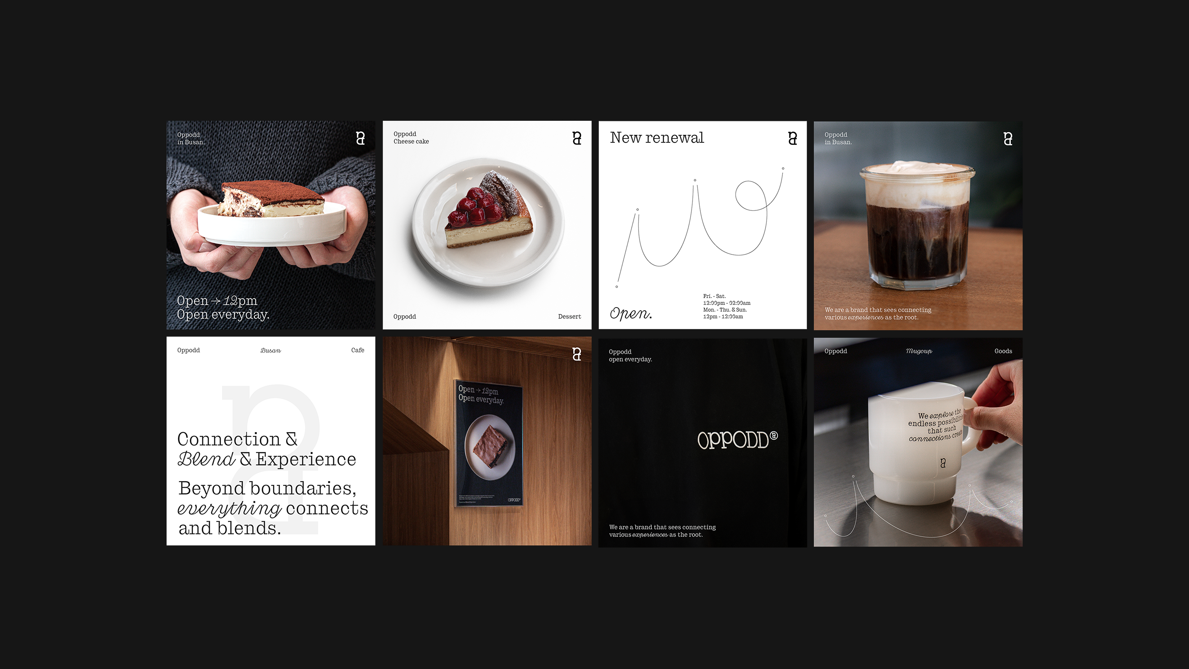
These are the designs for Oppodd's merchandise and supplies, incorporating Oppodd's brand identity to convey its design to customers both directly and indirectly.
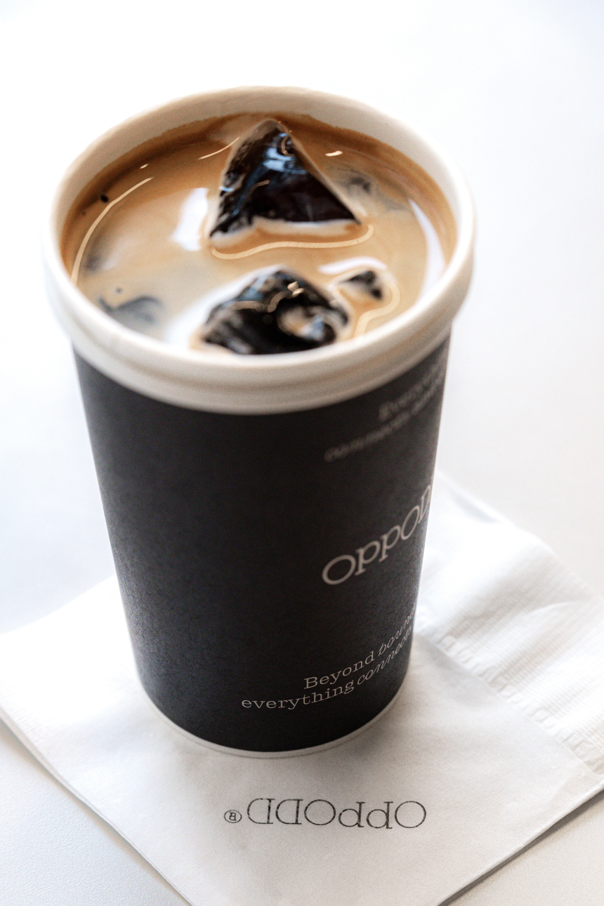
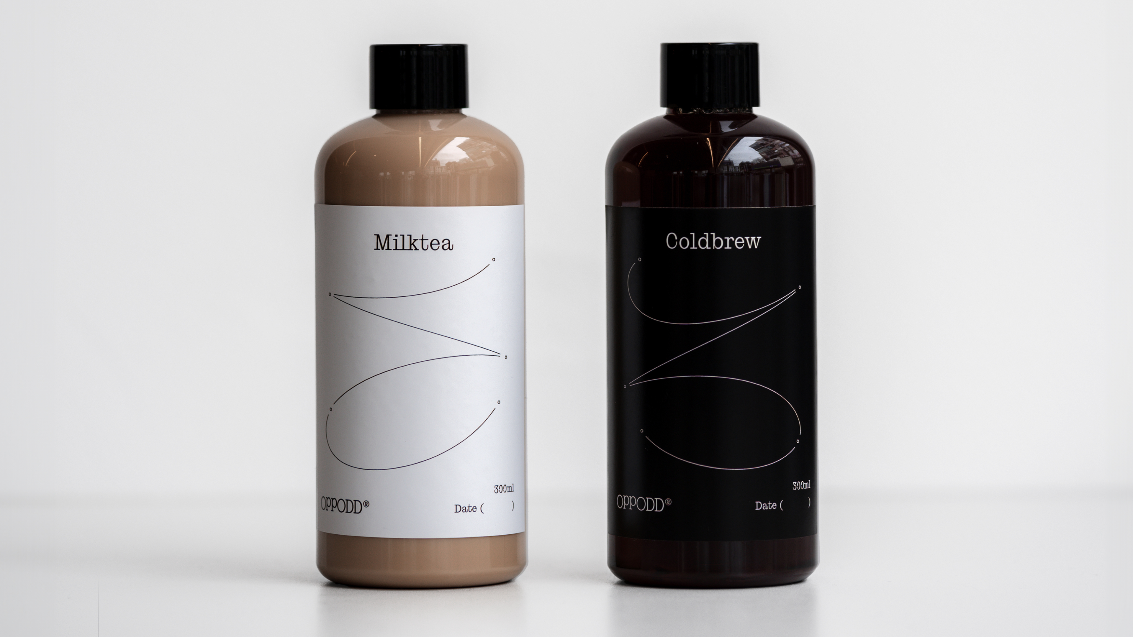
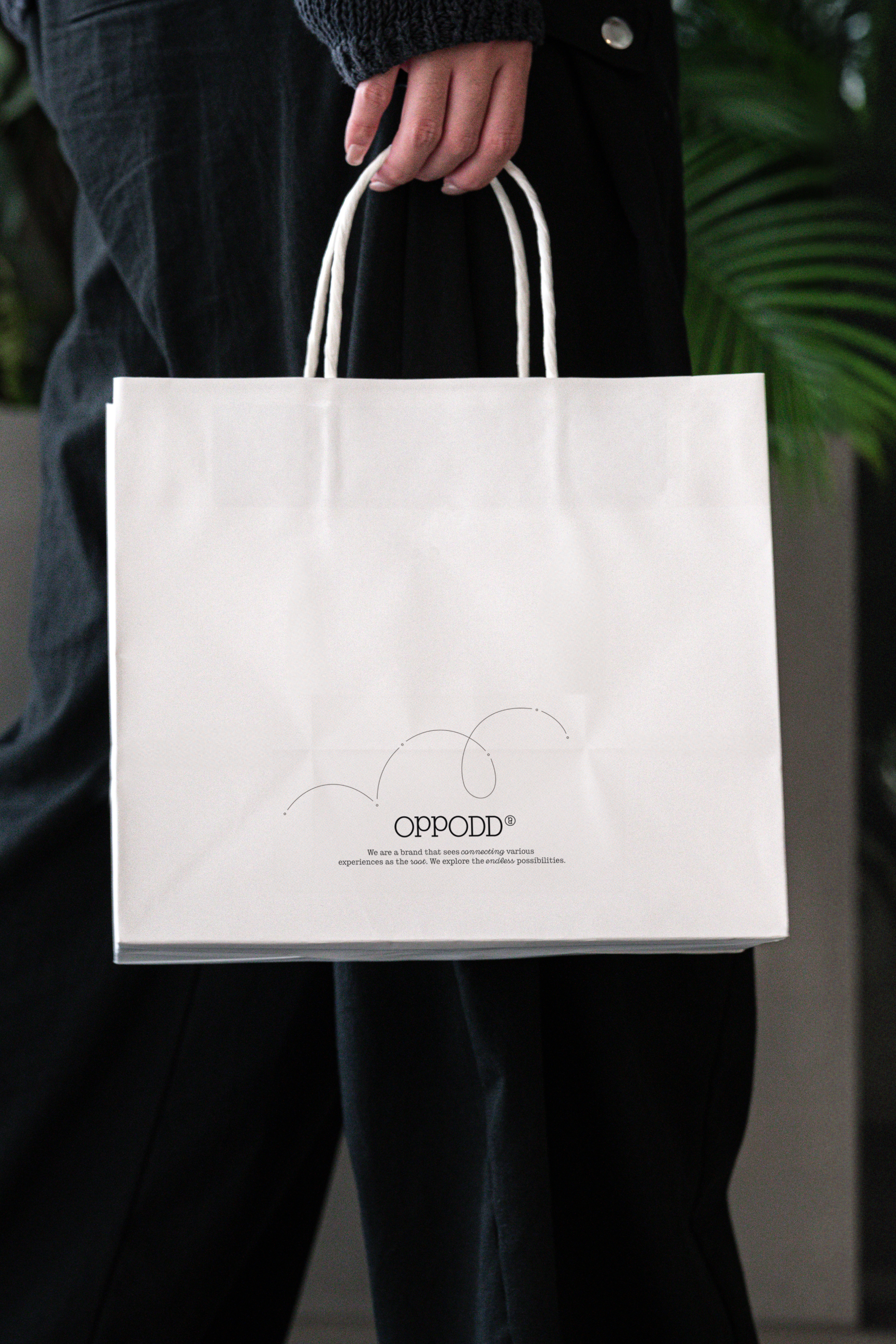
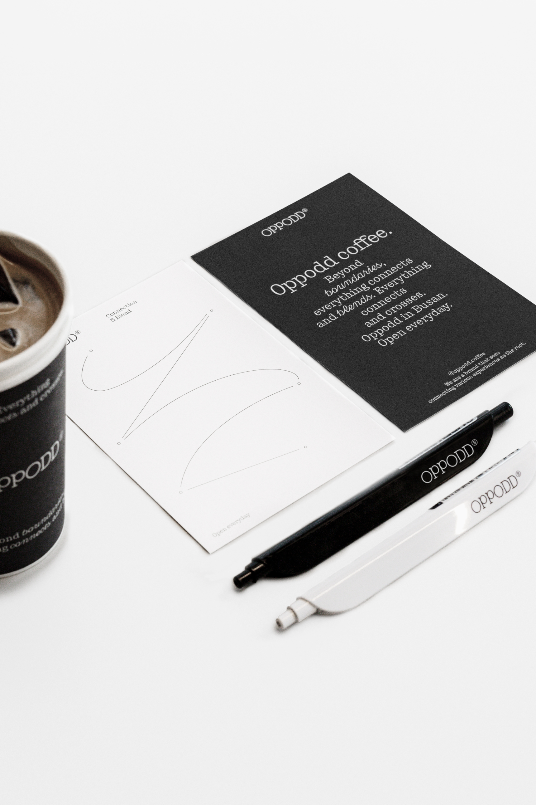
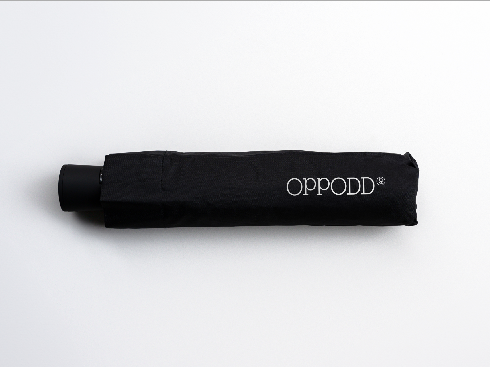
Oppodd’s various goods, such as eco-bags, keyrings, and pens, are sold directly to customers, serving as a way to convey Oppodd’s identity.
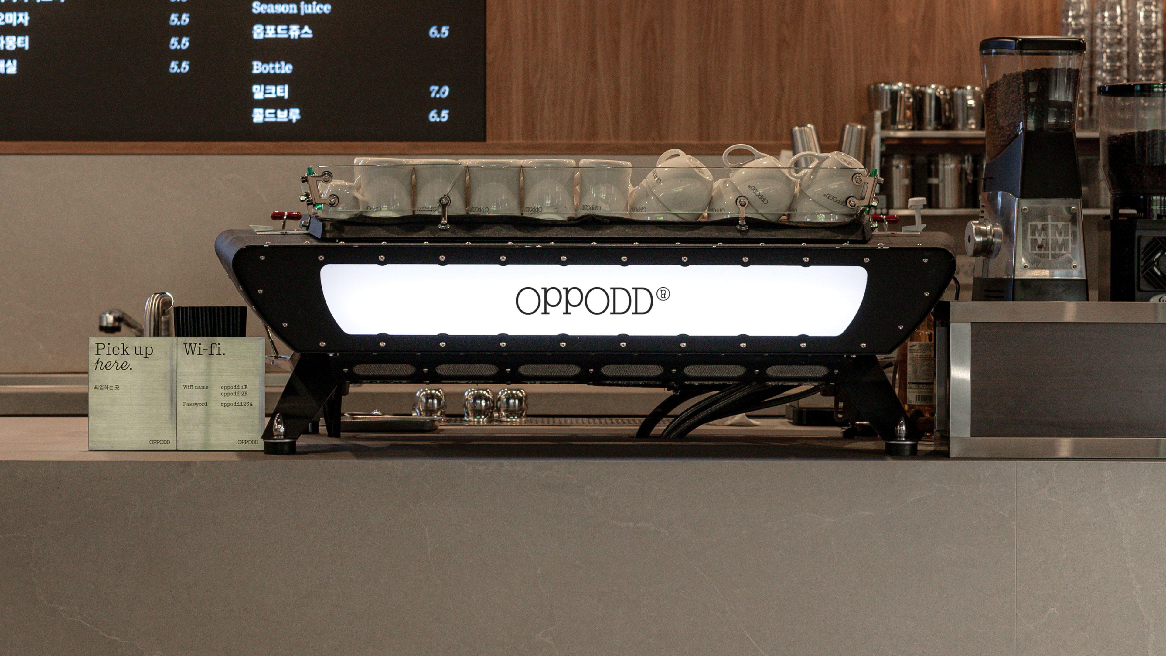
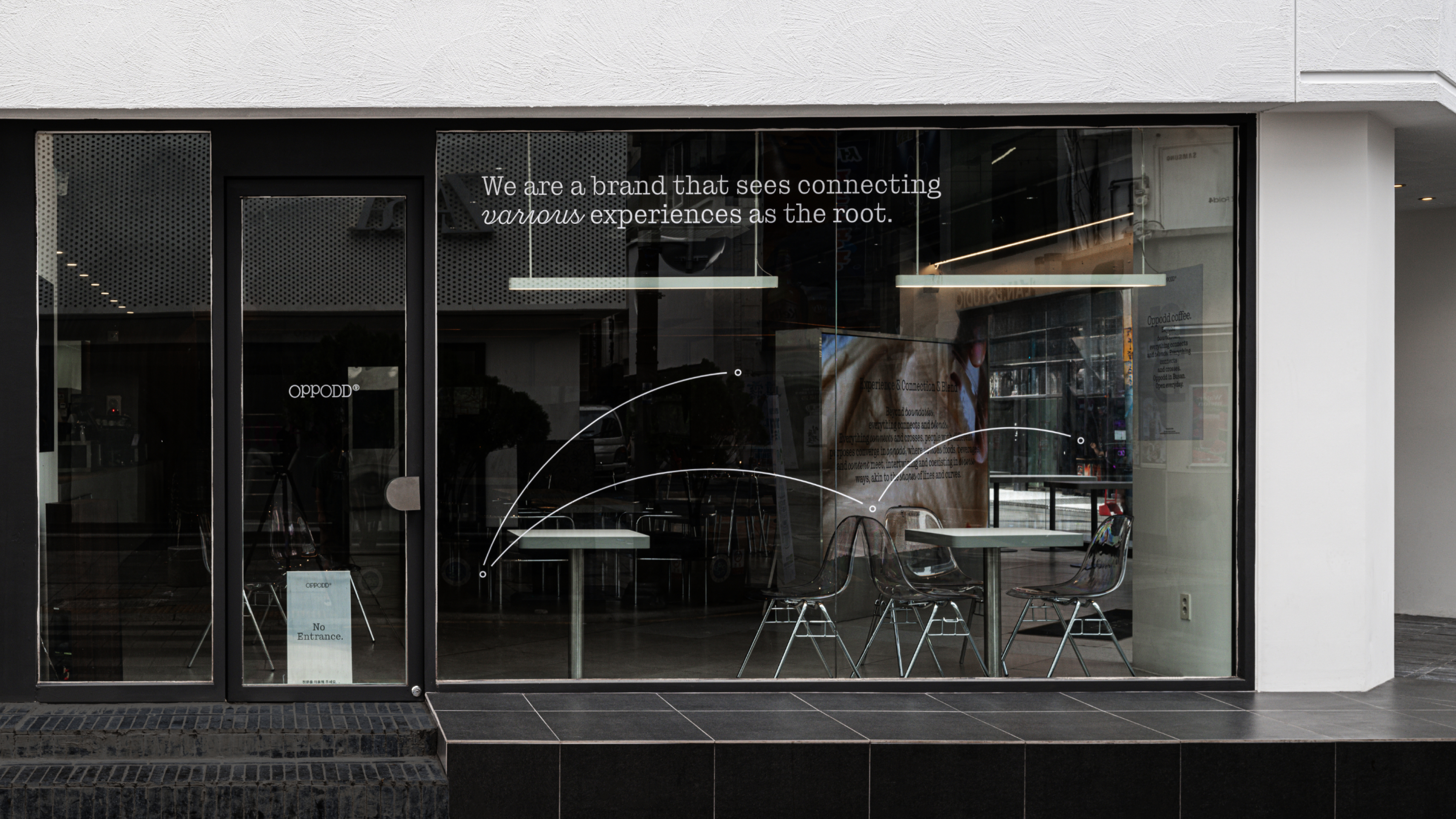
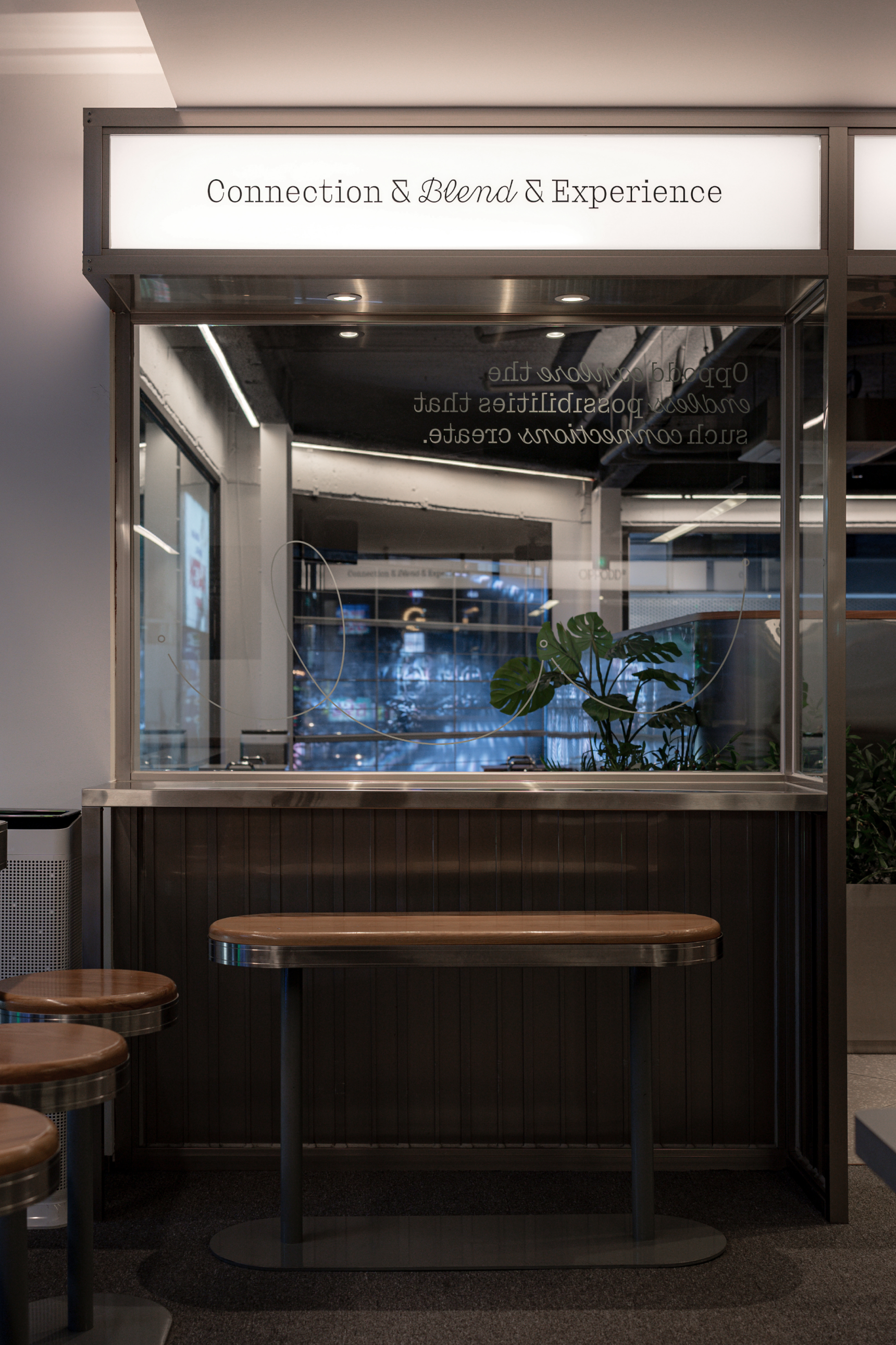
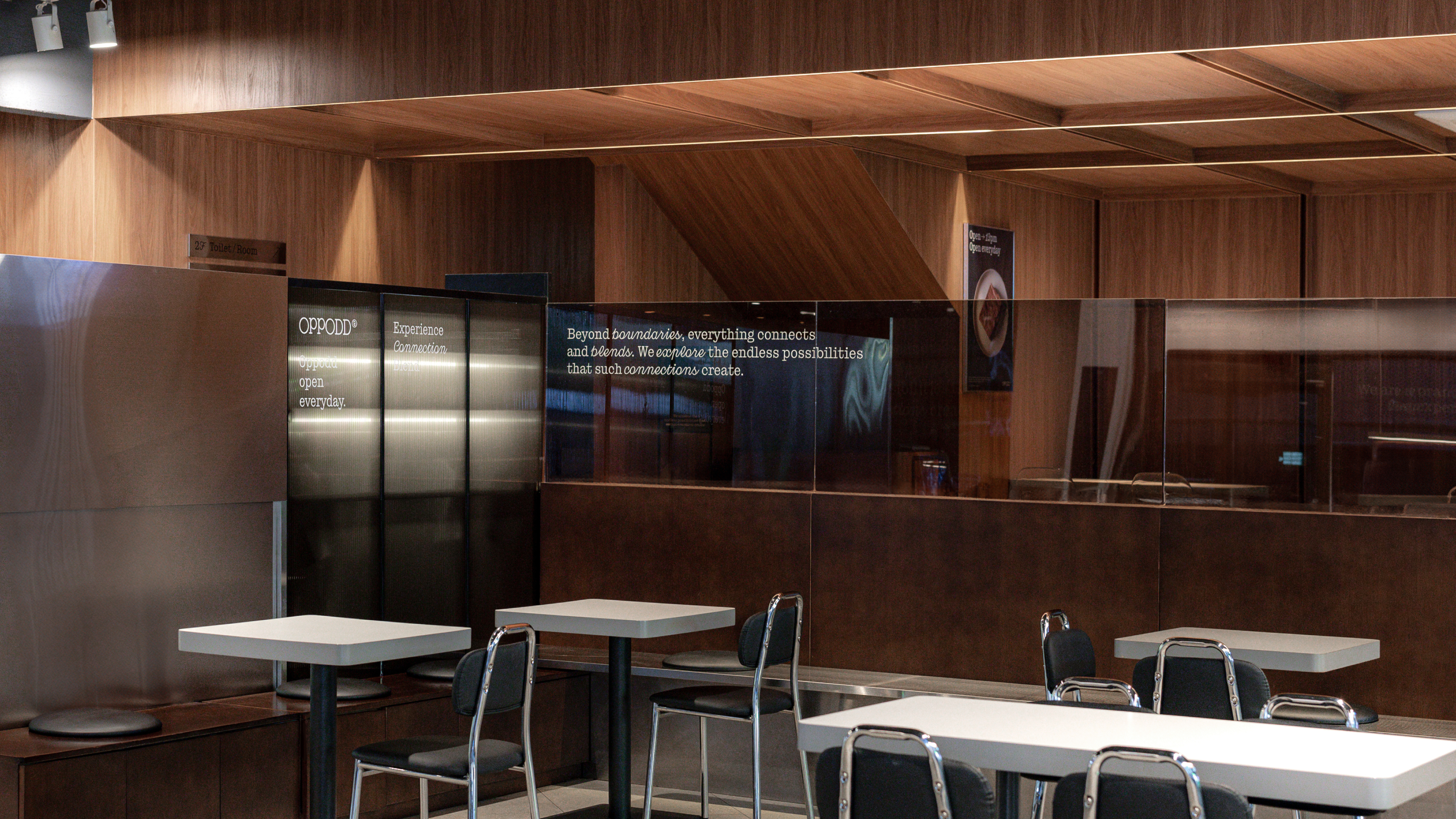
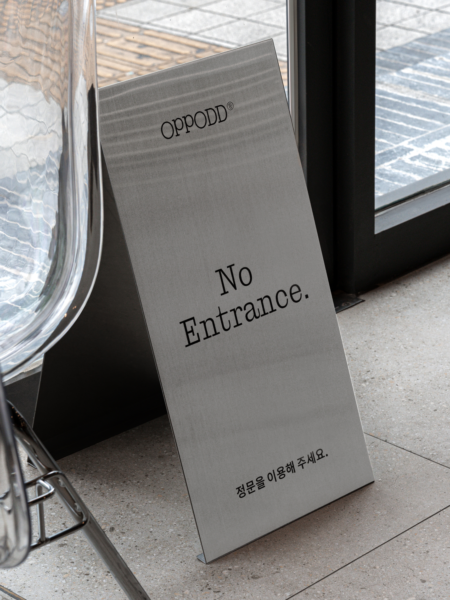
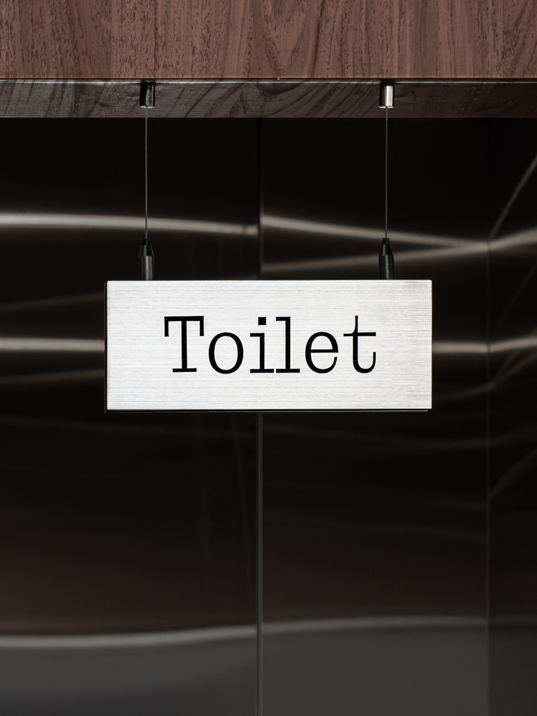
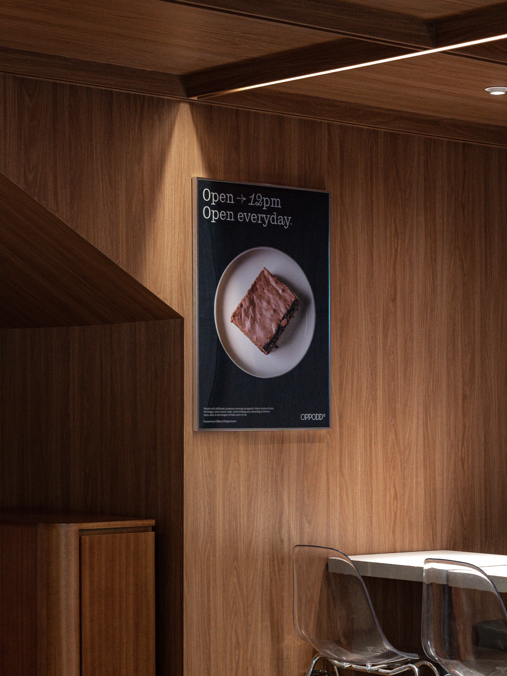
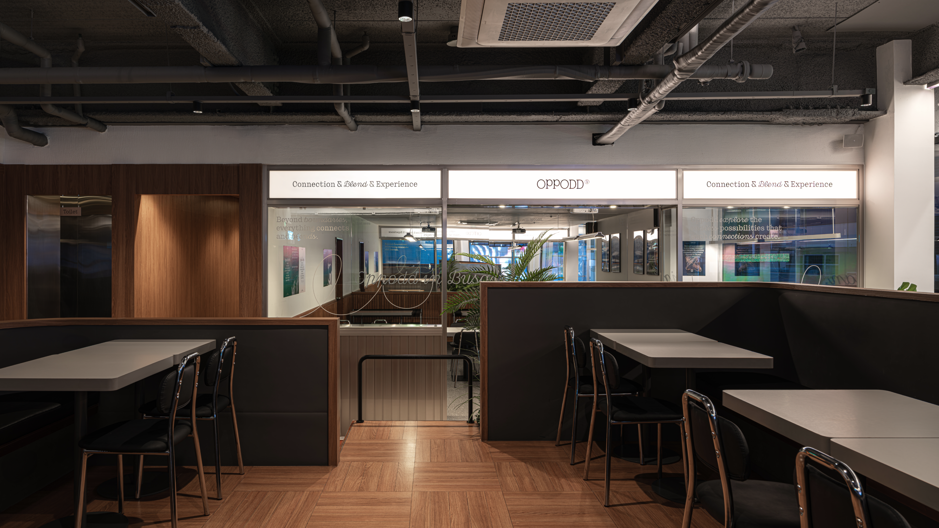
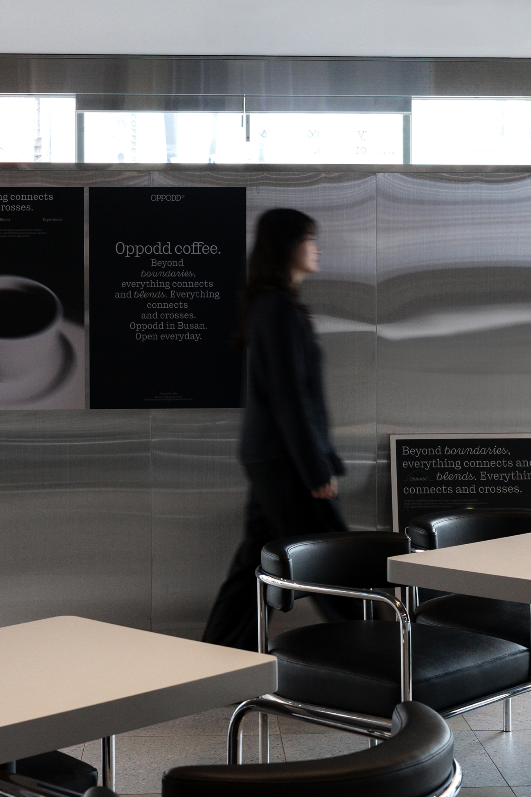
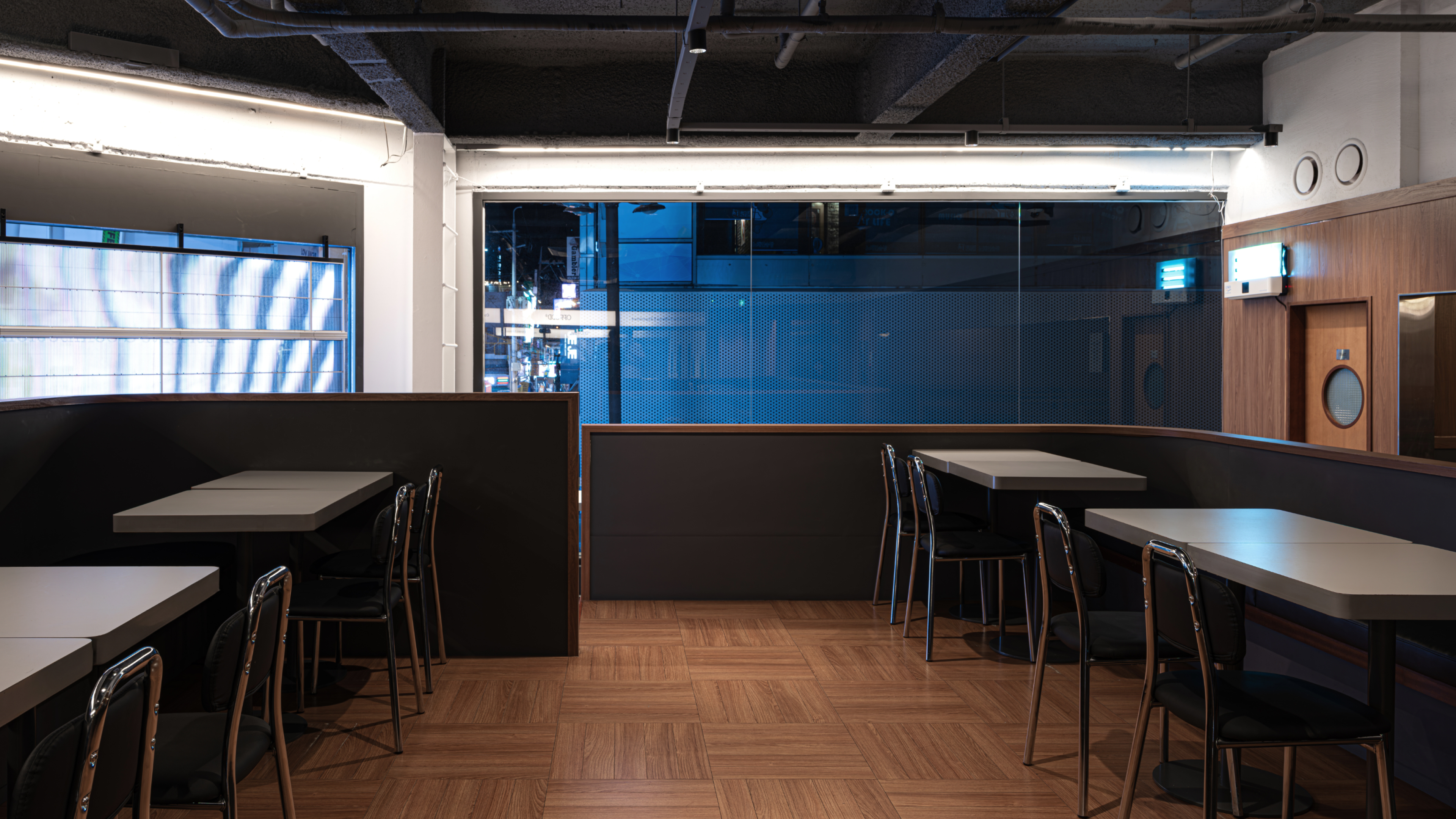
This is the spatial design of Oppodd. The space features a black-and-white color scheme, reflecting Oppodd's brand colors through painted surfaces and stainless steel materials. The seat signage design incorporates Oppodd's key visual elements, allowing customers to experience the brand’s identity directly.
Oppodd
Rebranding Project
BRENDEN
Creative Direction / Do-eui Lee
Project Direction / Wook Jung
Project Management / Jiwoon Kim, Byeongkuk Jung
Design / Haena Yang, Juhye Ma, Hanbeom Choi
Creative Partner / Mizupase, Jerry Kim