monimo
Brand Identity Design
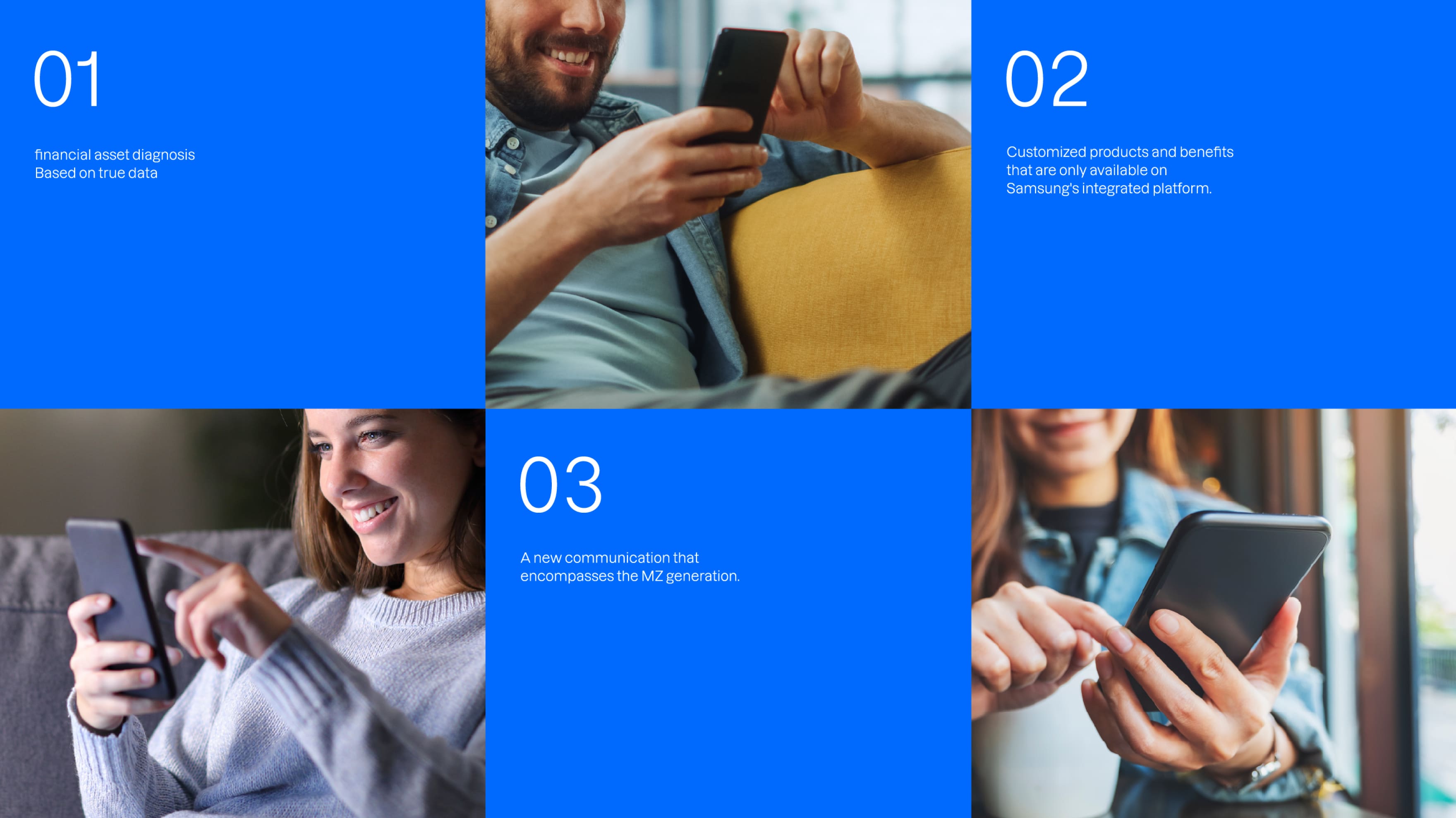
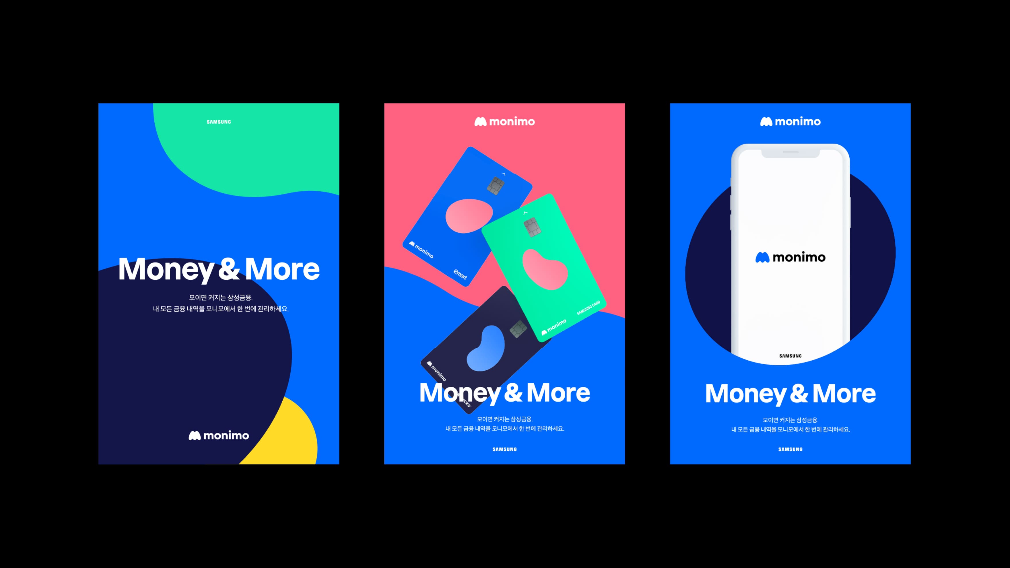
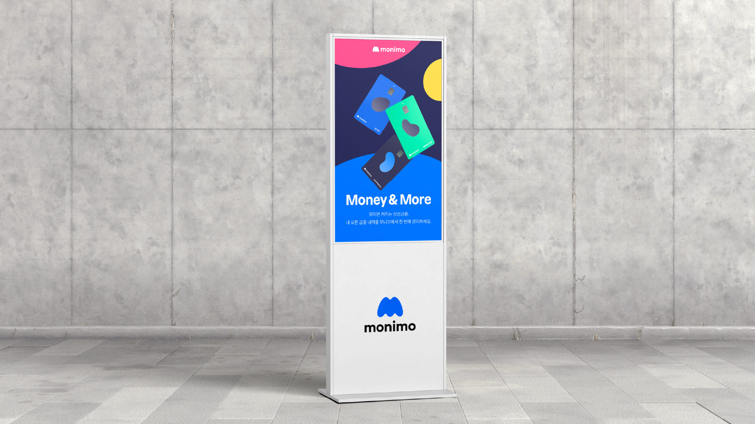
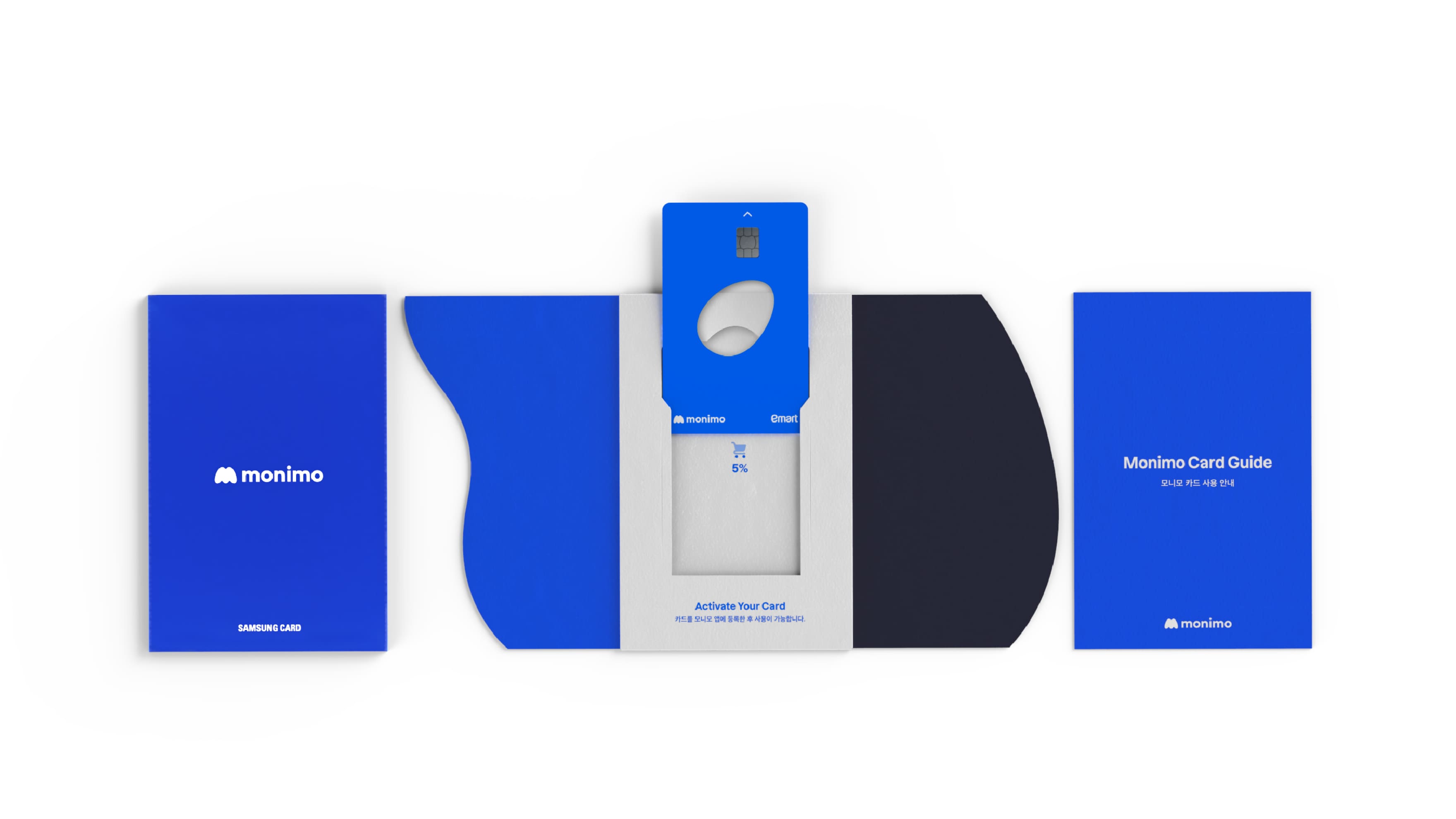
Monimo is Samsung Finance’s integrated PFM platform incorporating Samsung Life Insurance, Samsung Securities, Samsung Fire Insurance and Samsung Card to provide customers with Samsung’s financial services including financial asset diagnosis and management, personalized products and preferential benefits. BRENDEN implemented Monimo’s identity in the form of organic curves representing daily changes of assets, and engaged in overall design including naming, brand design, motion design and credit card design.
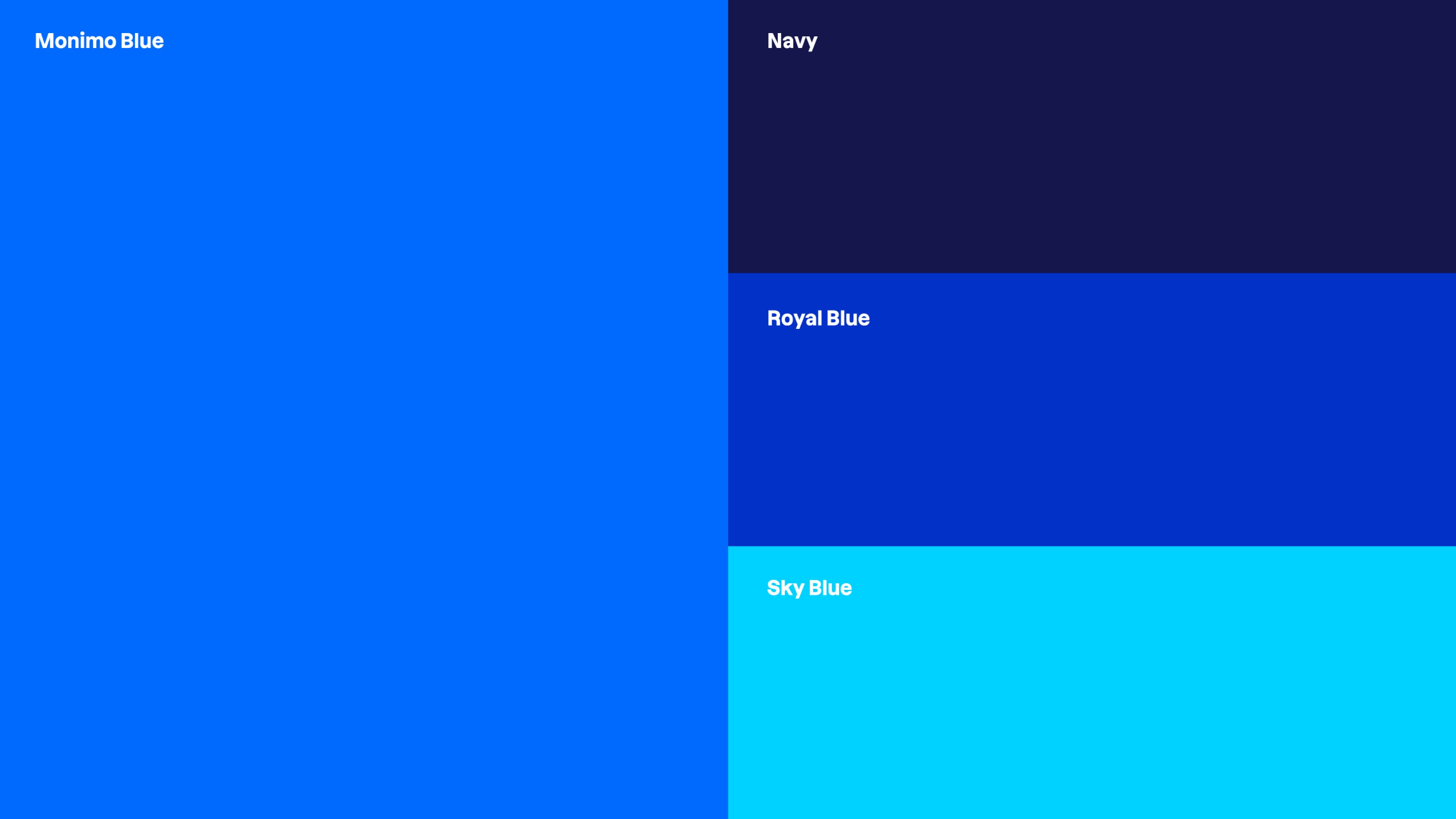
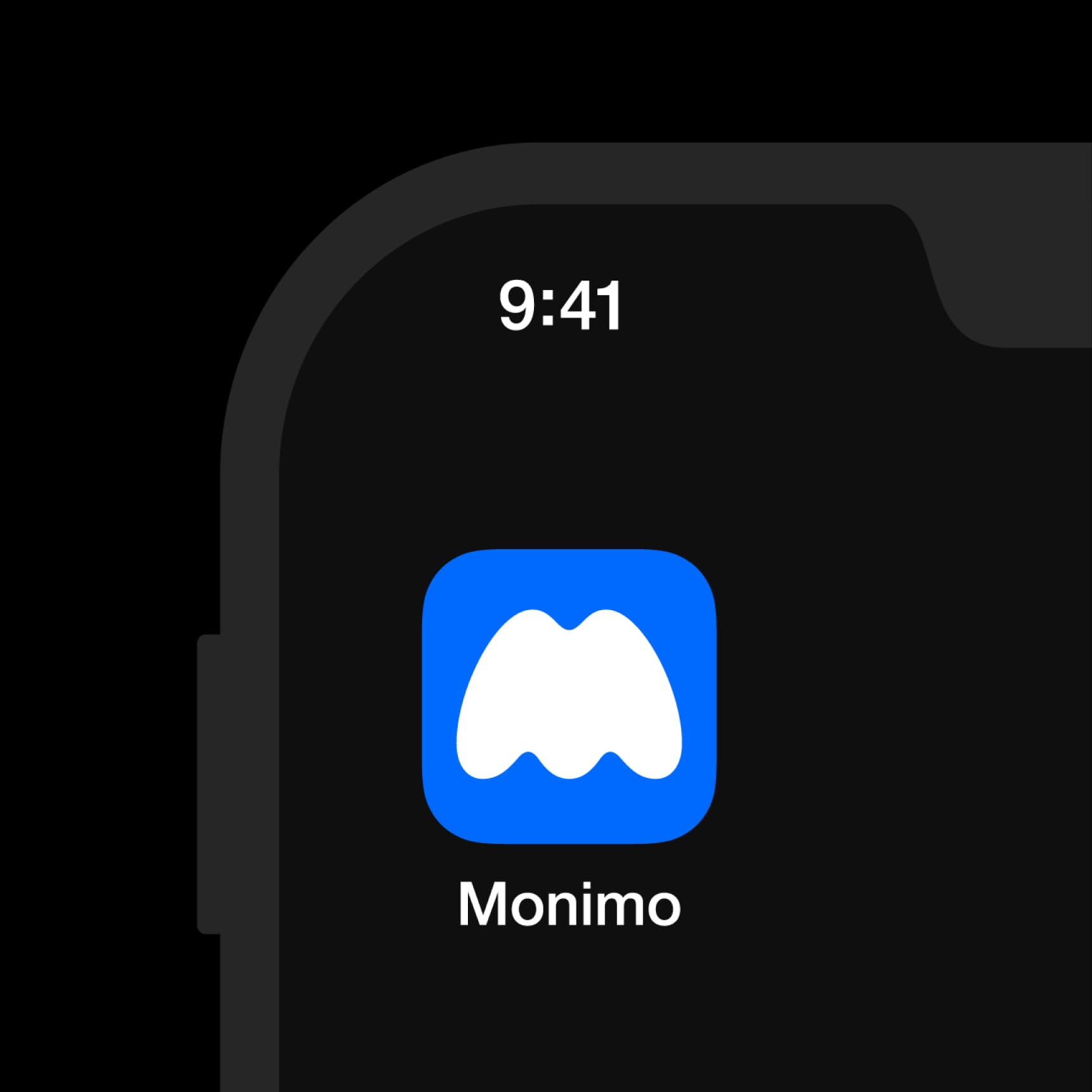
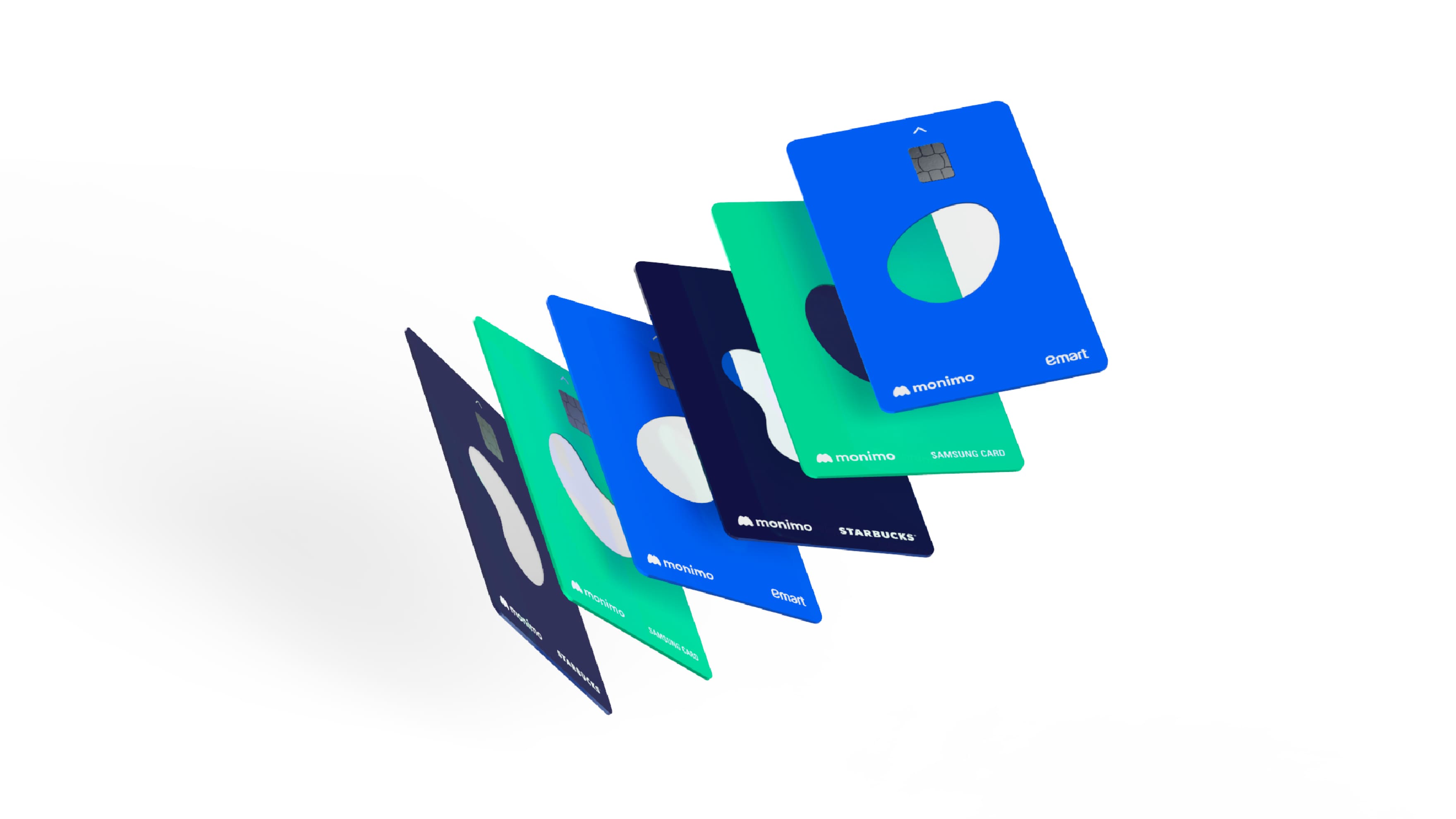
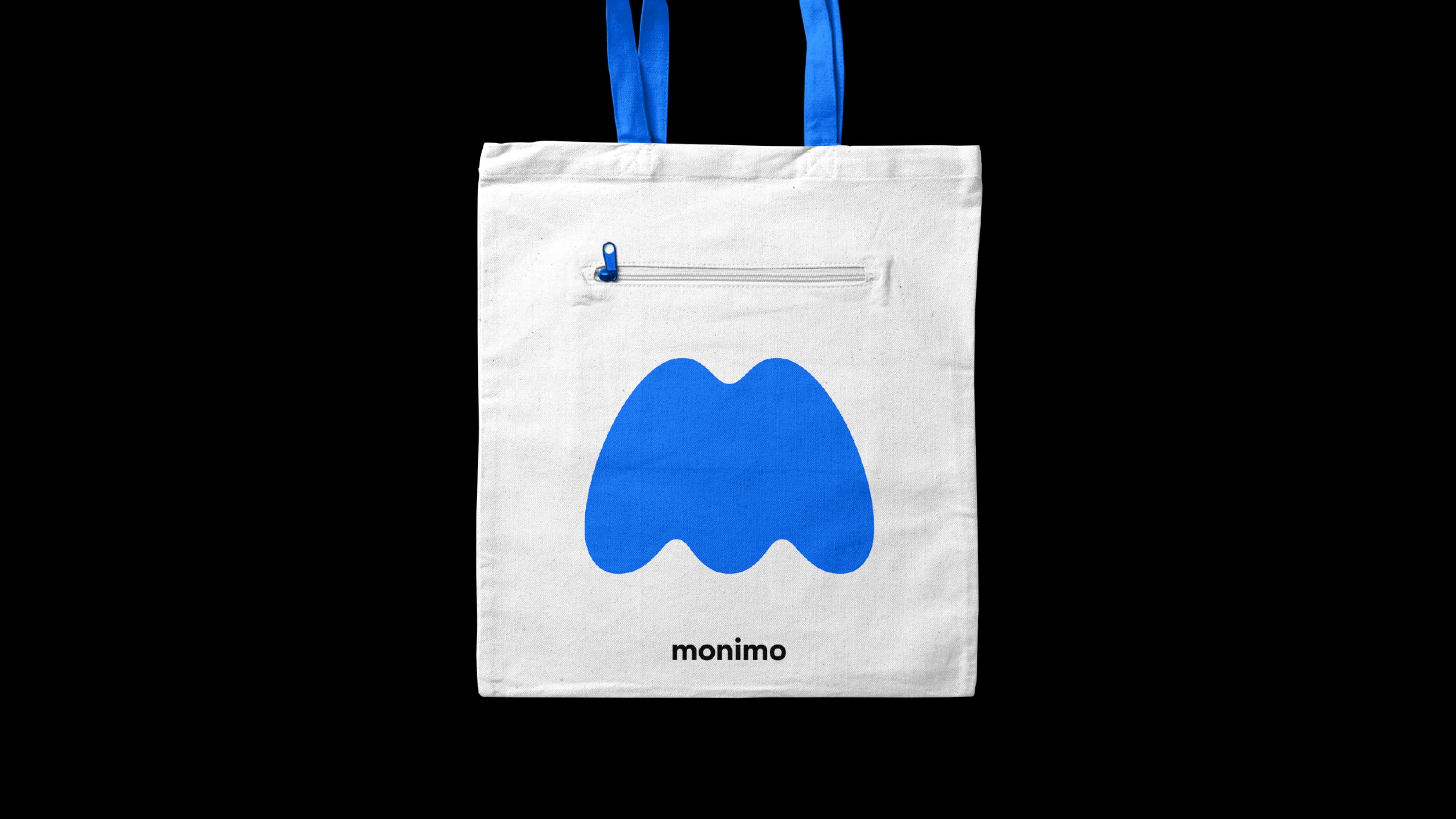
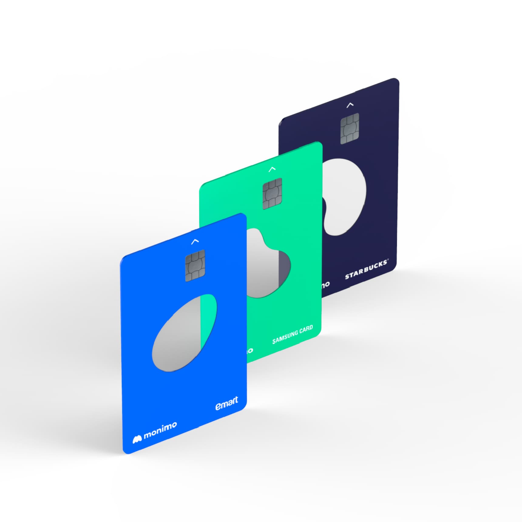
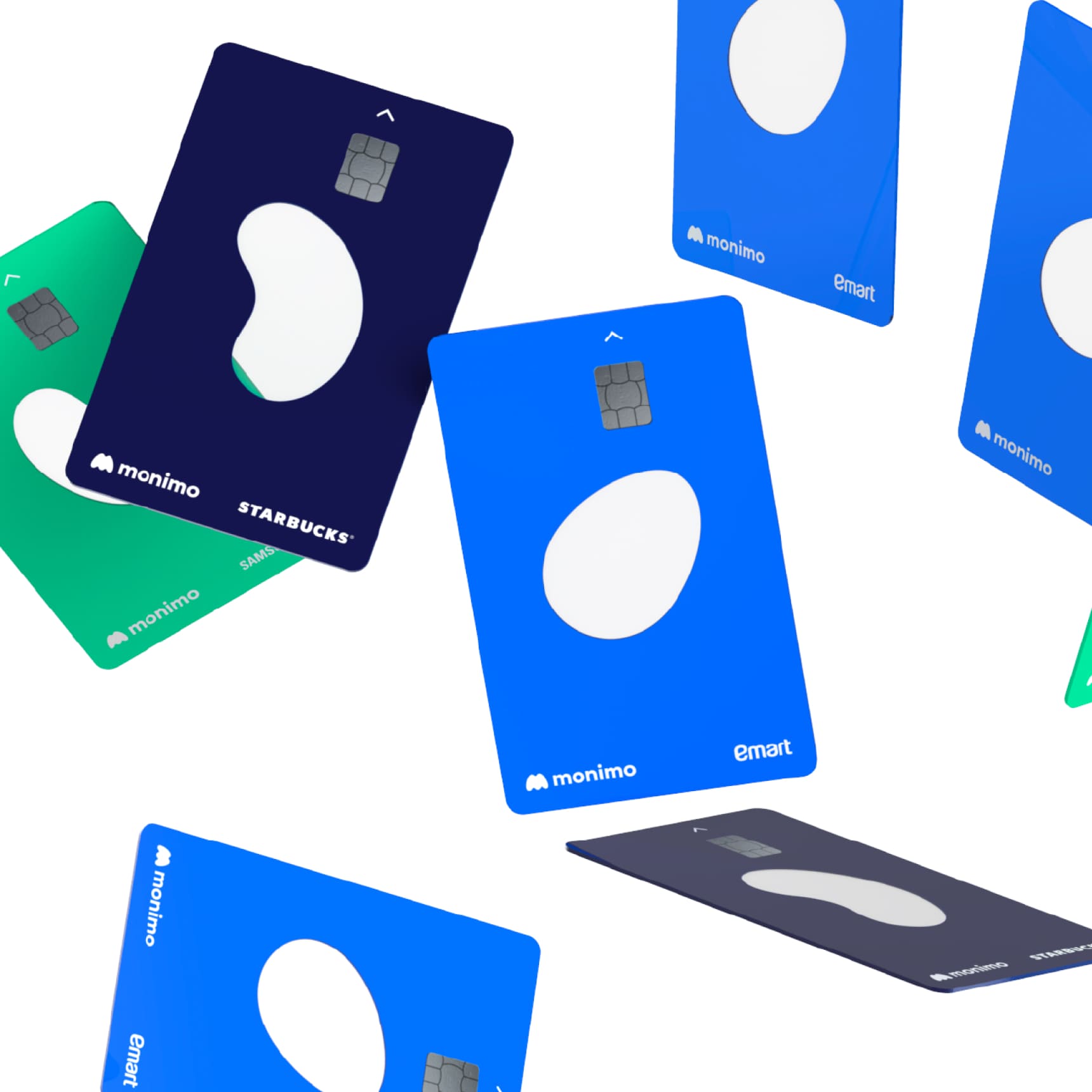
Monimo’s symbol takes the form of organic curves encompassing the elliptical graphic symbolizing each affiliate (Samsung Life Insurance, Samsung Securities, Samsung Fire Insurance and Samsung Card) and assets, to represent Samsung Finance’s assets connected via Monimo. Monimo Blue based on Samsung’s brand color gives Samsung Finance’s reliability and feelings of youth and friendliness.
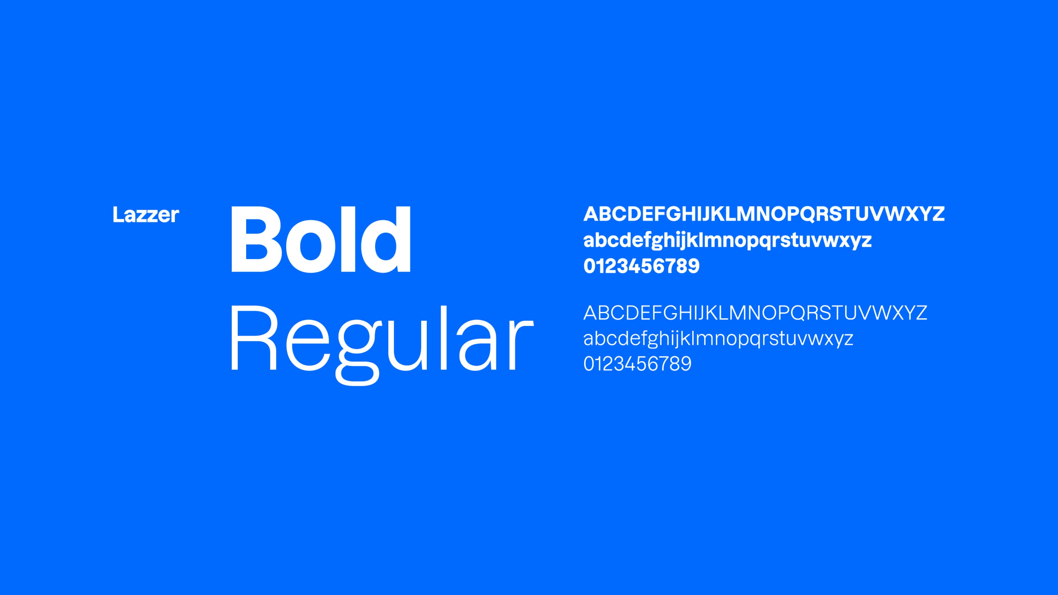
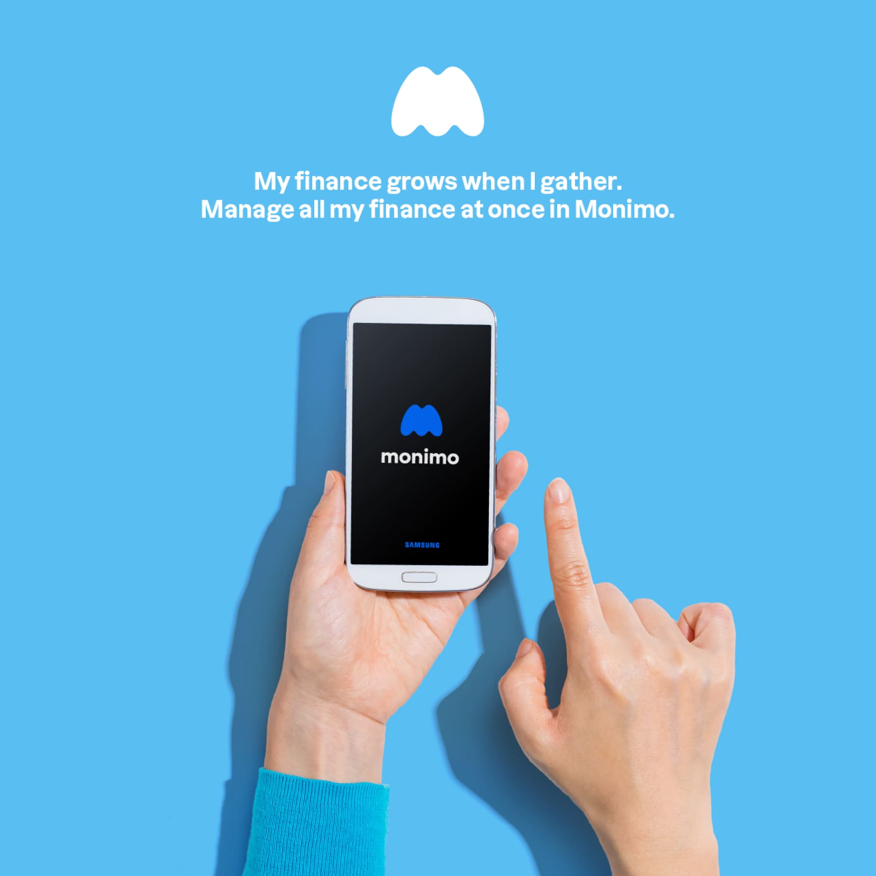
The sans serif wordmark props up the symbol, delivering the reliability of its financial services.

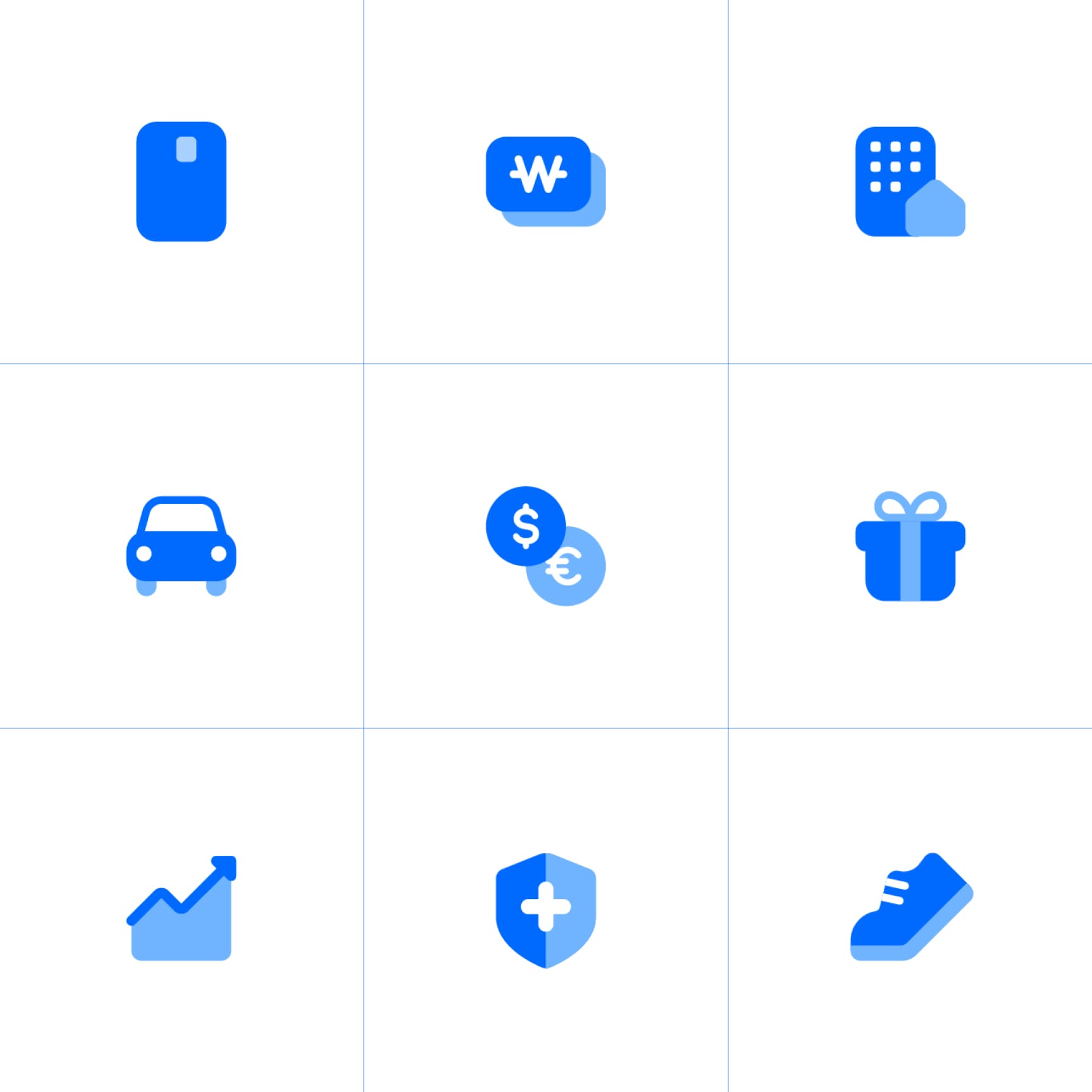
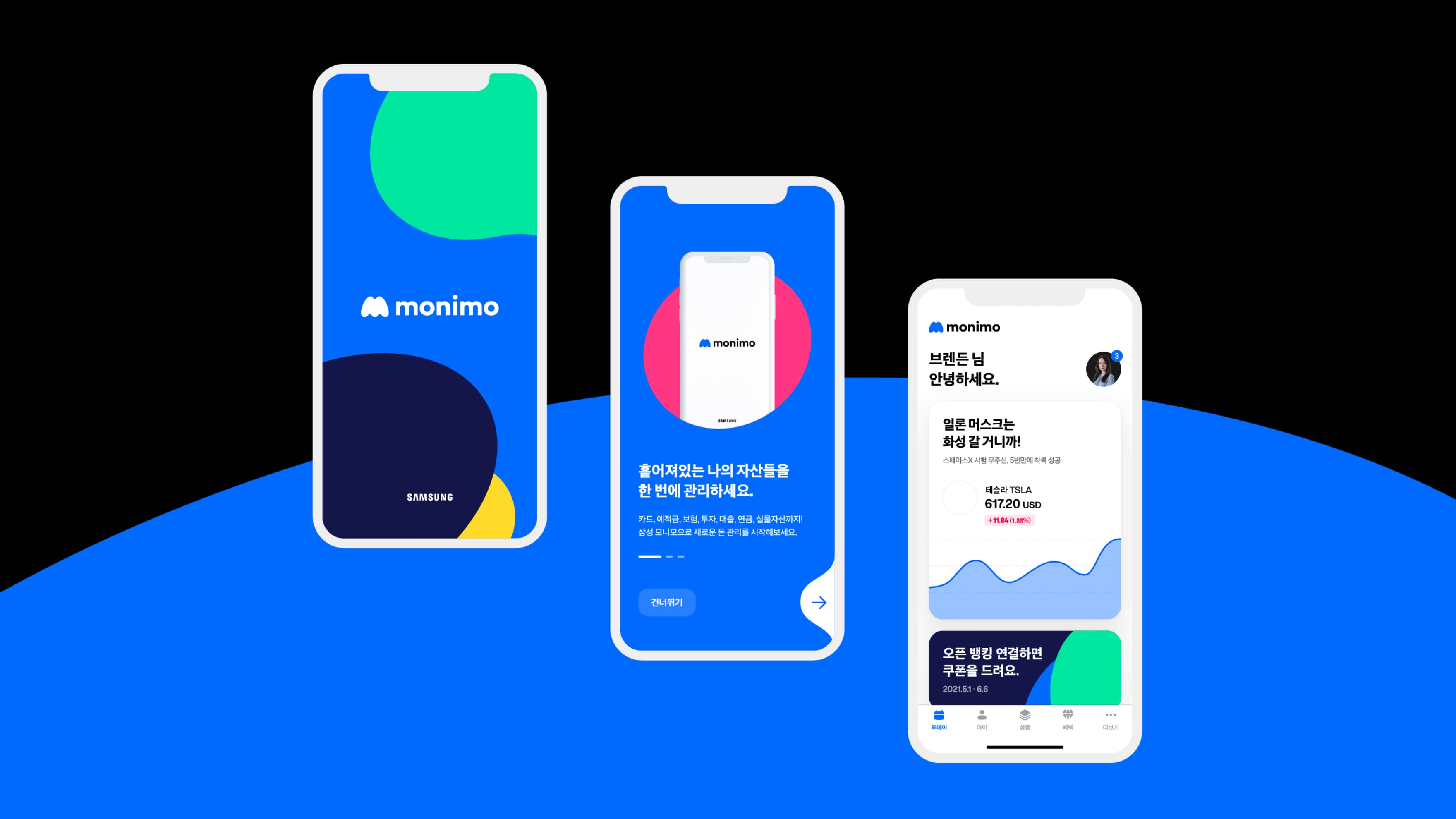
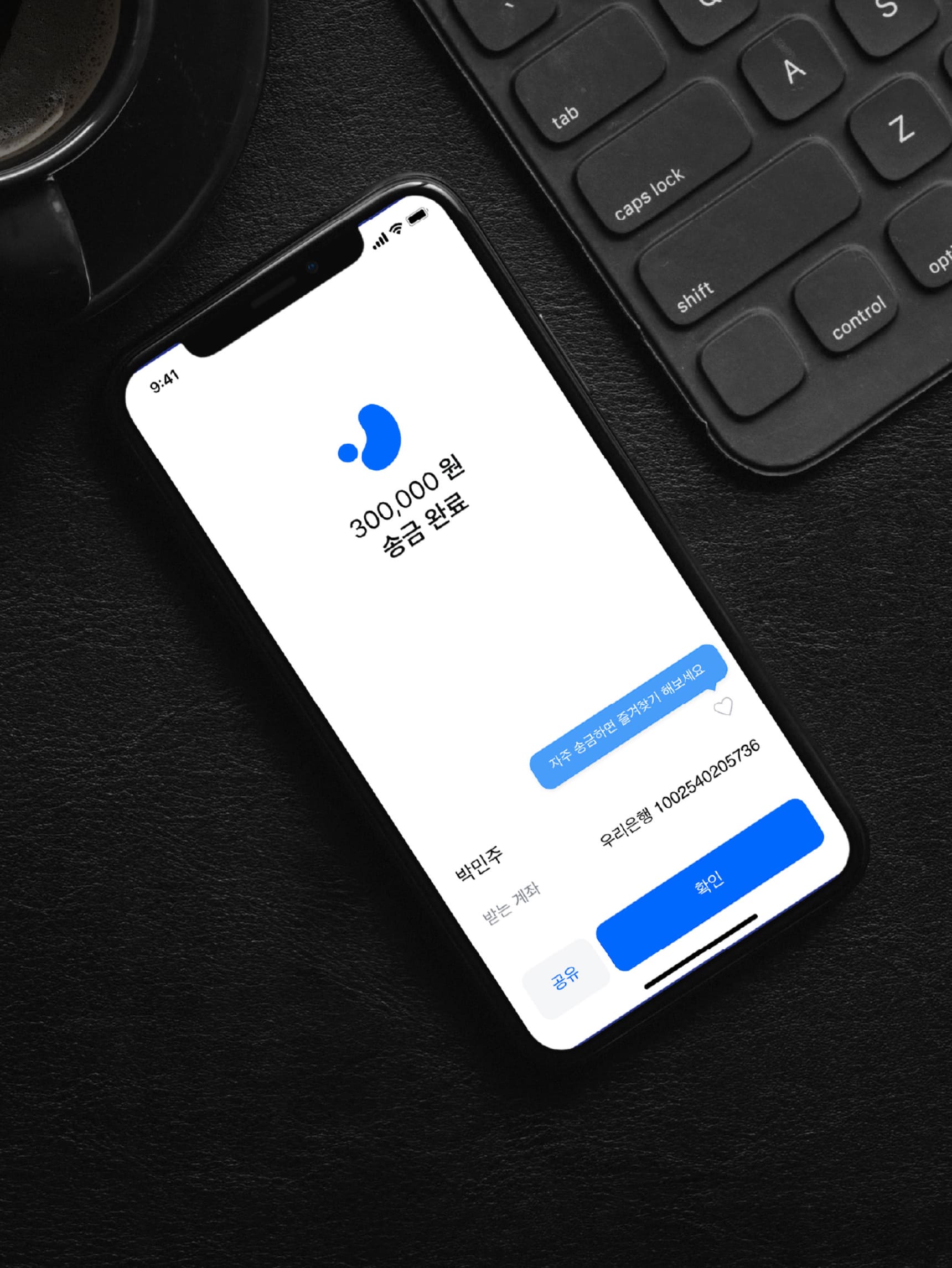
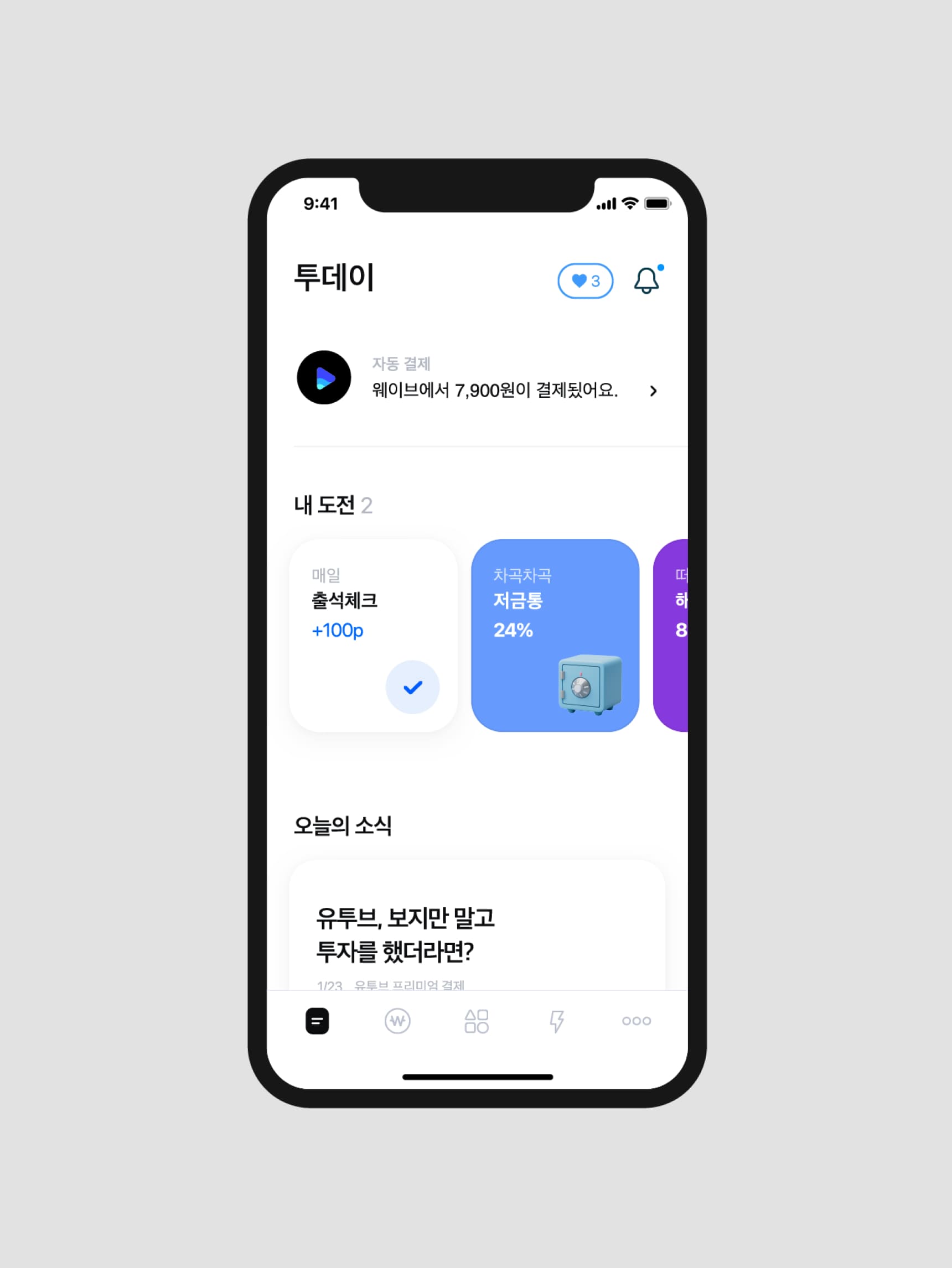
Monimo’s key visual uses the organic curve graphic extended from Monimo’s symbol. We used motion graphic to represent daily changes of assets converging on a point, and effectively deliver Monimo’s unique visual identity via app-based interactions. In addition to Monimo Blue, we used sub-colors as point colors representing the diversified functions and products available on the platform.
Monimo’s symbol takes the form of organic curves encompassing the elliptical graphic symbolizing each affiliate (Samsung Life Insurance, Samsung Securities, Samsung Fire Insurance and Samsung Card) and assets, to represent Samsung Finance’s assets connected via Monimo. Monimo Blue based on Samsung’s brand color gives Samsung Finance’s reliability and feelings of youth and friendliness.
The sanserif word mark props up the symbol, delivering the reliability of its financial services.

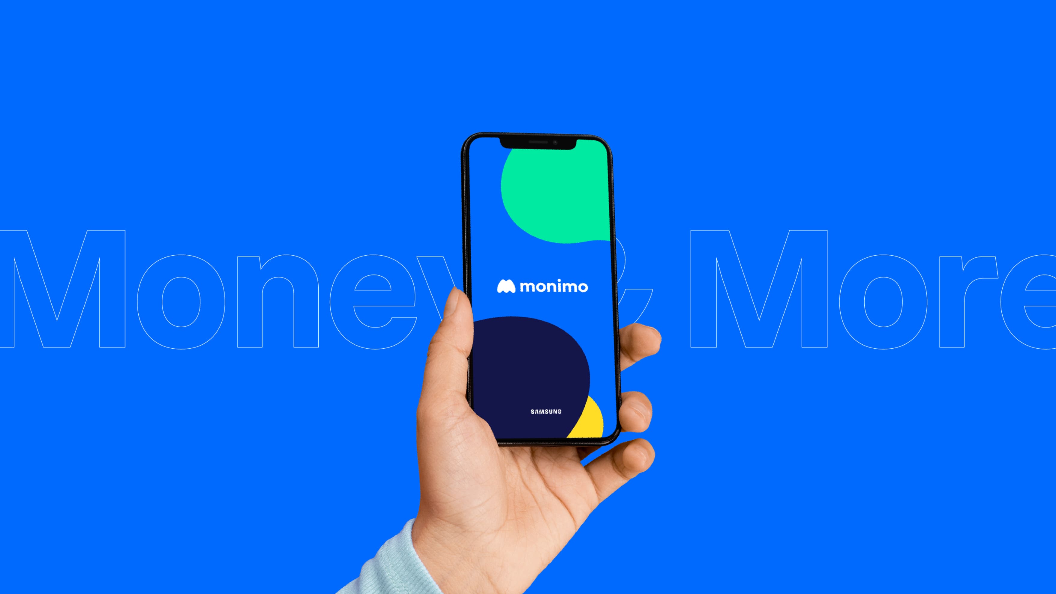
Monimo’s key visual uses the organic curve graphic extended from Monimo’s symbol. We used motion graphic to represent daily changes of assets converging on a point, and effectively deliver Monimo’s unique visual identity via app-based interactions. In addition to Monimo Blue, we used sub-colors as point colors representing the diversified functions and products available on the platform.
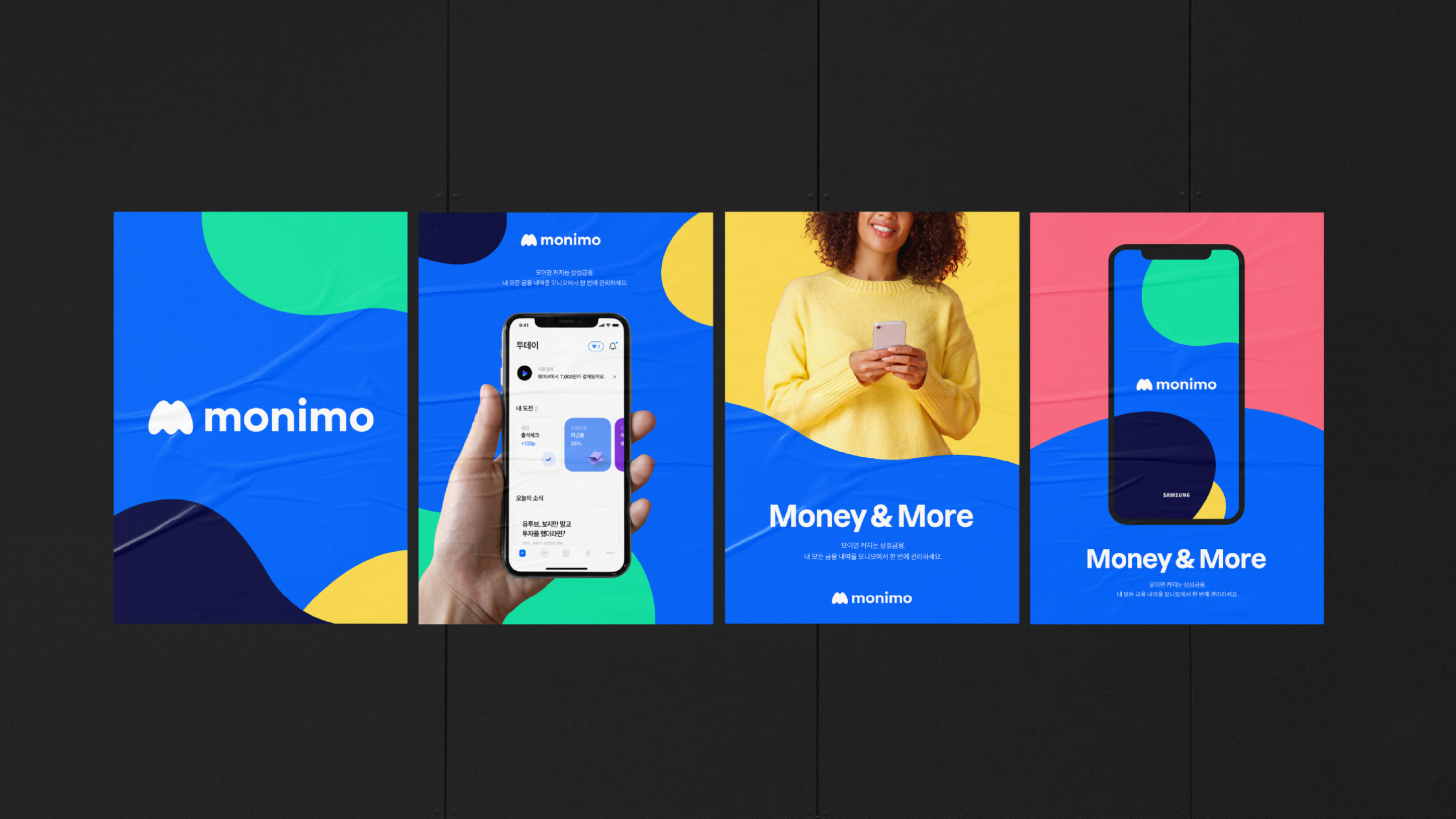
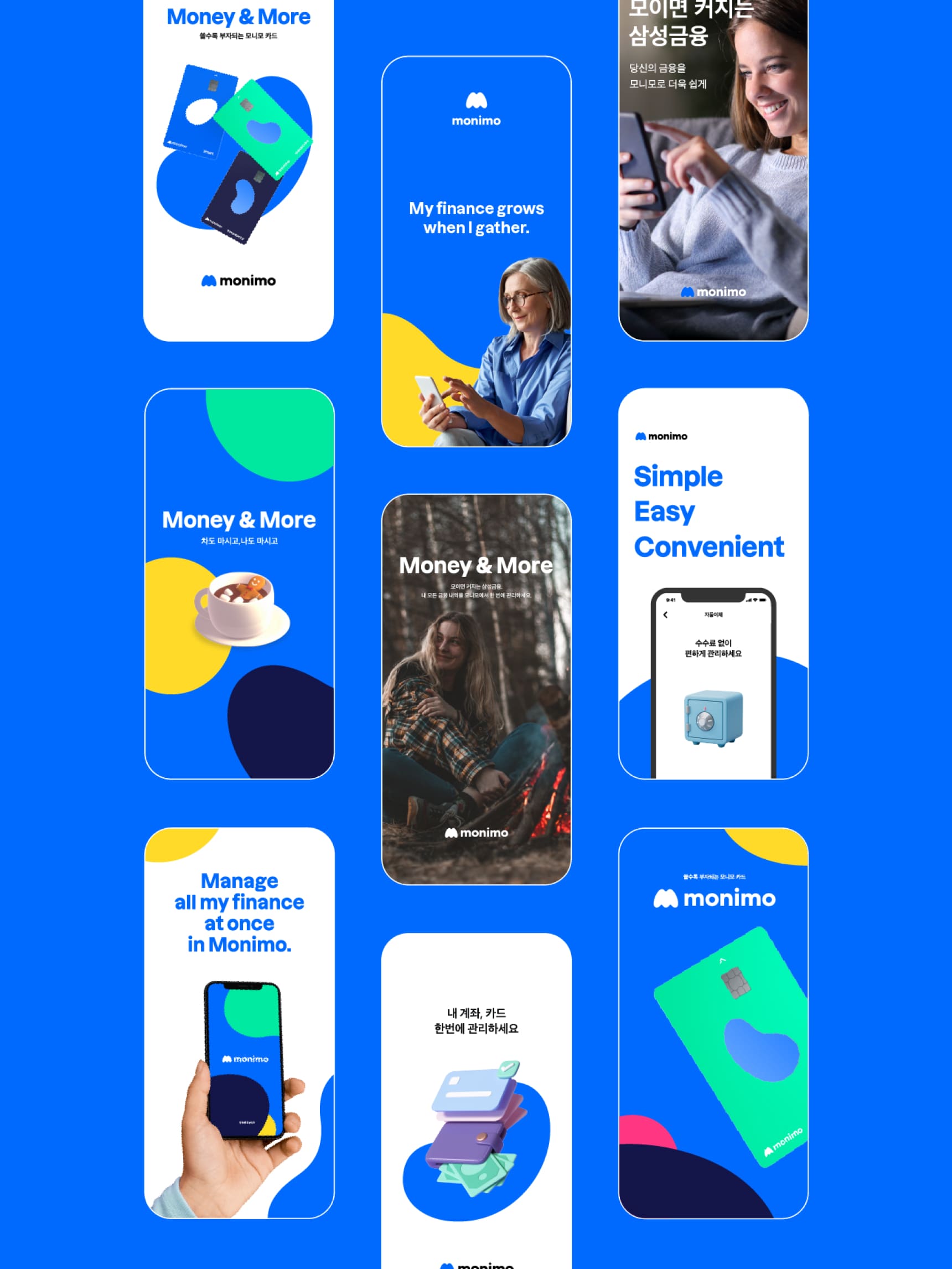
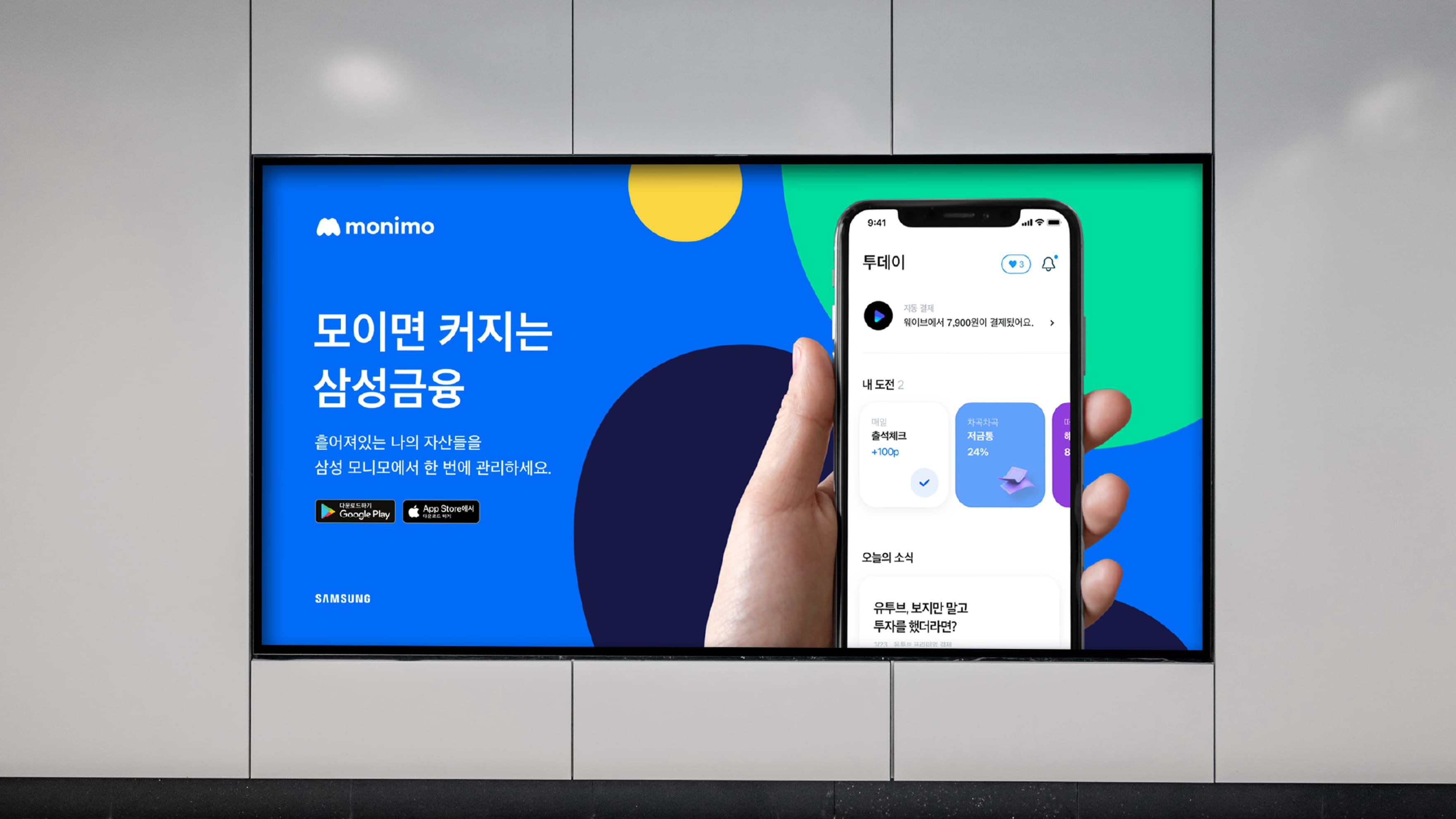
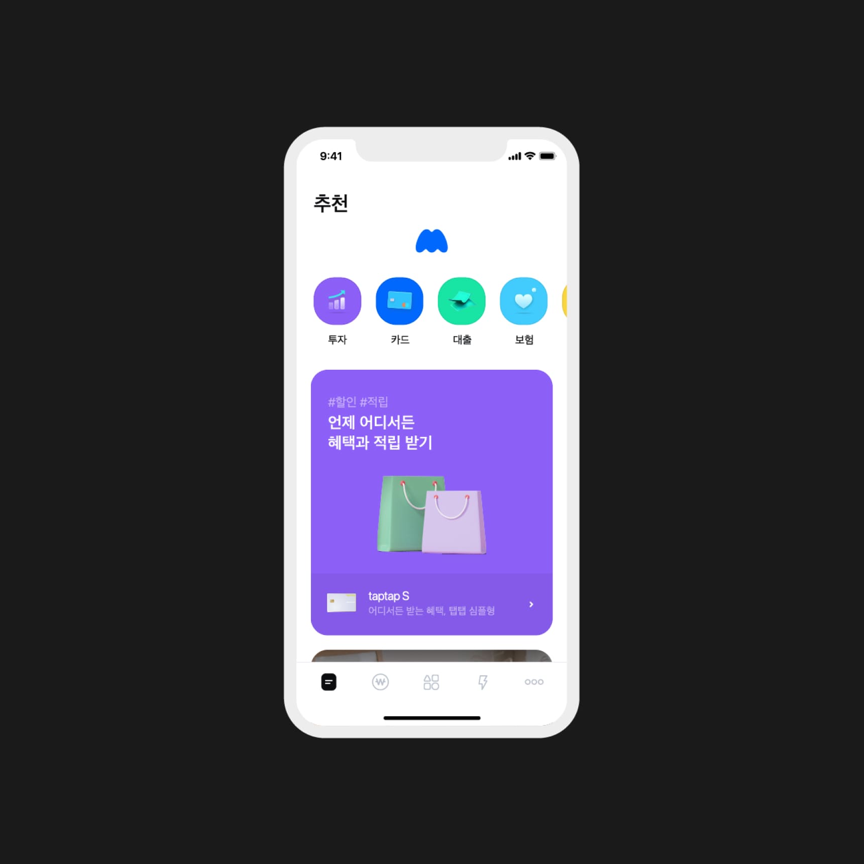
Monimo’s design is intended to deliver a friendly and easy-going image as opposed to the conventional unapproachable images of financial platforms, and show Monimo’s strategic direction via its consistent visual identity across products, online (social) media and offline media like credit cards.


monimo
Brand Identity Design
BRENDEN
Creative Direction / Do-eui Lee
Project Management / Wook Jung
Design / Jaewan Yu, Sangmin Lee
Creative Partner / Taeyeol Lee, Hyangran Jeon (J&Brand)
Client
Samsung Card