Hanatour Rebranding
This rebranding project is for ‘Hanatour,’ a travel agency in Korea. In the midst of the pandemic, Hanatour needed rebranding to shake off its old image as an offline package tour agency. BRENDEN designed the new CI and overall brand identity system carrying Hanatour’s corporate orientation and philosophy.
Year
2021
Category
Art Direction, Branding, Identity Design, Graphic Design, Visual Strategy, Signage Guide, Applications
Client
Cheil, Hanatour

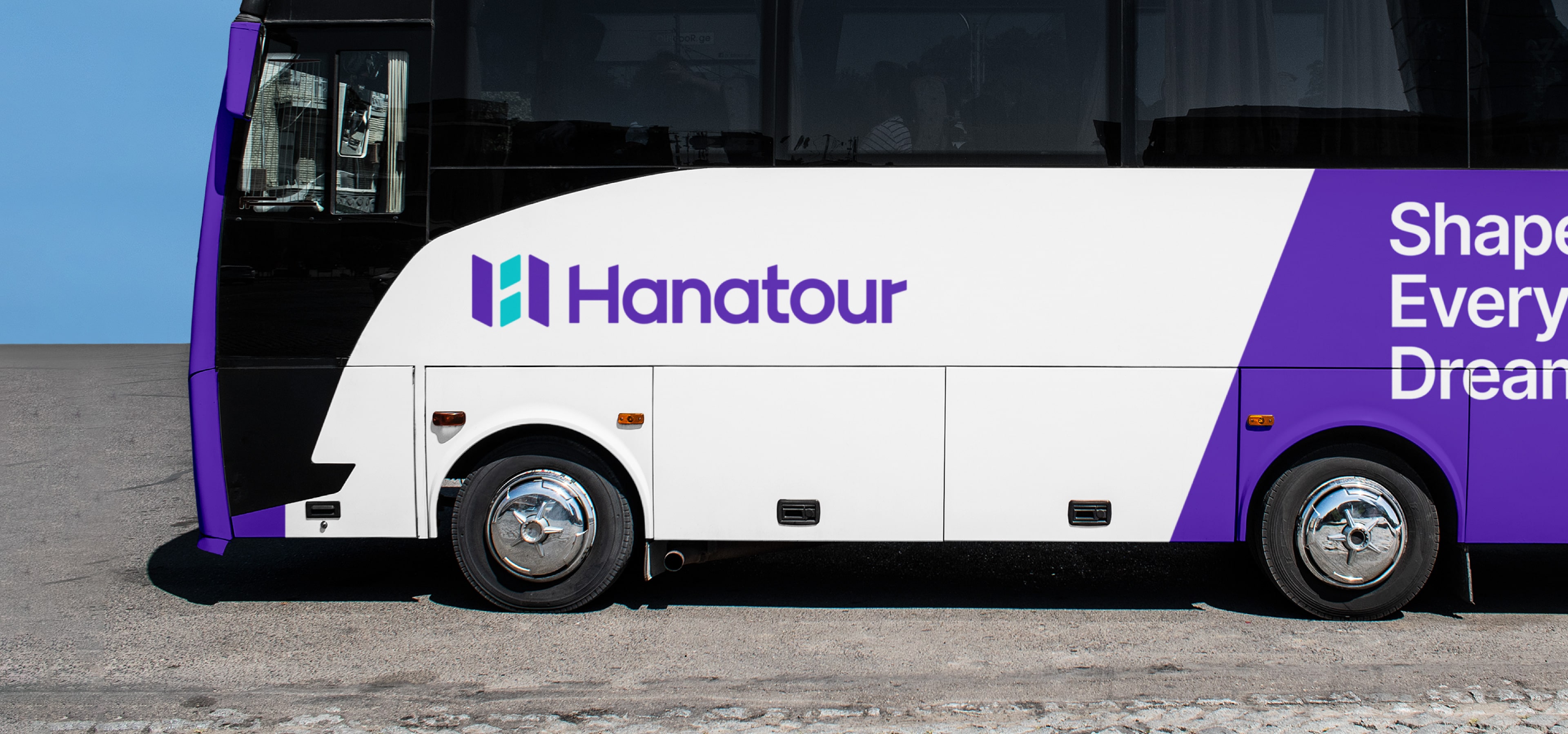
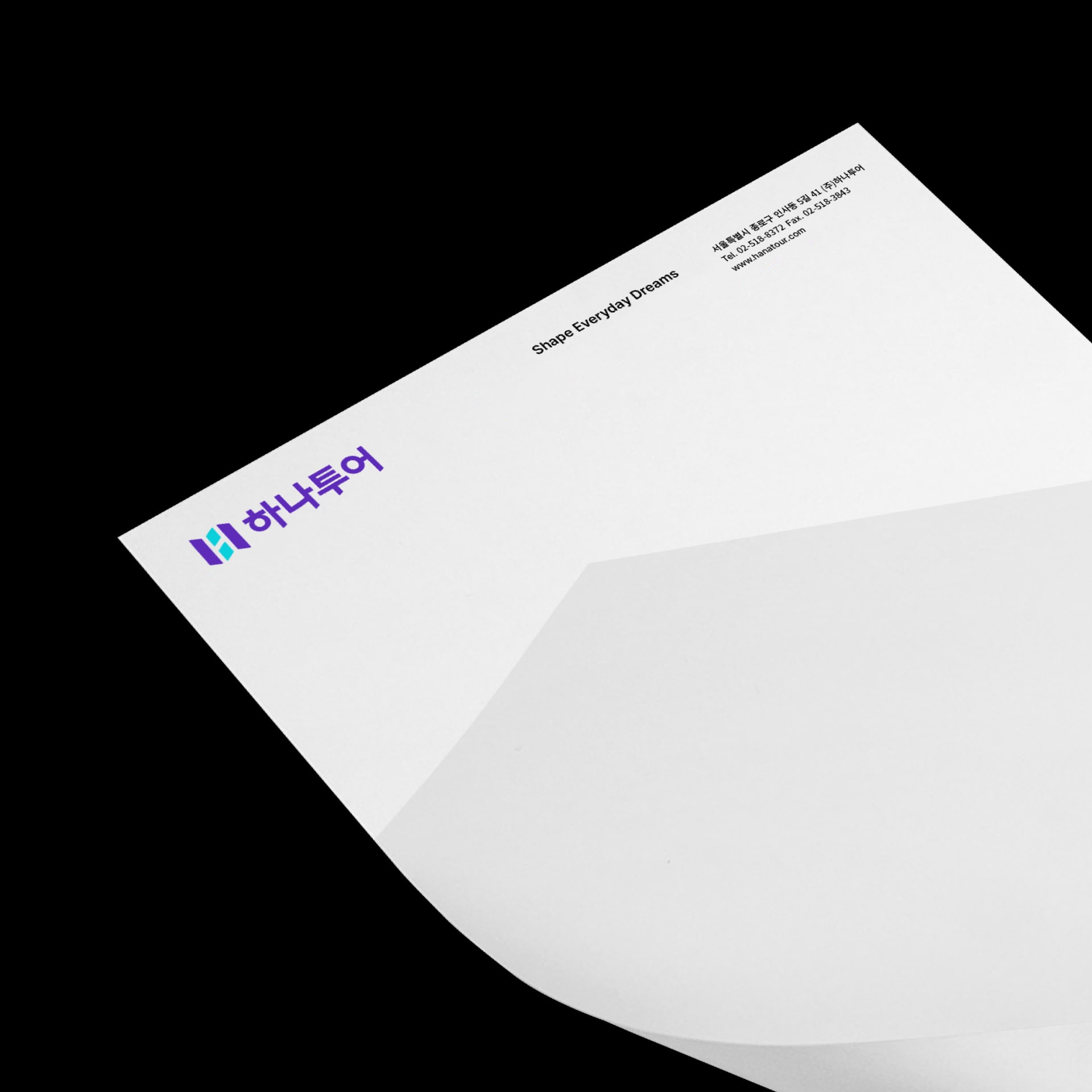
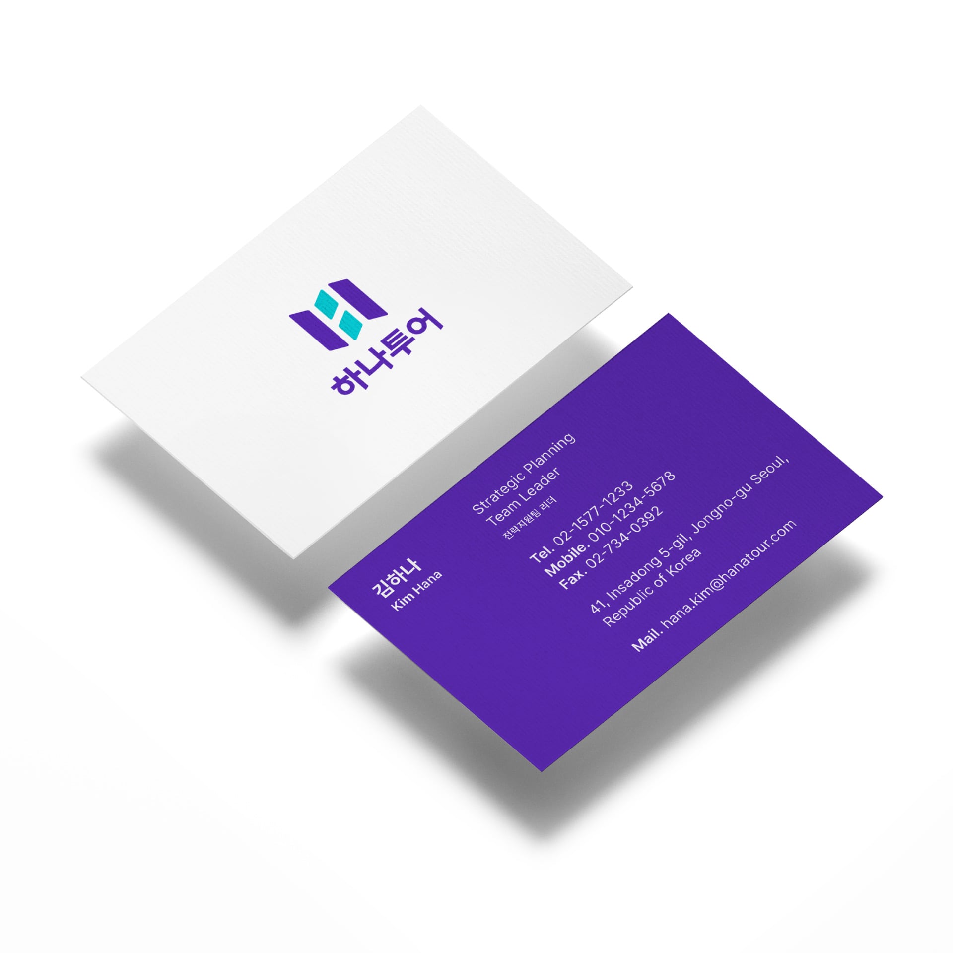
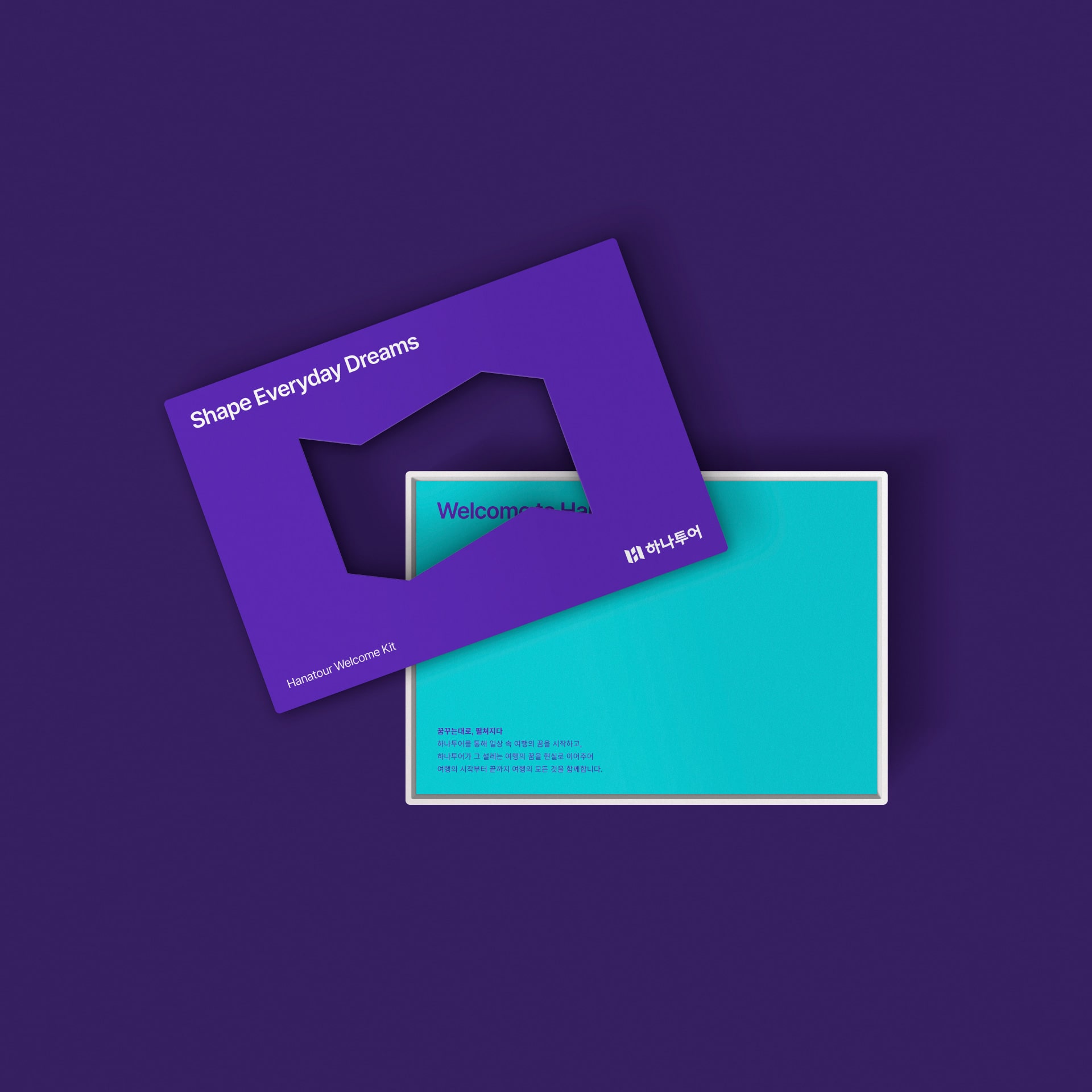
Hanatour’s new symbol carries a map symbolizing travels and challenges and ‘H’ symbolizing Hanatour to represent new experiences and potential unfolding with Hanatour. As a refined extension of Hanatour’s existing purple color, ‘Hanatour Purple’ implies Hanatour’s premium tourist service, safety, reliability and expertise, while ‘Hanatour Mint’ signifies passion, challenge, dream travels and excitement.
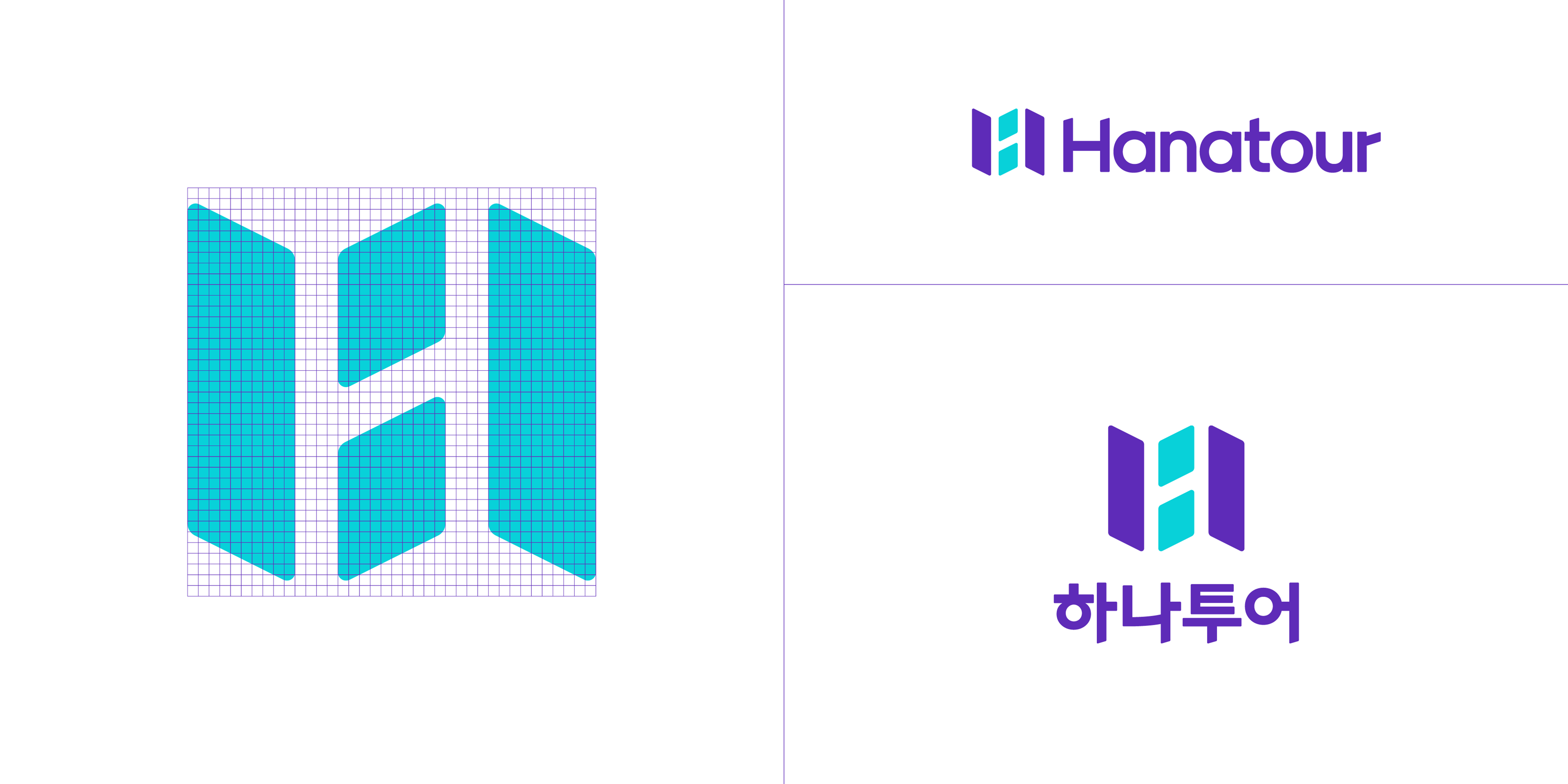



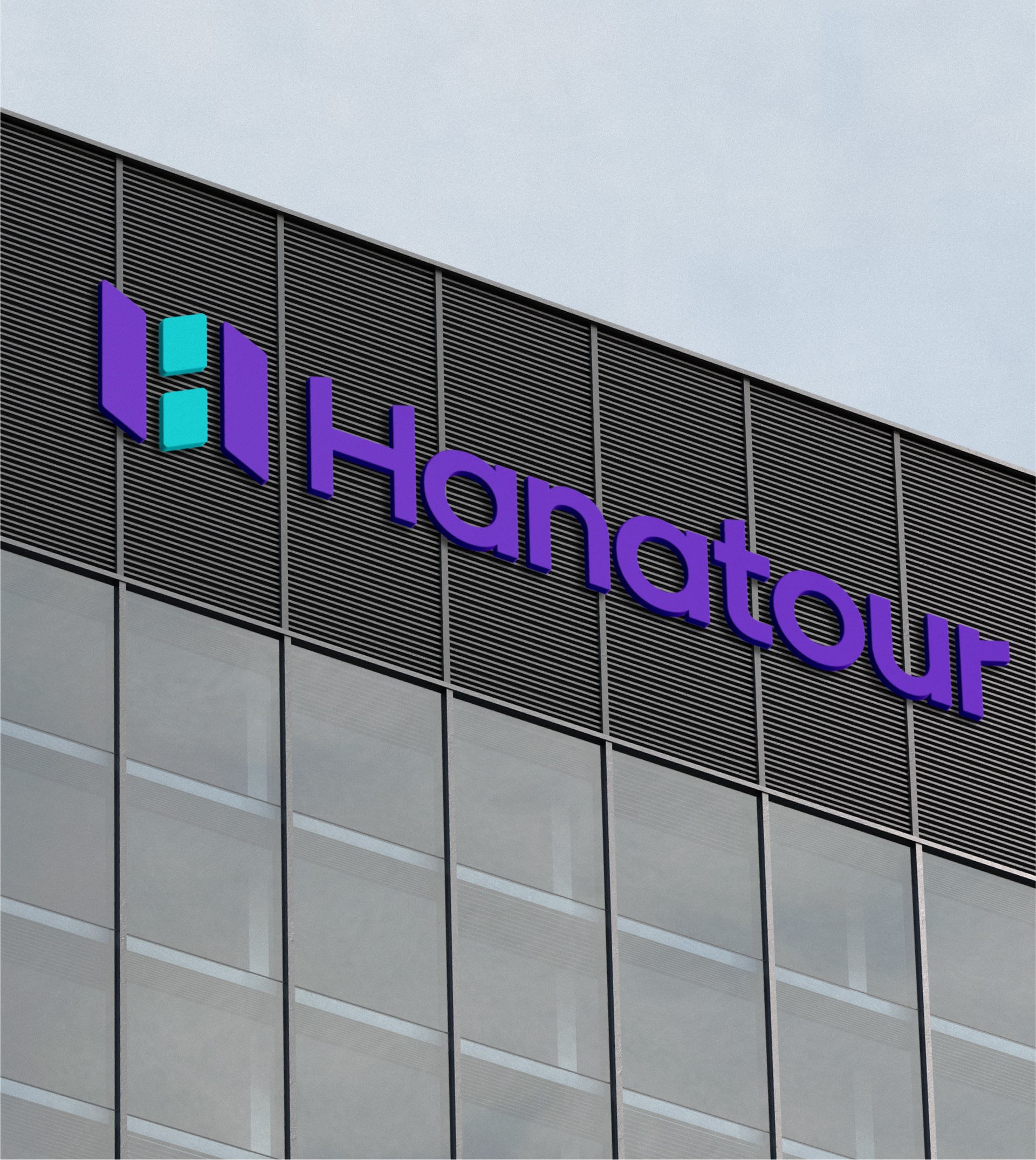
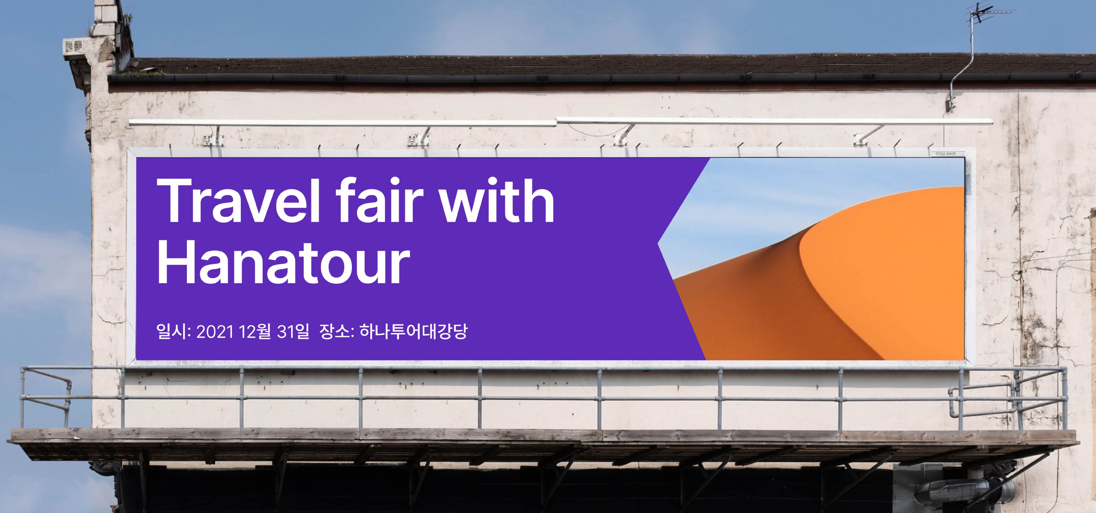
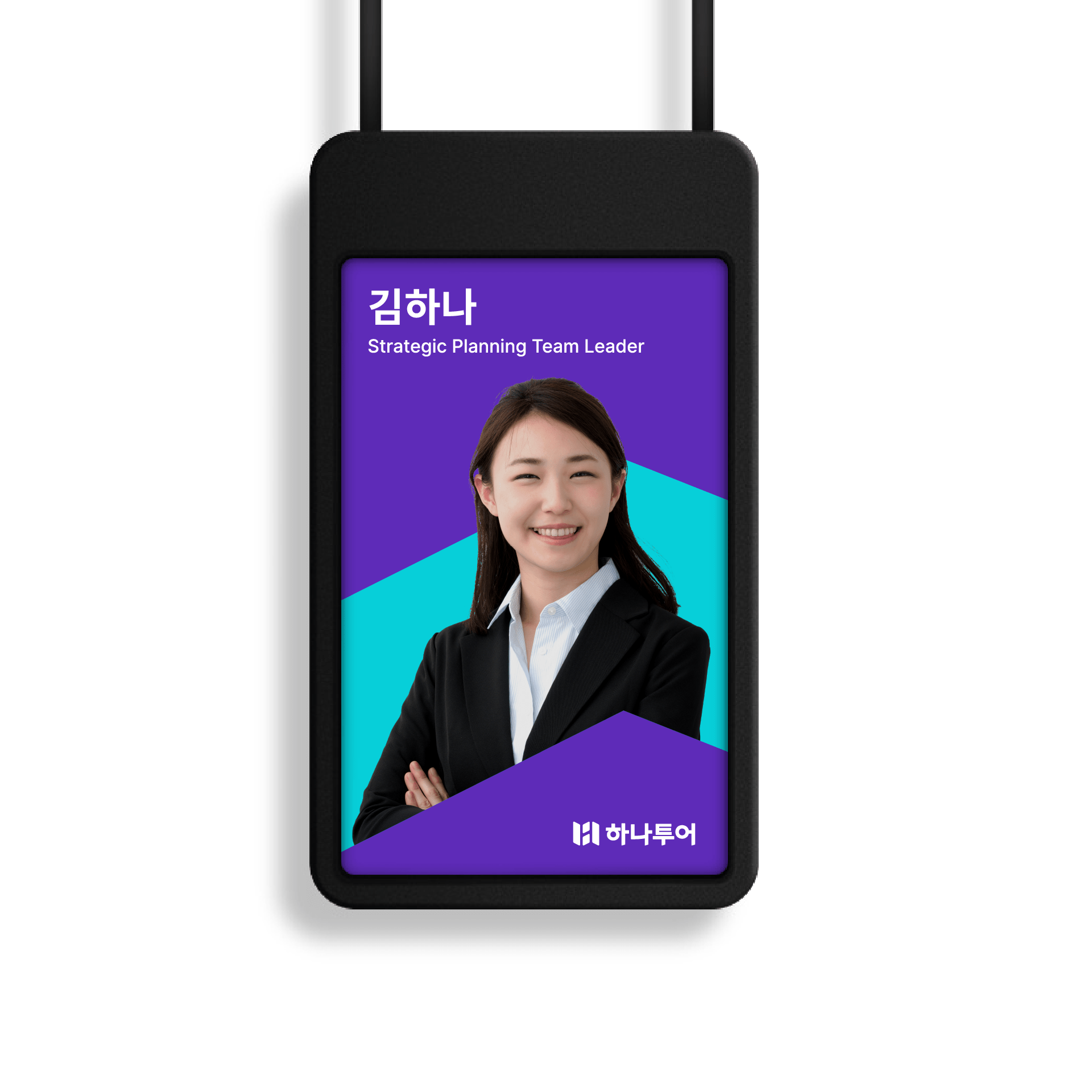
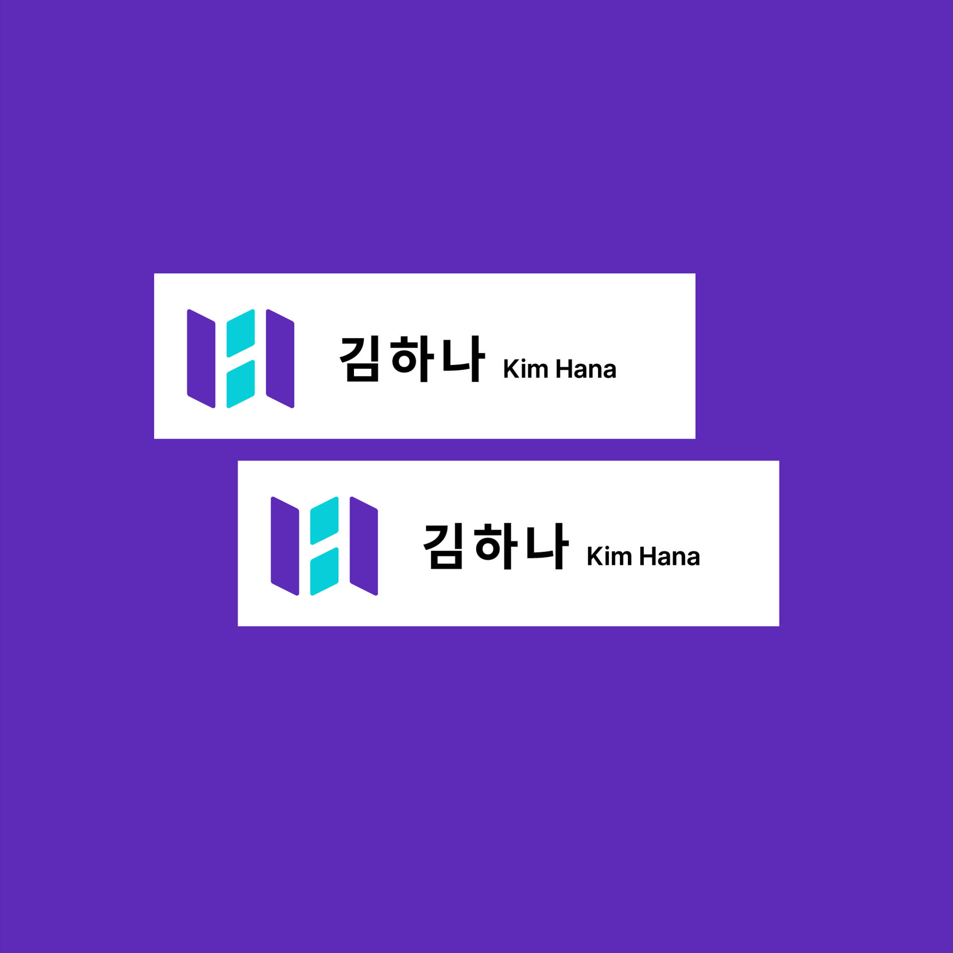
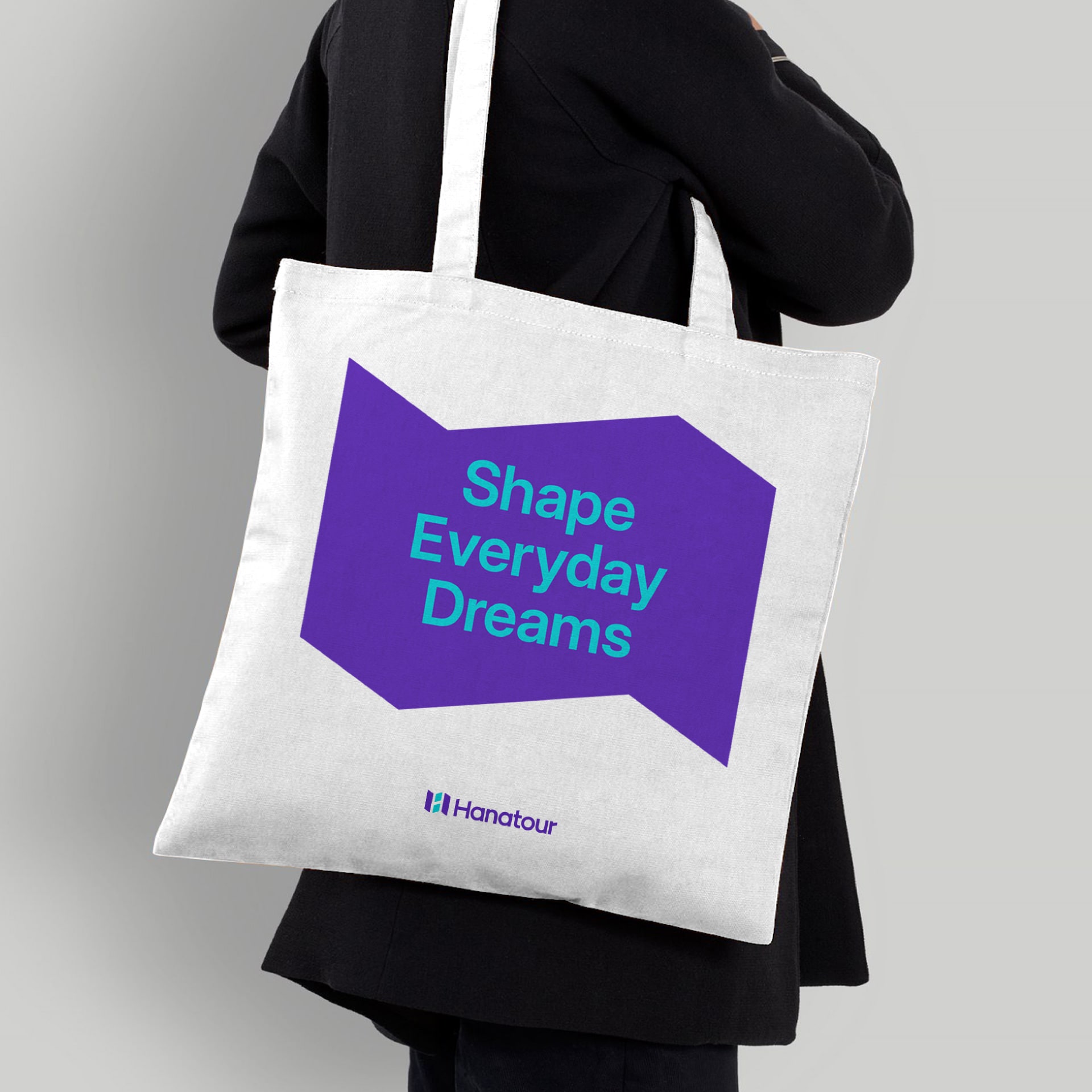
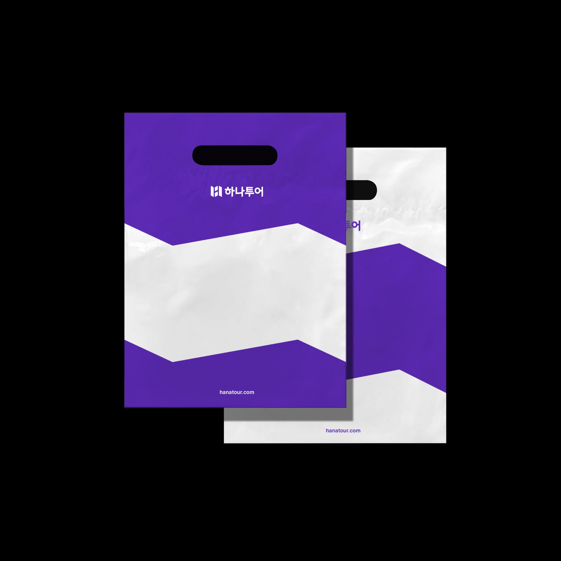
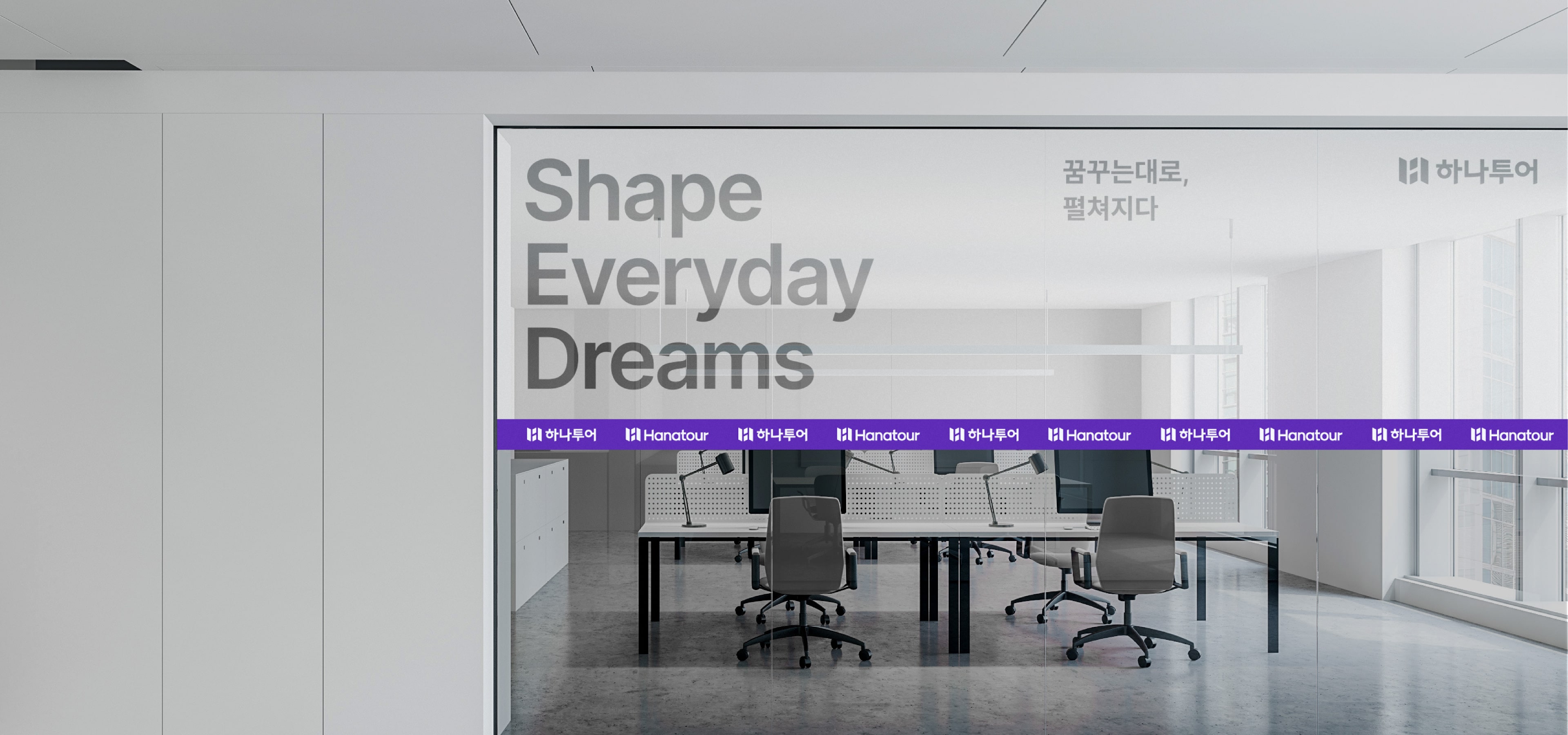
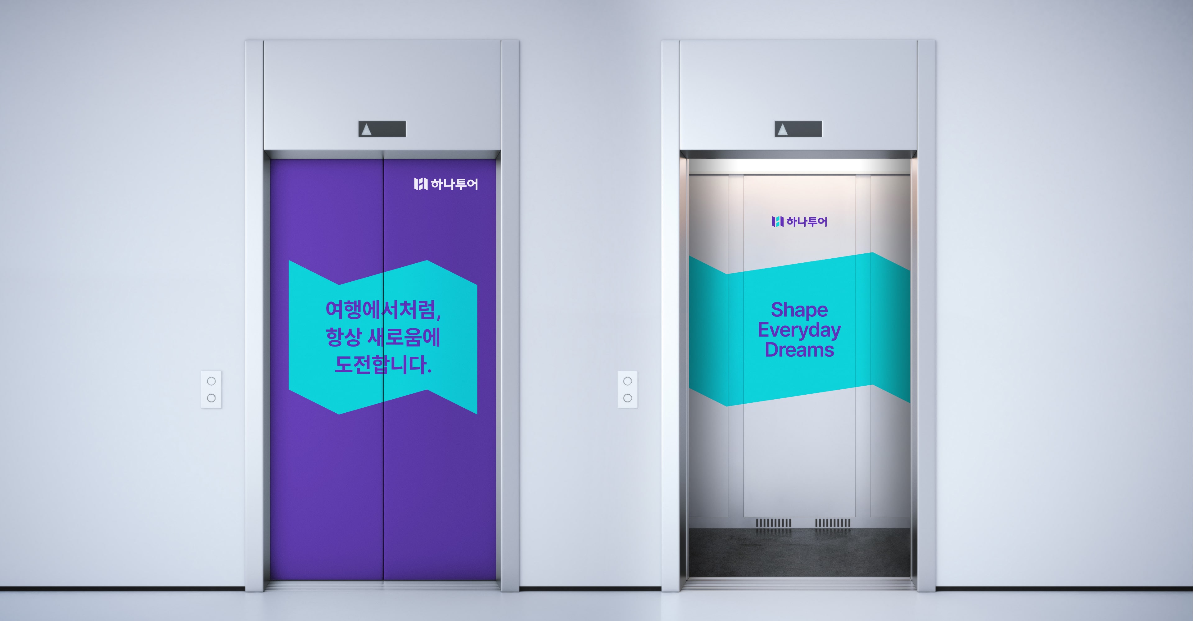
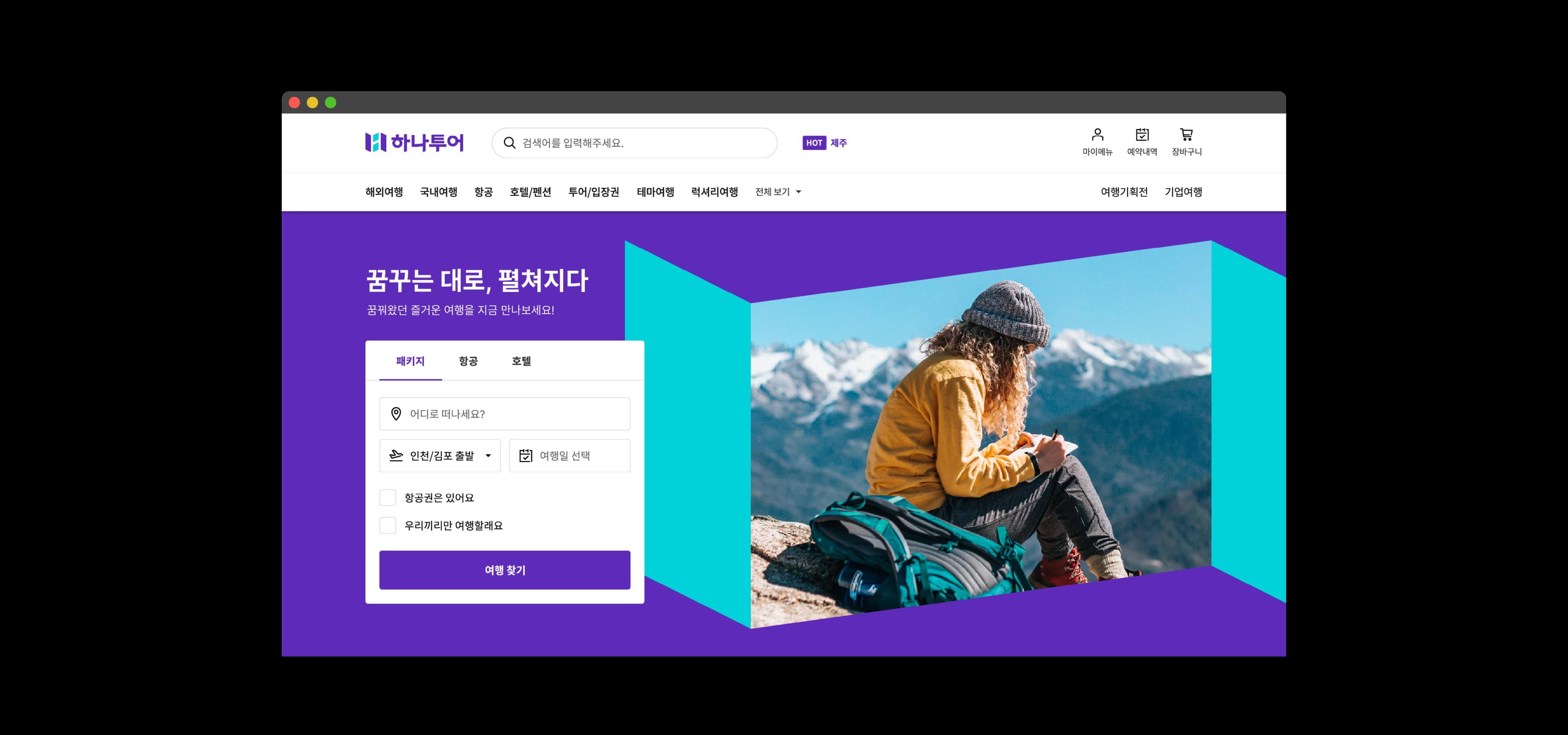
Hanatour’s graphic system has the opening and unfolding symbol. The graphic system conveys Hanatour’s new vision to turn a dream travel into reality before the eyes just like an unfolding map. The characteristic form of the symbol is reflected in the Korean and English wordmark design, with Hanatour’s consistent graphic identity applied to its app icon and motion graphic.
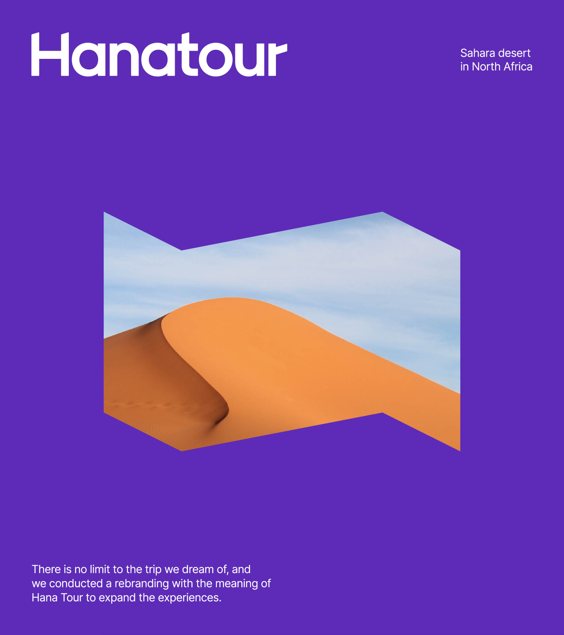


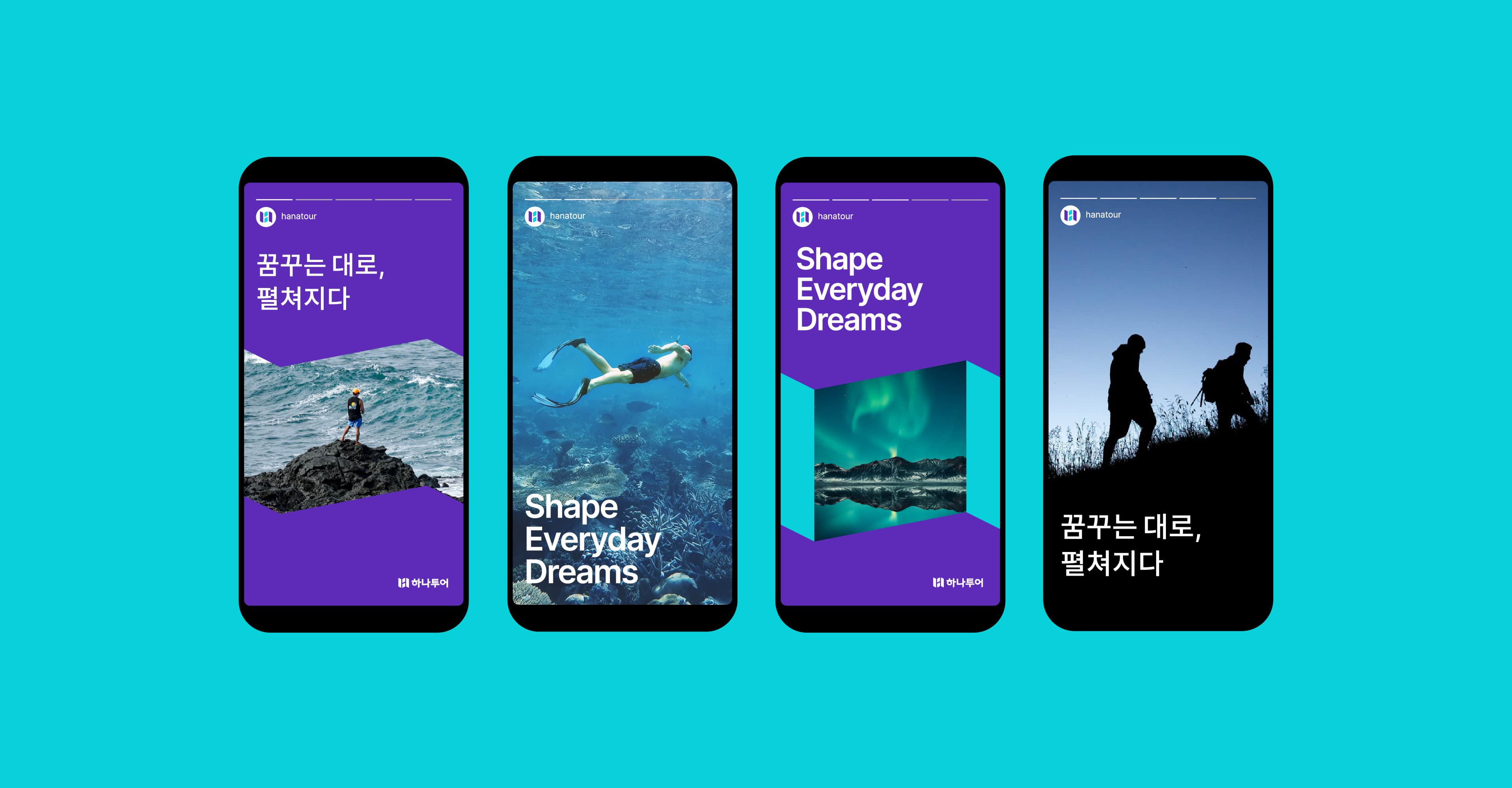
Various travel photos and videos were used in the graphic representing Hanatour’s new slogan ‘Dreams unfold' to effectively show different types of travels Hanatour offers. In line with Hanatour’s new orientation for evolving into a travel platform beyond another package tour vendor, we enhanced its online communication to extend its customer base to Gen-MZ.




BRENDEN
Creative Direction / Do-eui Lee
Project Management / Wook Jung
Design / Jaewan Yu, Haena Yang, Sangmin Lee
Client
Cheil
Hana Tour