Dingo
Rebranding Project
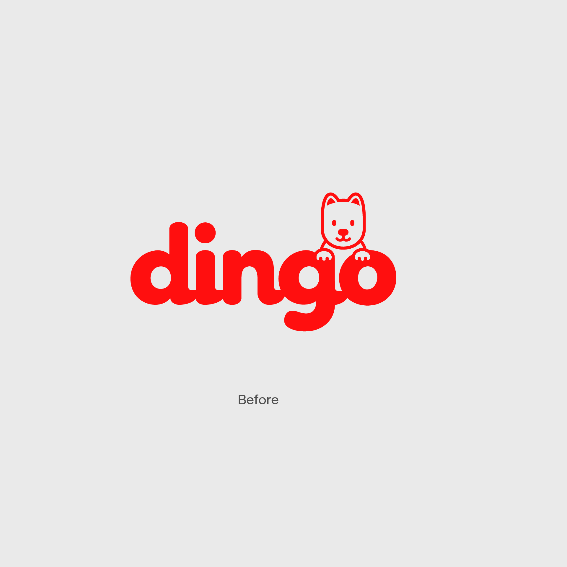
This rebranding project is for ‘Dingo’, a content channel run by ‘MAKE US’. Launched in 2015, Dingo kept its identity with a fox character motif before they found it necessary to build a different identity embodying its new philosophy and orientation to keep abreast of popular video trends appealing to ‘Gen Z’. BRENDEN participated in the overall rebranding project and designed Dingo’s brand concept, logo, graphic, slogan, motion and kits.
Year
2021
Category
Art Direction, Branding, Graphic Design, Verbal Design, Motion Design, Product Design
Client
MAKE US
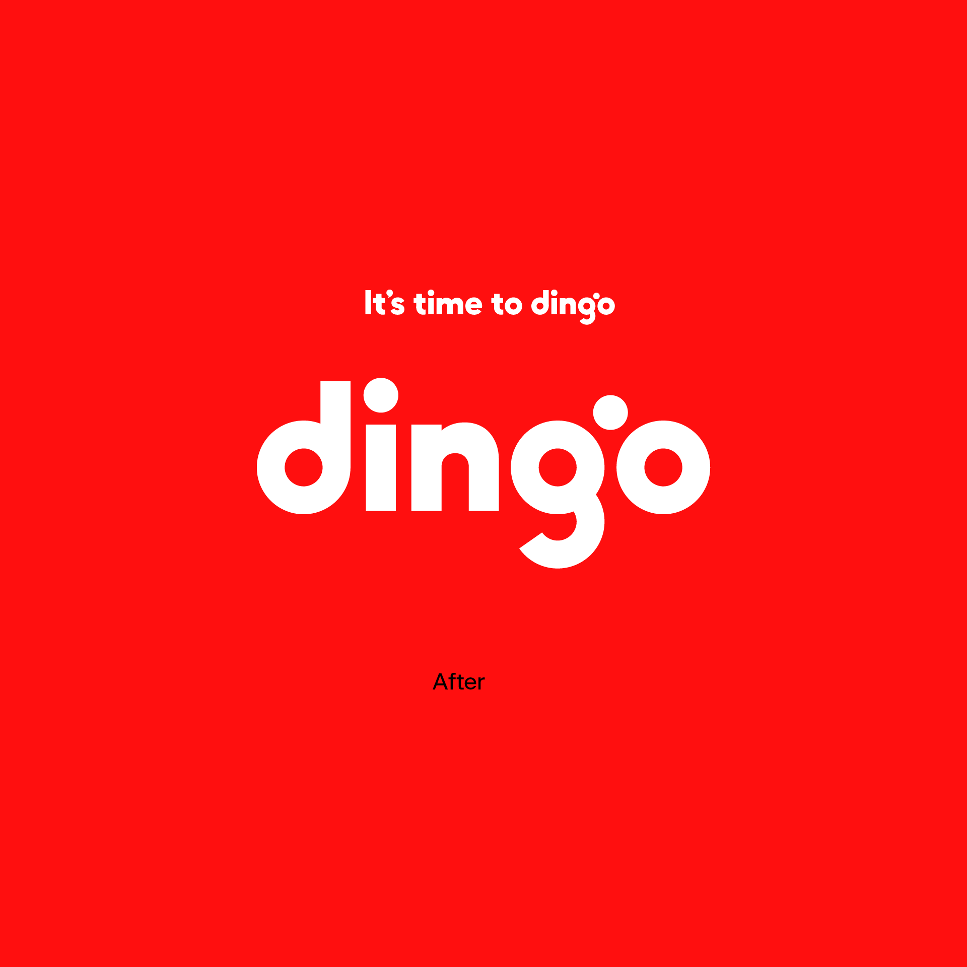
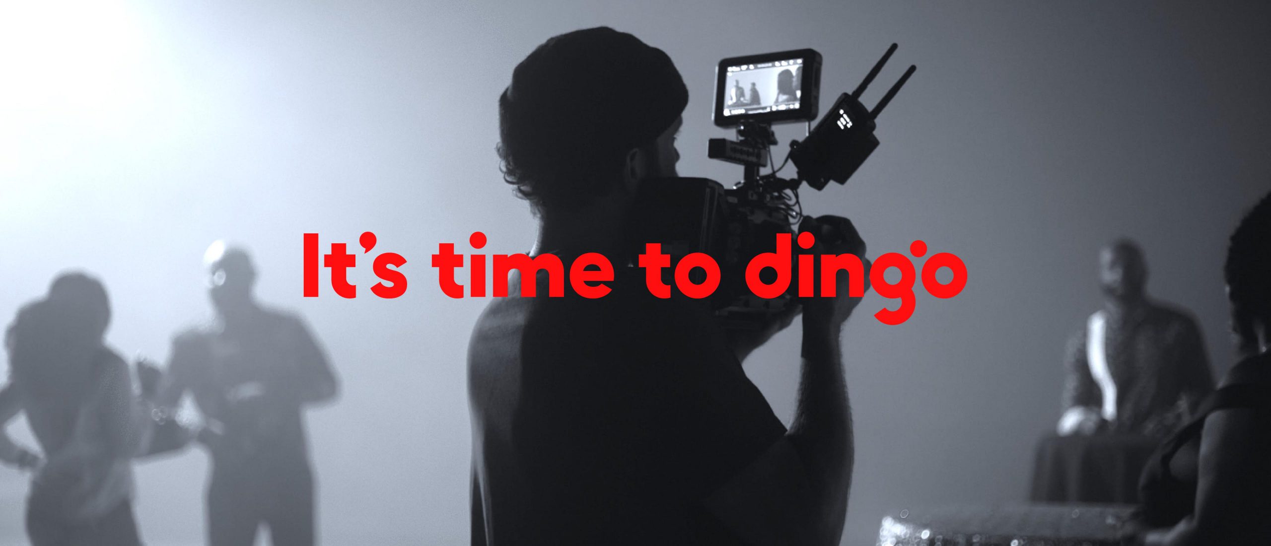
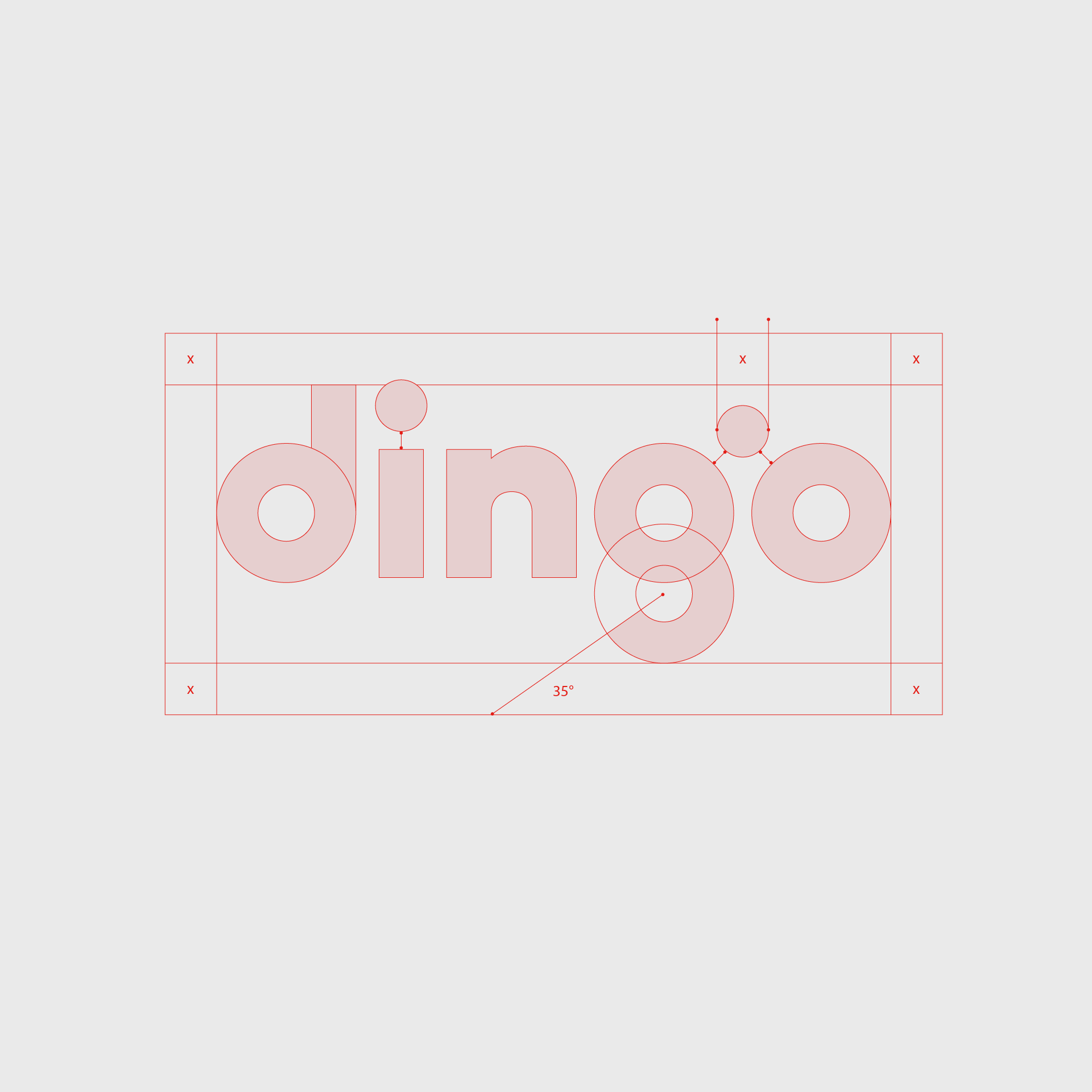
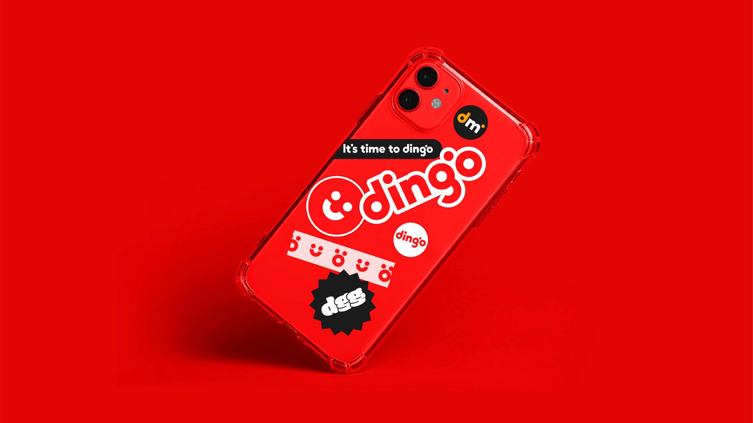
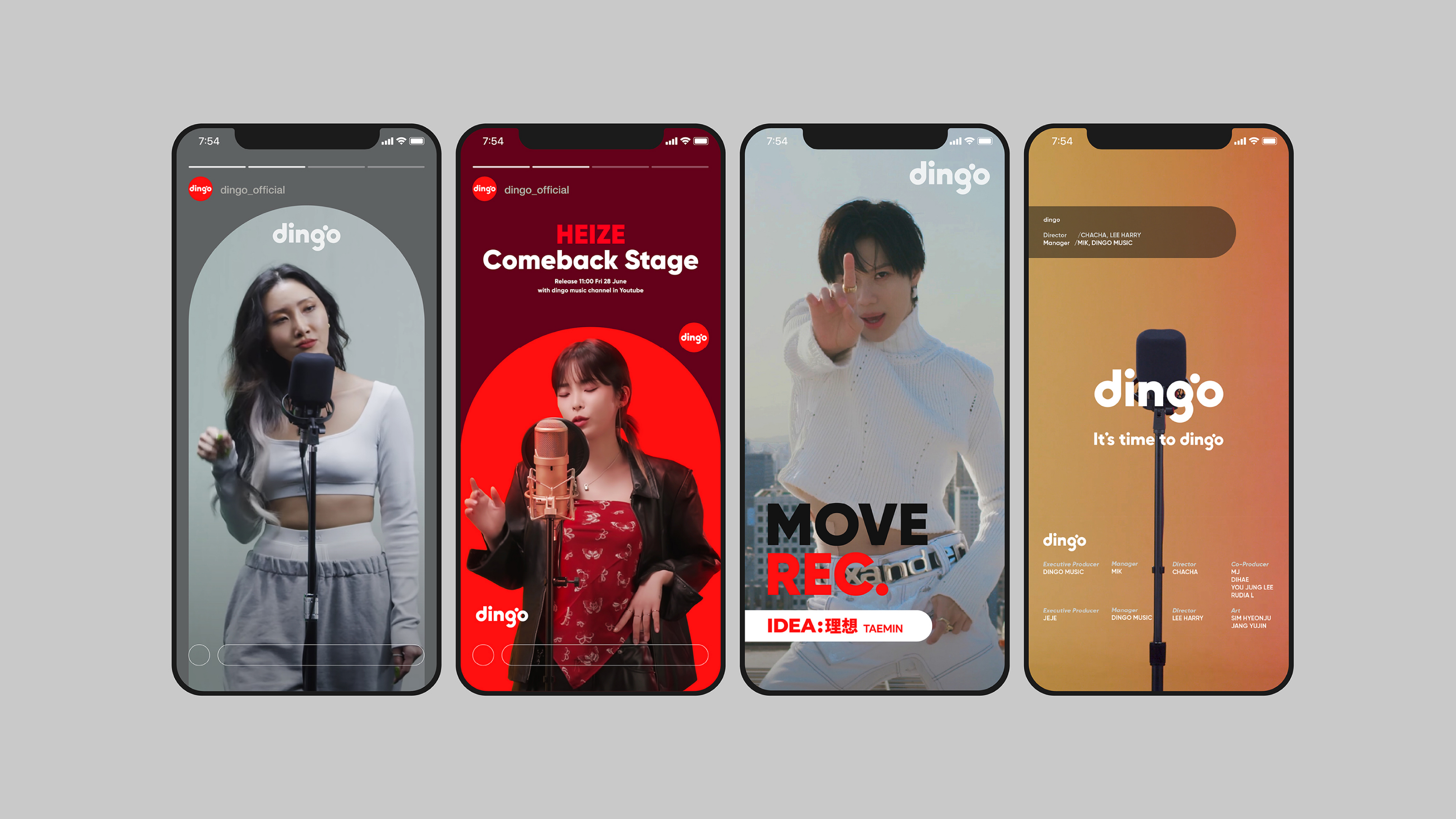
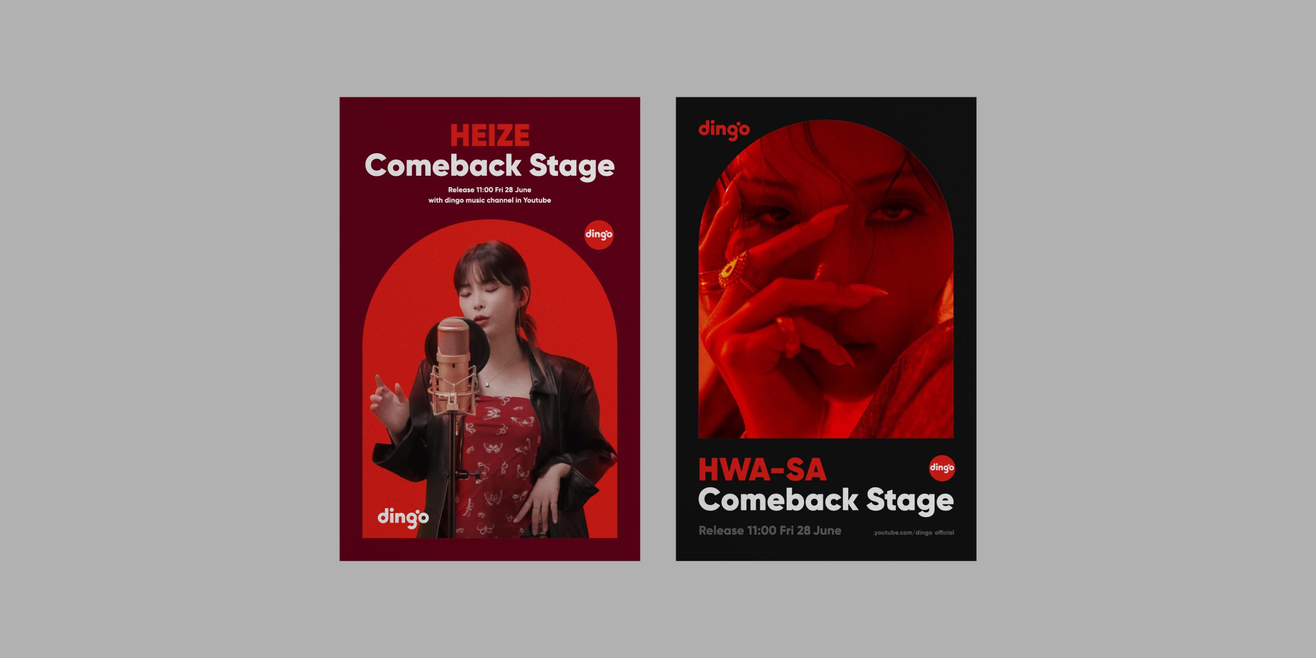
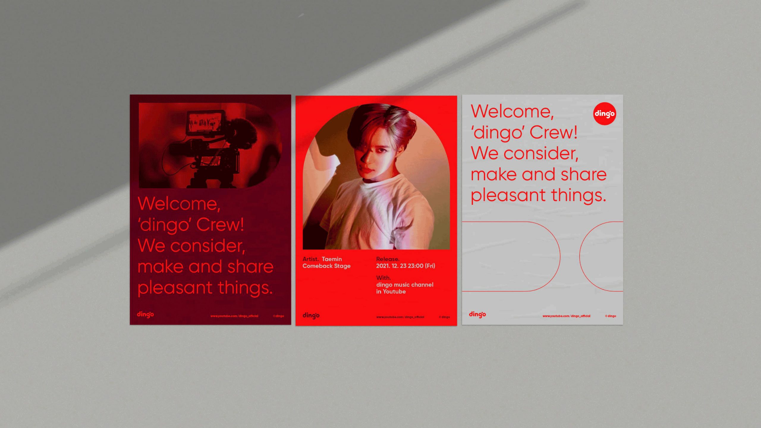
We replaced the fox character with the ‘Ding’ sound of the word Dingo as the new brand motif, and developed its visual identity appealing to the young generation used to mobile and video media in line with the new concept of ‘a new alarm, it’s time to dingo.’ Based on the ‘pendulum’ graphics symbolizing an alarm and sound, we created the lettering for Dingo’s word type, and applied the Ding sound to the motion graphics to convey the distinct characteristics of Dingo on YouTube, Instagram and other SNS videos.
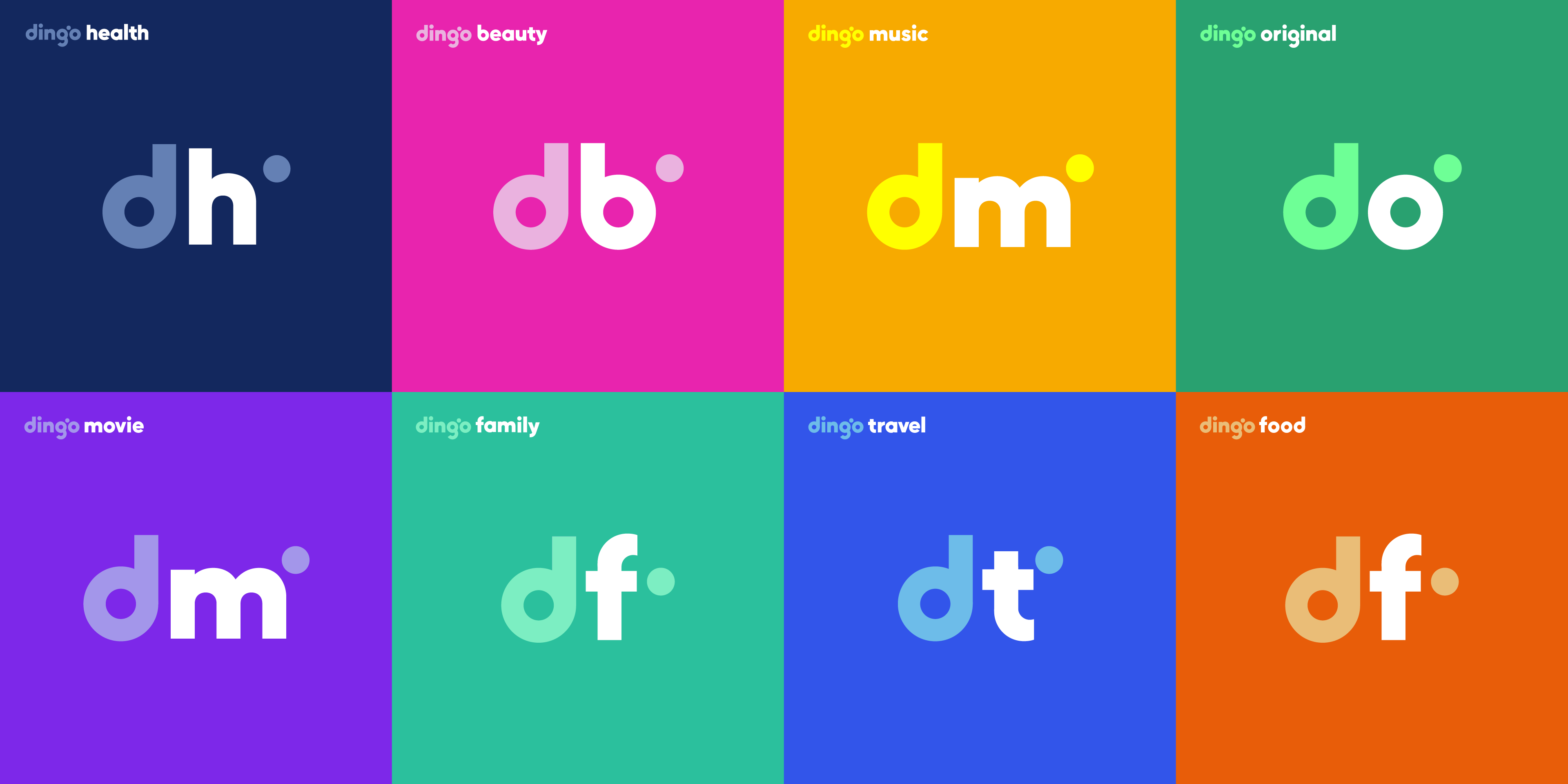
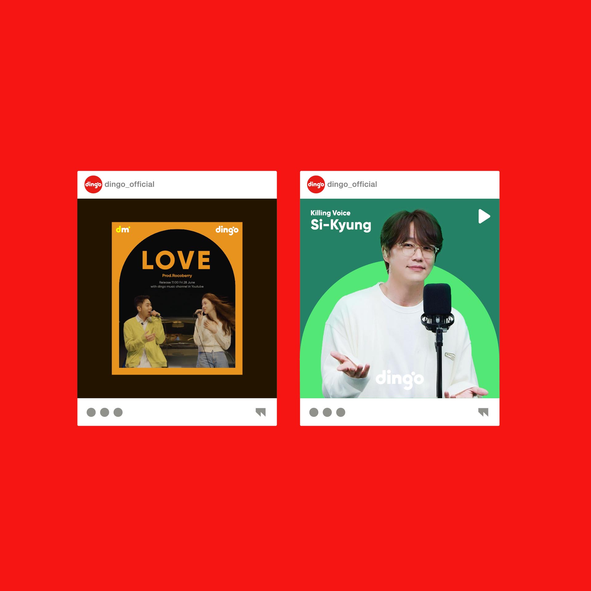
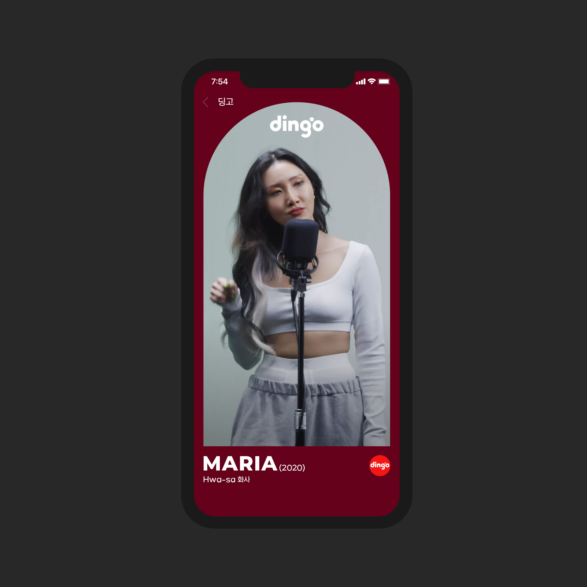
Dingo branding converges on the proper applicability of branding components to video channels. The sound-based Dingo’s ‘logo motion’ is designed to be effectively applicable to the intro/middle/ending parts of videos, embodying Dingo’s distinctiveness. Also, to differentiate Dingo’s channels, we combined the initials and colors of those channels and thereby implemented the consistency of Dingo and the distinctiveness of each channel.
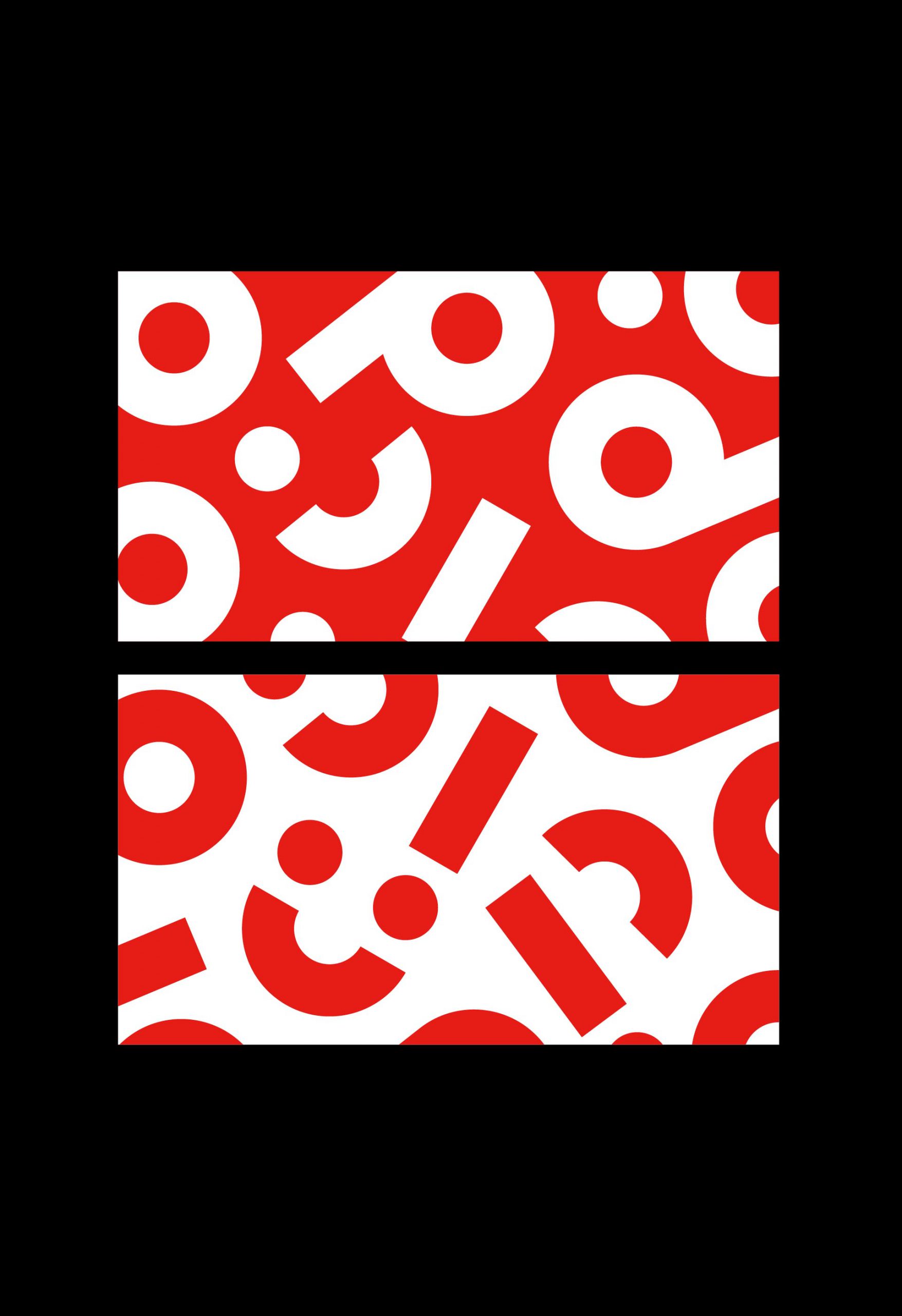
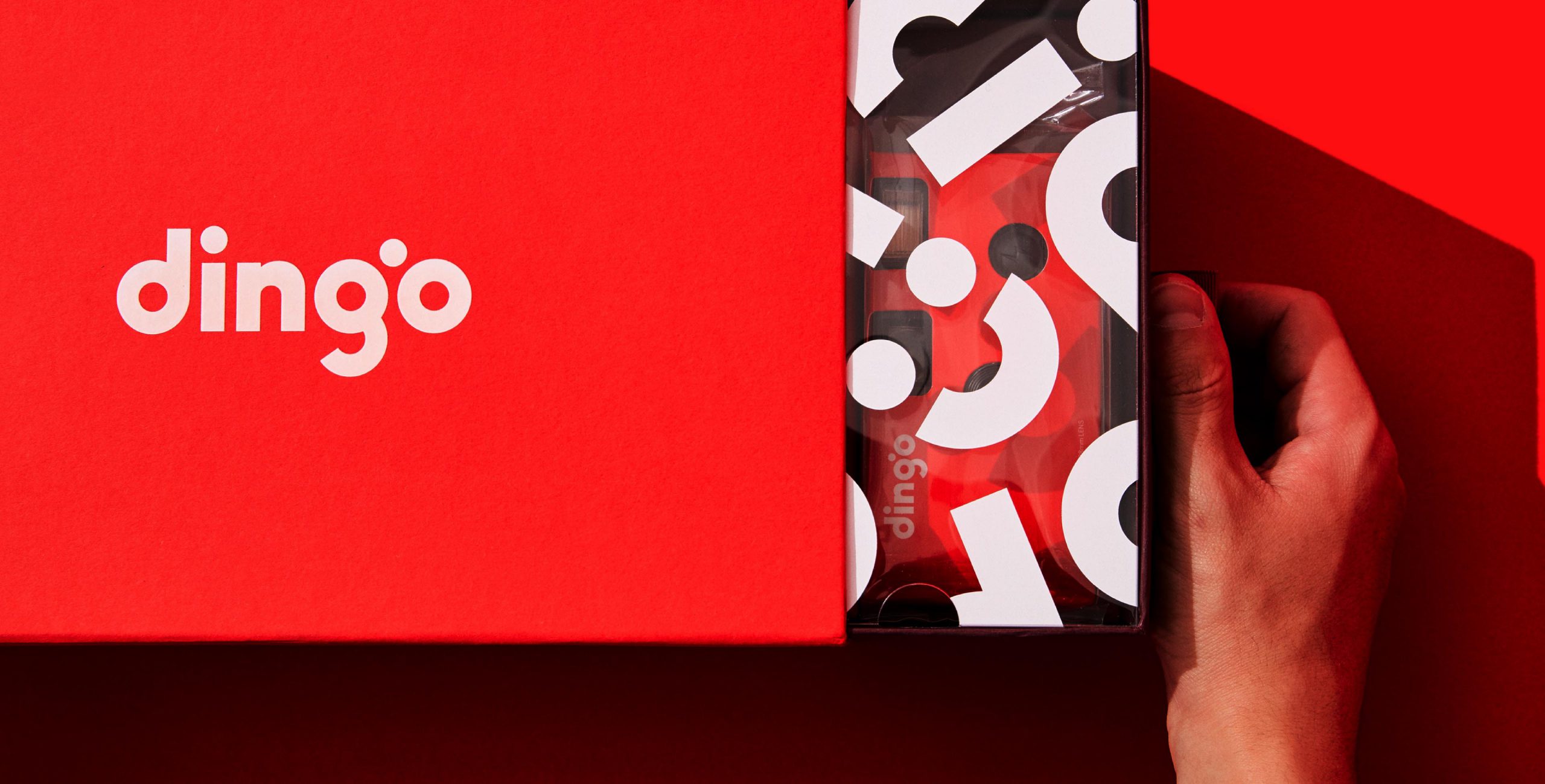
The graphic components manifested in Dingo’s word-type logo also symbolize the ‘swipe motions’ to which the mobile generation is accustomed. Dingo’s graphic components are possibly used as patterns, combined with a range of photo/video images to implement Dingo-specific graphics, and applied consistently to offline media including posters, packages, products and signage as well as diverse online/mobile contents.
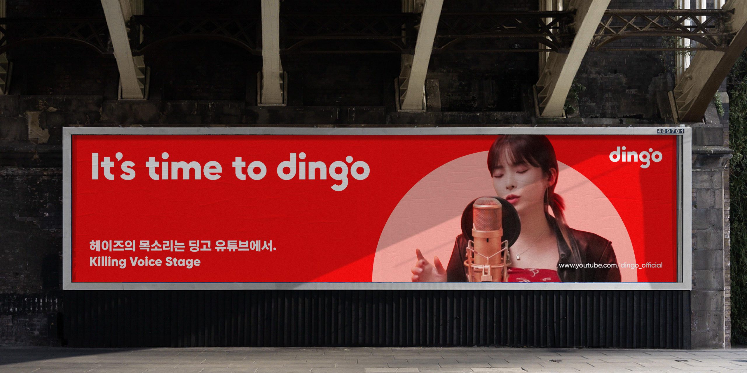
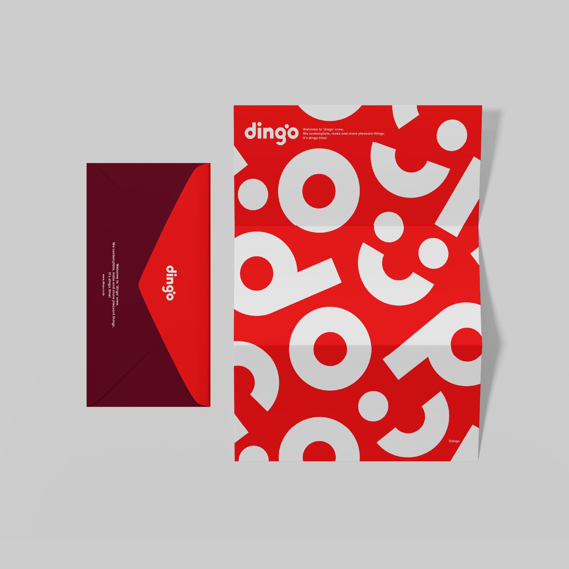
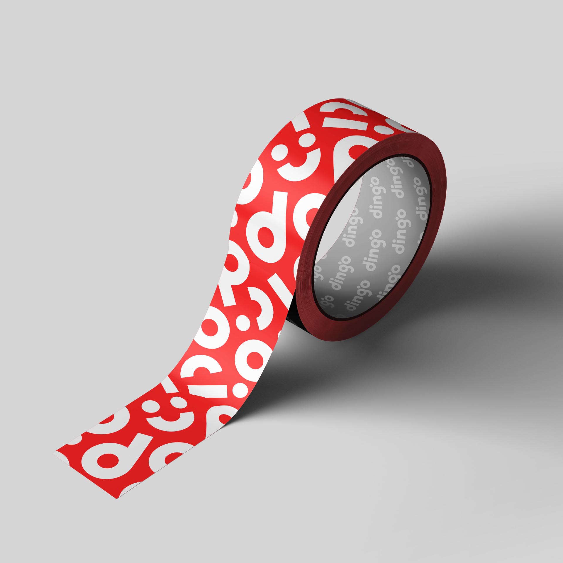
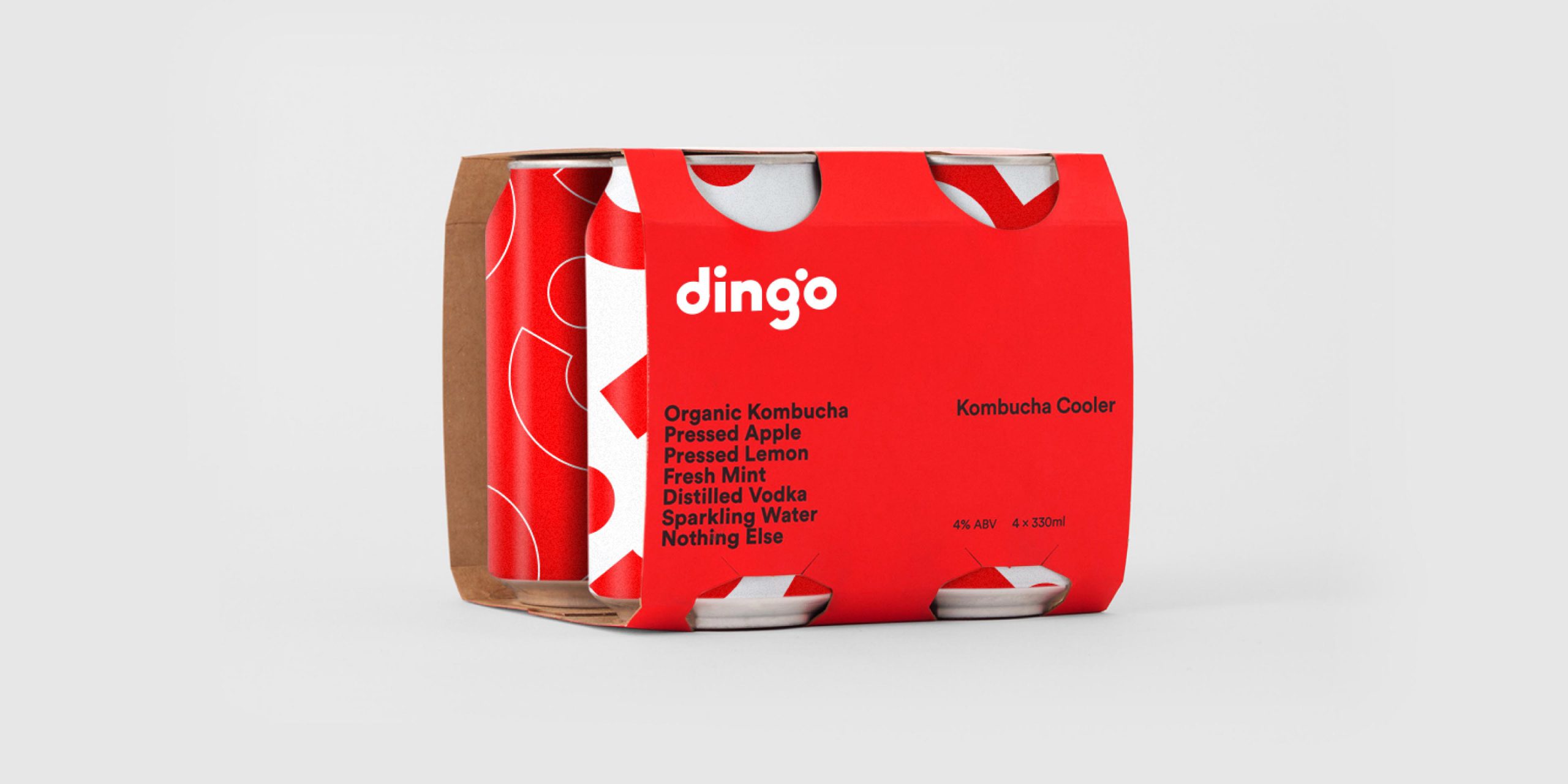
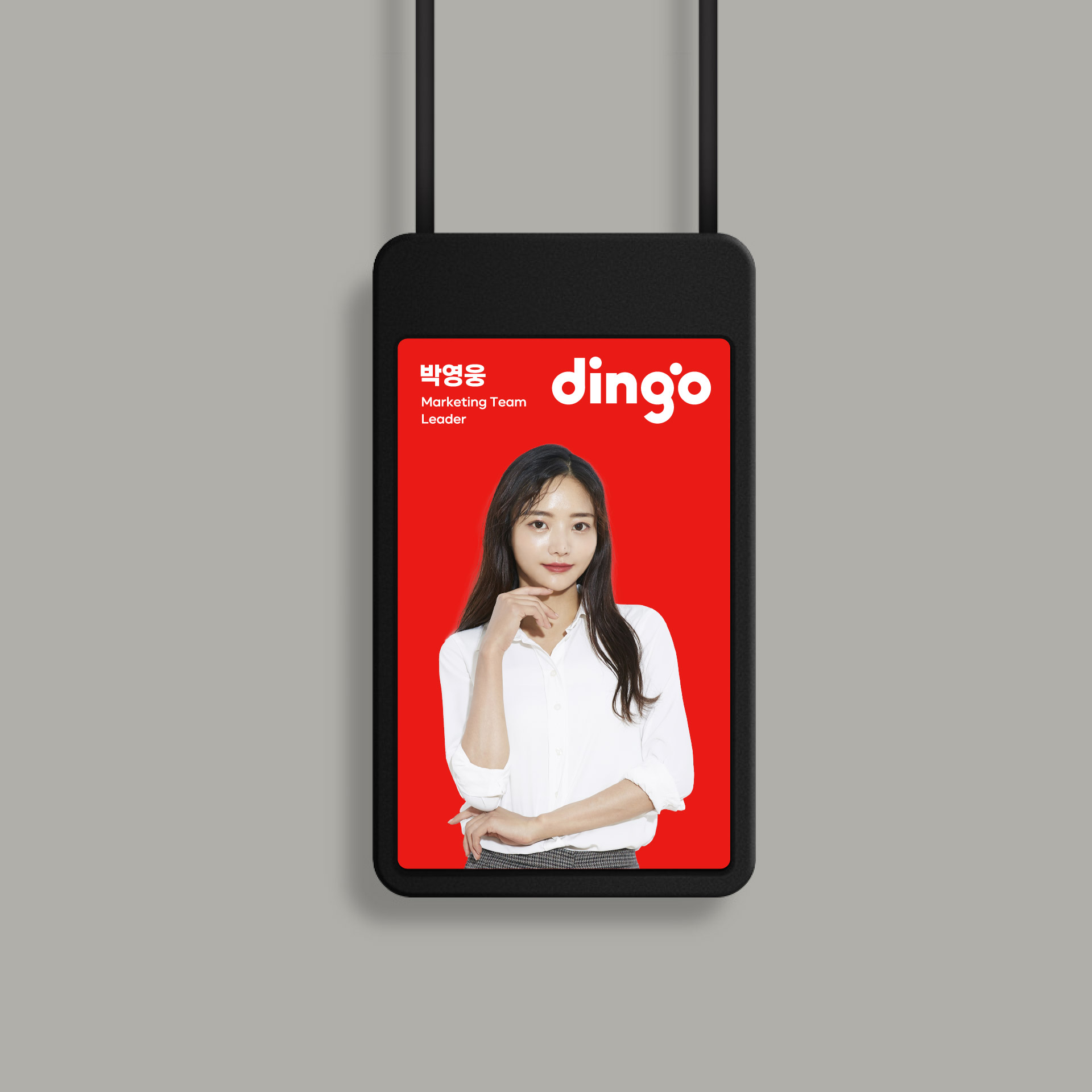
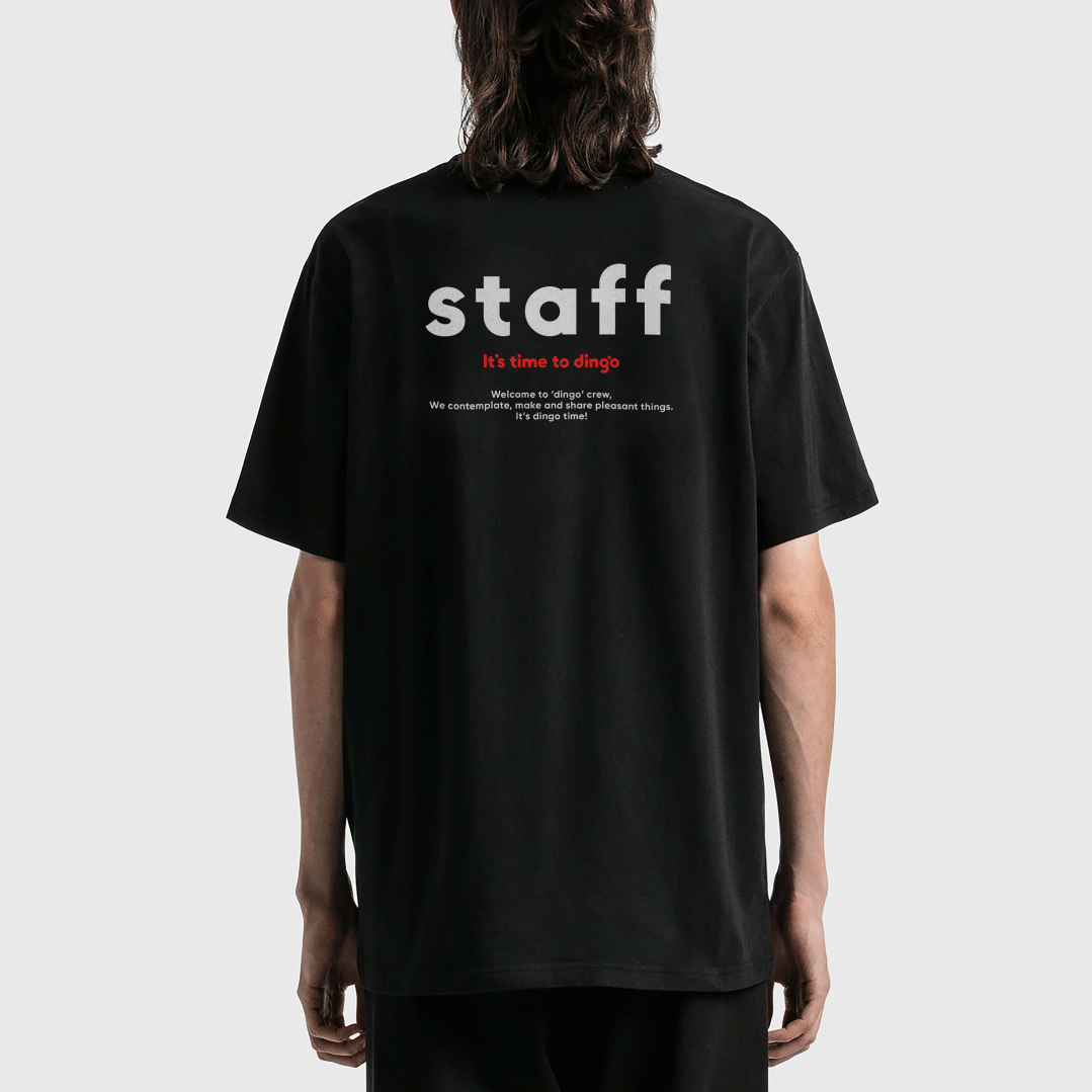
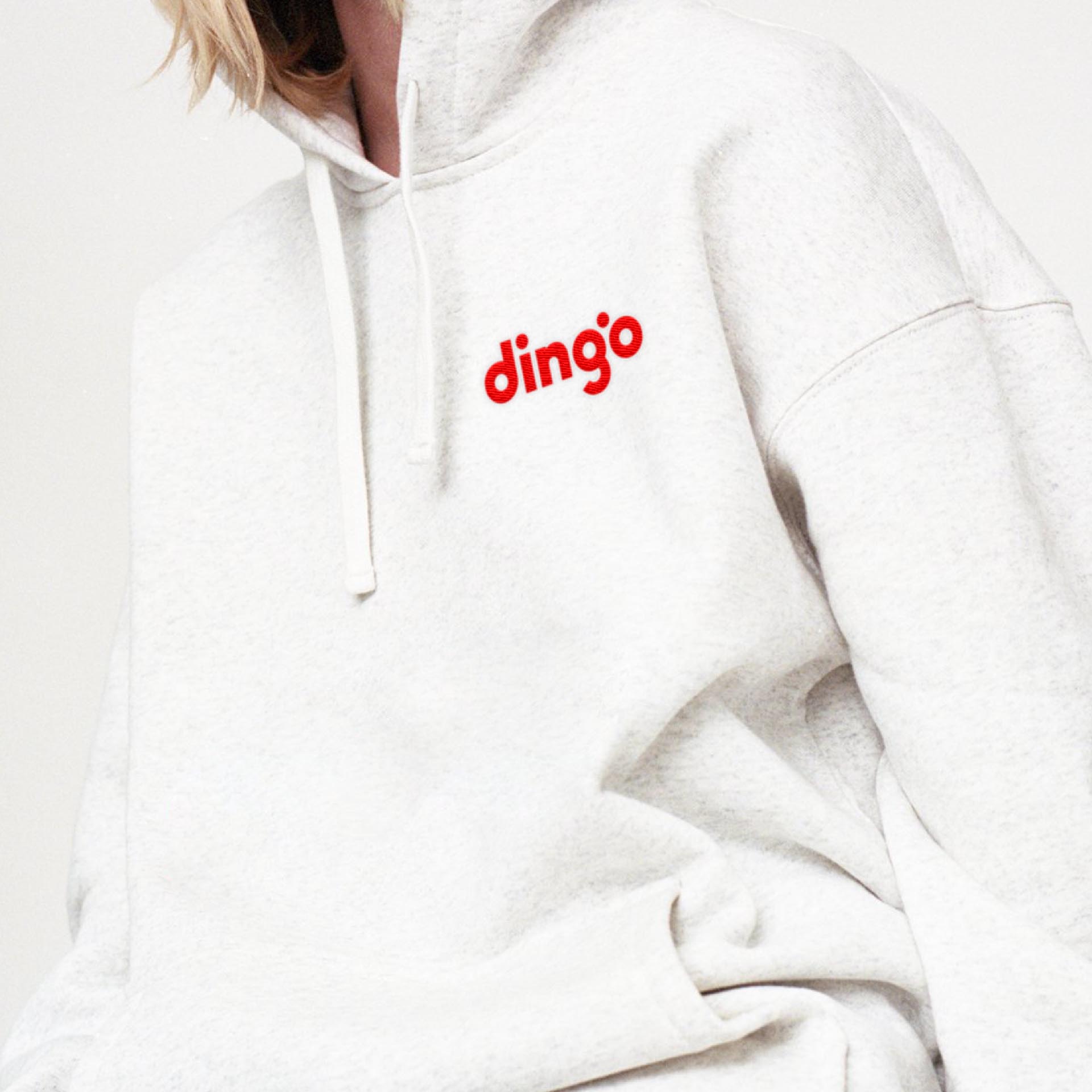
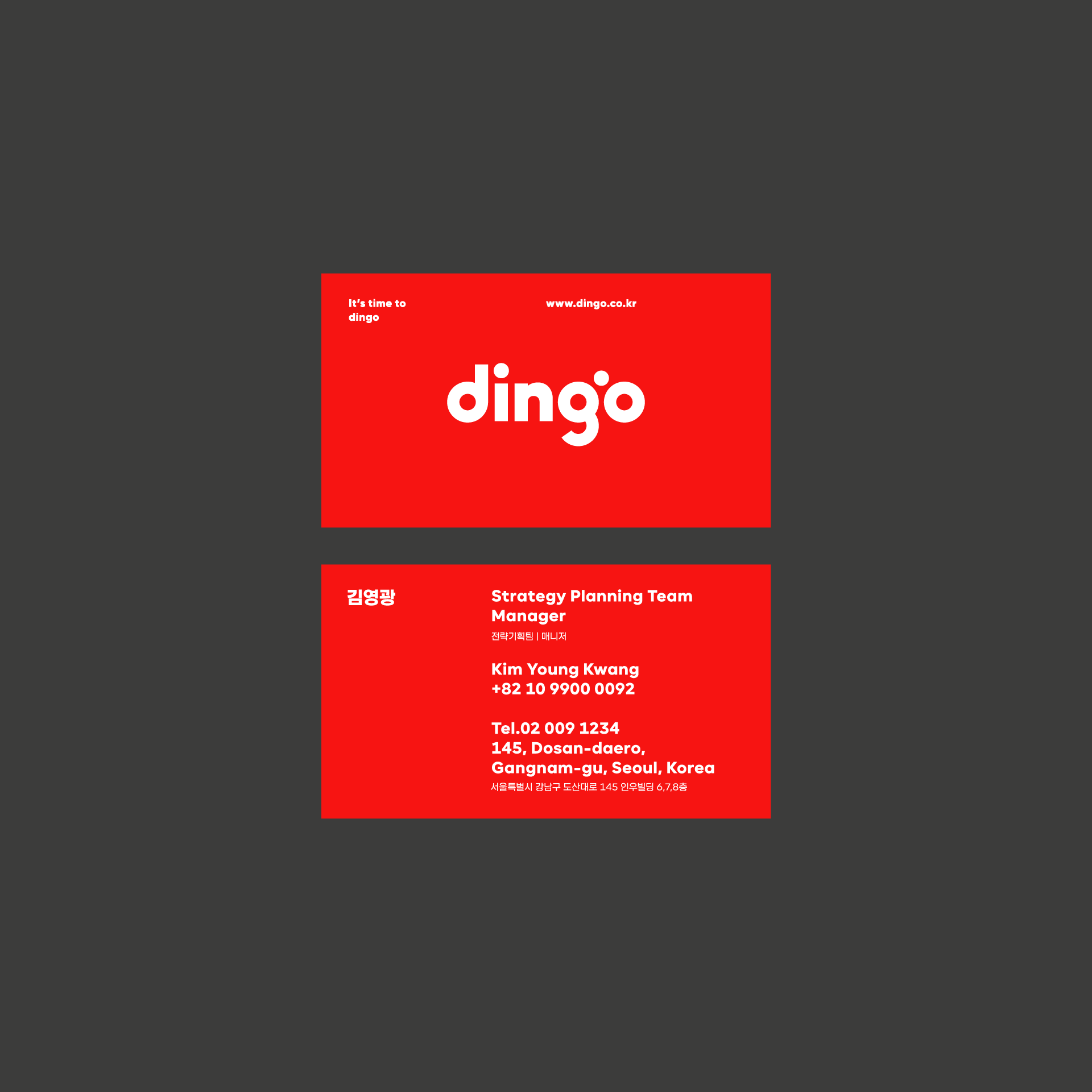
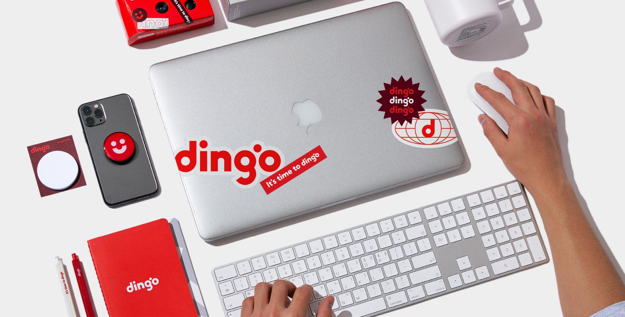
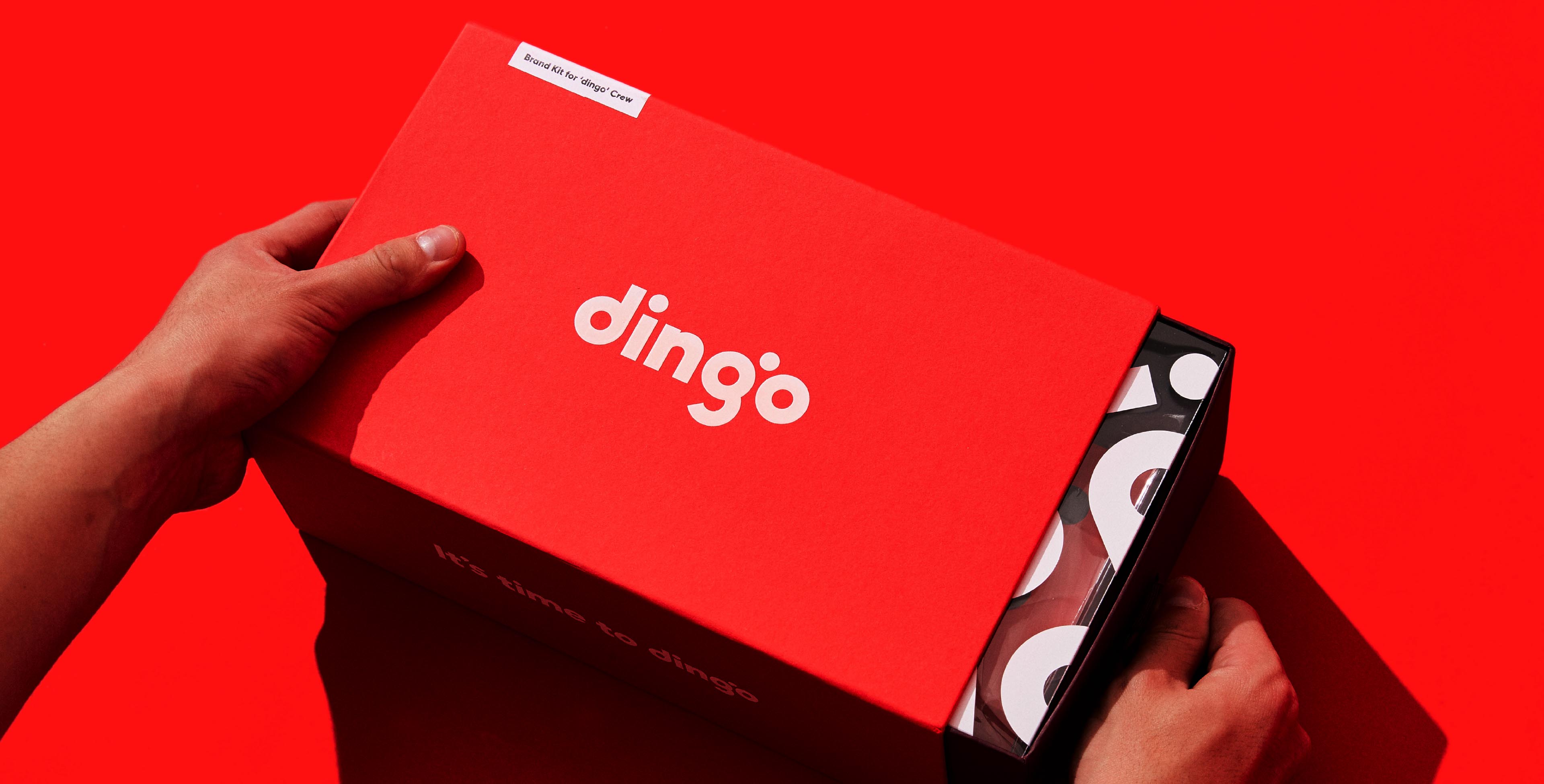
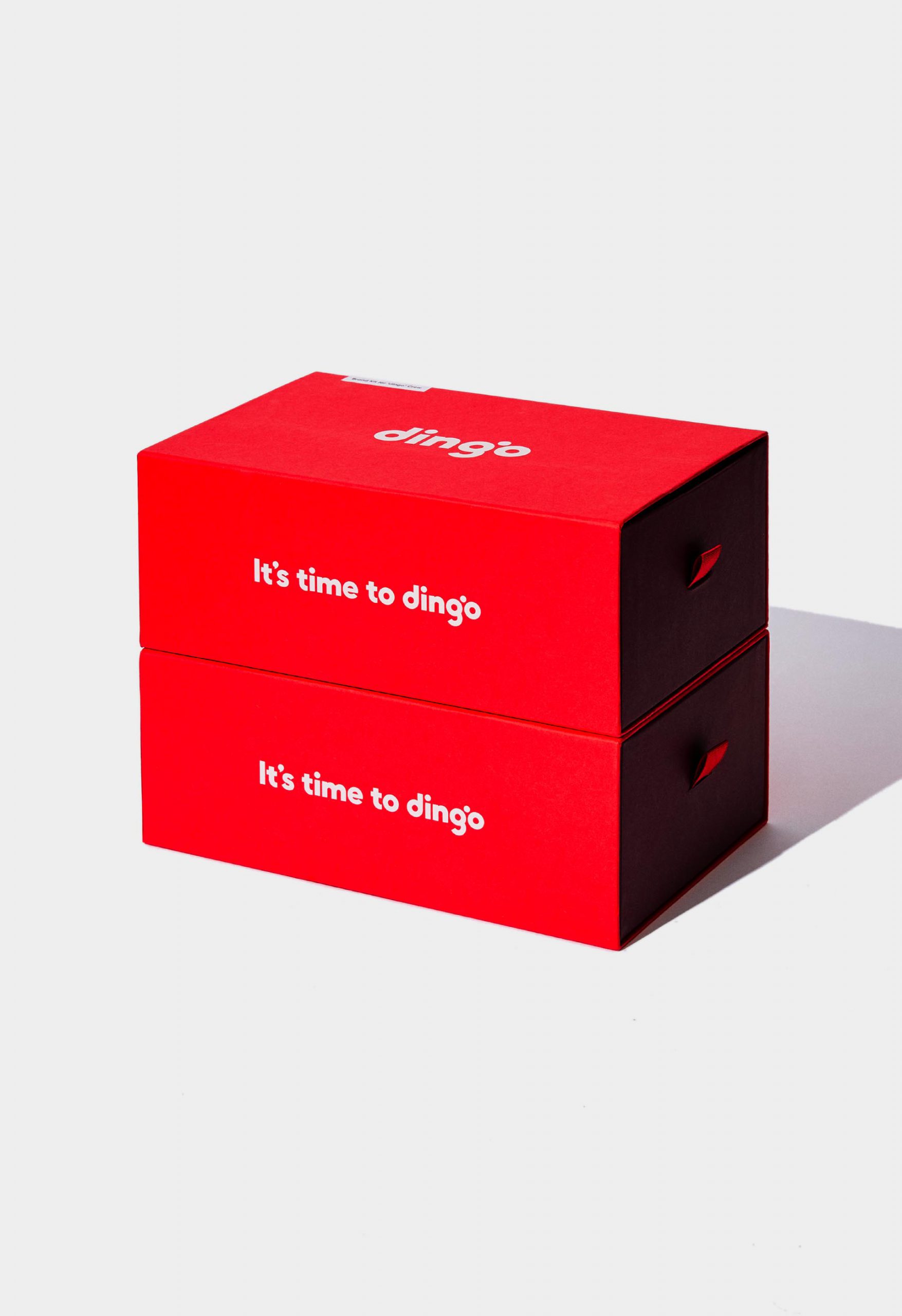
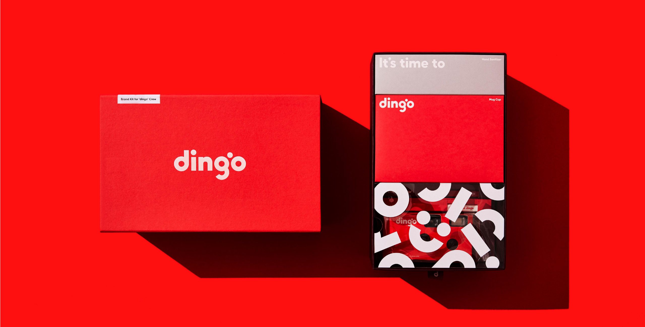
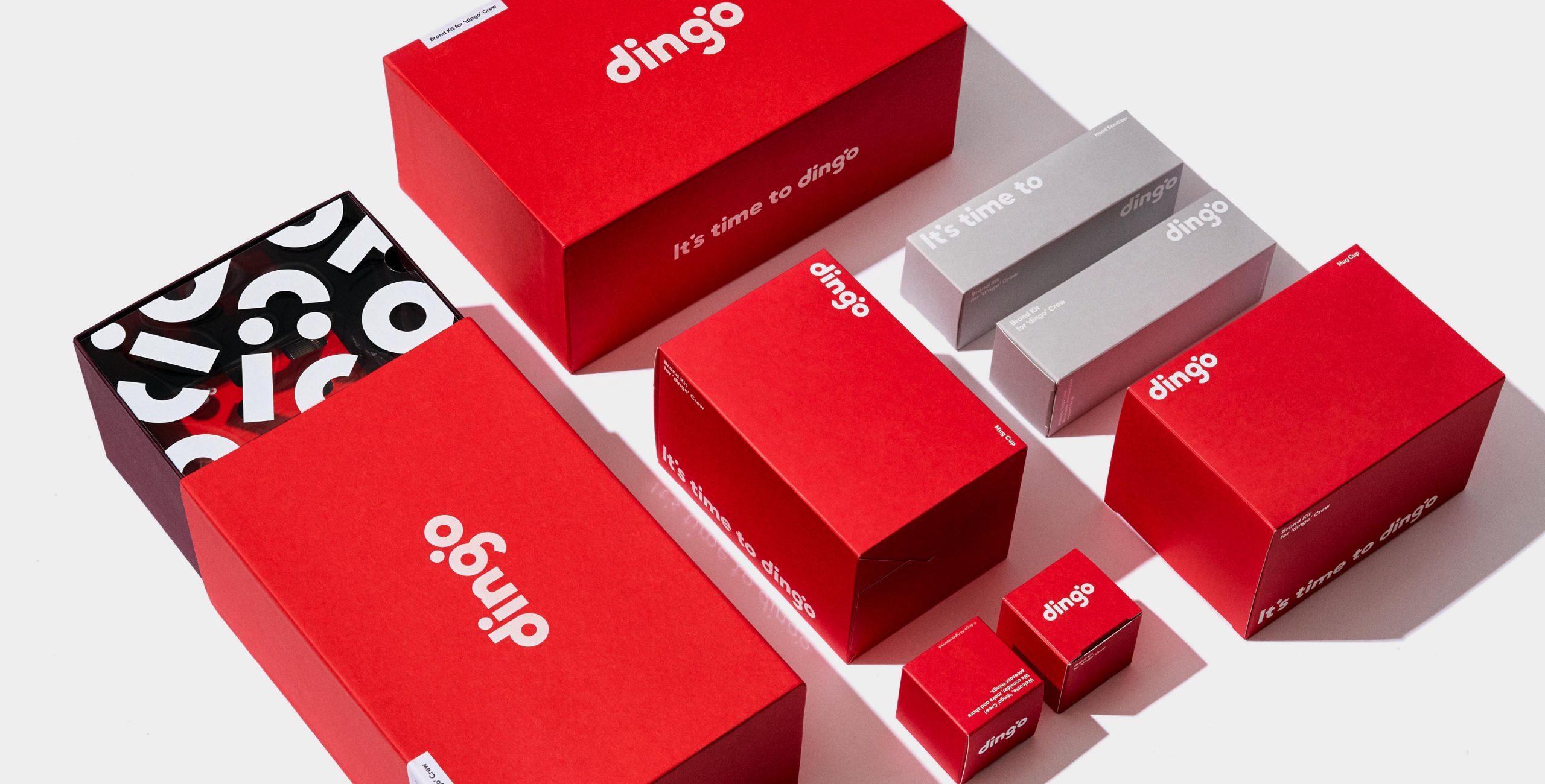
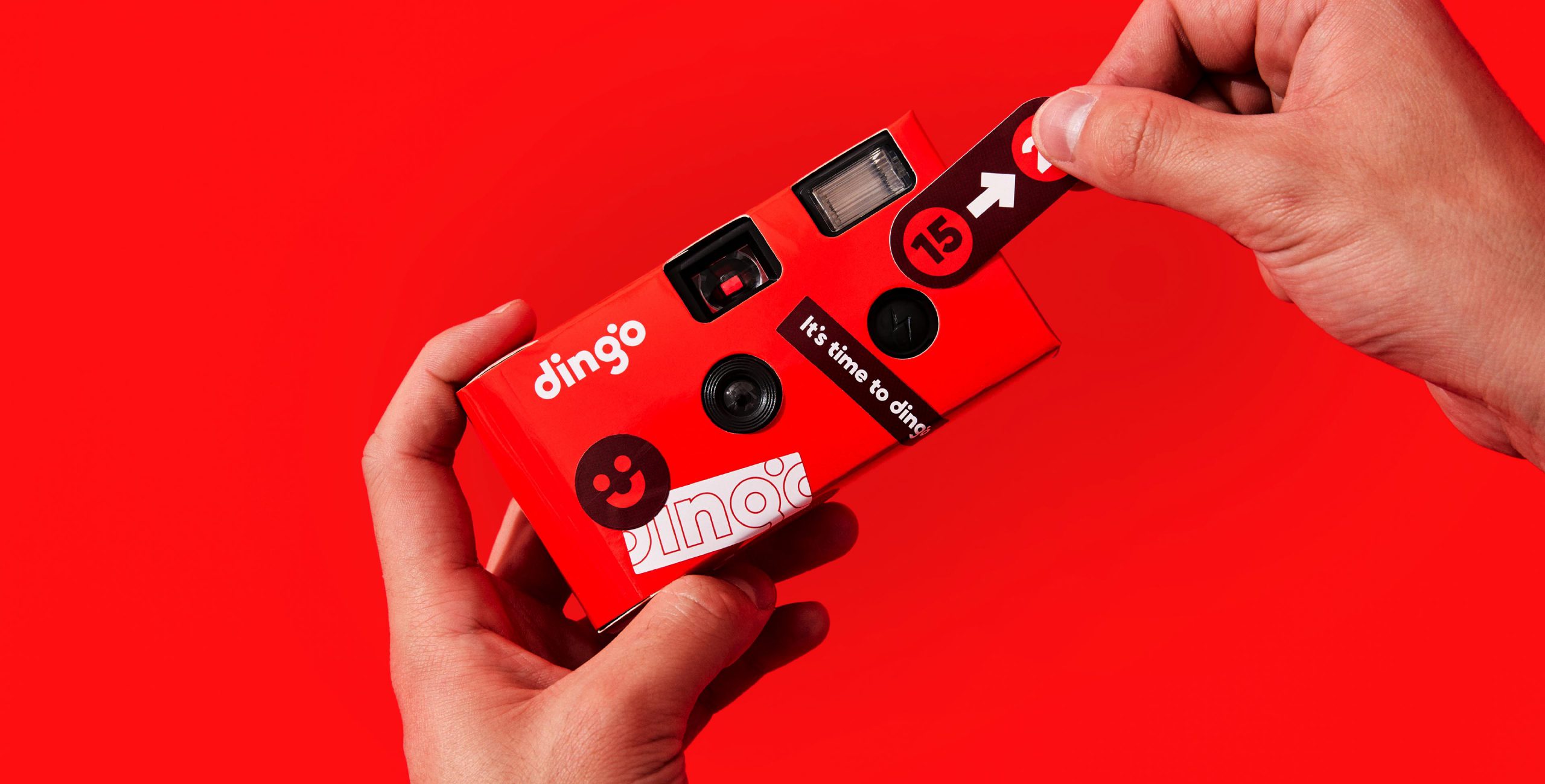
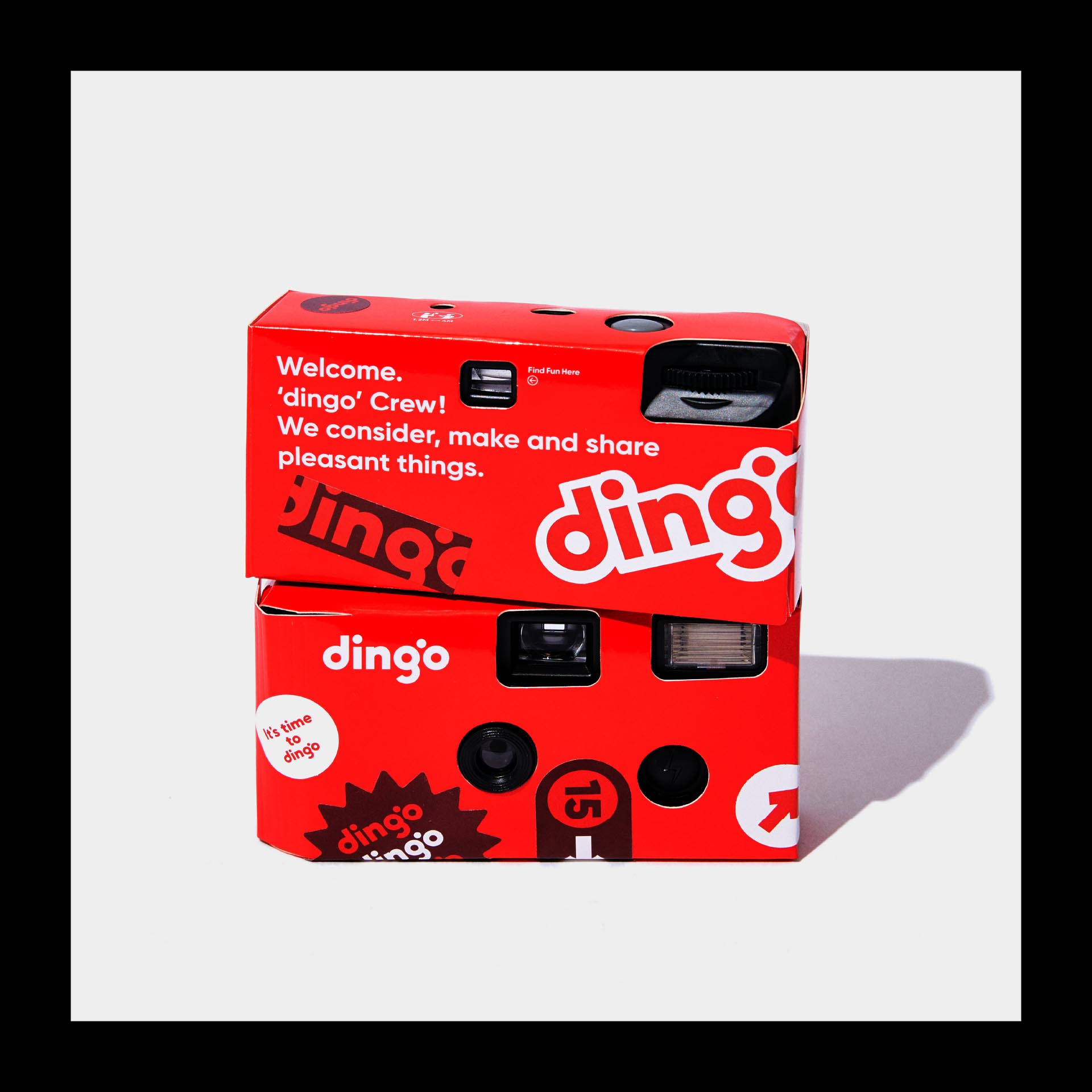
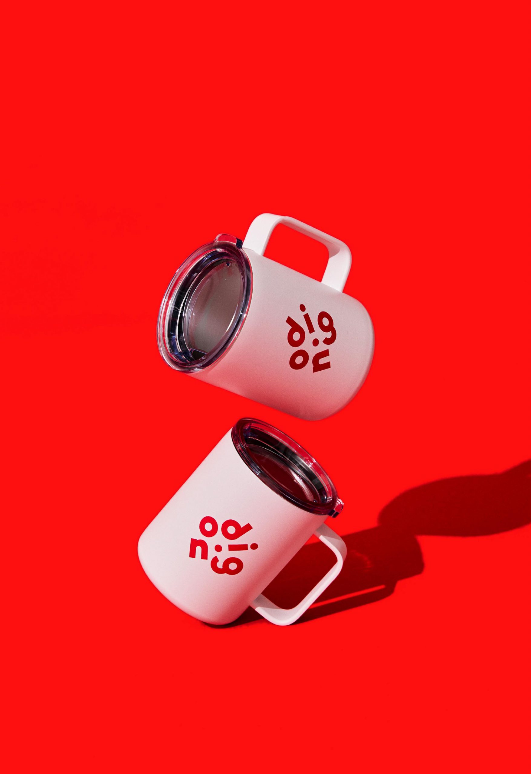
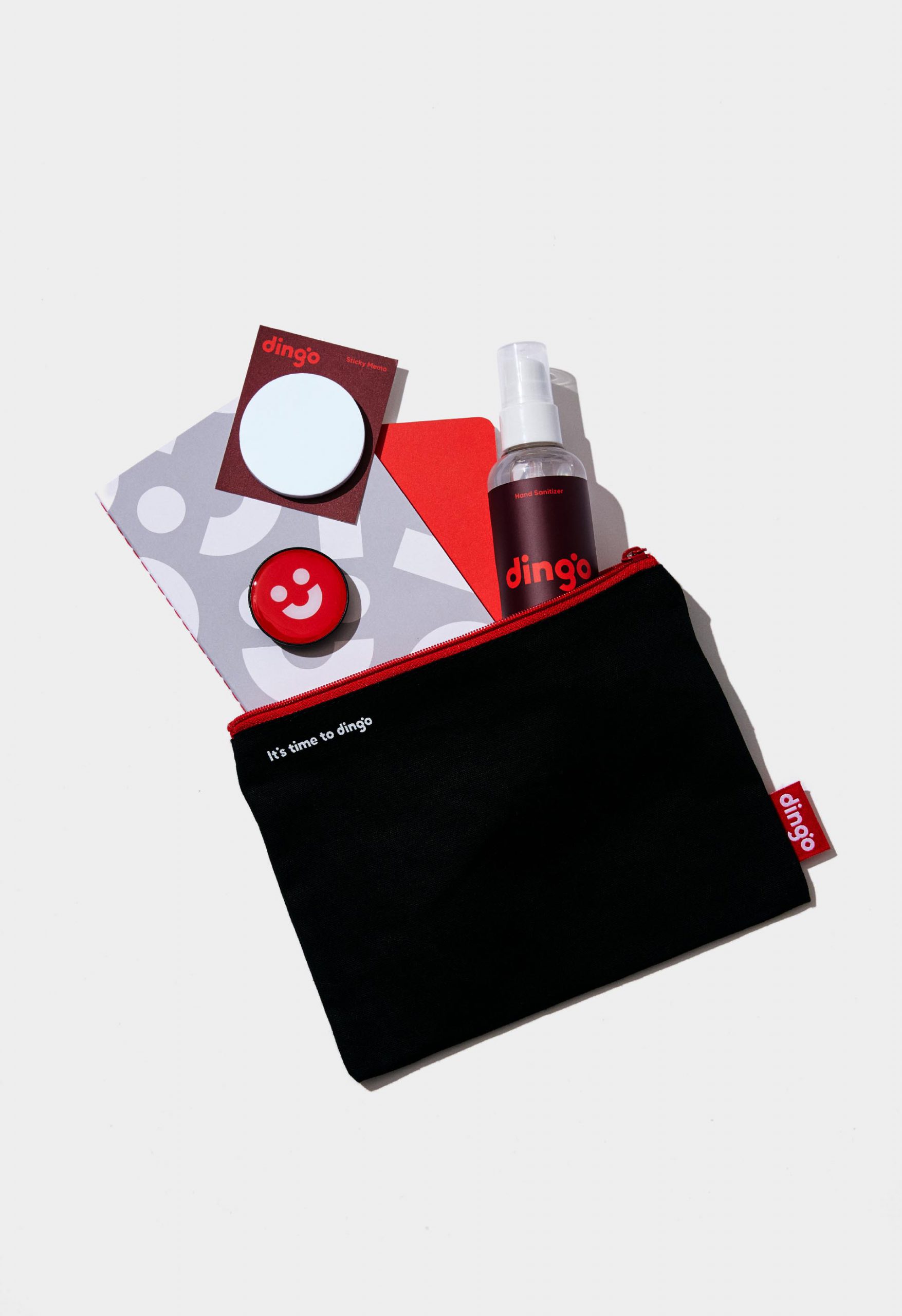
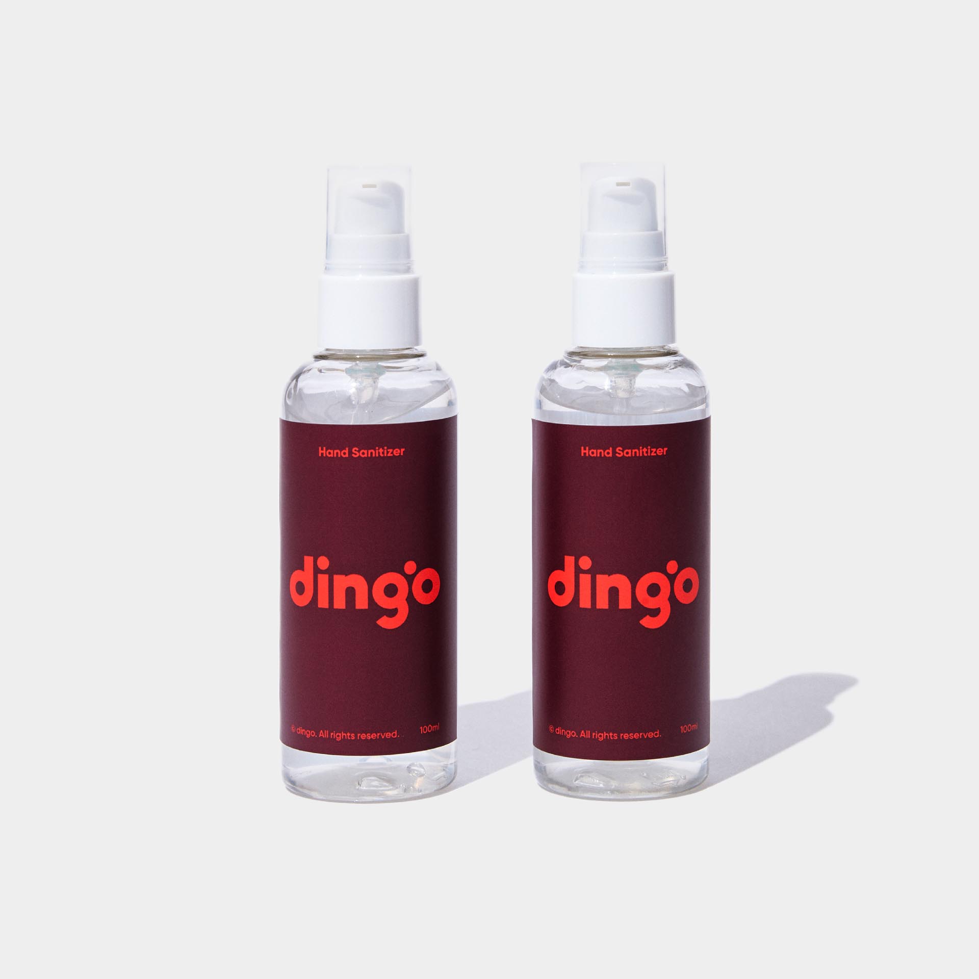
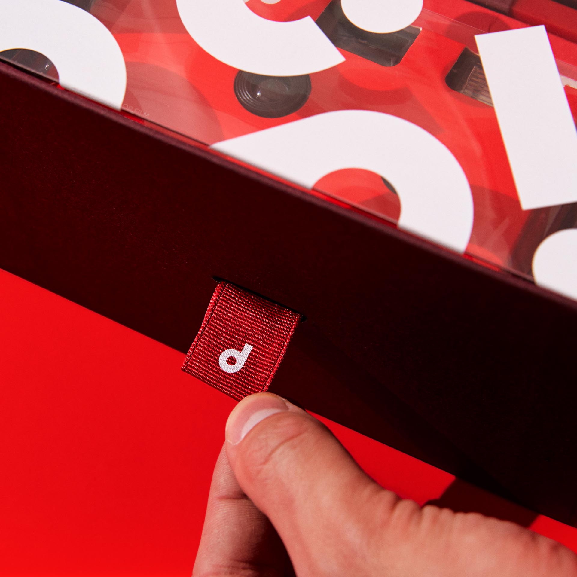
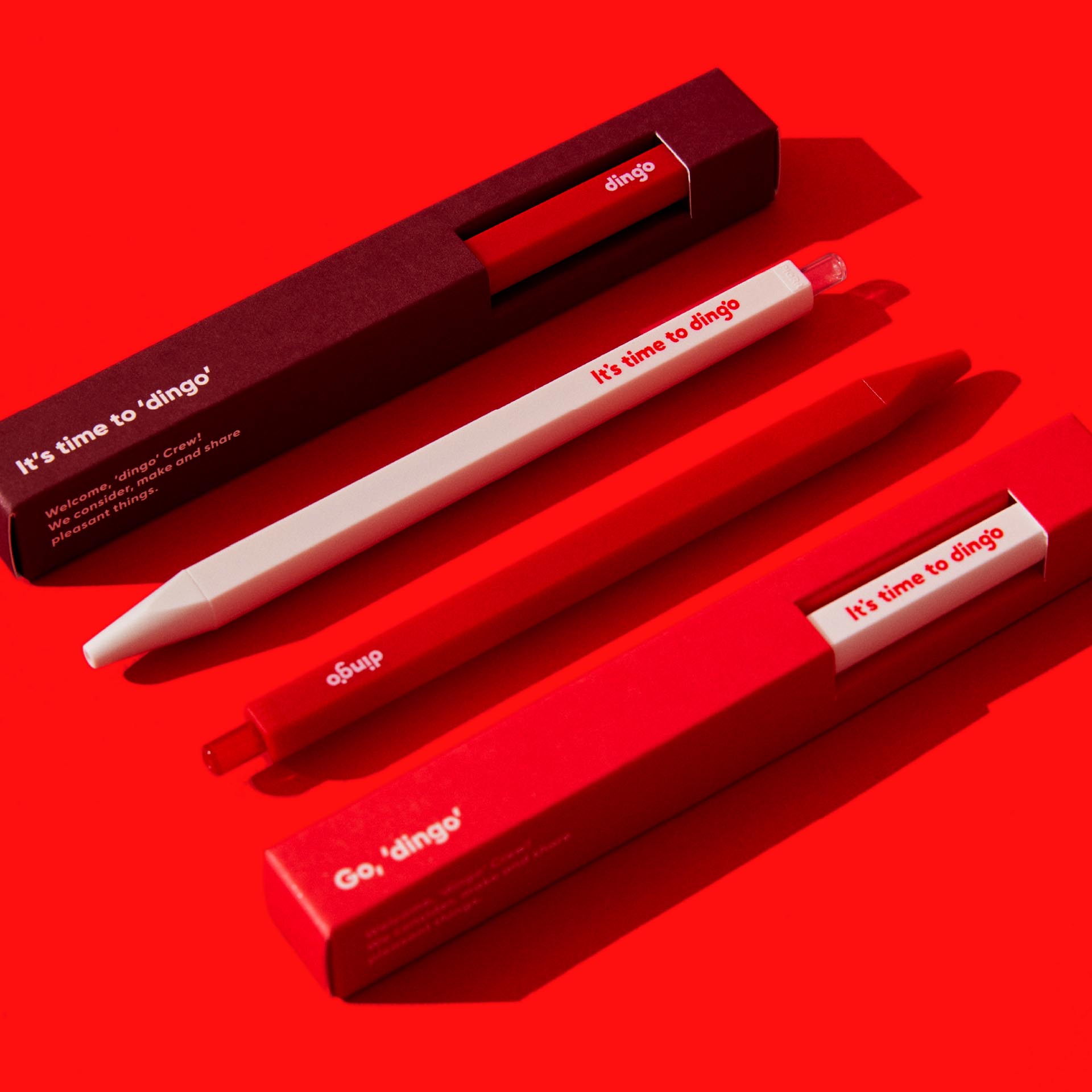
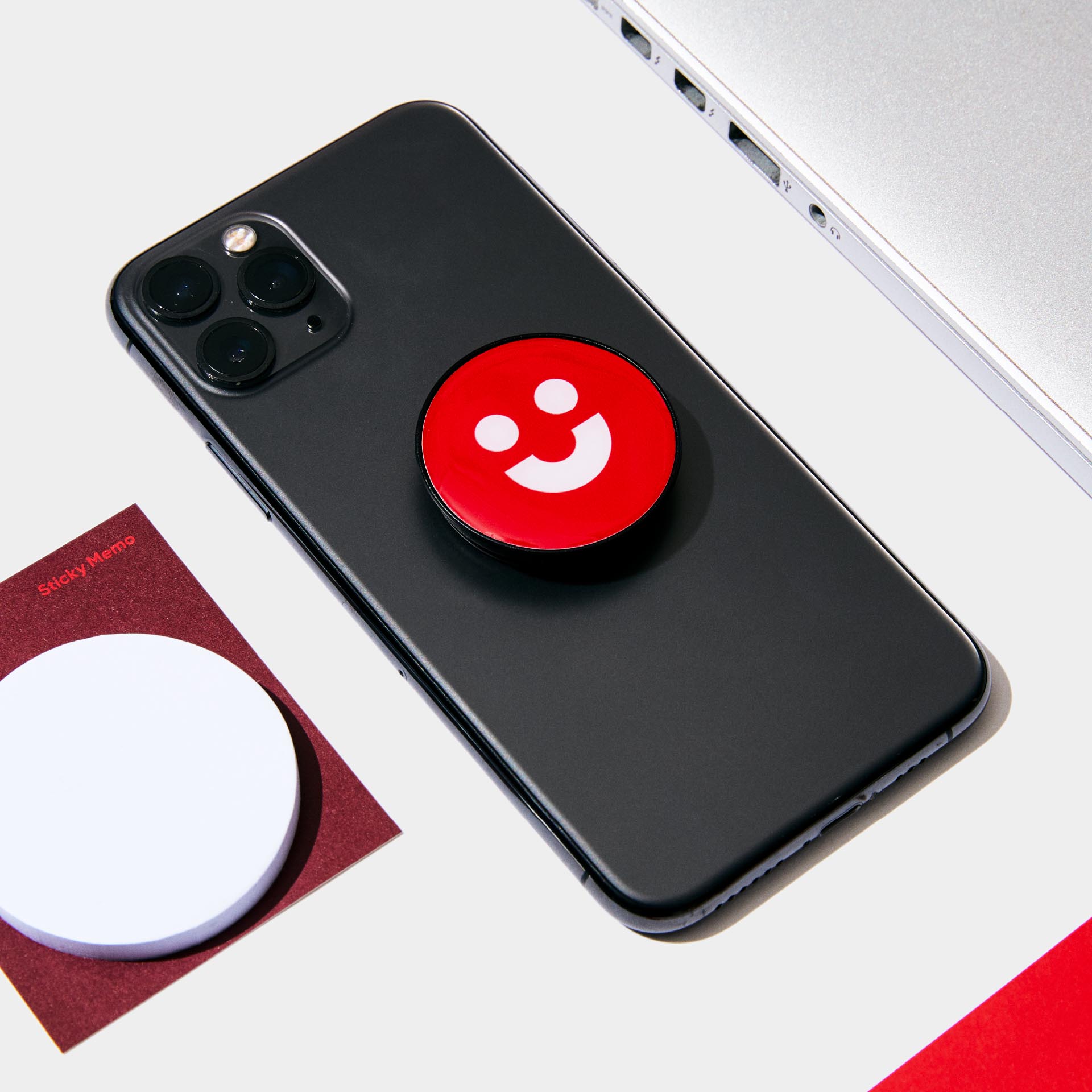
Dingo’s new design can be effectively applied to video media and diverse offline media. The ‘Dingo brand kit’ that we built collaboratively is utilized as the symbolic media communicating Dingo’s new branding and corporate vision. In addition to the corporate stationery often used by employees, film cameras, cups and pouches are used to communicate the renewed Dingo brand to a range of artists collaborating with Dingo as well as its employees.
BRENDEN
Creative Direction / Do-eui Lee
Project Management / Wook Jung
Design / Aerin Lee, Haeryung Choi, Hyejoo Yoon, Hwee
Client
MAKE US