BIGHIT MUSIC
Visual Branding Project
Founded in 2005 as Big Hit Ent, BIGHIT MUSIC rebranded in 2021 with a renewed identity. However, three key challenges remained: the need to grow beyond a label into a well-established brand, a more distinctive and modern visual direction with merchandise expansion in mind, and clearer guidelines for the existing graphic motif system. This project aimed to address these challenges by reestablishing the brand guide system and developing original merchandise to broaden BIGHIT MUSIC's reach and impact.
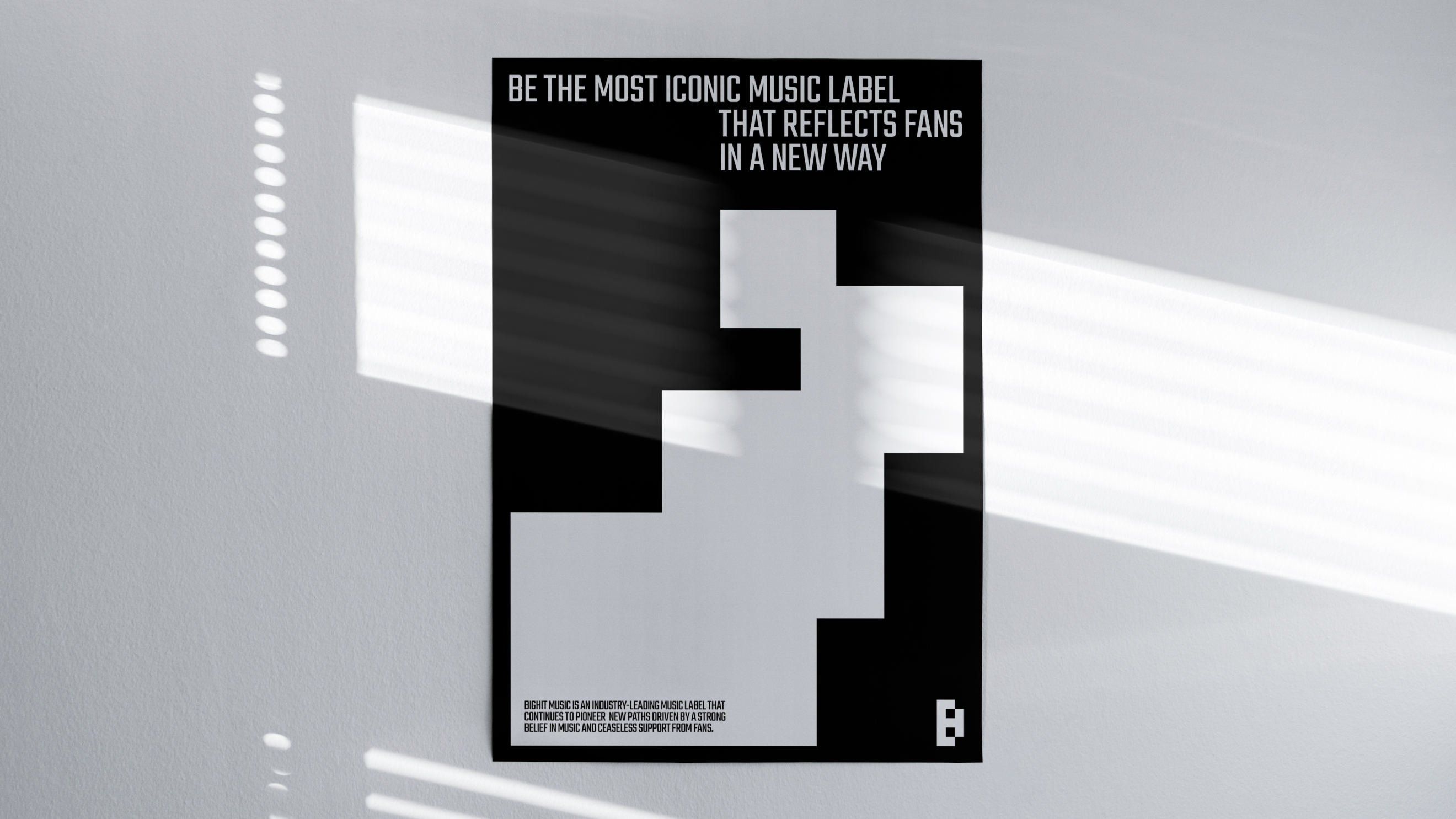
The pixel, derived from BIGHIT MUSIC's existing brand identity, is the most essential element of the brand, carrying two distinct meanings. The first is Music, which symbolizes a value that transcends time and represents a concept that resonates with artists and people around the world. The second is Core, which begins from the most fundamental unit and evolves into a symbolic icon that is both independent and organic, expanding and adapting to capture the spirit of each era.
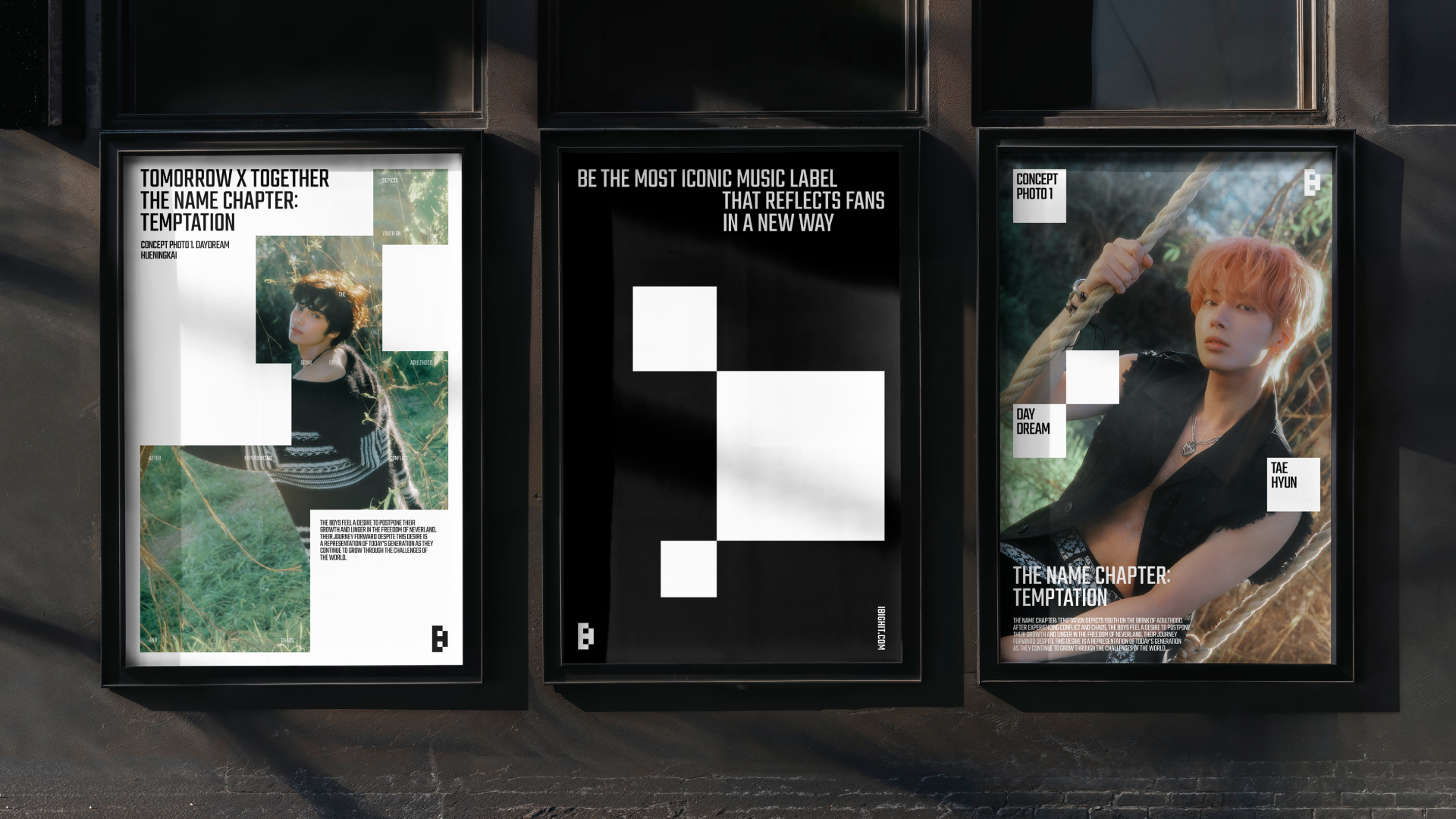
BIGHIT MUSIC's newly established graphic motif is defined by three types. The first, Essential, embodies the core identity of BIGHIT MUSIC that remains unchanged regardless of the era.
The second, Scale, expresses the unique characteristics of BIGHIT MUSIC that exist independently yet organically. The third, Expanded, symbolizes a creative group with infinite potential to become anything and everything.
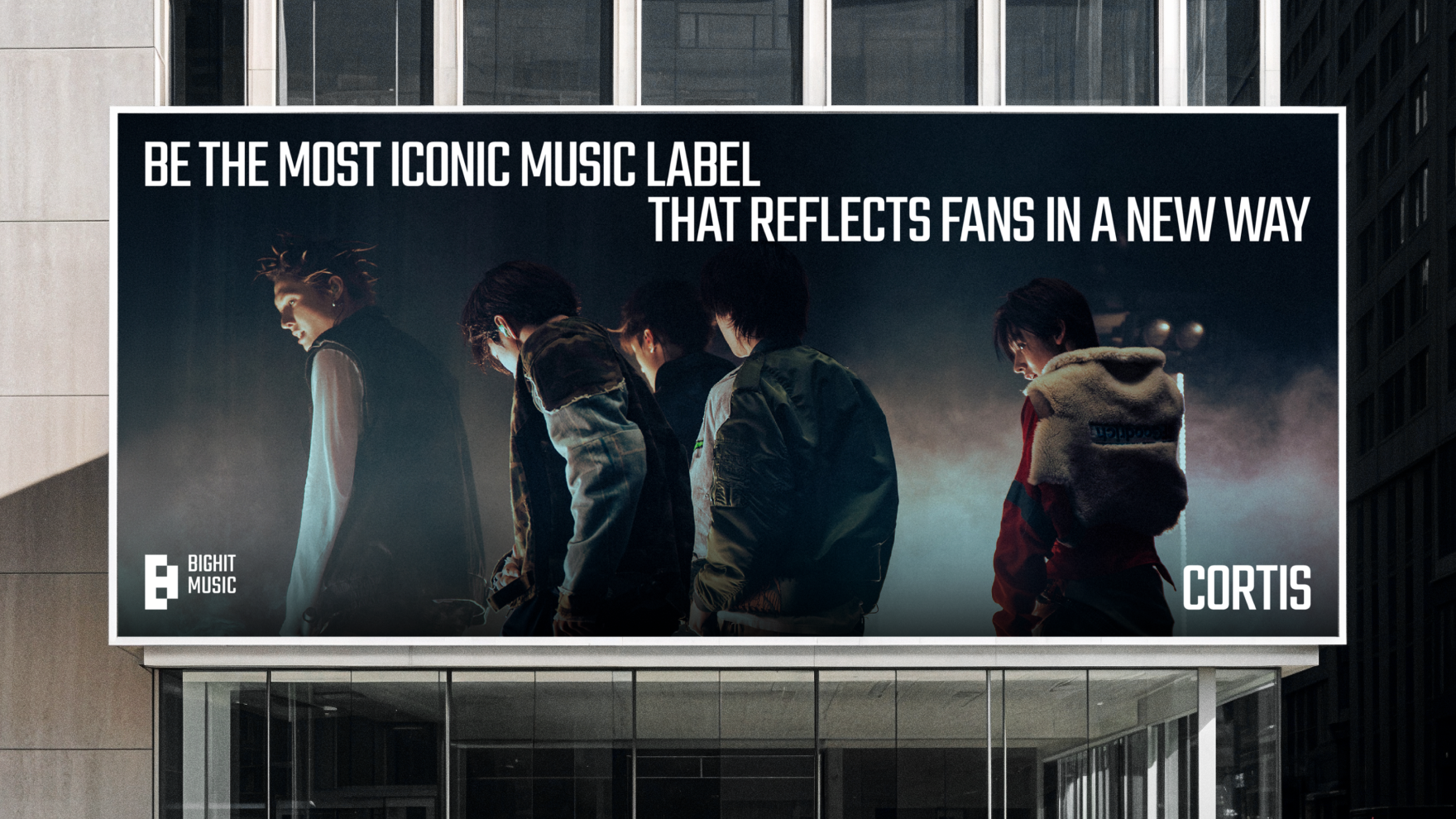
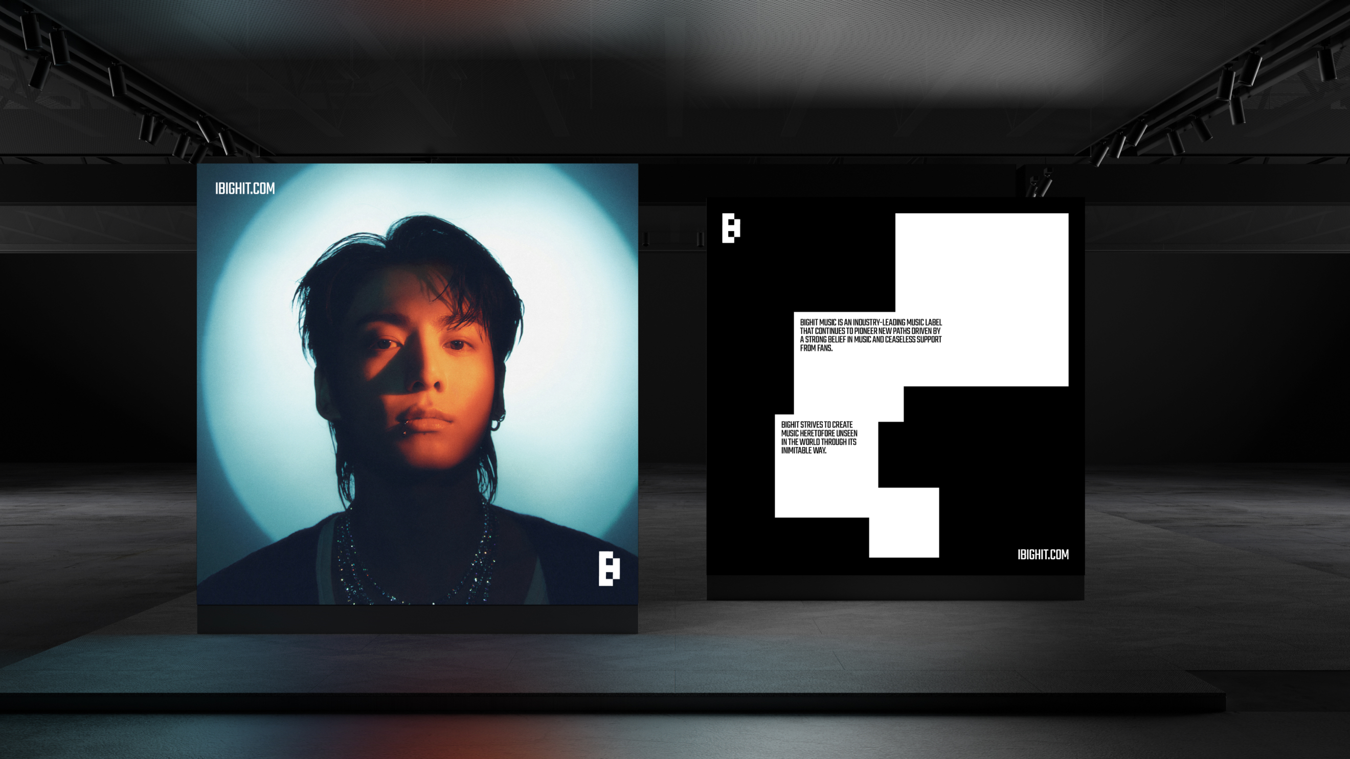

BIGHIT MUSIC's brand typography is centered around TEKO, the typeface used in existing brand identity elements such as the logo, ensuring a cohesive and unified visual language across the brand.
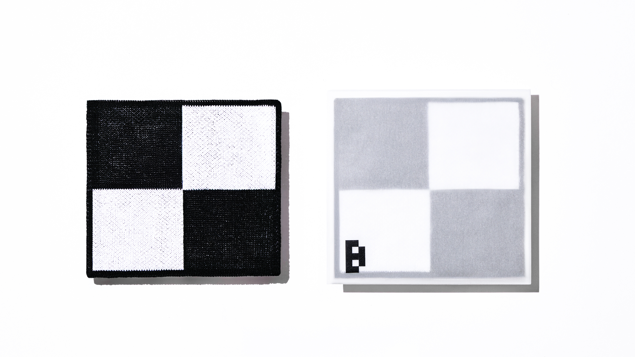
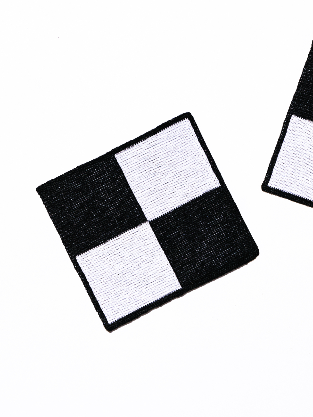
The brand colors retain the existing Black & White palette while incorporating various finishing techniques for offline applications to enhance the overall quality of visual materials. In addition, the existing Black & White colors are given new names, Core Black and Essential White, reflecting the core values and direction of the brand.
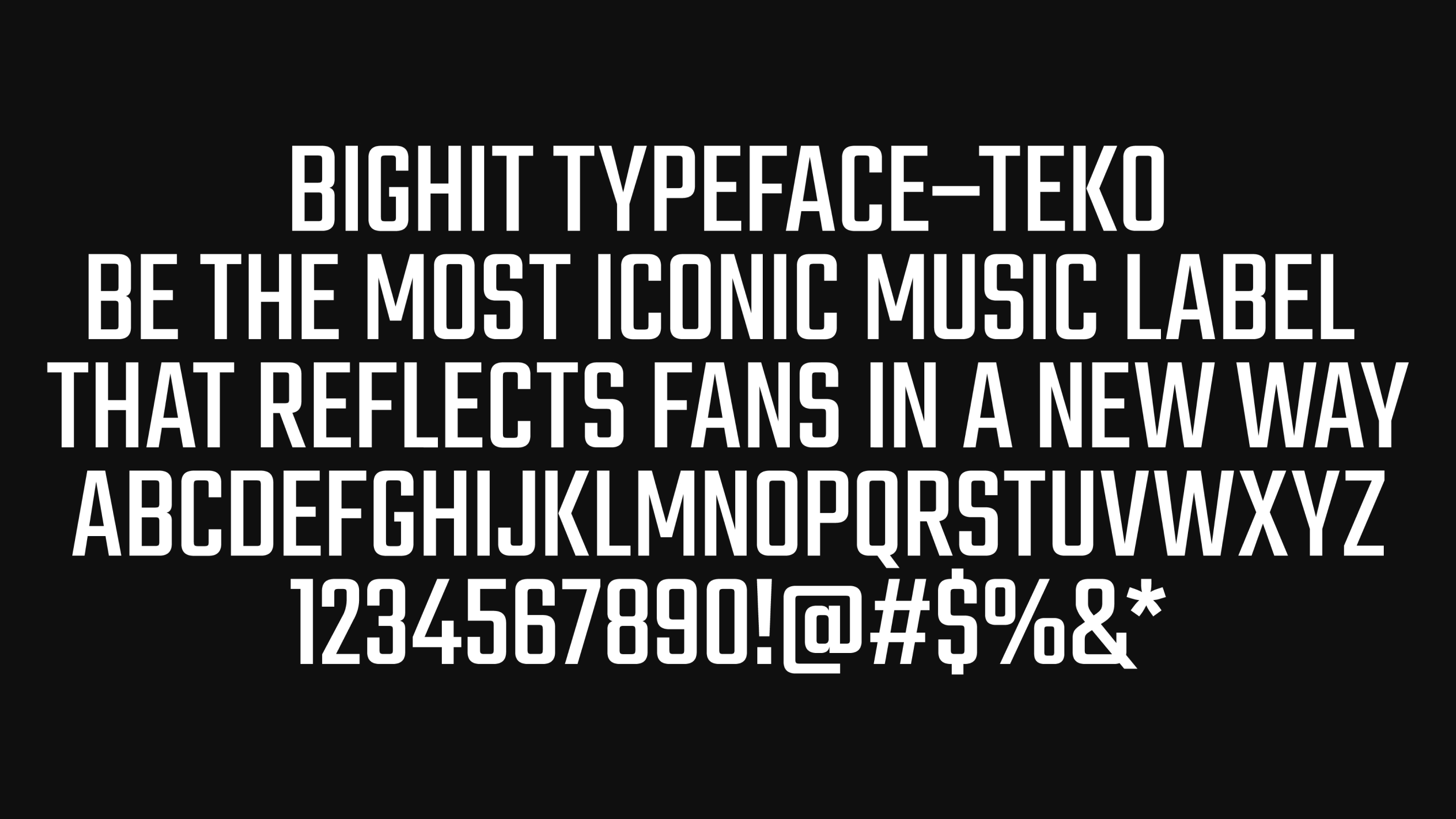


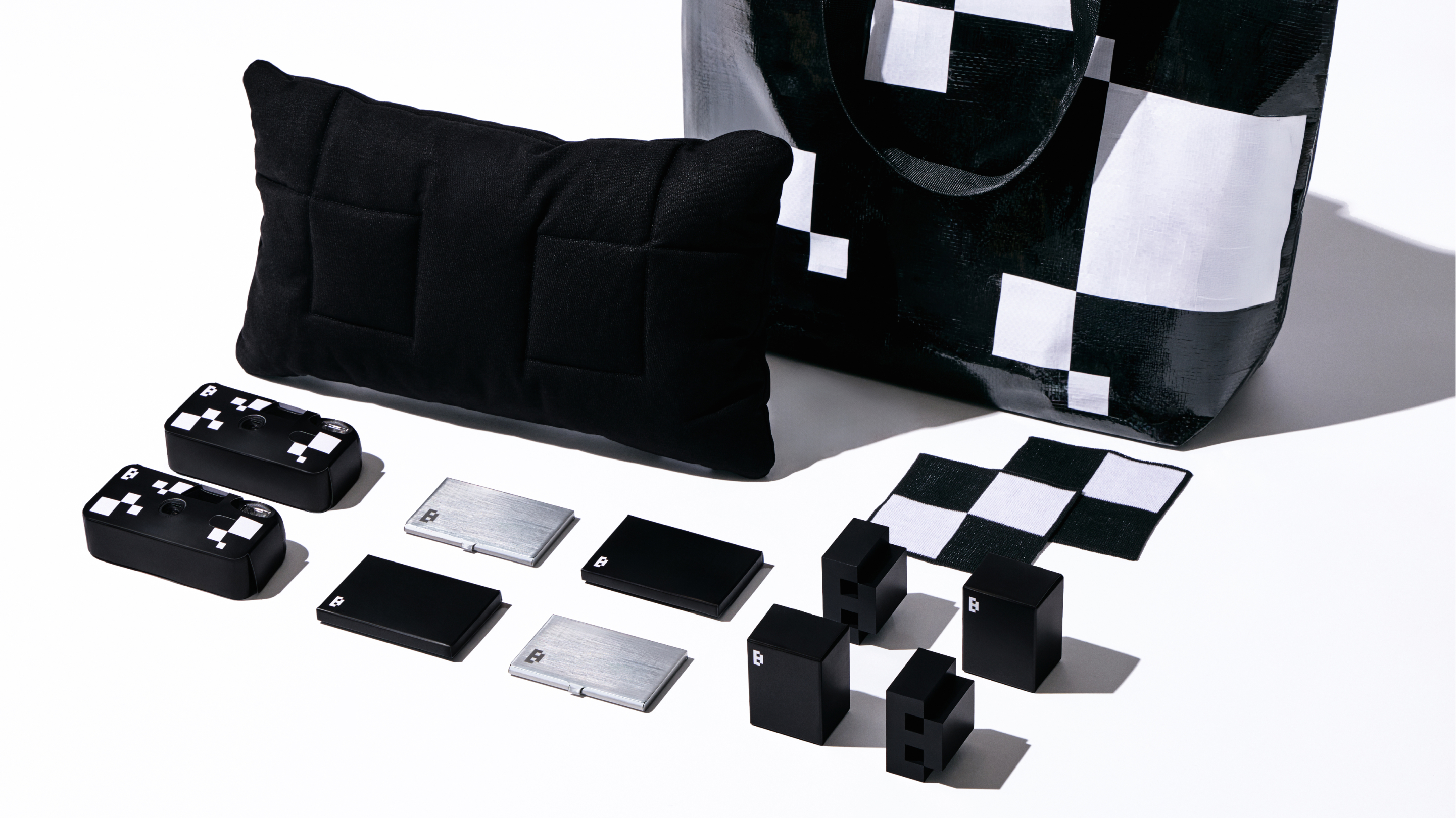
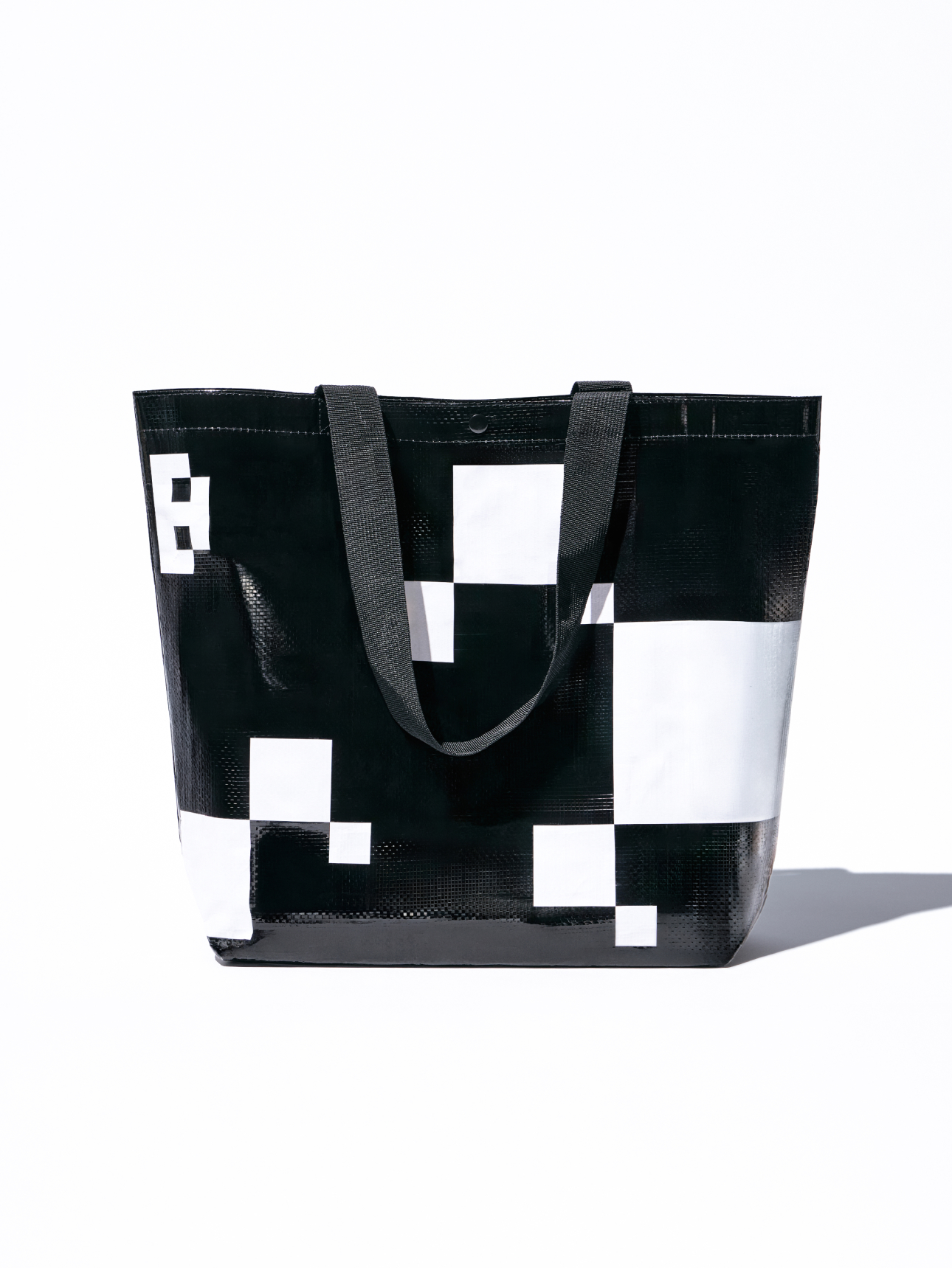
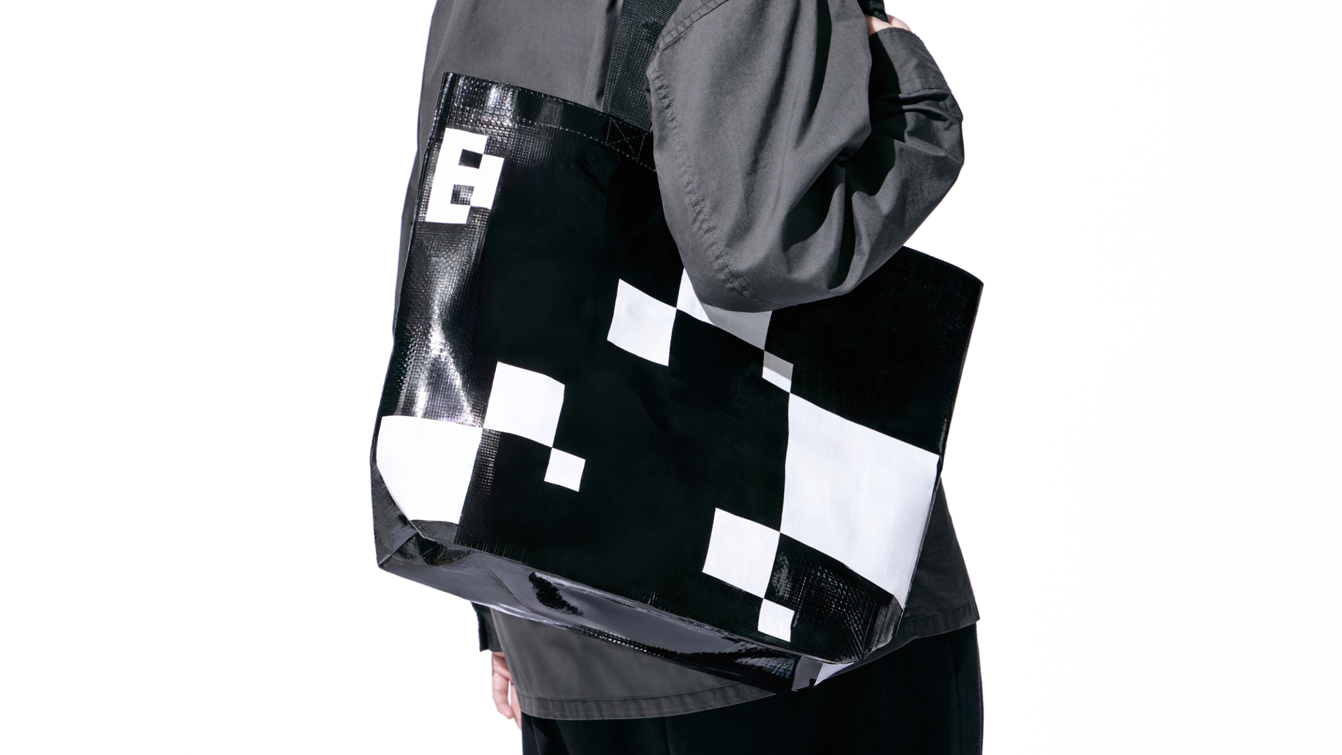
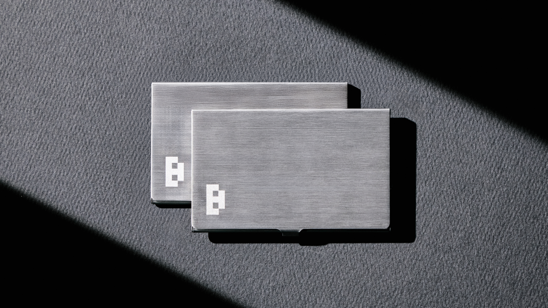
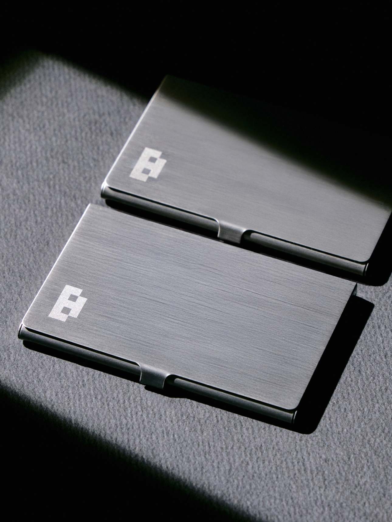
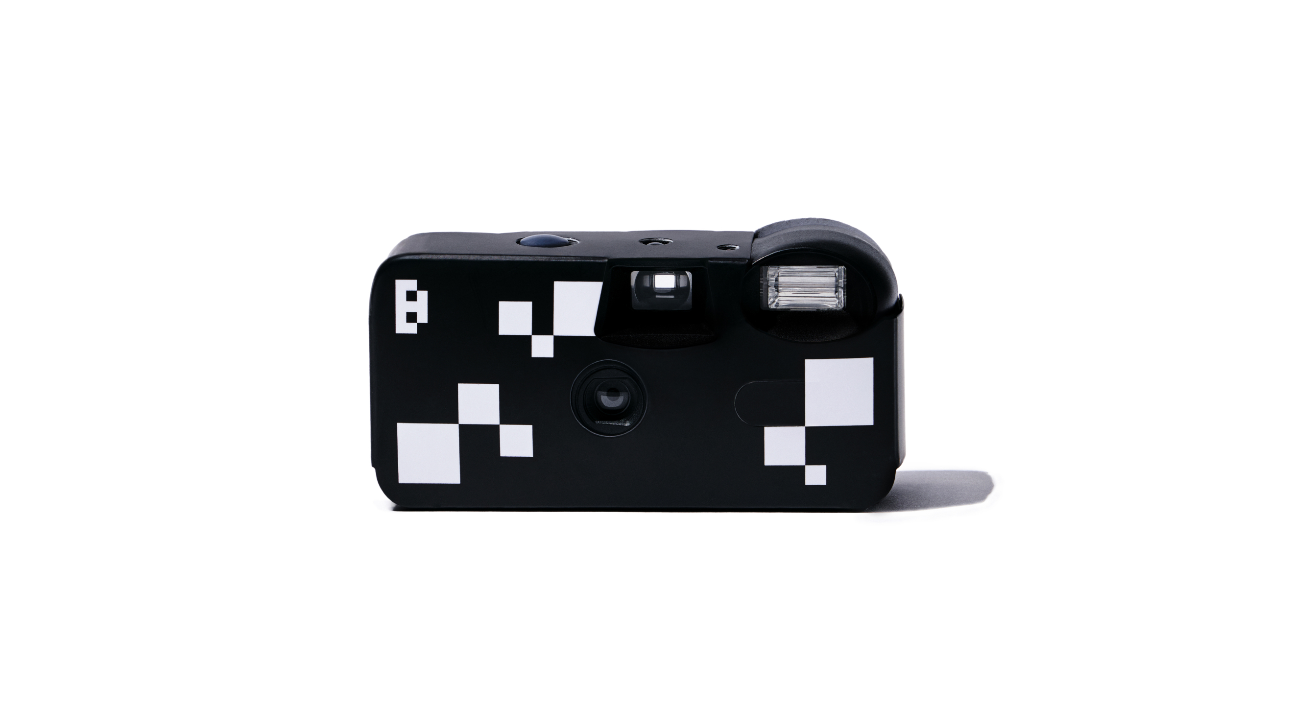
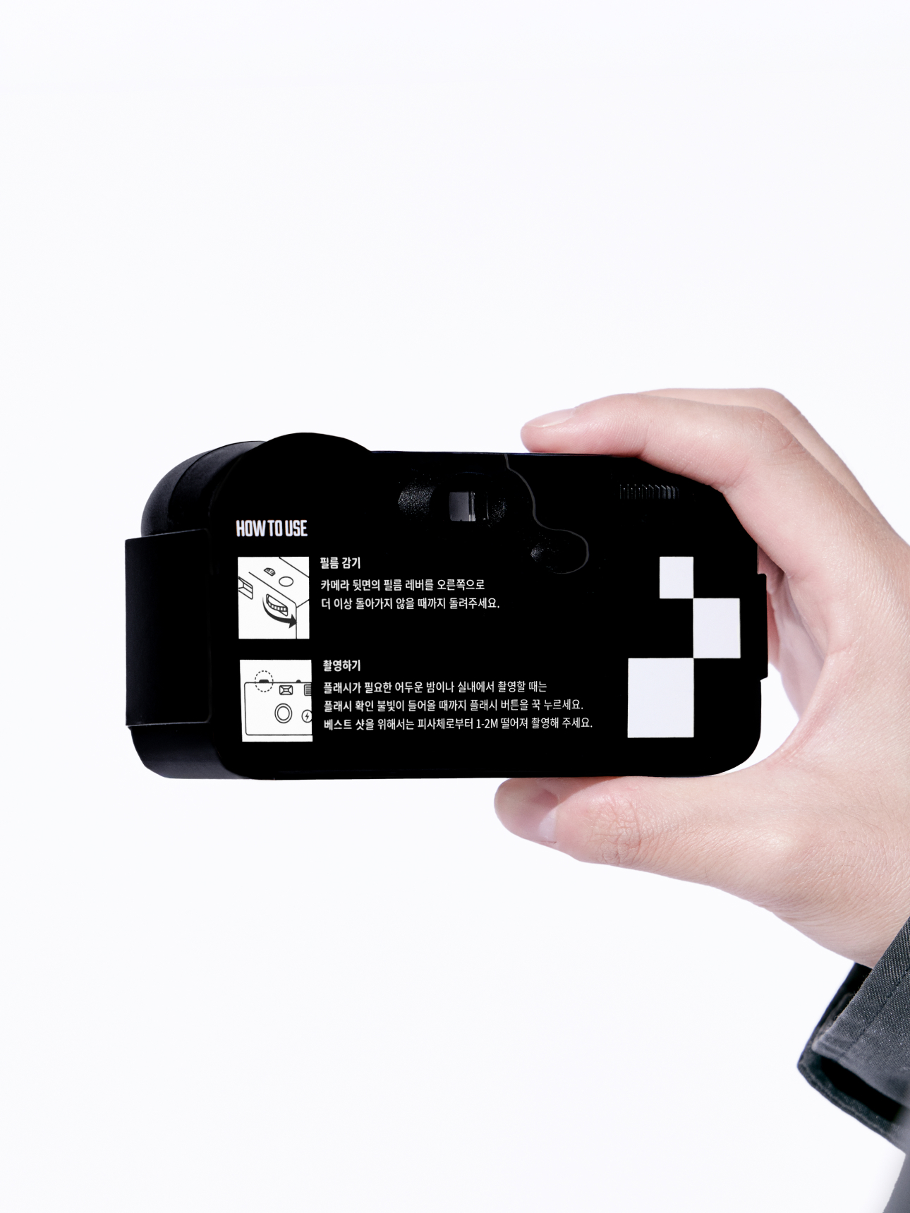
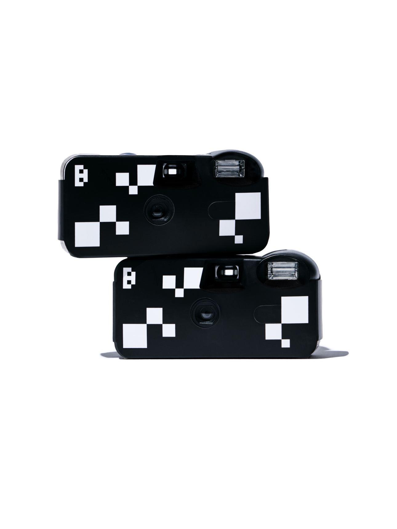
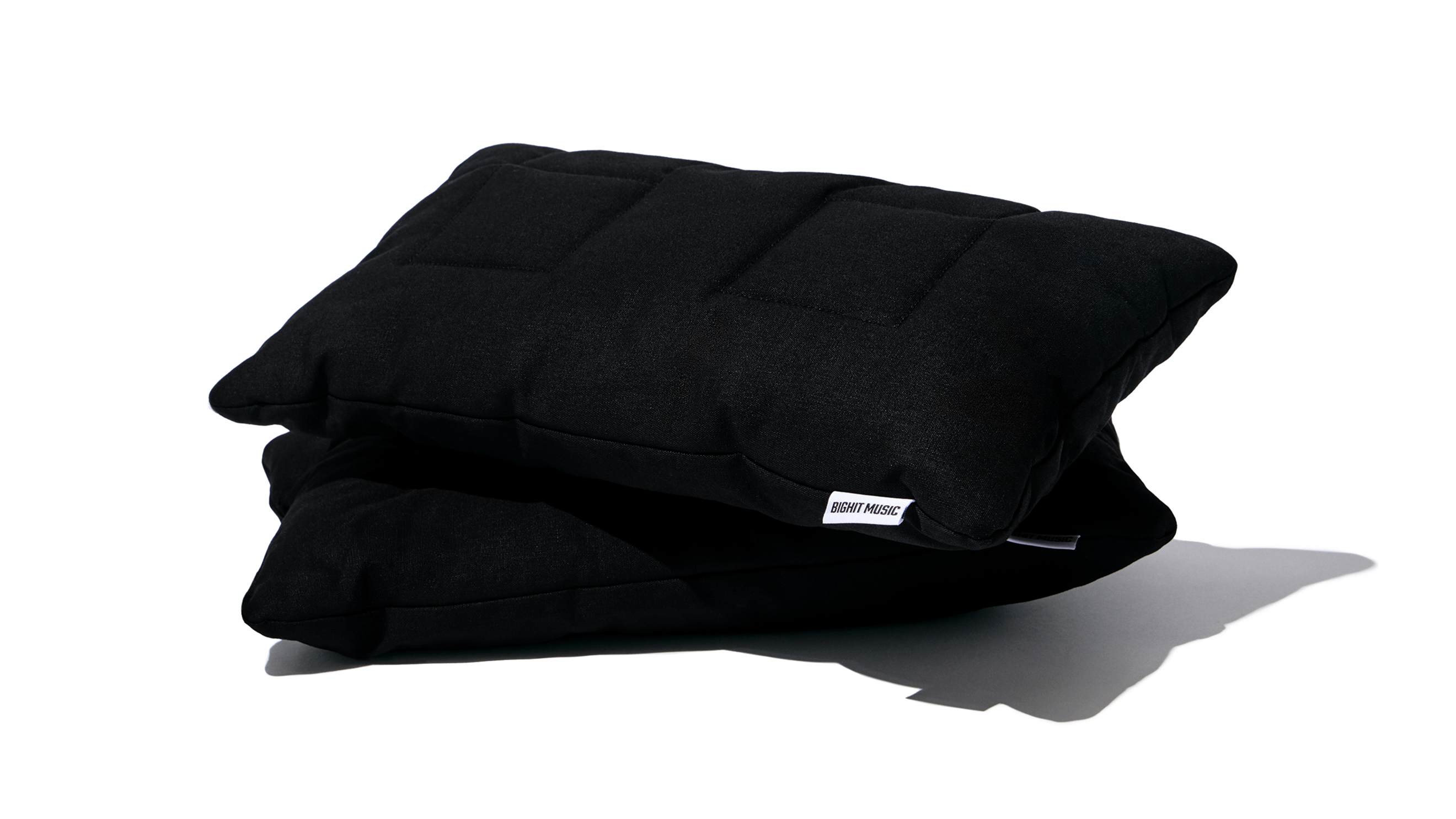
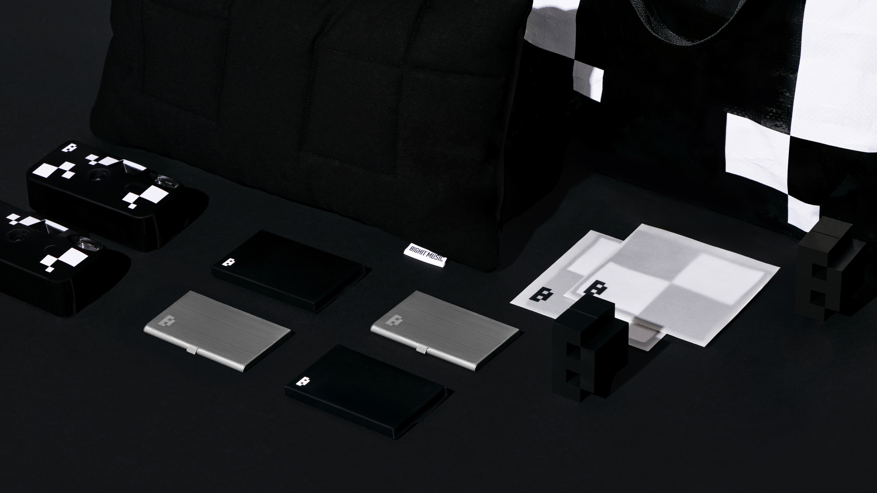
The BIGHIT MUSIC Welcome Kit is planned and produced based on the brand identity, and is provided to newly joining members of BIGHIT MUSIC. By consistently applying the newly established graphic motifs and brand colors, the kit allows new members to naturally experience the brand's values and identity from their very first day.




BIGHIT MUSIC
Visual Branding Project0
BRENDEN
Creative Direction / Do-eui Lee
Project Management / Wook Jung
Project Lead / Jiyeon Woo
Design / Jiyeon Woo, Jieun Lee, Haena Yang,
Subin Lee
Creative Partner / Apro Studio, Jieun Lee
Client
BIGHIT MUSIC
Project Direction / BIGHIT MUSIC
Brand Strategy / BIGHIT MUSIC
Brand Kit Design / BIGHIT MUSIC