Seoul E-Land FC
Rebranding Project
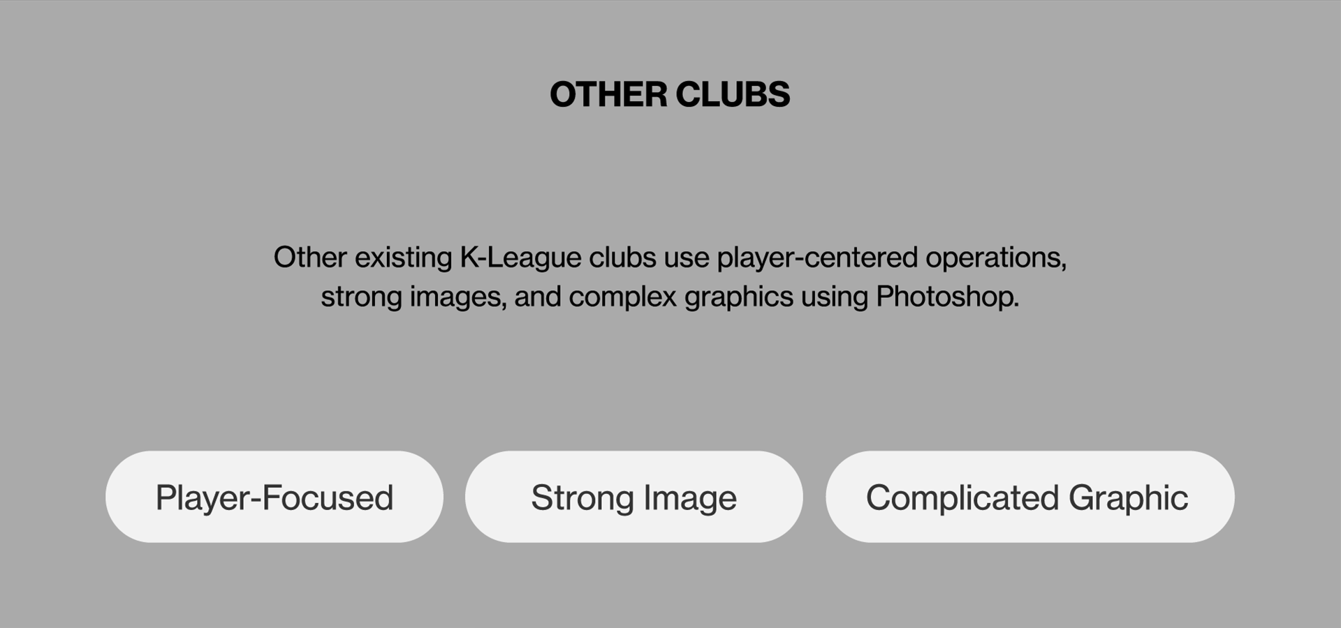
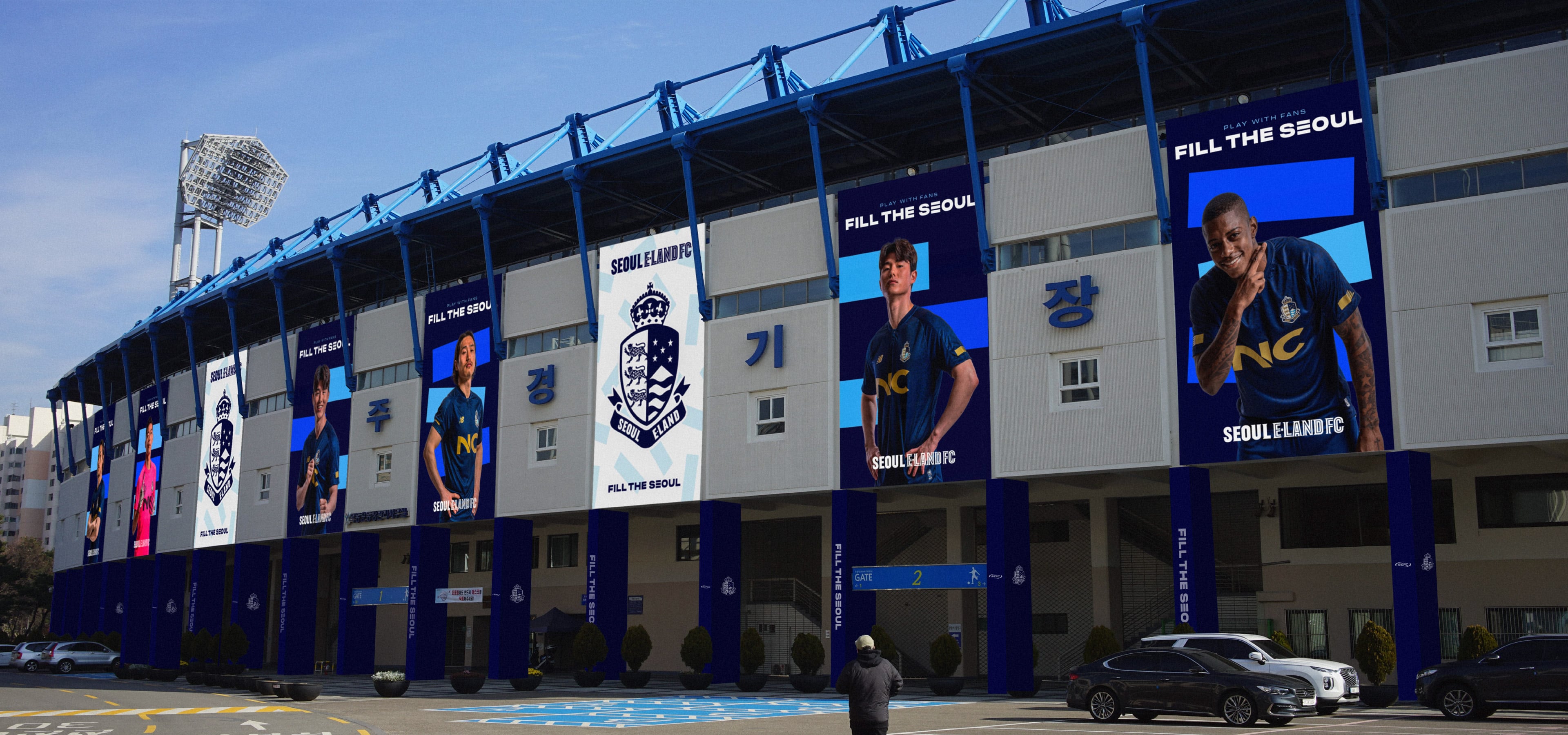
This rebranding project is for Korean K-League soccer team ‘Seoul E LAND FC.’ Beyond its ‘seasonal graphic’ including the design varying on a yearly basis over the past years, the client sought to develop a sustainable brand. Using E for E LAND, we participated in overall brand design including the identity system, graphic system and motion graphic system symbolizing E LAND FC’s distinct value and vision.
Year
2022
Category
Art Direction, Branding, Visual Strategy, Graphic Design System, Motion Design, Applications
Client
Seoul E-Land FC
Award
iF Design Award 2023
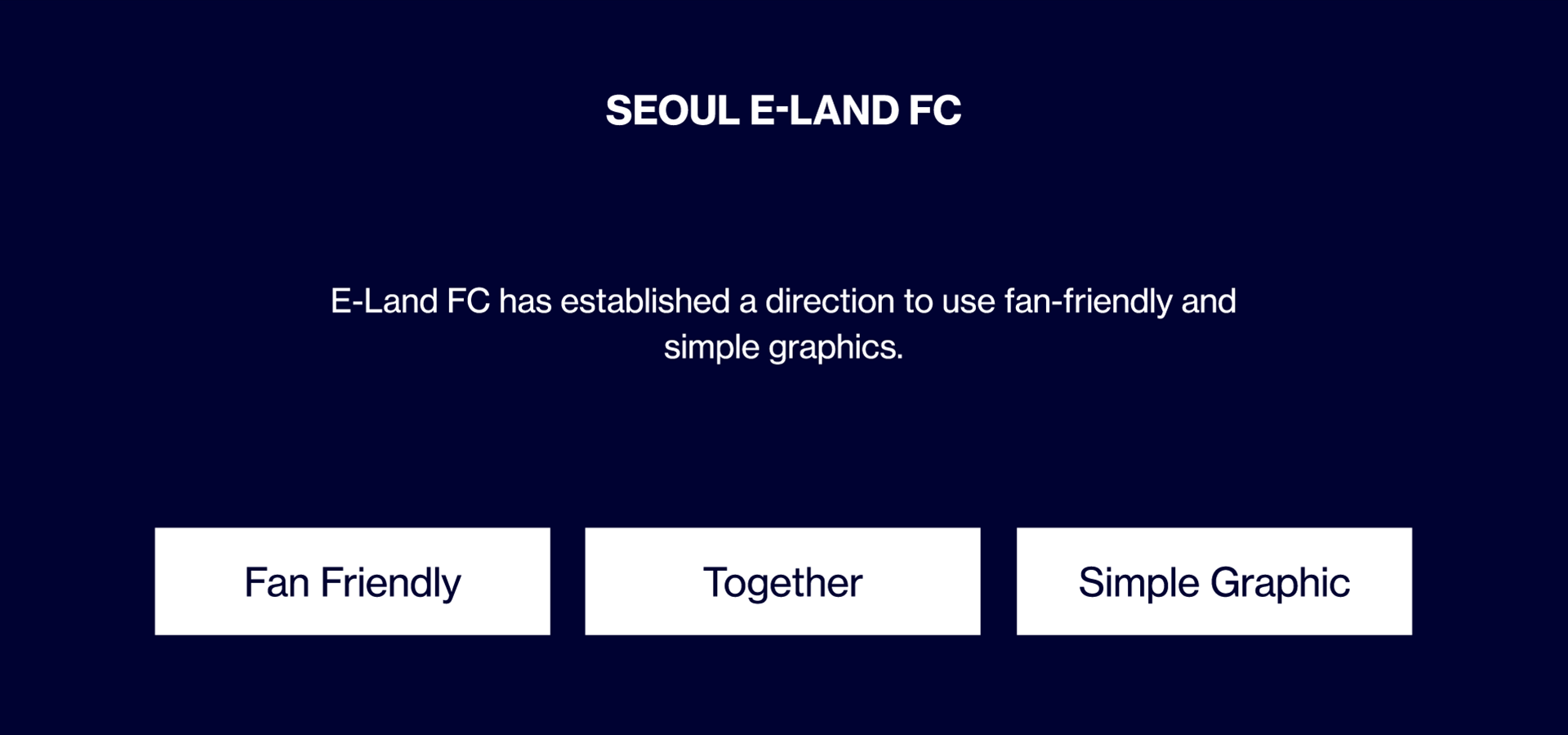

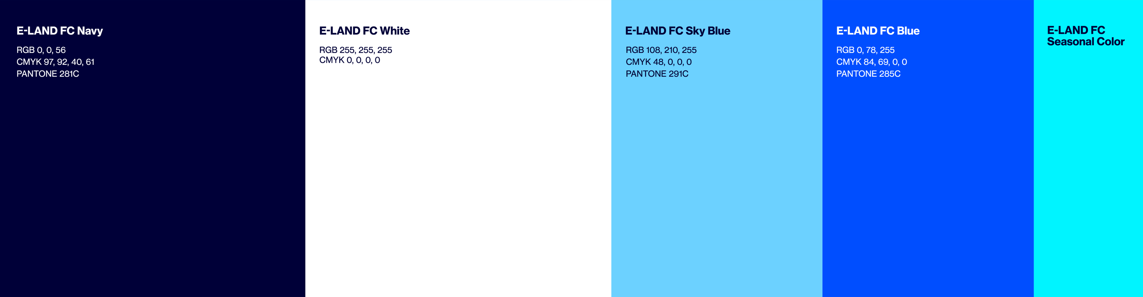
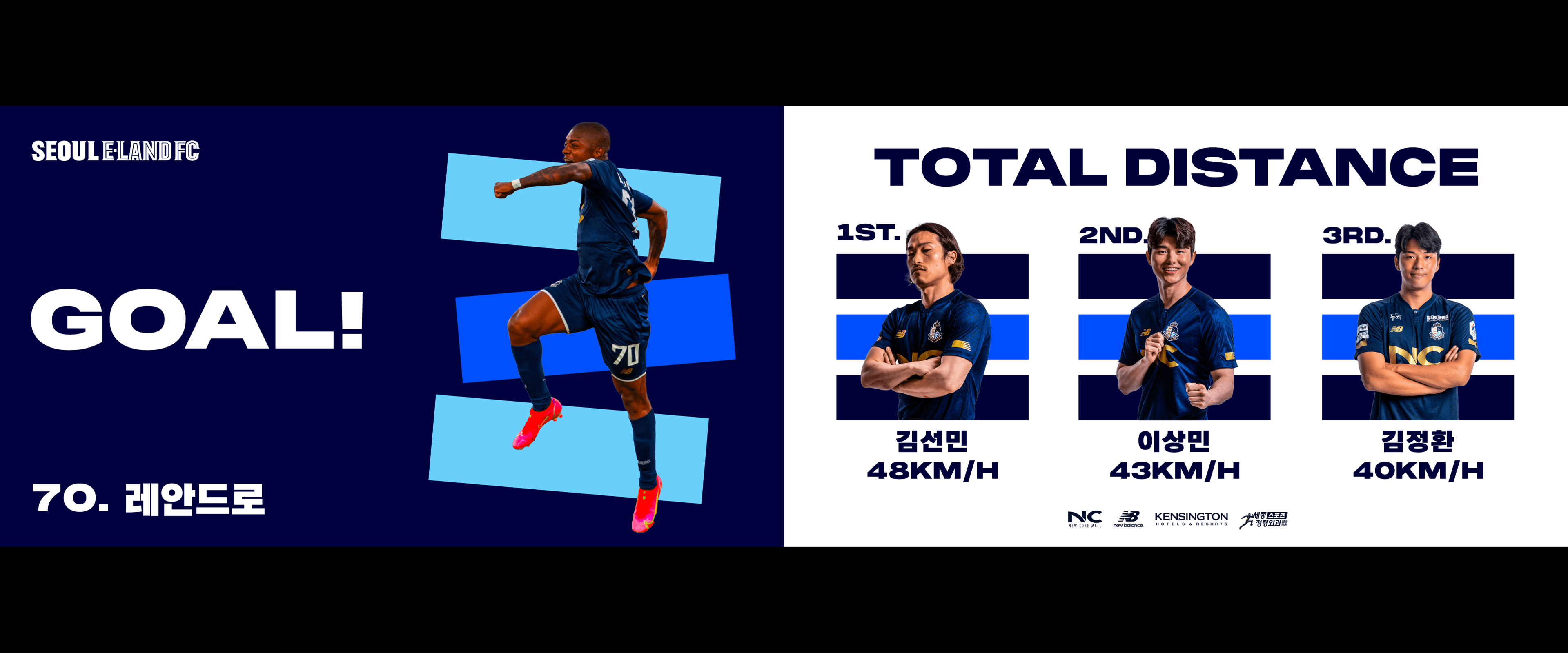
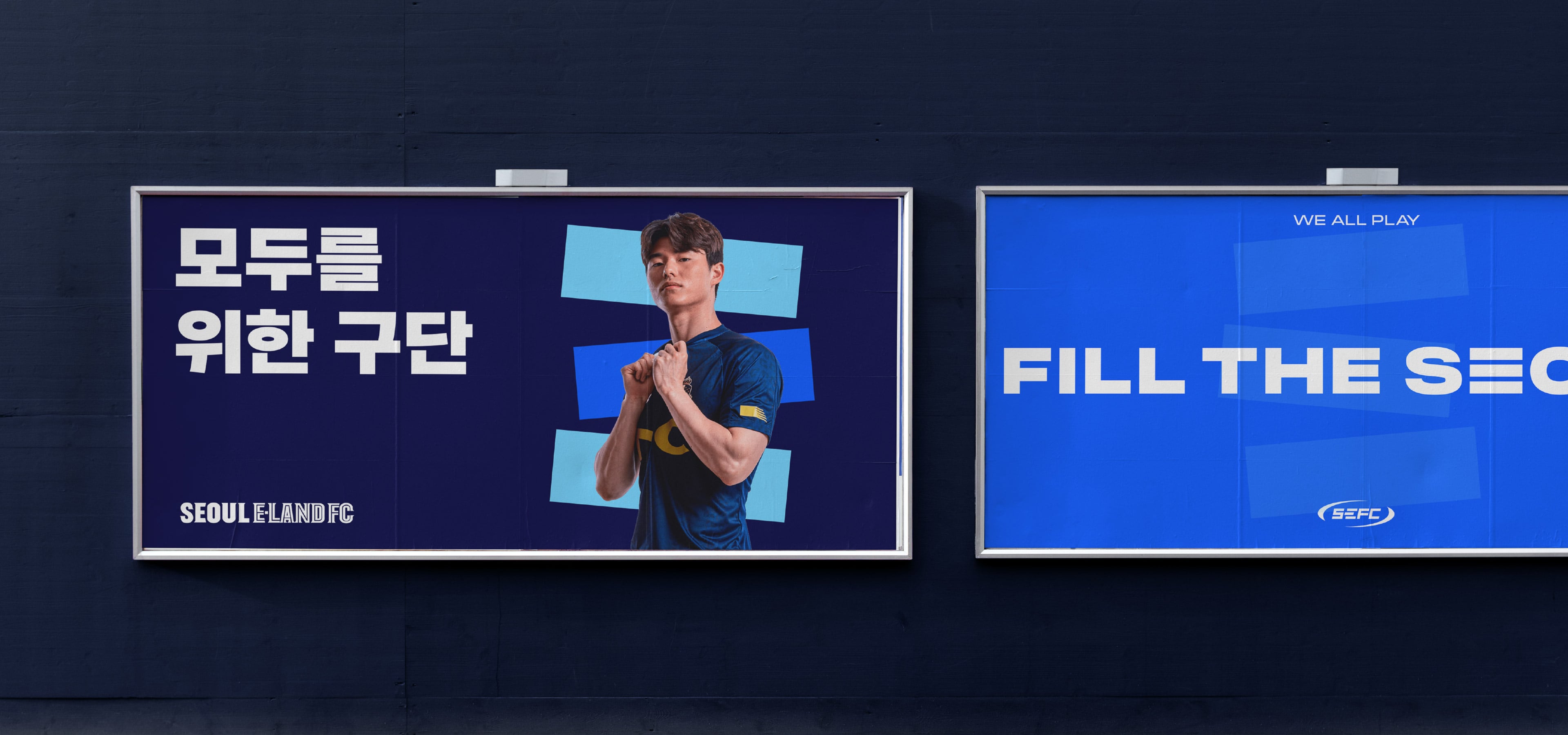
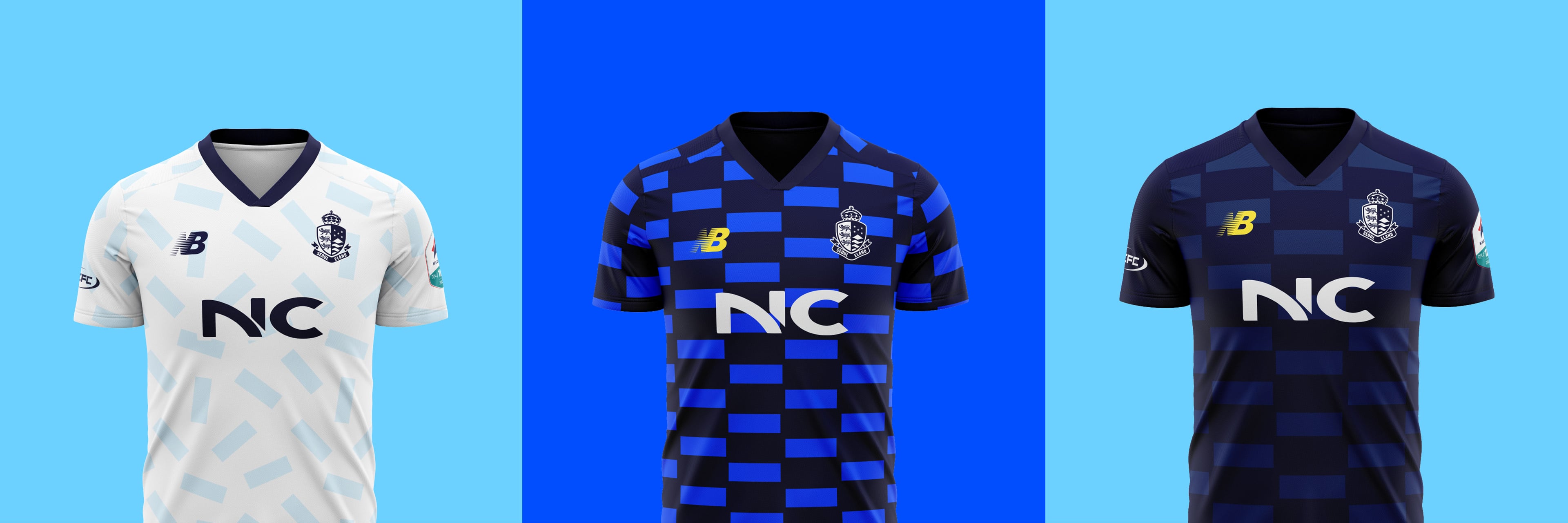
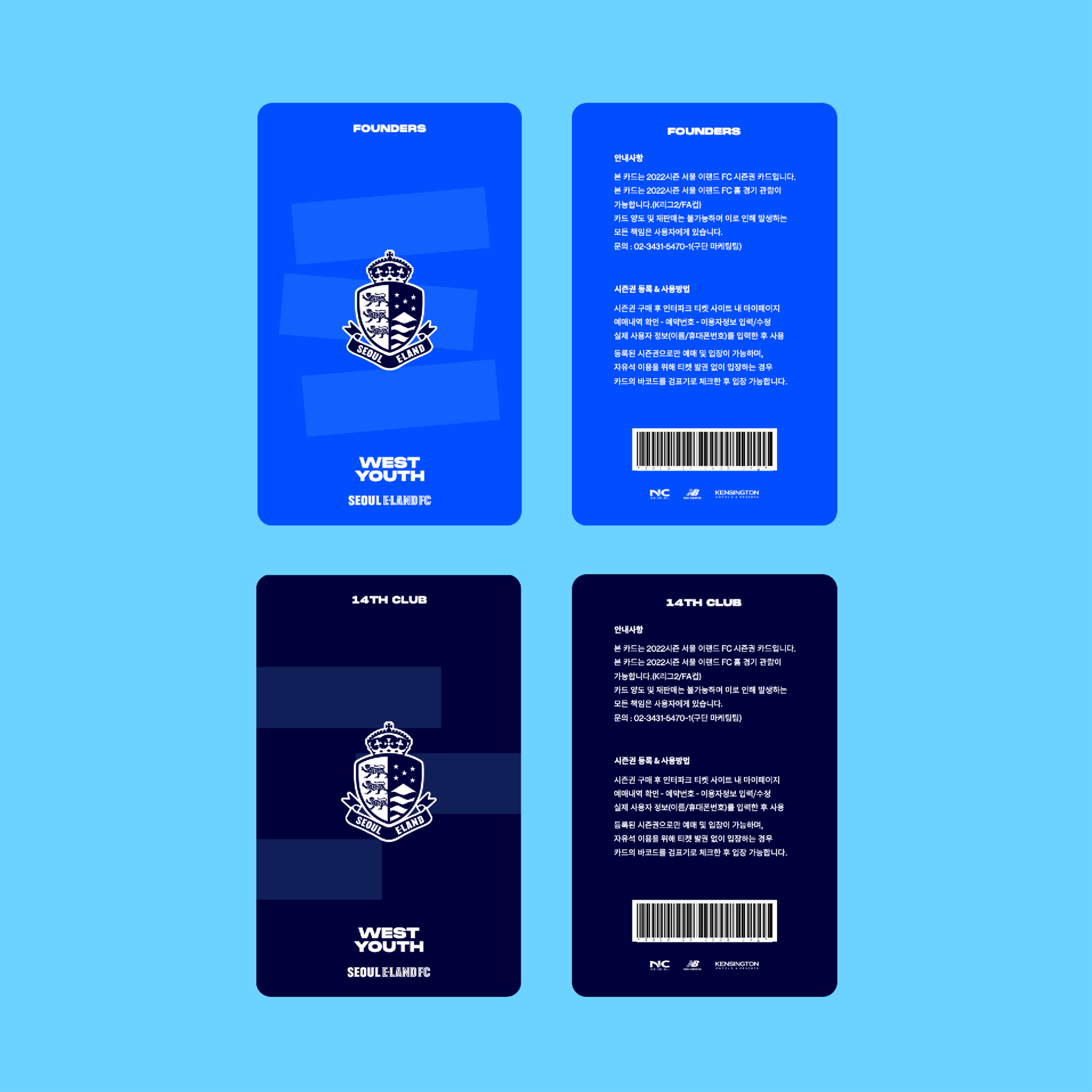
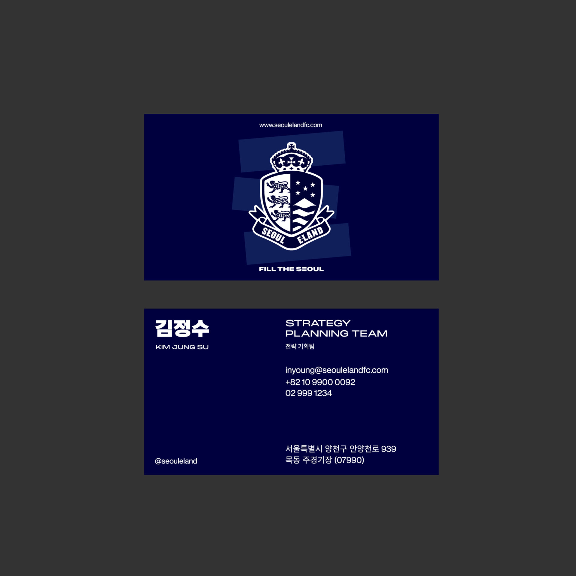
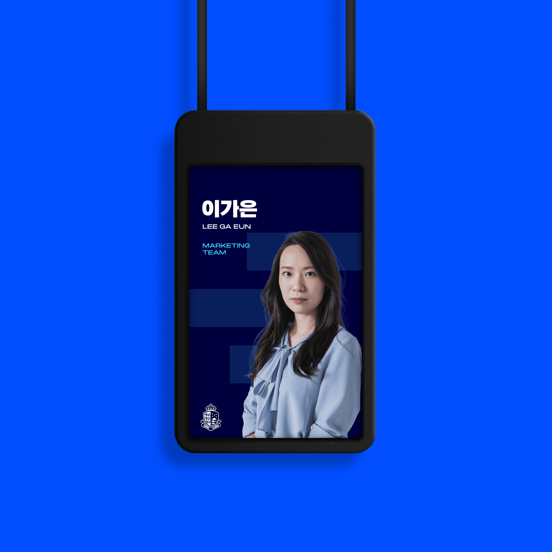
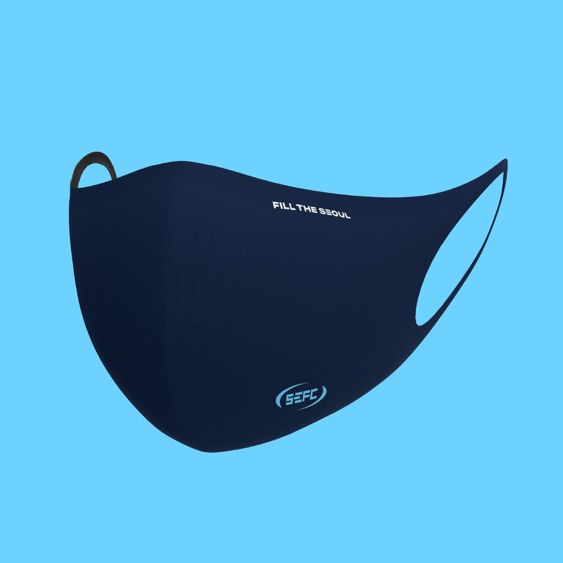
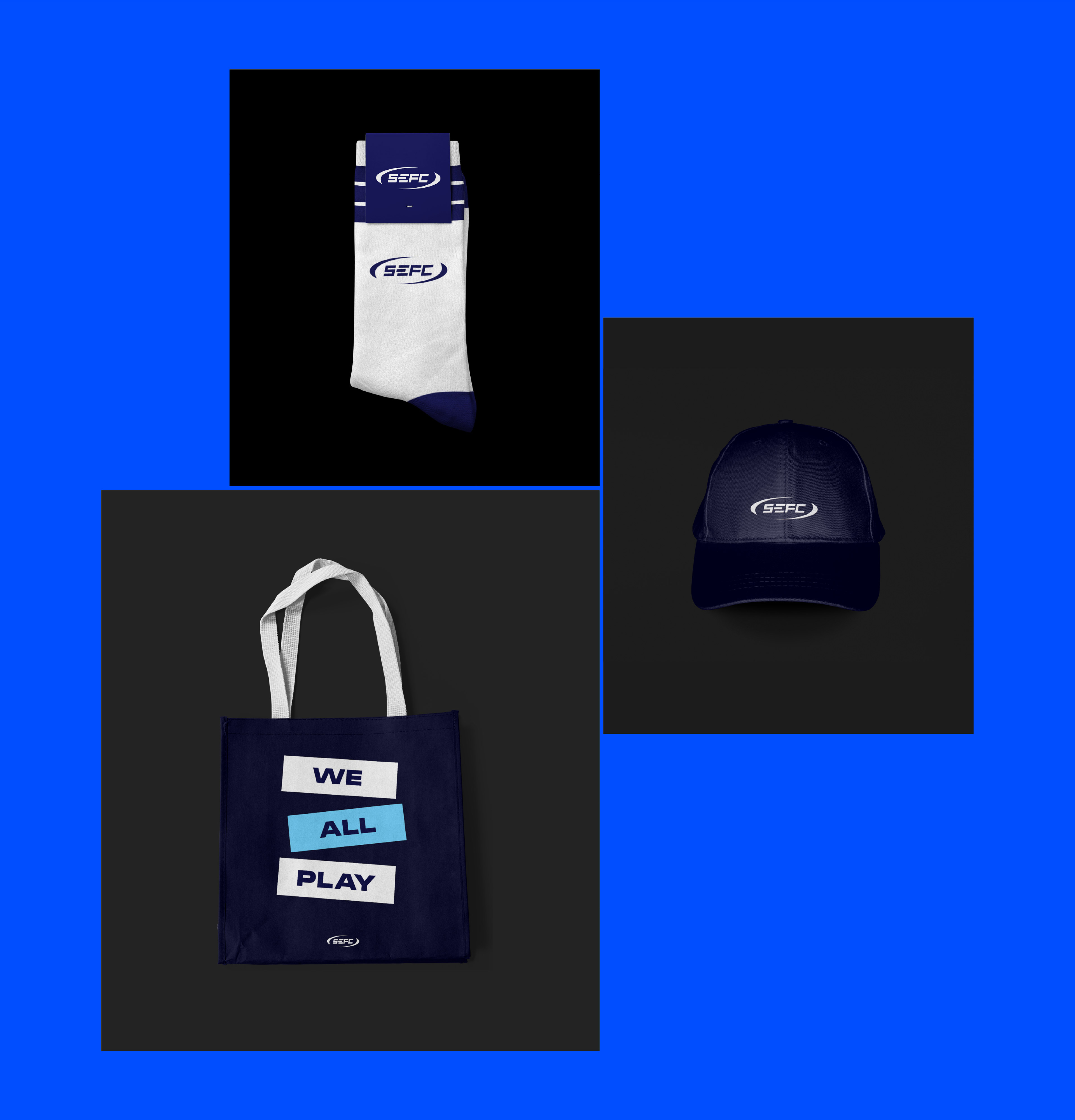
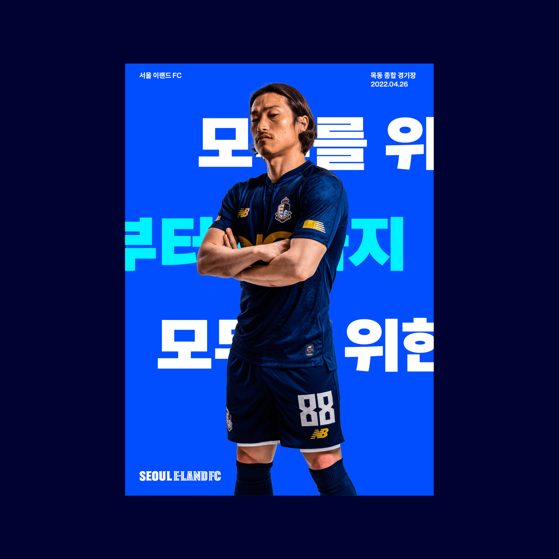
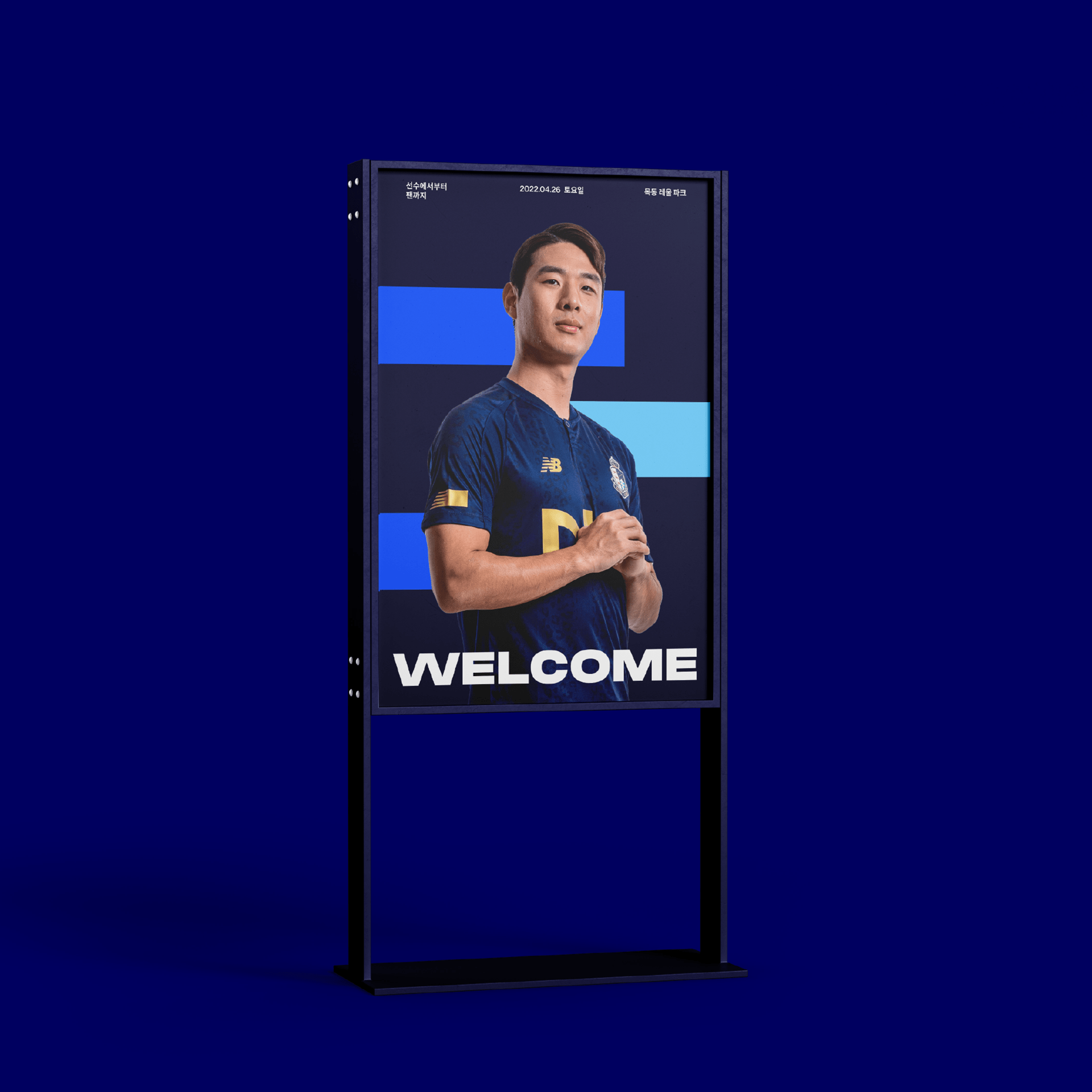
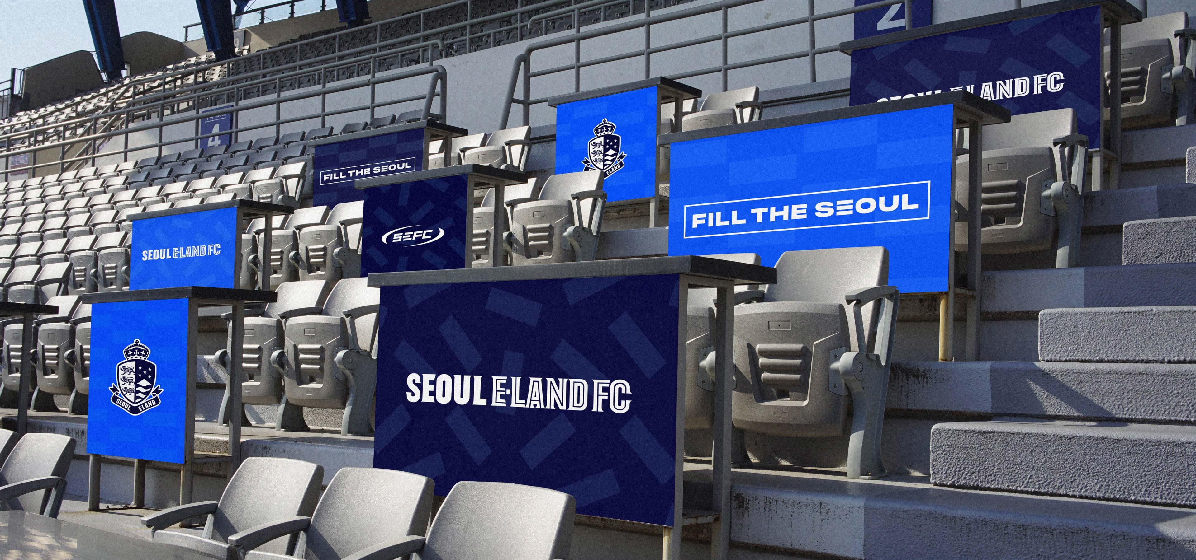
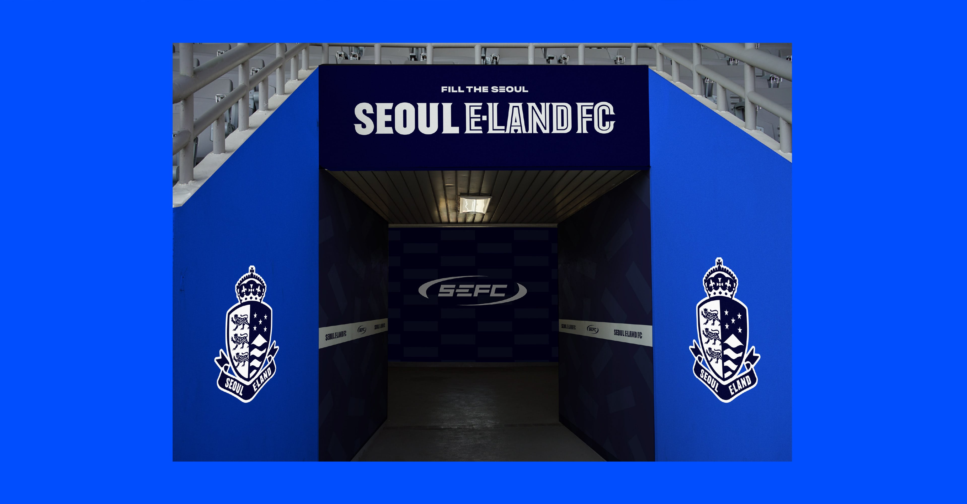
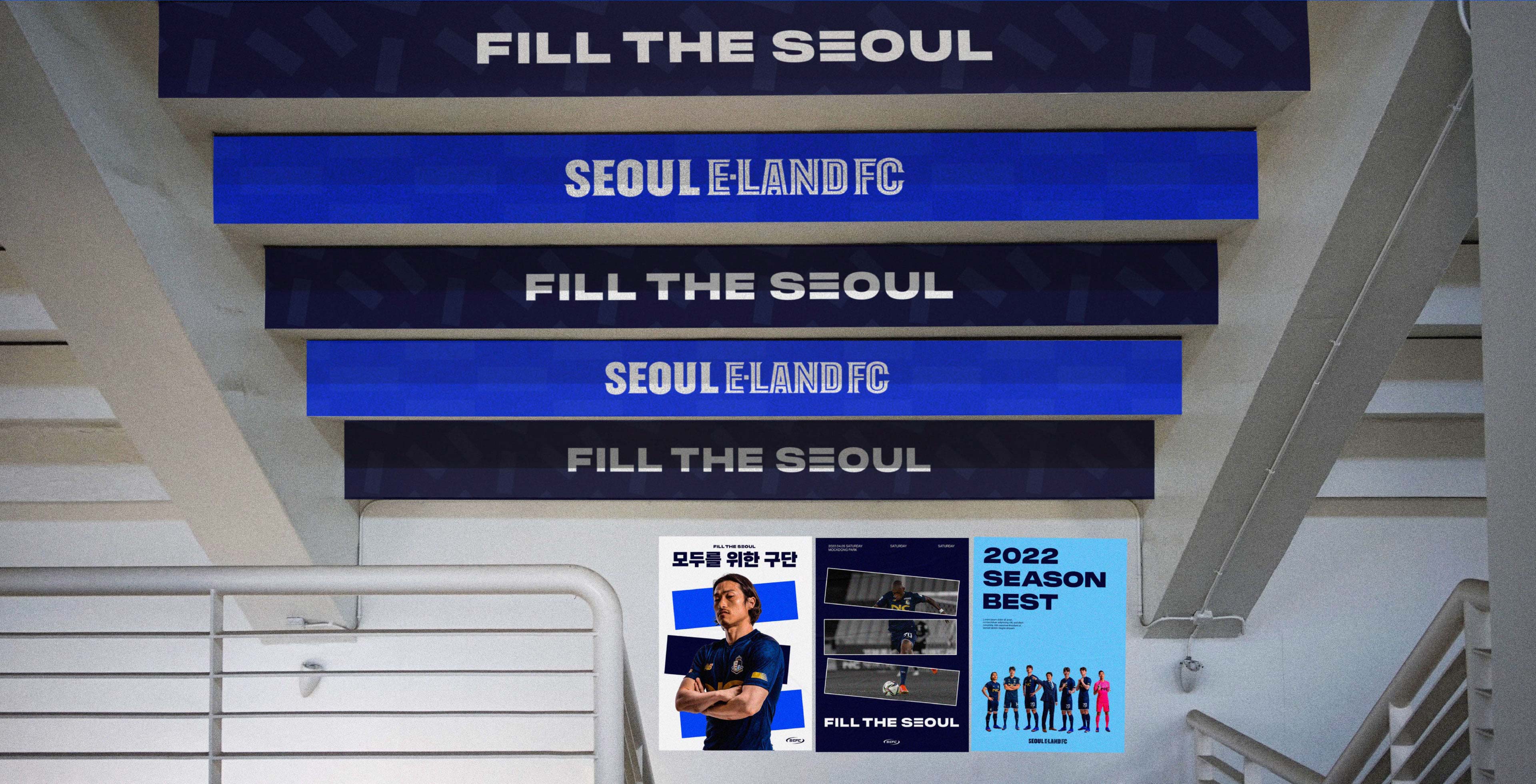
We used E to follow the parent company’s philosophy of ‘EVERY ONE’S LAND’, and derived three squares from E, symbolizing ‘players-connection-fans,’ respectively, as E-Land FC’s unique visual motif and the core penetrating all visual objects of E-Land FC. Also, we developed an E-based ‘sub-symbol’ to make the versatile symbol system and adjusted the visual system including fonts and colors to create a younger and brighter image.
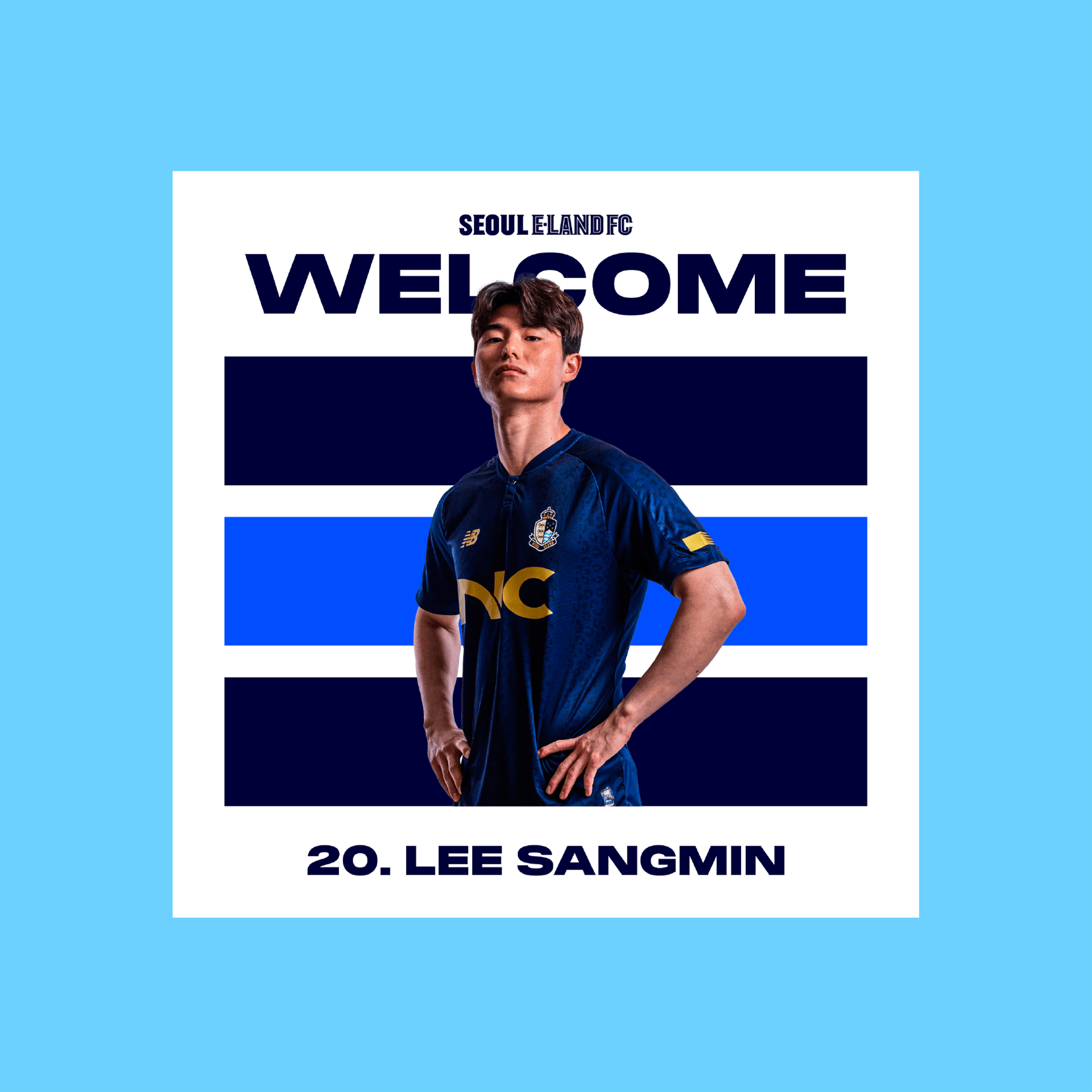
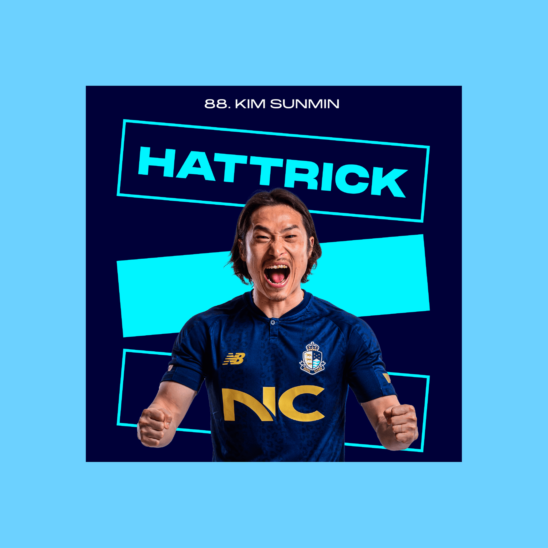
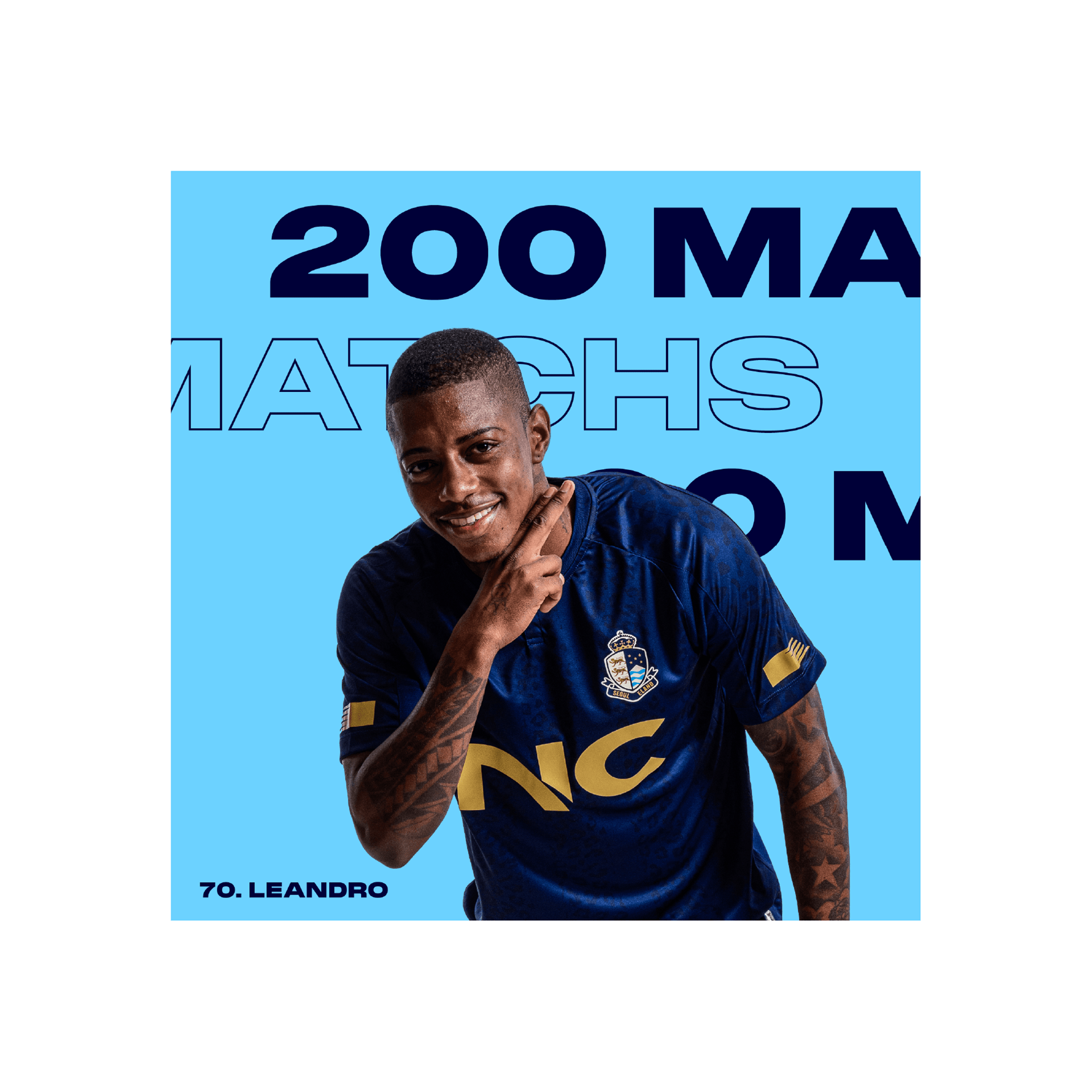
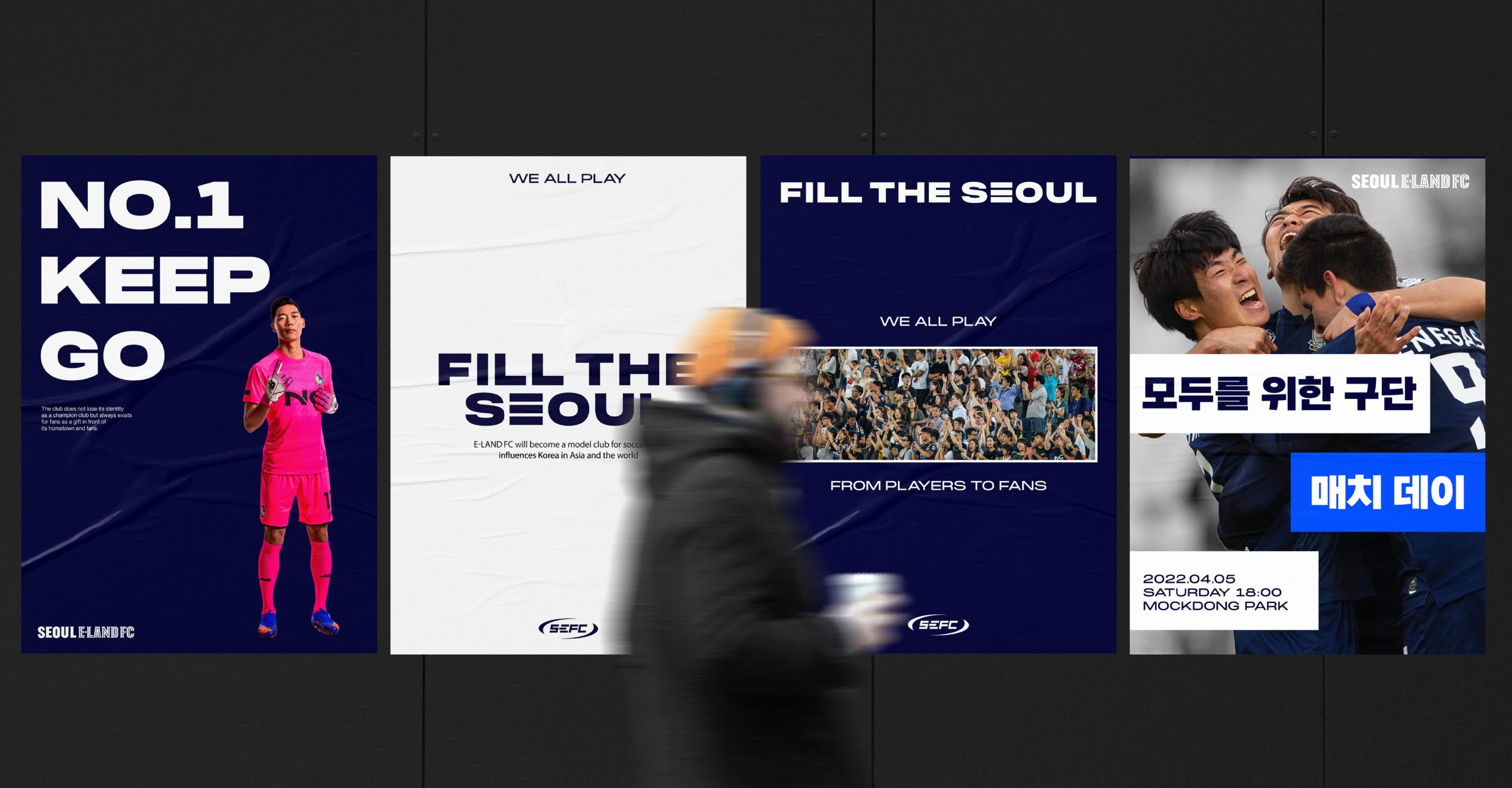
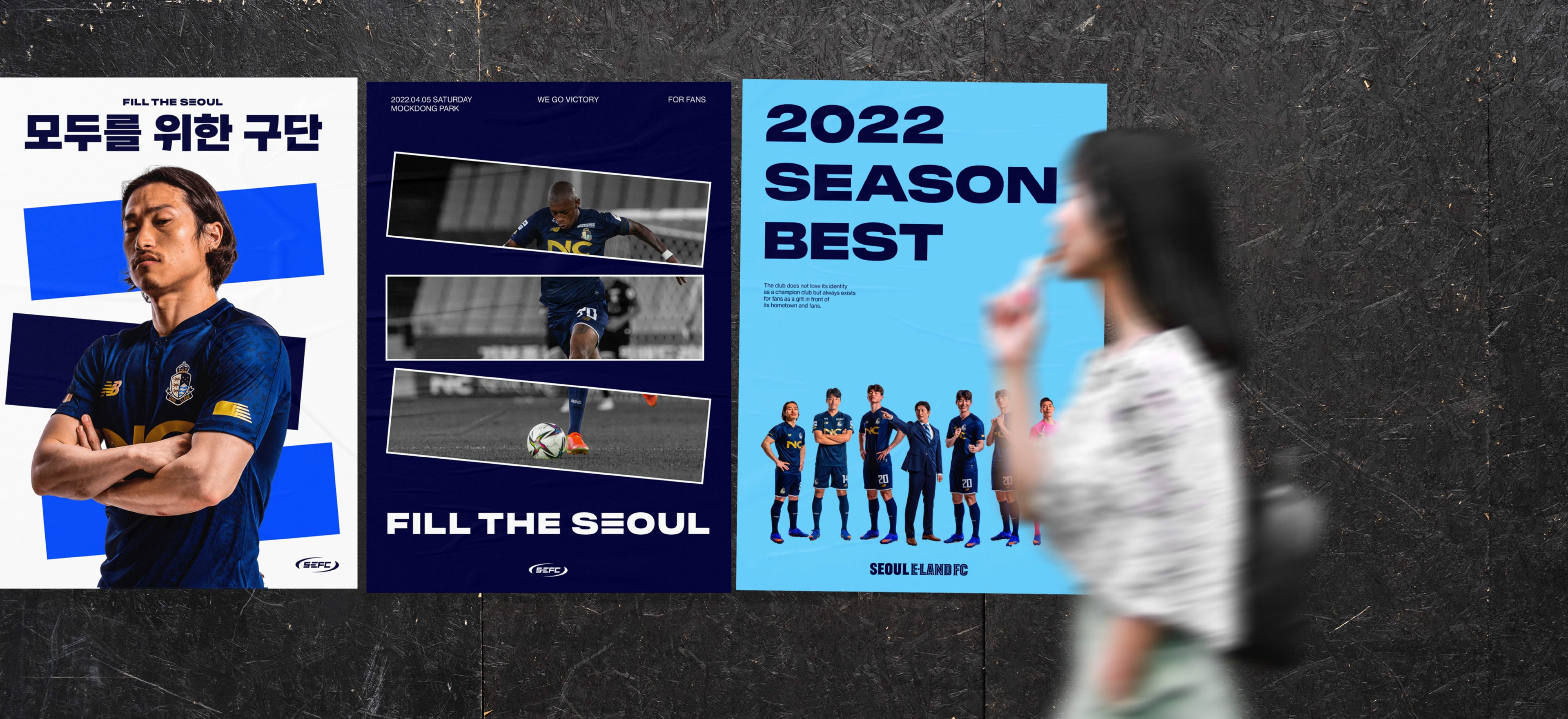
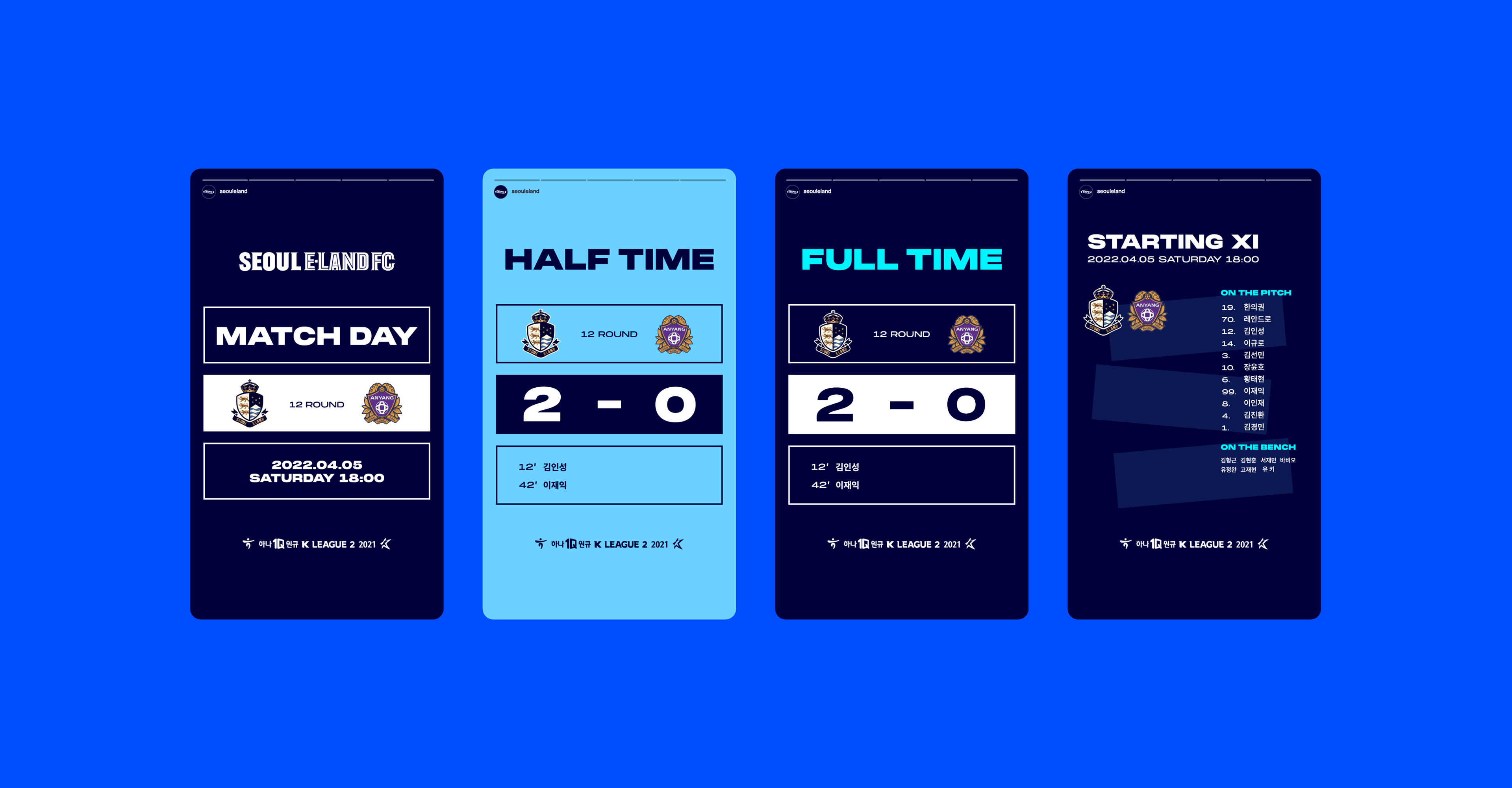
The graphic system using E is scalable and dynamic. We developed 3 systems that are widely applicable to visual objects in the stadium (banners, placards, and posters), media for interactions with fans (goods and SNS), and screen media (TV and LED) so that E-Land FC’s new philosophy and vision can be stamped on people’s minds.


BRENDEN
Creative Direction / Do-eui Lee
Project Management / Wook Jung
Art Direction / Doeui Lee, Jaewan Yu
Design / Sangmin Lee, Jaewan Yu
Creative Partner / Hwee
Client
Seoul E-land FC
Award
iF Design Award Winner 2023