Seoul City
Brand Identity Design
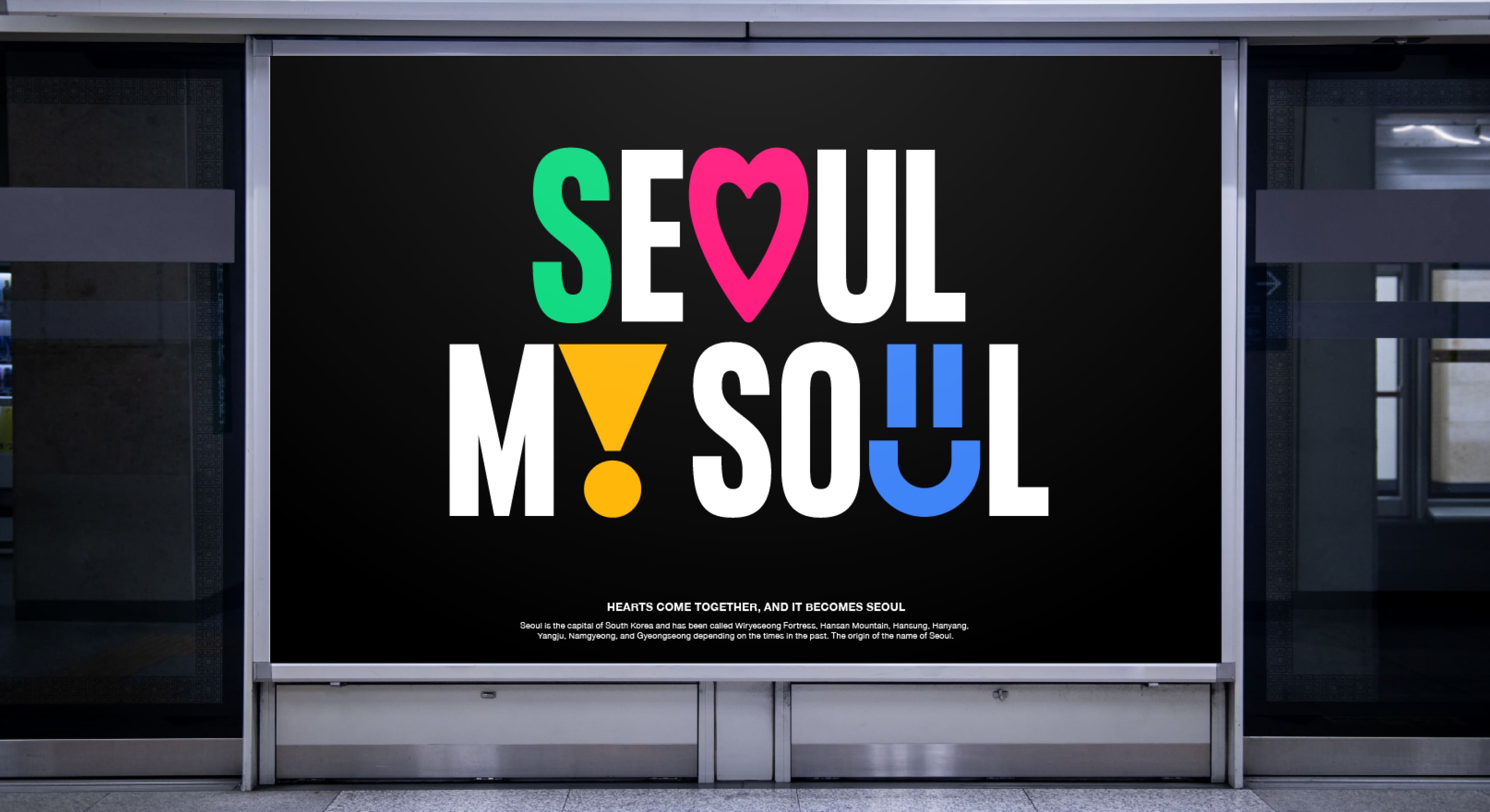
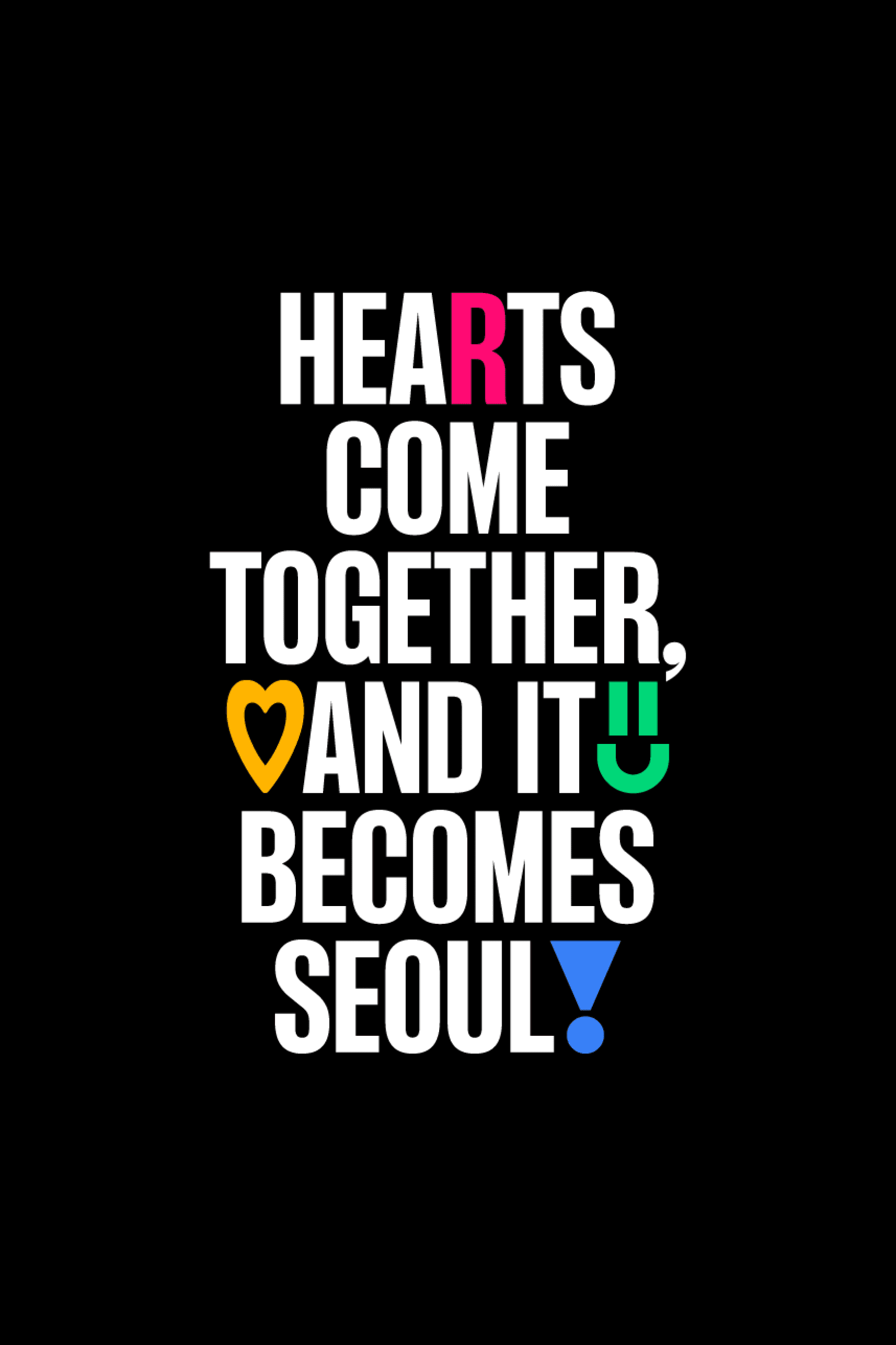
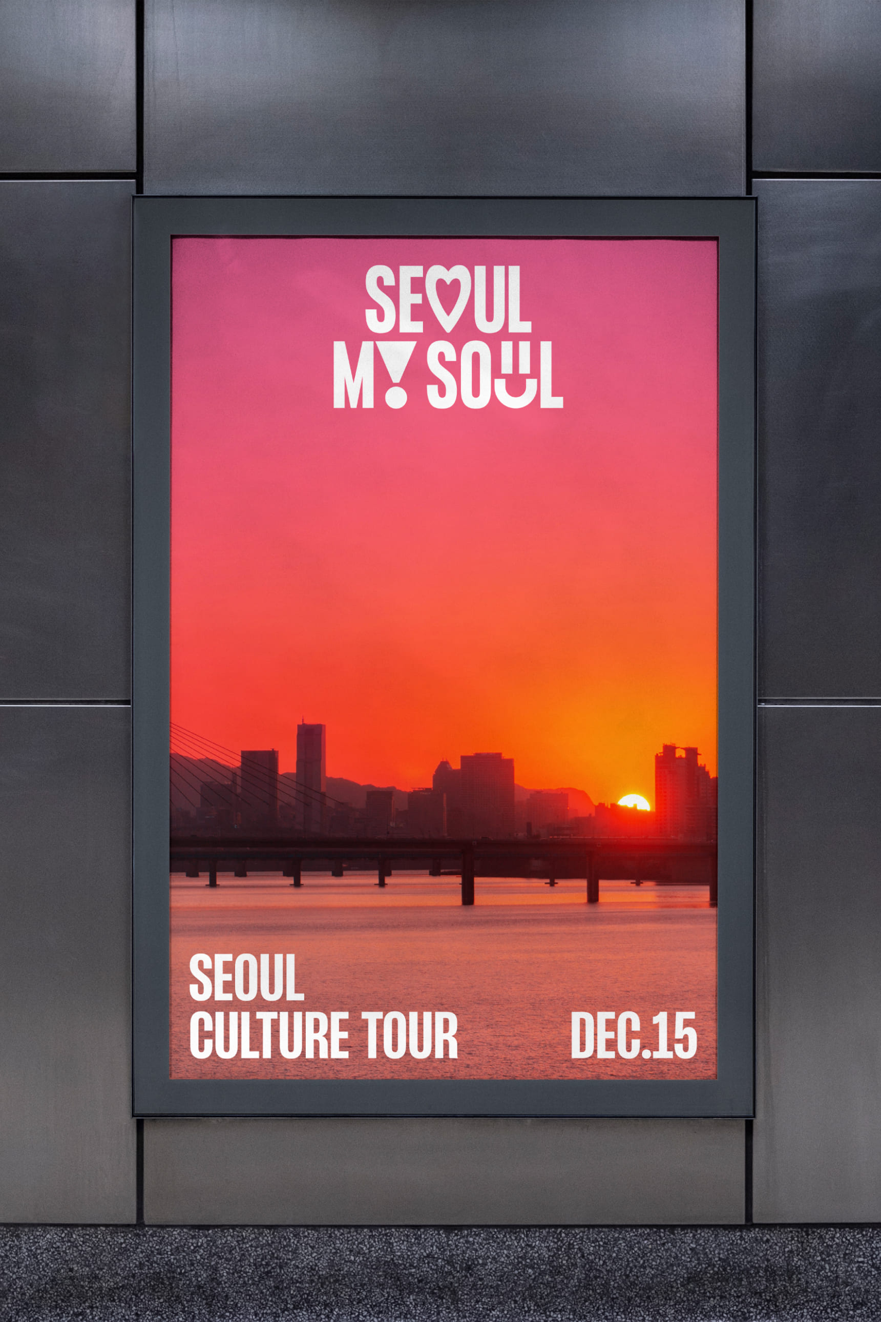
The essence of Seoul as a brand is encapsulated in the lifestyles, images, and unique moods of the people who live in Seoul. Therefore, we developed a new slogan with the keyword "Seoulites' Hearts" in mind. Our primary goal was to design something that goes beyond mere visual appeal and resonates with people of all ages and backgrounds, making it easy for everyone to relate to and understand.
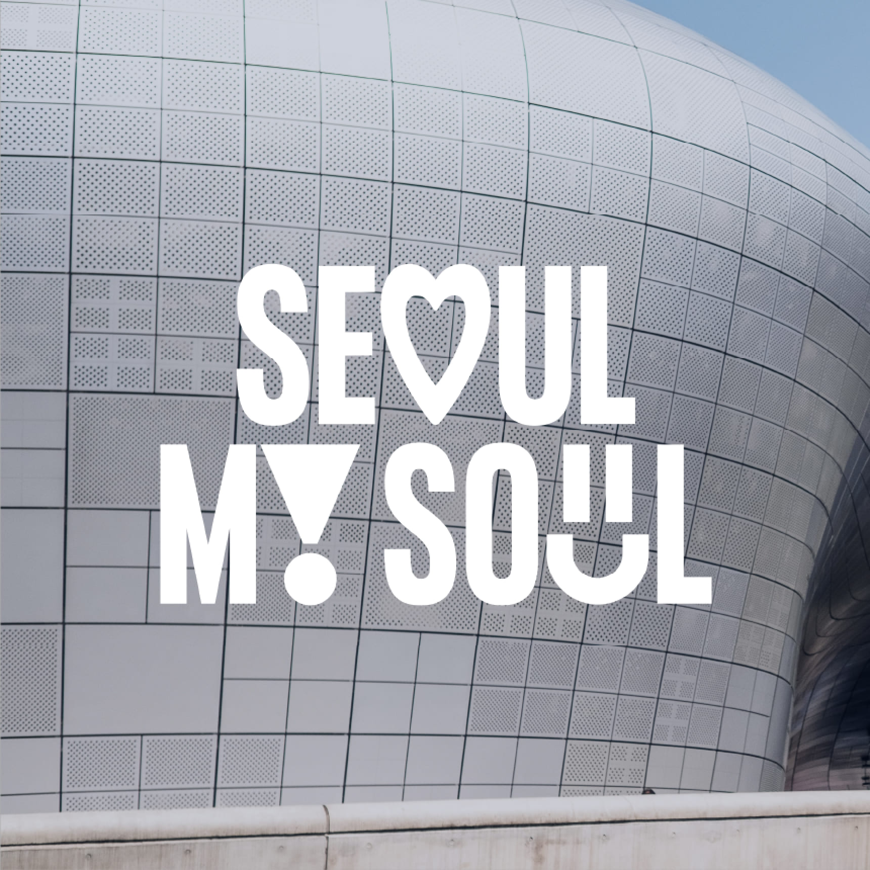
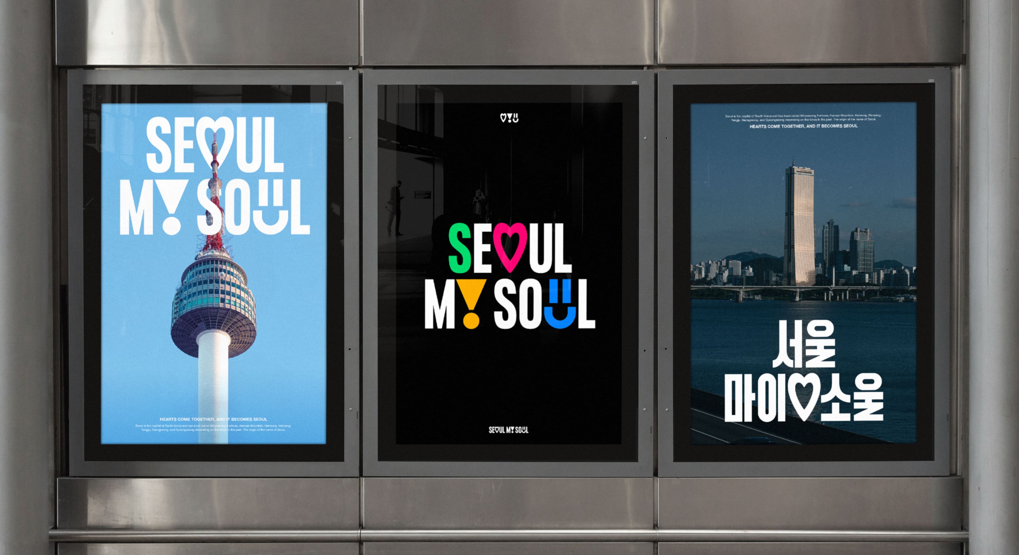
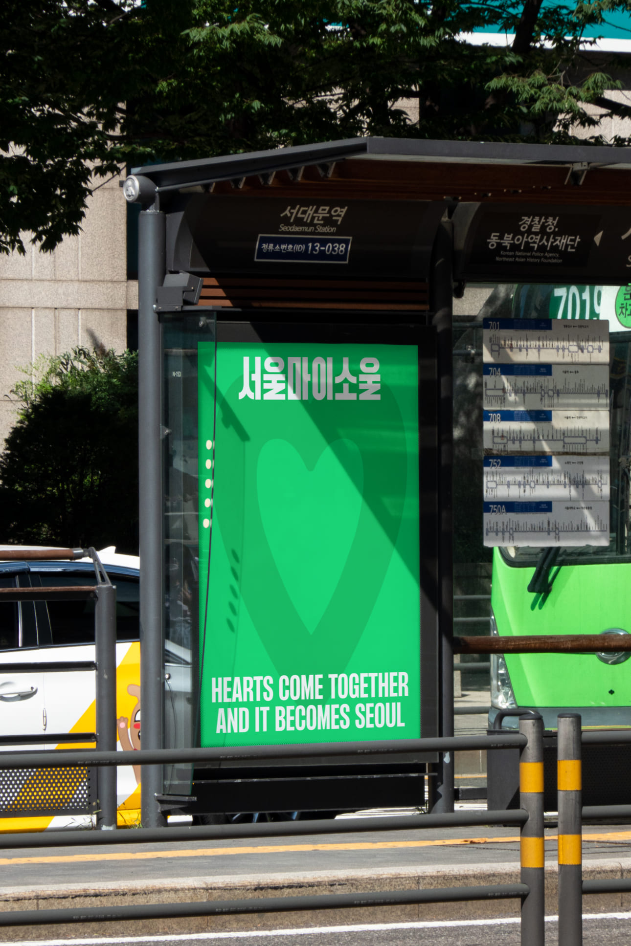
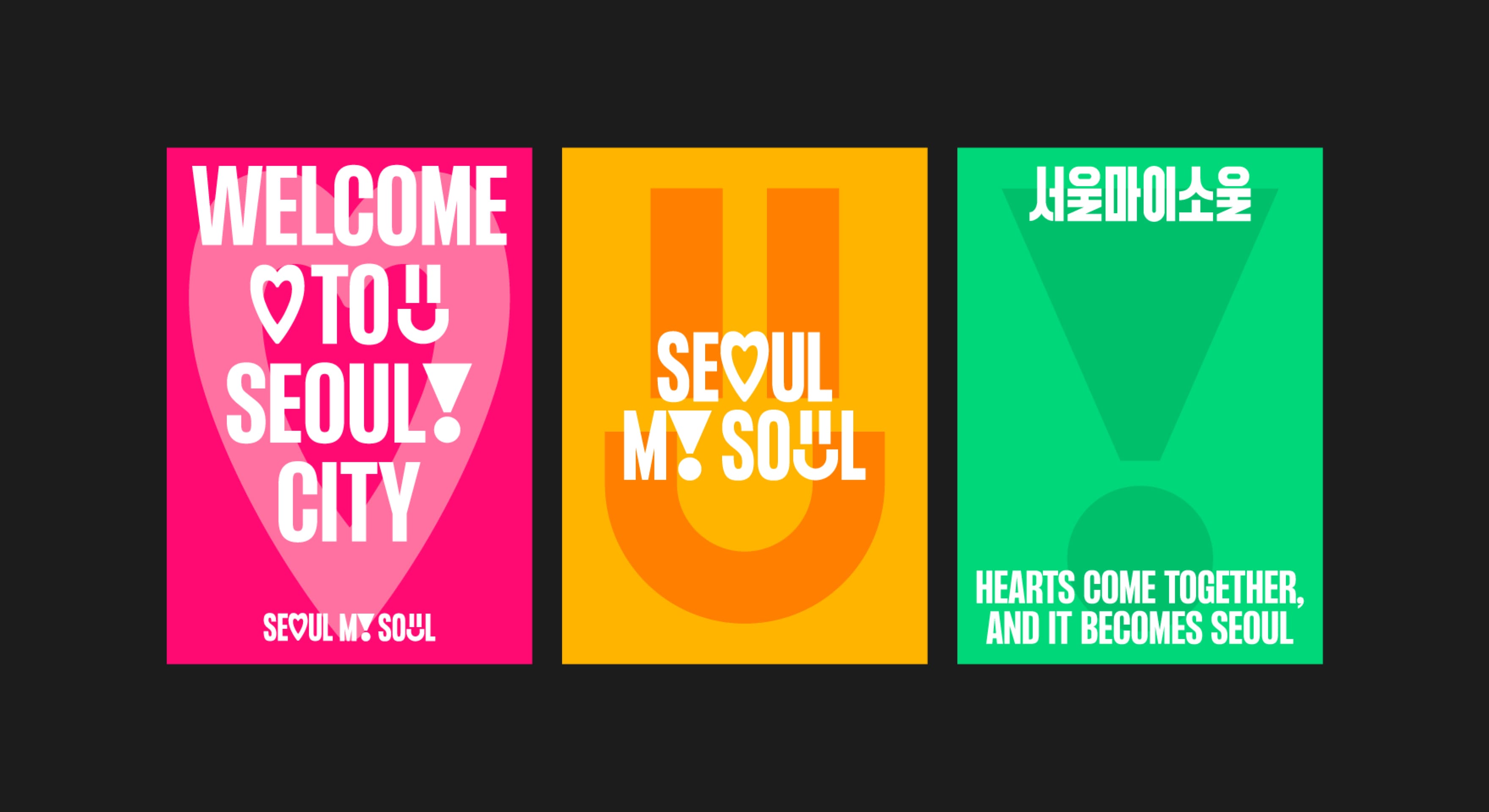
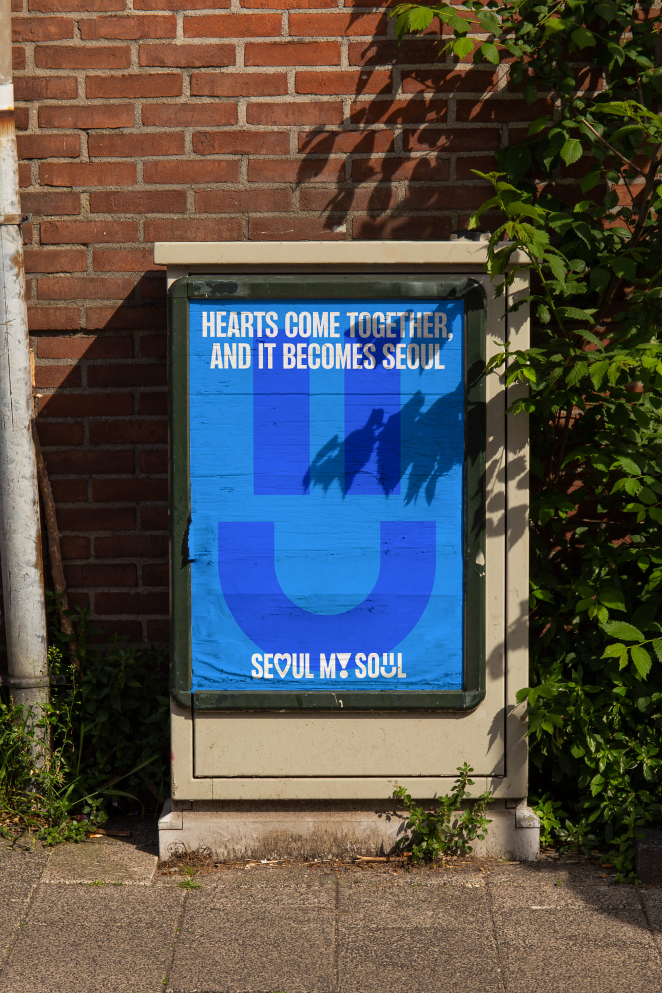
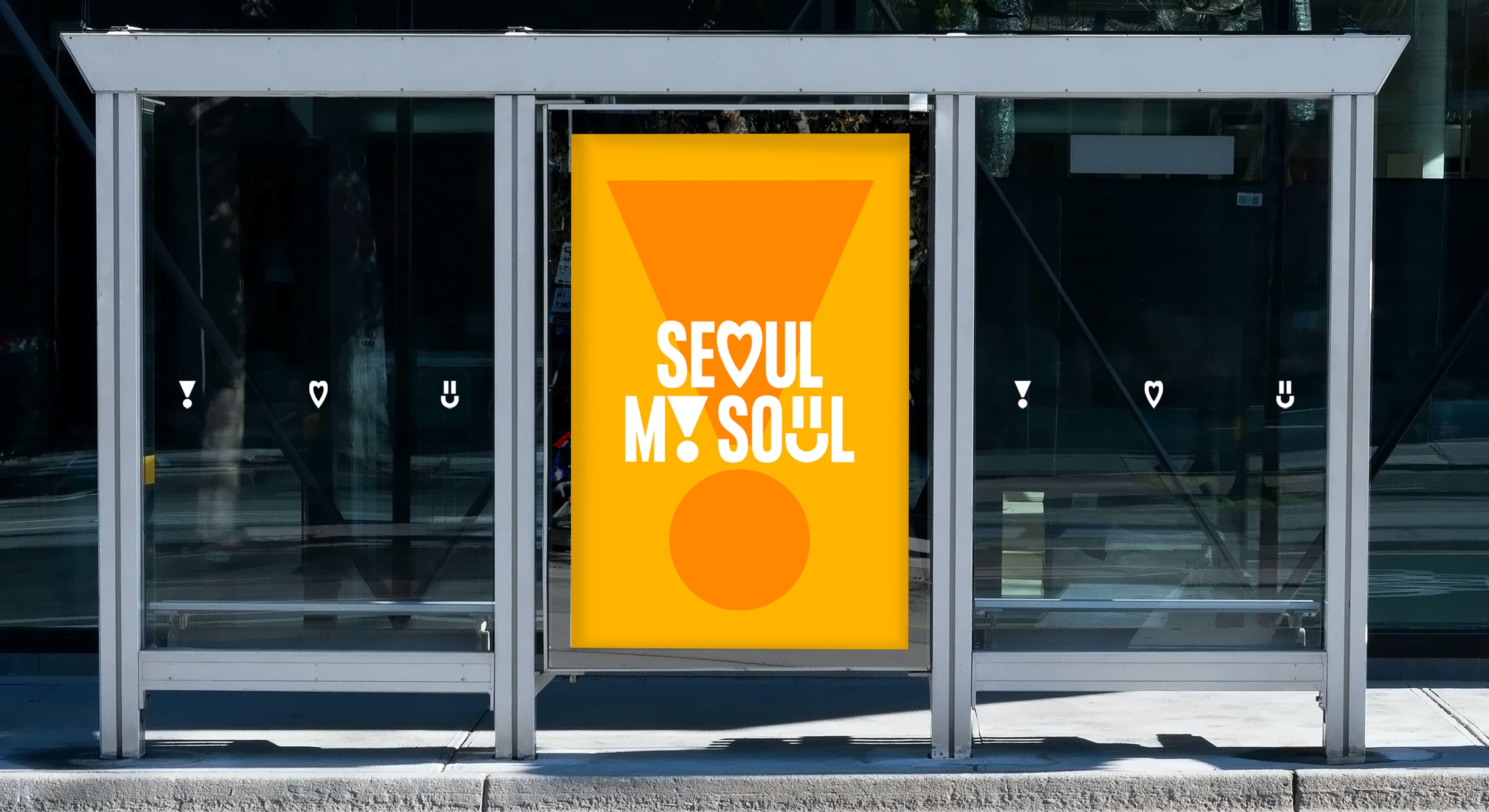
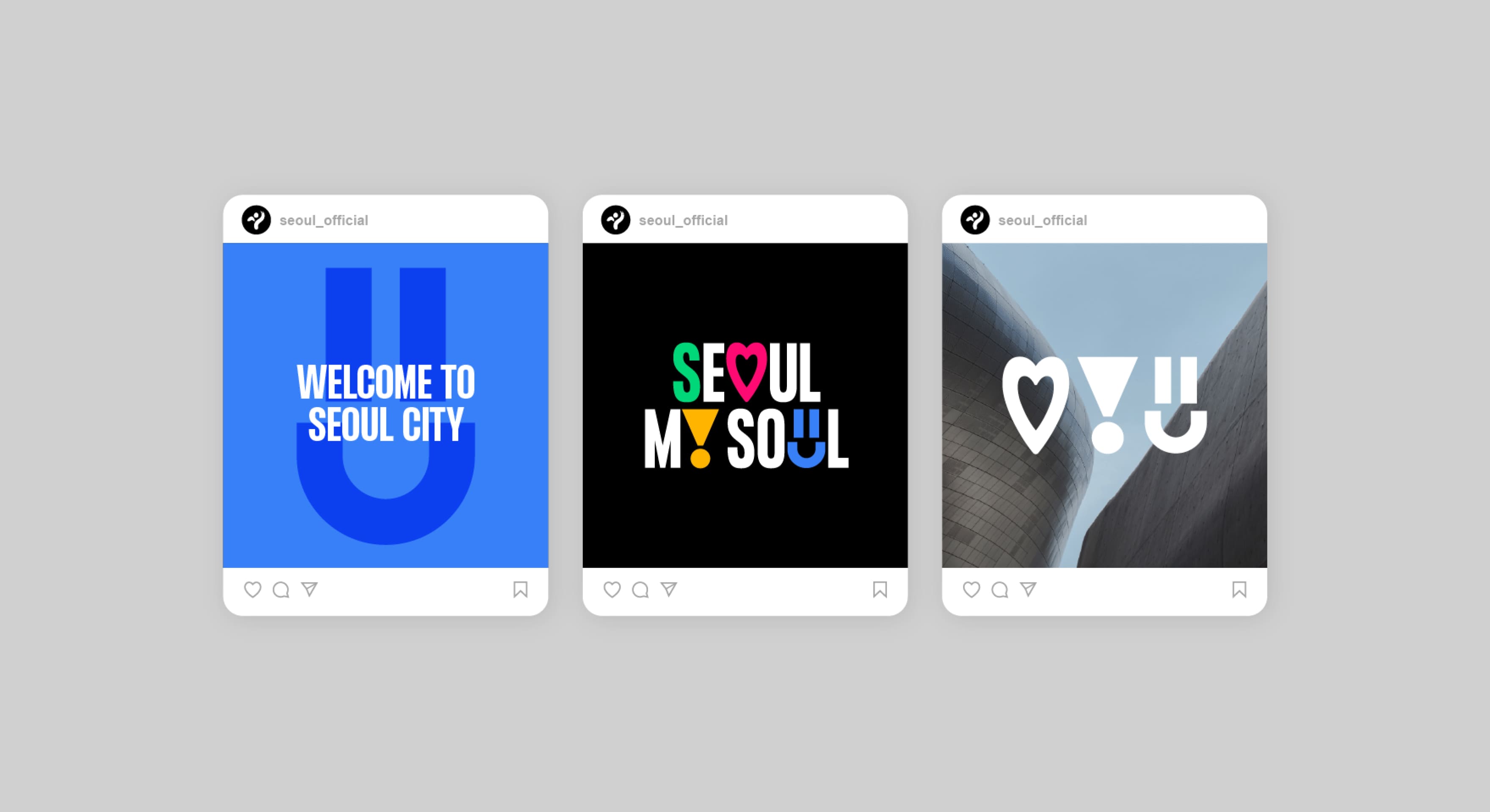
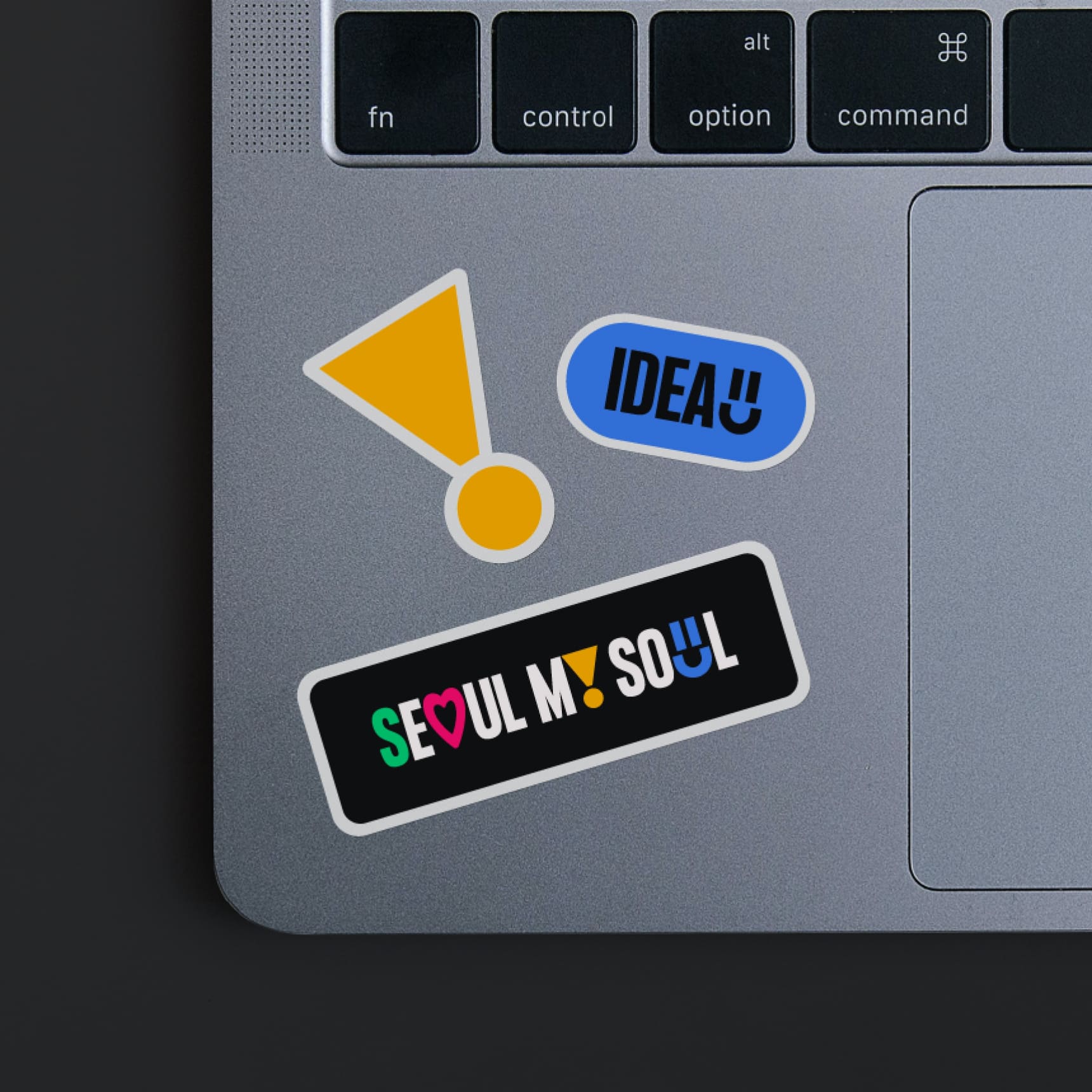
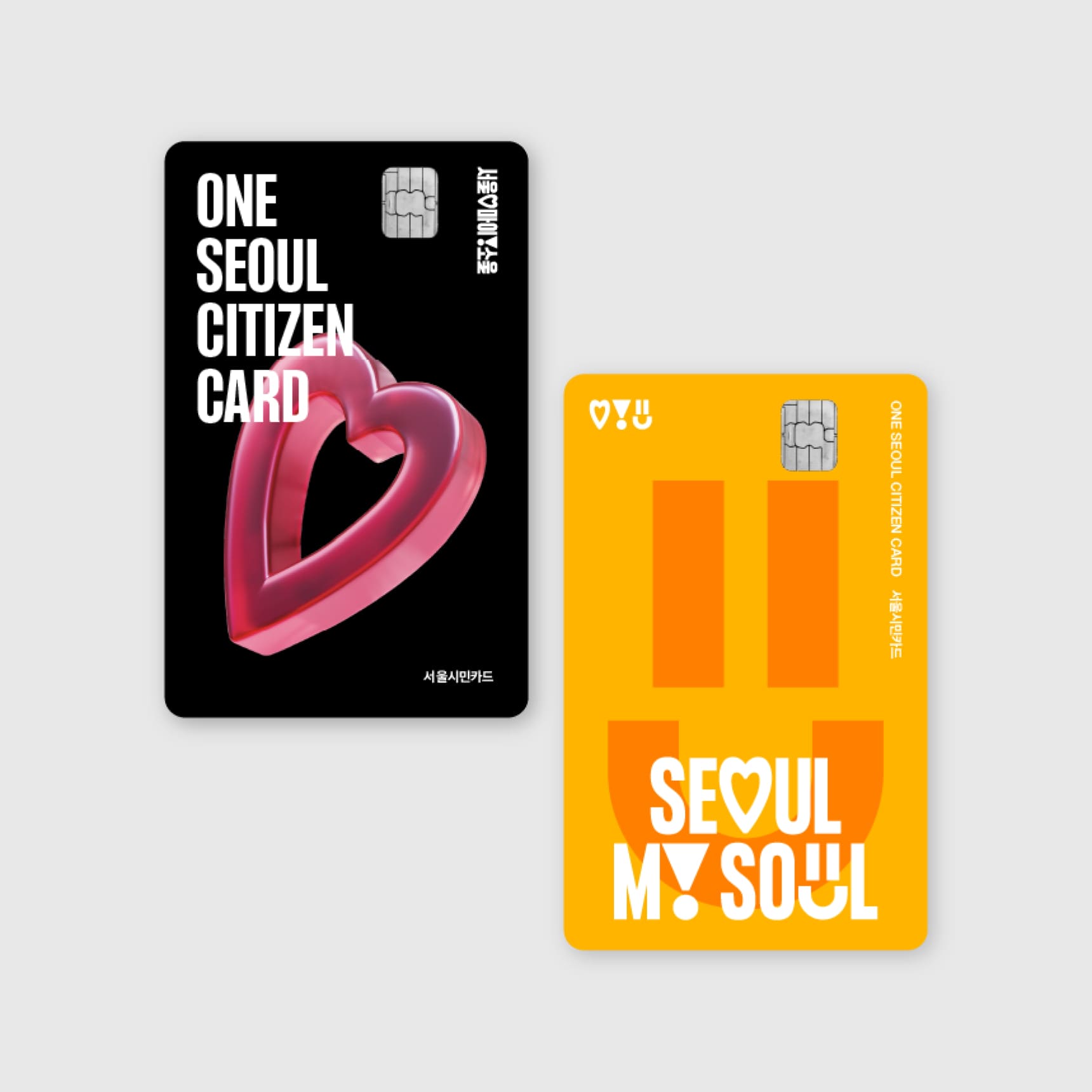
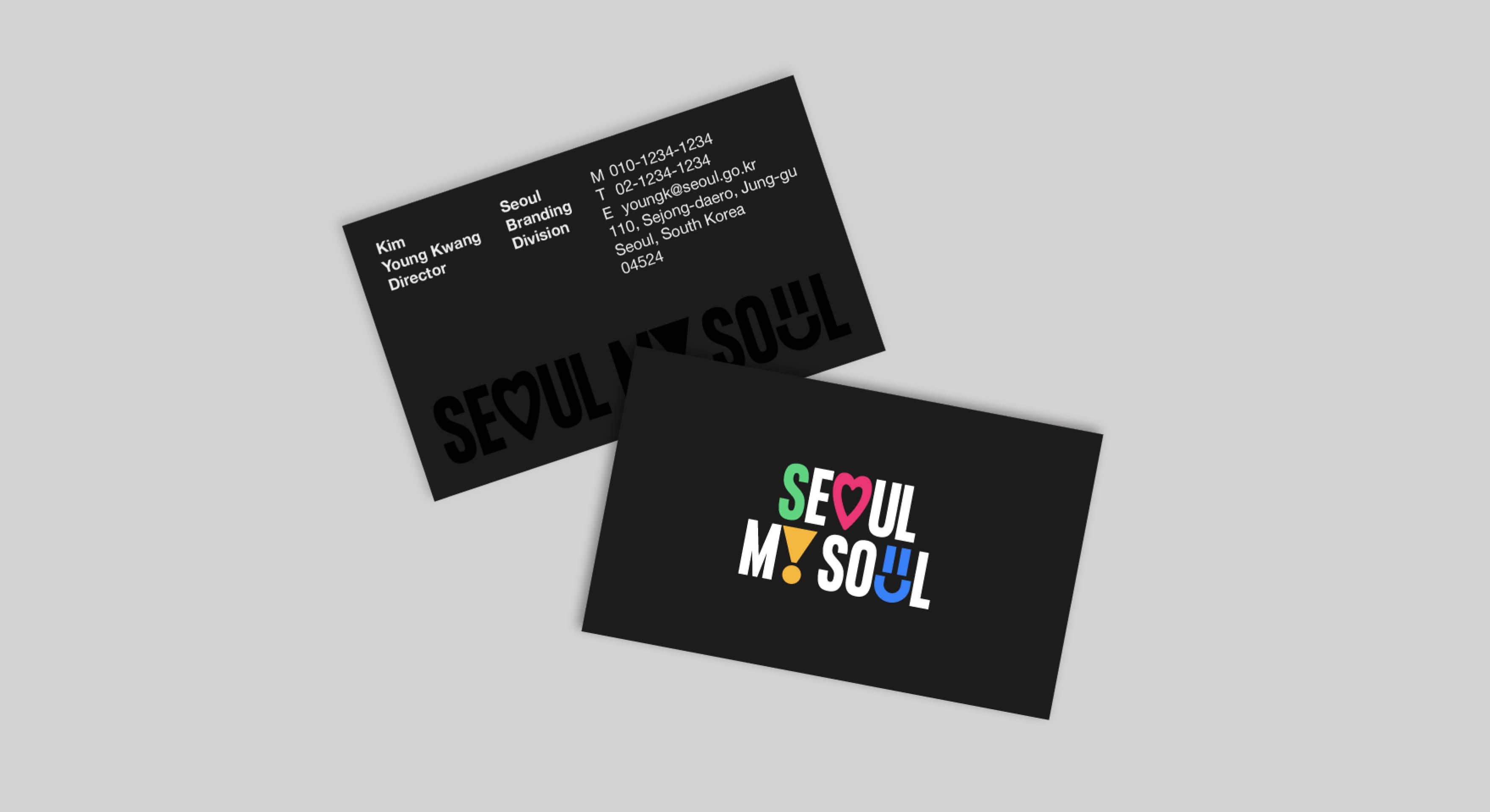
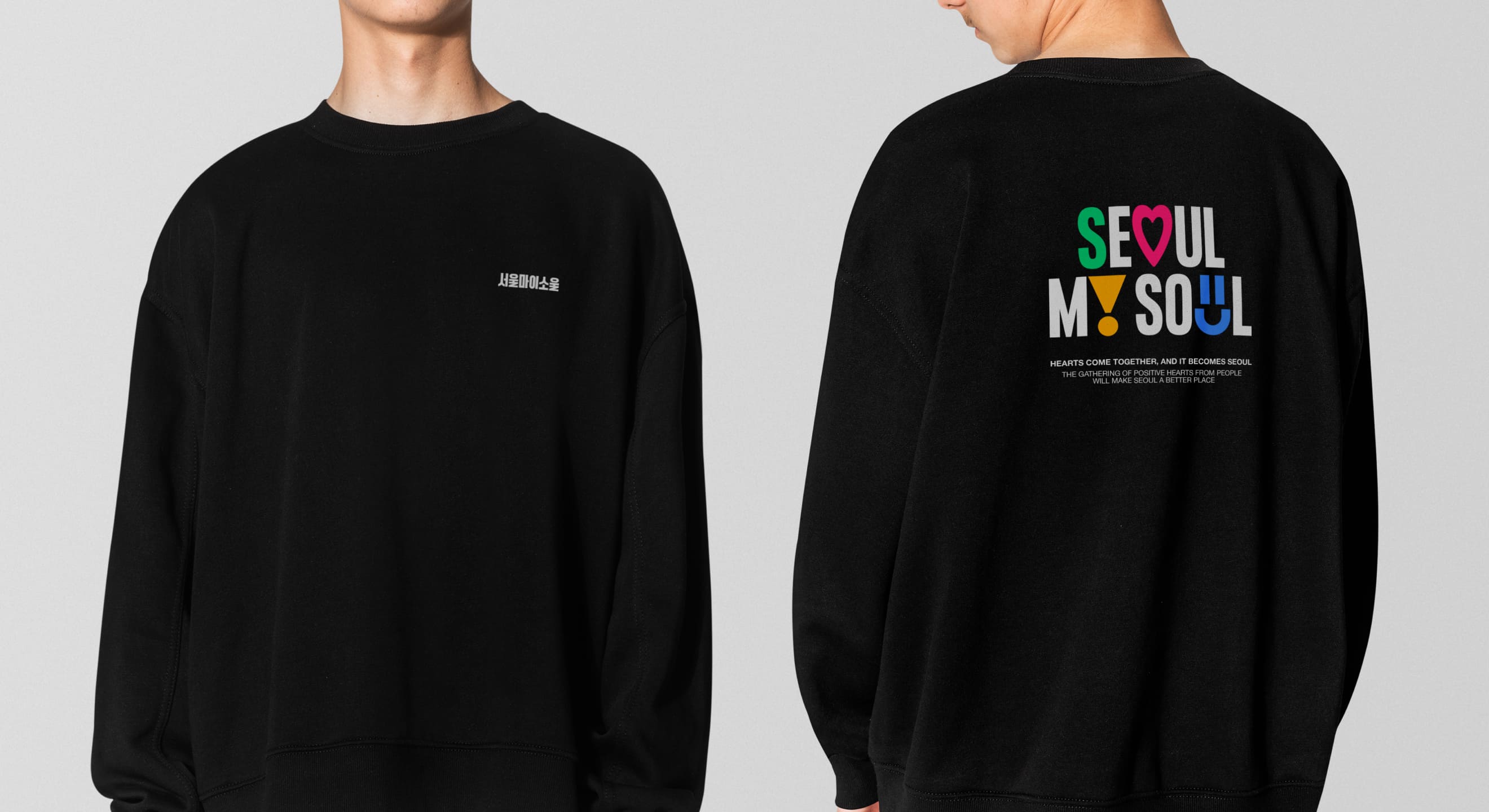
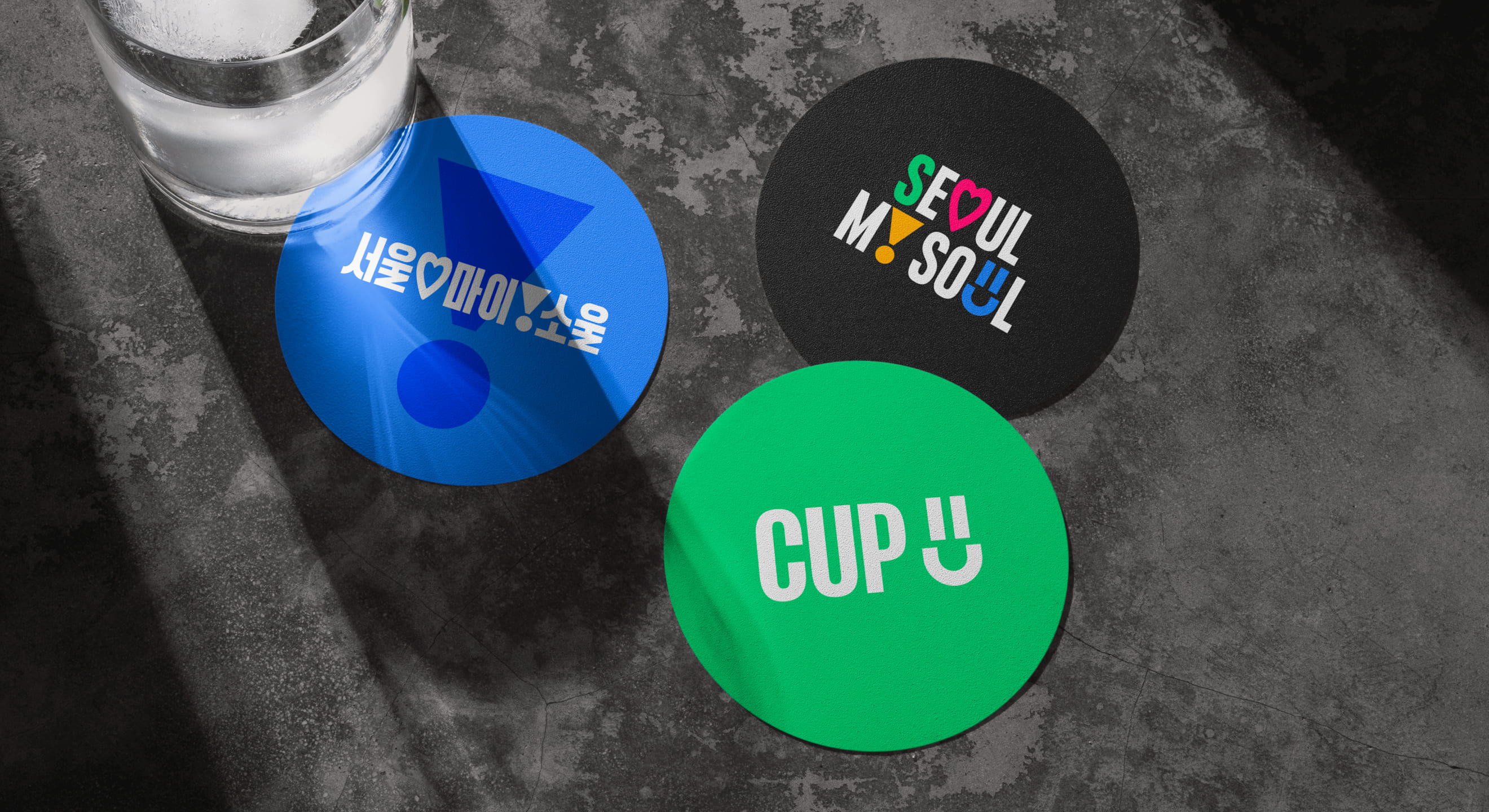
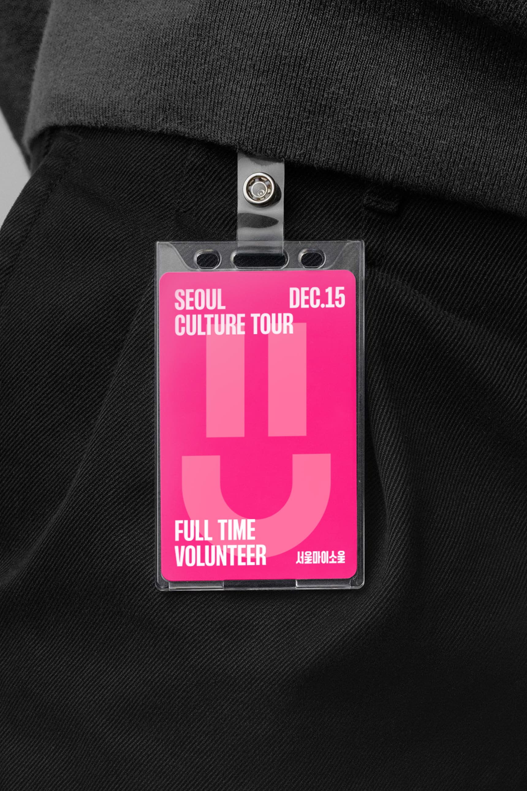
The pictograms applied in the logo symbolize Love, Inspire, and Fun, and they are designed in a shape similar to the alphabet to seamlessly integrate into the logo.
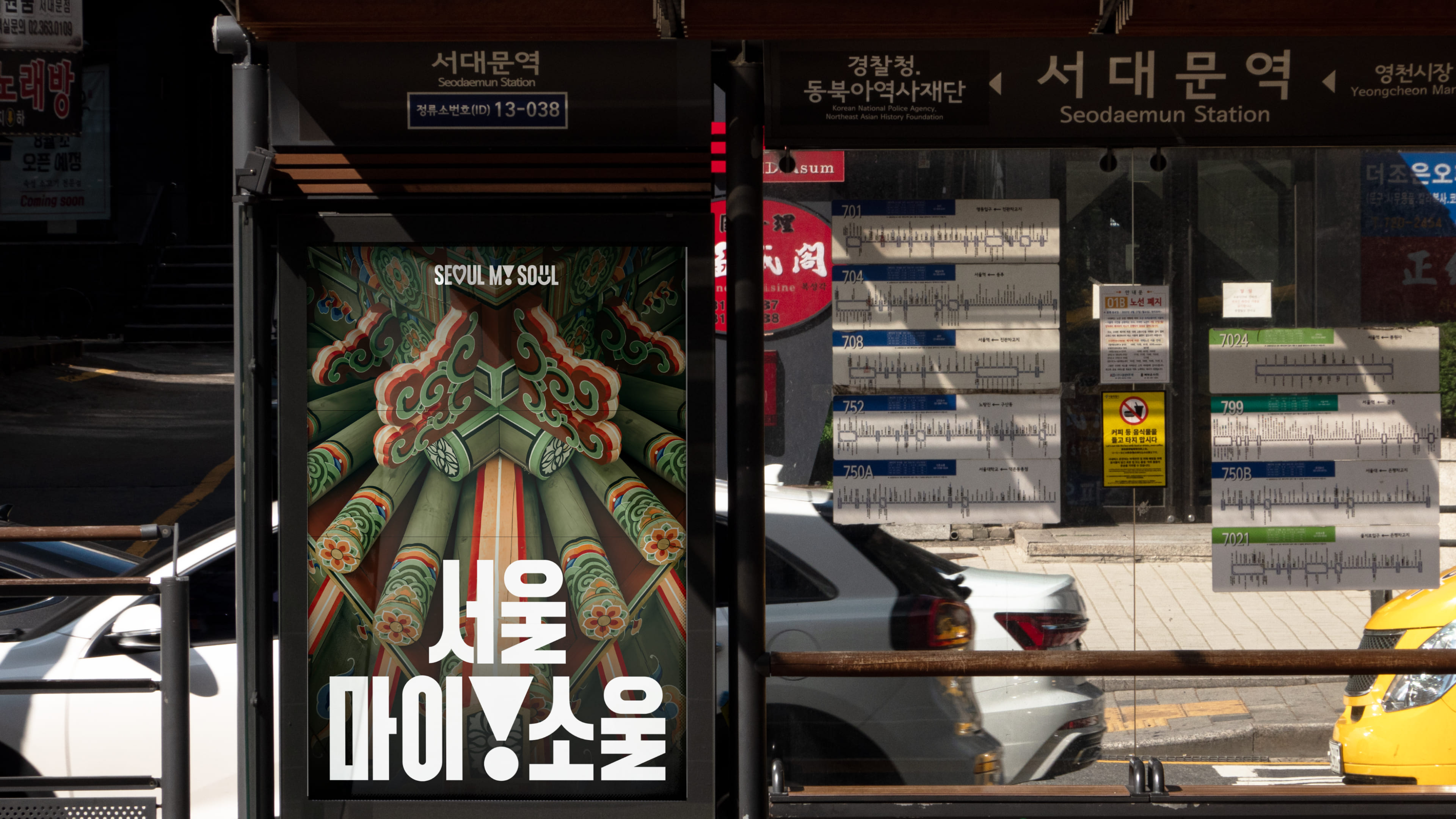
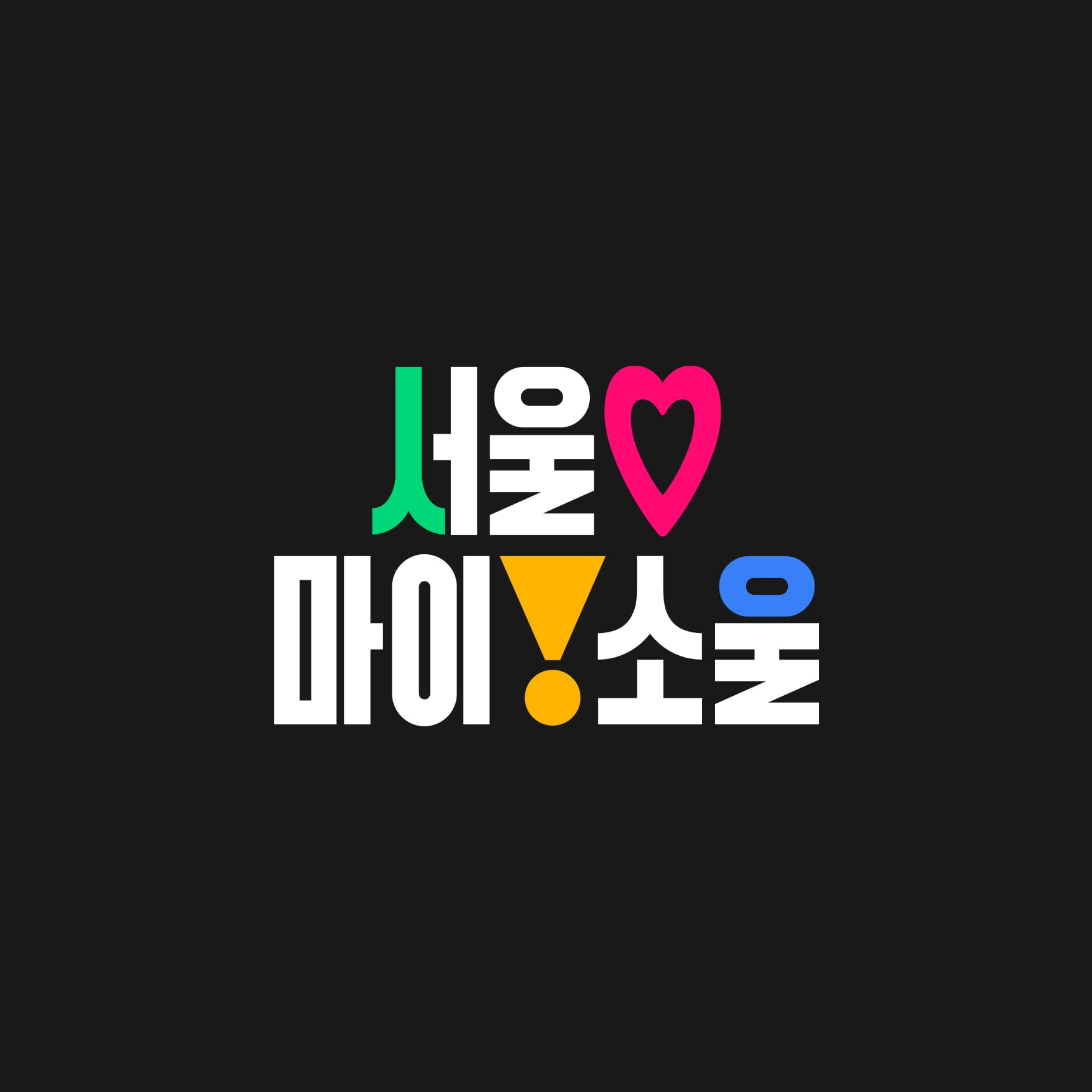
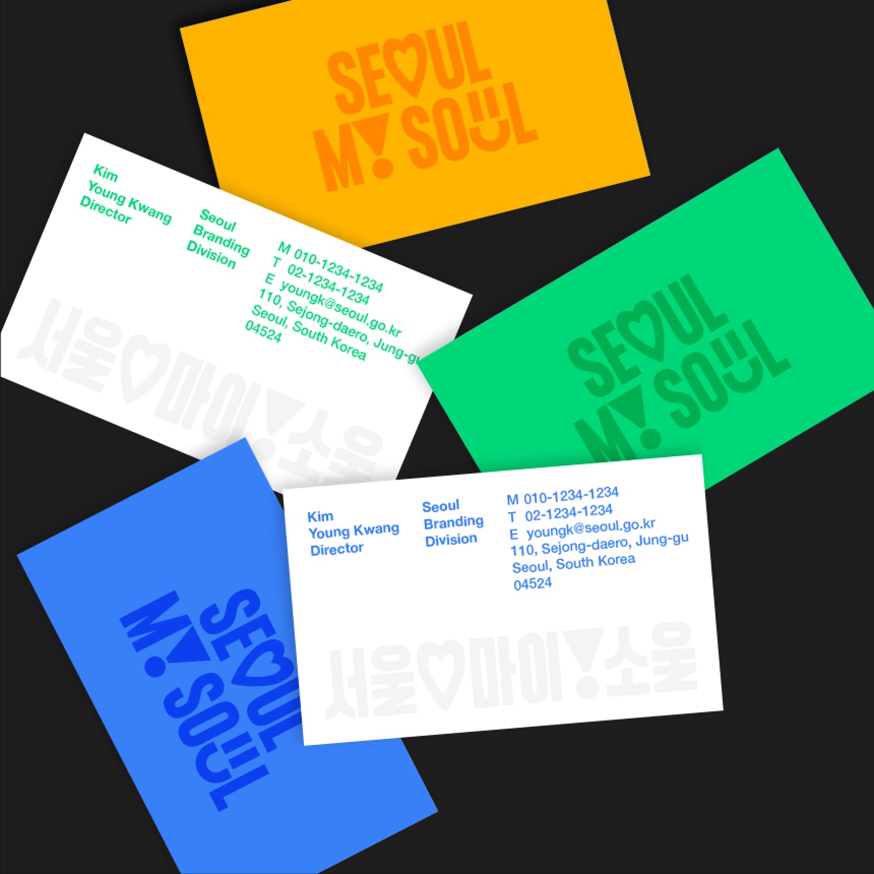
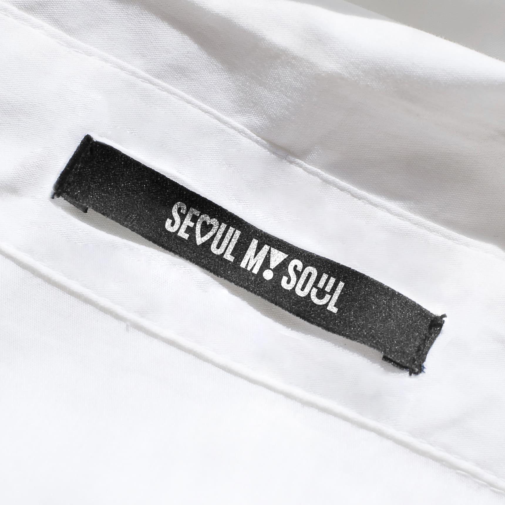
In addition to global Seoul, we have also designed a Korean logo to ensure that Seoul citizens can familiarly accept and use the slogan. The Korean logo is designed to minimize the visual differences from the English logo by inheriting visual elements like thickness and curves from English typography.

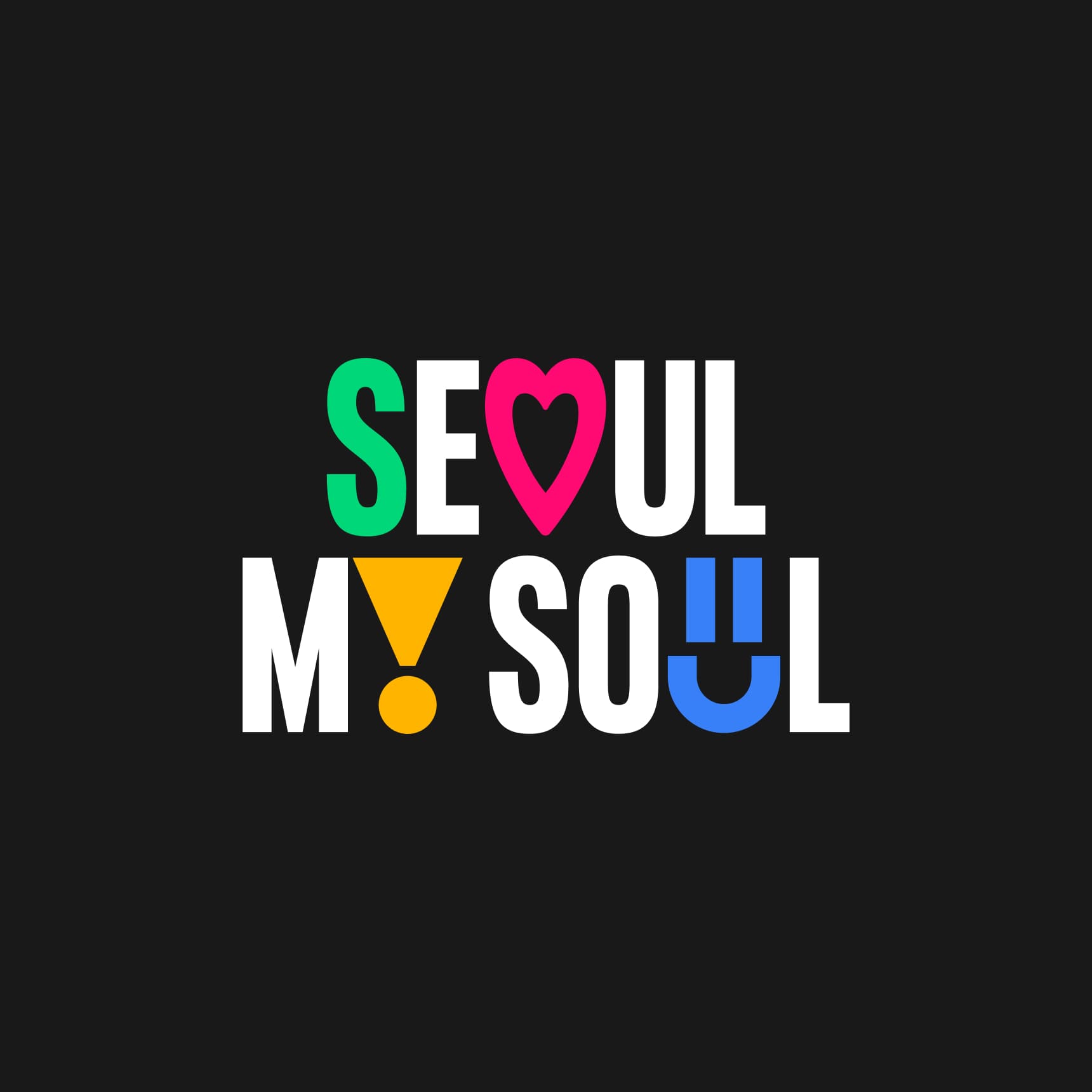


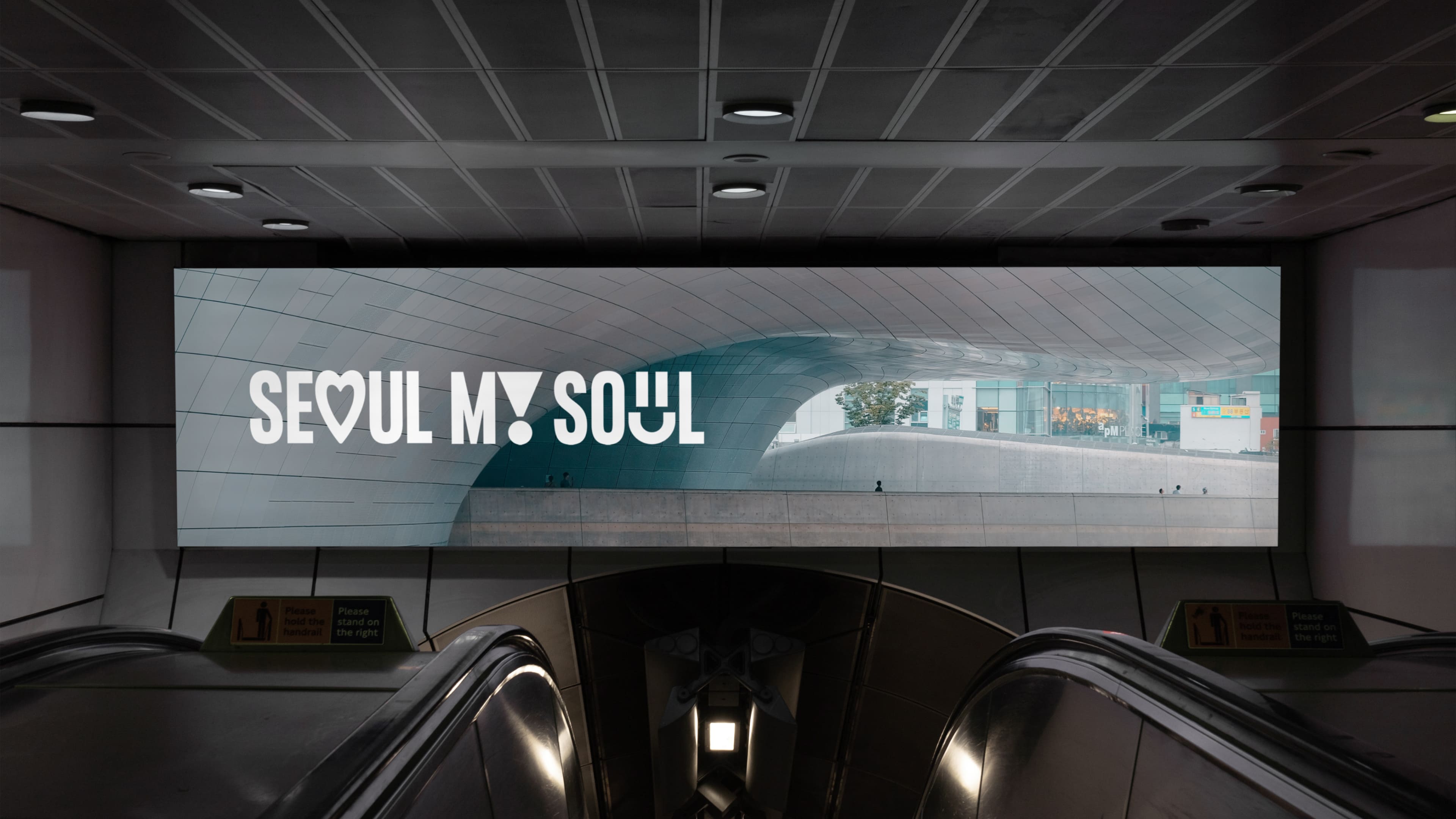
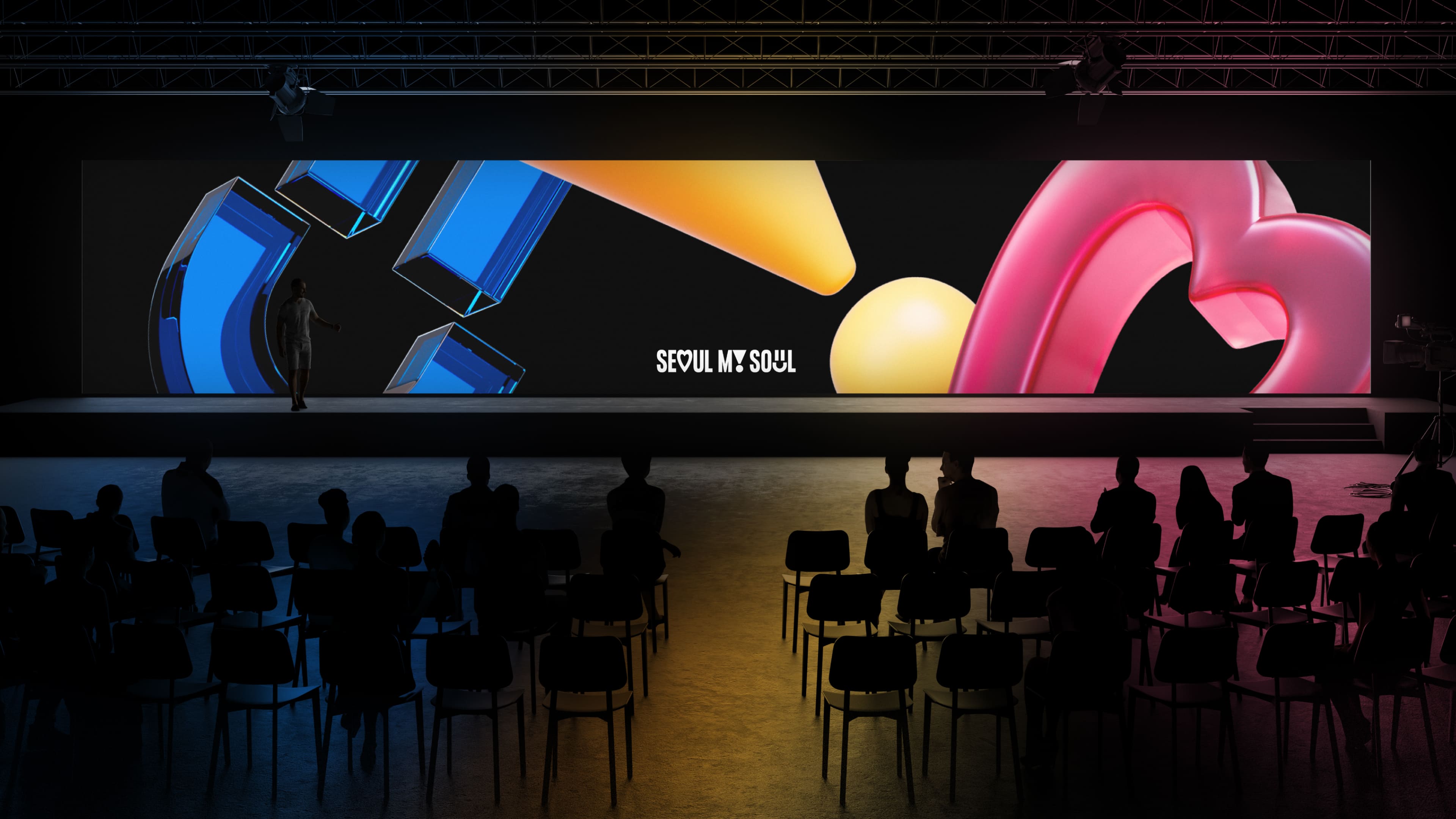
Graphic System The pictograms applied in the logo represent Love, Inspire, and Fun, and they are designed in a shape that resembles the alphabet to naturally integrate into the logo.
We have developed four primary colors based on Seoul's existing identity to showcase the diverse experiences of Seoul visually. We have created a design system that actively utilizes motion graphics and 3D assets, ideal for applications in social media, video, and various media.


Seoul City
Brand Identity Design
BRENDEN
Creative Direction / Do-eui Lee
Project Management / Wook Jung
Design / Hyejoo Yun, Haena Yang, Hyewon Jang, Hanbeom Choi
Client
Seoul City Hall
Award
iF Design Award Winner 2024